Software
Houzz Logo Print
sc484

Help with BM paint color for guest bedroom.

8 years ago
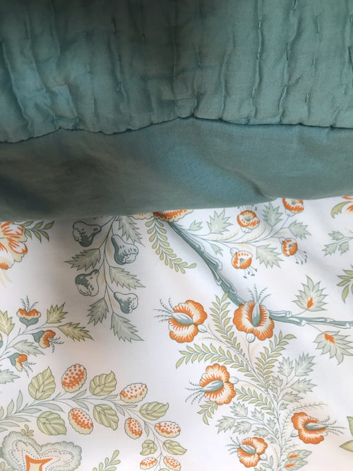
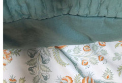
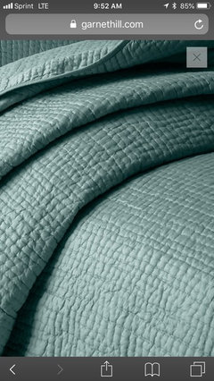
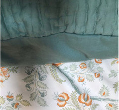
Below is a picture of our bedding. It will go in our guest bedroom, which will eventually be taken over by one of the kids. The room faces west, and is very dark in the AM.

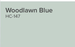
Was thinking of BM Woodlawn Blue. Is that too bold here?

The rest of the house is some form of gray, except my daughter’s room across the hall, which will be painted BM slip.

Thoughts / suggestions??

Comments (38)

  • 8 years ago
    last modified: 8 years ago

    On my computer screen that solid color looks gray, but mostly green. The flowers appear to be a shade of orange with some light color green leaves. I would paint the bathroom with a light color with a hint of gray such as Wevet No.273, Farrow & Ball. Then add in a couple deco items (hand towels) matching the orange in the fabric shown. It is hard to tell if the fabric is a curtain or bed linens; however, it appears to be bedding.

  • 8 years ago

    any reason to not choose the background white?

  • 8 years ago
    Ninigret - it would be too much white. We’re going white in the hallway and the foyer because of the way it flows between the two floors.
  • 8 years ago
    Dingle hopper - the blue is a soft blue green ... I thought Beach Glass might be a good match, but it seems a tad too dark.
  • 8 years ago

    Some have said you can ask for the paint to be mixed 25% lighter. It would be the same color, but lighter. I have never had paint mixed at a percentage lighter, but it might fix the issue of being to dark.

  • PRO
    8 years ago
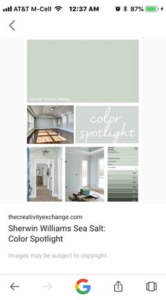
    No that is wrong. Cutting paint changes the color. No guarantees. I would suggest SW Sea Salt. It is a great color and could work perfectly. Let me go analyze some colors and get back tomorrow.
  • 8 years ago
    last modified: 8 years ago

    Love the greens. So calming.

    I think your Woodlawn blue is a beautiful choice, and a few others below that are a tad lighter....

    BM colors


  • PRO
    8 years ago
    SW Sea Salt is a real chameleon color. It is different than BM Sea Salt because the BM color is much more on the gray side. SW Sea Salt has a LRV 63 which means it is a medium on the LRV scale from 0 to 100. 100 being lightest. It is in the Green Yellow hue family. I will do some further analysis tomorrow on some comparison colors. What color is your trim? What color is flooring? These elements effect color perceptions as well.
  • 8 years ago
    I painted my room SW sea salt, had it lightened 25% because the lighting is bad in this room. I love the color. I love it so much I might paint my guest room the same color. It matches everything... Almost!
  • PRO
    8 years ago
    Colors on monitors and hand held devices are not accurate. Your dark bedding on my screen, looks more to a blue than green. What is your perception there in the room. Try setting your paint deck next to the dark fabric so we might get a better true sense of that color. West side will also tend to washout color and be dark in mornings so a fine line to walk. More on this tomorrow.
  • 8 years ago
    Thanks so much Flo!! These are great suggestions!!

    Our trim will likely be simply white (as that is what the rest of the house will be).

    Floors are a medium brown - minwax special walnut stain.

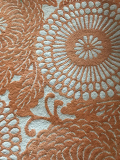
    I have an orange rug, which I could potentially use in this room too .... picture below.
  • 8 years ago
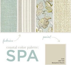
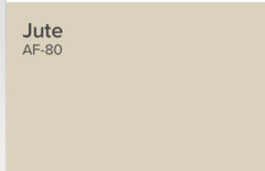
    Sea Salt is lovely. BM jute is a nice warm colour, subtle and not competing with the greens and blues
  • 8 years ago

    oooh -- that is very pretty too!

  • PRO
    8 years ago

    I have done a color measurement of the BM Woodlawn Blue HC-147 and it is an LRV of 61, it is in the green/cool hue family, so it will read mainly green/cool. I am concerned that your darker color in your bedding has a lot of blue in it, so I also scanned BM Yarmouth Blue HC 150. It has a LRV of 57 and is in the Blue Green Hue family and it might be a better direction than the all green family, IF I am reading the blue in your bedding properly. You might want to check that out. It is a bit darker than the Woodlawn Blue but with a West facing room, I think it would be very pretty. And with the trim color, your floors and a lighter rug (not feeling the orange rug) this would be a nice combination. If you go to the green side, it might clash with bedding is what I am saying. So check that out. Hope that helps.

  • 8 years ago
    May I ask where did you get this bedding? It is stunning!
  • 8 years ago
    Thanks Flo!! I love Yarmouth Blue in the pictures I’ve seen. Below is a better image of the sham and quilt color ... smoky teal.
  • 8 years ago
    Thanks Shelly! Do you have the source of the patterned fabric also?
  • 8 years ago

    That BM Jute is really pretty Irene. Here they are side by side....

    I'm also feeling the greens like Swept Away or similar.

  • 8 years ago
    last modified: 8 years ago

    I would due a very muted, very light color. My favorite colors are BM halo and BM healing aloe. They pull a little blue and green. And you can decorate them as your bedding style changes.

    BM Halo: http://fortheloveofahouse.blogspot.com/2011/04/dining-room.html

    Healing aloe: https://www.bloglovin.com/blogs/remodelaholic-2254410/color-spotlight-healing-aloe-from-benjamin-4440347651

  • 8 years ago

    Woodlawn blue is a gorgeous shade, but to me it pulls more blue than Palladian blue which pulls more green to me, if you are looking to match palladian blue would be great IMO and you can have it done with like 50pct color if you want it lighter than the chip... But Woodlawn blue is gorgeous and while it def does have green to it, to me it reads light blue on the wall, bit I have combined with teal and it looks beautiful but check out Palladian blue that reads more blue green but more on the green side of blue green if that makes sense :)

  • 8 years ago
    cjohnston - it’s from garnet hill.
  • 8 years ago

    Thanks Laura. Swept away looks beautiful too. (I tend to lean towards the cool colors). So many great choices here! Thanks everyone.

  • 8 years ago
    I think the orange and teal could work well, but then it might be better to choose a light neutral for walls. BM Edgecomb Grey is a lovely warm grey that works well with smoky teals. I think it sits close to the middle between grey and beige, and is a great colour for a bedroom.

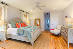
    Kiawah Beach House for GDC · More Info
  • PRO
    8 years ago
    Ok, let’s talk. You have beautiful strong color in the teal which is a blue green tone. You have a fairly busy pattern on the other bedding. What else is in the room? Flooring? Furniture? Those elements might help inform you color decision. But main thing is the strong teal is the boss.
  • 8 years ago
    So, the orange rug was just a fleeting thought. Was hoping to play up the orange accents in the bedding. But I think I’ll need something more neutral on the walls.

    As for furniture - this is the smallest bedroom in the house (8x8), and the only one that faces west. So it will only had a full size bed, with is an ebony stained wood headboard.

    What do you think about grey wisp?
  • PRO
    8 years ago
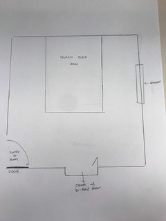
    Can you do a rough sketch of room so we can visualize where headboard of bed would go and where window is. You might be able to do two walls in accent color and two walls neutral. That is small room for sure but you can do fun things in small spaces!
  • 8 years ago
    Here’s a rough drawing. Hope it’s helpful!
  • PRO
    8 years ago
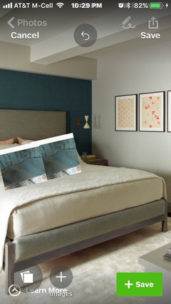
    Shelly. I put this little mock up to give you a bit of visualization on how a deep teal wall with a gray/beige other wall and your bedding could work. A touch of peach or coral in a couple of pillows with some cream from print fabric would work really well.
  • 8 years ago
    that looks great
  • 8 years ago
    Whoa!! That is stunning!! What color is that blue and the beige? I’m using Newburyport blue downstairs ... bringing the blue upstairs would be a nice touch. I’m going to experiment with BM Black Pepper.
  • PRO
    8 years ago
    I couldn’t find a color reference but not a problem. I will find a similar color(s) for you later tonite.
  • PRO
    8 years ago

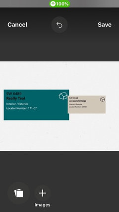
    I looked up some "teals" and the one I like and think it would work with the teal in your bedding is SW Really Teal 6489. I would also try SW Accessible Beige for the other walls with a white ceiling. I will post some pictures of these, but you will need to check them out in your light and with your bedding. Colors on monitors are never good but this will get you in the right basics anyway.

  • PRO
    8 years ago
    Here are those two colors.
  • 8 years ago

    @Shelly, how are your paint choices coming along?

  • 8 years ago

    Hi Laura! I actually ended up with Woodlawn Blue, and I found that it matched the fabric perfectly. I will post a picture once the room is finished! Thanks all!

  • PRO
    8 years ago
    Woodlawn is a very pretty color. Glad you are happy. Looking forward to your pics!
  • 7 years ago
    Any pics?
Sponsored
NME Builders LLC
Average rating: 5 out of 5 stars2 Reviews
Remodeling Company in New Albany, Ohio