Software
Houzz Logo Print
alice_wong8746

Last minute help deciding white interior paint!

8 years ago
last modified: 8 years ago

We are building a new house and need to choose our paint colors by tomorrow (yes, I have unfortunately left this Houzz inquiry very late).


We want the interior to be completely white. As in stark cold white - it sounds terrible but that is the way we like our house. So no blue, greys, yellow, pink, brown undertones whatsoever. In our current house, the walls are BM Decorator's White and I hate it - it leans gray and that is all I can see at night or in the corners.


We have narrowed it down to these 4 Benjamin Moore colors only (that is the brand our builder is using):


- Chantilly Lace

- Super White

- Ultra White

- Brilliant White


I've read a number of blogs that says Chantilly Lace is the purest, cleanest white (even more so than Super White). But when I toured another one of the homes that our builder has under construction, which uses Chantilly Lace, it looked downright yellow to me. It is just down the block from our house so it faces the same direction (living room/backyard faces south-east).


Any help would be much appreciated! Thank you.

Comments (28)

  • PRO
    8 years ago
    last modified: 8 years ago

    White is so finicky, like you are experiencing. I would get a small sample of each and paint each on different walls in your home. If you are unable to actually paint the walls, at least paint a piece of foam core and place it against several walls in the home, and at different times of day (morning, noon, evening).

    Hope this helps!

  • 8 years ago
    Super white is a bright clean white - at least in our space, but agree that you need a sample in your space to make sure it’s what you want
  • 8 years ago

    Benjamin Moore Super White, or Oxford White.

  • 8 years ago

    thank you! Although I would love to do the sampling, we are out of town so I'm relying on internet pictures and advice. Not the ideal situation but just the way our work lives are.

  • 8 years ago

    Well....sounds like you're gonna have to roll the dice and hope for the best. I think BM Super White is a good bet, but I'm not a pro and YMMV. Good luck!

  • PRO
    8 years ago


  • PRO
    8 years ago
    last modified: 8 years ago

    You cannot rely on monitor paint choices Chantilly Lace reads very green on my monitor so does super white . Honestly to choose color from an online site is never good. At least go looma the colors in a store and take them outside to see them.

  • 8 years ago
    last modified: 8 years ago

    Thanks all. I’m going to take the plunge and take a chance on Super White I think. At the very least, I’ve seen Chantilly Lace in person in the other house and I know for sure it was yellow to me.

  • 8 years ago

    I have read the Ceiling White, is a color....for ceilings. It has no undertones. It is designed to go with whatever the walls are. Ask your paint brand, store, if there are any tints added to their Ceiling White. It may be the color you need. Alot of pure whites, will lean BLUE in fabrics when your eyes and the light look at them. Alot of what you see in a white wall, is based on the kind of LIGHT BULB in that area, and the other colors that are reflected by some paints. So. You have a predicament, but this is just one suggestion of what you are up against. IF you go to the Paint store and they share the recipe of what tints they put into SUPER WHITE, than you will know what you might see, if the lighting is accurately reflecting it inside your home. Chantilly Lace, may be white, but if the flooring in the home had no floor covering on it and was raw wood, for instance, or beige carpet...there is where your "yellow" may be showing up. Also, if you choose an eggshell finish or a satin finish or a semi gloss finish paint....each one will look like a different color because of the way your eyes interpret the hue .

  • 8 years ago

    many paint stores have special lights so you can view the color swatches in various lights,

  • 8 years ago
    last modified: 8 years ago

    We considered asking for base white, no tint. But was told it would require an additional coat as the coverage is not as good. Considering this will be all the walls, all the ceilings, and all the trim in the entire house, that’s quite a bit of extra money that we don’t have to spare.

  • 8 years ago
    last modified: 8 years ago

    ? you're going to need two coats, regardless. I assume your walls are primed? I've never had issue with it not covering. have them add extra white to it. As for coverage, it's white paint. do you think adding a teaspoon of yellow tint is going to make a difference in coverage?? (or red, or blue,,,or whatever color tint it requires? it's a squirt or two. that's it)

    why don't you get a gallon and try it on a wall yourself? will take two hours or so to do one wall. see how it looks . like I said, you can always get it tinted, but the base white should be good enough. The amount of tint they add, in Simply White for example, is negligible and is not going to make a difference in coverage!

  • PRO
    8 years ago

    A shot of black can help with hide. Which is why so many colors of white and lighter colors will have a shot of black.


    For lesser grades of paint adding cheaper black colorant is a classic paint manufacturer strategy to feign quality. And it works because most people don't understand that some colors and colors of white don't hide well no matter what brand or grade.


    Every color white including untinted bases belong to a hue family.


    The colors of white that most people see as "just white" belong to the green-yellow hue family.


    And there are reasons why we perceived whites and grays from the green to green-yellow hue family as being totally neutral (achromatic) but I won't bore you with the details.


  • 8 years ago
    last modified: 8 years ago

    I’m just going to go with super white. I haven’t read anything about it going a strange color so will just take the chance rather than dealing with a possible 3rd coat, or adding black to a base as that probably will end up being a big discussion about how much to add, especially since I’m not in town to deal with all this. Thank you all so much!

  • 8 years ago
    last modified: 8 years ago

    Literally just went through the EXACT SAME THING with the same colors. Except I had it narrowed down to chantilly lace and super white. My backyard also faces the southeast. I tried The paint swatch things you can peel and stick on your walls and move around - didn’t work very well with being able to see the true colors so I ended up painting large squares (two coats for full coverage) in just about every room on every wall and butted the two colors against each other where one wall meets another just so I could tell the difference. In that case, I couldn’t tell the difference. HOWEVER, it wasn’t where all the light pours in.


    Where the light pours in, Chantilly lace does read a very bright and vivid white, but I wouldn’t call it yellow or creamy, think more natural-daylight-white (sunny-white but in the sense that it’s BRIGHT, not yellow). The super white reads a very pure white. I researched it for months and went to the end of the internet and back again. I also wanted a true, pure white with no undertones. Super white would be my number one choice. However, our house isn’t a new build and the cabinets are a very dark-stained cherry wood so the super white read too stark next to the red undertone in the cherry cabinets and the kitchen is in the back of the house (southeast), so we’re going with chantilly lace. If we had a new build though, and the cherry cabinets weren’t in the picture, I’d go with super white.


    BM pure white and decorators white was also in the running initially but those were rejected pretty early in the game as they both read dingy/almost gray and I did NOT want gray. I looked into brilliant white a long time ago but ended up ruling it out for some reason or another. We’re doing ceilings, walls and trim all the same color, FWIW.


    IIRC, Chantilly lace does have green and yellow undertones and super white has green. As for brightness though, Chantilly lace may be brighter but I’m pretty sure thats due to the chroma or light reflective value - I remember a pro here talking about it! Don’t confuse brightness with whiteness.

  • PRO
    8 years ago

    Don’t confuse brightness with whiteness.


    Yep.

  • 8 years ago
    last modified: 8 years ago

    OP, Lori is the pro I remember talking about it - she’s a master color expert and explained it in detail on another thread about whites.

  • 8 years ago
    last modified: 8 years ago

    Thank you lindsey - that is super helpful!

    Our kitchen cabinets are black with white quartz countertops so it probably will end up looking quite harsh :( But to me that is worth it rather than seeing hint of yellow on every wall. Part of me wonders if the yellow I saw was due to the lighting used by the builder in that particular house but so be it.

  • 8 years ago

    I like contrast so I do think black and white works well together in the kitchen, especially if your counters are white. Our counters came with the house and are a brownish quartz so those also dictated the decision to go with chantilly lace. Ideally, though, I would've chosen white.


    I’ll post some pictures of the swatches on my wall, maybe they’ll help.

  • 8 years ago
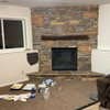
    Chantilly lace on the left, super white on the right. This was taken around 10AM, no camera flash and no interior lights were on when I took it.
  • 8 years ago
    Here is where they are butted against each other. Super white is on the left (or straight ahead), chantilly lace on the right and wrapping around the corner. This was taken at 7:45 AM. I think I used the camera flash when I took this.
  • 8 years ago

    IF you have one without the other, either one, you will see WHITE. Like a bleached set of teeth? LOL, minus the red lipstick.

  • 8 years ago

    don't forget your bulbs. if they are warmer temp, they will make white look on the yellow side.

  • 8 years ago
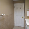
    Here it is next to the cabinets. The first picture next to the 5-lite door is super white. Second picture is chantilly lace.

    The door casing and door is pre-primed and will get painted along with everything else but you can see how much more white the super white is next to it. This was taken around 7:45 AM and camera flash ON but no lights were on in the house. Because of the camera flash, the cabinets look more like a black - they’re not this dark in person and like I said, they have a red tone to them because they’re cherry. But since yours are black, i figure it couldn’t hurt. Also keep in mind, while the super white does look stark next to them, I think if we had more linear looking pulls as well as flat slab or simpler cabinet doors, the stark contrast would work. So if you have that, I wouldn’t worry too much about the contrast. (Our cabinets have a slightly more traditional door and there’s also crown molding on them so it’s another reason the super white doesn’t work for us.)
  • 8 years ago

    Thank you all! And Lindsey these pictures are gold - thank you for sharing. The color difference is really obvious in the first picture as well as the ones in the kitchen. Definitely Super White is what we want. I‘m really relieved and really appreciate it.

  • 8 years ago
    And here’s the same location with each next to the cabinets but without the flash. 7:45 AM again. First picture (with door) is super white, second picture is chantilly lace.

    Third and fourth are some shots from farther away & at different angles. Chantilly lace is on the left, super white on the right. 7:45 AM, no flash.

    I would say the chantilly lace has more of a “glow” to it and the super white has more of a “shine” to it if that makes any sense. Hope this helps!
  • 8 years ago
    No problem. Glad I could help!