Software
Houzz Logo Print
webuser_8098849

HELP Decisions after visit to the slab yards...which granite???

7 years ago
last modified: 7 years ago
So hubby and I drove 4 hrs south to look at a couple slab yards our favorite fabricators work with.

We have cherry/chesnut cabinets and wanted granite but on the lighter side (nothing black) and nothing too crazy pattern wise

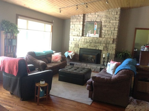
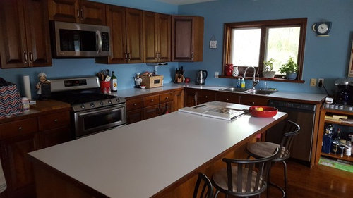
We have stainless appliances that have a bit of black on them , blue walls, and the living room/ kitchen is oak hardwood . I want to have just a simple longer subway tile in an offwhite for backsplash up to the cupboards and halfway up the window. We livee on a lake and my home is neutrals with warm toned browns, blues, turquoise and lots of wood trim, doors floors

Here are the granite choices we liked in our price range-

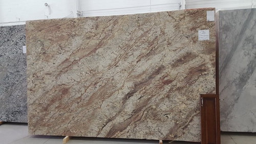
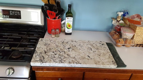
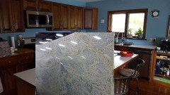
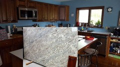
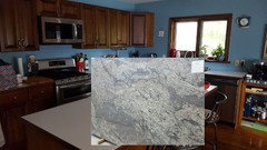
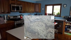
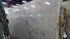
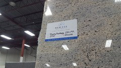
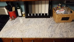
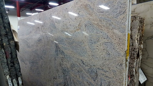
1. Ivory fantasy- its different with some movement and the gray looks almost blue, its creamy based has brown in it to tie in cupboards . (first 2 photos)

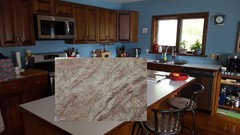
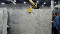
2. Nevaska is cooler in tone but nice movement with the cream , brown , gray and reminds me a bit of fantasy brown (which we like but its labelled soft quartzite and with messy teens worry about possible damage)

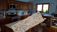
3. Pircima White- had darker colours with reddish brown bits that looked good with the cupboards

4. Typhoon bordeaux is alot of peoples obvious choice when it comes to cherry as it looks great with the cabinets BUT the creamy areas looked almost yellow to me which i didnt like , and there was ALOT of burgundy in the slabs they have and it seemed too much to me. Hubby liked it though

  1. We also have a small sample of white delicatus from another shop .

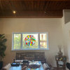
I've included a photo of my living room lastly as its open concept lake house .You can see what kind of colour scheme i have . The 2 rooms are open to one another so has to look ok moving from one end of the big room to the other. Excuse my furniture, its next on the list after the kitchen

Here is my current kitchen


Ivory Fantasy


Nevaska


Percima White


Typhoon bordeaux


White delicatus


here is my living room


Comments (45)

  • 7 years ago

    White delicatus

    Debbie Comerford-Lalonde thanked herbflavor
  • 7 years ago

    Same.

    Debbie Comerford-Lalonde thanked emmarene9
  • 7 years ago

    Ivory Fantasy


    Debbie Comerford-Lalonde thanked Jora
  • 7 years ago

    White delicatus

    Debbie Comerford-Lalonde thanked mcpherson007
  • 7 years ago

    Can't tell the proximity to fireplace wall and general feel w liv space. Nebraska may be important to consider if fireplace brick plays more light sand color and texture issues etc .nevaska and typhoon may need to be in the options along w delicatus then. Real life in space is best judge

    Debbie Comerford-Lalonde thanked herbflavor
  • 7 years ago

    We had azul delicatus(just a little more blue than the white)in our last kitchen and loved it. In your space the white delicatus would look fantastic!

    Debbie Comerford-Lalonde thanked Momofthree Ma
  • PRO
    7 years ago

    If your walls will remain blue I would suggest the Ivory Fantasy.


    Debbie Comerford-Lalonde thanked Norwood Architects
  • 7 years ago

    Norwood Architects, walls are staying blue, the other wall along front of house is a greige colour as seen in living room

  • 7 years ago

    Obviously they are all beautiful. I think I stand alone in preferring Percima White.

    (but they are ALL beautiful)

    Debbie Comerford-Lalonde thanked salonva
  • 7 years ago

    Ivory Fantasy. I like the blue in it, especially if you are keeping blue walls.

    Debbie Comerford-Lalonde thanked ljptwt7
  • 7 years ago

    White delicatus

    Debbie Comerford-Lalonde thanked raromeo
  • 7 years ago
    last modified: 7 years ago
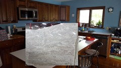
    here are the photos i made to get a better feel for choices. added in one more

    fantasy brown


    fantasy ivory


    nevaska


    white delicatus (hubbys now saying hes not a fan of this one)


    typhoon bordeux


    pircima white


  • 7 years ago

    I like the ivory fantasy.


  • 7 years ago

    Ivory Fantasy. Love the way it works with the blue. Plus the stone is gorgeous. If you would prefer to pick up the browns, the the Typhoon Bordeaux would be great.

  • 7 years ago

    The Ivory Fantasy is the perfect fit. Remember also that while it looks very busy right now standing up, once it's on the horizontal, it won't feel as busy. The Ivory Fantasy picks up the blues, grays and browns.

    The typhoon bordeaux which is a favorite of mine is a complete no no in your kitchen. it clashes.

    The white delicutis is bland and looks like so many other counters plus it doesn't pick up on that fabulous blue you have.

    Nevaska and Percima feel more gray than blue.

    Debbie Comerford-Lalonde thanked cpartist
  • 7 years ago

    Can you get samples of the other slabs? Seeing it in the lighting of the actual room is really helpful.

    Debbie Comerford-Lalonde thanked Kaylie
  • 7 years ago

    I'll be the weirdo who likes Nevaska - I love the way it has more brown and blue in it and overall has more color. It is still very light, but just darker than the Ivory and I think the bold rivers of color would look A-MAZING on the island.

    Debbie Comerford-Lalonde thanked Pam A
  • 7 years ago

    avoid blue in the counter. wall color can change in a heartbeat by you or the desire of others. Counter will likely not change for some time. You have other ones that WORK WITH the blue . In the last mock ups fantasy brown looks to be the right pick as far as I'm concerned.

    Debbie Comerford-Lalonde thanked herbflavor
  • 7 years ago

    Ivory fantasy

    Debbie Comerford-Lalonde thanked Annette Holbrook(z7a)
  • 7 years ago

    Ivory Fantasy


    Debbie Comerford-Lalonde thanked sheepla
  • 7 years ago

    That fantasy ivory is stunning! I like the nevasca too, but I can’t stop staring at the fantasy ivory! I think any of those stones would still look amazing if you got tired of your blue walls and went with a neutral beige, warm white, or taupe sometime down the line. Those stones are just spectacular though!

    Debbie Comerford-Lalonde thanked skmom
  • 7 years ago

    Ps, I hope you post a photo of your kitchen with your countertop choice all done!

    Debbie Comerford-Lalonde thanked skmom
  • 7 years ago

    Love the Ivory Fantasy! Make sure that you are there for templating, no matter which one you choose. Since your slabs have a lot of movement, you'll want to make sure you like the transition at the seam in the corner.

    Debbie Comerford-Lalonde thanked chicagoans
  • 7 years ago
    last modified: 7 years ago
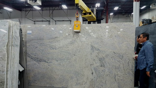
    herbflavor ivory fantasy looks blue but its actually gray in the stone...we just painted walls blue and love them . Pam A , skmom I like the nevaska too, i think its between it and ivory fantasy for me and when we actually get it done i will post photos. Hubbys fine with any of these he says EXCEPT for delicatus white, he doesnt like it as it has no movement. Kaylie Keesling i wish i could get samples but they are 4 hrs away (so 8 hr round trip driving) so no, i took the photos is best i can do.

  • 7 years ago

    i forgot to add in the pircima white mock up...but im still thinking either fantasy ivory or nevaska


  • 7 years ago

    The Nevaska is sooo pretty! It would be my pick!

    Debbie Comerford-Lalonde thanked Vvall
  • 7 years ago
    last modified: 7 years ago
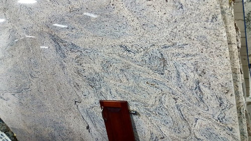
    here are more of the ivory fantasy photos, when i first looked at it i thought of the song Starry starry night and vincent van Goghs painting. the blueish looking parts are actually gray but look blue, We havent seen anything else like it . its tagged till and we have a couple weeks to decide if we want to keep it


  • PRO
    7 years ago

    I"m not liking any of these. They are all far to "dramatic" for a nice simple kitchen. I would choose a solid white countertop in either quartz or solid surface such as Corian.

    Debbie Comerford-Lalonde thanked Anglophilia
  • 7 years ago

    I vote for the Nevaska. I like the pattern in it, and as someone else said, the look changes when the slab is horizontal on your cabinets as opposed to looking at it vertically.

    Debbie Comerford-Lalonde thanked annac54
  • 7 years ago

    Starry night! Yes, that is exactly what came to my mind as well!

    Debbie Comerford-Lalonde thanked skmom
  • 7 years ago

    Anglophilia i have a solid white countertop right now :)

  • PRO
    7 years ago

    White delicatus

    Debbie Comerford-Lalonde thanked Judd Builders
  • 7 years ago

    I'm afraid white delicatus is out of the running. Hubby doesn't like it and since he'has to live with it he gets a say ...

  • 7 years ago

    I've opend a poll between Nevaska and Ivory fantasy :) https://www.houzz.com/discussions/5719400/which-granite-looks-better

  • 7 years ago

    Ivory Fantasy looks amazing with your kitchen.

    Debbie Comerford-Lalonde thanked Kim
  • 7 years ago

    Keeping my vote for fantasy ivory, but your last percima(?) white is beautiful as well, and so is navasca. I can see why it is a hard choice, but I would listen to Cpartist! (Glad your hubby nixed the one. I don't like that one at all.)

    Debbie Comerford-Lalonde thanked ljptwt7
  • 7 years ago
    last modified: 7 years ago
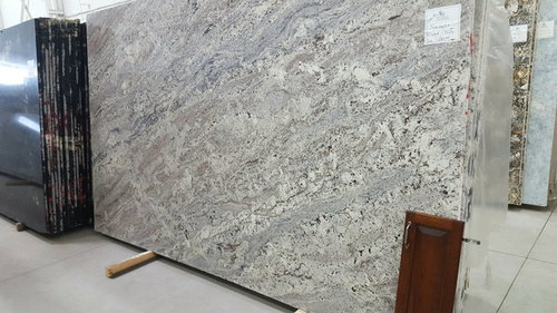
    My vote STILL is for Ivory Fantasy. The Nevaska has too much brown in it which, in my 'non-pro' opinion, is not a good contrast against your cabinets.

    The Ivory Fantasy (whether the waves are blue or gray) will compliment your cabinets beautifully - regardless of keeping your walls blue or otherwise.

    :)

  • 7 years ago

    it would be nice to see a sample in your space. Ivory fantasy is beautiful but to me all that gray may not be the right fit with your blue walls and all that wood (including wood ceiling in your living room).

    Debbie Comerford-Lalonde thanked champcamp
  • 7 years ago

    Very nice. I had to go look at your original countertops. You made a good choice.

    What is next for your kitchen?

  • 7 years ago

    emmarene9 thank you. Next up is back splash. up to the cupboards and across to the other side of window. Alot of the blue will be gone I am thinking cream subway tile, second from the left just not sure of size, these at 2.5 x 10

  • 7 years ago

    Debbie now that you have those vertical I actually like the lightest one. The cream one is looking too yellow to me. Again, best to get loose samples.

    Debbie Comerford-Lalonde thanked thinkdesignlive
  • 7 years ago

    I may be crazy, but have you thought of using a light blue tile that compliments both counter and wall color? I just think that picking up the blue in the counter would be awesome.

  • 7 years ago
    last modified: 7 years ago
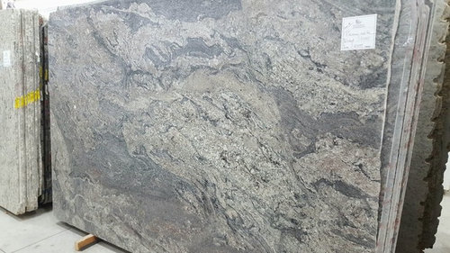
    ivory fantasy, its not even close! pulls in all the other colors.

  • 7 years ago

    You need to get some sample tiles. It looks yellowish to me.

Sponsored
Daniel Home
Average rating: 4.8 out of 5 stars20 Reviews
Premier Interior Design Team Transforming Spaces in Franklin Co, Ohio