Software
Houzz Logo Print
mabel_peabody

Travertine vs Wall Paint. The saga never ends.

3 years ago
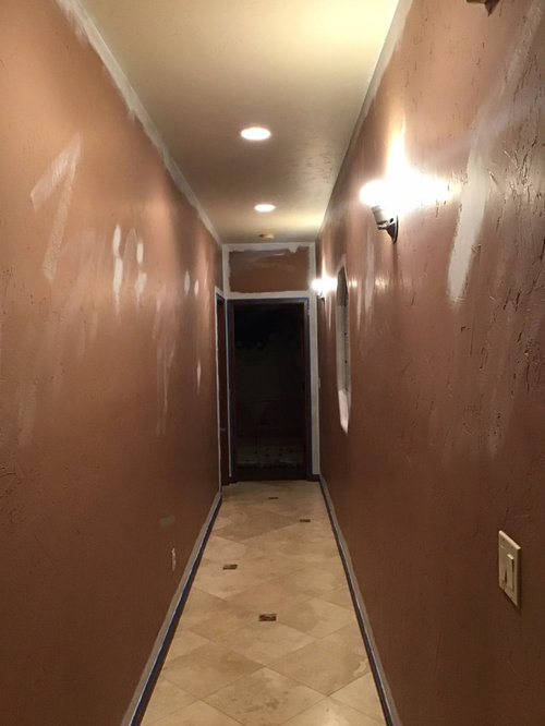
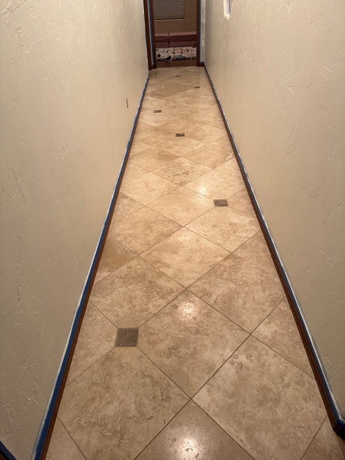
Heeeeeeeeeeeeeeeeeeeeeeelp. We have a southwestern adobe style home that we’re trying to update. I love the modern southwest style that has recently gotten popular. I chose Alabaster SW because it was warm, natural, and bright. Unfortunately it just looks like it’s fighting with the floors. Can anyone help?

Comments (31)

  • PRO
    3 years ago
    last modified: 3 years ago


  • 3 years ago

    Hey thanks so much for putting a visual together for me. This hall is very long and narrow so we’re trying to lighten it up.

  • 3 years ago

    Don’t try to match it with the travertine. Chose a happy color vintage runner, and match the paint to it.

  • 3 years ago

    I think that lightening the walls has an opposite effect from what you intended - it draws the eyes to the long runway where your walls and floors meet. If you paint the walls with a darker neutral closer in color to your floor tones, the walls and floors begin to blend and blur the tunnel effect.

  • 3 years ago

    I would highlight the hall and add some great light fixtures to the ceiling. Raise the eyes to the beautiful light fixtures. Add a runner if you’re not happy with your floors.

  • 3 years ago

    Emily, is that the front entrance hallway? And does that tile continue into the living space? Have you looked at it yet, as is, with the window protection and any trim paint project coverings removed? Seeing the outcome for yourself with natural lighting and all the trims will give you better info. I hear you that you want to lighten the space and if that's your front entrance hallway, I'd want it light, too. Once you see it altogether, take a few breaths that it isn't what you expected and live with it for a few days, possibly looking at different lighting (even just bulbs) and see if it starts to feel right for you. Wall sconce lighting, a mirror, a lovely runner you like and it might come together nicely! Paint for homeowners can be filled with unintended surprises. I know I've had my share and I now more fully appreciate why Pros do multiple sample paints (even when picking a "white") in big sections, painted on the surface or board, in the space before selecting the winning choice. Good luck!

  • 3 years ago

    It’s the hallway off the entrance. The tile runs through the whole house so we were testing colors on a grand scale. Thought we had the right one but it looks so off. Not trying to match. Just looking for a white the works with it. Not against it.

  • 3 years ago

    Hi Emily,

    Your wall paint is a little yellow and your tile is a lot pink/orange. If you want a white, look for off-whites that lean pink/orange with enough saturation so that saturation of the floor doesn't stand out too much. Also getting art on the walls will distract you from looking at the floors. All SW paint colors (test first!):

    - Nice White

    - Natural Linen

    - Kestrel White

    - Divine White

    - Canvas Tan

    - Navajo White

    - Shoji White


  • 3 years ago

    Thank you Susie!!! This is the exact help I was looking for. Thank you so much for the direction!!

  • 3 years ago

    Here’s a photo during the day. A little better but not exactly there yet. Susie do they still look orange/pink?

  • 3 years ago

    Here’s just the tile

  • 3 years ago

    And another one

  • 3 years ago

    When the faux Mediterranean trend was going on, I think SW Kilim Beige was one of the colors used with Travertine.

  • 3 years ago

    This is another recommended colour to go with travertine, BM Indian White OC-88.

  • 3 years ago

    It is so tricky to gauge undertones and what would work only by pics. But, seeing the tile only pic, I'd take a look at Revere Pewter. It might be darker than you want but I still love that color, especially with the deep tones in your wood trim. Whether it sings or not with the tile is the question but a quart sized can for a good sized sample used on a poster board that you can move around will give you your answer. Happy to see you have good lighting options to work with in that hallway! Best of luck!

  • 3 years ago

    It is hard to tell from the photo - but my guess is the reason you perceive the wall paint fighting with the floor is because they clash (close but not a match). I do know that SW Alabaster is a yellow off-white and travertine generally leans more orange/pink. You may look at it say "that's brown" or "that's tan" but they are both really orange when you think about the colors in the rainbow and try to put brown on a color wheel. You don't notice the color of the "white" until you get a big sample. Then when you put it next to another color, it may seem to take on a different color altogether. That's the tricky thing about color. Are you planning to paint your trim also?


    I had luck with SW Basket Beige in a travertine bathroom. It may be darker than you want to go, but it worked well. PPG/Glidden String of Pearls is a lighter version of that.

  • 3 years ago

    Yes eventually want to paint the trim too. I think that’s probably not helping the situation.

  • 3 years ago

    If you land on an off-white wall color I would paint the trim the same color, but satin or semi-gloss finish. And flat or matte for the walls with all that texture.

  • 3 years ago

    I used BM Pale Almond with porcelain travertine look alike tile in my previous house. It has a faint peach undertone that you probably need.

  • 3 years ago

    I’m really hoping for a white/off white. Still struggling. Shoji almost looks gray

  • 3 years ago

    Shoji looks gray next to the travertine? Or on it's own? It is less saturated than Navajo White (they are very close in hue, but it's the saturation sets them apart). Paints with low saturation do look more "gray".

  • 3 years ago

    Also - I didn't mention SW Creamy. It is slightly less yellow than Alabaster and leans toward peach. If you really want a "white" you may consider it. This is just a mock-up - your lighting in your space will affect it considerably. It still seems a little yellow to me (especially with the photo on the right), but it may look different in your home.


  • 3 years ago

    Hahahahaha I feel like I’m going colorblind they’re all starting to look the same

  • 3 years ago

    Natural Linen

  • 3 years ago

    Creamy

  • 3 years ago

    All three

  • 3 years ago

    The wall is currently Alabaster. The light differs a lot. This is the darkest area of the house. We just wanted to start here because it’s the least commitment.

  • 3 years ago

    Of the paint samples you've shown, Natural Linen looks like the best match.

  • 3 years ago

    Try putting a white sheet of paper behind the samples leaning on the wall. The blue tape and existing wall color are interfering. I’m sure you will have nightmares about paint chips tonight!

  • 3 years ago

    Natural linen looks like the best of your samples to me. I swear whites and tans are the hardest colors to choose. Do you have a tile scrap to take to paint store to color match? Beautiful travertine.

  • 3 years ago

    Try BM Swiss Coffee.


    From Dismal to Bright - White Kitchen in Benjamin Moore's "Swiss Coffee" · More Info


Sponsored
Kuhns Contracting, Inc.
Average rating: 5 out of 5 stars26 Reviews
Central Ohio's Trusted Home Remodeler Specializing in Kitchens & Baths