Software
Houzz Logo Print
webuser_690664953

To change the backsplash or counter?

2 years ago
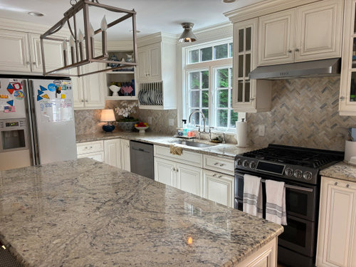
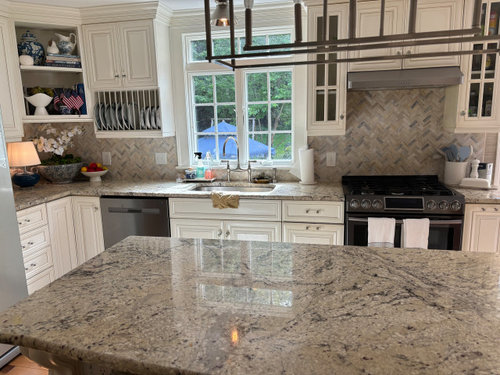
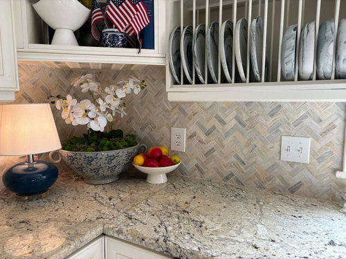
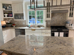
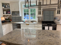
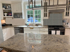
A few years ago in an attempt to update my kitchen (came with house, not my choices), I changed the backsplash with the idea that when it was in the budget I would update the counters. On my hunt for new counters i am really not loving a lot of my choices. i almost went with calacatta prado quartz, but then hesitated. i

would like something clean and timeless, no dramatic thick veining. i have found it difficult to find something that both suits the backsplash and cabinets (which will remain what they are). upon much reflection now i am considering keeping the counters, though ”dated” and opt to change, yet again, the backsplash. OR do i choose a counter that can be continued up as backsplash. i am so all over the place, perhaps from giving it too much thought and fear of making a regretful decision . any input is appreciated, i am really open to changing anything (with the exception of cabinets).


Comments (55)

  • 2 years ago
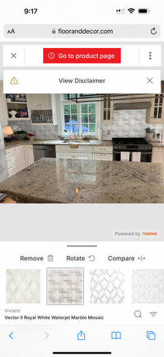
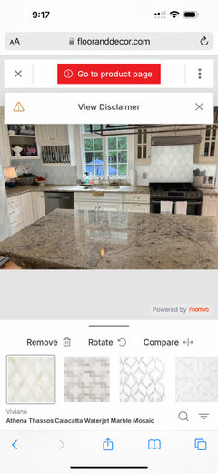
    i think what bothers me about the mix is the cool grey abd blue in the backsplash if i stuck to warmer tones it would perhaps seems less busy. playing around with a visualizer i came up with this:


  • 2 years ago


  • 2 years ago
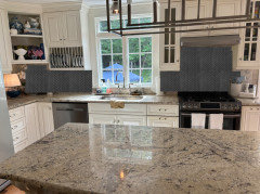
    I agree that the backsplash is the problem. Your counters are classic. Even still, the tile is not horrible. If you want to replace, pick a color from the granite and go with a very solid, non-variation tile and use a grout that blends. I'd even consider a glass tile.

  • 2 years ago
    Change the backsplash if you have to change something. Removing and installing new counters would inevitably damage the backsplash. The tops as is look fine to me.

  • 2 years ago

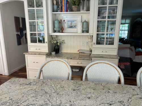
    Get rid of the beadboard behind the desk area. Your countertop and backsplash are not the problem. You don't want to change the cabinets, but you can change the cabinet door facings to something less dated.

  • 2 years ago
    I agree that a calmer backsplash would make a huge difference

    I also think you have very nice decor items in your kitchen but it looks a little cluttered. I would remove everything from the front of the fridge, the open desk cabinet, the open corner cabinet and off the counters and desk. "Shop" those items and only add back favorites and necessities.

  • 2 years ago

    “The backsplash is too busy for the counter. I would have looked for a simple subway in a color that is in the countertops.”

    Agree 100%. Correcting the splash will do wonders.

  • 2 years ago
    last modified: 2 years ago

    My first thought was this kitchen is beautiful!

    Agree that if you change anything it should be the backsplash. And the beadboard becoming a simpler line would be nice.

    I do think if you leave it as it is you will continue to have a beautiful kitchen

  • 2 years ago

    All of your visualizations are too white, too patterned!!! You need a plain, solid backsplash, in a color that matches one of the lighter colors in your countertops. A soft cream would also work, as long as it blends well with your cabinets.

  • 2 years ago

    Agree that the tiles in your renderings are too white and too busy. I get wanting to do a fun tile but it's really hard to pull off a fun/busy backsplash with busy counters. You need simple and classic.

  • 2 years ago

    Change the backsplash, not the counter.

  • 2 years ago

    Keep the countertop. Redo the backsplash. It can be much simpler and still be stunning.

  • 2 years ago

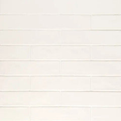
    All of your comments have been really helpful. at this point i am considering this tile in the cream color https://www.wayfair.com/home-improvement/pdp/bond-tile-southampton-2-x-8-ceramic-satin-subway-wall-tile-538-sq-ft-case-w003024376.html?piid%5B0%5D=27711570

  • 2 years ago

    That tile has too much variation in color for my taste. I think you will wind up not happy with that either. You need a tile that doesn't have variation in the coloring. The white version of that tile looks more like a cream and not much variation in it. I would use a grout that matches the tile. The texture you get from a tile like that one and the grout will look stunning on the backsplash.

  • 2 years ago

    I would hope that you are getting samples of several tiles you are considering so that you will be able to see it in your kitchen, placed vertically under your cabinets before deciding. You need to find a cream/off-white that goes with your cabinet and picks up the cream/off-white in your countertop.

  • 2 years ago

    It's possible to change the counter and backsplash to quartzite. Using slab for the backsplash with any pattern carefully matched to the counter. Taj Mahal is popular. This, imo, would be an upgrade. An induction range like a Bosch or Frigidaire industrial with knobs and a Bosch dw are more upgrades.

  • 2 years ago

    Also meant to mention that we have a wolf range on order

  • 2 years ago

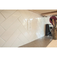
    I like your backsplash and think the chevron pattern is very current and the colors give you some options for your kitchen and other rooms as it's neutral. I'd consider matte quartz for the counters and you can go a light white/off-white or you can do a light grey or dark charcoal if you want heavy contracts (but that would be dark)...


    OR - if you want to keep it lighter then i'd keep the granite and go for a light subway tile type look...you can go with something different like a ceramic pearl white and do a longer tile like 2.5 x 10"

  • 2 years ago

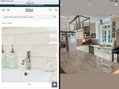
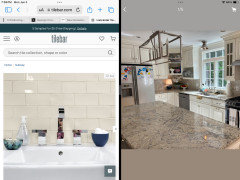
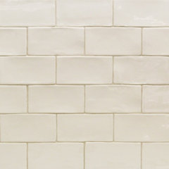
    I think white tile could look too stark. These two samples are “creamy”. Both are on TileBar.com.

  • 2 years ago

    At first glance I thought you ran the counter up the wall as a backsplash. The colors are so very similar. While I agree that the splash is too busy for your counters, I'd leave it for now.

    Your new stainless range is going to change everything. It will be a really bright focal point of the room. Get new lighting for over the island. Then repost pics. I think your counter and splash will no longer be a problem.


    I would take down the bead board and seriously declutter.

  • PRO
    2 years ago
    last modified: 2 years ago

    I'm not a big fan of speckly granite, but yours isn't terrible. It is definitely not working with the tile backsplash. Do a simple plain rectangle, either a 2 x 6 or 3 x 6, in a white color that works with the cabinets and the counter top. No variation in color, it will just continue the busy-ness that you don't like.

    Leave the beadboard, there's nothing wrong with it, and it suits your style.

  • 2 years ago

    I agree with Beverly above. I am not terribly offended by the backsplash or the granite countertops, but I do think a new Wolf range is going to be amazing. And the tile on your link is going to read just as busy as the one you currently have, so I don't see the point of that.


    I think your lighting could be updated as the new change that will be the icing on the cake. Is that light fixture over the island painted? Change that and put something different over the sink as well.

  • PRO
    2 years ago

    RedRyder's tile options would be a very nice change. The new Wolf range is definitely an upgrade, but I don't think it's going to have the same effect as simplifying the backsplash.

  • 2 years ago

    Please read Beverly's advice, above. She nailed it. Your counters are not dated. It's true they are the "white" granite that has been popular for the past 8 years or so, (I put mine in in 2016 😉 when they were just starting) and I believe they are pretty timeless and, actually, pretty. All granite has speckles but these aren't the dark 1980/90s "speckled granite".


    Your kitchen is lovely. It has a heavier feel which is the hallmark of this style. If you want a lighter feel, change to stainless appliances (as you say you are doing with the range), and maybe hang out on the serena and lily site for ideas for lighter decorative accessories.


  • 2 years ago

    I don’t see clutter. If that is clutter, I guess I’m a horder. 🤷‍♀️😂🏠

  • 2 years ago

    I agree with most of the suggestions.
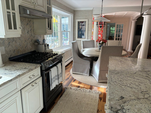
    Change the backsplash to something simple and that provides a contrast with the textured wallpaper in the dinette. Right now it’s all too similar. The eye needs a place to rest and a simple , not too white, backsplash would help. I like the countertops better than the backsplash.
    I noticed the black range right away, stainless to match your other appliances and range hood would be better.
    TBH I don’t love your light fixtures, especially the one over the island. I would change that as well.
    And if budget allows I would change the dinette chairs to wood. Again for some contrast,as the fabric chair covers, textured wall paper, backsplash, countertop and scatter rugs as feel the same in terms of colour and texture.
    I would also restyle the open shelf and countertop underneath. Personally, I’m not a fan of small table lamps on kitchen counters.
    Your kitchen and dinette area is quite lovely and inviting. Good luck with your plans.

  • 2 years ago

    Backsplash: Plain tiles in the palest background color of your countertops is the way to go. That's it!

  • 2 years ago

    I like your current materials together, including the beadboard.

  • 2 years ago

    BeverlyFLADeziner where is the backsplash from that you used as a suggestion? (braided looking bottom right). Thanks in advance!

  • 2 years ago
    last modified: 2 years ago

    there's a lot going on in this space and the current backsplash takes it over the edge.


    the colors are a dead match, but w/all of your knick knacks it's just too busy.

    I would look for a soft creamy grayish/white tile if you want to go that route.


    otherwise, I think this kitchen would be perfect for the larger beadboard splash (i see you have it on the desk area. the bottom part just needs to be finished, and a new coat of paint)


    I'd prob bring in some pendant lights too

  • 2 years ago

    To calm things down you can choose a tile that matches the color of your cabinets. Visually this will give you a space with two elements, cabinets and counter. The bs will disappear and your space will be brighter. You can get an idea of what this will look like by painting pieces of cardboard and taping them over your tiles.


  • 2 years ago

    I totally agree with BethH and Eam44. Your backsplash in beadboard or tile that matches your cabinet color is the way to go.

  • 2 years ago

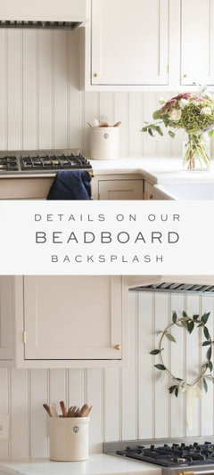
    A huge advantage of beadboard is that you can find a perfect match in the paint world faster than the tile world. I did that in my kitchen since my stone countertop has swirls of greens, grays, white, occasional pink and probably 10 more colors. Painting a beadboard backsplash was so much easier.

  • 2 years ago

    I think you originally did a great job matching your tile to the counter. I also believe you’re tired of the look and simply want a change. In order to achieve a brighter and a more simple look pick a plain backsplash that is the same colour as your cabinets. The “found” tile you showed is also a close match to your counter but I don’t believe it would give you the change you desire. Perhaps that tile comes in cream?

  • 2 years ago
    last modified: 2 years ago

    If you decide to change the backsplash, definitely match the cabinet color to the tiles as close as possible. If you can't find an exact match, look for handmade-style tiles. They often have very slight variations in color and texture that will help make the color difference between the tile and the cabinets less stark.

    If you are sick of the counter, the other thing you might consider is replacing the island with a wooden top. I would pick one of the dark tones from the floor. To see if it is a change that you might like, cover the island top with brown wrapping paper.

  • 2 years ago

    RedRyder really like the way your beadboard looks. This may be the decision i lean towards for the moment as i think i could put it up in front of my current tile without demoing until i fully decide which direction i want to take it. There is one tile i am going to take a look at today, which may be a good match:


    https://www.homedepot.com/p/Daltile-LuxeCraft-Arteko-Antique-White-3-in-x-12-in-Glazed-Ceramic-Wall-Tile-12-sq-ft-Case-AK01312HD1P2/313499026

  • 2 years ago

    Love that tile in the link @Dani Naughton. And can't wait to see a sample in your kitchen. Just for the record, I am in process of tearing out the beadboard on the back of my island and kitchen hood it is perfect if you want a GRiME catcher, KRuD hiding backsplash, please go with the tile. I find it very dated in my kitchen and can't wait for a fresh clean surface, especially near the range. I fear it will go the way of shiplap. Away.

  • 2 years ago

    Agree with the others. A simple tile in a light color of the counter. Get samples!

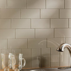
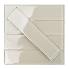
    Aspect 3" x 6" Glass Peel & Stick Subway Tile Kit in Putty & Reviews | Wayfair · More Info


    Lancaster Vanilla 3x6 Polished Ceramic Tile , Set of 8 · More Info


    Subway Tiles | TileBar · More Info


  • 2 years ago

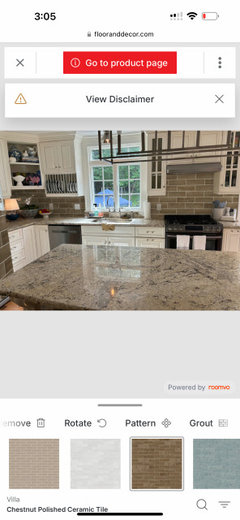
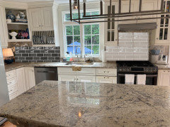
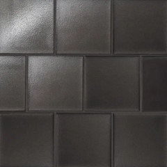
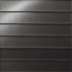
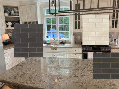
    Was playing around and accidentally chose a dark subway tile, but then decided i didnt hate it. what are your thoughts?


  • 2 years ago

    the taupe is meh. go with a lighter charcoal color if you want darker.

  • 2 years ago

    I agree with Beth H. The taupe looks to have variation in it also. I would stay away from tile that has variation. Stick with solid coloring.

  • 2 years ago
    last modified: 2 years ago

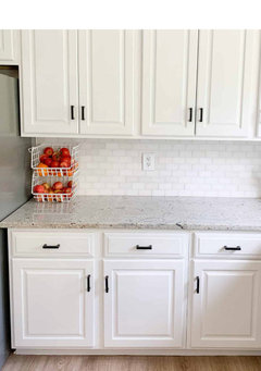
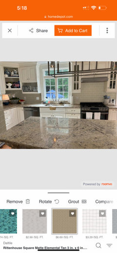
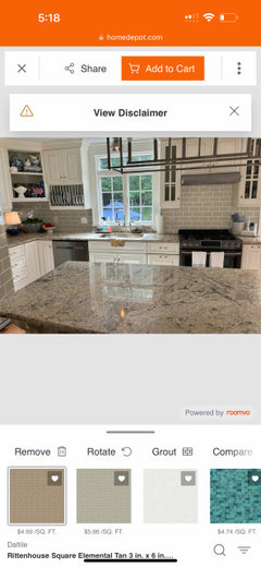
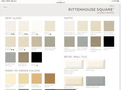
    I don’t love it, but you've got the right idea. You are taking three surfaces (cabinets, counter, and backsplash) and visually reducing them to two. I recommend you match the tile to the cabinet color, you’ve tried to match the tile to the counter color (which is pretty much what you tried to do when you installed the tile you have). In theory either should work. In practice it is easier to find the right white/cream than it is to match the stone. Besides, that Rittenhouse Square Elemental Tan tile is dark, the chestnut tile is even darker, and while they are improvements over the current tile, they’re sucking light out of the space. Consider the Daltile in Arctic White in semi gloss and matte (you can mix them). If the color isn’t right, move on to other white or cream options. You’ll find one that works.

    The question is, when you do find the right white will you love it? Tile choice, what is beautiful and what is not, is very personal. You’re getting solid feedback, I’m glad you’re sticking with tile, but in the end you are the one who will live with it, you are the only one who has to love it. If for you beauty is Elemental Tan, it’s Elemental Tan. Be sure to buy samples and see them in your space, in your light before you order though. Those visualizers can be misleading.


  • 2 years ago
    last modified: 2 years ago

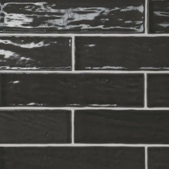
    bedrosians Celine in a 2x6" on left, or the 2.5x12" on the right, in a matte black


    Marin in a 2x5 and 2x10 in glossy black or Coastal Cliff


    black sea also comes in the longer size.


    Sahara in a 3x12 in a taupe and 'dark' color


    https://www.bedrosians.com/en/product/list/backsplashes/?page=3

    Clara tile in Ivory 2.75X11"


    Kaikos 4x4 glass tile in brown


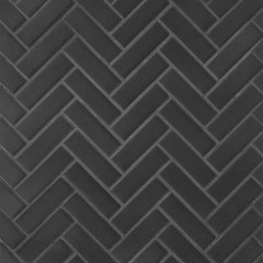
    LeCafe matte black small herringbone


    https://www.bedrosians.com/en/product/detail/backsplashes/le-cafe-mosaic/


    lastly, Zenia tile shown in Gravity, Solar and Umbra.


    https://www.bedrosians.com/en/product/list/?criteria=zenia

  • 2 years ago

    beth, thank you for your input. i dont love charcoal, but i do like the lighter suggestions you posted. Thanks!

  • 2 years ago

    You have so many straight lines everywhere. From the panelled cabinet doors, to plate holders, to mullion bars on windows and glass doors, to the box frame light fixture. I would not do any tiles with contrasting grout. Light tile with matching grout to minimize even more lines. Your eye needs a place to rest. Light tiles look much better than the dark tiles.

  • 2 years ago

    Emser Catch Glossy also in Matt. Available in six different sizes.

    Emser Catch Glossy Ivory

  • 2 years ago

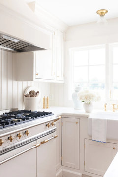
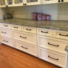
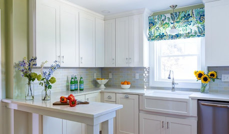
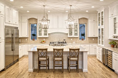
    When I first saw the new tile you posted, it made me think of this houzz kitchen that I love so much for the calm, elegant statement it presents. I do understand your granite is a bit more bossy than this picture, but this illustrates how the contrast on the backsplash works, IMO. I love this design so much. I like your second example best that doesn't have such a contrasting grout color.

    Taj Mahal Quartzite Kitchen Countertop · More Info


  • 2 years ago

    @Design2 girl i agree! i am also leaning towards the tile you mentioned. i think it makes the cabinets appear more ”crisp” and everything in general more cohesive without ”being more of the same”. im not trying to change my kitchen to something more trendy, i prefer timeless. thanks for the inspiration, it is beautiful.