

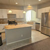
Kitchen island pendant help!
last year
last modified: last year
Sort by:Oldest
Comments (8)
Related Stories
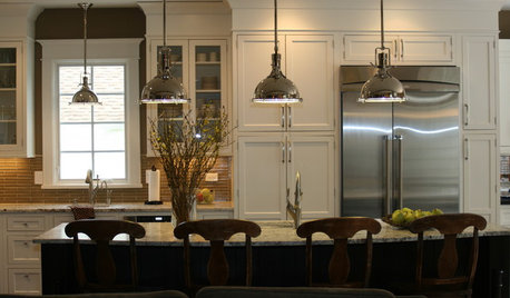
KITCHEN DESIGNKitchen Islands: Pendant Lights Done Right
How many, how big, and how high? Tips for choosing kitchen pendant lights
Full Story
LIGHTINGSource List: 20 Pendants That Illuminate the Kitchen Island
See the ceiling lighting fixtures that are popular on Houzz and find out where to get them
Full Story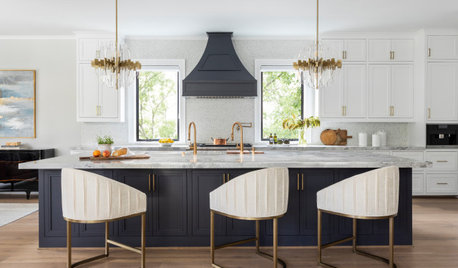
PENDANT LIGHTINGChoose the Right Pendant Lights for Your Kitchen Island
Get your island lighting scheme on track with tips on function, style, height and more
Full Story
KITCHEN DESIGNPick the Right Pendant for Your Kitchen Island
Don't settle for bland builder-grade pendant lights when you can have your pick of colors and kinds to match your kitchen's style
Full Story
KITCHEN DESIGNKey Measurements for Your Kitchen Design
Get the ideal kitchen setup by understanding spatial relationships, dimensions and work zones
Full Story
SHOP HOUZZShop Houzz: Your Favorite Horizontal Pendants and Kitchen Islands
Transform your kitchen by suspending a horizontal pendant or chandelier over the perfect kitchen island
Full Story0
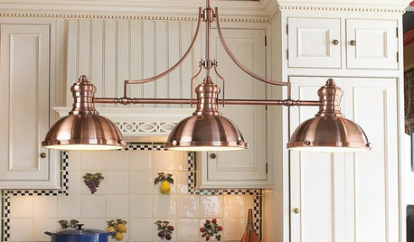
PRODUCT PICKSGuest Picks: Dashing Lighting for Over the Kitchen Island
These single-connection pendants and chandeliers will cover your island lighting needs no matter what your kitchen’s style
Full Story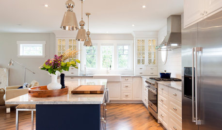
LIGHTINGHow to Get Your Kitchen Island Lighting Right
Here are some bright ideas on when to use chandeliers, pendants, track lights and more
Full Story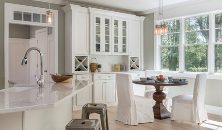
SHOP HOUZZShop Houzz: Kitchen Island Lighting and Pendants
Illuminate your kitchen workspace with beautiful pendant lighting
Full Story0

MOST POPULAR7 Ways to Design Your Kitchen to Help You Lose Weight
In his new book, Slim by Design, eating-behavior expert Brian Wansink shows us how to get our kitchens working better
Full Story
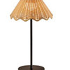
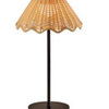
BeverlyFLADeziner
JAN MOYER
Related Professionals
Bartlesville Interior Designers & Decorators · Lima Furniture & Accessories · Saint Cloud Architects & Building Designers · Macon Kitchen & Bathroom Designers · Augusta Kitchen & Bathroom Designers · Jackson Kitchen & Bathroom Designers · Topeka Kitchen & Bathroom Designers · Florence Kitchen & Bathroom Designers · Bloomington Kitchen & Bathroom Designers · Jackson Kitchen Remodelers · Springfield Kitchen Remodelers · Bloomington Custom Countertops · Burlington Custom Countertops · Superior Custom Countertops · Bismarck Custom CountertopsJackyOriginal Author
JAN MOYER
JackyOriginal Author
BeverlyFLADeziner
JackyOriginal Author
JAN MOYER