
Search results for "Amplifying" in Home Design Ideas
 Ancient Surfaces
Product: Authentic Limestone for Exterior Living Spaces.
Ancient Surfaces
Contacts: (212) 461-0245
Email: Sales@ancientsurfaces.com
Website: www.AncientSurfaces.com
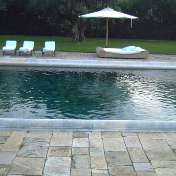
The design of external living spaces is known as the 'Al Fresco' design style as it is called in Italian. 'Al Fresco' translates into 'the open' or 'the cool/fresh exterior'. Customizing a fully functional outdoor kitchen, pizza oven, BBQ, fireplace or Jacuzzi pool spa all out of old reclaimed Mediterranean stone pieces is no easy task and shouldn’t be created out of the lowest common denominator of building materials such as concrete, Indian slates or Turkish travertine.
The one thing you can bet the farmhouse on is that when the entire process unravels and when your outdoor living space materializes from the architects rendering to real life, you will be guaranteed a true Mediterranean living experience if your choice of construction material was as authentic and possible to the Southern Mediterranean regions.
We believe that the coziness of your surroundings brought about by the creative usage of our antique stone elements will only amplify that authenticity.
whether you are enjoying a relaxing time soaking the sun inside one of our Jacuzzi spa stone fountains or sharing unforgettable memories with family and friends while baking your own pizzas in one of our outdoor BBQ pizza ovens, our stone designs will always evoke in most a feeling of euphoria and exultation that one only gets while being on vacation is some exotic European island surrounded with the pristine beauty of indigenous nature and ancient architecture...
 Unpatterned
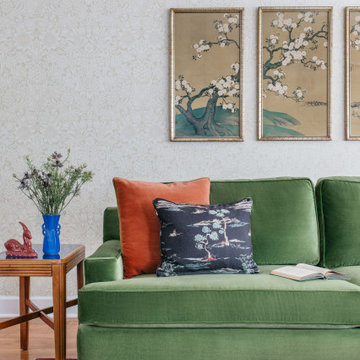
These clients had a hodgepodge of furniture mixed with a few great features and pieces - such as the William Morris wallpaper and vintage Chinese rug. We sourced a mix of vintage, new, and custom pieces to amplify the best parts of the existing features and create a space that felt less “formal” and more warm and inviting. We gutted the powder bath and created a fun statement with bright crocodile tile and subtle details. The kitchen needed a little facelift to stand up to the rest of the first floor, so we updated the tile, range, counters, hardware, plumbing fixtures, and lighting to bring the space to life.
FUN FACT: The fireplace was a dated yellow brick with a massive TV mounted above that was never used. We replaced the TV with some colorful art and framed out and Venetian Plastered the fireplace to compliment the elegance of the room.
Photography: Margaret Rajic
 Interiors by Maite Granda
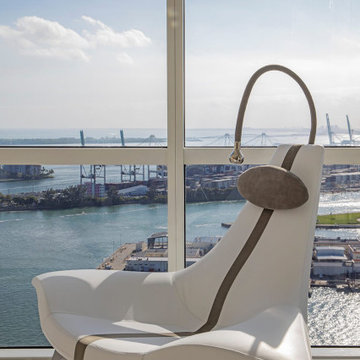
This project uses a neutral color palette to enhance the sea view, allowing the natural beauty outside to participate in the apartment's design. The soft whites, beiges, and creams throughout create a calming, cohesive backdrop that amplifies the light and airy ambiance of each space. To add vibrancy and personality, carefully selected artwork and decor pieces introduce pops of color, serving as focal points without disrupting the serene atmosphere. Thoughtfully incorporated biophilic design elements—such as fresh greenery and organic shapes—bring a natural feel indoors, fostering a connection with nature. The outcome is a sophisticated space that feels both luxurious and inviting.
Find the right local pro for your project
 Everything Home
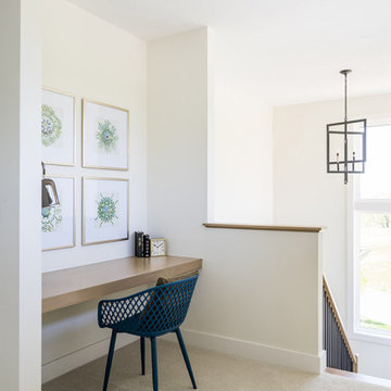
Our studio designed this luxury home by incorporating the house's sprawling golf course views. This resort-like home features three stunning bedrooms, a luxurious master bath with a freestanding tub, a spacious kitchen, a stylish formal living room, a cozy family living room, and an elegant home bar.
We chose a neutral palette throughout the home to amplify the bright, airy appeal of the home. The bedrooms are all about elegance and comfort, with soft furnishings and beautiful accessories. We added a grey accent wall with geometric details in the bar area to create a sleek, stylish look. The attractive backsplash creates an interesting focal point in the kitchen area and beautifully complements the gorgeous countertops. Stunning lighting, striking artwork, and classy decor make this lovely home look sophisticated, cozy, and luxurious.
---
Project completed by Wendy Langston's Everything Home interior design firm, which serves Carmel, Zionsville, Fishers, Westfield, Noblesville, and Indianapolis.
For more about Everything Home, see here: https://everythinghomedesigns.com/
To learn more about this project, see here:
https://everythinghomedesigns.com/portfolio/modern-resort-living/
 Aranelli Design
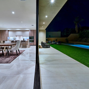
Immerse yourself in the functional simplicity of this modern galley kitchen. Flaunting a harmonious blend of natural wood and high-gloss slab doors, this space offers a seamless fusion of warmth, modernity, and streamlined design. The narrow, efficient layout amplifies the room's contemporary appeal, creating an inviting environment where functionality meets sophistication. The wood slab doors radiate a cozy, organic charm, their grain patterns adding visual interest. In contrast, the gloss slab doors reflect light beautifully, enhancing the sense of space. Together, they orchestrate a captivating interplay of textures, underlining the kitchen's minimalist yet welcoming aesthetic.
 Flooret
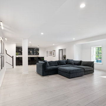
Influenced by classic Nordic design. Surprisingly flexible with furnishings. Amplify by continuing the clean modern aesthetic, or punctuate with statement pieces.
The Modin Rigid luxury vinyl plank flooring collection is the new standard in resilient flooring. Modin Rigid offers true embossed-in-register texture, creating a surface that is convincing to the eye and to the touch; a low sheen level to ensure a natural look that wears well over time; four-sided enhanced bevels to more accurately emulate the look of real wood floors; wider and longer waterproof planks; an industry-leading wear layer; and a pre-attached underlayment.
 Century Stair Company
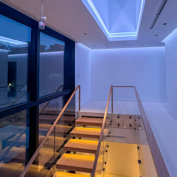
This contemporary home features two striking staircases with integrated LED lighting, glass railing, and thick wood treads. The color-changing LEDs shift from red to blue to yellow, transforming the staircases into dynamic focal points throughout the day. Wood treads and handrails are paired with frameless glass balustrades secured by black pins. Open risers amplify the LED lighting effect while maximizing transparency.
The first-level staircase uses cantilevered and field-supported construction, while the second rises on dual metal stringers. Glass railing continues on the second-floor balcony, creating a cohesive system where light and glass elevate the design beyond the purely functional.
1976-2026 © Century Stair Company
 Coastal Cabinet Works
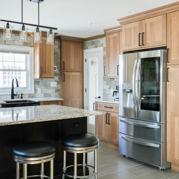
While we always love a great 'Before & After', seeing how our 3-D renderings compare to the final product is also up there on our list! We were thrilled how the homeowner's choice of hickory wood, rich in texture, was amplified with a biscotti finish and complimentary onyx stain.
Cabinet Line: Yorktowne Cabinetry
Door Style: Millgate
Wood Species: Hickory
Finish: Biscotti
Island & Hood Wood Species: Cherry
Island & Hood Finish: Onyx
 Chamberland Professional Painting
Whole-Home Interior Repaint — West Hartford & Farmington Valley
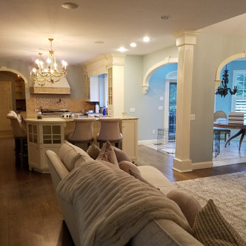
Warm, light-filled rooms deserve paint that flatters them in every season. For this full interior refresh, our crew prepped and repainted the kitchen, dining room, bedrooms, hallways, foyer, stair balusters/railings, ceilings, and detailed millwork/wainscoting. The result is a calm, timeless palette with crisp trim lines and a durable, scrub-friendly finish—perfect for busy New England homes.
Scope & Highlights
Careful protection of floors, stone, and furnishings; dust-controlled sanding and surface repairs
Precision cut-in on complex crown, panel moldings, and curved walls
Smooth, furniture-grade trim and door finishes; uniform ceilings with flawless sheen
Kitchen and adjacent living areas repainted for a cohesive, open-plan look
Color story features soft neutrals and clean whites that amplify natural light
Products We Love for Results Like This
Benjamin Moore Aura & Regal Select for superior coverage, color richness, and washability
Sheens selected by room use (matte/flat for ceilings & formal spaces; eggshell/satin for high-traffic areas)
Optional upgrade: Advance for cabinet/trim enamel hardness
Perfect For
Whole-home repaints before move-in
Refreshing dated color schemes without a full remodel
Pairing new rugs, lighting, or wallpaper with a clean, modern paint envelope
Adding a statement ceiling or upgraded millwork finish
Service Area (CT)
West Hartford, Avon, Farmington, Simsbury, Canton, Bloomfield, Glastonbury, South Windsor, Granby, and the greater Farmington Valley.
Thinking about kitchen cabinets?
We also refinish and paint cabinets with durable, enamel-hard finishes that resist fingerprints and daily wear—ask us to include a cabinet option with your estimate.
Ready to transform your interiors?
Message us here on Houzz or call (860) 243-9910 to schedule a fast, on-site consultation.
 Interiors by Maite Granda
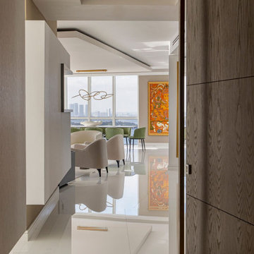
This project uses a neutral color palette to enhance the sea view, allowing the natural beauty outside to participate in the apartment's design. The soft whites, beiges, and creams throughout create a calming, cohesive backdrop that amplifies the light and airy ambiance of each space. To add vibrancy and personality, carefully selected artwork and decor pieces introduce pops of color, serving as focal points without disrupting the serene atmosphere. Thoughtfully incorporated biophilic design elements—such as fresh greenery and organic shapes—bring a natural feel indoors, fostering a connection with nature. The outcome is a sophisticated space that feels both luxurious and inviting.
 Drake's 7 Dees Landscaping & Garden Center
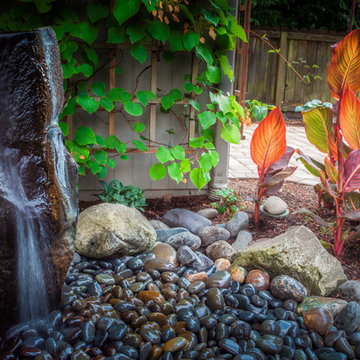
A small recirculating water feature is amplified by a galvanized metail echo chamber (it's under the river rock). A row of simple cedar trellis provide a face for vegetation to cling. Photography by: Joe Hollowell
 Studio Couture
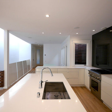
The full-length skylight above the stair floods the kitchen & dining areas with light. The powder coated, solid steel rail amplifies the clean aesthetic of the space. A rich wood panel outside (to screen out the neighbors), custom wood baby gate and gloss-black backsplash tiles all add a rich counter point to the white walls and cabinets and help anchor the space.
Photos: Couture Architecture
Construction: Building Alchemy
 Eisenbrandt Companies
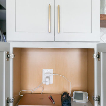
Timeless and transitional, this mudroom-kitchen addition was designed for maximum functionality and beauty. Every inch of this new space brings a luxurious feel with the promise of durability for everyday life. A brand new kitchen with full overlay cabinets and an accent blue island amplifies storage and drop zone areas. Herringbone backsplash with gold hardware and deep sapele wood floating shelves decorate the space with simple, yet endearing designs. Placed in view of the kitchen, the bar has a mirror backsplash with blue cabinets to tie into the kitchen island. With two efficient and separate spaces, the laundry room creates a perfect work zone with black fixtures and the mudroom keeps everything tucked away in style. A brand new powder room with fun blue-patterned tile to bring an element of play into the first floor.
 RAJ Kitchen and Bath, LLC
**Check out the video of this transformation on our website**
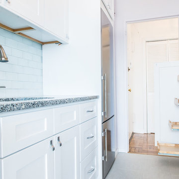
This small kitchen was way too small for this 2 bedrooms, 2 bathrooms apartment. Not only was it a very small kitchen, but the physical location of it made it very difficult to make it any bigger. There wasn't much that could have been done without incurring astronomical cost, which would get little or no return on the investment. The client wanted a kitchen that can be optimized in its current location to add a ton of value for resale.
This was difficult to do, because there was no moving of any mechanical around in the kitchen and even if we wanted to, the management of the building would not allow. For those of you who live in condos, co-ops or apartment building, you know how difficult it is to rework these foot prints. When we showed up, we saw the problems, but we also saw a huge opportunity where we can achieve those goals in the small space. This was accomplished by making some key changes and to incorporate some new things that was not possible when this kitchen was built years ago.
The crucial part of the design that would drive the entire new layout, was selecting the only appliance; that was the Refrigerator. Once we nailed down that refrigerator, we then proceeded to design the kitchen around it. We moved it to the other side of the wall where the sink was so that we can tap into the water line from the sink plumbing. It was crucial that it stays exactly 24" deep, not an inch more because we had to keep the entry as open as possible. Also, it was going to be directly in front of another big storage unit - The pantry. It is not ideal in most cases, but we needed the rest of the space to ramp up the design and open feel towards the side where all of the activities would take place, which happend to be the dining room and the view.
Once all that was figured out, we re-positioned the sink, dishwasher and the range and proceeded to wrap the cabinets around the columns to integrate them into the space. Thirty- six inches cabinets height was used so that they can be installed higher towards the ceiling height to give more room rather than the standard 18" required height between the counter tops. This was done to make the room feel a lot bigger than it really was. Not to mention, we also didn't want the faucet to be buried under the cabinets so that was also a necessary design detail for the space.
We then lowered both knee walls so that the counter top can sit on top of them, by removing that stop point that would have otherwise defined the kitchen area. This allowed us to pick up that extra footprint into the room for added prep space and enabled us to create the illusion of a kitchen that is looking longer than it really is. Every inch mattered when designing this kitchen and we made a conscious decision to use every one of that inch.
White cabinets were selected to do just what white cabinets are design to do; make a small or dark room appear bigger, brighter and more open. In this kitchen, this was amplified the more because of the kitchen location. It was perfect! We knew we did justice to the space because while we were there taking some photos, a few potential buyers walked in and went straight for the kitchen! They said its design just to fit the apartment.
Pantry roll out shelving, Double recycle bin, fancy handles, LED lighting, Quartz counter top, beautiful backslash tiles and grey linen floors finished off the kitchen which looked over a beautiful view of the George Washington Bridge from the top of this lovely 4th floor apartment.
Credit to Masterpiece Tile and Marble (Annmarie on the selection of Tiles and countertop and Val on the Construction to complete this project).
Davor Kokic Photography
 Super Bright LEDs
Thanks Jon for submitting this photo fo a beautiful space along with a review of this great project:
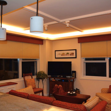
We couldn't be more pleased with the LED strips we ordered. Our NYC co-op would not allow us to add any lighting connections into our cement ceiling, but I wanted to be able to walk into each room, flip the switch on and have the room well lit. We installed coves in all the rooms and love the way it turned out. I thought I needed the 4NFLS to ensure enough brightness but we had to install the 2NFLS strips as they had the UL rating. Turns out they were more than sufficient as we dim the lights late at night. The coves were made with steel studs mounted horizontally.
We couldn't be more pleased with the LED strips we ordered. Our NYC co-op would not allow us to add any lighting connections into our cement ceiling, but I wanted to be able to walk into each room, flip the switch on and have the room well lit. We installed coves in all the rooms and love the way it turned out. I thought I needed the 4NFLS to ensure enough brightness but we had to install the 2NFLS strips as they had the UL rating. Turns out they were more than sufficient as we dim the lights late at night. The coves were made with steel studs mounted horizontally.

 The Jae Company
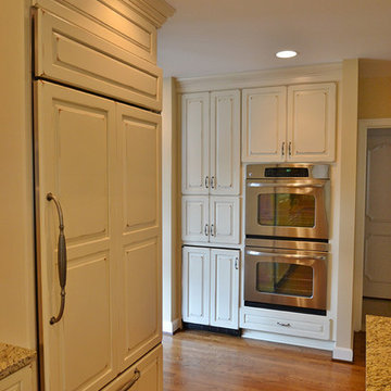
This Upper Arlington, Ohio, kitchen, bath and laundry room remodel allows natural light to do its job. The spaces use light colors amplifying the space and giving the rooms a larger feel. The kitchen and powder room white cabinetry is Kraftmaid's Marquette style in Cherry Vintage Bisque, while the kitchen island and master bathroom vanity feature Kraftmaid's Marquette style in Cognac.
 RAJ Kitchen and Bath, LLC
**Check out the video of this transformation on our website**
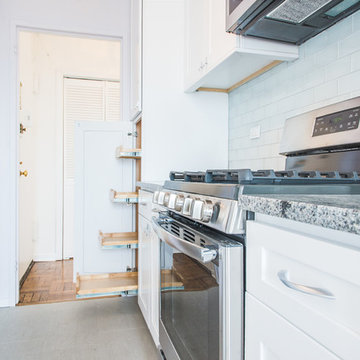
This small kitchen was way too small for this 2 bedrooms, 2 bathrooms apartment. Not only was it a very small kitchen, but the physical location of it made it very difficult to make it any bigger. There wasn't much that could have been done without incurring astronomical cost, which would get little or no return on the investment. The client wanted a kitchen that can be optimized in its current location to add a ton of value for resale.
This was difficult to do, because there was no moving of any mechanical around in the kitchen and even if we wanted to, the management of the building would not allow. For those of you who live in condos, co-ops or apartment building, you know how difficult it is to rework these foot prints. When we showed up, we saw the problems, but we also saw a huge opportunity where we can achieve those goals in the small space. This was accomplished by making some key changes and to incorporate some new things that was not possible when this kitchen was built years ago.
The crucial part of the design that would drive the entire new layout, was selecting the only appliance; that was the Refrigerator. Once we nailed down that refrigerator, we then proceeded to design the kitchen around it. We moved it to the other side of the wall where the sink was so that we can tap into the water line from the sink plumbing. It was crucial that it stays exactly 24" deep, not an inch more because we had to keep the entry as open as possible. Also, it was going to be directly in front of another big storage unit - The pantry. It is not ideal in most cases, but we needed the rest of the space to ramp up the design and open feel towards the side where all of the activities would take place, which happend to be the dining room and the view.
Once all that was figured out, we re-positioned the sink, dishwasher and the range and proceeded to wrap the cabinets around the columns to integrate them into the space. Thirty- six inches cabinets height was used so that they can be installed higher towards the ceiling height to give more room rather than the standard 18" required height between the counter tops. This was done to make the room feel a lot bigger than it really was. Not to mention, we also didn't want the faucet to be buried under the cabinets so that was also a necessary design detail for the space.
We then lowered both knee walls so that the counter top can sit on top of them, by removing that stop point that would have otherwise defined the kitchen area. This allowed us to pick up that extra footprint into the room for added prep space and enabled us to create the illusion of a kitchen that is looking longer than it really is. Every inch mattered when designing this kitchen and we made a conscious decision to use every one of that inch.
White cabinets were selected to do just what white cabinets are design to do; make a small or dark room appear bigger, brighter and more open. In this kitchen, this was amplified the more because of the kitchen location. It was perfect! We knew we did justice to the space because while we were there taking some photos, a few potential buyers walked in and went straight for the kitchen! They said its design just to fit the apartment.
Pantry roll out shelving, Double recycle bin, fancy handles, LED lighting, Quartz counter top, beautiful backslash tiles and grey linen floors finished off the kitchen which looked over a beautiful view of the George Washington Bridge from the top of this lovely 4th floor apartment.
Credit to Masterpiece Tile and Marble (Annmarie on the selection of Tiles and countertop and Val on the Construction to complete this project).
Davor Kokic Photography
 Flooret
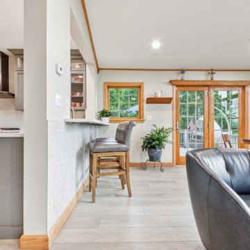
Influenced by classic Nordic design. Surprisingly flexible with furnishings. Amplify by continuing the clean modern aesthetic, or punctuate with statement pieces. With the Modin Collection, we have raised the bar on luxury vinyl plank. The result is a new standard in resilient flooring. Modin offers true embossed in register texture, a low sheen level, a rigid SPC core, an industry-leading wear layer, and so much more.
 Flooret
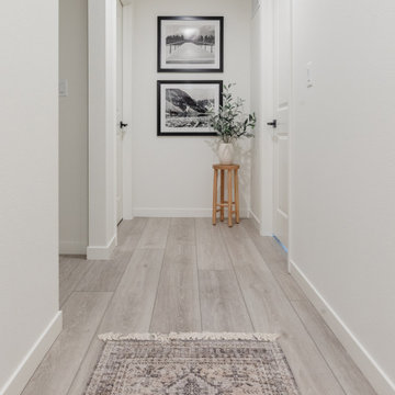
Influenced by classic Nordic design. Surprisingly flexible with furnishings. Amplify by continuing the clean modern aesthetic, or punctuate with statement pieces. With the Modin Collection, we have raised the bar on luxury vinyl plank. The result is a new standard in resilient flooring. Modin offers true embossed in register texture, a low sheen level, a rigid SPC core, an industry-leading wear layer, and so much more.
48