
Search results for "Amplifying" in Home Design Ideas
 The Jae Company
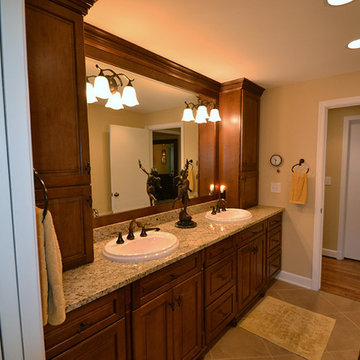
This Upper Arlington, Ohio, kitchen, bath and laundry room remodel allows natural light to do its job. The spaces use light colors amplifying the space and giving the rooms a larger feel. The kitchen and powder room white cabinetry is Kraftmaid's Marquette style in Cherry Vintage Bisque, while the kitchen island and master bathroom vanity feature Kraftmaid's Marquette style in Cognac.
 Nicole Arnold Interiors
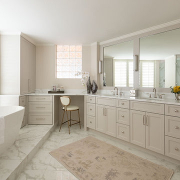
This high-rise condominium at The Mayfair longed for the renewal conceptualized in its 3 bathrooms. Each was a complete renovation, adding relevant aesthetic updates and much-needed functionality and storage. We capitalized on the immense amount of natural light in the primary bath and we amplified it throughout the space by opening up walls to the shower, lining the vanity with full-sized, built-in vanity mirrors, and distributing electrified lighting throughout. Custom cabinetry was designed to capture every inch of usable perimeter space and incorporate the elevated tub platform. The guest bath emulates a classic, luxury hotel feel infused with color, a great tile pattern on the focal shower wall, a furniture-style vanity, and a fun floor design. The powder bath is dark and moody with textural wallpaper and an espresso-colored porcelain floor tile emulating marble. All of the appointments throughout exude the luxury look and feel the client desired, are maintenance friendly and will stand the test of time.
 Urban Design + Build
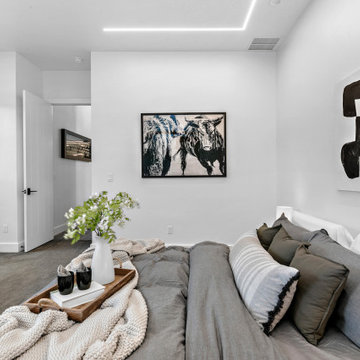
The master bedroom exudes contemporary elegance, with minimalist furnishings, a cohesive color palette, and modern finishes. Strategically placed art and soft textiles like the chunky throw blanket add texture and interest, while the clean lines of the furniture reinforce the sleek, modern vibe. The abundant natural light streaming through large windows, along with the smart placement of mirrors, amplifies the sense of openness, making the room not just a place to sleep but a serene retreat.
Find the right local pro for your project
 Charles Rose Architects Inc.
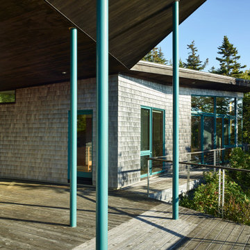
The approach to Edge House, a walk through verdant woodland abundant with ferns and moss, is a lesson in arrival. What appears is a woodsy yet contemporary dwelling divided into two volumes, framing an ocean view. Located on an island off Midcoast, Maine, Edge House is a low-slung cabin that hugs the rocky coast. The client commissioned Charles Rose Architects to design a simple cottage retreat that could take full advantage of the view, while also remaining inconspicuously nestled in the trees. The solution was a simple wood-shingled structure that features large glass windows, connecting both structure and inhabitant to the site. From the water’s edge, only a few hundred meters away, the house is barely visible. The selection of contextual materials, specifically cedar shingles, was meant to embed the structure in the landscape. For the interior, bedrooms are purposefully small, and beds were positioned close to the full-height windows, allowing occupants to immerse themselves in the view. Clerestory windows under the roof further amplify the quality of natural light and create a weightless effect on the roof from the outside. The stone fireplace, located in the living room, was crafted with stones gathered from the site as another way to bring the outdoors in.
 Flooret
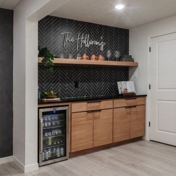
Influenced by classic Nordic design. Surprisingly flexible with furnishings. Amplify by continuing the clean modern aesthetic, or punctuate with statement pieces. With the Modin Collection, we have raised the bar on luxury vinyl plank. The result is a new standard in resilient flooring. Modin offers true embossed in register texture, a low sheen level, a rigid SPC core, an industry-leading wear layer, and so much more.
 Century Stair Company
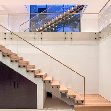
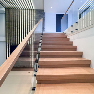
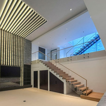
This contemporary home features two striking staircases with integrated LED lighting, glass railing, and thick wood treads. The color-changing LEDs shift from red to blue to yellow, transforming the staircases into dynamic focal points throughout the day. Wood treads and handrails are paired with frameless glass balustrades secured by black pins. Open risers amplify the LED lighting effect while maximizing transparency.
The first-level staircase uses cantilevered and field-supported construction, while the second rises on dual metal stringers. Glass railing continues on the second-floor balcony, creating a cohesive system where light and glass elevate the design beyond the purely functional.
1976-2026 © Century Stair Company
 C.E. Pontz Sons
Dream backyard
This Amazing Dream Backyard Project features just about all the options you have ever dreamed about having in your very own backyard. We just recently completed this project and as you can tell from the video and photos below it’s quite the dream backyard. But dreams can came true, and for these homeowners they certainly have. So proud of our team for coming together and installing another amazing backyard paradise. The outdoor living area features everything from fire to water and includes multiple travertine patio areas, flagstone and travertine walkways, stone steps, pondless waterfall, landscape lighting, outdoor audio, fire pit, and landscaping. To think were the project came from a decrepit old deck to this beautiful work of art is almost unreal!
Travertine Patio and Fire Pit
The dream backyard project included the installation of various hardscape items including travertine patio, Seating walls, Steps, and walkways. The patio material is silver travertine laid in French pattern. The patio area is approximately 1,012 sq ft with antiqued finish and natural edge. All walls and steps are constructed using natural stone Semco ‘Cedar Ridge’ sawn wall stone. Caps and stair treads are constructed of natural stone ‘Chateau Limestone’ 2″ thick and 14″ deep, thermal top and rock faced edges. Cap stone for grill wall is 18″ wide polished and sealed top. Under grill area the patio is outdoor ‘wood look’ porcelain tile. A Semco ‘Cedar Ridge’ 57″ Fire Pit with Large Zentro ‘Smokeless’ insert is installed on the lower patio area. As of these pictures and this video the fire pit insert has yet to be installed. Sealing of Travertine surfaces using GST stain blocking sealer will be completed once the project is entirely finished. Stepping stone pathway to the side of the home is full color Pa Flagstone irregular steppers.
Landscaping
Landscape beds, plants, trees, edging and mulching was done around the entire back and side yards of the home using triple cut bark mulch. Plant variety and size specifications were all chosen by our amazing designer Wes. The landscaping portion of this project also included the grading, lawn repair, and seeding of all the areas damaged and disturbed during construction.
Pondless Waterfall
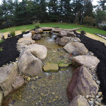
A 15′ pondless waterfall was installed into the new landscape to the side of the lower patio for maximum viewing. The waterfall features approximately 15 foot of stream with multiple waterfalls. Two side by side spillways merge into a wide stream with a small waterfall before turning and going into the final falls at the basin area. The Waterfall is outfitted with low voltage LED underwater landscape lighting throughout.
Outdoor Sound
The Outdoor Sound System installed was a TRU Audio 4 speaker system and 12″ outdoor hardscape subwoofer. This system also includes the amplifier which is located in the home owners basement as well as Apple Airport Express and Blue Tooth Connection.
Siding
Siding work to be completed is still unfinished as of the time this video and pictures were shot. Siding was removed and salvaged in areas need for the patio and electrical work. Siding in areas of new outdoor living space to include: new vinyl siding on entire rear kitchen/bathroom wall from top to bottom as well as Piecing in around lights and sliding door on adjacent wall and in back of garage.
 Kitchen & Bath Center
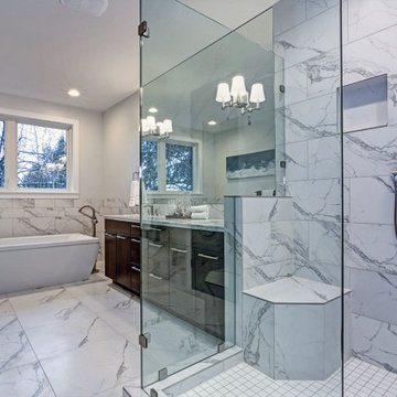
Experience the ultimate in modern luxury with our master bathroom renovation in Sudbury, offered exclusively by Kitchen and Bath Center. Imagine a space where elegance meets functionality: a sleek bathtub awaits, offering a sanctuary for relaxation beside a cozy, crackling fireplace, setting the perfect atmosphere for unwinding. Our designs feature stylish interior elements, including tastefully selected wall tiles that complement a sophisticated neutral palette of grey and black, accented by vibrant colors for depth and interest. Enhance your comfort with the added luxury of a wall-mounted television and the convenience of kitchen appliances, making this more than just a bathroom—it’s your private retreat. Mirrors and strategic lighting amplify the sense of space, while personal touches like picture frames make the room uniquely yours. Let Kitchen and Bath Center transform your Sudbury home with a master bathroom that blends modern sophistication with the warmth of home. Check out Kitchen and Bath Center when searching for bathroom remodel in Sudbury.
 Today's StarMark Custom Cabinetry & Furniture
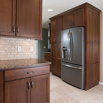
This southwest Sioux Falls kitchen is now warm and inviting, with amplified storage. Brooke, a designer with Today's StarMark Custom Cabinetry, specified StarMark's Roseville door style in Cherry finished in Cappuccino. The lighting, Cambria countertops, backsplash and hardware are perfect accompaniments!
 Seawavetable
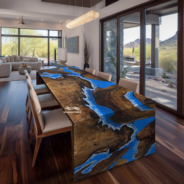
Unlike standard tables, this piece features a continuous, wrap-around waterfall construction — the black walnut and blue resin flow seamlessly over the tabletop and down the sides, creating a stunning, unbroken visual effect from every angle. No seams, no awkward joins, just a sleek, immersive design that makes it look like the “river” is endlessly cascading.
Crafted from premium black walnut with dramatic grain patterns, paired with a vibrant, high-gloss blue resin river hand-finished with realistic white wave details. The full mirror-like glossy finish amplifies the wood’s warmth and the resin’s depth, while offering durable, easy-care protection for everyday use.
Every inch is one-of-a-kind, blending natural wood beauty with bold resin art to create a centerpiece that transforms any room.
#WaterfallTable #BlackWalnutTable #EpoxyRiverTable #ResinFurniture #CustomFurniture
 RAJ Kitchen and Bath, LLC
**Check out the video of this transformation on our website**
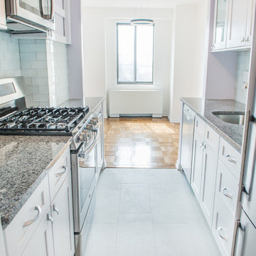
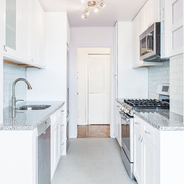
This small kitchen was way too small for this 2 bedrooms, 2 bathrooms apartment. Not only was it a very small kitchen, but the physical location of it made it very difficult to make it any bigger. There wasn't much that could have been done without incurring astronomical cost, which would get little or no return on the investment. The client wanted a kitchen that can be optimized in its current location to add a ton of value for resale.
This was difficult to do, because there was no moving of any mechanical around in the kitchen and even if we wanted to, the management of the building would not allow. For those of you who live in condos, co-ops or apartment building, you know how difficult it is to rework these foot prints. When we showed up, we saw the problems, but we also saw a huge opportunity where we can achieve those goals in the small space. This was accomplished by making some key changes and to incorporate some new things that was not possible when this kitchen was built years ago.
The crucial part of the design that would drive the entire new layout, was selecting the only appliance; that was the Refrigerator. Once we nailed down that refrigerator, we then proceeded to design the kitchen around it. We moved it to the other side of the wall where the sink was so that we can tap into the water line from the sink plumbing. It was crucial that it stays exactly 24" deep, not an inch more because we had to keep the entry as open as possible. Also, it was going to be directly in front of another big storage unit - The pantry. It is not ideal in most cases, but we needed the rest of the space to ramp up the design and open feel towards the side where all of the activities would take place, which happend to be the dining room and the view.
Once all that was figured out, we re-positioned the sink, dishwasher and the range and proceeded to wrap the cabinets around the columns to integrate them into the space. Thirty- six inches cabinets height was used so that they can be installed higher towards the ceiling height to give more room rather than the standard 18" required height between the counter tops. This was done to make the room feel a lot bigger than it really was. Not to mention, we also didn't want the faucet to be buried under the cabinets so that was also a necessary design detail for the space.
We then lowered both knee walls so that the counter top can sit on top of them, by removing that stop point that would have otherwise defined the kitchen area. This allowed us to pick up that extra footprint into the room for added prep space and enabled us to create the illusion of a kitchen that is looking longer than it really is. Every inch mattered when designing this kitchen and we made a conscious decision to use every one of that inch.
White cabinets were selected to do just what white cabinets are design to do; make a small or dark room appear bigger, brighter and more open. In this kitchen, this was amplified the more because of the kitchen location. It was perfect! We knew we did justice to the space because while we were there taking some photos, a few potential buyers walked in and went straight for the kitchen! They said its design just to fit the apartment.
Pantry roll out shelving, Double recycle bin, fancy handles, LED lighting, Quartz counter top, beautiful backslash tiles and grey linen floors finished off the kitchen which looked over a beautiful view of the George Washington Bridge from the top of this lovely 4th floor apartment.
Credit to Masterpiece Tile and Marble (Annmarie on the selection of Tiles and countertop and Val on the Construction to complete this project).
Davor Kokic Photography
 Luxury Antonovich Design AE
Project Type:
Residential Villa – Exterior Architecture, Landscaping & Fit-Out
Company:
Antonovich Group | Luxury Interior Design & Fit-Out Experts
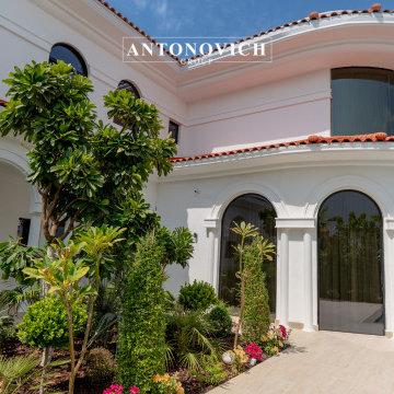
Set along the prestigious shores of Palm Jumeirah, this luxurious villa exterior and landscape renovation by Antonovich Group exemplifies modern Mediterranean elegance fused with contemporary architectural detailing.
Designed to complement Dubai’s iconic coastal skyline, the project blends refined exterior finishes, lush landscaping, and resort-style amenities to create an oasis of tranquility and grandeur.
The villa’s architecture highlights a timeless aesthetic with arched façades, terracotta roofing, and white stucco walls, all carefully restored and enhanced with modern touches.
The landscaping design introduces a vibrant tropical garden, reflective swimming pool, and panoramic waterfront views, connecting the indoor and outdoor living experiences in harmony.
Every curve, texture, and light source was strategically designed to amplify natural beauty and luxury living.
Key Design Elements:
*Mediterranean-inspired architectural restoration with a modern approach
*Grand arched façades and high-gloss white stucco finishing
*Custom-designed black marble driveway with geometric pattern accents
*Seamless glass railing integration for an open, contemporary look
*Lush tropical garden with structured greenery and floral accents
*Infinity-edge pool overlooking Dubai Marina skyline
*Elegant lighting scheme to enhance architectural curves and landscaping
*Glass elevator and wooden accents combining function and sophistication
This renovation demonstrates Antonovich Group’s excellence in creating a fully integrated luxury experience, from exterior detailing to spatial landscaping — transforming this Palm Jumeirah property into an exceptional modern haven.
Scope of Work:
*Exterior architectural renovation and façade enhancement
*Full landscaping design and tropical garden development
*Swimming pool renovation with lighting and filtration upgrade
*Marble driveway and natural stone installation
*Outdoor lighting and decorative wall fixture setup
*Customized glass railing and elevator integration
*Waterproofing, civil works, and structural finishing
*Turnkey exterior and outdoor space execution
#PalmJumeirahVilla #LuxuryExteriorDesign #AntonovichGroup #VillaLandscapingDubai #MediterraneanArchitecture #LuxuryFitOut #DubaiLuxuryVilla #WaterfrontLiving #TropicalGardenDesign #ElegantArchitecture #MarbleDriveway #LuxuryHomeDubai #VillaRenovationUAEContact Antonovich Group for your luxury interior transformation +971 54 299 5555 antonovich-design.ae Instagram: antonovich.design.dubai Send us messages!
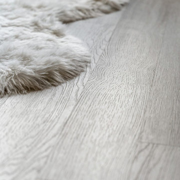 Flooret
 Influenced by classic Nordic design. Surprisingly flexible with furnishings. Amplify by continuing the clean modern aesthetic, or punctuate with statement pieces. With the Modin Collection, we have raised the bar on luxury vinyl plank. The result is a new standard in resilient flooring. Modin offers true embossed in register texture, a low sheen level, a rigid SPC core, an industry-leading wear layer, and so much more.
 RAJ Kitchen and Bath, LLC
**Check out the video of this transformation on our website**
This small kitchen was way too small for this 2 bedrooms, 2 bathrooms apartment. Not only was it a very small kitchen, but the physical location of it made it very difficult to make it any bigger. There wasn't much that could have been done without incurring astronomical cost, which would get little or no return on the investment. The client wanted a kitchen that can be optimized in its current location to add a ton of value for resale.
This was difficult to do, because there was no moving of any mechanical around in the kitchen and even if we wanted to, the management of the building would not allow. For those of you who live in condos, co-ops or apartment building, you know how difficult it is to rework these foot prints. When we showed up, we saw the problems, but we also saw a huge opportunity where we can achieve those goals in the small space. This was accomplished by making some key changes and to incorporate some new things that was not possible when this kitchen was built years ago.
The crucial part of the design that would drive the entire new layout, was selecting the only appliance; that was the Refrigerator. Once we nailed down that refrigerator, we then proceeded to design the kitchen around it. We moved it to the other side of the wall where the sink was so that we can tap into the water line from the sink plumbing. It was crucial that it stays exactly 24" deep, not an inch more because we had to keep the entry as open as possible. Also, it was going to be directly in front of another big storage unit - The pantry. It is not ideal in most cases, but we needed the rest of the space to ramp up the design and open feel towards the side where all of the activities would take place, which happend to be the dining room and the view.
Once all that was figured out, we re-positioned the sink, dishwasher and the range and proceeded to wrap the cabinets around the columns to integrate them into the space. Thirty- six inches cabinets height was used so that they can be installed higher towards the ceiling height to give more room rather than the standard 18" required height between the counter tops. This was done to make the room feel a lot bigger than it really was. Not to mention, we also didn't want the faucet to be buried under the cabinets so that was also a necessary design detail for the space.
We then lowered both knee walls so that the counter top can sit on top of them, by removing that stop point that would have otherwise defined the kitchen area. This allowed us to pick up that extra footprint into the room for added prep space and enabled us to create the illusion of a kitchen that is looking longer than it really is. Every inch mattered when designing this kitchen and we made a conscious decision to use every one of that inch.
White cabinets were selected to do just what white cabinets are design to do; make a small or dark room appear bigger, brighter and more open. In this kitchen, this was amplified the more because of the kitchen location. It was perfect! We knew we did justice to the space because while we were there taking some photos, a few potential buyers walked in and went straight for the kitchen! They said its design just to fit the apartment.
Pantry roll out shelving, Double recycle bin, fancy handles, LED lighting, Quartz counter top, beautiful backslash tiles and grey linen floors finished off the kitchen which looked over a beautiful view of the George Washington Bridge from the top of this lovely 4th floor apartment.
Credit to Masterpiece Tile and Marble (Annmarie on the selection of Tiles and countertop and Val on the Construction to complete this project).
Davor Kokic Photography
 Eco Minded Solutions
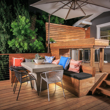
To maximize this small living space, we built a two-level deck featuring an outdoor kitchen and lounging space to amplify functionality.
Inspiration for a craftsman deck remodel in San Diego
Inspiration for a craftsman deck remodel in San Diego
 Eisenbrandt Companies
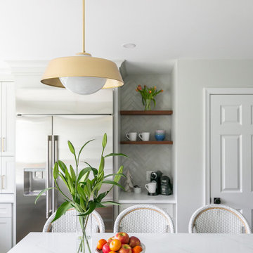
Timeless and transitional, this mudroom-kitchen addition was designed for maximum functionality and beauty. Every inch of this new space brings a luxurious feel with the promise of durability for everyday life. A brand new kitchen with full overlay cabinets and an accent blue island amplifies storage and drop zone areas. Herringbone backsplash with gold hardware and deep sapele wood floating shelves decorate the space with simple, yet endearing designs. Placed in view of the kitchen, the bar has a mirror backsplash with blue cabinets to tie into the kitchen island. With two efficient and separate spaces, the laundry room creates a perfect work zone with black fixtures and the mudroom keeps everything tucked away in style. A brand new powder room with fun blue-patterned tile to bring an element of play into the first floor.
 Century Stair Company
This contemporary home features two striking staircases with integrated LED lighting, glass railing, and thick wood treads. The color-changing LEDs shift from red to blue to yellow, transforming the staircases into dynamic focal points throughout the day. Wood treads and handrails are paired with frameless glass balustrades secured by black pins. Open risers amplify the LED lighting effect while maximizing transparency.
The first-level staircase uses cantilevered and field-supported construction, while the second rises on dual metal stringers. Glass railing continues on the second-floor balcony, creating a cohesive system where light and glass elevate the design beyond the purely functional.
1976-2026 © Century Stair Company
 Chamberland Professional Painting
Whole-Home Interior Repaint — West Hartford & Farmington Valley
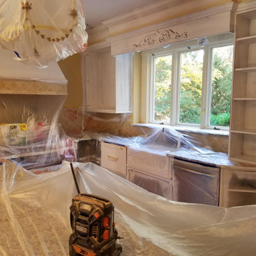
Warm, light-filled rooms deserve paint that flatters them in every season. For this full interior refresh, our crew prepped and repainted the kitchen, dining room, bedrooms, hallways, foyer, stair balusters/railings, ceilings, and detailed millwork/wainscoting. The result is a calm, timeless palette with crisp trim lines and a durable, scrub-friendly finish—perfect for busy New England homes.
Scope & Highlights
Careful protection of floors, stone, and furnishings; dust-controlled sanding and surface repairs
Precision cut-in on complex crown, panel moldings, and curved walls
Smooth, furniture-grade trim and door finishes; uniform ceilings with flawless sheen
Kitchen and adjacent living areas repainted for a cohesive, open-plan look
Color story features soft neutrals and clean whites that amplify natural light
Products We Love for Results Like This
Benjamin Moore Aura & Regal Select for superior coverage, color richness, and washability
Sheens selected by room use (matte/flat for ceilings & formal spaces; eggshell/satin for high-traffic areas)
Optional upgrade: Advance for cabinet/trim enamel hardness
Perfect For
Whole-home repaints before move-in
Refreshing dated color schemes without a full remodel
Pairing new rugs, lighting, or wallpaper with a clean, modern paint envelope
Adding a statement ceiling or upgraded millwork finish
Service Area (CT)
West Hartford, Avon, Farmington, Simsbury, Canton, Bloomfield, Glastonbury, South Windsor, Granby, and the greater Farmington Valley.
Thinking about kitchen cabinets?
We also refinish and paint cabinets with durable, enamel-hard finishes that resist fingerprints and daily wear—ask us to include a cabinet option with your estimate.
Ready to transform your interiors?
Message us here on Houzz or call (860) 243-9910 to schedule a fast, on-site consultation.
 Century Stair Company
This contemporary home features two striking staircases with integrated LED lighting, glass railing, and thick wood treads. The color-changing LEDs shift from red to blue to yellow, transforming the staircases into dynamic focal points throughout the day. Wood treads and handrails are paired with frameless glass balustrades secured by black pins. Open risers amplify the LED lighting effect while maximizing transparency.
The first-level staircase uses cantilevered and field-supported construction, while the second rises on dual metal stringers. Glass railing continues on the second-floor balcony, creating a cohesive system where light and glass elevate the design beyond the purely functional.
1976-2026 © Century Stair Company
 User
UserOur approach to the dining room wall was a key decision for the entire project. The wall was load bearing and the homeowners considered only removing half of it. In the end, keeping the overall open concept design was important to the homeowners, therefore we installed a load bearing beam in the ceiling. The beam was finished with drywall to be cohesive so it looked like it was a part of the original design. Now that the kitchen and dining room were open, paint colors were used to designate the spaces and create visual boundaries. This made each area feel like it’s its own space without using any structures.
The original L-shaped kitchen was cut short because of bay windows that overlooked the backyard patio. These windows were lost in the space and not functional; they were replaced with double French doors leading onto the patio. A brick layer was brought in to patch up the window swap and now it looks like the French doors always existed. New crown molding was installed throughout and painted to match the kitchen cabinets.
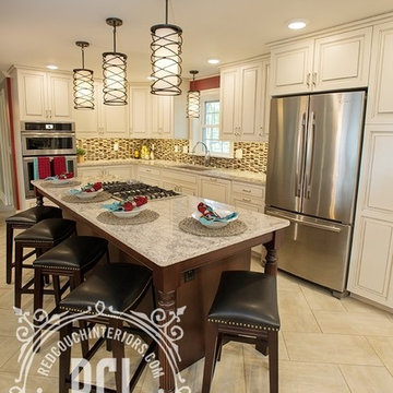
This window/door replacement allowed for a large pantry cabinet to be installed next to the refrigerator which was not in the old cabinet configuration. The replaced perimeter cabinets host custom storage solutions, like a mixer stand, spice organization, recycling center and functional corner cabinet with pull out shelving. The perimeter kitchen cabinets are painted with a glaze and the island is a cherry stain with glaze to amplify the raised panel door style.
We tripled the size of the kitchen island to expand countertop space. It seats five people and hosts charging stations for the family’s busy lifestyle. It was important that the cooktop in the island had a built in downdraft system because the homeowners did not want a ventilation hood in the center of the kitchen because it would obscure the open concept design.
The countertops are quartz and feature an under mount granite composite kitchen sink with a low divide center. The kitchen faucet, which features hands free and touch technology, and an instant hot water dispenser were added for convenience because of the homeowners’ busy lifestyle. The backsplash is a favorite, with a teal and red glass mosaic basket weave design. It stands out and holds its own among the expansive kitchen cabinets.
All recessed, under cabinet and decorative lights were installed on dimmer switches to allow the homeowners to adjust the lighting in each space of the project. All exterior and interior door hardware, hinges and knobs were replaced in oil rubbed bronze to match the dark stain throughout the space. The entire first floor remodel project uses 12x24 ceramic tile laid in a herringbone pattern. Since tile is typically cold, the flooring was also heated from below. This will also help with the homeowners’ original heating issues.
When accessorizing the kitchen, we used functional, everyday items the homeowners use like cutting boards, canisters for dry goods and place settings on the island. Ultimately, this project transformed their small, outdated kitchen into an expansive and functional workspace.
51