
Search results for "Awkwardly" in Home Design Ideas
 Corynne Pless
Photo: Corynne Pless Photography © 2014 Houzz
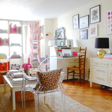
Example of a transitional open concept medium tone wood floor family room design in New York with beige walls and a tv stand
Example of a transitional open concept medium tone wood floor family room design in New York with beige walls and a tv stand
 Pool Environments, Inc.
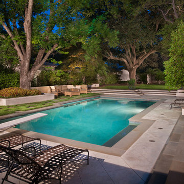
Originally designed by one of the most notable landscape architects in town, this once impressive project had faltered in recent years. The pool and spa still functioned well, and the client wanted to keep it intact. In addition, they wanted to keep as much of the existing landscaping as possible. The surrounding decks, walls, and steps were fair game. At first glance, one might think that our changes were simple material changes. Upon closer inspection, however, one can see the subtle, yet transformative changes that come together to update this classic pool in a tasteful, timeless manner, and improve the flow and usability of the deck areas, while softening the feel of the massive hardscape.
The subtle changes begin as soon as you walk out the back door of the house. The existing decking had a lot of what we call “tweeners”; areas that are overly generous walkways, yet not large enough to house furniture. The awkwardly small bluestone patio was expanded to accommodate a generous seating area, by pushing the step-down closer to the pool. Our talented stone mason carefully married the new bluestone into the existing, resulting in an imperceptible difference between the two. As you descend the new bluestone steps to the pool level, your bare feet will be thankful for the new smooth-finished limestone colored concrete, with a hand cut pattern carefully etched into its surface. The old red brick decking was so hot that the owners could not walk around the pool in bare feet. The brick coping was also replaced with an eased edge Pennsylvania Premier Stone which matches the new step treads throughout the project. Between the house and the pool, a large raised planter was reconfigured, giving additional space to the pool deck for a shaded lounge chair area.
Across the pool, a bank of rather tall painted brick retaining walls were cut down, shortened, and moved. This lessened the visual impact of the walls, which were rather overwhelming in the space, as well as opening up a new seating area, nestled under the arms of the massive pecan at the back of the property. Rather than continuing solid decking around the entire pool, the area near these walls has been transformed to large stone stepper pads set in a sea of beautiful St. Augustine lawn. This creates a visually softened area that is still suited to setting tables and chairs when the guest list calls for additional seating.
The spa area is quite possibly the most dramatic change on this project. Yet more raised planter walls divided this area into awkward spaces, unsuited to proper furniture placement. The planters were removed, new stone decks, once again expertly married into the existing, opening the area to house a large dining table and new built in bbq area. The spa itself was re-imagined with the bluestone coping, and painted brick veneer. The most impressive addition though is the new handmade glazed tiles that surround the existing cast stone water feature. This water feature was almost unnoticeable against the painted brick wall, but now the dramatic arch and pop of color draw the eye to this quaint little corner of the property.
 Randy Angell Designs
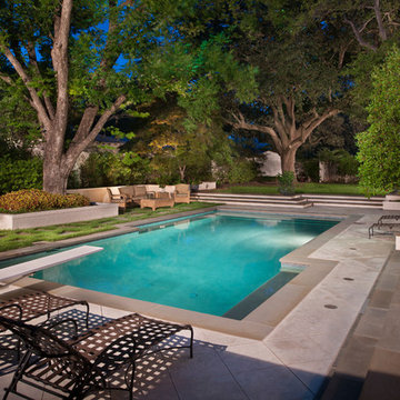
The subtle changes begin as soon as you walk out the back door of the house. The existing decking had a lot of what we call "tweeners"; areas that are overly generous walkways, yet not large enough to house furniture. The awkwardly small bluestone patio was expanded to accommodate a generous seating area. This was done by pushing the step-down closer to the pool.
Our talented stone mason carefully married the new bluestone into the existing portion of the patio, resulting in an imperceptible difference between the two.
As you descend the new bluestone steps to the pool level, your bare feet will be thankful for the new smooth-finished, limestone-colored concrete, with a hand cut pattern carefully etched into it's surface.
The old red brick decking was so hot that the owners could not walk around the pool with their bare feet. The brick coping was also replaced with an eased edge, Pennsylvania Premier Stone which matches the new step treads throughout the project.
Between the house and the pool, a large raised planter was reconfigured, giving additional space to the pool deck for a shaded lounge chair area. Across the pool, a bank of rather tall painted brick retaining walls were cut down, shortened and moved. This lessened the visual impact of the walls (which were overwhelming in the space) and also opened up a new seating area, nestled under the arms of the massive Pecan tree at the back of the property.
Rather than continuing solid decking around the entire pool, the area near these walls has been transformed to large stone stepper pads set in a sea of beautiful St. Augustine lawn. This creates a visually softened area that is still suited to setting tables and chairs when the guest list calls for additional seating.
The spa area is possibly the most dramatic change on this project. Yet more raised planter walls divided this area into awkward spaces, unsuited for proper furniture placement. The planters were removed, new stone decks added, and once again expertly married into the existing decks, opening the area to house a large dining table and a newly built-in BBQ area.
The spa itself was re-imagined with the bluestone coping and painted brick veneer. The most impressive addition though is the new handmade glazed tiles that surround the existing cast stone water feature. This water feature was almost unnoticeable against the painted brick wall, but now the dramatic arch and pop of color draw the eye to this quaint little corner of the property.
Originally designed by one of the most notable landscape architects in town, this once impressive project had faltered in recent years. The pool and spa still functioned well, and the client wanted to keep it intact. In addition, they wanted to keep as much of the existing landscape as possible. But, the surrounding decks, walls and steps were fair game.
At first glance, one might think that our changes were simple material changes. However, upon closer inspection, one can see the subtle-yet-transformative changes that came together to update this classic pool in a tasteful, timeless manner, as well as to improve the flow and usability of the deck areas, while softening the feel of this massive hardscape.
Find the right local pro for your project
 Kelly Rogers Interiors
Eric Roth Photography
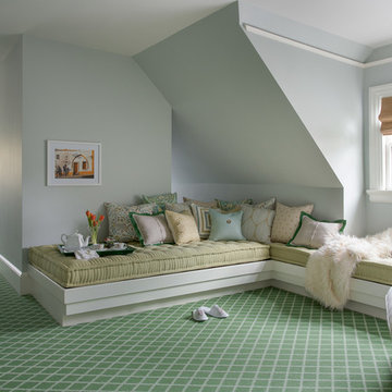
Inspiration for a large timeless guest carpeted and green floor bedroom remodel in Boston with blue walls
Inspiration for a large timeless guest carpeted and green floor bedroom remodel in Boston with blue walls
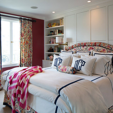
 Ann Lowengart Interiors
The bold pattern of the bed frame and trim add a fun twist to this bedroom while custom window treatments tie the room together. Borrowing a deep burgundy from the intricate pattern, the adjacent walls are painted in the saturated hue. Crisp white on the ceiling and bookshelves are juxtaposed against the striking color and reflect natural light flooding in through the large rectangular window.
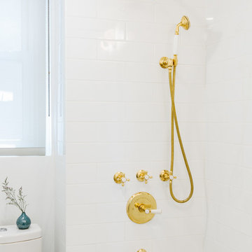
 designs by human.
Discover inspiration for small and narrow bathroom designs with this elegant transitional space featuring a striking black and white basketweave mosaic tile floor. This functional yet stylish bathroom boasts a white subway-tiled shower with luxurious gold fixtures, a sleek white vanity with coordinating gold hardware, and a space-saving toilet, creating a bright and sophisticated aesthetic perfect for modern homes.
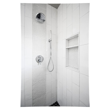
 Devine Bath & Kitchen
Northeast Portland is full of great old neighborhoods and houses bursting with character. The owners of this particular home had enjoyed their pink and blue bathroom’s quirky charm for years, but had finally outgrown its awkward layout and lack of functionality.
The Goal: Create a fresh, bright look for this bathroom that is both functional and fits the style of the home.
Step one was to establish the color scheme and style for our clients’ new bathroom. Bright whites and classic elements like marble, subway tile and penny-rounds helped establish a transitional style that didn’t feel “too modern” for the home.
When it comes to creating a more functional space, storage is key. The original bathroom featured a pedestal sink with no practical storage options. We designed a custom-built vanity with plenty of storage and useable counter space. And by opting for a durable, low-maintenance quartz countertop, we were able to create a beautiful marble-look without the hefty price-tag.
Next, we got rid of the old tub (and awkward shower outlet), and moved the entire shower-area to the back wall. This created a far more practical layout for this bathroom, providing more space for the large new vanity and the open, walk-in shower our clients were looking for.
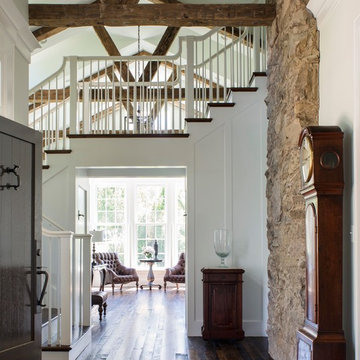
 Donald Lococo Architects
A white elegant paneling is counterpoint to rustic elements. Earthy and elemental materials are selected for the home that reference the barn without directly mimicking it. Wooden members found inside the barn and from other barns bridge ceilings and are used in floors along with rustic slate adding to a sense of simplicity to the farmhouse design.


 Sunnyfields Cabinetry
Dog in the built-in pet wash station in the laundry room.
Utility room - modern black floor utility room idea in Baltimore with white walls
Utility room - modern black floor utility room idea in Baltimore with white walls
 Room Redefined
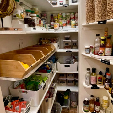
An awkward space can provide plenty of opportunities for storage. Using products from The Container Store like the Elfa Overdoor Rack, white storage bins with handles, Expand-a-shelf risers for cans, and other intentionally selected storage containers, we were able to maximize the space in this small pantry. Every kitchen organization project we do includes purging of unwanted/expired items, removal of items for donation/recycling/selling, space planning, product sourcing and purchasing, and then organizing each space for maximum functionality. Working with a professional organizer for your home organization projects reduces stress and allows you to focus on what you do best while ensuring your goals for your spaces are met!
 TEW Design Studio
Photography by Bob Fortner
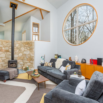
Inspiration for a mid-century modern living room remodel in Raleigh
Inspiration for a mid-century modern living room remodel in Raleigh
 Boxwood Design Co
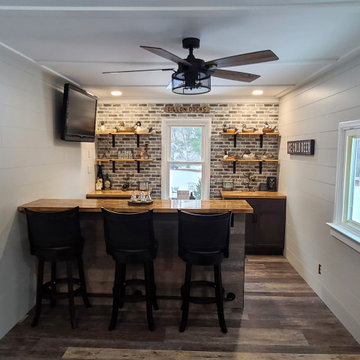
We turned a long awkward office space into a home bar for the homeowners to entertain in.
Example of a mid-sized farmhouse galley vinyl floor seated home bar design in Other with no sink, shaker cabinets, brown cabinets, wood countertops, multicolored backsplash, brick backsplash and beige countertops
Example of a mid-sized farmhouse galley vinyl floor seated home bar design in Other with no sink, shaker cabinets, brown cabinets, wood countertops, multicolored backsplash, brick backsplash and beige countertops
 Anthony Michael Interior Design, Ltd.
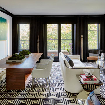
Single, upwardly mobile attorney who recently became partner at his firm at a very young age. This is his first “big boy house” and after years of living college and dorm mismatched items, the client decided to work with our firm. The space was awkward occupying a top floor of a four story walk up. The floorplan was very efficient; however it lacked any sense of “wow” There was no real foyer or entry. It was very awkward as it relates to the number of stairs. The solution: a very crisp black and while color scheme with accents of masculine blues. Since the foyer lacked architecture, we brought in a very bold and statement mural which resembles an ocean wave, creating movement. The sophisticated palette continues into the master bedroom where it is done in deep shades of warm gray. With a sense of cozy yet dramatic.
 Room Redefined
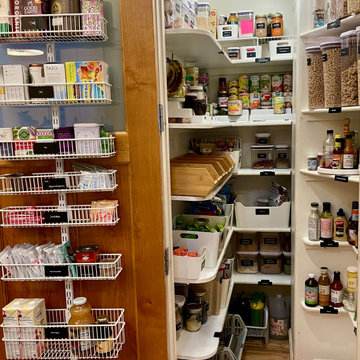
An awkward space can provide plenty of opportunities for storage. Using products from The Container Store like the Elfa Overdoor Rack, white storage bins with handles, Expand-a-shelf risers for cans, and other intentionally selected storage containers, we were able to maximize the space in this small pantry. Every kitchen organization project we do includes purging of unwanted/expired items, removal of items for donation/recycling/selling, space planning, product sourcing and purchasing, and then organizing each space for maximum functionality. Working with a professional organizer for your home organization projects reduces stress and allows you to focus on what you do best while ensuring your goals for your spaces are met!
 Jenna Burger Design
Kitchen - transitional dark wood floor kitchen idea in Boston with white cabinets
 KBK Interior Design
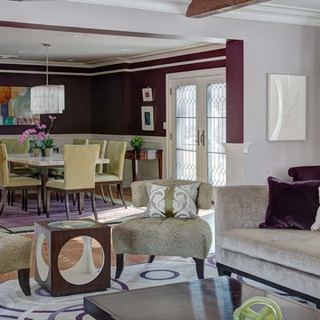
These clients, an entrepreneur and a physician with three kids, chose their Tudor home for the neighborhood, though it didn’t match their modern-transitional taste. They asked us to help them transform their into a place to play and entertain with clean lines and lively color, namely her favorites: bold purple and refreshing apple green.
Their previous layout had a stifled flow with a large sectional sofa that dominated the room, and an awkward assortment of furniture that they wanted to discard with the exception of a vintage stone dining table from her mother. The living room served as a pass through to both the family and dining rooms. The client wanted the living room to be less like a glorified hallway and become a destination. Our solution was to unify the design of this living space with the related rooms by using repetition of color and by creating usable areas for family game night, entertaining and small get togethers.
The generous proportions of the room enabled us to create three functional spaces: a game table with seating for four and adjacent pull up seating for family play; a seating area at the fireplace that accommodates a large group or small conversation; and seating at the front window that provides a view of the street (not seen in the photograph). The space went from awkward to one that is used daily for family activities and socializing.
As they were not interested in touching the existing architecture, transformations were made using new light fixtures, paint, distinctive furniture and art. The client had a strict budget but desired the highly styled look of couture design pieces with curves and movement. We accomplished this look by pairing a few distinctive couture items with inspired pieces that are budget balancers.
We combined the couture game table with more affordable chairs inspired by a classic klismos style, as one might pair Louboutins with stylish jeans. Right- and left-arm chairs with an interesting castle-like fret base detail flank windows.
To help the clients better understand the use of the color scheme, we keyed the floor plan to show how the greens and purples traveled in a balanced manner around the room and throughout the adjacent dining and family rooms. We paired apple green accents with layered hues of lavender, orchid and aubergine. Neutral taupe and ivory tones ground the bold colors.
The custom rug in ivory, aubergine, pale taupe, grey-lavender was inspired by a picture the client found, but we dramatically increased the scale of the pattern in proportion to our room size. This curvy movement is echoed in the sophisticated shapes of the furniture throughout the redesigned room—from the curved sofas to the circular cutouts in the cube end table.
At the windows the solid sateen panels with contrasting aubergine banding have the hand of silk, and are also cost conscious, creating room in the budget for the stunning custom pillows in Italian embroidered silk.
The distinctive color and shapes throughout provide the whimsy the clients' desired with the function they needed, creating an inviting living room that is now a daily destination.
Designed by KBK Interior Design
www.KBKInteriorDesign.com
Photo by Wing Wong
 osmosis architecture
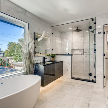
Owner's bath inspired by premium resort hotels.
Inspiration for a large contemporary master white tile white floor and double-sink bathroom remodel in Denver with a one-piece toilet, white walls, an undermount sink, a hinged shower door, black countertops and a floating vanity
Inspiration for a large contemporary master white tile white floor and double-sink bathroom remodel in Denver with a one-piece toilet, white walls, an undermount sink, a hinged shower door, black countertops and a floating vanity
 Anthony Michael Interior Design, Ltd.
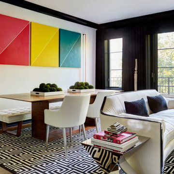
Single, upwardly mobile attorney who recently became partner at his firm at a very young age. This is his first “big boy house” and after years of living college and dorm mismatched items, the client decided to work with our firm. The space was awkward occupying a top floor of a four story walk up. The floorplan was very efficient; however it lacked any sense of “wow” There was no real foyer or entry. It was very awkward as it relates to the number of stairs. The solution: a very crisp black and while color scheme with accents of masculine blues. Since the foyer lacked architecture, we brought in a very bold and statement mural which resembles an ocean wave, creating movement. The sophisticated palette continues into the master bedroom where it is done in deep shades of warm gray. With a sense of cozy yet dramatic.
5