
Search results for "Bare spaces" in Home Design Ideas
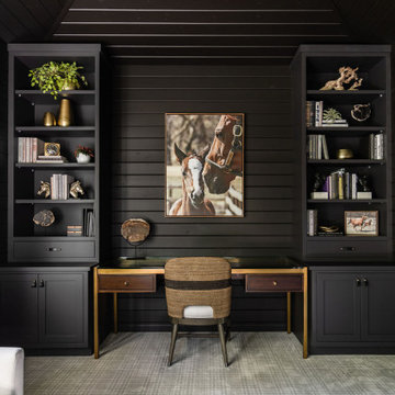
 Haus of Rowe Interiors
We transformed this barely used Sunroom into a fully functional home office because ...well, Covid. We opted for a dark and dramatic wall and ceiling color, BM Black Beauty, after learning about the homeowners love for all things equestrian. This moody color envelopes the space and we added texture with wood elements and brushed brass accents to shine against the black backdrop.
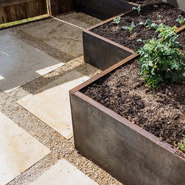
 Native Edge Landscape
After their brand new construction was completed, this family had a beautiful and comfortable home that truly fit their needs. However, this new construction lacked an outdoor living space, which left the backyard feeling stark and bare. With this blank slate, we were able to create a relaxing environment for this family to enjoy.
Faced with the challenge of using every square-inch of this small space, Native Edge was able to design a landscape that left this family worry-free. We incorporated a low maintenance composite decking system, modern raised metal planters, and a bubbling urn water feature to tie this peaceful landscape together. The poor drainage of the lot gave us the opportunity to create a striking cat walk and drainage feature, which left ample room for their vegetable and herb garden hobby. There is even a nook for the family dog to enjoy!
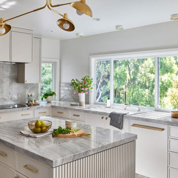
 Memmo Interiors
Mid-sized transitional u-shaped light wood floor and brown floor enclosed kitchen photo in San Francisco with an undermount sink, flat-panel cabinets, gray cabinets, quartzite countertops, gray backsplash, stone slab backsplash, paneled appliances, an island and gray countertops
Find the right local pro for your project
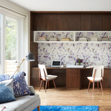
 Threshold Design Lab
Home office library - small mid-century modern built-in desk light wood floor and white floor home office library idea in Chicago with multicolored walls
 Hursthouse Landscape - Architect, Build, Maintain
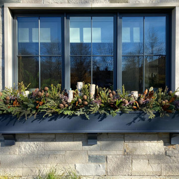
A low profile display of mixed winter greens, dried florals and birch poles amplifies the linear window box planter.
Design ideas for a mid-sized traditional full sun front yard landscaping in Chicago for winter.
Design ideas for a mid-sized traditional full sun front yard landscaping in Chicago for winter.
 User
Userarthur rutenberg homes
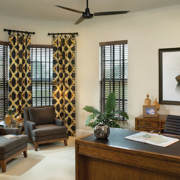
Inspiration for a mediterranean freestanding desk carpeted study room remodel in Tampa with white walls
Inspiration for a mediterranean freestanding desk carpeted study room remodel in Tampa with white walls
Sponsored
Fredericksburg, OH

High Point Cabinets
Columbus' Experienced Custom Cabinet Builder | 4x Best of Houzz Winner
 Birkholz Homes
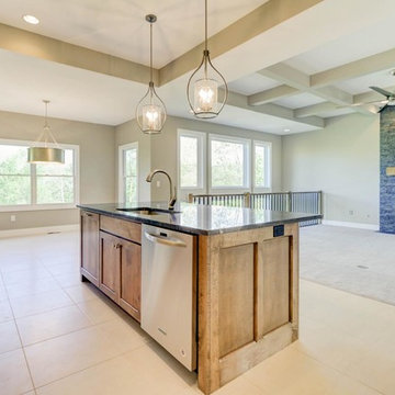
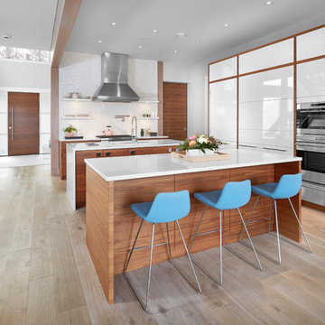
Incredible double island kitchen in an open concept home.
Inspiration for a contemporary kitchen remodel in Edmonton
Inspiration for a contemporary kitchen remodel in Edmonton


 Décor Aid
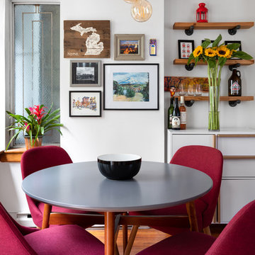
With a restrained hand, out interior designer set about bringing a new life in our clients petite apartment while also introducing easy to maintain, durable surfaces and furnishings as they love to entertain and have a lively St. Bernard. And as they had an extensive book collection and a single three-foot wide closet, the key challenge here was to make the best use of the entire space while injecting it with charming whimsy.
After falling in love with our designer’s presentation, our clients went for a complete apartment overhaul and started from scratch. Since the space is small, our designer Anna S. wanted to create an urgent sense of vibrancy without coming off as too heavy handed. So she worked in expressive colors and decorative extras in small doses for subtle impact.
Starting the project by changing several of the unit’s light fixtures for brighter, more minimal styles, Anna surveyed the apartment room to room to devise clever storage solutions that are easy on the eye.
As they have friends over often, Anna created a warm and inviting living room boasting a slightly feminine take on mid-century modern layered with colorful pillows, patterned rugs, and eclectic art that doesn’t take over the apartment.
In the kitchen, she added a strong yet gender neutral burlap wallpaper, floating wooden shelves, and new plumbing fixtures that were more sophisticated than the original, standard ones in place.
However, our favorite part of the apartment is the moody, statement-making foyer. Though it was a long and narrow barely used, neglected space, Anna brought in wallpaper from Tempaper that features a matte black background covered with gold bird and floral illustrations, and added a long row of black glass cabinets and several large gold mirrors for an added sense of glamorous drama and an extra amount of storage space to boot.
 The Cousins
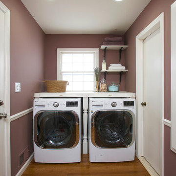
The new laundry room has a new LG washer and dryer along with retractable clothes hangers and more storage space.
Dedicated laundry room - small transitional single-wall medium tone wood floor dedicated laundry room idea in New York with wood countertops, purple walls and a side-by-side washer/dryer
Dedicated laundry room - small transitional single-wall medium tone wood floor dedicated laundry room idea in New York with wood countertops, purple walls and a side-by-side washer/dryer
 EMR Architecture
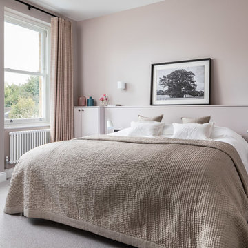
Trendy master carpeted and gray floor bedroom photo in London with pink walls and no fireplace

Sponsored
Columbus, OH

Structural Remodeling
Franklin County's Heavy Timber Specialists | Best of Houzz 2020!
 JMA INTERIOR DESIGN
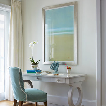
Beach style freestanding desk medium tone wood floor study room photo in San Diego with beige walls
 Randy Angell Designs
The subtle changes begin as soon as you walk out the back door of the house. The existing decking had a lot of what we call "tweeners"; areas that are overly generous walkways, yet not large enough to house furniture. The awkwardly small bluestone patio was expanded to accommodate a generous seating area. This was done by pushing the step-down closer to the pool.
Our talented stone mason carefully married the new bluestone into the existing portion of the patio, resulting in an imperceptible difference between the two.
As you descend the new bluestone steps to the pool level, your bare feet will be thankful for the new smooth-finished, limestone-colored concrete, with a hand cut pattern carefully etched into it's surface.
The old red brick decking was so hot that the owners could not walk around the pool with their bare feet. The brick coping was also replaced with an eased edge, Pennsylvania Premier Stone which matches the new step treads throughout the project.
Between the house and the pool, a large raised planter was reconfigured, giving additional space to the pool deck for a shaded lounge chair area. Across the pool, a bank of rather tall painted brick retaining walls were cut down, shortened and moved. This lessened the visual impact of the walls (which were overwhelming in the space) and also opened up a new seating area, nestled under the arms of the massive Pecan tree at the back of the property.
Rather than continuing solid decking around the entire pool, the area near these walls has been transformed to large stone stepper pads set in a sea of beautiful St. Augustine lawn. This creates a visually softened area that is still suited to setting tables and chairs when the guest list calls for additional seating.
The spa area is possibly the most dramatic change on this project. Yet more raised planter walls divided this area into awkward spaces, unsuited for proper furniture placement. The planters were removed, new stone decks added, and once again expertly married into the existing decks, opening the area to house a large dining table and a newly built-in BBQ area.
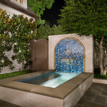
The spa itself was re-imagined with the bluestone coping and painted brick veneer. The most impressive addition though is the new handmade glazed tiles that surround the existing cast stone water feature. This water feature was almost unnoticeable against the painted brick wall, but now the dramatic arch and pop of color draw the eye to this quaint little corner of the property.
Originally designed by one of the most notable landscape architects in town, this once impressive project had faltered in recent years. The pool and spa still functioned well, and the client wanted to keep it intact. In addition, they wanted to keep as much of the existing landscape as possible. But, the surrounding decks, walls and steps were fair game.
At first glance, one might think that our changes were simple material changes. However, upon closer inspection, one can see the subtle-yet-transformative changes that came together to update this classic pool in a tasteful, timeless manner, as well as to improve the flow and usability of the deck areas, while softening the feel of this massive hardscape.
 Hyndman Ltd Contractors
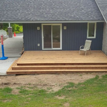
New Deck. Sienna PT Lumber, great stuff, great look, awsum job by Stevo and Mike here.
WJH, Mike Vance.
Outdoor kitchen deck - mid-sized craftsman backyard outdoor kitchen deck idea in Toronto with no cover
Outdoor kitchen deck - mid-sized craftsman backyard outdoor kitchen deck idea in Toronto with no cover
 Olamar Interiors
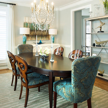
This condo in Sterling, VA belongs to a couple about to enter into retirement. They own this home in Sterling, along with a weekend home in West Virginia, a vacation home on Emerald Isle in North Carolina and a vacation home in St. John. They want to use this home as their "home-base" during their retirement, when they need to be in the metro area for business or to see family. The condo is small and they felt it was too "choppy," it didn't have good flow and the rooms were too separated and confined. They wondered if it could have more of an open concept feel but were doubtful due to the size and layout of the home. The furnishings they owned from their previous home were very traditional and heavy. They wanted a much lighter, more open and more contemporary feel to this home. They wanted it to feel clean, light, airy and much bigger then it is.
The first thing we tackled was an unsightly, and very heavy stone veneered fireplace wall that separated the family room from the office space. It made both rooms look heavy and dark. We took down the stone and opened up parts of the wall so that the two spaces would flow into each other.
We added a view thru fireplace and gave the fireplace wall a faux marble finish to lighten it and make it much more contemporary. Glass shelves bounce light and keep the wall feeling light and streamlined. Custom built ins add hidden storage and make great use of space in these small rooms.
Our strategy was to open as much as possible and to lighten the space through the use of color, fabric and glass. New furnishings in lighter colors and soft textures help keep the feeling light and modernize the space. Sheer linen draperies soften the hard lines and add to the light, airy feel. Tinius Photography
Sponsored
Columbus, OH
Free consultation for landscape design!

Peabody Landscape Group
Franklin County's Reliable Landscape Design & Contracting
 Daniel Scerri Periti
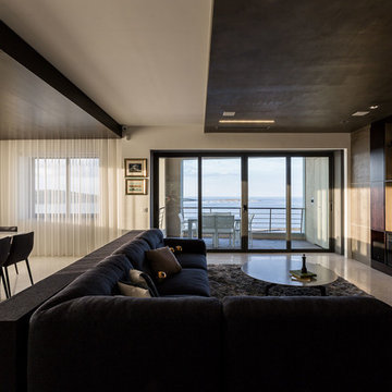
We were approached with a request to design the furnishings for an existing ‘finished’ apartment. The intention was to move in relatively fast, and the property already had an existing marble floor, kitchen and bathrooms which had to be kept. The property also boasted a fantastic 270 degree view, seen from most of the apartment. The clients had a very important role in the completion of the project. They were very involved during the design process and through various decoration choices. The final design was kept as a rigid guideline when faced with picking out all the different elements.
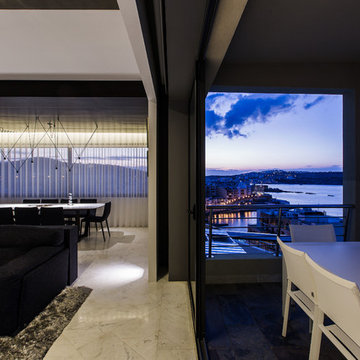
Once clear of all previous furniture, the space felt cold and bare; so we immediately felt the need for warmth, and raw, natural elements and textures to complement the cold marble floor while visually tying in the design of the whole apartment together.
Since the existing kitchen had a touch of dark walnut stain, we felt this material was one we should add to the palette of materials to contest the stark materials. A raw cement finish was another material we felt would add an interesting contrast and could be used in a variety of ways, from cabinets to walls and ceilings, to tie up the design of various areas of the apartment.
To warm up the living/dining area, keeping the existing marble floor but visually creating zones within the large living/dining area without hindering the flow, a dark timber custom-made soffit, continuous with a floor-to-ceiling drinks cabinet zones the dining area, giving it a degree of much-needed warmth.
The various windows with a stupendous 270 degree view needed to be visually tied together. This was done by introducing a continuous sheer [drape] which also doubled up as a sound-absorbing material along 2 of the 4 walls of the space.
A very large sofa was required to fill up the space correctly, also required for the size of the young family.
Services were integrated within the units and soffits, while a customized design in the corner between the kitchen and the living room took into consideration the viewpoints from the main areas to create a pantry without hindering the flow or views. A strategically placed floor-to-ceiling mirror doubles up the space and extends the view to the inner parts of the apartment.
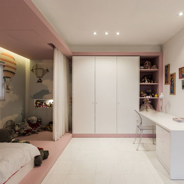
The daughter’s bedroom was a small challenge in itself, and a fun task, where we wanted to achieve the perception of a cozy niche with its own enclosed reading nook [for reading fairy tales], behind see-through curtains and a custom-ordered wall print sporting the girl’s favorite colors.
The sons’ bedroom had double the requirements in terms of space needed: more wardrobe, more homework desk space, a tv/play station area… “We combined a raised platform area between the boys’ beds to become an area with cushions where the kids can lay down and play, and face a hidden screen behind the homework desk’s sliding back panel for their play station”. The color of the homework desk was chosen in relation to the boys’ ages. A more masculine material palette was chosen for this room, in contrast to the light pastel palette of the girl’s bedroom. Again, this colour can easily be changed over time for a more mature look.
PROJECT DATA:
St. Paul’s Bay, Malta
DESIGN TEAM:
Perit Rebecca Zammit, Perit Daniel Scerri, Elyse Tonna
OTHER CREDITS:
Photography: Tonio Lombardi
Styling : TKS
 Daniel Scerri Periti
We were approached with a request to design the furnishings for an existing ‘finished’ apartment. The intention was to move in relatively fast, and the property already had an existing marble floor, kitchen and bathrooms which had to be kept. The property also boasted a fantastic 270 degree view, seen from most of the apartment. The clients had a very important role in the completion of the project. They were very involved during the design process and through various decoration choices. The final design was kept as a rigid guideline when faced with picking out all the different elements.
Once clear of all previous furniture, the space felt cold and bare; so we immediately felt the need for warmth, and raw, natural elements and textures to complement the cold marble floor while visually tying in the design of the whole apartment together.
Since the existing kitchen had a touch of dark walnut stain, we felt this material was one we should add to the palette of materials to contest the stark materials. A raw cement finish was another material we felt would add an interesting contrast and could be used in a variety of ways, from cabinets to walls and ceilings, to tie up the design of various areas of the apartment.
To warm up the living/dining area, keeping the existing marble floor but visually creating zones within the large living/dining area without hindering the flow, a dark timber custom-made soffit, continuous with a floor-to-ceiling drinks cabinet zones the dining area, giving it a degree of much-needed warmth.
The various windows with a stupendous 270 degree view needed to be visually tied together. This was done by introducing a continuous sheer [drape] which also doubled up as a sound-absorbing material along 2 of the 4 walls of the space.
A very large sofa was required to fill up the space correctly, also required for the size of the young family.
Services were integrated within the units and soffits, while a customized design in the corner between the kitchen and the living room took into consideration the viewpoints from the main areas to create a pantry without hindering the flow or views. A strategically placed floor-to-ceiling mirror doubles up the space and extends the view to the inner parts of the apartment.
The daughter’s bedroom was a small challenge in itself, and a fun task, where we wanted to achieve the perception of a cozy niche with its own enclosed reading nook [for reading fairy tales], behind see-through curtains and a custom-ordered wall print sporting the girl’s favorite colors.
The sons’ bedroom had double the requirements in terms of space needed: more wardrobe, more homework desk space, a tv/play station area… “We combined a raised platform area between the boys’ beds to become an area with cushions where the kids can lay down and play, and face a hidden screen behind the homework desk’s sliding back panel for their play station”. The color of the homework desk was chosen in relation to the boys’ ages. A more masculine material palette was chosen for this room, in contrast to the light pastel palette of the girl’s bedroom. Again, this colour can easily be changed over time for a more mature look.
PROJECT DATA:
St. Paul’s Bay, Malta
DESIGN TEAM:
Perit Rebecca Zammit, Perit Daniel Scerri, Elyse Tonna
OTHER CREDITS:
Photography: Tonio Lombardi
Styling : TKS
 Daniel Scerri Periti
We were approached with a request to design the furnishings for an existing ‘finished’ apartment. The intention was to move in relatively fast, and the property already had an existing marble floor, kitchen and bathrooms which had to be kept. The property also boasted a fantastic 270 degree view, seen from most of the apartment. The clients had a very important role in the completion of the project. They were very involved during the design process and through various decoration choices. The final design was kept as a rigid guideline when faced with picking out all the different elements.
Once clear of all previous furniture, the space felt cold and bare; so we immediately felt the need for warmth, and raw, natural elements and textures to complement the cold marble floor while visually tying in the design of the whole apartment together.
Since the existing kitchen had a touch of dark walnut stain, we felt this material was one we should add to the palette of materials to contest the stark materials. A raw cement finish was another material we felt would add an interesting contrast and could be used in a variety of ways, from cabinets to walls and ceilings, to tie up the design of various areas of the apartment.
To warm up the living/dining area, keeping the existing marble floor but visually creating zones within the large living/dining area without hindering the flow, a dark timber custom-made soffit, continuous with a floor-to-ceiling drinks cabinet zones the dining area, giving it a degree of much-needed warmth.
The various windows with a stupendous 270 degree view needed to be visually tied together. This was done by introducing a continuous sheer [drape] which also doubled up as a sound-absorbing material along 2 of the 4 walls of the space.
A very large sofa was required to fill up the space correctly, also required for the size of the young family.
Services were integrated within the units and soffits, while a customized design in the corner between the kitchen and the living room took into consideration the viewpoints from the main areas to create a pantry without hindering the flow or views. A strategically placed floor-to-ceiling mirror doubles up the space and extends the view to the inner parts of the apartment.
The daughter’s bedroom was a small challenge in itself, and a fun task, where we wanted to achieve the perception of a cozy niche with its own enclosed reading nook [for reading fairy tales], behind see-through curtains and a custom-ordered wall print sporting the girl’s favorite colors.
The sons’ bedroom had double the requirements in terms of space needed: more wardrobe, more homework desk space, a tv/play station area… “We combined a raised platform area between the boys’ beds to become an area with cushions where the kids can lay down and play, and face a hidden screen behind the homework desk’s sliding back panel for their play station”. The color of the homework desk was chosen in relation to the boys’ ages. A more masculine material palette was chosen for this room, in contrast to the light pastel palette of the girl’s bedroom. Again, this colour can easily be changed over time for a more mature look.
PROJECT DATA:
St. Paul’s Bay, Malta
DESIGN TEAM:
Perit Rebecca Zammit, Perit Daniel Scerri, Elyse Tonna
OTHER CREDITS:
Photography: Tonio Lombardi
Styling : TKS
35