
Search results for "Better" in Home Design Ideas
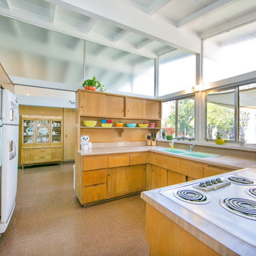
 Better Living SoCal
Pops of bold color accent the original bespoke wood cabinetry in this beautiful Mid-Century Modern kitchen by Architect Ben Urmston. The still-working turquoise Westinghouse oven and matching sink truly steal the show.
OCModHomes.com
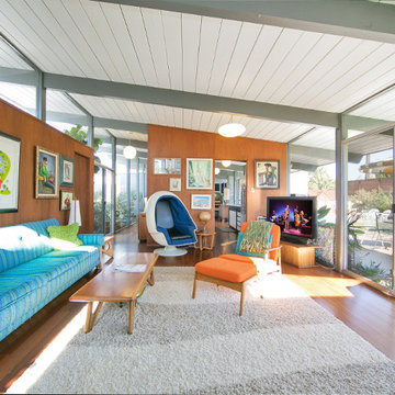 Better Living SoCal
Life is too short…not to love where you live. Who wouldn’t want the opportunity to purchase a stunning, magazine-featured, mid-century modern Eichler home? This living room is the perfect place to showcase your Mid Century Modern furniture and take in the veiws of teh outside back patio space.
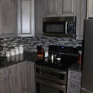
 Cabinetry by Better Bilt
Manufacturer: Starmark
Style: Hickory Ridgeville
Finish: Stain – Driftwood w/ Ebony Glaze
Countertop: Obsidian Quartz (Select Solid Surfaces)
Sink: Blanco Silgranite 40/60 under-mount in “Metallic Gray”
Tile: Saturn Random Strip Mosaic (Genesee Ceramic Tile)
Designer: Andrea Yeip
Contractor: Paul Carson (Carson Installations)
Find the right local pro for your project
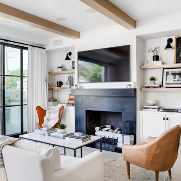

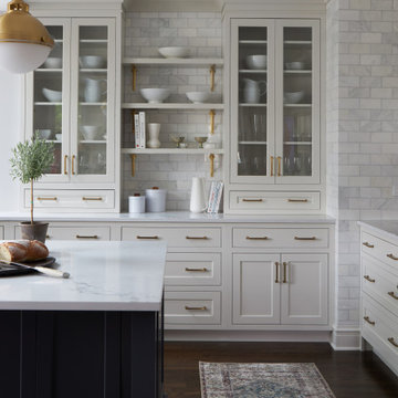
 TKS Design Group
Download our free ebook, Creating the Ideal Kitchen. DOWNLOAD NOW
For many, extra time at home during COVID left them wanting more from their homes. Whether you realized the shortcomings of your space or simply wanted to combat boredom, a well-designed and functional home was no longer a want, it became a need. Tina found herself wanting more from her Old Irving Park home and reached out to The Kitchen Studio about adding function to her kitchen to make the most of the available real estate.
At the end of the day, there is nothing better than returning home to a bright and happy space you love. And this kitchen wasn’t that for Tina. Dark and dated, with a palette from the past and features that didn’t make the most of the available square footage, this remodel required vision and a fresh approach to the space. Lead designer, Stephanie Cole’s main design goal was better flow, while adding greater functionality with organized storage, accessible open shelving, and an overall sense of cohesion with the adjoining family room.
The original kitchen featured a large pizza oven, which was rarely used, yet its footprint limited storage space. The nearby pantry had become a catch-all, lacking the organization needed in the home. The initial plan was to keep the pizza oven, but eventually Tina realized she preferred the design possibilities that came from removing this cumbersome feature, with the goal of adding function throughout the upgraded and elevated space. Eliminating the pantry added square footage and length to the kitchen for greater function and more storage. This redesigned space reflects how she lives and uses her home, as well as her love for entertaining.
The kitchen features a classic, clean, and timeless palette. White cabinetry, with brass and bronze finishes, contrasts with rich wood flooring, and lets the large, deep blue island in Woodland’s custom color Harbor – a neutral, yet statement color – draw your eye.
The kitchen was the main priority. In addition to updating and elevating this space, Tina wanted to maximize what her home had to offer. From moving the location of the patio door and eliminating a window to removing an existing closet in the mudroom and the cluttered pantry, the kitchen footprint grew. Once the floorplan was set, it was time to bring cohesion to her home, creating connection between the kitchen and surrounding spaces.
The color palette carries into the mudroom, where we added beautiful new cabinetry, practical bench seating, and accessible hooks, perfect for guests and everyday living. The nearby bar continues the aesthetic, with stunning Carrara marble subway tile, hints of brass and bronze, and a design that further captures the vibe of the kitchen.
Every home has its unique design challenges. But with a fresh perspective and a bit of creativity, there is always a way to give the client exactly what they want [and need]. In this particular kitchen, the existing soffits and high slanted ceilings added a layer of complexity to the lighting layout and upper perimeter cabinets.
While a space needs to look good, it also needs to function well. This meant making the most of the height of the room and accounting for the varied ceiling features, while also giving Tina everything she wanted and more. Pendants and task lighting paired with an abundance of natural light amplify the bright aesthetic. The cabinetry layout and design compliments the soffits with subtle profile details that bring everything together. The tile selections add visual interest, drawing the eye to the focal area above the range. Glass-doored cabinets further customize the space and give the illusion of even more height within the room.
While her family may be grown and out of the house, Tina was focused on adding function without sacrificing a stunning aesthetic and dreamy finishes that make the kitchen the gathering place of any home. It was time to love her kitchen again, and if you’re wondering what she loves most, it’s the niche with glass door cabinetry and open shelving for display paired with the marble mosaic backsplash over the range and complimenting hood. Each of these features is a stunning point of interest within the kitchen – both brag-worthy additions to a perimeter layout that previously felt limited and lacking.
Whether your remodel is the result of special needs in your home or simply the excitement of focusing your energy on creating a fun new aesthetic, we are here for it. We love a good challenge because there is always a way to make a space better – adding function and beauty simultaneously.
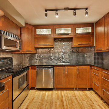
 Better Home Design Inc
BMB Photography
Inspiration for a mid-sized transitional u-shaped light wood floor eat-in kitchen remodel in Calgary with an undermount sink, shaker cabinets, medium tone wood cabinets, granite countertops, metallic backsplash, metal backsplash, stainless steel appliances and a peninsula
Inspiration for a mid-sized transitional u-shaped light wood floor eat-in kitchen remodel in Calgary with an undermount sink, shaker cabinets, medium tone wood cabinets, granite countertops, metallic backsplash, metal backsplash, stainless steel appliances and a peninsula
 Renovisions
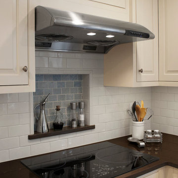
 These homeowners were anxiously ready to remodel their dated 80’s kitchen and reached out to Renovisions to handle the transformation. In this new undertaking we met to discuss plans to brighten the dark room with custom painted white inset cabinets, adding more functional storage, better task lighting and GE Monogram appliances, new hardwood flooring throughout and creating a better flow into the adjacent family room. In order to open up the space, Renovisions suggested creating an angle at the peninsula. Continuing with this approach we replaced the rear door with a new one-light door that swings out instead of in to accommodate new bar stools and a better flow of traffic in and out to the deck outside. Silestone’s quartz countertops in ‘Merope’ were the perfect choice adding a nice contrast yet truly durable and low maintenance. Creating a beautifully unique subway tile niche in linen color at cooktop area and backsplash added an elegant touch to the overall look and homeowners were thrilled with this refreshing look after the Renovision.
Now their newly renovated kitchen is a showcase and nicely outfitted for family and friends.


 Renovisions
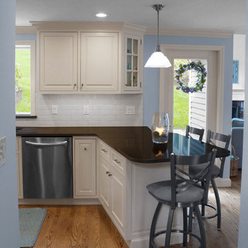
 These homeowners were anxiously ready to remodel their dated 80’s kitchen and reached out to Renovisions to handle the transformation. In this new undertaking we met to discuss plans to brighten the dark room with custom painted white inset cabinets, adding more functional storage, better task lighting and GE Monogram appliances, new hardwood flooring throughout and creating a better flow into the adjacent family room. In order to open up the space, Renovisions suggested creating an angle at the peninsula. Continuing with this approach we replaced the rear door with a new one-light door that swings out instead of in to accommodate new bar stools and a better flow of traffic in and out to the deck outside. Silestone’s quartz countertops in ‘Merope’ were the perfect choice adding a nice contrast yet truly durable and low maintenance. Creating a beautifully unique subway tile niche in linen color at cooktop area and backsplash added an elegant touch to the overall look and homeowners were thrilled with this refreshing look after the Renovision.
Now their newly renovated kitchen is a showcase and nicely outfitted for family and friends.
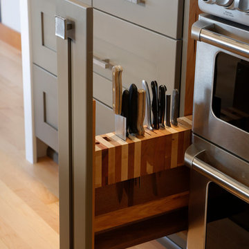
 Signature Design & Cabinetry LLC
Pull out knife block makes use of a small space while keep essential cooking tools close at hand. ~
Brian DalBalcon Photography
Kitchen - mid-sized transitional kitchen idea in Seattle
Kitchen - mid-sized transitional kitchen idea in Seattle
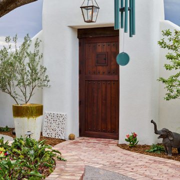
 George Ocampo
Coming home has never felt better...This complete exterior home renovation & curb appeal has vibes of Palm Springs written all over it!!! Views of the Organ Mountains surrounded by the Chihuahuan Desert creates an outdoor space like no other. Modifications were made to the courtyard walls, new entrance door, sunset balcony included removing an over designed standard staircase access with a new custom spiral staircase, a new T&G ceiling, minimized obstructing columns, replaced w/substantial cedar support beams. Stucco patch, repair & new paint, new down spouts & underground drainage were all key to making a better home. Now our client can come home with feel good vibes!!! Our next focus was the access driveway, taking boring to sophisticated. With nearly 9' of elevation change from the street to the home we wanted to create a fun and easy way to come home. 8" bed drystack limestone walls & planters were key to making the transition of elevation smooth, also being completely permeable, but with the strength to retain, these walls will be here for a lifetime. Accented with oversized Mossrock boulders and mossrock slabs used for steps, naturalized the environment, serving as break points and easy access. Native plants surrounded by natural vegetation compliments the flow with an outstanding lighting show when the sun goes down. Welcome to your home!!!

 Better Builders
Bill Babb and Pete Baughman lead Better Builders with a shared commitment to redefining the remodeling experience—prioritizing honesty, delivering on time and on budget, and treating every client with the trust and respect they deserve.
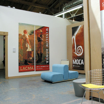
 BetterWall
A loft like gallery space with high walls and concrete floors highlights a selection of authentic promotional street banners for museum exhibitions around the country. A light blue Kazuhide Takahama designed Suzanne Lounge Chair from Knoll creates a back to back seating options for view the artwork. Also featured is a Bertoia Barstool and beige Spoleto Chair (back corner).
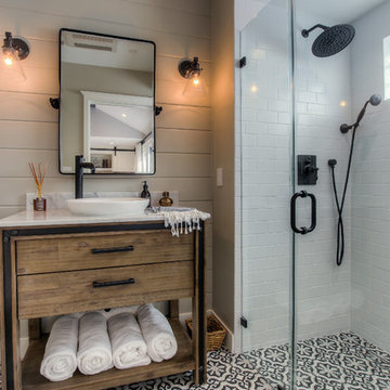
 Spazio LA
This beautiful bathroom features cement tiles (from Cement Tile Shop) on the floors with an infinity drain a custom frameless shower door and custom lighting. Vanity is Signature Hardware, and mirror is from Pottery Barn.

Sponsored
Sunbury, OH

J.Holderby - Renovations
Franklin County's Leading General Contractors - 2X Best of Houzz!
 TVL Creative Ltd.
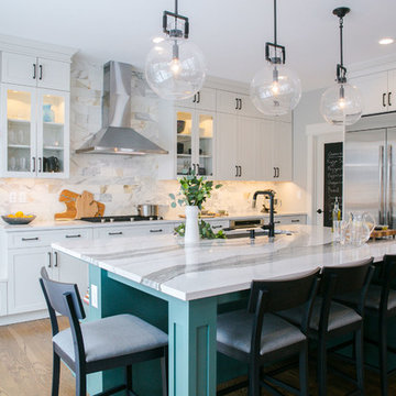
Our clients had just recently closed on their new house in Stapleton and were excited to transform it into their perfect forever home. They wanted to remodel the entire first floor to create a more open floor plan and develop a smoother flow through the house that better fit the needs of their family. The original layout consisted of several small rooms that just weren’t very functional, so we decided to remove the walls that were breaking up the space and restructure the first floor to create a wonderfully open feel.
After removing the existing walls, we rearranged their spaces to give them an office at the front of the house, a large living room, and a large dining room that connects seamlessly with the kitchen. We also wanted to center the foyer in the home and allow more light to travel through the first floor, so we replaced their existing doors with beautiful custom sliding doors to the back yard and a gorgeous walnut door with side lights to greet guests at the front of their home.
Living Room
Our clients wanted a living room that could accommodate an inviting sectional, a baby grand piano, and plenty of space for family game nights. So, we transformed what had been a small office and sitting room into a large open living room with custom wood columns. We wanted to avoid making the home feel too vast and monumental, so we designed custom beams and columns to define spaces and to make the house feel like a home. Aesthetically we wanted their home to be soft and inviting, so we utilized a neutral color palette with occasional accents of muted blues and greens.
Dining Room
Our clients were also looking for a large dining room that was open to the rest of the home and perfect for big family gatherings. So, we removed what had been a small family room and eat-in dining area to create a spacious dining room with a fireplace and bar. We added custom cabinetry to the bar area with open shelving for displaying and designed a custom surround for their fireplace that ties in with the wood work we designed for their living room. We brought in the tones and materiality from the kitchen to unite the spaces and added a mixed metal light fixture to bring the space together
Kitchen
We wanted the kitchen to be a real show stopper and carry through the calm muted tones we were utilizing throughout their home. We reoriented the kitchen to allow for a big beautiful custom island and to give us the opportunity for a focal wall with cooktop and range hood. Their custom island was perfectly complimented with a dramatic quartz counter top and oversized pendants making it the real center of their home. Since they enter the kitchen first when coming from their detached garage, we included a small mud-room area right by the back door to catch everyone’s coats and shoes as they come in. We also created a new walk-in pantry with plenty of open storage and a fun chalkboard door for writing notes, recipes, and grocery lists.
Office
We transformed the original dining room into a handsome office at the front of the house. We designed custom walnut built-ins to house all of their books, and added glass french doors to give them a bit of privacy without making the space too closed off. We painted the room a deep muted blue to create a glimpse of rich color through the french doors
Powder Room
The powder room is a wonderful play on textures. We used a neutral palette with contrasting tones to create dramatic moments in this little space with accents of brushed gold.
Master Bathroom
The existing master bathroom had an awkward layout and outdated finishes, so we redesigned the space to create a clean layout with a dream worthy shower. We continued to use neutral tones that tie in with the rest of the home, but had fun playing with tile textures and patterns to create an eye-catching vanity. The wood-look tile planks along the floor provide a soft backdrop for their new free-standing bathtub and contrast beautifully with the deep ash finish on the cabinetry.
 PassivWorks, Inc. - Better Buildings
Ned Bonzi Photography
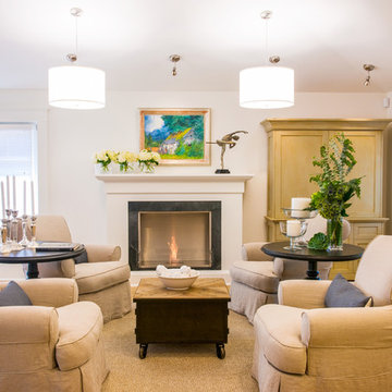
Mid-sized elegant formal and open concept light wood floor and brown floor living room photo in San Francisco with white walls, a standard fireplace, a concealed tv and a wood fireplace surround
Mid-sized elegant formal and open concept light wood floor and brown floor living room photo in San Francisco with white walls, a standard fireplace, a concealed tv and a wood fireplace surround
 ShelfGenie of Columbus
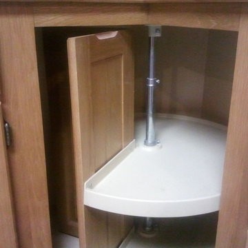
The traditional lazy Susan is a time-tested solution for making your corner cabinets more accessible. Installed in either an upper or lower cabinet, a lazy Susan can create better organization, better visibility and better accessibility to all of your stored items.
 Zieba Builders, Inc.
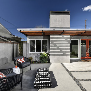
Built in the 1960’s, this 1,566 sq. ft. single story home needed updating and visual interests. The clients love to entertain and wanted to create a welcoming, fun atmosphere. Their wish lists were to have an enclosed courtyard to utilize the outdoor space, an open floor plan providing a bigger kitchen and better flow, and to incorporate a mid-century modern style.
The goal of this project was to create an open floor plan that would allow for better flow and function, thereby providing a more usable workspace and room for entertaining. We also incorporate the mid-century modern feel throughout the entire home from the inside to the out, bringing elements of design to all the spaces resulting in a completely uniform home.
Opening-up the space and removing any visual barriers resulted in the interior and exterior spaces appearing much larger. This allowed a much better flow into the space, and a flood of natural sunlight from the windows into the living area. We were able to enclose the outside front space with a rock wall and a gate providing additional square footage and a private outdoor living space. We also introduced materials such as IPE wood, stacked stone, and metal to incorporate into the exterior which created a warm, aesthetically pleasing, and mid-century modern courtyard.
Sponsored
Sunbury, OH
J.Holderby - Renovations
Franklin County's Leading General Contractors - 2X Best of Houzz!
 Maquette Interior Design
LIz Daly
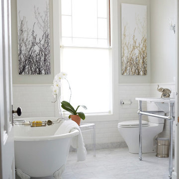
Example of a mid-sized classic master white tile and subway tile marble floor bathroom design in San Francisco with marble countertops, gray walls, a two-piece toilet and a console sink
Example of a mid-sized classic master white tile and subway tile marble floor bathroom design in San Francisco with marble countertops, gray walls, a two-piece toilet and a console sink

 Pella Windows and Doors
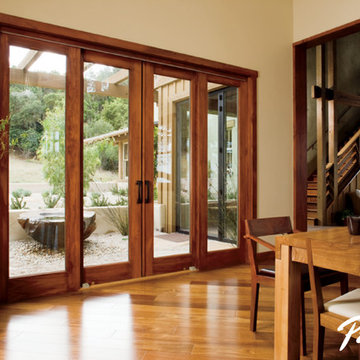
This Pella® Architect Series® wood with aluminum-clad sliding patio door features Pella’s unique design with the sliding panel on the outside — so the harder the wind blows, the tighter the seal against the elements.
37