
Search results for "Boosted problem solving" in Home Design Ideas

 Archadeck of Austin
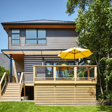
In addition to designing and building all of the structures you see, we added large concrete beam walls at ground level to solve an existing problem. Water from rainfall had been running into the area under the old deck. The low concrete walls we added to the deck design now divert water properly. The homeowners are quite glad to be rid of that problem! The new design provides plenty of storage space under the deck so they can easily store their waterfront toys.
 Advance Design Studio, Ltd.
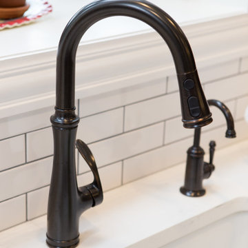
After six years of living in their Huntley IL home, Chris and Meghan were tired of their dark, dingy, outdated kitchen and it was finally time for a long-anticipated change. “The kitchen is the place where we live, it’s where we do everything,” Meghan said. “It was important that it be a space where we wanted to be.” Meghan loves cooking and enjoys including their girls in healthy meal prepping, this led them to want a brighter, more enjoyable kitchen with increased functionality and improved storage.
For Chris especially, the laundry room was an entirely dysfunctional eyesore. “We had a washer and a dryer, but it was all kind-of cobbled together!” Chris said. “There were always laundry piles everywhere, we weren’t really sure what we wanted to do in there, but it was time for us to make a change.” The mess of the space was stressful every time they walked in the door from the garage each day. Kids’ backpacks and shoes piled up haphazardly in the makeshift boot-bench closet left the family feeling disorganized and stressed. They needed space for folding clothes and locker cubbies to help keep the family organized.
Having known Christine and Todd in the Huntley community for years, Chris and Meghan were familiar with their work. “We already trusted them personally and having seen their projects for years we knew they did top notch work. After we reviewed the initial round of designs, we knew that hiring them was definitely the right choice,” Meghan and Chris said. Although Chris had done a lot of work in their home himself, the kitchen and laundry room renovation was such a large undertaking that he didn’t want to steal time away from his family to spend what would surely be many long weekends doing the job himself. “That would not have been a wise choice for us,” Chris laughed.
“Our designer, Michelle was very, very, easy to work with; anything we wanted to see or weren’t sure about, she went above and beyond to make this easy for us. She was easy to get hold of and always quick to respond,” the couple said. Michelle pulled ideas that mirrored the couple’s taste and style and was adept at directing the couple to limited choices that didn’t overwhelm them and kept the process moving. “I have a hard time making decisions. Michelle made the decision-making process so easy. I loved how she listened to what I liked and then presented three great options for me to choose from,” Meghan said.
The main objectives for the kitchen were better storage solutions, they wanted the space to reflect their lifestyle and taste, and they wanted it to last for years with low maintenance. One of the first steps in creating a more functional kitchen was relocating the refrigerator, creating an improved workflow for the busy family.
“We didn’t know that we could even move the refrigerator to a new location where it is now, that was something that we never would have thought of,” Chris said. “The new refrigerator location makes the kitchen feel so much bigger. We didn’t add any space, but our whole kitchen with the new design just seems like it’s so much larger than before!” Meghan said.
The perimeter mist colored cabinets helped warm and brighten the entire room, while the graphite colored cabinets on the island added contrast. Using this fresh, clean color palette satisfied the couple’s desire for a bright space that was the exact opposite of what they had before. Organization accessories were also added to the cabinets such as a spice drawer tray and roll outs to create hidden convenience.
“I absolutely love the hidden spices – it makes cooking so much more enjoyable!” Chris said. “And all the pull outs, and the double trash bin, who would think you could get so excited about organization!” the couple said in unison.
One thing they hated in their original kitchen was how dark the space felt. Added lighting on the ceiling with the new light fixtures combined with the lighter cabinetry colors throughout solved this problem. “Our new kitchen has this warm, almost cozy feeling that our old kitchen never had, it’s just a space that I love spending my time in now,” Meghan said. The light airy feeling was accentuated with the use of floating white shelves on either side of the decorative range hood. “We have so much cabinetry space, the new design is amazing we actually have more storage space than we will ever need,” Meghan said.
The island was extended to create more work surface and added space for stool seating. “The new island changes how we live. Now the kids can be in the kitchen with us, doing homework, eating breakfast, and the three of us have special dinners there when Chris is working late,” Meghan said.
The Carrara Marmi Quartz countertops were chosen because they are, not only beautiful, but are made from hard-working material that doesn’t require maintenance. The white subway tile backsplash that wraps to the ceiling behind the focal point cooktop range/hood compliments the crisp white countertops perfectly, while brushed brass hardware and light fixtures keep the design fresh and new.
The couple had a few fears at the beginning of the project, as most homeowners do. Their biggest fear was being out of their kitchen and laundry room for an extended time. The crew made it very easy for the family to work in a limited space keeping the washer and dryer hooked up the majority of the time, and also getting appliances working with minimal downtime.
“They above and beyond accommodated us to get us through the process,” Meghan said. “They did a great job making sure we were as comfortable as possible throughout the process,” Chris added.
“Our project manager DJ did a great job. He was very good at updating us on schedule changes, getting guys in as quickly as possible. Everyone that stepped in the house was nice and did great work,” said Chris. They thought Advance’s carpenter was phenomenal and were impressed when he took a conceptual idea from a photograph and worked with designer Michelle to create a one of a kind range/hood that has become the topic of conversation with friends and family who visit the new kitchen. “He was in our house literally every day for several weeks. He was easy to work with and good at what he did,” Meghan and Chris said.
The focal point of the kitchen; a hand-crafted, custom-built ventilation hood was clad with handpicked reclaimed barnwood. Advance Design’s carpenter built the framework and the cladding to create a one-of-a-kind design element that the couple loves.
“I think it was especially fun for him to create something unique from scratch, showcasing his talent in this area,” Meghan said. “I love that my kitchen is not like everyone else’s. I got to pick out the wood on my hood and watch it being built and was able to choose what pieces of wood went where on it. It’s totally unique.”
Red Oak flooring was toothed-in throughout the kitchen and the rest of the first floor anywhere changes were made. Then the whole floor was refinished to tone down the orange undertones in the existing floor stain, ultimately changing the color complexion of the entire first floor. The result is a completely new feeling to the entire home.
Renovating the laundry room was extremely important to Meghan and Chris, but they had trouble visualizing what the possibilities were for the seemingly small space. Michelle produced beautiful 3D illustrations that helped them envision the space in a whole new way.
“I must have told Michelle 100 times that I am a visual person, seeing the designs in 3D made it so easy to make decisions and see what we could really do with our space,” Meghan said.
A dividing wall and doorway were removed between the existing laundry room and hallway formerly containing a coat closet, providing space to design specialized graphite colored cabinetry matching the kitchen island to house custom storage cubbies for each family member. Adding the tall utility cabinetry in the new laundry area helped solve the storage issue, tucking away cleaning supplies, household items, and even the cat got its own cubby.
“I love how everything is now hidden in its own space. I can’t tell you how much I hated coming home and seeing everything sitting around on counters,” Chris said.
Electrical outlets were planned for the inside of utility cabinets, so devices could charge in hidden locations. Stacking the washer and dryer allowed for wider countertop space to provide a folding area and a special space for clothes to hang. “The way I do laundry has been completely transformed! I can actually fold clothes and hang them now right out of the washer and dryer,” Meghan said.
“The end result in the kitchen and the laundry/mud room was an updated light and bright space, with a smarter work flow that better meets the needs of this family,” Michelle said.
“I would totally recommend Advance Design,” Meghan said. “Sometimes I sit and just look at my kitchen and laundry room and think ‘Wow, I can’t believe I get to live here!’ It’s an understatement to say we love our new space.”
 Bridgewater
The new owners were looking forward to living in their new home with an open floor plan, tall vaulted ceilings, and great views. It featured a large Great Room with two big French Doors separating the Dining Room from the Master Bedroom.
But after only a few months they identified a major design flaw: Each of the French Doors had ten glass windows with two large windows above each door. (Check out our before and after designs, traffic flow diagrams and photos of this project.) Glass windows and doors allowed sound and light from guests or the TV in the great room to easily sneak into the bedroom. With unique work and sleep schedules (he’s a pilot, she’s a registered nurse) this design wasn’t working.
Then there was a traffic flow design flaw: The Master Bedroom had a second entrance from a hallway. To get into the bedroom from the hallway you needed to walk down another claustrophobic hallway.
To get from the Master Bedroom to the Master Bath begin at the most remote corner of the bedroom and down a hallway between two closets. Once inside the bath, a huge triangular Jacuzzi dominating the space.
So, from a privacy and traffic flow perspective, this home had some major design issues.
When Craig Weber first met with the owners, he listened to their ideas and concerns. The owners trusted Craig to come up with the most efficient and most effective solution to this design dilemma. He offered a solution that resolved the bed-bath traffic flow problem, offered some bedroom room privacy, and updated the bath.
First, the two French Doors and windows were removed. A new wall was built with sound-absorbing materials, making the Great Room and Dining Room more comfortable spaces for entertaining while creating the bedroom privacy the owners craved.
Solving the Bedroom/Bath traffic flow problem began with removing the two existing closets. The bath door was relocated next to the hall entrance, and then a new walk-in closet was added adjacent to the hallway entrance. The solution offered easy access to and from the bath, closet and hallway without a hint of claustrophobia.
The Master Bath underwent a major transformation designed for convenience and comfort – especially during long, cold Minnesota winters.
Most everything from the former bath was torn out, beginning with the giant Jacuzzi.
A new bathtub that is wider and deeper than the standard size was installed with brushed Nickel fixtures. It’s the perfect place to relax with a glass of wine and candles.
Warm floors are a Minnesota “must have.” The bath’s new ceramic floor features in-floor electric heat. Getting in and out of the tub is easy and comfortable.
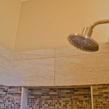
The new walk-in shower again features in-floor heating and a place to sit. The most interesting feature of this shower may the custom ceramic tile installed with unique patterns.
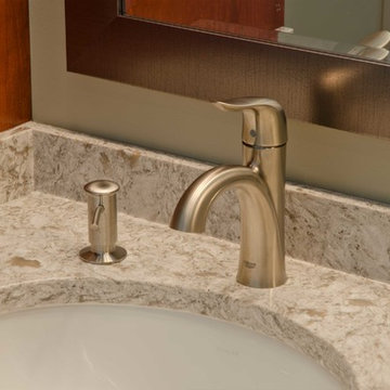
A new vanity Cambria Bradshaw countertops features two under-hung ceramic sinks with matching brushed Nickel fixtures.
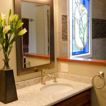
Tall ceilings and three glass windows near the ceiling flood the room with natural light. A new energy-efficient window frames an ornamental stained glass window created by the owner’s father – a great personal touch.
A quiet place to sleep. A private dining room for entertaining. A Master Bath to die for. And easy traffic flow. The owners couldn’t have been more delighted with the outcome. And Lilly, their cat, loves it too.
Find the right local pro for your project
 Decorating Den Interiors-Barbara Tabak
The client’s goal for this makeover was to create a clean style with a contemporary vibe in her cold empty bedroom. The client’s main focus for the design was to block the morning sun that woke her up long before she wanted to begin her day.
Problem(s) addressed:
The room was void of furnishings, bedding and accessories. The décor consisted of a mattress, box spring, jewelry chest and an old comforter, and therefore had no inspirational piece from which to begin the design. We were literally starting from scratch. As for the morning sun dilemma, I was excited to come up with a better solution to the sun challenge than her temporary solution of stacking towels in the arch window.
Solution provided:
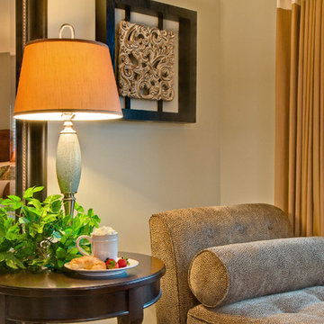
Furnishings were the first priority. Rich espresso-stained contemporary dresser, gentleman’s chest and nightstands began the design. Next, a leopard print upholstered chaise was selected to sit in front of the double arched window providing a place to read, work on a laptop, and listen to music or just lounge. Two faux leather ottomans were selected to perch at the end of the bed.
Custom bedding and color scheme was next on the list. The client had requested a restful color palette, which fell into place when we found the perfect heather-gray, gold and cream hued bed ensemble. With the bedding selected, a coordinating wall paint and gold velvet fabric was chosen for the upholstered headboard.
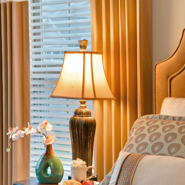
To solve the clients early morning wake up call, traversing draperies that are installed above the window arch were designed to shut out the morning sun. The inverted French pleat draperies, with their color block design, enhance the room’s clean contemporary style. Brushed silver hardware with cracked crystal finials coordinated the furniture hardware and added a touch of sophistication.
Finally, a combination of elegant lighting, mixed media art, an area rug and accessories finish the room’s contemporary design.
 Schulte Design Build
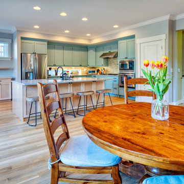
This kitchen project is in a newer build home (2007). The family liked everything about the space except for the island layout and location. Both ends of it were pinch points which made it cumbersome for multiple people to be in the space at a time. They liked the granite countertops but the one on the island was damaged and needed to be replaced to accommodate the new island configuration. Due to this, it made sense to replace all the countertops with quartz. The perimeter cabinets were in good shape but were a dark color which made the space dark and uninviting. We solved this by painting them a bright green/blue color with a two-part water-based paint. We added a couple of other cabinets in the adjacent spaces to provide them with more needed storage which did not impact the kitchen space. We relocated the existing 3 recessed lights over the island which saved them from the landfill. We replaced the old under cabinet fluorescent light fixtures with new energy efficient LED channel fixtures that provide much better counter task lighting. We painted both the ceiling and walls to freshen up the space. As you can see, we were able to solve this family’s kitchen problems in both an environmentally and budget conscious way with creative solutions.
 Bridgewater
The new owners were looking forward to living in their new home with an open floor plan, tall vaulted ceilings, and great views. It featured a large Great Room with two big French Doors separating the Dining Room from the Master Bedroom.
But after only a few months they identified a major design flaw: Each of the French Doors had ten glass windows with two large windows above each door. (Check out our before and after designs, traffic flow diagrams and photos of this project.) Glass windows and doors allowed sound and light from guests or the TV in the great room to easily sneak into the bedroom. With unique work and sleep schedules (he’s a pilot, she’s a registered nurse) this design wasn’t working.
Then there was a traffic flow design flaw: The Master Bedroom had a second entrance from a hallway. To get into the bedroom from the hallway you needed to walk down another claustrophobic hallway.
To get from the Master Bedroom to the Master Bath begin at the most remote corner of the bedroom and down a hallway between two closets. Once inside the bath, a huge triangular Jacuzzi dominating the space.
So, from a privacy and traffic flow perspective, this home had some major design issues.
When Craig Weber first met with the owners, he listened to their ideas and concerns. The owners trusted Craig to come up with the most efficient and most effective solution to this design dilemma. He offered a solution that resolved the bed-bath traffic flow problem, offered some bedroom room privacy, and updated the bath.
First, the two French Doors and windows were removed. A new wall was built with sound-absorbing materials, making the Great Room and Dining Room more comfortable spaces for entertaining while creating the bedroom privacy the owners craved.
Solving the Bedroom/Bath traffic flow problem began with removing the two existing closets. The bath door was relocated next to the hall entrance, and then a new walk-in closet was added adjacent to the hallway entrance. The solution offered easy access to and from the bath, closet and hallway without a hint of claustrophobia.
The Master Bath underwent a major transformation designed for convenience and comfort – especially during long, cold Minnesota winters.
Most everything from the former bath was torn out, beginning with the giant Jacuzzi.
A new bathtub that is wider and deeper than the standard size was installed with brushed Nickel fixtures. It’s the perfect place to relax with a glass of wine and candles.
Warm floors are a Minnesota “must have.” The bath’s new ceramic floor features in-floor electric heat. Getting in and out of the tub is easy and comfortable.
The new walk-in shower again features in-floor heating and a place to sit. The most interesting feature of this shower may the custom ceramic tile installed with unique patterns.
A new vanity Cambria Bradshaw countertops features two under-hung ceramic sinks with matching brushed Nickel fixtures.
Tall ceilings and three glass windows near the ceiling flood the room with natural light. A new energy-efficient window frames an ornamental stained glass window created by the owner’s father – a great personal touch.
A quiet place to sleep. A private dining room for entertaining. A Master Bath to die for. And easy traffic flow. The owners couldn’t have been more delighted with the outcome. And Lilly, their cat, loves it too.
 Decorating Den Interiors-Barbara Tabak
The client’s goal for this makeover was to create a clean style with a contemporary vibe in her cold empty bedroom. The client’s main focus for the design was to block the morning sun that woke her up long before she wanted to begin her day.
Problem(s) addressed:
The room was void of furnishings, bedding and accessories. The décor consisted of a mattress, box spring, jewelry chest and an old comforter, and therefore had no inspirational piece from which to begin the design. We were literally starting from scratch. As for the morning sun dilemma, I was excited to come up with a better solution to the sun challenge than her temporary solution of stacking towels in the arch window.
Solution provided:
Furnishings were the first priority. Rich espresso-stained contemporary dresser, gentleman’s chest and nightstands began the design. Next, a leopard print upholstered chaise was selected to sit in front of the double arched window providing a place to read, work on a laptop, and listen to music or just lounge. Two faux leather ottomans were selected to perch at the end of the bed.
Custom bedding and color scheme was next on the list. The client had requested a restful color palette, which fell into place when we found the perfect heather-gray, gold and cream hued bed ensemble. With the bedding selected, a coordinating wall paint and gold velvet fabric was chosen for the upholstered headboard.
To solve the clients early morning wake up call, traversing draperies that are installed above the window arch were designed to shut out the morning sun. The inverted French pleat draperies, with their color block design, enhance the room’s clean contemporary style. Brushed silver hardware with cracked crystal finials coordinated the furniture hardware and added a touch of sophistication.
Finally, a combination of elegant lighting, mixed media art, an area rug and accessories finish the room’s contemporary design.
 Bridgewater
The new owners were looking forward to living in their new home with an open floor plan, tall vaulted ceilings, and great views. It featured a large Great Room with two big French Doors separating the Dining Room from the Master Bedroom.
But after only a few months they identified a major design flaw: Each of the French Doors had ten glass windows with two large windows above each door. (Check out our before and after designs, traffic flow diagrams and photos of this project.) Glass windows and doors allowed sound and light from guests or the TV in the great room to easily sneak into the bedroom. With unique work and sleep schedules (he’s a pilot, she’s a registered nurse) this design wasn’t working.
Then there was a traffic flow design flaw: The Master Bedroom had a second entrance from a hallway. To get into the bedroom from the hallway you needed to walk down another claustrophobic hallway.
To get from the Master Bedroom to the Master Bath begin at the most remote corner of the bedroom and down a hallway between two closets. Once inside the bath, a huge triangular Jacuzzi dominating the space.
So, from a privacy and traffic flow perspective, this home had some major design issues.
When Craig Weber first met with the owners, he listened to their ideas and concerns. The owners trusted Craig to come up with the most efficient and most effective solution to this design dilemma. He offered a solution that resolved the bed-bath traffic flow problem, offered some bedroom room privacy, and updated the bath.
First, the two French Doors and windows were removed. A new wall was built with sound-absorbing materials, making the Great Room and Dining Room more comfortable spaces for entertaining while creating the bedroom privacy the owners craved.
Solving the Bedroom/Bath traffic flow problem began with removing the two existing closets. The bath door was relocated next to the hall entrance, and then a new walk-in closet was added adjacent to the hallway entrance. The solution offered easy access to and from the bath, closet and hallway without a hint of claustrophobia.
The Master Bath underwent a major transformation designed for convenience and comfort – especially during long, cold Minnesota winters.
Most everything from the former bath was torn out, beginning with the giant Jacuzzi.
A new bathtub that is wider and deeper than the standard size was installed with brushed Nickel fixtures. It’s the perfect place to relax with a glass of wine and candles.
Warm floors are a Minnesota “must have.” The bath’s new ceramic floor features in-floor electric heat. Getting in and out of the tub is easy and comfortable.
The new walk-in shower again features in-floor heating and a place to sit. The most interesting feature of this shower may the custom ceramic tile installed with unique patterns.
A new vanity Cambria Bradshaw countertops features two under-hung ceramic sinks with matching brushed Nickel fixtures.
Tall ceilings and three glass windows near the ceiling flood the room with natural light. A new energy-efficient window frames an ornamental stained glass window created by the owner’s father – a great personal touch.
A quiet place to sleep. A private dining room for entertaining. A Master Bath to die for. And easy traffic flow. The owners couldn’t have been more delighted with the outcome. And Lilly, their cat, loves it too.

 Fitz's Fish Ponds
Our client reached out with a problem for us to solve. Part of his property was an eyesore and difficult to keep up. A tree had fallen into his overgrown pond, it had been leaking for ages, and it had become a major problem for this homeowner.
Mike Hall (Design and Construction manager) saw the land and with the help of Fitz's team and developed this concept of a multi-level waterfall that pours gracefully into the large basin. The challenge was to use the existing layout and keep the feel of the beautiful forest that surrounded it.
This project was a chance to push the limit on scale. We were able to build a large water feature that was complex and build a sustainable healthy pond at the bottom. With over 30,000 gallons of water, our team custom built a filtration system to keep the water clean and healthy for the fish that call it home. The gravel suction grid for filtration worked like a charm. Then added a Used an external pressure filter, to keep the water extra clear.
Our team cleared the whole pond, saved fish, fixed the drainage issues, lined the pond with a massive liner. Then we brought in 50 tons of moss rock boulders. Saved the original bridges and made them stronger and sturdy. Created a look that was natural to the forest surrounding it.
This was an exciting project for the FFP team and we are extremely proud of how it turned out!
 User
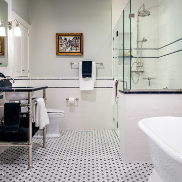
UserOriginal bath of historic 1904 Home in Franklin, TN gets new look by taking in a large hallway that had been made from the original back porch. The original bath of the home was located on the back porch, accessible through the original kitchen and a back door off the hallway between the kitchen and breakfast rooms.
In an earlier remodel, the back porch was taken in to for a hallway leading to a new kitchen addition leaving the original kitchen to become a bedroom. The bathroom was small, there were no closets and no access to the original breakfast room. The new floor plan has solved all of the problems by making the original bath foot print into walk-in closets. Supplying natural light by leaving the original window to the bathroom between the closets and taking in the back hall for the new shower, tub vanities and toilet. Built-in medicine cabinets and storage over the toilet solve storage issues and the original exterior door to the porch was utilized to make the decorative niche over the tub.
 Decorating Den Interiors-Barbara Tabak
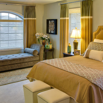
The client’s goal for this makeover was to create a clean style with a contemporary vibe in her cold empty bedroom. The client’s main focus for the design was to block the morning sun that woke her up long before she wanted to begin her day.
Problem(s) addressed:
The room was void of furnishings, bedding and accessories. The décor consisted of a mattress, box spring, jewelry chest and an old comforter, and therefore had no inspirational piece from which to begin the design. We were literally starting from scratch. As for the morning sun dilemma, I was excited to come up with a better solution to the sun challenge than her temporary solution of stacking towels in the arch window.
Solution provided:
Furnishings were the first priority. Rich espresso-stained contemporary dresser, gentleman’s chest and nightstands began the design. Next, a leopard print upholstered chaise was selected to sit in front of the double arched window providing a place to read, work on a laptop, and listen to music or just lounge. Two faux leather ottomans were selected to perch at the end of the bed.
Custom bedding and color scheme was next on the list. The client had requested a restful color palette, which fell into place when we found the perfect heather-gray, gold and cream hued bed ensemble. With the bedding selected, a coordinating wall paint and gold velvet fabric was chosen for the upholstered headboard.
To solve the clients early morning wake up call, traversing draperies that are installed above the window arch were designed to shut out the morning sun. The inverted French pleat draperies, with their color block design, enhance the room’s clean contemporary style. Brushed silver hardware with cracked crystal finials coordinated the furniture hardware and added a touch of sophistication.
Finally, a combination of elegant lighting, mixed media art, an area rug and accessories finish the room’s contemporary design.
 Best Hot Tubs "Hot Tub and Spa Experts"
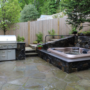
The hot tub installation design closed in the spa only on 3 sides, leaving one side open for repair work. It’s also where the hot tub cover fits onto the spa.
“We recently did a service call for them,” says Bill Renter. “The unenclosed area made it easy to open the control panel and check on the problem they were having. It turned out, in this case, not to be an issue with the hot tub at all. But I was able to diagnose the problem. They had an electricity issue and I recommended a particular switch the electrician could put in. I’m glad I was able to solve the issue for their electrician.”
 Land2c Landscape Architecture
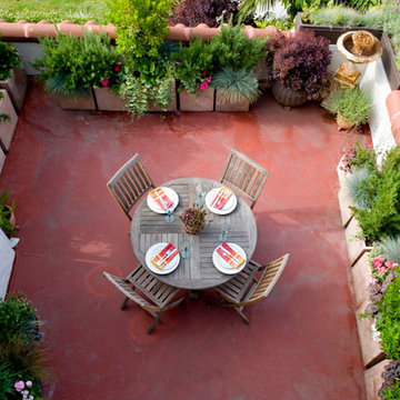
This expansive condominium terrace needed privacy from an apartment building across the street to the right and the adjacent neighbor to the left. Light-weight fiber pots filled with varied heights of plants solved that problem. The area is now more private and welcoming with colorful Mediterranean-type plants. The tallest shrubs are compact Strawberry Trees (Arbutus unedo 'Compacta'.
 Natural Path Landscaping
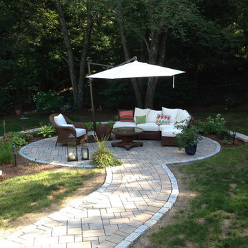
The owners wanted a restful patio with some shade. The raised patio solved the sloping yard problem and allowed better utilization of their property.
Inspiration for a large contemporary concrete paver patio remodel in Boston
Inspiration for a large contemporary concrete paver patio remodel in Boston
 Betz Pools Limited
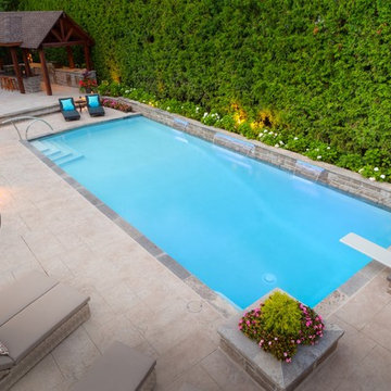
The dazzling focal point of this Thornhill backyard is a dry Gunite pool with premium PebbleTec white glass bead interior and Wiarton flagstone coping. The backyard had a drainage problem which was solved with a sloping raised upper patio in architecturally stamped concrete to re-direct the runoff away from the house. (18 x 42 custom rectangular)
 Lars Remodeling & Design
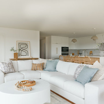
The completely reimagined floorplan included relocating the kitchen and Master Suite to the opposite side of the home to take better advantage of the views and natural light. All bathrooms and the laundry room were completely remodeled along with installing new doors, windows, and flooring throughout the home and completely upgrading all electrical and plumbing.
The end result is simply stunning. Light, bright, and modern, the new version of this home demonstrates the power of thoughtful architectural planning, creative problem solving, and expert design details.
 Klopf Architecture
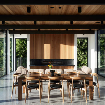
Malibu Glass Box House by Klopf Architecture
Following the devastating Woolsey Fire of 2018, the site in Malibu offered a unique opportunity to rebuild not just a home, but a new architectural composition that highlighted the property’s potential while navigating strict fire-rebuild codes in the area. Designed by Klopf Architecture, this project embraced a set of limitations and translated them into an architectural asset.
The city’s fire-rebuild process required the new structure to remain close to the original footprint, size and bulk, a constraint that ultimately clarified the architectural direction. Perched near the front of a long, narrow lot, the new home frames and overlooks a private, park-like rear expanse, an uncommon luxury especially in this part of Malibu .
Without a fixed program, the design process allowed for a different kind of creative focus allowing Klopf Architecture the opportunity to explore how a modernist home could best respond to this site. The team approached the project not with a list of requirements, but with a question: How might a modernist live here? What spatial qualities would inspire calm, connection, and a sense of wonder in this setting? The process became less about problem-solving and more about architectural storytelling—letting the site, the light, and the principles of modern design guide the form and flow of the home.
The response emerged in the form of a glass-box pavilion, an open, Mid-Century Modern inspired living, dining, and kitchen space that floats at the edge of the property’s natural descent. Connected to the more enclosed, private areas of the home by a glass-walled hallway, the living pavilion becomes a distinct centerpiece of the design. It opens on all four sides to the landscape with decks and patios on the flanks, an internal garden and water feature to the north, and a dramatic unguarded view of the expansive backyard and ocean horizon to the south.
Because of the mandated footprint, careful planning was required to ensure every space could still engage with light, landscape, or both. Strategic voids in the form of atriums and courtyards allow daylight to filter deep into the home’s core, while offering moments of surprise and retreat. These design gestures allow natural light to filter deep into the interior, creating a sense of brightness and openness throughout the day. At the same time, they expand the perceptual boundaries between inside and out, making the home feel more expansive while anchoring its connection to the surrounding landscape.
The siting of the house is what gives it its unique character. Rather than receding into the backyard like the neighboring homes, the house holds a slight prominence. From the central living pavilion, stepping down into the landscape feels more like entering a secluded park where a separate existing accessory structure, trail, and recreational areas await. The home’s modest street presence gives way to this unfolding drama of space, view, and nature.
Fire-resilient materials and assemblies are integrated seamlessly throughout including triple-pane glazing, under-slab and roof insulation, and locally sourced fire-rated cladding ensure the house not only meets Calfornia’s rigorous wildland-urban interface (WUI) standards, but feels effortlessly aligned with them. While technical decisions like fire-hardening and mechanical systems presented some construction challenges, particularly around the cantilevered glass box, the team found a functional compromise that preserved the integrity of the design.
Inside, a restrained palette and exposed post and beam design celebrate the ethos of mid-century modernism. A central circulation spine extends from the entry to the rear glass wall, offering a continuous visual link from street to ocean. Spaces such as the library and office, though more intimate in scale, are never cut off from nature as each opens to its own unique courtyard or garden view.
Though born out of a strict regulatory framework and developed without a specific client, the rebuild design unfolded with remarkable clarity. Grounded in site logic, refined by limitations and an emphasis on timeless spatial relationships – light, proportion, and a strong connection to nature, the resulting design feels both effortless and uplifting. The home lives lightly on the land, opens generously to its surroundings, and strikes a careful balance between privacy, openness, and calm. For Klopf Architecture, it stands as a compelling case study in how site, code, and circumstantial constraints can inspire enduring, modernist architecture. With years of experience reimagining mid-century modern design for how people live today, the firm took the project’s limitations as an opportunity. The result is a home shaped by open, flowing spaces, strong indoor-outdoor connections, and a calm, clear sense of structure. It’s a good reminder that even with strict constraints, there’s still room for architecture to breathe—and for modernism to keep moving forward.
Klopf Architecture project team: Geoff Campen, John Klopf, AIA, and Sherry Tan
Structural Engineer: ZFA
Contractor: Maison D’Artiste
Photography: ©2025 Mariko Reed
Year Completed: 2023
 F9 Productions Inc.
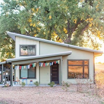
Imagine a barn that's also a home, overlooking Boulder's iconic Flatirons. The Boulder Barndominium mixes farm practicality with modern coziness, designed for efficiency and those stunning views that make every day feel special.
Client and Brief
The owners sought a simple, smart building that saves materials and energy. They wanted light-filled spaces, a west-facing unit for mountain sights, and a patio to relax outside.
Problems Solved
Energy costs and weather can add up, but solar roofs and clever orientation make it net-zero – using the sun for power and keeping things comfortable without extra bills.
Design Concept and Form
The concept is straightforward – a long rectangle with sloping roofs for panels, and high windows to bring in daylight. It feels balanced and connected to the land.
Construction and Materials
Wood framing provides strength and tradition, built to endure while staying budget-friendly.
Energy Efficiency
Solar arrays power everything, with radiant heating and east/west setup for natural warmth and light – sustainable living that's easy and effective.
Interior Design
Barn space for work and storage, dwelling with bedroom, bath, and open areas leading to the patio for seamless inside-out flow.
Outcome
Since 2020, this barndominium has been a functional, green haven. It blends utility with beauty, offering savings, views, and a sense of peace in Boulder's landscape.
 Kristen Elizabeth Design
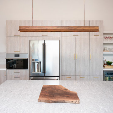
This home remodel was all about creating a modern oasis for easy entertaining and family life while accentuating the existing architecture of the home. It was critical to harmonize the kitchen with the remainder of the home and we achieved that by bringing a fresh and clean palette throughout the entry, living and kitchen areas. Every aspect of this design was thoughtfully curated in the best interest of the structure of the home and the desires of our clients.
We highlighted the negative wall space by adding a textured three dimensional tile to the entire back wall. To balance, we added an asymmetric lower bank of storage with open pockets for easy access. We blended a fine linen veneer that provides a soft contrast to the back wall cabinets and the island. For additional visual interest we added a grey wood veneer to complete the remainder of the space.
To continue the theme of harmony we needed to open up the divider wall between the living and kitchen, without removing it- as it was a critical structural shear wall. To problem solve, we mirrored the vaulted architecture of the kitchen in the opening to add consistency throughout the space.
The result: A crisp and contemporary aesthetic guests are sure to be WOW’d by.
18