
Search results for "Budget plan" in Home Design Ideas

 K&P Builders, Inc.
Here is K&P Builders popular Kentmorr floor plan, Available to be built in their Charles County, MD community, Kingsview!
This beautiful home features nearly 3400sf of finished space above grade, plus a full basement! In this photo, you are viewing the sunroom, which is located just off of the formal living room. This room is amazing, with wall to wall, and floor to ceiling, windows! The cathedral ceiling provides an airy atmosphere! The room is large and features beautiful décor, with rattan bar and stools, and beautiful upholstered furnishings!
K&P Builders custom builds homes to suit their clients needs and budget!
K&P Builders' homes are quality built, with quality materials and workmanship! The builder customizes each home to suit their customers; needs! All of our homes meet the strict Energy Star standards, too!
Kingsview is a community located in White Plains, in Charles County, MD. The community offers an easy commute to Washington DC and Virginia, as well as area military bases. The community features a pool, tennis courts, soccer fields, nature trails, playgrounds and more! It is a beautiful community with active residents!
Visit Kingsview and explore how you may own one of K&P Builders' custom homes!

 Advance Design Studio, Ltd.
Raza and Baneen purchased their home in Schaumburg IL. knowing it needed work, but they saw the incredible potential it had with its expanse of beautiful kitchen windows and spacious floor plan.
The kitchen technically functioned fine, but was desperately outdated with its honey oak cabinets and plain countertops. This family loved to cook and host parties so it was an easy decision that the kitchen remodel was the first project they needed to tackle to make their home come to life.
Baneen had very specific ideas for her new dream kitchen and had been thinking about it for over 10 years! When they met Advance Design’s Project Designer Claudia Pop, Baneen felt an instant connection.
“From the first meeting, I knew that Claudia would guide us without putting down our ideas,” Baneen said.
The couple had two fears common among remodeling home owners: Would the project be done on time? And, would the project stay on budget? Advance Design was able to alleviate their fears early on, as Claudia shared the “Common Sense Remodeling” process. Raza and Baneen absolutely loved the custom project analysis that helped them understand how a budget could be accurately predicted and then safeguarded during the design process.
“Advance Design was spot on with both the budget and the project timeframe,” Baneen said. “Overall there were no surprises, and the budget was exactly what we were quoted. The experience was phenomenal, everybody was professional, everybody was courteous, everyone was nice, everyone was friendly. It wasn't stressful for us, they still left the house in a presentable state. It wasn't like we would come home and we were bring the kids in and it was going to be hazardous."
After the relationship was cemented, Raza, Baneen and Claudia began to finalize the kitchen design. The main objective was to create a functional space for preparing meals and to create an inviting space for their family and friends to enjoy, while incorporating interesting design elements such as the iconic blue island and reclaimed Chicago brick walls. Sufficient storage space was really important to Baneen, and high quality appliances were a priority. As the overall layout was being completed, together they reviewed each cabinet to determine exactly what would be stored there.
Because cooking was a high priority for this family, Claudia incorporated spice racks close to the range and included two mixer lift shelves for their larger countertop appliances.
The focal point of the kitchen is the striking blue island constructed from custom colored Dura Supreme cabinets. Designed with decorative shelving and a highly functional prep sink. The couple loves the “galley” prep sink, it adds even more functionality and significantly shortens preparation and cleaning time. This island also includes a 24" Bosch Dishwasher with matching panel to blend in.
"Aesthetically, and in terms of functionality, the island everything I imagined," Baneen said. "I love how beautiful it looks and how functional it is. It just brings everybody together."
The Praa Sands Quartz countertop with an ogee edge profile provides excellent contrast by blending it's subtle tones with the outer cabinetry. It ties the island together with the rest of the space. Overlooking the beautiful backyard through spacious windows, the crisp white farmhouse sink is something that Baneen envisioned in her kitchen for years.
Two tones of Dura Supreme Cabinetry were used throughout the rest of the kitchen. Chestnut Cherry cabinets grace the range and decorative range hood and as panels over the Wolf refrigerator and freezer. Antique White cabinets surround the perimeter, creating a warm balance that beckons guests into the softly rounded space.
Drawing the eye immediately to the custom wood hood hiding a powerful 1,500 CFM ventilation system and spectacular 60” Duel Fuel Wolf range, a creatively patterned Tessen in Café & Brine backsplash detail stands out from the white subway tile backsplash spanning the outer walls. The vibrant space reflects the lively personality of the family who now loves spending time both cooking and enjoying this kitchen as a family.
“The end result is a beautiful and extremely functional kitchen that is able to handle a growing family, lots of parties and lots of cooking,” Claudia said.
“Advance Design was wonderfully professional and a pleasure to work with. They catered to what my needs and ideas were, while skillfully guiding us to make the right choices where we seemed lost,” Baneen said.

 JL Interiors
This use to be a closed in kitchen separated by walls, The client is a cook and wanted a open concept kitchen with plenty of light! With ample of room to prep this is the perfect renovation on a budget. We accented with natural elements with the faux ceiling beams, walnut kitchen cabinet pulls, live edge counter stools and concrete pendants. Soft design with a huge impact! Who wouldn't want to cook in this kitchen with natural lighting?
JL Interiors is a LA-based creative/diverse firm that specializes in residential interiors. JL Interiors empowers homeowners to design their dream home that they can be proud of! The design isn’t just about making things beautiful; it’s also about making things work beautifully. Contact us for a free consultation Hello@JLinteriors.design _ 310.390.6849_ www.JLinteriors.design
Find the right local pro for your project
 K&P Builders, Inc.
Here is K&P Builders popular Kentmorr floor plan, Available to be built in their Charles County, MD community, Kingsview!
This beautiful home features nearly 3400sf of finished space above grade, plus a full basement! In this photo, you are viewing the formal living room! Maple floors are installed with a neutral area rug overtop,, gorgeous turned new posts and spindles can be found on the large and beautiful staircase, beautiful columns in the fore-ground separating the living room from the dining room, high ceilings, gorgeous windows with transoms, and beautiful furnishings.
K&P Builders custom builds homes to suit their clients needs and budget!
K&P Builders' homes are quality built, with quality materials and workmanship! The builder customizes each home to suit their customers; needs! All of our homes meet the strict Energy Star standards, too!
Kingsview is a community located in White Plains, in Charles County, MD. The community offers an easy commute to Washington DC and Virginia, as well as area military bases. The community features a pool, tennis courts, soccer fields, nature trails, playgrounds and more! It is a beautiful community with active residents!
Visit Kingsview and explore how you may own one of K&P Builders' custom homes!
 TKS Design Group
Download our free ebook, Creating the Ideal Kitchen. DOWNLOAD NOW
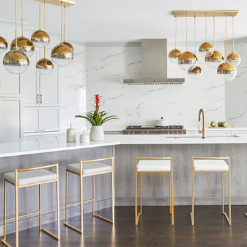
This client was referred to us from a past client. They are a busy 2-career household with young children and enjoy entertaining friends and family in their home. They have a beautiful open concept home but unfortunately the kitchen was not fitting for the rest of the home. They were not quite sure what to do with the space. We talked about trying to refresh it or do more of a minor remodel, but in the end they decided a full gut would get them to where they wanted to be.
One problem was there was no place for guests to hang out other than the large and awkward banquette area. The brick wall and tiled hood area were feeling a bit dated and tired. The space was just not functional for their lifestyle. There was no prep space near the cooktop and no landing area for items coming out of the ovens or refrigerator, plus a big dead zone in the center of the room.
Banquettes, like the one they previously had in the space, are great for small spaces, but when they get really large like this one, it makes getting in and out of the seating area awkward and uncomfortable. Plus, there was room for a large table, so we eliminated the awkward built in.
We started by removing the faux brick wall between the kitchen and back entry. We relocated the entry to the garage over a couple feet in order to get every last inch out of the new kitchen. We also made the decision to close up the primary window that faced the pretty ho hum brick wall of the neighbor’s house. There was plenty of light coming in from the seating area, so we just didn’t feel the window was adding much to the room.
Construction went smoothy. There was a bit of rework with electrical, flooring and HVAC, but in the end, we think it was well worth it.
The clients really wanted a sleek contemporary look, and we originally had planned for a full height slab backsplash, but due to it’s size, it was a budget buster. Instead, we got creative and settled on large format porcelain tiles that have a similar feel but were a fraction of the cost. We made sure the wall was plumb and level so that the fit and finish would mimic that of slab material.
The final space was quite a change. A large prep sink sits directly across from the new pro-style range with plenty additional prep space on the large island. The refrigerator and ovens now have miles of landing space, and a nice tight work triangle makes cooking a breeze.
Since we wanted a more contemporary feel, not many wall cabinets were included. Instead, we outfitted some of the drawers for dish storage with a peg system. Two large pantries flanking the refrigerator hold baking supplies and small appliances. Large drawers by the cooktop hold pots and pans, and an appliance garage tucked away to the left of the range hides away miscellaneous items. The large island also houses a microwave drawer and tons of storage, most of which is drawers offering maximum convenience.
The island now seats 5-6 people comfortably along with the new table in the seating area which can seat up to 8. Entertaining will be a breeze in this space. With such a clean backdrop, we knew we would need some drama with the lighting, so we chose two sets of staggered pendants, which we adjusted for the right visual balance above the island.
We also included a small coffee station to the right of the main kitchen, which helps keep the coffee clutter out of the kitchen proper. Two tones of complimentary gray are featured in this kitchen. The perimeter is a light gray that reads almost white. The island is a gray stain that adds some depth and interest with the visible wood texture. The countertops are clean white quartz, and the hardware, barstools and light fixtures add warm brass tones. I see lots of cooking and entertaining with family and friends in the near future in this bright and airy new space.
Designed by: Susan Klimala, CKD, CBD
Photography by: Michael Kaskel
For more information on kitchen and bath design ideas go to: www.kitchenstudio-ge.com

 River Valley Landscapes
Blending contemporary forms and lush plantings, this Garden maximizes the sensory experience of the materials and planting from inside and outside the home. The garden occupies an interior courtyard framed by four interior walls. The home, designed by Architect Cliff May was built in 1948 and the following year was featured in House Beautiful Magazine. The clients list of needs and desires was brief. They wanted a space that would complement the mid century modern home and provide visual interest from inside the home. Some form of water was also requested. They had a budget of $30,000. In order to stay within their budget the clients performed the demolition of the old garden. The designer’s intent was to create a garden that would possess a clear sculptural quality and would be as visually striking from inside the home as it would be from inside the courtyard. The strategy behind the design was to use hardscape materials characterized by simple geometric forms and a planting palette that would emphasize form over color, and then to arrange the materials to achieve an interpretation of modern aesthetic.
The views from inside the homes three main living rooms present the garden as a graphic composition of space, hardscape materials and planting. Inside the courtyard the edges are defined by stone and planting. The floor is composed of rectangular slabs of Teakwood flagstone with a counterpoint of Mexican beach pebbles set within the joints and around the edges. Concrete along the edges of the Teakwood pads reduces migration of the modified stone and sand base. The contrast of the Mexican beach pebbles accentuates the pattern of the flagstone. The outside perimeter of the pebbles is contained with low profile edging. An existing catch drain was utilized for storm water runoff. A concrete block pier set on a concrete footing is covered with black stucco and provides a perch for a custom made copper bowl that circulates water into the L shaped water feature. The water features subterranean basin is constructed of pressure treated wood with a custom box liner insert. Since the Teakwood flagstone was unavailable as coping for the water feature, the designer chose Shawnee Buff stone to complement the Teakwood flagstone. The subtle sound of water spilling from the copper bowl and the reflective qualities of the water help to create an atmosphere of relaxation. The planting is composed of shades of green with white flowers in order to accentuate the graphic design. ‘Justin Brouwer’ Boxwood, ‘Sum and Substance’ Hosta, white Anemones, black bamboo and ornamental grasses contrast dramatically with the clean lines of the hardscape elements. The black bamboo is set in 30” diameter concrete containers to control the vigorous plant from spreading.
The construction of the interior courtyard space challenged the building team. They set up baffles between the front door and the door to the courtyard as well as temporary protection over the floor to allow the process to move forward without too much disturbance to the client’s lives. All of the materials were shuffled through the temporary portal.
The clients love the space and recently said that “the design is so well thought out and simple that they would never get tired of it.” The designs sculptural quality compliments the modern feel of the home and creates a sublime yet dramatic view from within the house or within the courtyard. The clients plan to purchase two black Bertoia Diamond chairs with red cushions which should perfectly integrate with the space.

 Progressive Design Build
Southwest Florida’s hot summers and mild winters, along with amenity-rich communities and beautiful homes, attract retirees from around the world every year. And, it is not uncommon to see these active adults choosing to spend their summers away from Florida, only to return for the fall/winter.
For our fabulous clients, that’s exactly what they did. After spending summers in Michigan, and winters in Bonita Springs, Florida, they decided to set down some roots. They purchased a home in Bonita Bay where they had enough space to build a guest suite for an aging parent who needed around the clock care.
After interviewing three different contractors, the chose to retain Progressive Design Build’s design services.
Progressive invested a lot of time during the design process to ensure the design concept was thorough and reflected the couple’s vision. Options were presented, giving these homeowners several alternatives and good ideas on how to realize their vision, while working within their budget. Progressive Design Build guided the couple all the way—through selections and finishes, saving valuable time and money.
When all was said and done, the design plan included a completely remodeled master suite, a separate master suite for the couple’s aging parents, a new kitchen, family room entertainment area, and laundry room. The cozy home was renovated with tiled flooring throughout, with the exception of carpeting in the bedrooms. Progressive Design Build modified some interior walls, created Wainscoted panels, a new home office, and completely painted the home inside and out.
This project resulted in the first of four additional projects this homeowner would complete with Progressive Design Build over the next five years.

 Donald Lococo Architects
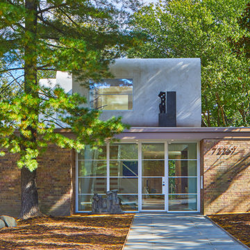
Designed in 1970 for an art collector, the existing referenced 70’s architectural principles. With its cadence of ‘70’s brick masses punctuated by a garage and a 4-foot-deep entrance recess. This recess, however, didn’t convey to the interior, which was occupied by disjointed service spaces. To solve, service spaces are moved and reorganized in open void in the garage. (See plan) This also organized the home: Service & utility on the left, reception central, and communal living spaces on the right.
To maintain clarity of the simple one-story 70’s composition, the second story add is recessive. A flex-studio/extra bedroom and office are designed ensuite creating a slender form and orienting them front to back and setting it back allows the add recede. Curves create a definite departure from the 70s home and by detailing it to "hover like a thought" above the first-floor roof and mentally removable sympathetic add.Existing unrelenting interior walls and a windowless entry, although ideal for fine art was unconducive for the young family of three. Added glass at the front recess welcomes light view and the removal of interior walls not only liberate rooms to communicate with each other but also reinform the cleared central entry space as a hub.
Even though the renovation reinforms its relationship with art, the joy and appreciation of art was not dismissed. A metal sculpture lost in the corner of the south side yard bumps the sculpture at the front entrance to the kitchen terrace over an added pedestal. (See plans) Since the roof couldn’t be railed without compromising the one-story '70s composition, the sculpture garden remains physically inaccessible however mirrors flanking the chimney allow the sculptures to be appreciated in three dimensions. The mirrors also afford privacy from the adjacent Tudor's large master bedroom addition 16-feet away.

 Jack Calderone
This custom kitchen is part of an adventuresome project my wife and I embarked upon to create a complete apartment in the basement of our townhouse. We designed a floor plan that creatively and efficiently used all of the 385-square-foot-space, without sacrificing beauty, comfort or function – and all without breaking the bank! To maximize our budget, we did the work ourselves and added everything from thrift store finds to DIY wall art to bring it all together.

 Saikley Architects
We updated this 1907 two-story family home for re-sale. We added modern design elements and amenities while retaining the home’s original charm in the layout and key details. The aim was to optimize the value of the property for a prospective buyer, within a reasonable budget.
New French doors from kitchen and a rear bedroom open out to a new bi-level deck that allows good sight lines, functional outdoor living space, and easy access to a garden full of mature fruit trees. French doors from an upstairs bedroom open out to a private high deck overlooking the garden. The garage has been converted to a family room that opens to the garden.
The bathrooms and kitchen were remodeled the kitchen with simple, light, classic materials and contemporary lighting fixtures. New windows and skylights flood the spaces with light. Stained wood windows and doors at the kitchen pick up on the original stained wood of the other living spaces.
New redwood picture molding was created for the living room where traces in the plaster suggested that picture molding has originally been. A sweet corner window seat at the living room was restored. At a downstairs bedroom we created a new plate rail and other redwood trim matching the original at the dining room. The original dining room hutch and woodwork were restored and a new mantel built for the fireplace.
We built deep shelves into space carved out of the attic next to upstairs bedrooms and added other built-ins for character and usefulness. Storage was created in nooks throughout the house. A small room off the kitchen was set up for efficient laundry and pantry space.
We provided the future owner of the house with plans showing design possibilities for expanding the house and creating a master suite with upstairs roof dormers and a small addition downstairs. The proposed design would optimize the house for current use while respecting the original integrity of the house.
Photography: John Hayes, Open Homes Photography
https://saikleyarchitects.com/portfolio/classic-craftsman-update/

 Cascade West Development
Paint by Sherwin Williams
Body Color - City Loft - SW 7631
Trim Color - Custom Color - SW 8975/3535
Master Suite & Guest Bath - Site White - SW 7070
Girls' Rooms & Bath - White Beet - SW 6287
Exposed Beams & Banister Stain - Banister Beige - SW 3128-B
Flooring & Tile by Macadam Floor & Design
Hardwood by Kentwood Floors
Hardwood Product Originals Series - Plateau in Brushed Hard Maple
Wall & Floor Tile by Macadam Floor & Design
Counter Backsplash, Shower Niche & Bathroom Floor by Tierra Sol
Backsplash & Shower Niche Product Driftwood Cronos Engraved in Bianco Cararra Mosaic
Bathroom Floor Product Portobello Marmi Classico in Bianco Cararra Herringbone
Shower Wall Tile by Surface Art Inc
Shower Wall Product A La Mode in Honed Mushroom
SMud Set Shower Pan by Emser Tile
Shower Wall Product Winter Frost in Mixed 1in Hexagons
Slab Countertops by Wall to Wall Stone Corp
Kitchen Quartz Product True North Calcutta
Master Suite Quartz Product True North Venato Extra
Girls' Bath Quartz Product True North Pebble Beach
All Other Quartz Product True North Light Silt
Windows by Milgard Windows & Doors
Window Product Style Line® Series
Window Supplier Troyco - Window & Door
Window Treatments by Budget Blinds
Lighting by Destination Lighting
Fixtures by Crystorama Lighting
Interior Design by Tiffany Home Design
Custom Cabinetry & Storage by Northwood Cabinets
Customized & Built by Cascade West Development
Photography by ExposioHDR Portland
Original Plans by Alan Mascord Design Associates
 Jack Calderone
This custom kitchen is part of an adventuresome project my wife and I embarked upon to create a complete apartment in the basement of our townhouse. We designed a floor plan that creatively and efficiently used all of the 385-square-foot-space, without sacrificing beauty, comfort or function – and all without breaking the bank! To maximize our budget, we did the work ourselves and added everything from thrift store finds to DIY wall art to bring it all together.
We don’t like the look of the standard plain panels on the sides of base cabinets, so we added square columns and shelves on the ends of the cabinets and island to dress them up.
 Donald Lococo Architects
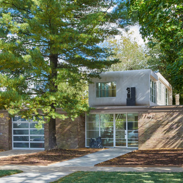
Designed in 1970 for an art collector, the existing referenced 70’s architectural principles. With its cadence of ‘70’s brick masses punctuated by a garage and a 4-foot-deep entrance recess. This recess, however, didn’t convey to the interior, which was occupied by disjointed service spaces. To solve, service spaces are moved and reorganized in open void in the garage. (See plan) This also organized the home: Service & utility on the left, reception central, and communal living spaces on the right.
To maintain clarity of the simple one-story 70’s composition, the second story add is recessive. A flex-studio/extra bedroom and office are designed ensuite creating a slender form and orienting them front to back and setting it back allows the add recede. Curves create a definite departure from the 70s home and by detailing it to "hover like a thought" above the first-floor roof and mentally removable sympathetic add.Existing unrelenting interior walls and a windowless entry, although ideal for fine art was unconducive for the young family of three. Added glass at the front recess welcomes light view and the removal of interior walls not only liberate rooms to communicate with each other but also reinform the cleared central entry space as a hub.
Even though the renovation reinforms its relationship with art, the joy and appreciation of art was not dismissed. A metal sculpture lost in the corner of the south side yard bumps the sculpture at the front entrance to the kitchen terrace over an added pedestal. (See plans) Since the roof couldn’t be railed without compromising the one-story '70s composition, the sculpture garden remains physically inaccessible however mirrors flanking the chimney allow the sculptures to be appreciated in three dimensions. The mirrors also afford privacy from the adjacent Tudor's large master bedroom addition 16-feet away.
Sponsored
Sunbury, OH

J.Holderby - Renovations
Franklin County's Leading General Contractors - 2X Best of Houzz!

 The Artisans Group, Inc.
Essential, contemporary, and inviting defines this extremely energy efficient, Energy Star certified, Passive House design-inspired home in the Pacific Northwest. Designed for an active family of four, the one-story 3 bedroom, 2 bath floor plan offers tasteful aging in place features, a strong sense of privacy for both kids and parents, and a low profile that doesn’t impinge on the natural landscape. This house will heat itself in the dead of winter with less energy than it takes to run a hair dryer, and be sensual to live in while it does it. The forms throughout the home are simple and neutral, allowing for ample natural light, rich warm materials, and of course, room for the Guinea pigs makes this a great example of artful architecture applied to a genuine family lifestyle.
This ultra energy efficient home relies on extremely high levels of insulation, air-tight detailing and construction, and the implementation of high performance, custom made European windows and doors by Zola Windows. Zola’s ThermoPlus Clad line, which boasts R-11 triple glazing and is thermally broken with a layer of patented German Purenit®, was selected for the project. Natural daylight enters both from the tilt & turn and fixed windows in the living and dining areas, and through the terrace door that leads seamlessly outside to the natural landscape.
Designed and constructed by The Artisans Group out of Olympia, Washington - a small but mighty firm co-owned by Randy Foster and Tessa Smith. Fun, funky and innovative, The Artisans Group has designed and built more Passive Houses than any other firm on the West Coast. Known for their striking, award winning, and sensible work, they provide solutions for projects of any size and budget.
Photography: Art Gray of Art Gray Photography

 Homeowner Services of Michigan LLC
Homeowner Services of Michigan (HSM) is excited to share the details of a new 16' x 22' family room expansion in Ann Arbor, Michigan. This project reflects our dedication to meeting our clients' specific needs.
Our clients approached us needing more space for their growing family and wanted a seamless integration with their existing home. After thorough consultations, we developed a plan to bring their vision to life.
The project began with careful architectural planning. We worked with a local architect to create detailed plans and secured all necessary permits to ensure compliance with local building codes.
Site preparation involved demolishing an existing carport, grading, and excavation to prepare the building pad for the new foundation. This step was essential to ensure a stable base for the construction.
Our team then focused on structural framing, tying the new addition to the existing home. We ensured that the new structure matched the current architectural style for a seamless blend. The addition was then roofed and sheathed to provide a sturdy and weatherproof exterior.
Next, we addressed the electrical work, installing new circuits for lighting, HVAC, and receptacles, and adding smoke and carbon monoxide detectors to meet safety standards. A licensed journeyman electrician performed the electrical service to ensure high-quality and compliant installations.
Insulation and drywall installation followed. We installed batt insulation to meet or exceed Michigan Energy Code requirements. The interior surfaces were finished with drywall, taping, mudding, sanding, and priming to prepare for painting. Baseboard molding and trim around doors and windows added the finishing touches.
Exterior features were also important. We framed and installed new windows and a front entry door and added a front eyebrow vent feature to match the existing structure. Vinyl siding was installed to complete the exterior, ensuring a cohesive look and enhanced curb appeal.
Throughout the project, we maintained a clean and professional worksite, disposing of debris responsibly and minimizing disruption to the client's daily lives. Our focus was always on delivering quality and ensuring client satisfaction.
This home addition project highlights our commitment to understanding and fulfilling our clients' needs. We are proud to have added valuable space and enhanced the overall functionality and aesthetic of the home.
These folks had a vision, a budget, and a whole lot of patience. We got through this family room remodel during a global pandemic. What great people to work with!
 Donald Lococo Architects
Designed in 1970 for an art collector, the existing referenced 70’s architectural principles. With its cadence of ‘70’s brick masses punctuated by a garage and a 4-foot-deep entrance recess. This recess, however, didn’t convey to the interior, which was occupied by disjointed service spaces. To solve, service spaces are moved and reorganized in open void in the garage. (See plan) This also organized the home: Service & utility on the left, reception central, and communal living spaces on the right.
To maintain clarity of the simple one-story 70’s composition, the second story add is recessive. A flex-studio/extra bedroom and office are designed ensuite creating a slender form and orienting them front to back and setting it back allows the add recede. Curves create a definite departure from the 70s home and by detailing it to "hover like a thought" above the first-floor roof and mentally removable sympathetic add.Existing unrelenting interior walls and a windowless entry, although ideal for fine art was unconducive for the young family of three. Added glass at the front recess welcomes light view and the removal of interior walls not only liberate rooms to communicate with each other but also reinform the cleared central entry space as a hub.
Even though the renovation reinforms its relationship with art, the joy and appreciation of art was not dismissed. A metal sculpture lost in the corner of the south side yard bumps the sculpture at the front entrance to the kitchen terrace over an added pedestal. (See plans) Since the roof couldn’t be railed without compromising the one-story '70s composition, the sculpture garden remains physically inaccessible however mirrors flanking the chimney allow the sculptures to be appreciated in three dimensions. The mirrors also afford privacy from the adjacent Tudor's large master bedroom addition 16-feet away.
 Drury Design
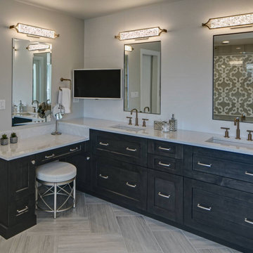
The original idea was to update the tile floor and the tub. That’s it.
A further discussion of wants and needs revealed intentions for an eventual larger shower and an improved vanity storage. It made sense to map out the possibilities and design our update with potential next steps in mind. The process was exciting, ultimately leading to the decision to do a full primary bath remodel.
Design Objectives:
-Maintain existing locations for all major bathroom functions
-Make the shower larger and more open
-Use luxurious materials throughout
-Improve vanity storage and define accessories for specific items
-Incorporate luxury shower fixtures
-Include the latest technology
Design Challenges
-Enlarging the shower in a typical rectangular shape would block the view and light from the alcove windows behind the tub
-Logical placement of the built-in shower caddy and all shower components in accordance with how and where they were to be used
-Keeping the long, back wall free from any shower modules to maintain the decorative tile design
-Combining the owner’s existing smart home system with a comprehensive shower system
-Planning cabinetry for hidden storage and use for various small appliances and make-up
-Integrating expensive shower wall tile with less expensive wall tile for aesthetic and budget purposes
-Incorporating special design features to balance the highly decorative shower tile
Design solutions:
-A clipped corner was planned for the shower bench seat – this allowed for a larger glass wall. The glass wall at the angled bench also brought more natural light into the shower
-Thoughtful shower space design prevented the crowding of features – the shower caddy and handheld shower head were placed on the full-height wall by the shower bench, the regular shower head and body sprays remained on the opposite wall, and the rain head was placed in the center of the shower
-A multi-port DTV system was installed, providing control of all shower components, including chromotherapy and music inside and outside the shower
-The lavish water-jet stone and glass decorative tile was paired with a less-expensive glass tile found in the mosaic
-Pull-out grooming organizers and electrical docking stations were incorporated into the cabinetry
Additional storage was created in the lower corner cabinet
The homeowners are thrilled with their new primary bathroom. Clear goals and carefully evaluated materials informed a fun and functional design that is both thoughtful and sumptuous!
Sponsored
Plain City, OH

The Creative Kitchen Company
Columbus Area Kitchen Remodeling and Refacing Professional
 Jay-Quinones Contracting Inc.
This was a complete kitchen renovation. The remodel included removing skylights and installing a two story bump up adding no square footage to the room but creating a dramatic visual even for the most discriminating designer. When you enter this kitchen your eyes wander trying to absorb the immense planning and detail that went into the renovation but ultimately you find yourself positioned under the large Theresa Maria chandelier gazing into the sky. The kitchen was designed around the 48 inch Thermador stove. The 2 story inset cabinet creation around the stove flows up into the addition creating a visual masterpiece that is only rivaled by original pieces of art works created by the likes of Van Gogh, Picasso and Rembrandt. The sink was relocated from the exterior wall and into the island so that the stove wall would be isolated and not connected any other cabinets. The 36-inch-wide refrigerator and 36-inch-wide freezer were designed and installed next to a microwave cabinet that makes heating up items as convenient as 1,2,3. The outside cabinet wall section is perfect for entertaining with the 42 inch base cabinets. The massive two-tiered island of 124 inches long is perfect for everyday family living. A farmer’s sink adds the perfect touch to this traditional design. Renovating a kitchen without ceiling detail is one of the most overlooked parts of the renovation. The amount of money spent on the renovation depends on the budget of course but I highly recommend including ceiling detail as much as one considers the tile backsplash.

 TaylorPro Design and Remodeling, Inc.
The owners lived in their home as we added this gorgeous contemporary master suite addition in Del Mar. We tore off the roof of the home, added a 2nd story 654 sqft master suite and successfully minimized the disruption to their daily lives. Working as a team throughout the process made this master suite renovation enjoyable for both the client and the TaylorPro team.
To quote the owners, "Kerry Taylor and his team were simply outstanding...We have very busy work lives and I need calm and order at home. I very much appreciated how Kerry and his team handled our project especially since we stayed in our home for this entire remodel process. Throughout it all, Kerry was a ready knowledgeable resource and always responsive to anything we raised or simply were curious about. The attention to detail and delivering a quality product was fabulous and sustained throughout the entire process. The finished project was even better than we hoped and we now feel that we have a transformed home. As a special plus, the budget was just as advertised! We were so happy that we actually added additional work to the project that I was planning to do at a later time. We couldn't be happier!"

 ALL Renovation & Design LLC
The Deistel’s had an ultimatum: either completely renovate their home exactly the way they wanted it and stay forever – or move.
Like most homes built in that era, the kitchen was semi-dysfunctional. The pantry and appliance placement were inconvenient. The layout of the rooms was not comfortable and did not fit their lifestyle.
Before making a decision about moving, they called Amos at ALL Renovation & Design to create a remodeling plan. Amos guided them through two basic questions: “What would their ideal home look like?” And then: “What would it take to make it happen?” To help with the first question, Amos brought in Ambience by Adair as the interior designer for the project.
Amos and Adair presented a design that, if acted upon, would transform their entire first floor into their dream space.
The plan included a completely new kitchen with an efficient layout. The style of the dining room would change to match the décor of antique family heirlooms which they hoped to finally enjoy. Elegant crown molding would give the office a face-lift. And to cut down cost, they would keep the existing hardwood floors.
Amos and Adair presented a clear picture of what it would take to transform the space into a comfortable, functional living area, within the Deistel’s reasonable budget. That way, they could make an informed decision about investing in their current property versus moving.
The Deistel’s decided to move ahead with the remodel.
The ALL Renovation & Design team got right to work.
Gutting the kitchen came first. Then came new painted maple cabinets with glazed cove panels, complemented by the new Arley Bliss Element glass tile backsplash. Armstrong Alterna Mesa engineered stone tiles transformed the kitchen floor.
The carpenters creatively painted and trimmed the wainscoting in the dining room to give a flat-panel appearance, matching the style of the heirloom furniture.
The end result is a beautiful living space, with a cohesive scheme, that is both restful and practical.
209