
Search results for "Cabinet ventilation" in Home Design Ideas

 Studio Wills + Architects
BLUE BOX of intense atmospheric quality, standing in stark contrast with the original pared-down interior.
Photography by Beton Brut.
Example of a transitional multicolored floor kitchen design in Singapore with a double-bowl sink, flat-panel cabinets, blue cabinets, stainless steel appliances and an island
Example of a transitional multicolored floor kitchen design in Singapore with a double-bowl sink, flat-panel cabinets, blue cabinets, stainless steel appliances and an island


 Studio Dearborn
A young family moving from NYC tackled a lightning fast makeover of their new colonial revival home before the arrival of their second child. The kitchen area was quite spacious but needed a facelift and new layout. Painted cabinetry matched to Benjamin Moore’s Light Pewter is balanced by grey glazed rift oak cabinetry on the island. Shiplap paneling on the island and cabinet lend a slightly contemporary edge. White bronze hardware by Schaub & Co. in a contemporary bar shape offer clean lines with some texture in a warm metallic tone.
White Marble countertops in “Alpine Mist” create a harmonious color palette while the pale blue/grey Waterworks backsplash adds a touch of color. Kitchen design and custom cabinetry by Studio Dearborn. Countertops by Rye Marble. Refrigerator, freezer and wine refrigerator--Subzero; Ovens--Wolf. Cooktop--Gaggenau. Ventilation—Sirius. Hardware--Schaub & Company. Sink--Kohler Strive. Sink faucet--Rohl. Tile--Waterworks. Stools--Palacek. Flooring—Sota Floors. Window treatments: www.horizonshades.com in “Northbrook Birch.” Photography Adam Kane Macchia.
Find the right local pro for your project

 ZeroEnergy Design
This renovated brick rowhome in Boston’s South End offers a modern aesthetic within a historic structure, creative use of space, exceptional thermal comfort, a reduced carbon footprint, and a passive stream of income.
DESIGN PRIORITIES. The goals for the project were clear - design the primary unit to accommodate the family’s modern lifestyle, rework the layout to create a desirable rental unit, improve thermal comfort and introduce a modern aesthetic. We designed the street-level entry as a shared entrance for both the primary and rental unit. The family uses it as their everyday entrance - we planned for bike storage and an open mudroom with bench and shoe storage to facilitate the change from shoes to slippers or bare feet as they enter their home. On the main level, we expanded the kitchen into the dining room to create an eat-in space with generous counter space and storage, as well as a comfortable connection to the living space. The second floor serves as master suite for the couple - a bedroom with a walk-in-closet and ensuite bathroom, and an adjacent study, with refinished original pumpkin pine floors. The upper floor, aside from a guest bedroom, is the child's domain with interconnected spaces for sleeping, work and play. In the play space, which can be separated from the work space with new translucent sliding doors, we incorporated recreational features inspired by adventurous and competitive television shows, at their son’s request.
MODERN MEETS TRADITIONAL. We left the historic front facade of the building largely unchanged - the security bars were removed from the windows and the single pane windows were replaced with higher performing historic replicas. We designed the interior and rear facade with a vision of warm modernism, weaving in the notable period features. Each element was either restored or reinterpreted to blend with the modern aesthetic. The detailed ceiling in the living space, for example, has a new matte monochromatic finish, and the wood stairs are covered in a dark grey floor paint, whereas the mahogany doors were simply refinished. New wide plank wood flooring with a neutral finish, floor-to-ceiling casework, and bold splashes of color in wall paint and tile, and oversized high-performance windows (on the rear facade) round out the modern aesthetic.
RENTAL INCOME. The existing rowhome was zoned for a 2-family dwelling but included an undesirable, single-floor studio apartment at the garden level with low ceiling heights and questionable emergency egress. In order to increase the quality and quantity of space in the rental unit, we reimagined it as a two-floor, 1 or 2 bedroom, 2 bathroom apartment with a modern aesthetic, increased ceiling height on the lowest level and provided an in-unit washer/dryer. The apartment was listed with Jackie O'Connor Real Estate and rented immediately, providing the owners with a source of passive income.
ENCLOSURE WITH BENEFITS. The homeowners sought a minimal carbon footprint, enabled by their urban location and lifestyle decisions, paired with the benefits of a high-performance home. The extent of the renovation allowed us to implement a deep energy retrofit (DER) to address air tightness, insulation, and high-performance windows. The historic front facade is insulated from the interior, while the rear facade is insulated on the exterior. Together with these building enclosure improvements, we designed an HVAC system comprised of continuous fresh air ventilation, and an efficient, all-electric heating and cooling system to decouple the house from natural gas. This strategy provides optimal thermal comfort and indoor air quality, improved acoustic isolation from street noise and neighbors, as well as a further reduced carbon footprint. We also took measures to prepare the roof for future solar panels, for when the South End neighborhood’s aging electrical infrastructure is upgraded to allow them.
URBAN LIVING. The desirable neighborhood location allows the both the homeowners and tenant to walk, bike, and use public transportation to access the city, while each charging their respective plug-in electric cars behind the building to travel greater distances.
OVERALL. The understated rowhouse is now ready for another century of urban living, offering the owners comfort and convenience as they live life as an expression of their values.
Photography: Eric Roth Photo

 M|R Walls
Bathroom Shower Ideas, Ceiling Mounted Shower, Bathroom Shower Designs, Rain Shower, Double Shower, Shower Room, Rain Shower Head, Bathroom Shower Designs, Led Shower Light, Luxury Shower System

 TKS Design Group
Free ebook, Creating the Ideal Kitchen. DOWNLOAD NOW
One of my favorite things to work on is older homes with a bit of history because I find it an interesting challenge to marry the historical architectural features of a home with modern design elements that work well for my client’s current lifestyle.
This home was particularly fun because it was the second kitchen we had done for this family and was quite a departure from the style of the first kitchen.
The before shot of the kitchen shows a view from the family room. See the dropped ceiling? We were curious, was this just part of the design or was the dropped ceiling there to hide mechanicals? Well we soon found out that it was mostly decorative (yay!), and with the exception of a little bit of work to some plumbing from an upstairs bathroom and rerouting of the ventilation system within the original floor joists, we were in the clear, phew! The shot of the completed kitchen from roughly the same vantage point shows how much taller the ceilings are. It makes a huge difference in the feel of the space. Dark and gloomy turned fresh and light!
Another serious consideration was what do we do with the skinny transom window above the refrigerator. After much back and forth, we decided to eliminate it and do some open shelving instead. This ended up being one of the nicest areas in the room. I am calling it the “fun zone” because it houses all the barware, wine cubbies and a bar fridge — the perfect little buffet spot for entertaining. It is flanked on either side by pull out pantries that I’m sure will get a ton of use. Since the neighboring room has literally three walls of almost full height windows, the kitchen gets plenty of light.
The gold shelving brackets, large pendant fixtures over the island and the tile mural behind the range all pay subtle homage to the home’s prairie style architecture and bring a bit of sparkle to the room.
Even though the room is quite large, the work triangle is very tight with the large Subzero fridge, sink and range all nearby for easy maneuvering during meal prep. There is seating for four at the island, and work aisles are generous.
Designed by: Susan Klimala, CKD, CBD
Photography by: LOMA Studios
For more information on kitchen and bath design ideas go to: www.kitchenstudio-ge.com

 Advance Design Studio, Ltd.
After six years of living in their Huntley IL home, Chris and Meghan were tired of their dark, dingy, outdated kitchen and it was finally time for a long-anticipated change. “The kitchen is the place where we live, it’s where we do everything,” Meghan said. “It was important that it be a space where we wanted to be.” Meghan loves cooking and enjoys including their girls in healthy meal prepping, this led them to want a brighter, more enjoyable kitchen with increased functionality and improved storage.
For Chris especially, the laundry room was an entirely dysfunctional eyesore. “We had a washer and a dryer, but it was all kind-of cobbled together!” Chris said. “There were always laundry piles everywhere, we weren’t really sure what we wanted to do in there, but it was time for us to make a change.” The mess of the space was stressful every time they walked in the door from the garage each day. Kids’ backpacks and shoes piled up haphazardly in the makeshift boot-bench closet left the family feeling disorganized and stressed. They needed space for folding clothes and locker cubbies to help keep the family organized.
Having known Christine and Todd in the Huntley community for years, Chris and Meghan were familiar with their work. “We already trusted them personally and having seen their projects for years we knew they did top notch work. After we reviewed the initial round of designs, we knew that hiring them was definitely the right choice,” Meghan and Chris said. Although Chris had done a lot of work in their home himself, the kitchen and laundry room renovation was such a large undertaking that he didn’t want to steal time away from his family to spend what would surely be many long weekends doing the job himself. “That would not have been a wise choice for us,” Chris laughed.
“Our designer, Michelle was very, very, easy to work with; anything we wanted to see or weren’t sure about, she went above and beyond to make this easy for us. She was easy to get hold of and always quick to respond,” the couple said. Michelle pulled ideas that mirrored the couple’s taste and style and was adept at directing the couple to limited choices that didn’t overwhelm them and kept the process moving. “I have a hard time making decisions. Michelle made the decision-making process so easy. I loved how she listened to what I liked and then presented three great options for me to choose from,” Meghan said.
The main objectives for the kitchen were better storage solutions, they wanted the space to reflect their lifestyle and taste, and they wanted it to last for years with low maintenance. One of the first steps in creating a more functional kitchen was relocating the refrigerator, creating an improved workflow for the busy family.
“We didn’t know that we could even move the refrigerator to a new location where it is now, that was something that we never would have thought of,” Chris said. “The new refrigerator location makes the kitchen feel so much bigger. We didn’t add any space, but our whole kitchen with the new design just seems like it’s so much larger than before!” Meghan said.
The perimeter mist colored cabinets helped warm and brighten the entire room, while the graphite colored cabinets on the island added contrast. Using this fresh, clean color palette satisfied the couple’s desire for a bright space that was the exact opposite of what they had before. Organization accessories were also added to the cabinets such as a spice drawer tray and roll outs to create hidden convenience.
“I absolutely love the hidden spices – it makes cooking so much more enjoyable!” Chris said. “And all the pull outs, and the double trash bin, who would think you could get so excited about organization!” the couple said in unison.
One thing they hated in their original kitchen was how dark the space felt. Added lighting on the ceiling with the new light fixtures combined with the lighter cabinetry colors throughout solved this problem. “Our new kitchen has this warm, almost cozy feeling that our old kitchen never had, it’s just a space that I love spending my time in now,” Meghan said. The light airy feeling was accentuated with the use of floating white shelves on either side of the decorative range hood. “We have so much cabinetry space, the new design is amazing we actually have more storage space than we will ever need,” Meghan said.
The island was extended to create more work surface and added space for stool seating. “The new island changes how we live. Now the kids can be in the kitchen with us, doing homework, eating breakfast, and the three of us have special dinners there when Chris is working late,” Meghan said.
The Carrara Marmi Quartz countertops were chosen because they are, not only beautiful, but are made from hard-working material that doesn’t require maintenance. The white subway tile backsplash that wraps to the ceiling behind the focal point cooktop range/hood compliments the crisp white countertops perfectly, while brushed brass hardware and light fixtures keep the design fresh and new.
The couple had a few fears at the beginning of the project, as most homeowners do. Their biggest fear was being out of their kitchen and laundry room for an extended time. The crew made it very easy for the family to work in a limited space keeping the washer and dryer hooked up the majority of the time, and also getting appliances working with minimal downtime.
“They above and beyond accommodated us to get us through the process,” Meghan said. “They did a great job making sure we were as comfortable as possible throughout the process,” Chris added.
“Our project manager DJ did a great job. He was very good at updating us on schedule changes, getting guys in as quickly as possible. Everyone that stepped in the house was nice and did great work,” said Chris. They thought Advance’s carpenter was phenomenal and were impressed when he took a conceptual idea from a photograph and worked with designer Michelle to create a one of a kind range/hood that has become the topic of conversation with friends and family who visit the new kitchen. “He was in our house literally every day for several weeks. He was easy to work with and good at what he did,” Meghan and Chris said.
The focal point of the kitchen; a hand-crafted, custom-built ventilation hood was clad with handpicked reclaimed barnwood. Advance Design’s carpenter built the framework and the cladding to create a one-of-a-kind design element that the couple loves.
“I think it was especially fun for him to create something unique from scratch, showcasing his talent in this area,” Meghan said. “I love that my kitchen is not like everyone else’s. I got to pick out the wood on my hood and watch it being built and was able to choose what pieces of wood went where on it. It’s totally unique.”
Red Oak flooring was toothed-in throughout the kitchen and the rest of the first floor anywhere changes were made. Then the whole floor was refinished to tone down the orange undertones in the existing floor stain, ultimately changing the color complexion of the entire first floor. The result is a completely new feeling to the entire home.
Renovating the laundry room was extremely important to Meghan and Chris, but they had trouble visualizing what the possibilities were for the seemingly small space. Michelle produced beautiful 3D illustrations that helped them envision the space in a whole new way.
“I must have told Michelle 100 times that I am a visual person, seeing the designs in 3D made it so easy to make decisions and see what we could really do with our space,” Meghan said.
A dividing wall and doorway were removed between the existing laundry room and hallway formerly containing a coat closet, providing space to design specialized graphite colored cabinetry matching the kitchen island to house custom storage cubbies for each family member. Adding the tall utility cabinetry in the new laundry area helped solve the storage issue, tucking away cleaning supplies, household items, and even the cat got its own cubby.
“I love how everything is now hidden in its own space. I can’t tell you how much I hated coming home and seeing everything sitting around on counters,” Chris said.
Electrical outlets were planned for the inside of utility cabinets, so devices could charge in hidden locations. Stacking the washer and dryer allowed for wider countertop space to provide a folding area and a special space for clothes to hang. “The way I do laundry has been completely transformed! I can actually fold clothes and hang them now right out of the washer and dryer,” Meghan said.
“The end result in the kitchen and the laundry/mud room was an updated light and bright space, with a smarter work flow that better meets the needs of this family,” Michelle said.
“I would totally recommend Advance Design,” Meghan said. “Sometimes I sit and just look at my kitchen and laundry room and think ‘Wow, I can’t believe I get to live here!’ It’s an understatement to say we love our new space.”
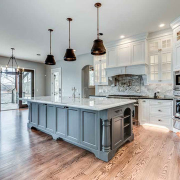
Sponsored
Fredericksburg, OH

High Point Cabinets
Columbus' Experienced Custom Cabinet Builder | 4x Best of Houzz Winner

 Pineapple House Interior Design
-The kitchen was isolated but was key to project’s success, as it is the central axis of the first level
-The designers renovated the entire lower level to create a configuration that opened the kitchen to every room on lower level, except for the formal dining room
-New double islands tripled the previous counter space and doubled previous storage
-Six bar stools offer ample seating for casual family meals and entertaining
-With a nod to the children, all upholstery in the Kitchen/ Breakfast Room are indoor/outdoor fabrics
-Removing & shortening walls between kitchen/family room/informal dining allows views, a total house connection, plus the architectural changes in these adjoining rooms enhances the kitchen experience
-Design aesthetic was to keep everything neutral with pops of color and accents of dark elements
-Cream cabinetry contrasts with dark stain accents on the island, hood & ceiling beams
-Back splash is over-scaled subway tile; pewter cabinetry hardware
-Fantasy Brown granite counters have a "leather-ed" finish
-The focal point and center of activity now stems from the kitchen – it’s truly the Heart of this Home.
Galina Coada Photography

 Ryan Hughes Design
The screened, open plan kitchen and media room offer space for family and friends to gather while delicious meals are prepared using the Fire Magic grill and Big Green Egg ceramic charcoal grill; drinks are kept cool in the refrigerator by Perlick. Plenty of room for everyone to comfortably relax on the sectional sofa by Patio Renaissance. The tile backsplash mirrors the fireplace’s brick face, providing visual continuity across the outdoor spaces.

 TZS Design
Traditionally detailed laundry room. The lattice screened cabinet is actually the end point for the laundry chute. Clothes on the floor above travel down a chute and into this cabinet.
 Studio Dearborn
A young family moving from NYC tackled a lightning fast makeover of their new colonial revival home before the arrival of their second child. The kitchen area was quite spacious but needed a facelift and new layout. Painted cabinetry matched to Benjamin Moore’s Light Pewter is balanced by grey glazed rift oak cabinetry on the island. Shiplap paneling on the island and cabinet lend a slightly contemporary edge. White bronze hardware by Schaub & Co. in a contemporary bar shape offer clean lines with some texture in a warm metallic tone.
White Marble countertops in “Alpine Mist” create a harmonious color palette while the pale blue/grey Waterworks backsplash adds a touch of color. Kitchen design and custom cabinetry by Studio Dearborn. Countertops by Rye Marble. Refrigerator, freezer and wine refrigerator--Subzero; Ovens--Wolf. Cooktop--Gaggenau. Hardware--Schaub & Company. Sink--Kohler Strive. Sink faucet--Rohl. Tile- Waterworks Architectonics 3x6 in the dust pressed line, Icewater color.. Stools--Palacek. Flooring—Sota Floors. Window treatments: www.horizonshades.com in “Northbrook Birch.” Photography Adam Kane Macchia.

 Martinkovic Milford Architects
©Scott Hargis Photo
Inspiration for a timeless galley dark wood floor eat-in kitchen remodel in San Francisco with an undermount sink, shaker cabinets, green cabinets, wood countertops, white backsplash, subway tile backsplash, stainless steel appliances and an island
Inspiration for a timeless galley dark wood floor eat-in kitchen remodel in San Francisco with an undermount sink, shaker cabinets, green cabinets, wood countertops, white backsplash, subway tile backsplash, stainless steel appliances and an island
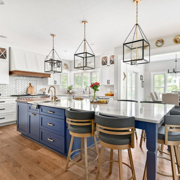
 Kowalske Kitchen & Bath
Inspiration for a huge transitional u-shaped vinyl floor and brown floor eat-in kitchen remodel in Milwaukee with a farmhouse sink, shaker cabinets, blue cabinets, quartzite countertops, white backsplash, subway tile backsplash, stainless steel appliances, an island and white countertops
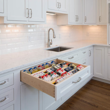


 John Thayer Cabinetmakers, LLC
Eric Roth Photography
Farmhouse l-shaped light wood floor kitchen photo in Boston with a farmhouse sink, shaker cabinets, light wood cabinets, white backsplash, stainless steel appliances and an island
Farmhouse l-shaped light wood floor kitchen photo in Boston with a farmhouse sink, shaker cabinets, light wood cabinets, white backsplash, stainless steel appliances and an island

 Design Manifest
High end, highly custom complete kitchen remodel with amazing details.
THE KEY FEATURES
- Dining Room Wall removed
- Island w/ sink, dishwasher and trash/recycling; eating area that seats 2-3 people on the other side
- Full height Pantry next to refrigerator
- 36″ paneled refrigerator
- 3 Work Zones: the island, left of the range, right of the range
- Snack Zone: a place away from the work zone to house the toaster, coffeemaker and microwave
- Dish/ Cutlery Storage: Two sets of dishes and cutlery also store in the cabinets on the snack zone wall.
- Ample Cooking storage: Two 45″ and 33″ base cabinets with adjustable roll-out shelves provide ample space for pots/ pans / cooking supplies
- Garden Window Relocated and Re-sized.
.
Photo by Courtney Apple

 Teakwood Builders, Inc.
It’s easy to find a place to sit or stash a coat in this comfortably organized mudroom.
Scott Bergmann Photography
Inspiration for a cottage slate floor mudroom remodel in Boston with a glass front door and white walls
Inspiration for a cottage slate floor mudroom remodel in Boston with a glass front door and white walls

 Kathy Marshall Design
Major renovation to a beautiful old Victorian outside of Boston. We opened up the kitchen to expose the original pantry, restored the old wood cabinets and painted the interiors a beautiful shade of navy blue. Exposed brick and added on a much needed mudroom and new entry to the kitchen, we were able to expose the back stair case and added batten and board on the walls. Beautiful.
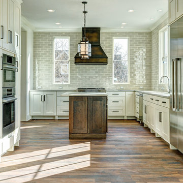
Sponsored
Columbus, OH

Hope Restoration & General Contracting
Columbus Design-Build, Kitchen & Bath Remodeling, Historic Renovations

 Talianko Design Group, LLC
Within the master bedroom was a small entry hallway and extra closet. A perfect spot to carve out a small laundry room. Full sized stacked washer and dryer fit perfectly with left over space for adjustable shelves to hold supplies. New louvered doors offer ventilation and work nicely with the home’s plantation shutters throughout. Photography by Erika Bierman

 Planning and Building, Inc
Patio kitchen - large transitional backyard concrete paver patio kitchen idea in Miami with a roof extension

 Build Nashville
Double shower - contemporary gray tile and mosaic tile gray floor and single-sink double shower idea in Nashville with flat-panel cabinets, black cabinets, a vessel sink, a hinged shower door, white countertops, a niche and a floating vanity
5