
Search results for "Carefully deciding" in Home Design Ideas
 Hive Home
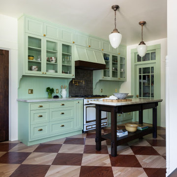
Since it was built in 1910 by Alfred and Grace Hare this home has been lovingly cared for by it’s past and present owners, and for that care it was declared a Los Angeles Historic Cultural Monument. The home’s charm is everywhere: stone porch, shingles, original wood wainscoting and trims, glass buffet, but our clients’ young family had desperately outgrown the tiny kitchen. With thought, care, and quality workmanship an addition at the rear afforded them a new kitchen and main bedroom suite. Hive Home designed the kitchen to marry modern function with the home’s historic whimsy, creating a fresh space that feels right at home. The main bath is a soothing respite with a custom colored historic tile floor and a generous shower space. So many subtle details were decided on (keep an eye out for the hares), and we couldn’t be more thrilled with the result. We hope our clients love their new space for many happy years to come!
 Edgewater Design Group
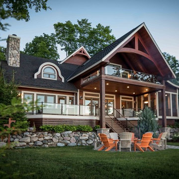
We were hired to add space to their cottage while still maintaining the current architectural style. We enlarged the home's living area, created a larger mudroom off the garage entry, enlarged the screen porch and created a covered porch off the dining room and the existing deck was also enlarged. On the second level, we added an additional bunk room, bathroom, and new access to the bonus room above the garage. The exterior was also embellished with timber beams and brackets as well as a stunning new balcony off the master bedroom. Trim details and new staining completed the look.
- Jacqueline Southby Photography
 Advance Design Studio, Ltd.
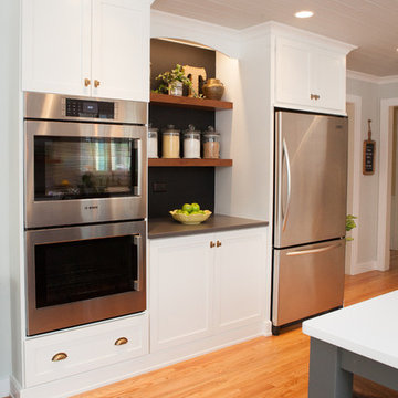
When this suburban family decided to renovate their kitchen, they knew that they wanted a little more space. Advance Design worked together with the homeowner to design a kitchen that would work for a large family who loved to gather regularly and always ended up in the kitchen! So the project began with extending out an exterior wall to accommodate a larger island and more moving-around space between the island and the perimeter cabinetry.
Style was important to the cook, who began collecting accessories and photos of the look she loved for months prior to the project design. She was drawn to the brightness of whites and grays, and the design accentuated this color palette brilliantly with the incorporation of a warm shade of brown woods that originated from a dining room table that was a family favorite. Classic gray and white cabinetry from Dura Supreme hits the mark creating a perfect balance between bright and subdued. Hints of gray appear in the bead board detail peeking just behind glass doors, and in the application of the handsome floating wood shelves between cabinets. White subway tile is made extra interesting with the application of dark gray grout lines causing it to be a subtle but noticeable detail worthy of attention.
Suede quartz Silestone graces the countertops with a soft matte hint of color that contrasts nicely with the presence of white painted cabinetry finished smartly with the brightness of a milky white farm sink. Old melds nicely with new, as antique bronze accents are sprinkled throughout hardware and fixtures, and work together unassumingly with the sleekness of stainless steel appliances.
The grace and timelessness of this sparkling new kitchen maintains the charm and character of a space that has seen generations past. And now this family will enjoy this new space for many more generations to come in the future with the help of the team at Advance Design Studio.
Dura Supreme Cabinetry
Photographer: Joe Nowak
Find the right local pro for your project
 Studio Shed - Live Large. Build Small.
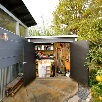
4x8 Pinyon Studio SHED - these are a great way to store anything from lawn tools to art supplies or athletic gear. The Pinyon comes flat packed and is shipped as a DIY installation - a 1-2 day project depending on your building experience. One owner had his up in just 3 hours! Many choose to install their Pinyon against the side of their home. Pictured here: a Pinyon sits perpendicular to it's big brother, a 10x12 Studio Shed home office.
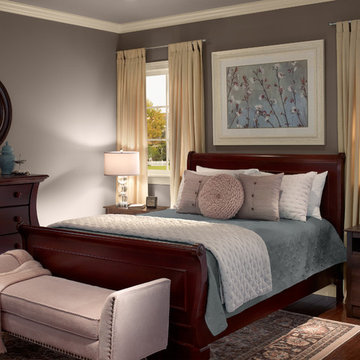
 BEHR®
BEHR®Wall Color: Smoky Trout MQ2-53
Trim Color: Scribe MQ2-31
Bedroom - contemporary bedroom idea in Orange County
Bedroom - contemporary bedroom idea in Orange County
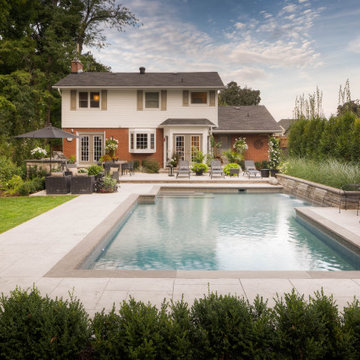
 Betz Pools Limited
This family in Georgetown decided to create a backyard oasis which would be the focal point for fun during the summer. The overall look is a classic take on modern design which complements the traditional architecture of the home. Care was taken to balance patio space with ample lawn area for children’s play.
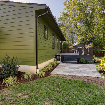
 Meadowlark Design+Build
Our client decided to move back into her family home to take care of her aging father. A remodel and size-appropriate addition transformed this home to allow both generations to live safely and comfortably. This remodel and addition was designed and built by Meadowlark Design+Build in Ann Arbor, Michigan. Photo credits Sean Carter
Sponsored
Columbus, OH

Hope Restoration & General Contracting
Columbus Design-Build, Kitchen & Bath Remodeling, Historic Renovations
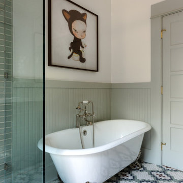 Hive Home
Since it was built in 1910 by Alfred and Grace Hare this home has been lovingly cared for by it’s past and present owners, and for that care it was declared a Los Angeles Historic Cultural Monument. The home’s charm is everywhere: stone porch, shingles, original wood wainscoting and trims, glass buffet, but our clients’ young family had desperately outgrown the tiny kitchen. With thought, care, and quality workmanship an addition at the rear afforded them a new kitchen and main bedroom suite. Hive Home designed the kitchen to marry modern function with the home’s historic whimsy, creating a fresh space that feels right at home. The main bath is a soothing respite with a custom colored historic tile floor and a generous shower space. So many subtle details were decided on (keep an eye out for the hares), and we couldn’t be more thrilled with the result. We hope our clients love their new space for many happy years to come!
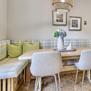
 Lori Pedersen Home
This home was custom built many decades ago, and had a character all its own. We decided to brighten it up with a fresh coat of paint, and some carefully chosen furnishings. We embraced the retro feeling, and it stood out when compared to all the other "McMansions" in the area. It sold in 19days, in a languishing market. Thrilled for the sellers, and excited that the new buyers will love it and make it their own.
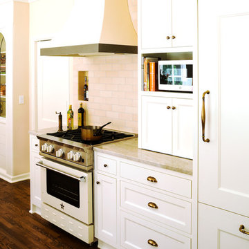
 Jenni Leasia Interior Design
The dark wood floors of the kitchen are balanced with white inset shaker cabinets with a light brown polished countertop. The wall cabinets feature glass doors and are topped with tall crown molding. Brass hardware has been used for all the cabinets. For the backsplash, we have used a soft beige. The countertop features a double bowl undermount sink with a gooseneck faucet. The windows feature roman shades in a floral print. A white BlueStar range is topped with a custom hood.
Project by Portland interior design studio Jenni Leasia Interior Design. Also serving Lake Oswego, West Linn, Vancouver, Sherwood, Camas, Oregon City, Beaverton, and the whole of Greater Portland.
For more about Jenni Leasia Interior Design, click here: https://www.jennileasiadesign.com/
To learn more about this project, click here:
https://www.jennileasiadesign.com/montgomery
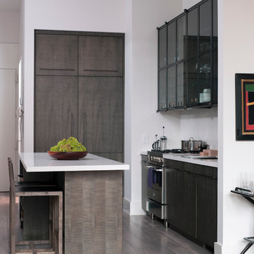
 DHD Architecture and Interior Design
2 Bedrooms / 2,200 Square Feet
This pied-à-terre loft with soaring fourteen foot ceilings, sits within a classic cast iron building in the heart of Noho, NYC. It is home to a couple who are serious about their art. DHD worked on this project from the onset of design and construction, allowing for a clear harmony between the architecture and design. The wide plank grey oak floors and white gallery walls set the palette for an art filled environment. A custom designed silk rug fills the main space, while the large-scale Lindsey Adelman light installation hangs above. The furniture, a mix of vintage and classic contemporary, were carefully curated to create a home that is elegant and subtle yet eclectic. The use of cowhide, mohair, woven leather and velvet create subtle textures against the painted brick and wood planked walls.
Artists: Burning plane photo: Richard Mosse
Sculpture coffee table: Roy Gussow
Drawings in the wall unit: Louise Bourgeois and Tracey Emin
Custom Metal Artist: Todd Fouser of Face Design & Fabrication
http://facedesign.com
Photography by: Rick Lew
www.ricklew.com
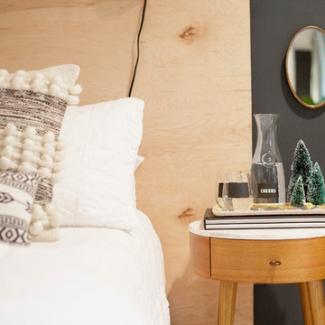
 Margaret Wright Photography
Photo: Margaret Wright © 2017 Houzz
Styling: Liz Martin
Bedroom - 1960s bedroom idea in Charleston
Bedroom - 1960s bedroom idea in Charleston
 MAAM
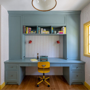
MAAMThis charming house was built in 1924 with all the aspiration of the California transplants of that era - mimicking a traditional, English cottage built into the hillside of scenic Los Feliz. When our clients moved in, nearly 100 years later, the house was suffering from a poorly-built, 2006 addition which was a jumble of walls and bathrooms that also turned out to be a breeding ground for black mold. After careful remediation, the clients decided to make the most of the fact that their primary suite had been taken down to the studs by reconceiving the layout of the 300 sf wing to accommodate a generous new primary bathroom, walk-in closet and convertible home office / guest bedroom.
Sponsored
Columbus, OH
Hope Restoration & General Contracting
Columbus Design-Build, Kitchen & Bath Remodeling, Historic Renovations
 MAAM
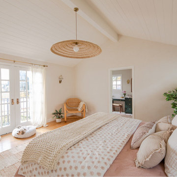
MAAMThis charming house was built in 1924 with all the aspiration of the California transplants of that era - mimicking a traditional, English cottage built into the hillside of scenic Los Feliz. When our clients moved in, nearly 100 years later, the house was suffering from a poorly-built, 2006 addition which was a jumble of walls and bathrooms that also turned out to be a breeding ground for black mold. After careful remediation, the clients decided to make the most of the fact that their primary suite had been taken down to the studs by reconceiving the layout of the 300 sf wing to accommodate a generous new primary bathroom, walk-in closet and convertible home office / guest bedroom.
 MAAM
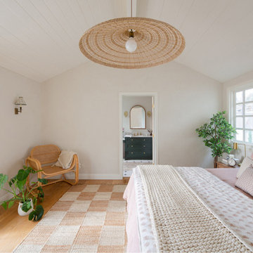
MAAMThis charming house was built in 1924 with all the aspiration of the California transplants of that era - mimicking a traditional, English cottage built into the hillside of scenic Los Feliz. When our clients moved in, nearly 100 years later, the house was suffering from a poorly-built, 2006 addition which was a jumble of walls and bathrooms that also turned out to be a breeding ground for black mold. After careful remediation, the clients decided to make the most of the fact that their primary suite had been taken down to the studs by reconceiving the layout of the 300 sf wing to accommodate a generous new primary bathroom, walk-in closet and convertible home office / guest bedroom.
 ZeroEnergy Design
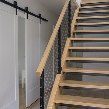
This modern green home offers both a vacation destination on Cape Cod near local family members and an opportunity for rental income.
FAMILY ROOTS. A West Coast couple living in the San Francisco Bay Area sought a permanent East Coast vacation home near family members living on Cape Cod. As academic professionals focused on sustainability, they sought a green, energy efficient home that was well-aligned with their values. With no green homes available for sale on Cape Cod, they decided to purchase land near their family and build their own.
SLOPED SITE. Comprised of a 3/4 acre lot nestled in the pines, the steeply sloping terrain called for a plan that embraced and took advantage of the slope. Of equal priority was optimizing solar exposure, preserving privacy from abutters, and creating outdoor living space. The design accomplished these goals with a simple, rectilinear form, offering living space on the both entry and lower/basement levels. The stepped foundation allows for a walk-out basement level with light-filled living space on the down-hill side of the home. The traditional basement on the eastern, up-hill side houses mechanical equipment and a home gym. The house welcomes natural light throughout, captures views of the forest, and delivers entertainment space that connects indoor living space to outdoor deck and dining patio.
MODERN VISION. The clean building form and uncomplicated finishes pay homage to the modern architectural legacy on the outer Cape. Durable and economical fiber cement panels, fixed with aluminum channels, clad the primary form. Cedar clapboards provide a visual accent at the south-facing living room, which extends a single roof plane to cover the entry porch.
SMART USE OF SPACE. On the entry level, the “L”-shaped living, dining, and kitchen space connects to the exterior living, dining, and grilling spaces to effectively double the home’s summertime entertainment area. Placed at the western end of the entry level (where it can retain privacy but still claim expansive downhill views) is the master suite with a built-in study. The lower level has two guest bedrooms, a second full bathroom, and laundry. The flexibility of the space—crucial in a house with a modest footprint—emerges in one of the guest bedrooms, which doubles as home office by opening the barn-style double doors to connect it to the bright, airy open stair leading up to the entry level. Thoughtful design, generous ceiling heights and large windows transform the modest 1,100 sf* footprint into a well-lit, spacious home. *(total finished space is 1800 sf)
RENTAL INCOME. The property works for its owners by netting rental income when the owners are home in San Francisco. The house especially caters to vacationers bound for nearby Mayo Beach and includes an outdoor shower adjacent to the lower level entry door. In contrast to the bare bones cottages that are typically available on the Cape, this home offers prospective tenants a modern aesthetic, paired with luxurious and green features. Durable finishes inside and out will ensure longevity with the heavier use that comes with a rental property.
COMFORT YEAR-ROUND. The home is super-insulated and air-tight, with mechanical ventilation to provide continuous fresh air from the outside. High performance triple-paned windows complement the building enclosure and maximize passive solar gain while ensuring a warm, draft-free winter, even when sitting close to the glass. A properly sized air source heat pump offers efficient heating & cooling, and includes a carefully designed the duct distribution system to provide even comfort throughout the house. The super-insulated envelope allows us to significantly reduce the equipment capacity, duct size, and airflow quantities, while maintaining unparalleled thermal comfort.
ENERGY EFFICIENT. The building’s shell and mechanical systems play instrumental roles in the home’s exceptional performance. The building enclosure reduces the most significant energy glutton: heating. Continuous super-insulation, thorough air sealing, triple-pane windows, and passive solar gain work together to yield a miniscule heating load. All active energy consumers are extremely efficient: an air source heat pump for heating and cooling, a heat pump hot water heater, LED lighting, energy recovery ventilation (ERV), and high efficiency appliances. The result is a home that uses 70% less energy than a similar new home built to code requirements.
OVERALL. The home embodies the owners’ goals and values while comprehensively enabling thermal comfort, energy efficiency, a vacation respite, and supplementary income.
PROJECT TEAM
ZeroEnergy Design - Architect & Mechanical Designer
A.F. Hultin & Co. - Contractor
Pamet Valley Landscape Design - Landscape & Masonry
Lisa Finch - Original Artwork
European Architectural Supply - Windows
Eric Roth Photography - Photography
 ODS Architecture
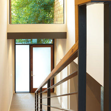
Located in Menlo Park, California, this 3,000 sf. remodel was carefully crafted to generate excitement and make maximum use of the owner’s strict budget and comply with the city’s stringent planning code. It was understood that not everything was to be redone from a prior owner’s quirky remodel which included odd inward angled walls, circular windows and cedar shingles.
Remedial work to remove and prevent dry rot ate into the budget as well. Studied alterations to the exterior include a new trellis over the garage door, pushing the entry out to create a new soaring stair hall and stripping the exterior down to simplify its appearance. The new steel entry stair leads to a floating bookcase that pivots to the family room. For budget reasons, it was decided to keep the existing cedar shingles.
Upstairs, a large oak multi-level staircase was replaced with the new simple run of stairs. The impact of angled bedroom walls and circular window in the bathroom were calmed with new clean white walls and tile.
Photo Credit: John Sutton Photography.
 Meadowlark Design+Build
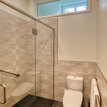
Our client decided to move back into her family home to take care of her aging father. A remodel and size-appropriate addition transformed this home to allow both generations to live safely and comfortably. Aging-in-place design strategies were used in the new master bathroom on the first floor. Photo credits Sean Carter
 dirzobriceno@gmail.com
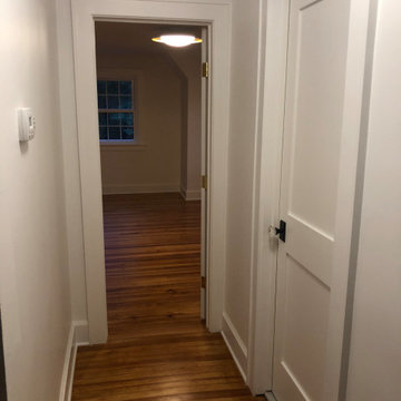
A young couple from New York decided to move to the peaceful area of Stamford. They bought a house that needed the love and vision of my clients. We removed the wallpaper and applied a skim coat of plaster to the entire upper area of the house to resurface the walls that had been poorly treated over time and were hidden beneath the wallpaper. It was an intense and careful job because the walls are made of plaster, a type of material used over 40 years ago. We covered areas like the floor and other details that should not be damaged or painted.
 MAAM
MAAMThis charming house was built in 1924 with all the aspiration of the California transplants of that era - mimicking a traditional, English cottage built into the hillside of scenic Los Feliz. When our clients moved in, nearly 100 years later, the house was suffering from a poorly-built, 2006 addition which was a jumble of walls and bathrooms that also turned out to be a breeding ground for black mold. After careful remediation, the clients decided to make the most of the fact that their primary suite had been taken down to the studs by reconceiving the layout of the 300 sf wing to accommodate a generous new primary bathroom, walk-in closet and convertible home office / guest bedroom.
11