
Search results for "Challenging task" in Home Design Ideas

 Wirkkala Woodworks
This family is beyond creative! They chose a rich flannel grey color for the majority of the cabinetry to compliment the stark white on the remainder of the cabinetry. The eclectic choice of mouldings made this job an exciting project to work on. This is a one of kind kitchen and one of my favorites. Additional challenge on this job: They kept their existing counter tops and had me put in all new cabinets underneath - that was a task that I mastered. For your cabinetry or remodeling needs, Contact WIRKKALA WOODWORKS at (949) 633 4018

 Dado Interior Design
The Challenge
This original mid-century Colorado Springs home hadn’t been updated in 40 years. We were tasked with transforming a dysfunctional, outdated space into a seamless design that maintained the integrity of the original architecture - including a challenging layout, seven different flooring types, and old lighting and electrical.
The Solution
Within a limited budget we streamlined the finish palette with natural materials to play with the concept of indoor/outdoor living; gutted the bedrooms and combined two guest rooms into one large master suite; updated the electrical with recessed cans and Noguchi fixtures (which pay homage to the home’s 1960s roots); and filled the home with new furniture and accessories that speak to the homeowner’s love of modern design.
Dado Interior Design
Location: Denver, CO, USA
Photographed by: JC Buck
 Van Eeuwen Construction Corp.
Just found some pics of an aprox 4,000+ square foot second floor residential addition we built in 2011. Originally we built the commercial part of the building (animal hospital) in 2002. This was not an easy task to accomplish this "mixed use" residential addition during all operating hours of the animal hospital.This project was a great example of uncompromising quality, construction time, and ancillary factors to keep the hospital running during"business as usual". Additionally we worked threw that very snowy winter to meet our deadline. Then again, we do love to challenge ourselves to keep things interesting! (22 photos)
Find the right local pro for your project
 Van Eeuwen Construction Corp.
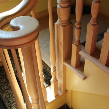
Just found some pics of an aprox 4,000+ square foot second floor residential addition we built in 2011. Originally we built the commercial part of the building (animal hospital) in 2002. This was not an easy task to accomplish this "mixed use" residential addition during all operating hours of the animal hospital.This project was a great example of uncompromising quality, construction time, and ancillary factors to keep the hospital running during"business as usual". Additionally we worked threw that very snowy winter to meet our deadline. Then again, we do love to challenge ourselves to keep things interesting! (22 photos)
 Van Eeuwen Construction Corp.
Just found some pics of an aprox 4,000+ square foot second floor residential addition we built in 2011. Originally we built the commercial part of the building (animal hospital) in 2002. This was not an easy task to accomplish this "mixed use" residential addition during all operating hours of the animal hospital.This project was a great example of uncompromising quality, construction time, and ancillary factors to keep the hospital running during"business as usual". Additionally we worked threw that very snowy winter to meet our deadline. Then again, we do love to challenge ourselves to keep things interesting! (22 photos)

 Native Edge Landscape
We had a several challenges to face with this project. Not only did we need to update a dated landscape to accommodate two seemingly different design tastes (modern & minimalistic vs natural english garden), we were tasked with improving the property’s drainage, improving the driveway access, reducing water usage and plant maintenance, and fixing a crumbling wall.
To marry the two design tastes, we started with the more modern elements of metal planters and softened the landscape with mass plantings of ornamental grasses and native sedge. These grasses act as a turf replacement that do not need to be mowed and require less regular watering. On each side of the yard we constructed new cedar fences to provide updated and additional privacy. In addition, we poured a new concrete wall to replace the existing retaining wall and play off the new modern vibe.
 Dado Interior Design
The Challenge
This original mid-century Colorado Springs home hadn’t been updated in 40 years. We were tasked with transforming a dysfunctional, outdated space into a seamless design that maintained the integrity of the original architecture - including a challenging layout, seven different flooring types, and old lighting and electrical.
The Solution
Within a limited budget we streamlined the finish palette with natural materials to play with the concept of indoor/outdoor living; gutted the bedrooms and combined two guest rooms into one large master suite; updated the electrical with recessed cans and Noguchi fixtures (which pay homage to the home’s 1960s roots); and filled the home with new furniture and accessories that speak to the homeowner’s love of modern design.
Dado Interior Design
Location: Denver, CO, USA
Photographed by: JC Buck



 M.O.Daby Design
Conceived more similar to a loft type space rather than a traditional single family home, the homeowner was seeking to challenge a normal arrangement of rooms in favor of spaces that are dynamic in all 3 dimensions, interact with the yard, and capture the movement of light and air.
As an artist that explores the beauty of natural objects and scenes, she tasked us with creating a building that was not precious - one that explores the essence of its raw building materials and is not afraid of expressing them as finished.
We designed opportunities for kinetic fixtures, many built by the homeowner, to allow flexibility and movement.
The result is a building that compliments the casual artistic lifestyle of the occupant as part home, part work space, part gallery. The spaces are interactive, contemplative, and fun.
More details to come.
credits:
design: Matthew O. Daby - m.o.daby design /
construction: Cellar Ridge Construction /
structural engineer: Darla Wall - Willamette Building Solutions /
photography: Erin Riddle - KLIK Concepts
 Native Edge Landscape
We had a several challenges to face with this project. Not only did we need to update a dated landscape to accommodate two seemingly different design tastes (modern & minimalistic vs natural english garden), we were tasked with improving the property’s drainage, improving the driveway access, reducing water usage and plant maintenance, and fixing a crumbling wall.
To marry the two design tastes, we started with the more modern elements of metal planters and softened the landscape with mass plantings of ornamental grasses and native sedge. These grasses act as a turf replacement that do not need to be mowed and require less regular watering. On each side of the yard we constructed new cedar fences to provide updated and additional privacy. In addition, we poured a new concrete wall to replace the existing retaining wall and play off the new modern vibe.
 Native Edge Landscape
We had a several challenges to face with this project. Not only did we need to update a dated landscape to accommodate two seemingly different design tastes (modern & minimalistic vs natural english garden), we were tasked with improving the property’s drainage, improving the driveway access, reducing water usage and plant maintenance, and fixing a crumbling wall.
To marry the two design tastes, we started with the more modern elements of metal planters and softened the landscape with mass plantings of ornamental grasses and native sedge. These grasses act as a turf replacement that do not need to be mowed and require less regular watering. On each side of the yard we constructed new cedar fences to provide updated and additional privacy. In addition, we poured a new concrete wall to replace the existing retaining wall and play off the new modern vibe.
 Dado Interior Design
The Challenge
This original mid-century Colorado Springs home hadn’t been updated in 40 years. We were tasked with transforming a dysfunctional, outdated space into a seamless design that maintained the integrity of the original architecture - including a challenging layout, seven different flooring types, and old lighting and electrical.
The Solution
Within a limited budget we streamlined the finish palette with natural materials to play with the concept of indoor/outdoor living; gutted the bedrooms and combined two guest rooms into one large master suite; updated the electrical with recessed cans and Noguchi fixtures (which pay homage to the home’s 1960s roots); and filled the home with new furniture and accessories that speak to the homeowner’s love of modern design.
Dado Interior Design
Location: Denver, CO, USA
Photographed by: JC Buck
 M.O.Daby Design
Conceived more similar to a loft type space rather than a traditional single family home, the homeowner was seeking to challenge a normal arrangement of rooms in favor of spaces that are dynamic in all 3 dimensions, interact with the yard, and capture the movement of light and air.
As an artist that explores the beauty of natural objects and scenes, she tasked us with creating a building that was not precious - one that explores the essence of its raw building materials and is not afraid of expressing them as finished.
We designed opportunities for kinetic fixtures, many built by the homeowner, to allow flexibility and movement.
The result is a building that compliments the casual artistic lifestyle of the occupant as part home, part work space, part gallery. The spaces are interactive, contemplative, and fun.
More details to come.
credits:
design: Matthew O. Daby - m.o.daby design
construction: Cellar Ridge Construction
structural engineer: Darla Wall - Willamette Building Solutions
photography: Erin Riddle - KLIK Concepts

 Elza B. Design, Inc.
Upon moving to a new home, this couple chose to convert two small guest baths into one large luxurious space including a Japanese soaking tub and custom glass shower with rainfall spout. Two floating vanities in a walnut finish topped with composite countertops and integrated sinks flank each wall. Due to the pitched walls, Barbara worked with both an industrial designer and mirror manufacturer to design special clips to mount the vanity mirrors, creating a unique and modern solution in a challenging space.
The mix of travertine floor tiles with glossy cream wainscotting tiles creates a warm and inviting feel in this bathroom. Glass fronted shelving built into the eaves offers extra storage for towels and accessories. A oil-rubbed bronze finish lantern hangs from the dramatic ceiling while matching finish sconces add task lighting to the vanity areas.
This project was featured in Boston Magazine Home Design section entitiled "Spaces: Bathing Beauty" in the March 2018 issue. Click here for a link to the article:
https://www.bostonmagazine.com/property/2018/03/27/elza-b-design-bathroom-transformation/
Photography: Jared Kuzia

 Gilmans Kitchens and Baths
The challenge of modernizing this 1970’s kitchen was its high ceilings. A dark color pallet was selected to keep the focus at eye level. A wall was removed to create symmetry within the space. To balance the dark pallet, lights where added above and under the cabinets.
Treve Johnson Photography

 Nathan Taylor for Obelisk Home
This 1970’s Ranch was purchased by a young family with active boys and animals. Changes were needed in this home for the family to be comfortable. With a very limited budget, Obelisk Home was challenged to be creative but keep with the clients sensibilities. We painted paneling, painted trim in custom colors, and took the room to a new level. High gloss paint on brick added to a bright open feel. New art, lighting, furniture and accessories were brought in to work with existing furniture that was incorporated from the clients Oklahoma home. Old, dark and full becomes light, airy and cozy.
Original Artwork by Kat Allie
Photos by Jeremy Mason McGraw
 Native Edge Landscape
We had a several challenges to face with this project. Not only did we need to update a dated landscape to accommodate two seemingly different design tastes (modern & minimalistic vs natural english garden), we were tasked with improving the property’s drainage, improving the driveway access, reducing water usage and plant maintenance, and fixing a crumbling wall.
To marry the two design tastes, we started with the more modern elements of metal planters and softened the landscape with mass plantings of ornamental grasses and native sedge. These grasses act as a turf replacement that do not need to be mowed and require less regular watering. On each side of the yard we constructed new cedar fences to provide updated and additional privacy. In addition, we poured a new concrete wall to replace the existing retaining wall and play off the new modern vibe.
 Native Edge Landscape
We had a several challenges to face with this project. Not only did we need to update a dated landscape to accommodate two seemingly different design tastes (modern & minimalistic vs natural english garden), we were tasked with improving the property’s drainage, improving the driveway access, reducing water usage and plant maintenance, and fixing a crumbling wall.
To marry the two design tastes, we started with the more modern elements of metal planters and softened the landscape with mass plantings of ornamental grasses and native sedge. These grasses act as a turf replacement that do not need to be mowed and require less regular watering. On each side of the yard we constructed new cedar fences to provide updated and additional privacy. In addition, we poured a new concrete wall to replace the existing retaining wall and play off the new modern vibe.

 Orren Pickell Building Group
A home office off the kitchen can be concealed with a pocket door. Gray-painted maple Wood-Mode cabinetry complements the kitchen finishes but makes the space unique.
**Project Overview**
A small, quiet, efficient office space for one that is perfect for sorting mail and paying bills. Though small it has a great deal of natural light and views out the front of the house of the lush landscaping and wildlife. A pocket door makes the office disappear when it's time to entertain.
**What Makes This Project Unique?**
Small yet incredibly functional, this desk space is a comfortable, quiet place to catch up on home management tasks. Filled with natural light and offering a view of lush landscaping, the compact space is light and airy. To keep it from feeling cramped or crowded, we complemented warm gray-painted maple cabinetry with light countertops and tile. Taller ceilings allow ample storage, including full-height open storage, to manage all of the papers, files and extras that find their way into the home.
**Design Challenges**
While the office was intentionally designed into a tiny nook off the kitchen and pantry, we didn't want it to feel small for the people using it. By keeping the color palette light, taking cabinetry to the ceiling, incorporating open storage and maximizing natural light, the space feels cozy, and larger than it actually is.
Photo by MIke Kaskel.
 Legacy Builders Group
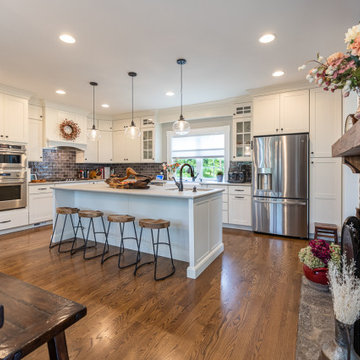
This 1800s-era Fort Mitchell farmhouse renovation has been a labor of love. Updating historical homes while preserving their character is a challenging but honorable task. This project included remodeling the kitchen, an outdoor space, and crafting a great room addition that seamlessly blends with the rest of the house. See more images of this stunning renovation on our website. This kitchen was relocated in this 1800s farmhouse. Existing fireplace was retrofitted and turned into double sided fireplace for the new great room addition.
Legacy cut and removed a portion of the existing stone and firebrick to create a see-through fireplace
 Native Edge Landscape
We had a several challenges to face with this project. Not only did we need to update a dated landscape to accommodate two seemingly different design tastes (modern & minimalistic vs natural english garden), we were tasked with improving the property’s drainage, improving the driveway access, reducing water usage and plant maintenance, and fixing a crumbling wall.
To marry the two design tastes, we started with the more modern elements of metal planters and softened the landscape with mass plantings of ornamental grasses and native sedge. These grasses act as a turf replacement that do not need to be mowed and require less regular watering. On each side of the yard we constructed new cedar fences to provide updated and additional privacy. In addition, we poured a new concrete wall to replace the existing retaining wall and play off the new modern vibe.
9