
Search results for "Changed" in Home Design Ideas
 Alderwood Landscape Architecture and Construction
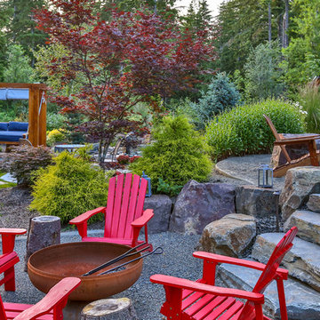
Example of a large classic backyard concrete paver patio design in Seattle with a fireplace and a gazebo
 Kitchen Design Concepts
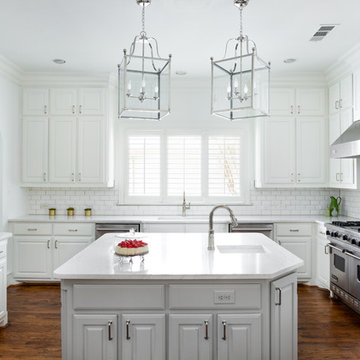
With a little bit of love, you can transform your kitchen into a space you love to spend time in! Many people are so used to their surroundings that we don’t realize what a little bit of paint and new finishes can do to change a room. That’s exactly the case of this kitchen. Actually, the cabinetry was already refinished prior to us coming into the picture, our clients couldn’t wait! So, we had the opportunity to incorporate those finishing touches to really seal the deal of this space. Today, this kitchen is up-to-date and classic. It really will stand the test of time! To learn more about this space, continue reading below:
Cabinets
The cabinetry was already refinished prior to us doing our magic. But we love how the crisp and clean finishes of the cabinetry pairs so well with the new finishes and materials we incorporated. To elevate the cabinetry, we embellished the doors and drawers with 5 inch “Emerald” hardware from Top Knobs (TK288BSN).
Countertops
At first glance, you may have noticed we incorporated beautiful marble countertops to this space. So, what if we told you those countertops are not made of marble? Actually, not even close! These countertops are a beautiful 3cm Cambria quartz in the finish “Ironsbridge”. The specs of grey and veining in the countertops might have fooled you! We love the way it looks in this space.
Backsplash
Subway tiles have been around a long time. Still, we love the classic look of subway tile and our clients are always requesting it! A simple way to add interested to subway tile is to utilize tile with beveling, create a contrasting pattern, and add contrasting grout color, as we have done here. Here we have utilized a 3×6 Daltile Rittenhouse Square with beveled edges as the main tile. Then, over the range, we have framed the tile and changed the pattern to herringbone to add some pop!
Fixtures
The fixtures of this space are classically styled as well. From Blanco, we have the main sink in a Precis Super Single Bowl in White paired with an Atura kitchen faucet with pull-down spray in stainless steel. Then on the island, we have a Precis Medium Bowl in White and an Atura Pulldown bar faucet in stainless steel, also from Blanco.
 Change Your Bathroom©
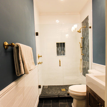
Craftsman style bathroom, antique gold fixtures, white subway tile, black limestone floor, blue glass tile. Atlanta Bathroom.
Example of a mid-sized arts and crafts 3/4 blue tile, white tile and ceramic tile limestone floor and black floor bathroom design in Atlanta with shaker cabinets, a two-piece toilet, blue walls, an integrated sink, solid surface countertops and a hinged shower door
Example of a mid-sized arts and crafts 3/4 blue tile, white tile and ceramic tile limestone floor and black floor bathroom design in Atlanta with shaker cabinets, a two-piece toilet, blue walls, an integrated sink, solid surface countertops and a hinged shower door
Find the right local pro for your project
 Convene Architecture
Child's Room
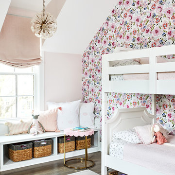
Photography: Stacy Zarin Goldberg Photography; Interior Design: Kristin Try Interiors; Builder: Harry Braswell, Inc.
Kids' room - coastal kids' room idea in DC Metro
Kids' room - coastal kids' room idea in DC Metro
 User
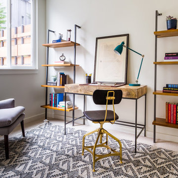
UserHome office - transitional freestanding desk carpeted home office idea in San Francisco with white walls

Sponsored
Fredericksburg, OH

High Point Cabinets
Columbus' Experienced Custom Cabinet Builder | 4x Best of Houzz Winner

 BRIAN PAQUETTE INTERIORS
Haris Kenjar
Coastal white two-story wood exterior home idea in Seattle with a hip roof
Coastal white two-story wood exterior home idea in Seattle with a hip roof
 Southerly Abode
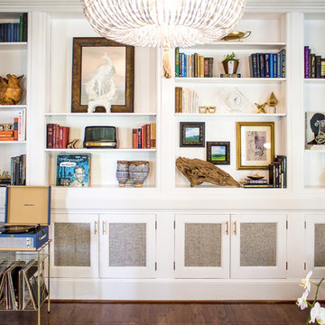
Living room - transitional dark wood floor living room idea in Nashville with blue walls
 Found Design Studio
Photo By: Joyelle West
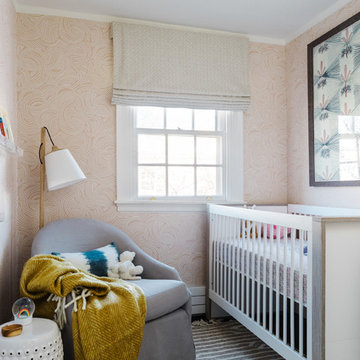
Trendy gender-neutral nursery photo in Boston with orange walls
Trendy gender-neutral nursery photo in Boston with orange walls
 C Change Design
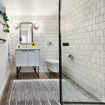
Example of a mid-sized trendy 3/4 ceramic tile slate floor and brown floor corner shower design in Portland with gray cabinets, a wall-mount toilet, white walls, an undermount sink, white countertops and flat-panel cabinets
 Partners 4, Design
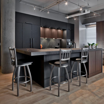
Inspiration for a mid-sized industrial l-shaped light wood floor and brown floor eat-in kitchen remodel in Minneapolis with an undermount sink, black cabinets, quartz countertops, metallic backsplash, porcelain backsplash, paneled appliances, an island, black countertops and flat-panel cabinets
 TKS Design Group
Download our free ebook, Creating the Ideal Kitchen. DOWNLOAD NOW
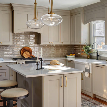
This family from Wheaton was ready to remodel their kitchen, dining room and powder room. The project didn’t call for any structural or space planning changes but the makeover still had a massive impact on their home. The homeowners wanted to change their dated 1990’s brown speckled granite and light maple kitchen. They liked the welcoming feeling they got from the wood and warm tones in their current kitchen, but this style clashed with their vision of a deVOL type kitchen, a London-based furniture company. Their inspiration came from the country homes of the UK that mix the warmth of traditional detail with clean lines and modern updates.
To create their vision, we started with all new framed cabinets with a modified overlay painted in beautiful, understated colors. Our clients were adamant about “no white cabinets.” Instead we used an oyster color for the perimeter and a custom color match to a specific shade of green chosen by the homeowner. The use of a simple color pallet reduces the visual noise and allows the space to feel open and welcoming. We also painted the trim above the cabinets the same color to make the cabinets look taller. The room trim was painted a bright clean white to match the ceiling.
In true English fashion our clients are not coffee drinkers, but they LOVE tea. We created a tea station for them where they can prepare and serve tea. We added plenty of glass to showcase their tea mugs and adapted the cabinetry below to accommodate storage for their tea items. Function is also key for the English kitchen and the homeowners. They requested a deep farmhouse sink and a cabinet devoted to their heavy mixer because they bake a lot. We then got rid of the stovetop on the island and wall oven and replaced both of them with a range located against the far wall. This gives them plenty of space on the island to roll out dough and prepare any number of baked goods. We then removed the bifold pantry doors and created custom built-ins with plenty of usable storage for all their cooking and baking needs.
The client wanted a big change to the dining room but still wanted to use their own furniture and rug. We installed a toile-like wallpaper on the top half of the room and supported it with white wainscot paneling. We also changed out the light fixture, showing us once again that small changes can have a big impact.
As the final touch, we also re-did the powder room to be in line with the rest of the first floor. We had the new vanity painted in the same oyster color as the kitchen cabinets and then covered the walls in a whimsical patterned wallpaper. Although the homeowners like subtle neutral colors they were willing to go a bit bold in the powder room for something unexpected. For more design inspiration go to: www.kitchenstudio-ge.com
 WERK | Building Modern
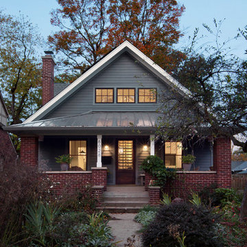
Home blends with scale and character of streetscape - Architecture/Interior Design/Renderings/Photography: HAUS | Architecture - Construction Management: WERK | Building Modern
 Change Your Bathroom©
The detailed plans for this bathroom can be purchased here: https://www.changeyourbathroom.com/shop/felicitous-flora-bathroom-plans/
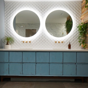
The original layout of this bathroom underutilized the spacious floor plan and had an entryway out into the living room as well as a poorly placed entry between the toilet and the shower into the master suite. The new floor plan offered more privacy for the water closet and cozier area for the round tub. A more spacious shower was created by shrinking the floor plan - by bringing the wall of the former living room entry into the bathroom it created a deeper shower space and the additional depth behind the wall offered deep towel storage. A living plant wall thrives and enjoys the humidity each time the shower is used. An oak wood wall gives a natural ambiance for a relaxing, nature inspired bathroom experience.
 Klopf Architecture
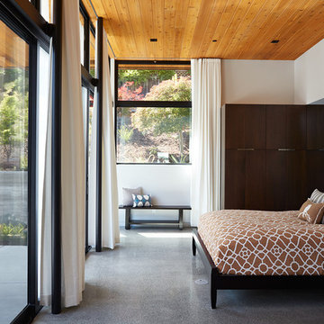
Klopf Architecture, Arterra Landscape Architects and Henry Calvert of Calvert Ventures Designed and built a new warm, modern, Eichler-inspired, open, indoor-outdoor home on a deeper-than-usual San Mateo Highlands property where an original Eichler house had burned to the ground.
The owners wanted multi-generational living and larger spaces than the original home offered, but all parties agreed that the house should respect the neighborhood and blend in stylistically with the other Eichlers. At first the Klopf team considered re-using what little was left of the original home and expanding on it. But after discussions with the owner and builder, all parties agreed that the last few remaining elements of the house were not practical to re-use, so Klopf Architecture designed a new home that pushes the Eichler approach in new directions.
One disadvantage of Eichler production homes is that the house designs were not optimized for each specific lot. A new custom home offered the team a chance to start over. In this case, a longer house that opens up sideways to the south fit the lot better than the original square-ish house that used to open to the rear (west). Accordingly, the Klopf team designed an L-shaped “bar” house with a large glass wall with large sliding glass doors that faces sideways instead of to the rear like a typical Eichler. This glass wall opens to a pool and landscaped yard designed by Arterra Landscape Architects.
Driving by the house, one might assume at first glance it is an Eichler because of the horizontality, the overhanging flat roof eaves, the dark gray vertical siding, and orange solid panel front door, but the house is designed for the 21st Century and is not meant to be a “Likeler.” You won't see any posts and beams in this home. Instead, the ceiling decking is a western red cedar that covers over all the beams. Like Eichlers, this cedar runs continuously from inside to out, enhancing the indoor / outdoor feeling of the house, but unlike Eichlers it conceals a cavity for lighting, wiring, and insulation. Ceilings are higher, rooms are larger and more open, the master bathroom is light-filled and more generous, with a separate tub and shower and a separate toilet compartment, and there is plenty of storage. The garage even easily fits two of today's vehicles with room to spare.
A massive 49-foot by 12-foot wall of glass and the continuity of materials from inside to outside enhance the inside-outside living concept, so the owners and their guests can flow freely from house to pool deck to BBQ to pool and back.
During construction in the rough framing stage, Klopf thought the front of the house appeared too tall even though the house had looked right in the design renderings (probably because the house is uphill from the street). So Klopf Architecture paid the framer to change the roofline from how we had designed it to be lower along the front, allowing the home to blend in better with the neighborhood. One project goal was for people driving up the street to pass the home without immediately noticing there is an "imposter" on this lot, and making that change was essential to achieve that goal.
This 2,606 square foot, 3 bedroom, 3 bathroom Eichler-inspired new house is located in San Mateo in the heart of the Silicon Valley.
Klopf Architecture Project Team: John Klopf, AIA, Klara Kevane
Landscape Architect: Arterra Landscape Architects
Contractor: Henry Calvert of Calvert Ventures
Photography ©2016 Mariko Reed
Location: San Mateo, CA
Year completed: 2016


42