
Search results for "Clashing" in Home Design Ideas


 LALAYA DESIGN
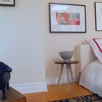
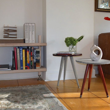
This side table is named Ta Ka Tsi Ka after the sound of Brazilian drums. It looks great on its own and is at its very best when paired with its mirror image (the Ka Tsi Ka Ta side table).
The concrete legs of Ta Ka Tsi Ka are unexpected, while the smooth, soft texture of Ka Tsi Ka Ta’s top clashes with its seemingly rough surface.
Concrete top, wooden legs, steel leg mount
15.5" height x 15" diameter
Find the right local pro for your project
 The Decorating Therapist
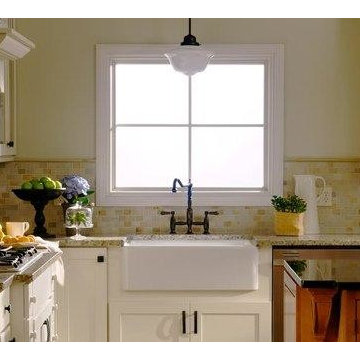
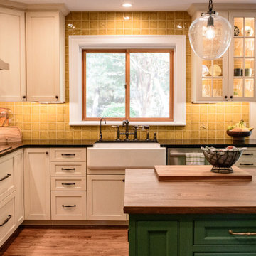
This kitchen renovation began with the challenge of reimagining an addition that had been DIYed onto the house 40 years ago. The previous homeowner’s efforts, while well-intentioned, fell short of today’s standards, both in terms of building codes and design choices. Materials like modern bamboo cabinetry and a choppy, poorly thought-out layout clashed with the timeless character of the home. The interior design didn’t reflect the 250-year-old Federal-style brick home’s essence, located in the heart of Historic Ellicott City. The current homeowners purchased this house because of its rich history and unique charm, and they wanted a kitchen that honored that legacy—not necessarily a period-perfect replica, but one infused with vintage character and a touch of the home’s original quirkiness.
Homes from that era were rarely perfect—they were designed for function, not flawless aesthetics. With that in mind, the renovation focused on balancing modern convenience with historical charm. For example, a small, awkwardly placed window by the refrigerator offered a view of an outdoor wall. Instead of keeping it, we opted to close it up, creating a more cohesive design. The result is a space that feels like it belongs to the home’s history while incorporating the comfort and efficiency of a modern kitchen. Every detail was carefully considered to create harmony between the old and the new. Even down to the Tiffany lampshade that effortlessly binds all of the kitchen hues in one place.
To accommodate the homeowners, who are on the shorter side, we designed countertops with their needs in mind. While we couldn’t lower the main counters without creating appliance-fitting issues—and custom appliances were cost-prohibitive—we prioritized usability wherever possible. For the countertops, they selected soapstone, a material that perfectly marries beauty and function. Its natural, timeworn appearance fits seamlessly with the home’s vintage aesthetic, and as a bonus, its antimicrobial properties make it a practical choice for a busy kitchen.
The result is a space that feels like it has always been part of this historic home—authentic, functional, and full of character.
 LALAYA DESIGN
These side tables are at their best as a pair. Their names are complimentary and together they form the sound of a drum playing Brazilian samba. The concrete legs of Ta Ka Tsi Ka are unexpected, while the smooth, soft texture of Ka Tsi Ka Ta’s top clashes with its seemingly rough surface.
16" height x 15" diameter
 UGUYS Development LLC
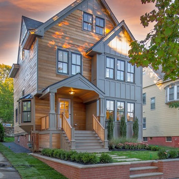
What was previously a tired and run-down old house was gutted to the studs and given a complete overhaul (including a small addition in the form of a facelift). The new front façade's varying depths lend to its multi-dimensional look. The natural tones of the clear-grade Western Red Cedar and the shaker-profiled PVC were contrasted with black sheet metal rooflines and black framed windows. An oversized ipe deck stays true to the natural toned theme, and the lavender entry door gives a splash of color-pop. Traditional rooflines and architectural touches allowed us to stand out from the homes in the neighborhood without clashing. A neatly landscaped front yard adds to the symmetry and rounds out one of the most eye-catching façades in town.
photo by Fred Light


 TKS Design Group
Download our free ebook, Creating the Ideal Kitchen. DOWNLOAD NOW
This family from Wheaton was ready to remodel their kitchen, dining room and powder room. The project didn’t call for any structural or space planning changes but the makeover still had a massive impact on their home. The homeowners wanted to change their dated 1990’s brown speckled granite and light maple kitchen. They liked the welcoming feeling they got from the wood and warm tones in their current kitchen, but this style clashed with their vision of a deVOL type kitchen, a London-based furniture company. Their inspiration came from the country homes of the UK that mix the warmth of traditional detail with clean lines and modern updates.
To create their vision, we started with all new framed cabinets with a modified overlay painted in beautiful, understated colors. Our clients were adamant about “no white cabinets.” Instead we used an oyster color for the perimeter and a custom color match to a specific shade of green chosen by the homeowner. The use of a simple color pallet reduces the visual noise and allows the space to feel open and welcoming. We also painted the trim above the cabinets the same color to make the cabinets look taller. The room trim was painted a bright clean white to match the ceiling.
In true English fashion our clients are not coffee drinkers, but they LOVE tea. We created a tea station for them where they can prepare and serve tea. We added plenty of glass to showcase their tea mugs and adapted the cabinetry below to accommodate storage for their tea items. Function is also key for the English kitchen and the homeowners. They requested a deep farmhouse sink and a cabinet devoted to their heavy mixer because they bake a lot. We then got rid of the stovetop on the island and wall oven and replaced both of them with a range located against the far wall. This gives them plenty of space on the island to roll out dough and prepare any number of baked goods. We then removed the bifold pantry doors and created custom built-ins with plenty of usable storage for all their cooking and baking needs.
The client wanted a big change to the dining room but still wanted to use their own furniture and rug. We installed a toile-like wallpaper on the top half of the room and supported it with white wainscot paneling. We also changed out the light fixture, showing us once again that small changes can have a big impact.
As the final touch, we also re-did the powder room to be in line with the rest of the first floor. We had the new vanity painted in the same oyster color as the kitchen cabinets and then covered the walls in a whimsical patterned wallpaper. Although the homeowners like subtle neutral colors they were willing to go a bit bold in the powder room for something unexpected. For more design inspiration go to: www.kitchenstudio-ge.com
 Burlock Interiors
Meredith Heuer
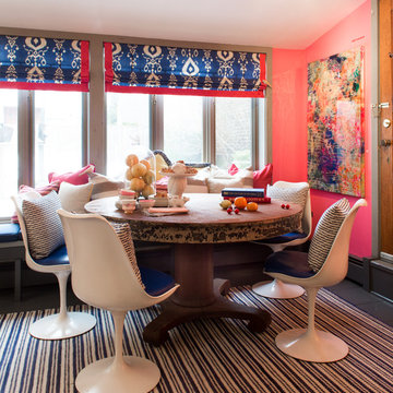
Enclosed dining room - mid-sized eclectic enclosed dining room idea in New York with multicolored walls
Enclosed dining room - mid-sized eclectic enclosed dining room idea in New York with multicolored walls
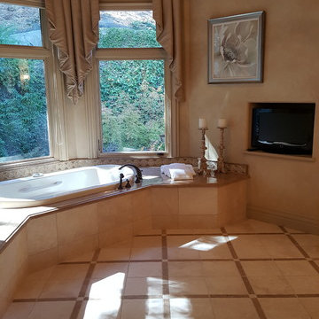
 Impluvium Architecture
Impluvium Architecture
Alamo, CA, USA
The realtor who sold the property to the Dinstells mentioned that an Architect just bought the property next door (we were neighbors for our first house - found under Houzz Projects = Haley 3)
I was the Architect and helped coordinate with various sub-contractors. I also co-designed the project with various consultants including Interior and Landscape Design (+our house concurrently being built next door)
This project I had to put professional ethics above my personal needs for my new house concurrently built next door. I originally wanted a Modern House and the Dinstell's wanted a French Country but I knew that they would clash next to each other so I redesigned our house to be a Contemporary Craftsman style.
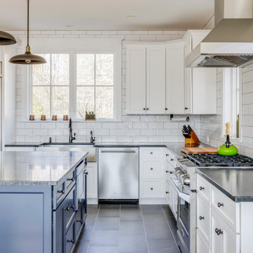
 Market Square Architects PLLC
Example of a danish cement tile floor and gray floor eat-in kitchen design in Boston with a single-bowl sink, flat-panel cabinets, white cabinets, white backsplash, subway tile backsplash, stainless steel appliances, an island and gray countertops
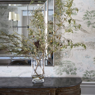 TKS Design Group
Download our free ebook, Creating the Ideal Kitchen. DOWNLOAD NOW
This family from Wheaton was ready to remodel their kitchen, dining room and powder room. The project didn’t call for any structural or space planning changes but the makeover still had a massive impact on their home. The homeowners wanted to change their dated 1990’s brown speckled granite and light maple kitchen. They liked the welcoming feeling they got from the wood and warm tones in their current kitchen, but this style clashed with their vision of a deVOL type kitchen, a London-based furniture company. Their inspiration came from the country homes of the UK that mix the warmth of traditional detail with clean lines and modern updates.
To create their vision, we started with all new framed cabinets with a modified overlay painted in beautiful, understated colors. Our clients were adamant about “no white cabinets.” Instead we used an oyster color for the perimeter and a custom color match to a specific shade of green chosen by the homeowner. The use of a simple color pallet reduces the visual noise and allows the space to feel open and welcoming. We also painted the trim above the cabinets the same color to make the cabinets look taller. The room trim was painted a bright clean white to match the ceiling.
In true English fashion our clients are not coffee drinkers, but they LOVE tea. We created a tea station for them where they can prepare and serve tea. We added plenty of glass to showcase their tea mugs and adapted the cabinetry below to accommodate storage for their tea items. Function is also key for the English kitchen and the homeowners. They requested a deep farmhouse sink and a cabinet devoted to their heavy mixer because they bake a lot. We then got rid of the stovetop on the island and wall oven and replaced both of them with a range located against the far wall. This gives them plenty of space on the island to roll out dough and prepare any number of baked goods. We then removed the bifold pantry doors and created custom built-ins with plenty of usable storage for all their cooking and baking needs.
The client wanted a big change to the dining room but still wanted to use their own furniture and rug. We installed a toile-like wallpaper on the top half of the room and supported it with white wainscot paneling. We also changed out the light fixture, showing us once again that small changes can have a big impact.
As the final touch, we also re-did the powder room to be in line with the rest of the first floor. We had the new vanity painted in the same oyster color as the kitchen cabinets and then covered the walls in a whimsical patterned wallpaper. Although the homeowners like subtle neutral colors they were willing to go a bit bold in the powder room for something unexpected. For more design inspiration go to: www.kitchenstudio-ge.com
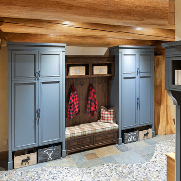
 Old World Kitchens & Custom Cabinets
Bob Young Photography
Mid-sized mountain style mudroom photo in Vancouver
Mid-sized mountain style mudroom photo in Vancouver
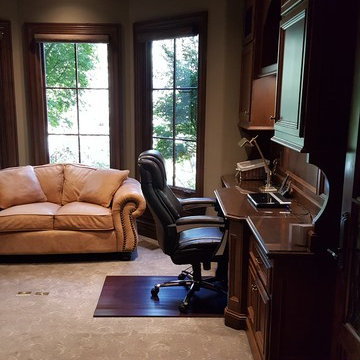 Impluvium Architecture
Impluvium Architecture
Alamo, CA, USA
The realtor who sold the property to the Dinstells mentioned that an Architect just bought the property next door (we were neighbors for our first house - found under Houzz Projects = Haley 3)
I was the Architect and helped coordinate with various sub-contractors. I also co-designed the project with various consultants including Interior and Landscape Design (+our house concurrently being built next door)
This project I had to put professional ethics above my personal needs for my new house concurrently built next door. I originally wanted a Modern House and the Dinstell's wanted a French Country but I knew that they would clash next to each other so I redesigned our house to be a Contemporary Craftsman style.
Photographed by: Tim Haley
 MODEVO
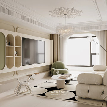
2. "Earthy" Tones That Clash With Our Sunlight
Wabi-sabi loves muted greens/browns… but in LA’s golden-hour light? That "serene" charcoal accent wall? It looks like a storm cloud. Worse: pairing it with cheap, glossy ceramics (looking at you, "artisanal" Target mugs). Fix it: Stick to warm neutrals—think Ojai sandstone, dried sage green—and matte finishes. Let the sun make your space glow, not fight it.

 Silicon Engineering Consultants Canada
Get the best quality Scan To BIM Services from one of the top CAD services providers in Canada. Silicon Engineering Consultants Canada’s proven CAD expertise and the top searched CAD services provider offer premium BIM services at unbeatable rates across Canada. Our BIM modlers reduce design and on site execution disparities, optimize project logistics, and develop clash free 3D BIM models using the latest BIM software, reducing the time and effort required to coordinate the project and increasing coordination accuracy. We are committed to the success of our clients and to providing high quality services at reasonable prices.
Why Choose Our Scan to BIM Services?
Low Cost and High Quality
Accuracy and Precision
Streamlined Workflow
Comprehensive BIM Models
BIM Interoperability
Reduced Project Risks
Our services are not limited to St Johns's but we also serve services across Canada with cities like Hamilton, Calgary, Manitoba, Vancouver, Québec City, etc.
For more details click on the link below:
https://www.siliconec.ca/building-information-modelling/scan-to-bim-services.html
 TKS Design Group
Download our free ebook, Creating the Ideal Kitchen. DOWNLOAD NOW
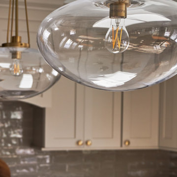
This family from Wheaton was ready to remodel their kitchen, dining room and powder room. The project didn’t call for any structural or space planning changes but the makeover still had a massive impact on their home. The homeowners wanted to change their dated 1990’s brown speckled granite and light maple kitchen. They liked the welcoming feeling they got from the wood and warm tones in their current kitchen, but this style clashed with their vision of a deVOL type kitchen, a London-based furniture company. Their inspiration came from the country homes of the UK that mix the warmth of traditional detail with clean lines and modern updates.
To create their vision, we started with all new framed cabinets with a modified overlay painted in beautiful, understated colors. Our clients were adamant about “no white cabinets.” Instead we used an oyster color for the perimeter and a custom color match to a specific shade of green chosen by the homeowner. The use of a simple color pallet reduces the visual noise and allows the space to feel open and welcoming. We also painted the trim above the cabinets the same color to make the cabinets look taller. The room trim was painted a bright clean white to match the ceiling.
In true English fashion our clients are not coffee drinkers, but they LOVE tea. We created a tea station for them where they can prepare and serve tea. We added plenty of glass to showcase their tea mugs and adapted the cabinetry below to accommodate storage for their tea items. Function is also key for the English kitchen and the homeowners. They requested a deep farmhouse sink and a cabinet devoted to their heavy mixer because they bake a lot. We then got rid of the stovetop on the island and wall oven and replaced both of them with a range located against the far wall. This gives them plenty of space on the island to roll out dough and prepare any number of baked goods. We then removed the bifold pantry doors and created custom built-ins with plenty of usable storage for all their cooking and baking needs.
The client wanted a big change to the dining room but still wanted to use their own furniture and rug. We installed a toile-like wallpaper on the top half of the room and supported it with white wainscot paneling. We also changed out the light fixture, showing us once again that small changes can have a big impact.
As the final touch, we also re-did the powder room to be in line with the rest of the first floor. We had the new vanity painted in the same oyster color as the kitchen cabinets and then covered the walls in a whimsical patterned wallpaper. Although the homeowners like subtle neutral colors they were willing to go a bit bold in the powder room for something unexpected. For more design inspiration go to: www.kitchenstudio-ge.com
 Stairworks
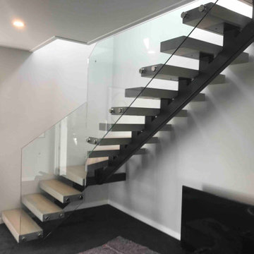
We were asked by a house builder to build a steel staircase as the centrepiece for their new show home in Auckland. Although they had already decided on the central mono-stringer style staircase (also known as a floating staircase), with solid oak treads and glass balustrades, when we met with them we also made some suggestions. This was in order to help nest the stairs in their desired location, which included having to change the layout to avoid clashing with the existing structure.
The stairs lead from a reception area up to a bedroom, so one of our first suggestions, was to have the glass balustrade on the side of the staircase finishing, and finish at the underside of the ground-floor ceiling, and then building an independent balustrade in the bedroom. The intention behind this was to give some separation between the living and sleeping areas, whilst maximising the full width of the opening for the stairs. Additionally, this also helps hide the staircase from inside the bedroom, as you don’t see the balustrade coming up from the floor below.
We also recommended the glass on the first floor was face fixed directly to the boundary beam, and the fixings covered with a painted fascia panel. This was in order to avoid using a large floor fixed glazing channel or reduce the opening width with stand-off pin fixings.
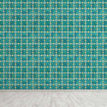
 WallsNeedLove
Cut into a background of flat, light teal, these watercolor circles of velvety green, blue, and emerald collide together and reverberate with golden diamonds and ripples. This seamless pattern runs from end to end, forming intricate little stars between the spaces clashing contours. Its glittery, vintage appeal speaks to those with sophisticated souls. Available in both removable peel-and-stick and permanent wallpapers. Printed with child-safe inks.

38