
Search results for "Clashing" in Home Design Ideas
 Capitol City Wood Works LLC
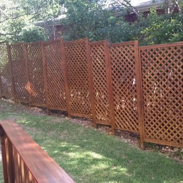
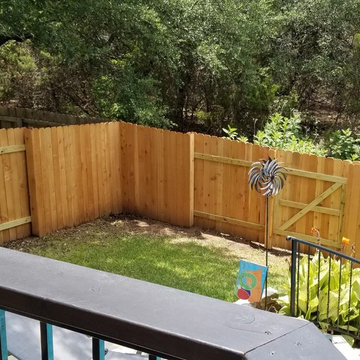
This is an example of a mid-sized traditional backyard landscaping in Austin.

 WallsNeedLove
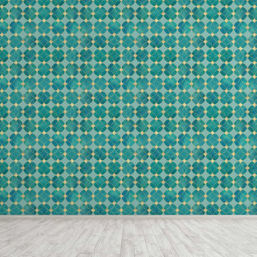
Cut into a background of flat, light teal, these watercolor circles of velvety green, blue, and emerald collide together and reverberate with golden diamonds and ripples. This seamless pattern runs from end to end, forming intricate little stars between the spaces clashing contours. Its glittery, vintage appeal speaks to those with sophisticated souls. Available in both removable peel-and-stick and permanent wallpapers. Printed with child-safe inks.
Find the right local pro for your project
 Kirby Mast of Hartville Hardware
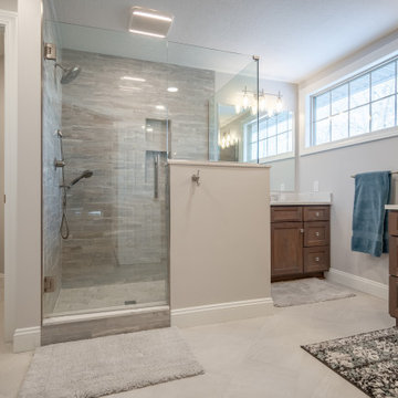
Dramatically updated and reconfigured master bathroom.
The new design includes his and hers separate sinks for added convenience, a linen cabinet for extra storage, and a luxurious shower featuring a herringbone mosaic tile floor, 3x12 tile walls with a built-in bench and niche, and heated tile flooring for added comfort.
 Calyx Builds
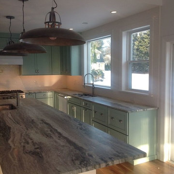
Mid-sized country u-shaped medium tone wood floor and brown floor open concept kitchen photo in Orange County with a double-bowl sink, shaker cabinets, green cabinets, white backsplash, ceramic backsplash, stainless steel appliances and an island
 MODEVO
2. "Earthy" Tones That Clash With Our Sunlight
Wabi-sabi loves muted greens/browns… but in LA’s golden-hour light? That "serene" charcoal accent wall? It looks like a storm cloud. Worse: pairing it with cheap, glossy ceramics (looking at you, "artisanal" Target mugs). Fix it: Stick to warm neutrals—think Ojai sandstone, dried sage green—and matte finishes. Let the sun make your space glow, not fight it.
 Robin's Nest Interiors
Updated Spec Home: The Bathrooms
The last stop on the main level of this Updated Spec Home are the Bathrooms. Every surface of the Guest Bath and Master Bath was touched- even some renovations in the Master bedroom. All I can say is thank goodness these two love wallpaper – we selected classic patterns for each bath that will stand the test of time!
Guest Bathroom
The Guest Bath also doubles as my mom’s bath. The footprint remained the same but we updated everything. A new vanity was chosen to give her that furniture look while still providing some storage – although there is a linen closet located just outside the bath. We topped it off with a beautiful mirror with great detail and an equally great light fixture. Also, we mixed the finishes in the bath between nickel and champagne, i.e., gold/silver mix. Mixing metals is perfectly acceptable and quite frankly way more interesting the everything matching. Updated Spec Home Bathrooms - Robin's Nest Interiors
Updated Spec Home Bathrooms - Robin's Nest Interiors
We found this amazing wallpaper with its subtle colors and pattern and selected a large square tile to coordinate for the floor. Yes, you can do a large tile in a small bath because it actually makes the space feel larger. For finishing touches, we had this gorgeous shower curtain made. Above the new toilet, we added interesting abstract artwork framed in a large mat so it would not clash with the wallpaper.
Master Bathroom
Originally, the Master Bath had a large garden tub as the focal point and a tiny stand up shower in the corner. We removed the garden tub, moved the shower to this area as the focal point and turned the tiny shower into a much needed linen closet. At this point, I know you are thinking, what about resale with no tub? There is a tub in the Guest Bath so the house will still be appealing to young families or bath lovers alike.
© 2016 RealTourCast | Tim Furlong Jr.
Tile selections came first – my sister fell in love with this gorgeous dark greige glass tile. We used it in the upper half of the shower while keeping the lower half light with this plank tile in a striated pattern. We carried the plank tile onto the floor for a seamless look.
Updated Spec Home Bathrooms - Robin's Nest Interiors
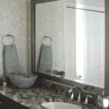
We replaced the two vanities with stock cabinetry that looks custom in a rich wood stain. Also, we found a gorgeous granite remnant for the countertop and finished off the vanity area with oversized mirrors, sleek lighting, and striking hardware.Updated Spec Home Bathrooms - Robin's Nest Interiors
The wallpaper is absolutely perfect for this space – it adds an interesting backdrop without overpowering the room. Her fantastic artwork was able to fit in the niche next to the new toilet. This is one gorgeous bath!
Updated Spec Home Bathrooms - Robin's Nest Interiors
Coming Soon
Spoiler Alert – my mom and sister have decided to update their Basement Family Room and add a small Powder Bath so look for Season 2 of the Updated Spec Home series!
See the rest of this house through these links! Foyer & Great Room, Kitchen & Breakfast Area, Bedrooms, Guest Bedroom.

 All American Painting Plus
This was an interesting project. The client worked with one of our preferred interior designers. The house was a contemporary design and had a very open floor plan. Whichever way you turned in this house there was always 2-3 walls in different rooms in your line of sight. We came up with a plan that all walls which were in the line of sight of each other would be painted all the same color. Most rooms ended up having 3-4 colors but it worked amazingly well. This was one of my favorite projects because of the challenges involved and having to think outside the box. I love the bold colors and crisp clean paint lines. What a transformation.
 Impluvium Architecture
Impluvium Architecture
Alamo, CA, USA
The realtor who sold the property to the Dinstells mentioned that an Architect just bought the property next door (we were neighbors for our first house - found under Houzz Projects = Haley 3)
I was the Architect and helped coordinate with various sub-contractors. I also co-designed the project with various consultants including Interior and Landscape Design (+our house concurrently being built next door)
This project I had to put professional ethics above my personal needs for my new house concurrently built next door. I originally wanted a Modern House and the Dinstell's wanted a French Country but I knew that they would clash next to each other so I redesigned our house to be a Contemporary Craftsman style.
 Market Square Architects PLLC
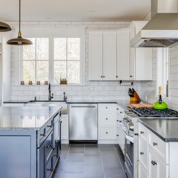
Example of a danish cement tile floor and gray floor eat-in kitchen design in Boston with a single-bowl sink, flat-panel cabinets, white cabinets, white backsplash, subway tile backsplash, stainless steel appliances, an island and gray countertops
 Stairworks
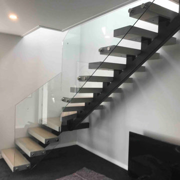
We were asked by a house builder to build a steel staircase as the centrepiece for their new show home in Auckland. Although they had already decided on the central mono-stringer style staircase (also known as a floating staircase), with solid oak treads and glass balustrades, when we met with them we also made some suggestions. This was in order to help nest the stairs in their desired location, which included having to change the layout to avoid clashing with the existing structure.
The stairs lead from a reception area up to a bedroom, so one of our first suggestions, was to have the glass balustrade on the side of the staircase finishing, and finish at the underside of the ground-floor ceiling, and then building an independent balustrade in the bedroom. The intention behind this was to give some separation between the living and sleeping areas, whilst maximising the full width of the opening for the stairs. Additionally, this also helps hide the staircase from inside the bedroom, as you don’t see the balustrade coming up from the floor below.
We also recommended the glass on the first floor was face fixed directly to the boundary beam, and the fixings covered with a painted fascia panel. This was in order to avoid using a large floor fixed glazing channel or reduce the opening width with stand-off pin fixings.
 The Decorating Therapist
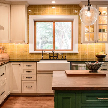
This kitchen renovation began with the challenge of reimagining an addition that had been DIYed onto the house 40 years ago. The previous homeowner’s efforts, while well-intentioned, fell short of today’s standards, both in terms of building codes and design choices. Materials like modern bamboo cabinetry and a choppy, poorly thought-out layout clashed with the timeless character of the home. The interior design didn’t reflect the 250-year-old Federal-style brick home’s essence, located in the heart of Historic Ellicott City. The current homeowners purchased this house because of its rich history and unique charm, and they wanted a kitchen that honored that legacy—not necessarily a period-perfect replica, but one infused with vintage character and a touch of the home’s original quirkiness.
Homes from that era were rarely perfect—they were designed for function, not flawless aesthetics. With that in mind, the renovation focused on balancing modern convenience with historical charm. For example, a small, awkwardly placed window by the refrigerator offered a view of an outdoor wall. Instead of keeping it, we opted to close it up, creating a more cohesive design. The result is a space that feels like it belongs to the home’s history while incorporating the comfort and efficiency of a modern kitchen. Every detail was carefully considered to create harmony between the old and the new. Even down to the Tiffany lampshade that effortlessly binds all of the kitchen hues in one place.
To accommodate the homeowners, who are on the shorter side, we designed countertops with their needs in mind. While we couldn’t lower the main counters without creating appliance-fitting issues—and custom appliances were cost-prohibitive—we prioritized usability wherever possible. For the countertops, they selected soapstone, a material that perfectly marries beauty and function. Its natural, timeworn appearance fits seamlessly with the home’s vintage aesthetic, and as a bonus, its antimicrobial properties make it a practical choice for a busy kitchen.
The result is a space that feels like it has always been part of this historic home—authentic, functional, and full of character.
 Charlie Allen Renovations, Inc.
Renovation is stressful. Wouldn’t it be nice to let someone else oversee product selections, manage day-to-day issues, and bring your project to a successful completion? The owners of a two-family in Arlington recently did just that, flying off to Florida just as we began renovating their first floor unit.
Of course, before they left we thoroughly discussed all aspects of the work order, which included renovating the kitchen and bathroom, painting the bedroom, and adding a laundry closet. We reviewed color and material selections, and set up a schedule for regular briefings.
A handful of issues did come up. But because we had planned ahead, we were able to resolve them with very little stress for our clients. For instance, the client had chosen a bright yellow paint color for the kitchen walls, but once the new cabinets, countertop, and flooring had been installed, it was clear that yellow would clash. We suggested a more complementary Benjamin Moore Lancaster Whitewash shade instead.
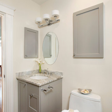
In the bathroom, the clients had selected a deep inset mirrored medicine cabinet. But when the wall behind the vanity was opened, it revealed a pipe running up the wall, too close for the inset model. In this small space, a bump-out medicine cabinet would be awkward, so instead we placed a mirror over the sink and two smaller inset cabinets on either side – a solution that pleased the homeowners, who now have his-and-hers storage spaces.
Finally, the homeowners had resigned themselves to the fact that the laundry closet would be too small for storing detergent and other needs. However once the units were in place, we realized that a small custom shelf could be built and had it installed to the delight of the homeowners.
Photo by Shelly Harrison
 Cava Companies
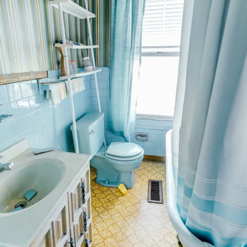
Why must the floor clash with the tile, and tub, and toilet?
Bathroom - bathroom idea in Richmond
Bathroom - bathroom idea in Richmond
 J. W. McCarter & Associates
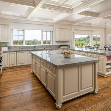
Multiple cream and white paint tones create a neutral background against the stunning Sea Pearl Quartzite countertops. Polished nickel hardware and plumbing fixtures add a little sparkle to the space. Artistic tile mosaic tile was used for the backsplash inset. Mixed paneled and stainless steel appliances complement the space.
 Capitol City Wood Works LLC
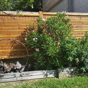
This is an example of a mid-sized contemporary full sun backyard landscaping in Austin.
 Amy Fisk
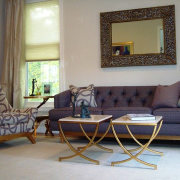
After Photo: This family needed to redesign their living room to coordinate with the adjacent dining room which was full of vibrant artwork and Asian pieces they had collected over their many years of traveling. The dining room had a lot of color going on in it so it was important to pull in color to the living room. However, it needed to be done in a more subtle way so that the two rooms wouldn’t compete or clash when it came to color. The walls in the two rooms were both painted a warm neutral in order to connect the two rooms rather than separate them. Although the amethyst color primarily used is soft and calming, it also lends a sense of fun when you pair it with a fun pattern! Gold accents add to the Asian flair in the adjacent dining room as well as add a little extra sophistication to the living room. Silk drapes add a great finishing touch!
 L.I.U. Landscape Inc.
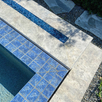
Luxury backyard design for a residence. The expansive design included amenities such as an outdoor patio space with a barbecue counter, swimming pool and spa, and gazebo and pond. The design combines both traditional and contemporary aspects next to each other without clashing. The owners are able to immediately view the contemporary outdoor space with the barbecue, swimming pool, and spa. The traditional Chinese garden design is cleverly hidden in the corner with a gazebo surrounded by a natural pond and lush plants.
 Built Construction & Electric
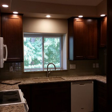
The original kitchen layout had the range located in the peninsula with a hood overhead. The previous wall cabinet units were 30"H and suspended from large soffits around the perimeter of the kitchen. The decision was made to increase cabinet storage, functionality, and just upgrade and bring current materials without clashing with the existing style of home. In doing so we removed and replaced smaller soffits over the cabinetry. As an additional feature we incorporated 4" recessed can lights into the soffits accenting the cabinetry and countertops without having the clutter of standard ceiling units.
45