
Search results for "Clean up reasons" in Home Design Ideas
 Haven Design and Construction
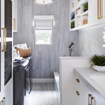
This light filled laundry room is as functional as it is beautiful. It features a vented clothes drying cabinet, complete with a hanging rod for air drying clothes and pullout mesh racks for drying t-shirts or delicates. The handy dog shower makes it easier to keep Fido clean and the full height wall tile makes cleaning a breeze. Open shelves above the dog shower provide a handy spot for rolled up towels, dog shampoo and dog treats. A laundry soaking sink, a custom pullout cabinet for hanging mops, brooms and other cleaning supplies, and ample cabinet storage make this a dream laundry room. Design accents include a fun octagon wall tile and a whimsical gold basket light fixture.
 Corinthian Fine Homes
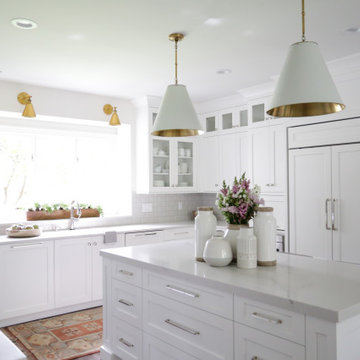
Our busy young homeowners were looking to move back to Indianapolis and considered building new, but they fell in love with the great bones of this Coppergate home. The home reflected different times and different lifestyles and had become poorly suited to contemporary living. We worked with Stacy Thompson of Compass Design for the design and finishing touches on this renovation. The makeover included improving the awkwardness of the front entrance into the dining room, lightening up the staircase with new spindles, treads and a brighter color scheme in the hall. New carpet and hardwoods throughout brought an enhanced consistency through the first floor. We were able to take two separate rooms and create one large sunroom with walls of windows and beautiful natural light to abound, with a custom designed fireplace. The downstairs powder received a much-needed makeover incorporating elegant transitional plumbing and lighting fixtures. In addition, we did a complete top-to-bottom makeover of the kitchen, including custom cabinetry, new appliances and plumbing and lighting fixtures. Soft gray tile and modern quartz countertops bring a clean, bright space for this family to enjoy. This delightful home, with its clean spaces and durable surfaces is a textbook example of how to take a solid but dull abode and turn it into a dream home for a young family.

 TKS Design Group
Download our free ebook, Creating the Ideal Kitchen. DOWNLOAD NOW
This client was referred to us from a past client. They are a busy 2-career household with young children and enjoy entertaining friends and family in their home. They have a beautiful open concept home but unfortunately the kitchen was not fitting for the rest of the home. They were not quite sure what to do with the space. We talked about trying to refresh it or do more of a minor remodel, but in the end they decided a full gut would get them to where they wanted to be.
One problem was there was no place for guests to hang out other than the large and awkward banquette area. The brick wall and tiled hood area were feeling a bit dated and tired. The space was just not functional for their lifestyle. There was no prep space near the cooktop and no landing area for items coming out of the ovens or refrigerator, plus a big dead zone in the center of the room.
Banquettes, like the one they previously had in the space, are great for small spaces, but when they get really large like this one, it makes getting in and out of the seating area awkward and uncomfortable. Plus, there was room for a large table, so we eliminated the awkward built in.
We started by removing the faux brick wall between the kitchen and back entry. We relocated the entry to the garage over a couple feet in order to get every last inch out of the new kitchen. We also made the decision to close up the primary window that faced the pretty ho hum brick wall of the neighbor’s house. There was plenty of light coming in from the seating area, so we just didn’t feel the window was adding much to the room.
Construction went smoothy. There was a bit of rework with electrical, flooring and HVAC, but in the end, we think it was well worth it.
The clients really wanted a sleek contemporary look, and we originally had planned for a full height slab backsplash, but due to it’s size, it was a budget buster. Instead, we got creative and settled on large format porcelain tiles that have a similar feel but were a fraction of the cost. We made sure the wall was plumb and level so that the fit and finish would mimic that of slab material.
The final space was quite a change. A large prep sink sits directly across from the new pro-style range with plenty additional prep space on the large island. The refrigerator and ovens now have miles of landing space, and a nice tight work triangle makes cooking a breeze.
Since we wanted a more contemporary feel, not many wall cabinets were included. Instead, we outfitted some of the drawers for dish storage with a peg system. Two large pantries flanking the refrigerator hold baking supplies and small appliances. Large drawers by the cooktop hold pots and pans, and an appliance garage tucked away to the left of the range hides away miscellaneous items. The large island also houses a microwave drawer and tons of storage, most of which is drawers offering maximum convenience.
The island now seats 5-6 people comfortably along with the new table in the seating area which can seat up to 8. Entertaining will be a breeze in this space. With such a clean backdrop, we knew we would need some drama with the lighting, so we chose two sets of staggered pendants, which we adjusted for the right visual balance above the island.
We also included a small coffee station to the right of the main kitchen, which helps keep the coffee clutter out of the kitchen proper. Two tones of complimentary gray are featured in this kitchen. The perimeter is a light gray that reads almost white. The island is a gray stain that adds some depth and interest with the visible wood texture. The countertops are clean white quartz, and the hardware, barstools and light fixtures add warm brass tones. I see lots of cooking and entertaining with family and friends in the near future in this bright and airy new space.
Designed by: Susan Klimala, CKD, CBD
Photography by: Michael Kaskel
For more information on kitchen and bath design ideas go to: www.kitchenstudio-ge.com
Find the right local pro for your project
 Dream Kitchens
Imagine a lazy morning in this casually elegant kitchen, sipping your freshly brewed coffee as natural light pours through floor to ceiling windows. Then imagine being in this kitchen sipping your morning coffee and gazing out at the beautiful rolling landscape of one of New England’s prestigious golf clubs. Imagine . . .
The owner of this beautiful contemporary kitchen with its idyllic setting imagined ! And her kitchen designer captured her imagination and brought this inspired space to life in both style and function.
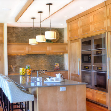
Columns of stainless steel are balanced by columns with the warmth of birch wood with just a hint of stain. On an adjacent wall one more wood column rises from floor to ceiling. A strong horizontal line of cabinetry seemingly intersects the vertical columns. While contemporary in design, the cabinetry in this kitchen found its beginnings with the Shakers and the designers of the Craftsman period. Increasing the size of the framing on the doors, accenting the cabinet shapes with square-edged trim and blocks of wood at varying depths, thinly slicing and randomly sizing the natural stone on the accent wall, and choosing oversized stainless steel handles definitively bring this kitchen forward in time. Recycled glass countertops in a soft, quiet color continue to help this kitchen live so harmoniously with its surroundings.
As the day unfolds and the lazy morning turns into ambitious meal preparation, it is clear that this kitchen is a chef’s delight. The stainless steel columns incorporate double ovens, a microwave and a steam oven. Two wood columns house a refrigerator and a freezer. The separate wood column reveals pantry storage, and a TV is hidden behind a lift-up door.
On the island with its clean, rectangular shape two dishwashers flank the sink. Imagine ! how much more pleasant the task of clean-up is when you overlook the family living space and vista beyond.
In the cook center, a complement of drawers provides excellent storage for pots and pans, utensils, spices and herbs around the 5-burner cooktop. A powerful vent with a rear exhaust maintains the horizontal design of the space. And the freshly-brewed coffee in the morning ? It comes from a built-in coffee maker that’s just around the corner from the refrigerator. Along with a wine refrigerator, it creates a beverage and serving center between the kitchen and the dining room.
The homeowner envisioned a kitchen that is as beautiful as its surroundings. Her kitchen designer wanted her kitchen to be as functional as it is beautiful. Both agree that this kitchen lives up to their expectations!
 Heller & Associates
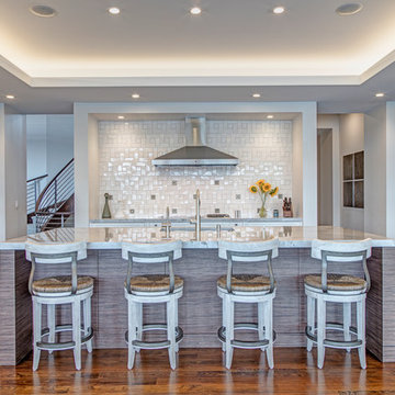
A striking island occupies the center of a spacious kitchen in Bloomfield Hills. The HPL backed real wood veneer in Ebony Sabbiata from Tree Frog bridges the tonal distance between the walnut floors and all white cabinets and walls, creating harmony and visual balance. Full height backsplashes in shiny white are laid out in a windmill pattern, punctuated every so often with intricately designed accent squares. A combination of bold veining and delicate blooming on the Calacatta quartzite countertops contributes its subtle energy to the mix. The kitchen is separated into several independent vignettes, each one laid out symmetrically. The vast island with built in sink offers all the prep space a chef could need. The built in cooktop is centered directly behind to facilitate easy cooking, while an additional sink in the clean up area expedites after dinner chores. A walk-pantry and small home office are tucked in behind the refrigerator freezer wall. Multiple lighting details, including lighted cabinet interiors and a lighted display niche above the refrigerator, complete this stunning 2015 lake home.
 TVL Creative Ltd.
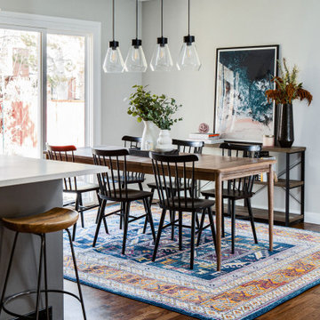
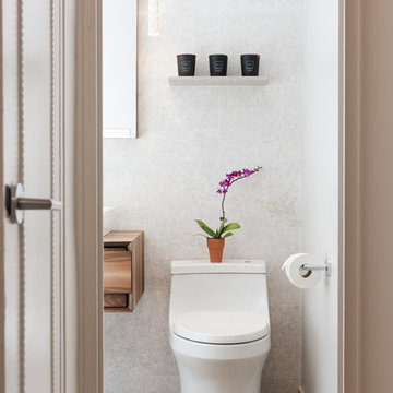
Our clients were ready to trade in their 1950s kitchen (faux brick and all) for a more contemporary space that could accommodate their growing family. We were more then happy to tear down the walls that hid their kitchen to create some simply irresistible sightlines! Along with opening up the spaces in this home, we wanted to design a kitchen that was filled with clean lines and moments of blissful details. Kitchen- Crisp white cabinetry paired with a soft grey backsplash tile and a warm butcher block countertop provide the perfect clean backdrop for the rest of the home. We utilized a deep grey cabinet finish on the island and contrasted it with a lovely white quartz countertop. Our great obsession is the island ceiling lights! The soft linen shades and linear black details set the tone for the whole space and tie in beautifully with the geometric light fixture we brought into the dining room. Bathroom- Gone are the days of florescent lights and oak medicine cabinets, make way for a modern bathroom that leans it clean geometric lines. We carried the simple color pallet into the bathroom with grey hex floors, a high variation white wall tile, and deep wood tones at the vanity. Simple black accents create moments of interest through out this calm little space.
 Cabinet Plant
See what our client say about working with us:
I started my search for a contractor about a year before I hired Paul to do a kitchen and bathroom renovation. This was my first time at the bat, and I really had no idea what to expect. I had many contractor proposals that swung wildly in price but for some reason I never felt inclined to hire any of the guys I met with. I happened to be looking at Houzz one day and came across Paul’s company and he had very good reviews. I gave him a call and he came to my apartment quickly. I liked him immediately when we met. I thought it was strange that he asked me for my budget and how much I wanted to spend but in hindsight, providing that information allowed Paul to come back to me with a very detailed proposal based on my budget. I soon realized that the lower proposals I had did not include many of the budget items that would be necessary to complete the job. Paul laid out the pricing and provided a very reasonable “allowance” based on your measurements for tile, toilet, sinks, etc. It is up to you to stay within that allowance.
Another reason I hired Paul was because of his design skills. Paul met me in the at tile stores several times and helped guide me in choosing tile and a style for the bathroom that really looks beautiful. I fought him a little but in the end, was glad I went with his recommendations. He also uses a kitchen cabinet maker so all the cabinets are custom to what you want. Paul also has a great customer website that allows you to see all the expenses, make choices, and easily communicate with him.
If you are planning to do a renovation, I think it helps to plan for the worst and hope for the best. I live in a co-op and we had a couple of little glitches and Paul was always quick to resolve issues as they arose. He was extremely responsive and really cared about the work and doing a good job. I would definitely hire Paul again if I needed a contractor.
Sponsored
Columbus, OH

Hope Restoration & General Contracting
Columbus Design-Build, Kitchen & Bath Remodeling, Historic Renovations
 Urbanology Designs
A captivating transformation in the coveted neighborhood of University Park, Dallas
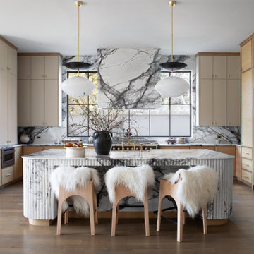
The heart of this home lies in the kitchen, where we embarked on a design endeavor that would leave anyone speechless. By opening up the main kitchen wall, we created a magnificent window system that floods the space with natural light and offers a breathtaking view of the picturesque surroundings. Suspended from the ceiling, a steel-framed marble vent hood floats a few inches from the window, showcasing a mesmerizing Lilac Marble. The same marble is skillfully applied to the backsplash and island, featuring a bold combination of color and pattern that exudes elegance.
Adding to the kitchen's allure is the Italian range, which not only serves as a showstopper but offers robust culinary features for even the savviest of cooks. However, the true masterpiece of the kitchen lies in the honed reeded marble-faced island. Each marble strip was meticulously cut and crafted by artisans to achieve a half-rounded profile, resulting in an island that is nothing short of breathtaking. This intricate process took several months, but the end result speaks for itself.
To complement the grandeur of the kitchen, we designed a combination of stain-grade and paint-grade cabinets in a thin raised panel door style. This choice adds an elegant yet simple look to the overall design. Inside each cabinet and drawer, custom interiors were meticulously designed to provide maximum functionality and organization for the day-to-day cooking activities. A vintage Turkish runner dating back to the 1960s, evokes a sense of history and character.
The breakfast nook boasts a stunning, vivid, and colorful artwork created by one of Dallas' top artist, Kyle Steed, who is revered for his mastery of his craft. Some of our favorite art pieces from the inspiring Haylee Yale grace the coffee station and media console, adding the perfect moment to pause and loose yourself in the story of her art.
The project extends beyond the kitchen into the living room, where the family's changing needs and growing children demanded a new design approach. Accommodating their new lifestyle, we incorporated a large sectional for family bonding moments while watching TV. The living room now boasts bolder colors, striking artwork a coffered accent wall, and cayenne velvet curtains that create an inviting atmosphere. Completing the room is a custom 22' x 15' rug, adding warmth and comfort to the space. A hidden coat closet door integrated into the feature wall adds an element of surprise and functionality.
This project is not just about aesthetics; it's about pushing the boundaries of design and showcasing the possibilities. By curating an out-of-the-box approach, we bring texture and depth to the space, employing different materials and original applications. The layered design achieved through repeated use of the same material in various forms, shapes, and locations demonstrates that unexpected elements can create breathtaking results.
The reason behind this redesign and remodel was the homeowners' desire to have a kitchen that not only provided functionality but also served as a beautiful backdrop to their cherished family moments. The previous kitchen lacked the "wow" factor they desired, prompting them to seek our expertise in creating a space that would be a source of joy and inspiration.
Inspired by well-curated European vignettes, sculptural elements, clean lines, and a natural color scheme with pops of color, this design reflects an elegant organic modern style. Mixing metals, contrasting textures, and utilizing clean lines were key elements in achieving the desired aesthetic. The living room introduces bolder moments and a carefully chosen color scheme that adds character and personality.
The client's must-haves were clear: they wanted a show stopping centerpiece for their home, enhanced natural light in the kitchen, and a design that reflected their family's dynamic. With the transformation of the range wall into a wall of windows, we fulfilled their desire for abundant natural light and breathtaking views of the surrounding landscape.
Our favorite rooms and design elements are numerous, but the kitchen remains a standout feature. The painstaking process of hand-cutting and crafting each reeded panel in the island to match the marble's veining resulted in a labor of love that emanates warmth and hospitality to all who enter.
In conclusion, this tastefully lux project in University Park, Dallas is an extraordinary example of a full gut remodel that has surpassed all expectations. The meticulous attention to detail, the masterful use of materials, and the seamless blend of functionality and aesthetics create an unforgettable space. It serves as a testament to the power of design and the transformative impact it can have on a home and its inhabitants.
Project by Texas' Urbanology Designs. Their North Richland Hills-based interior design studio serves Dallas, Highland Park, University Park, Fort Worth, and upscale clients nationwide.
 Kitchen & Bath Concepts
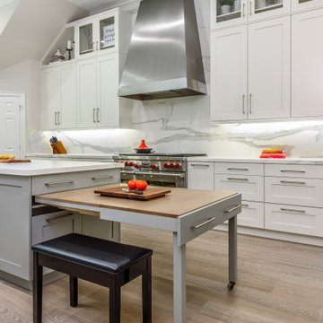
This dark and dated feeling kitchen and bar were completely renovated for this multi-generational global family. By re-configuring the space and incorporating the bar, removing several heavy columns and a wall, it made the kitchen open and accessible to the adjacent rooms and visible from the front door. Everything was lightened and brightened with new cabinetry, counter tops, appliances, flooring, paint, better windows, electrical and lighting. The old range top and down draft were enclosed in a massive brick structure, with no prep space, by removing it and centering the new range on the wall with a custom hood and full height stone back splash, a stunning focal point was created. The position of other key appliances and plumbing were moved or added to create several work stations throughout the large space, such as the refrigeration, full prep sink, coffee bar, baking station, cocktail bar and clean up island. Another special feature of this kitchen was roll out table from the end of the serving island.
Specialty features include:
A roll out table for eating, prep or serving; coffee bar and drink service area with beverage center; full size prep sink adjacent to refrigeration and cooking areas; steam oven and baking station; microwave/warming drawer; dual fuel range with double ovens, 6 burners and a griddle top; two separate islands, one for serving large family meals, one for clean up; specialty spice storage inserts and pull outs; corner turn outs for large items; two double pull outs for trash and recycling; stacked cabinetry with glass display at the top to take advantage of the 14' ceilings.
 Milgard Windows & Doors
The Kiguchi family moved into their Austin, Texas home in 1994. Built in the 1980’s as part of a neighborhood development, they happily raised their family here but longed for something more contemporary. Once they became empty nesters, they decided it was time for a major remodel. After spending many years visiting Austin AIA Home Tours that highlight contemporary residential architecture, they had a lot of ideas and in 2013 were ready to interview architects and get their renovation underway.
The project turned into a major remodel due to an unstable foundation. Architects Ben Arbib and Ed Hughey, of Arbib Hughey Design were hired to solve the structural issue and look for inspiration in the bones of the house, which sat on top of a hillside and was surrounded by great views.
Unfortunately, with the old floor plan, the beautiful views were hidden by small windows that were poorly placed. In order to bring more natural light into the house the window sizes and configurations had to be addressed, all while keeping in mind the homeowners desire for a modern look and feel.
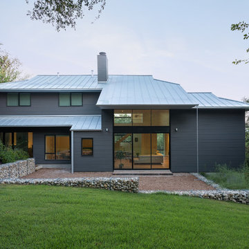
To achieve a more contemporary and sophisticated front of house, a new entry was designed that included removing a two-story bay window and porch. The entrance of the home also became more integrated with the landscape creating a template for new foliage to be planted. Older exterior materials were updated to incorporate a more muted palette of colors with a metal roof, dark grey siding in the back and white stucco in the front. Deep eaves were added over many of the new large windows for clean lines and sun protection.
“Inside it was about opening up the floor plan, expanding the views throughout the house, and updating the material palette to get a modern look that was also warm and inviting,” said Ben from Arbib Hughey Design. “Prior to the remodel, the house had the typical separation of rooms. We removed the walls between them and changed all of the windows to Milgard Thermally Improved Aluminum to connect the inside with the outside. No matter where you are you get nice views and natural light.”
The architects wanted to create some drama, which they accomplished with the window placement and opening up the interior floor plan to an open concept approach. Cabinetry was used to help delineate intimate spaces. To add warmth to an all-white living room, white-washed oak wood floors were installed and pine planks were used around the fireplace. The large windows served as artwork bringing the color of nature into the space.
An octagon shaped, elevated dining room, (named “the turret”), had a big impact on the design of the house. They architects rounded the corners and added larger window openings overlooking a new sunken garden. The great room was also softened by rounding out the corners and that circular theme continued throughout the house, being picked up in skylight wells and kitchen cabinetry. A staircase leading to a catwalk was added and the result was a two-story window wall that flooded the home with natural light.
When asked why Milgard® Thermally Improved Aluminum windows were selected, the architectural team listed many reasons:
1) Aesthetics: “We liked the slim profiles and narrow sightlines. The window frames never get in the way of the view and that was important to us. They also have a very contemporary look that went well with our design.”
2) Options: “We liked that we could get large sliding doors that matched the windows, giving us a very cohesive look and feel throughout the project.”
3) Cost Effective: “Milgard windows are affordable. You get a good product at a good price.”
4) Custom Sizes: “Milgard windows are customizable, which allowed us to get the right window for each location.”
Ready to take on your own traditional to modern home remodeling project? Arbib Hughey Design advises, “Work with a good architect. That means picking a team that is creative, communicative, listens well and is responsive. We think it’s important for an architect to listen to their clients and give them something they want, not something the architect thinks they should have. At the same time you want an architect who is willing and able to think outside the box and offer up design options that you may not have considered. Design is about a lot of back and forth, trying out ideas, getting feedback and trying again.”
The home was completely transformed into a unique, contemporary house perfectly integrated with its site. Internally the home has a natural flow for the occupants and externally it is integrated with the surroundings taking advantage of great natural light. As a side note, it was highly praised as part of the Austin AIA homes tour.
 TVL Creative Ltd.
[Our Clients]
We were so excited to help these new homeowners re-envision their split-level diamond in the rough. There was so much potential in those walls, and we couldn’t wait to delve in and start transforming spaces. Our primary goal was to re-imagine the main level of the home and create an open flow between the space. So, we started by converting the existing single car garage into their living room (complete with a new fireplace) and opening up the kitchen to the rest of the level.
[Kitchen]
The original kitchen had been on the small side and cut-off from the rest of the home, but after we removed the coat closet, this kitchen opened up beautifully. Our plan was to create an open and light filled kitchen with a design that translated well to the other spaces in this home, and a layout that offered plenty of space for multiple cooks. We utilized clean white cabinets around the perimeter of the kitchen and popped the island with a spunky shade of blue. To add a real element of fun, we jazzed it up with the colorful escher tile at the backsplash and brought in accents of brass in the hardware and light fixtures to tie it all together. Through out this home we brought in warm wood accents and the kitchen was no exception, with its custom floating shelves and graceful waterfall butcher block counter at the island.
[Dining Room]
The dining room had once been the home’s living room, but we had other plans in mind. With its dramatic vaulted ceiling and new custom steel railing, this room was just screaming for a dramatic light fixture and a large table to welcome one-and-all.
[Living Room]
We converted the original garage into a lovely little living room with a cozy fireplace. There is plenty of new storage in this space (that ties in with the kitchen finishes), but the real gem is the reading nook with two of the most comfortable armchairs you’ve ever sat in.
[Master Suite]
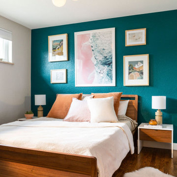
This home didn’t originally have a master suite, so we decided to convert one of the bedrooms and create a charming suite that you’d never want to leave. The master bathroom aesthetic quickly became all about the textures. With a sultry black hex on the floor and a dimensional geometric tile on the walls we set the stage for a calm space. The warm walnut vanity and touches of brass cozy up the space and relate with the feel of the rest of the home. We continued the warm wood touches into the master bedroom, but went for a rich accent wall that elevated the sophistication level and sets this space apart.
[Hall Bathroom]
The floor tile in this bathroom still makes our hearts skip a beat. We designed the rest of the space to be a clean and bright white, and really let the lovely blue of the floor tile pop. The walnut vanity cabinet (complete with hairpin legs) adds a lovely level of warmth to this bathroom, and the black and brass accents add the sophisticated touch we were looking for.
[Office]
We loved the original built-ins in this space, and knew they needed to always be a part of this house, but these 60-year-old beauties definitely needed a little help. We cleaned up the cabinets and brass hardware, switched out the formica counter for a new quartz top, and painted wall a cheery accent color to liven it up a bit. And voila! We have an office that is the envy of the neighborhood.
 J Design Group - Interior Designers Miami - Modern
Projects by J Design Group, Your friendly Interior designers firm in Miami, FL. at your service.
AVENTURA MAGAZINE selected our client’s luxury 5000 Sf ocean front apartment in Miami Beach, to publish it in their issue and they Said:
Story by Linda Marx, Photography by Daniel Newcomb
Light & Bright
New York snowbirds redesigned their Miami Beach apartment to take advantage of the tropical lifestyle.
New York snowbirds redesigned their Miami Beach apartment to take advantage of the tropical lifestyle.
WHEN INTERIOR DESIGNER JENNIFER CORREDOR was asked to recreate a four-bedroom, six-bath condominium at The Bath Club in Miami Beach, she seized the opportunity to open the rooms and better utilize the vast ocean views.
In five months last year, the designer transformed a dark and closed 5,000-square-foot unit located on a high floor into a series of sweeping waterfront spaces and updated the well located apartment into a light and airy retreat for a sports-loving family of five.
“They come down from New York every other weekend and wanted to make their waterfront home a series of grand open spaces,” says Jennifer Corrredor, of the J. Design Group in Miami, a firm specializing in modern and contemporary interiors. “Since many of the rooms face the ocean, it made sense to open and lighten up the home, taking advantage of the awesome views of the sea and the bay.”
The designer used 40 x 40 all white tile throughout the apartment as a clean base. This way, her sophisticated use of color would stand out and bring the outdoors in.
The close-knit family members—two parents and three boys in college—like to do things together. But there were situations to overcome in the process of modernizing and opening the space. When Jennifer Corredor was briefed on their desires, nothing seemed too daunting. The confident designer was ready to delve in. For example, she fixed an area at the front door
that was curved. “The wood was concave so I straightened it out,” she explains of a request from the clients. “It was an obstacle that I overcame as part of what I do in a redesign. I don’t consider it a difficult challenge. Improving what I see is part of the process.”
She also tackled the kitchen with gusto by demolishing a wall. The kitchen had formerly been enclosed, which was a waste of space and poor use of available waterfront ambience. To create a grand space linking the kitchen to the living room and dining room area, something had to go. Once the wall was yesterday’s news, she relocated the refrigerator and freezer (two separate appliances) to the other side of the room. This change was a natural functionality in the new open space. “By tearing out the wall, the family has a better view of the kitchen from the living and dining rooms,” says Jennifer Corredor, who also made it easier to walk in and out of one area and into the other. “The views of the larger public space and the surrounding water are breathtaking.
Opening it up changed everything.”
They clients can now see the kitchen from the living and dining areas, and at the same time, dwell in an airy and open space instead of feeling stuck in a dark enclosed series of rooms. In fact, the high-top bar stools that Jennifer Corredor selected for the kitchen can be twirled around to use for watching TV in the living room.
In keeping with the theme of moving seamlessly from one room to the other, Corredor designed a subtle wall of glass in the living room along with lots of comfortable seating. This way, all family members feel at ease while relaxing, talking, or watching sporting events on the large flat screen television. “For this room, I wanted more open space, light and a supreme airy feeling,” she says. “With the glass design making a statement, it quickly became the star of the show.”…….
….. To add texture and depth, Jennifer Corredor custom created wood doors here, and in other areas of the home. They provide a nice contrast to the open Florida tropical feel. “I added character to the openness by using exotic cherry wood,” she says. “I repeated this throughout the home and it works well.”
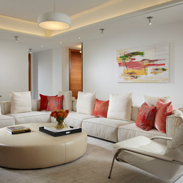
Known for capturing the client’s vision while adding her own innovative twists, Jennifer Corredor lightened the family room, giving it a contemporary and modern edge with colorful art and matching throw pillows on the sofas. She added a large beige leather ottoman as the center coffee table in the room. This round piece was punctuated with a bold-toned flowering plant atop. It effortlessly matches the pillows and colors of the contemporary canvas.
Jennifer Corredor also gutted all of the bathrooms, resulting in a major redesign of the master. She jettisoned the whirlpool and created the dazzling illusion of a floating tub. From an area where there were two toilets, she eliminated one to make a grand rectangular shower, which became an overall showpiece. The master bath went from being just a functional water closet to a sophisticated spa-like space. “The client said I was ‘delicious’ after seeing the change,” laughed Jennifer Corredor, who emphasized that her clients love their part-time life
in South Florida more each time they come down. Even when the husband has to work from their Miami Beach digs, he is surrounded by tropical beauty. For instance, there are times when the master bedroom must double as the husband’s home office.
The room had to be large enough to accommodate a working space for this purpose. So Jennifer Corredor placed an appropriate table near the window and across from the king-size bed. “No blocking of the amazing water view was necessary,” she says. “I kept an open space with a lot of white so It functions well and the work space fits right in.” She repeated the bold modern art in the
room as well as in the guest bedroom, which also has a workspace for the sons when they are home from school and need to study.
The designer is still happy and glowing with the results of her toil in this apartment. She gets a “spiritual feeling” when she walks inside. “It is so peaceful and serene, with subtle hints of explosive statements,” she says. “The entire space is open, yet anchored by the warmth of the exotic woods.” The client wrote Jennifer Corredor a letter at the end of the project congratulating her on a
job well done. She revealed that owning a Miami Beach home was her husband’s dream 30 years ago. “Now we have a quality perfect yet practical home,” she wrote to the designer. “You solved the challenges, and the end
result far exceeds our expectations. We love it.”
Thanks for your interest in our Contemporary Interior Design projects and if you have any question please do not hesitate to ask us.
http://www.JDesignGroup.com
305.444.4611
Modern Interior designer Miami. Contemporary
Miami
Miami Interior Designers
Miami Interior Designer
Interior Designers Miami
Interior Designer Miami
Modern Interior Designers
Modern Interior Designer
Modern interior decorators
Modern interior decorator
Contemporary Interior Designers
Contemporary Interior Designer
Interior design decorators
Interior design decorator
Interior Decoration and Design
Black Interior Designers
Black Interior Designer
Interior designer
Interior designers
Interior design decorators
Interior design decorator
Home interior designers
Home interior designer
Interior design companies
Interior decorators
Interior decorator
Decorators
Decorator
Miami Decorators
Miami Decorator
Decorators Miami
Decorator Miami
Interior Design Firm
Interior Design Firms
Interior Designer Firm
Interior Designer Firms
Interior design
Interior designs
home decorators
Interior decorating Miami
Best Interior Designers.
225 Malaga Ave.
Coral Gable, FL 33134
http://www.JDesignGroup.com
305.444.4611
 emma delon
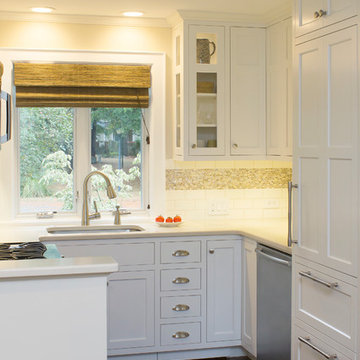
Maximizing the functionality of this space, and coordinating the new kitchen with the beautiful remodel completed previously by the client were the two most important aspects of this project. The existing spaces are elegantly decorated with an open plan, dark hardwood floors, and natural stone accents. The new, lighter, more open kitchen flows beautifully into the client’s existing dining room space. Satin nickel hardware blends with the stainless steel appliances and matches the satin nickel details throughout the home. The fully integrated refrigerator next to the narrow pull-out pantry cabinet, take up less visual weight than a traditional stainless steel appliance and the two combine to provide fantastic storage. The glass cabinet doors and decorative lighting beautifully highlight the client’s glassware and dishes. Finished with white subway tile, Dreamy Marfil quartz countertops, and a warm natural wood blind; the space warm, inviting, elegant, and extremely functional.
copyright 2013 marilyn peryer photography


 Paul Maue Associates Landscape Architects
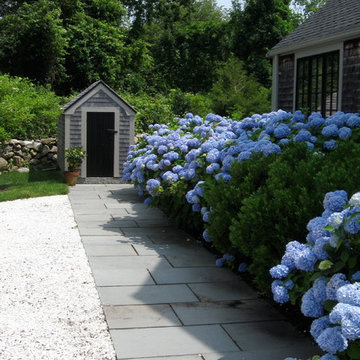
The crused shell driveway is traditional surface that is bordered by a bluestone walk that connects to both the front and back house entries. The relocated tool shed has an outdoor shower on the backside for cleaning up after coming back from the beach. Paul Maue
 JRP Design & Remodel
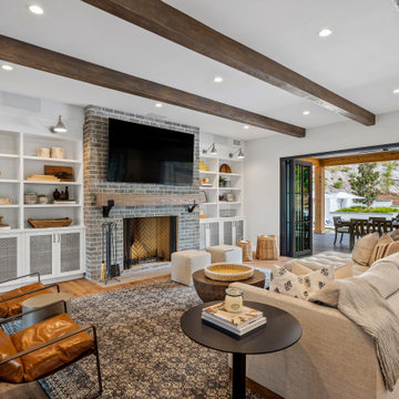
Our clients wanted the ultimate modern farmhouse custom dream home. They found property in the Santa Rosa Valley with an existing house on 3 ½ acres. They could envision a new home with a pool, a barn, and a place to raise horses. JRP and the clients went all in, sparing no expense. Thus, the old house was demolished and the couple’s dream home began to come to fruition.
The result is a simple, contemporary layout with ample light thanks to the open floor plan. When it comes to a modern farmhouse aesthetic, it’s all about neutral hues, wood accents, and furniture with clean lines. Every room is thoughtfully crafted with its own personality. Yet still reflects a bit of that farmhouse charm.
Their considerable-sized kitchen is a union of rustic warmth and industrial simplicity. The all-white shaker cabinetry and subway backsplash light up the room. All white everything complimented by warm wood flooring and matte black fixtures. The stunning custom Raw Urth reclaimed steel hood is also a star focal point in this gorgeous space. Not to mention the wet bar area with its unique open shelves above not one, but two integrated wine chillers. It’s also thoughtfully positioned next to the large pantry with a farmhouse style staple: a sliding barn door.
The master bathroom is relaxation at its finest. Monochromatic colors and a pop of pattern on the floor lend a fashionable look to this private retreat. Matte black finishes stand out against a stark white backsplash, complement charcoal veins in the marble looking countertop, and is cohesive with the entire look. The matte black shower units really add a dramatic finish to this luxurious large walk-in shower.
Photographer: Andrew - OpenHouse VC
 Plain & Posh
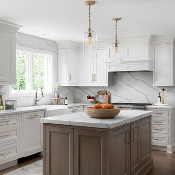
Thse clients came to me for a kitchen refresh. Keeping the existing floor plan but updating as much as possible. After explaining my thoughts, they chose to go with a much larger project. The wall to the garage wash pushed bach 12" to allow for the island to happen. This almost couldn't happen as there is a support post in the garage we had to keep. I designed the last pantry area as on 10" deep, allowing us to conceal that behind the cabinets. Then, we opend up the wall to the dining room to make the rooms one large space. The wall to the family room was also openend up, leaving the half wall to allow for the kitchen eating area. They wanted to incorporate a bar area, without it feeling like a "bar" The fabulous tall custom unit houses their wine collection and then half of the dining room buffet area holds glassware and other bar items. I helped the clients with all of the design choices.We all wanted to keep the space classic, war, functional and with mixed materials. I chose to use the same countertop material for the backsplash, to keep the space feeling as large as possible.
 TKS Design Group
Free ebook, Creating the Ideal Kitchen. DOWNLOAD NOW
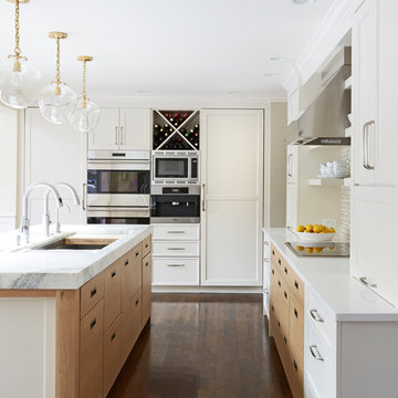
This large open concept kitchen and dining space was created by removing a load bearing wall between the old kitchen and a porch area. The new porch was insulated and incorporated into the overall space. The kitchen remodel was part of a whole house remodel so new quarter sawn oak flooring, a vaulted ceiling, windows and skylights were added.
A large calcutta marble topped island takes center stage. It houses a 5’ galley workstation - a sink that provides a convenient spot for prepping, serving, entertaining and clean up. A 36” induction cooktop is located directly across from the island for easy access. Two appliance garages on either side of the cooktop house small appliances that are used on a daily basis.
Honeycomb tile by Ann Sacks and open shelving along the cooktop wall add an interesting focal point to the room. Antique mirrored glass faces the storage unit housing dry goods and a beverage center. “I chose details for the space that had a bit of a mid-century vibe that would work well with what was originally a 1950s ranch. Along the way a previous owner added a 2nd floor making it more of a Cape Cod style home, a few eclectic details felt appropriate”, adds Klimala.
The wall opposite the cooktop houses a full size fridge, freezer, double oven, coffee machine and microwave. “There is a lot of functionality going on along that wall”, adds Klimala. A small pull out countertop below the coffee machine provides a spot for hot items coming out of the ovens.
The rooms creamy cabinetry is accented by quartersawn white oak at the island and wrapped ceiling beam. The golden tones are repeated in the antique brass light fixtures.
“This is the second kitchen I’ve had the opportunity to design for myself. My taste has gotten a little less traditional over the years, and although I’m still a traditionalist at heart, I had some fun with this kitchen and took some chances. The kitchen is super functional, easy to keep clean and has lots of storage to tuck things away when I’m done using them. The casual dining room is fabulous and is proving to be a great spot to linger after dinner. We love it!”
Designed by: Susan Klimala, CKD, CBD
For more information on kitchen and bath design ideas go to: www.kitchenstudio-ge.com


 The Jack + Mare | Portland Design & Build
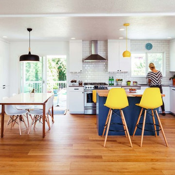
Split Level 1970 home of a young and active family of four. The main public spaces in this home were remodeled to create a fresh, clean look.
The Jack + Mare demo'd the kitchen and dining room down to studs and removed the wall between the kitchen/dining and living room to create an open concept space with a clean and fresh new kitchen and dining with ample storage. Now the family can all be together and enjoy one another's company even if mom or dad is busy in the kitchen prepping the next meal.
The custom white cabinets and the blue accent island (and walls) really give a nice clean and fun feel to the space. The island has a gorgeous local solid slab of wood on top. A local artisan salvaged and milled up the big leaf maple for this project. In fact, the tree was from the University of Portland's campus located right where the client once rode the bus to school when she was a child. So it's an extra special custom piece! (fun fact: there is a bullet lodged in the wood that is visible...we estimate it was shot into the tree 30-35 years ago!)
The 'public' spaces were given a brand new waterproof luxury vinyl wide plank tile. With 2 young daughters, a large golden retriever and elderly cat, the durable floor was a must.
project scope at quick glance:
- demo'd and rebuild kitchen and dining room.
- removed wall separating kitchen/dining and living room
- removed carpet and installed new flooring in public spaces
- removed stair carpet and gave fresh black and white paint
- painted all public spaces
- new hallway doorknob harware
- all new LED lighting (kitchen, dining, living room and hallway)
Jason Quigley Photography
 Décor Aid
Million Dollar Listing’s celebrity broker Ryan Serhant reached out to Decor Aid to stage a luxurious Brooklyn condo development. The only caveat was that our interior designers had 48 hours to come up with the design, concept, and source all the furniture. Always up for a challenge, we partnered with Mitchell Gold & Bob Williams to create this contemporary gem.
Staying true to their contemporary vision, our interior decorators sourced all pieces through MGBW. Starting in the living room, we placed the Gunner Sofa, a piece that offers clean-lined living. The thin arms and slanted profile emphasize the modern elegance of the home. Through the use of various contemporary patterns and textures we were able to avoid the one-dimensional ambiance, and instead, the apartment’s living room feels detailed and thought out, without making anyone who enters overcrowded with home decor.
The Melrose cocktail table was sourced for its sleek, stainless steel and glass design that contrasts with more substantial pieces in the space, while also complementing the contemporary style. The glass design gives the illusion that this table takes up less space, giving the living room design a light and airy feel all around. The living space transformed into something out of a decor catalog with just the right amount of personality, creating a room that follows through with our starting design, yet functional for everyday use.
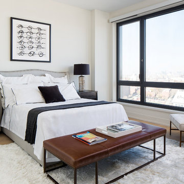
After the living room area, we set our eyes on designing the master bedroom. Our interior decorators were immediately drawn to the Celina Floating Rail Bed, it’s opulent nailhead trim, and dramatic design brings fresh sophistication to the bedroom design, while also standing out as a timeless piece that can complement various trends or styles that might be added later on to the bedroom decoration. We sourced the Roland Table Lamp to add texture, with its elaborate ribbed design, that compliments the air of masculinity the Carmen Leather Ottoman add while contrasting with the light, sleeker pieces. This difference in weight left us with a bedroom decoration that lives up to the trending modern standards, yet a space that is timeless and stylish no matter the decor trends.
Once we finished and the project was completed, our senior designers took a step back and took in all of their hard labor. Decor Aid was able to make this newly built blank space and design it into a modern wonder small brooklyn apartment. The MGBW furnishings were all hand-picked to keep an even balance of complementing and contrasting contemporary pieces, which was one of our more critical apartment decorating ideas. The apartment home decor brings to life this modern concept in a way that isn’t overbearing and shows off their style making the space in every sense an accurate reflection of a chic contemporary style.
 Corine Maggio Design
This adorable beach cottage is in the heart of the village of La Jolla in San Diego. The goals were to brighten up the space and be the perfect beach get-away for the client whose permanent residence is in Arizona. Some of the ways we achieved the goals was to place an extra high custom board and batten in the great room and by refinishing the kitchen cabinets (which were in excellent shape) white. We created interest through extreme proportions and contrast. Though there are a lot of white elements, they are all offset by a smaller portion of very dark elements. We also played with texture and pattern through wallpaper, natural reclaimed wood elements and rugs. This was all kept in balance by using a simplified color palate minimal layering.
I am so grateful for this client as they were extremely trusting and open to ideas. To see what the space looked like before the remodel you can go to the gallery page of the website www.cmnaturaldesigns.com
Photography by: Chipper Hatter
2