
Search results for "Clean up reasons" in Home Design Ideas
 CG&S Design-Build
Design by Joanna Hartman
Photography by Ryann Ford
Styling by Adam Fortner
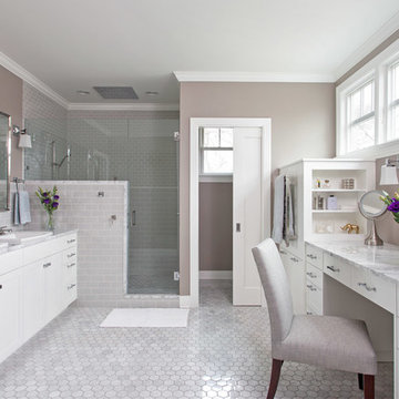
This bath features 3cm Bianco Carrera Marble at the vanities, Restoration Hardware, Ann Sacks "Savoy" 3X6 and 2x4 tile in Dove on shower walls and backsplash, D190 Payette Liner for shower walls and niche, 3" Carrara Hex honed and polished floor and shower floor tile, Benjamin Moore "River Reflections" paint, and Restoration Hardware chrome Dillon sconces.
 Change Your Bathroom©
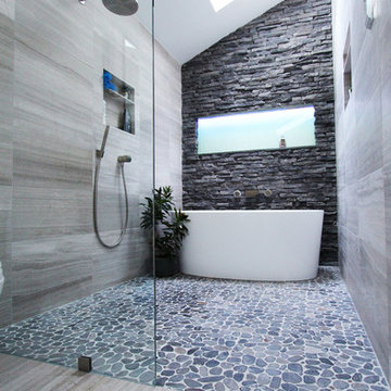
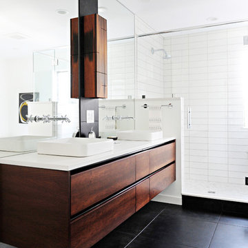
The goal of this project was to upgrade the builder grade finishes and create an ergonomic space that had a contemporary feel. This bathroom transformed from a standard, builder grade bathroom to a contemporary urban oasis. This was one of my favorite projects, I know I say that about most of my projects but this one really took an amazing transformation. By removing the walls surrounding the shower and relocating the toilet it visually opened up the space. Creating a deeper shower allowed for the tub to be incorporated into the wet area. Adding a LED panel in the back of the shower gave the illusion of a depth and created a unique storage ledge. A custom vanity keeps a clean front with different storage options and linear limestone draws the eye towards the stacked stone accent wall.
Houzz Write Up: https://www.houzz.com/magazine/inside-houzz-a-chopped-up-bathroom-goes-streamlined-and-swank-stsetivw-vs~27263720
The layout of this bathroom was opened up to get rid of the hallway effect, being only 7 foot wide, this bathroom needed all the width it could muster. Using light flooring in the form of natural lime stone 12x24 tiles with a linear pattern, it really draws the eye down the length of the room which is what we needed. Then, breaking up the space a little with the stone pebble flooring in the shower, this client enjoyed his time living in Japan and wanted to incorporate some of the elements that he appreciated while living there. The dark stacked stone feature wall behind the tub is the perfect backdrop for the LED panel, giving the illusion of a window and also creates a cool storage shelf for the tub. A narrow, but tasteful, oval freestanding tub fit effortlessly in the back of the shower. With a sloped floor, ensuring no standing water either in the shower floor or behind the tub, every thought went into engineering this Atlanta bathroom to last the test of time. With now adequate space in the shower, there was space for adjacent shower heads controlled by Kohler digital valves. A hand wand was added for use and convenience of cleaning as well. On the vanity are semi-vessel sinks which give the appearance of vessel sinks, but with the added benefit of a deeper, rounded basin to avoid splashing. Wall mounted faucets add sophistication as well as less cleaning maintenance over time. The custom vanity is streamlined with drawers, doors and a pull out for a can or hamper.
A wonderful project and equally wonderful client. I really enjoyed working with this client and the creative direction of this project.
Brushed nickel shower head with digital shower valve, freestanding bathtub, curbless shower with hidden shower drain, flat pebble shower floor, shelf over tub with LED lighting, gray vanity with drawer fronts, white square ceramic sinks, wall mount faucets and lighting under vanity. Hidden Drain shower system. Atlanta Bathroom.
 TKS Design Group
Download our free ebook, Creating the Ideal Kitchen. DOWNLOAD NOW
This master bath remodel is the cat's meow for more than one reason! The materials in the room are soothing and give a nice vintage vibe in keeping with the rest of the home. We completed a kitchen remodel for this client a few years’ ago and were delighted when she contacted us for help with her master bath!
The bathroom was fine but was lacking in interesting design elements, and the shower was very small. We started by eliminating the shower curb which allowed us to enlarge the footprint of the shower all the way to the edge of the bathtub, creating a modified wet room. The shower is pitched toward a linear drain so the water stays in the shower. A glass divider allows for the light from the window to expand into the room, while a freestanding tub adds a spa like feel.
The radiator was removed and both heated flooring and a towel warmer were added to provide heat. Since the unit is on the top floor in a multi-unit building it shares some of the heat from the floors below, so this was a great solution for the space.
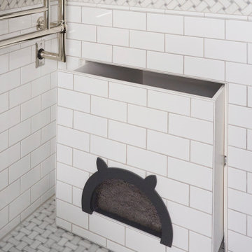
The custom vanity includes a spot for storing styling tools and a new built in linen cabinet provides plenty of the storage. The doors at the top of the linen cabinet open to stow away towels and other personal care products, and are lighted to ensure everything is easy to find. The doors below are false doors that disguise a hidden storage area. The hidden storage area features a custom litterbox pull out for the homeowner’s cat! Her kitty enters through the cutout, and the pull out drawer allows for easy clean ups.
The materials in the room – white and gray marble, charcoal blue cabinetry and gold accents – have a vintage vibe in keeping with the rest of the home. Polished nickel fixtures and hardware add sparkle, while colorful artwork adds some life to the space.
Find the right local pro for your project
 Kitchen Kraft
John Evans
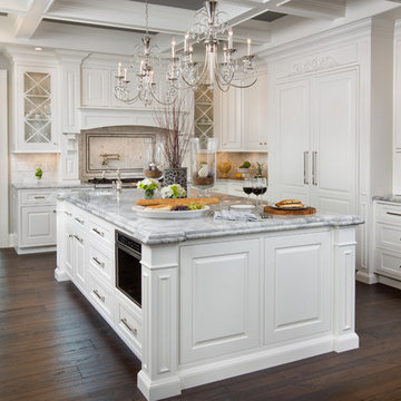
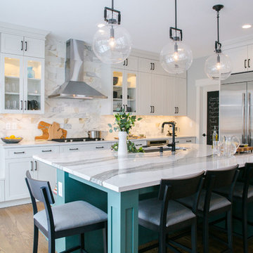
Inspiration for a huge timeless u-shaped dark wood floor kitchen remodel in Columbus with beaded inset cabinets, white cabinets, white backsplash, paneled appliances, an island, granite countertops and stone tile backsplash
Inspiration for a huge timeless u-shaped dark wood floor kitchen remodel in Columbus with beaded inset cabinets, white cabinets, white backsplash, paneled appliances, an island, granite countertops and stone tile backsplash
 TVL Creative Ltd.
Our clients had just recently closed on their new house in Stapleton and were excited to transform it into their perfect forever home. They wanted to remodel the entire first floor to create a more open floor plan and develop a smoother flow through the house that better fit the needs of their family. The original layout consisted of several small rooms that just weren’t very functional, so we decided to remove the walls that were breaking up the space and restructure the first floor to create a wonderfully open feel.
After removing the existing walls, we rearranged their spaces to give them an office at the front of the house, a large living room, and a large dining room that connects seamlessly with the kitchen. We also wanted to center the foyer in the home and allow more light to travel through the first floor, so we replaced their existing doors with beautiful custom sliding doors to the back yard and a gorgeous walnut door with side lights to greet guests at the front of their home.
Living Room
Our clients wanted a living room that could accommodate an inviting sectional, a baby grand piano, and plenty of space for family game nights. So, we transformed what had been a small office and sitting room into a large open living room with custom wood columns. We wanted to avoid making the home feel too vast and monumental, so we designed custom beams and columns to define spaces and to make the house feel like a home. Aesthetically we wanted their home to be soft and inviting, so we utilized a neutral color palette with occasional accents of muted blues and greens.
Dining Room
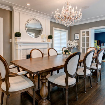
Our clients were also looking for a large dining room that was open to the rest of the home and perfect for big family gatherings. So, we removed what had been a small family room and eat-in dining area to create a spacious dining room with a fireplace and bar. We added custom cabinetry to the bar area with open shelving for displaying and designed a custom surround for their fireplace that ties in with the wood work we designed for their living room. We brought in the tones and materiality from the kitchen to unite the spaces and added a mixed metal light fixture to bring the space together
Kitchen
We wanted the kitchen to be a real show stopper and carry through the calm muted tones we were utilizing throughout their home. We reoriented the kitchen to allow for a big beautiful custom island and to give us the opportunity for a focal wall with cooktop and range hood. Their custom island was perfectly complimented with a dramatic quartz counter top and oversized pendants making it the real center of their home. Since they enter the kitchen first when coming from their detached garage, we included a small mud-room area right by the back door to catch everyone’s coats and shoes as they come in. We also created a new walk-in pantry with plenty of open storage and a fun chalkboard door for writing notes, recipes, and grocery lists.
Office
We transformed the original dining room into a handsome office at the front of the house. We designed custom walnut built-ins to house all of their books, and added glass french doors to give them a bit of privacy without making the space too closed off. We painted the room a deep muted blue to create a glimpse of rich color through the french doors
Powder Room
The powder room is a wonderful play on textures. We used a neutral palette with contrasting tones to create dramatic moments in this little space with accents of brushed gold.
Master Bathroom
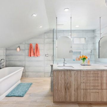
The existing master bathroom had an awkward layout and outdated finishes, so we redesigned the space to create a clean layout with a dream worthy shower. We continued to use neutral tones that tie in with the rest of the home, but had fun playing with tile textures and patterns to create an eye-catching vanity. The wood-look tile planks along the floor provide a soft backdrop for their new free-standing bathtub and contrast beautifully with the deep ash finish on the cabinetry.

 Twelve Stones Designs, LLC
The owners of this kitchen had spent the money to upgrade the finishes in their kitchen upon building the home 12 years ago, but after living in the space for several years they realized how nonfunctional the layout really was. The (then) two preschool aged children had grown into busy, hungry teenagers with many friends who also liked to hang out at the house. So the family needed a more functional kitchen with better traffic flow, space for daily activities revolving around the kitchen at different times of day, and a kitchen that could accommodate cooking for and serving large groups. Furthermore, the dark, traditional finishes no longer reflected the homeowners’ style. They requested a brighter, more relaxed, coastal style that reflected their love of the seaside cities they like to visit.
Originally, the kitchen was U-shaped with a narrow island in the middle. The island created narrow aisles that bottle-necked at the dishwasher, refrigerator, and cooktop areas. There was a pass-through from the foyer into the kitchen, but the owners never liked that the pass-through was also located so close to the powder room. The awkward proximity was unappealing and made guests feel uncomfortable.
The kitchen’s storage was made up of lots of narrow cabinets, apothecary drawers, clipped corner units, and very few drawers. It lacked useful storage for the larger items the family used on a daily basis. And the kitchen’s only pantry was small closet that had only builder-grade, narrow shelving with no illumination to be able to see the contents inside.
Overall, the kitchen’s lighting plan was poorly executed. Only six recessed cans illuminated the entire kitchen and nook areas. The under cabinet lighting was not evenly distributed either. In fact, the builder had mis-placed the under cabinet lighting around the decorative pilasters which made for choppy, dark cubbies. Further, the builder didn’t include any lighting over the sink or the bar area, which meant whoever was doing the dishes was always in their own shadow. That, coupled with the steep overhang of the game room above made the bar area feel like a dim, cavernous space that wasn’t inviting or task oriented. The kitchen looked out into the main living space, but the raised bar and a narrow wall (which held the only large cabinet in the kitchen) created more of a barrier than a relationship to the living room or breakfast nook. In fact, one couldn’t even see the breakfast nook from the cooktop or sink areas due to its orientation. The raised bar top was too narrow to comfortably sit to either dine at or chat from due to the lack of knee space. The the homeowners confided that the kitchen felt more like a dark, dirty prison than place where the family, or their guests, wanted to gather and commune.
The clients' needs and desires were:
➢ to create a kitchen that would be a space the family loved to be in; to relate to the adjacent spaces all around, and to have better flow for entertaining large groups
➢ to remove the walls between the breakfast nook and living area and to be able to utilize the natural light from the windows in both those areas
➢ to incorporate a functional chopping block for prepping fresh food for home cooked meals, an island with a large sink and drain board, 2 pull out trash cans, and seating for at least the 2 teens to eat or do homework
➢ to design a kitchen and breakfast nook with an airy, coastal, relaxed vibe that blended with the rest of the house's coastal theme
➢ to integrate a layered lighting plan which would include ample general illumination, specific task lighting, decorative lighting, and lots of illuminated storage
➢ to design a kitchen with not only more storage for all the husband’s kitchen gadgets and collection of oils and spices, but smart storage, including a coffee/breakfast bar and a place to store and conceal the toaster oven and microwave
➢ to find a way to utilize the large open space between the kitchen, pantry area, and breakfast nook
Twelve Stones Designs achieved the owner's goals by:
➢ removing the walls between the kitchen and living room to allow the natural light to filter in from the adjacent rooms and to create a connection between the kitchen, nook, and living spaces for a sense of unity and communion
➢ removing the existing pantry and designing 3 large pantry style cabinets with LED tape lights and rollout drawers to house lots of kitchen appliances, gadgets, and tons of groceries. We also took the cabinets all the way up to the 9’ ceiling for additional storage for seasonal items and bulk storage.
➢ designing 2 islands - 1 with a gorgeous black walnut chopping block that houses a drawer for chopping and carving knives and a custom double pull out trash unit for point of use utilization - and 1 that houses the dishwasher, a large Blanco Gourmet sink with integrated drain board, woven baskets for fresh root vegetables and kitchen towels, plenty of drawer storage for kitchen items, and bar seating for up to 4 diners.
➢ closing off the space between the kitchen and the powder room to create a beautiful new private alcove for the powder room as well as adding some decorative storage. This also gave us space to include more tall storage near the new range for precision placement of the husband’s extensive oil and spice collection as well as a location for a combo-steam oven the wife wanted for baking and cooking healthy meals.
The project is enhanced functionally by:
➢ incorporated USB and standard receptacles for the kids’ laptops and phone charging in the large island
➢ designing the small island to include additional open shelving for items used on a daily basis such as a variety of bowls, plates, and colanders. This set up also works well for the husband who prefers to “plate” his dinners in restaurant-style fashion before presenting them to the table.
➢ the integration of specific storage units, such as double stacked cutlery drawers, a custom spice pull-out, a Kuerig coffee and tea pod drawer, and custom double stacked utensil drawers
➢ moving the refrigerator to the old oven location - this eliminated the bottle neck as well as created a better relationship to the eating table. It also utilizes the floor space between the pantry, nook, and kitchen
➢ creating a banquet style breakfast nook - this banquette seating not only doubles the amount of seating for large gatherings but it better utilizes the odd space between the kitchen and the previous nook area. It also helps to create a distinct pathway from the mudroom room through the pantry area, kitchen, nook, and living room.
➢ the coffee/breakfast bar area which includes the perfect location for the concealed microwave and toaster oven, convenient storage for the coffee pods and tea accoutrements. Roll-out drawers below also house the smoothie maker, hot water kettle, and a plethora of smoothie-making ingredients such as protein powders, smoothie additives, etc. Furthermore, the drawers below the Keurig house measuring utensil, cutlery, baking supplies and tupperware storage.
➢ incorporating lots of wide drawers and pullouts to accommodate large cookware.
➢ utilizing as much vertical space as possible by building storage to the ceiling which accommodates the family’s abundant amount of serving platters, baking sheets, bakeware, casserole dishes, and additional cutting boards.
The project is enhanced aesthetically by:
➢ new 5-piece Versailles pattern porcelain tile that now seamlessly joins the entire down stairs area together creating a bright, cohesiveness feeling instead of choppy separated spaces - it also adds a coastal feeling
➢ designing a cabinet to conceal the microwave and toaster oven
➢ the coastal influenced light fixtures over the nook table and island
➢ the sandy colors of the Langdon Cambria countertops. The swirling pattern and sparkling quartz pieces remind the homeowner of black-and-tan sandy beaches
➢ the striped banquet seating whose creamy white background and blue-green stripes were the inspiration for the cabinet and wall colors.
➢ All the interior doors were painted black to coordinate with the blacks and grays in the backsplash tile and countertop. This also adds a hint of tailored formality to an otherwise casual space.
➢ the use of WAC's Oculux small aperture LED units for the overhead lighting complimented with Diode LED strips for task lighting under the cabinets and inside the pantry and glass wall cabinets. All of the lighting applications are on separate dimmer switches.
Innovative uses of materials or construction methods by Realty Restoration LLC:
➢ Each 1-1/2” x 3” block of reclaimed end-grain black walnut that makes up the center island chopping block was hand milled and built in the shop. It was designed to look substantial and proportional to the surrounding elements, executed by creating the 4 inch tall top with a solid wood chamfered edge band.
➢ The metal doors on either side of the vent hood were also custom designed for this project and built in the Realty Restoration LLC shop. They are made 1x2, 11-gauge mild steel with ribbed glass. Weighing 60 lbs a piece, heavy duty cabinet hinges were added to support the weight of the door and keep them from sagging.
➢ Under-cabinet receptacles were added along the range wall in order to have a clean, uninterrupted backsplash.
Design obstacles to overcome:
➢ Because we were removing the demising walls between the kitchen and living room, we had to find a way to plumb and vent the new island. We did this by tunneling through the slab (the slab had post tension cables which prevented us from just trenching) to run a new wet vent through a nearby structural wall. We pulled the existing hot and cold lines between upper floor joists and ran them down the structural wall as well and up through a conduit in the tunnel.
➢ Since we were converting from wall overs to a gas range it allowed us to utilize the 220 feed for the wall ovens to provide a new sub panel for all the new kitchen circuits
➢ Due to framing deficiencies inherited from the original build there was a 1-1/2” differential in the floor-to-ceiling height over a 20 foot span; by utilizing the process of cutting and furring coupled with the crown moulding details on the cabinet elevations we were able to mask the problem and provide seamless transitions between the cabinet components.
Evidence of superior craftsmanship:
➢ uniquely designed, one-of-a-kind metal “X” end panels on the large island. The end panels were custom made in the Realty Restoration LLC shop and fitted to the exact dimensions of the island. The welding seams are completely indistinguishable - the posts look like they are cut from a single sheet of metal
➢ square metal posts on the small island were also custom made and designed to compliment and carry through the metal element s throughout the kitchen
➢ the beautiful, oversized end panels on the pantry cabinets which give the breakfast nook a tailored look
➢ integrating a large format 5 piece Versailles tile pattern to seamlessly flow from the existing spaces into the new kitchen space
➢ By constructing a custom cabinet that jogged around a corner we could not remodel (housing the entry way coat closet) we were able to camouflage the adjacent wall offset within the upper and lower cabinets. By designing around the existing jog in the structural walls we accomplished a few things: we were able to find the space to house, and hide, the microwave and toaster oven yet still have a clean cohesive appearance from the kitchen side. Additionally, the owners were able to keep their much needed coat closet and we didn’t have to increase the budget with unnecessary structural work.
 Pineapple House Interior Design
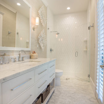
The shower is universally designed and has no curb or step at its entry. The drawer pulls are also designed for easy use.
A Bonisolli Photography
Mid-sized transitional white tile walk-in shower photo in Miami with an undermount sink, flat-panel cabinets, white cabinets and marble countertops
Mid-sized transitional white tile walk-in shower photo in Miami with an undermount sink, flat-panel cabinets, white cabinets and marble countertops

 Change Your Bathroom©
The goal of this project was to upgrade the builder grade finishes and create an ergonomic space that had a contemporary feel. This bathroom transformed from a standard, builder grade bathroom to a contemporary urban oasis. This was one of my favorite projects, I know I say that about most of my projects but this one really took an amazing transformation. By removing the walls surrounding the shower and relocating the toilet it visually opened up the space. Creating a deeper shower allowed for the tub to be incorporated into the wet area. Adding a LED panel in the back of the shower gave the illusion of a depth and created a unique storage ledge. A custom vanity keeps a clean front with different storage options and linear limestone draws the eye towards the stacked stone accent wall.
Houzz Write Up: https://www.houzz.com/magazine/inside-houzz-a-chopped-up-bathroom-goes-streamlined-and-swank-stsetivw-vs~27263720
The layout of this bathroom was opened up to get rid of the hallway effect, being only 7 foot wide, this bathroom needed all the width it could muster. Using light flooring in the form of natural lime stone 12x24 tiles with a linear pattern, it really draws the eye down the length of the room which is what we needed. Then, breaking up the space a little with the stone pebble flooring in the shower, this client enjoyed his time living in Japan and wanted to incorporate some of the elements that he appreciated while living there. The dark stacked stone feature wall behind the tub is the perfect backdrop for the LED panel, giving the illusion of a window and also creates a cool storage shelf for the tub. A narrow, but tasteful, oval freestanding tub fit effortlessly in the back of the shower. With a sloped floor, ensuring no standing water either in the shower floor or behind the tub, every thought went into engineering this Atlanta bathroom to last the test of time. With now adequate space in the shower, there was space for adjacent shower heads controlled by Kohler digital valves. A hand wand was added for use and convenience of cleaning as well. On the vanity are semi-vessel sinks which give the appearance of vessel sinks, but with the added benefit of a deeper, rounded basin to avoid splashing. Wall mounted faucets add sophistication as well as less cleaning maintenance over time. The custom vanity is streamlined with drawers, doors and a pull out for a can or hamper.
A wonderful project and equally wonderful client. I really enjoyed working with this client and the creative direction of this project.
Brushed nickel shower head with digital shower valve, freestanding bathtub, curbless shower with hidden shower drain, flat pebble shower floor, shelf over tub with LED lighting, gray vanity with drawer fronts, white square ceramic sinks, wall mount faucets and lighting under vanity. Hidden Drain shower system. Atlanta Bathroom.
 Artistic Renovations of Ohio LLC
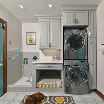
this dog wash is a great place to clean up your pets and give them the spa treatment they deserve. There is even an area to relax for your pet under the counter in the padded cabinet.
 Susan Yeley Homes
This gem of a house was built in the 1950s, when its neighborhood undoubtedly felt remote. The university footprint has expanded in the 70 years since, however, and today this home sits on prime real estate—easy biking and reasonable walking distance to campus.
When it went up for sale in 2017, it was largely unaltered. Our clients purchased it to renovate and resell, and while we all knew we'd need to add square footage to make it profitable, we also wanted to respect the neighborhood and the house’s own history. Swedes have a word that means “just the right amount”: lagom. It is a guiding philosophy for us at SYH, and especially applied in this renovation. Part of the soul of this house was about living in just the right amount of space. Super sizing wasn’t a thing in 1950s America. So, the solution emerged: keep the original rectangle, but add an L off the back.
With no owner to design with and for, SYH created a layout to appeal to the masses. All public spaces are the back of the home--the new addition that extends into the property’s expansive backyard. A den and four smallish bedrooms are atypically located in the front of the house, in the original 1500 square feet. Lagom is behind that choice: conserve space in the rooms where you spend most of your time with your eyes shut. Put money and square footage toward the spaces in which you mostly have your eyes open.
In the studio, we started calling this project the Mullet Ranch—business up front, party in the back. The front has a sleek but quiet effect, mimicking its original low-profile architecture street-side. It’s very Hoosier of us to keep appearances modest, we think. But get around to the back, and surprise! lofted ceilings and walls of windows. Gorgeous.
 TaylorPro Design and Remodeling, Inc.
"Kerry Taylor was professional and courteous from our first meeting forwards. We took a long time to decide on our final design but Kerry and his design team were patient and respectful and waited until we were ready to move forward. There was never a sense of being pushed into anything we didn’t like. They listened, carefully considered our requests and delivered an awesome plan for our new bathroom. Kerry also broke down everything so that we could consider several alternatives for features and finishes and was mindful to stay within our budget. He accommodated some on-the-fly changes, after construction was underway and suggested effective solutions for any unforeseen problems that arose.
Having construction done in close proximity to our master bedroom was a challenge but the excellent crew TaylorPro had on our job made it relatively painless: courteous and polite, arrived on time daily, worked hard, pretty much nonstop and cleaned up every day before leaving. If there were any delays, Kerry made sure to communicate with us quickly and was always available to talk when we had concerns or questions."
This Carlsbad couple yearned for a generous master bath that included a big soaking tub, double vanity, water closet, large walk-in shower, and walk in closet. Unfortunately, their current master bathroom was only 6'x12'.
Our design team went to work and came up with a solution to push the back wall into an unused 2nd floor vaulted space in the garage, and further expand the new master bath footprint into two existing closet areas. These inventive expansions made it possible for their luxurious master bath dreams to come true.
Just goes to show that, with TaylorPro Design & Remodeling, fitting a square peg in a round hole could be possible!
Photos by: Jon Upson
 Tracy Berman Interiors
The kids Jack and Jill bath received a full makeover with knotty alder vanities, a Dekton counter top and antique pewter finishes on the plumbing fixtures. The pebble tile left with a natural edge gives this bathroom a cool rustic feel to it. The bath/shower combo is clean and easy to maintain with a striped pattern of flat and wavy tile.
The guest bath received a partial black and white update. The shower was in great shape so we chose to keep it and switch the fixtures to matte black. The floor received a patterned tile and a new white vanity cleaned up the space. A matte black metal framed mirror and shelving unit complete the look.
 Plain & Posh
This stunning home is a combination of the best of traditional styling with clean and modern design, creating a look that will be as fresh tomorrow as it is today. Traditional white painted cabinetry in the kitchen, combined with the slab backsplash, a simpler door style and crown moldings with straight lines add a sleek, non-fussy style. An architectural hood with polished brass accents and stainless steel appliances dress up this painted kitchen for upscale, contemporary appeal. The kitchen islands offers a notable color contrast with their rich, dark, gray finish.
The stunning bar area is the entertaining hub of the home. The second bar allows the homeowners an area for their guests to hang out and keeps them out of the main work zone.
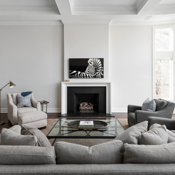
The family room used to be shut off from the kitchen. Opening up the wall between the two rooms allows for the function of modern living. The room was full of built ins that were removed to give the clean esthetic the homeowners wanted. It was a joy to redesign the fireplace to give it the contemporary feel they longed for.
Their used to be a large angled wall in the kitchen (the wall the double oven and refrigerator are on) by straightening that out, the homeowners gained better function in the kitchen as well as allowing for the first floor laundry to now double as a much needed mudroom room as well.
Sponsored
Columbus, OH

Hope Restoration & General Contracting
Columbus Design-Build, Kitchen & Bath Remodeling, Historic Renovations
 Pamela Dailey Design
This 400 s.f. studio apartment in NYC’s Greenwich Village serves as a pied-a-terre
for clients whose primary residence is on the West Coast.
Although the clients do not reside here full-time, this tiny space accommodates
all the creature comforts of home.
Bleached hardwood floors, crisp white walls, and high ceilings are the backdrop to
a custom blackened steel and glass partition, layered with raw silk sheer draperies,
to create a private sleeping area, replete with custom built-in closets.
Simple headboard and crisp linens are balanced with a lightly-metallic glazed
duvet and a vintage textile pillow.
The living space boasts a custom Belgian linen sectional sofa that pulls out into a
full-size bed for the couple’s young children who sometimes accompany them.
Efficient and inexpensive dining furniture sits comfortably in the main living space
and lends clean, Scandinavian functionality for sharing meals. The sculptural
handrafted metal ceiling mobile offsets the architecture’s clean lines, defining the
space while accentuating the tall ceilings.
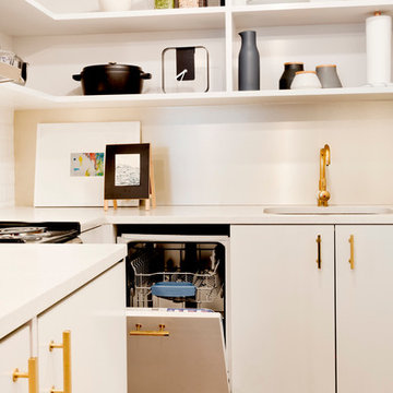
The kitchenette combines custom cool grey lacquered cabinets with brass fittings,
white beveled subway tile, and a warm brushed brass backsplash; an antique
Boucherouite runner and textural woven stools that pull up to the kitchen’s
coffee counter punctuate the clean palette with warmth and the human scale.
The under-counter freezer and refrigerator, along with the 18” dishwasher, are all
panelled to match the cabinets, and open shelving to the ceiling maximizes the
feeling of the space’s volume.
The entry closet doubles as home for a combination washer/dryer unit.
The custom bathroom vanity, with open brass legs sitting against floor-to-ceiling
marble subway tile, boasts a honed gray marble countertop, with an undermount
sink offset to maximize precious counter space and highlight a pendant light. A
tall narrow cabinet combines closed and open storage, and a recessed mirrored
medicine cabinet conceals additional necessaries.
The stand-up shower is kept minimal, with simple white beveled subway tile and
frameless glass doors, and is large enough to host a teak and stainless bench for
comfort; black sink and bath fittings ground the otherwise light palette.
What had been a generic studio apartment became a rich landscape for living.
 TVL Creative Ltd.
[Our Clients]
We were so excited to help these new homeowners re-envision their split-level diamond in the rough. There was so much potential in those walls, and we couldn’t wait to delve in and start transforming spaces. Our primary goal was to re-imagine the main level of the home and create an open flow between the space. So, we started by converting the existing single car garage into their living room (complete with a new fireplace) and opening up the kitchen to the rest of the level.
[Kitchen]
The original kitchen had been on the small side and cut-off from the rest of the home, but after we removed the coat closet, this kitchen opened up beautifully. Our plan was to create an open and light filled kitchen with a design that translated well to the other spaces in this home, and a layout that offered plenty of space for multiple cooks. We utilized clean white cabinets around the perimeter of the kitchen and popped the island with a spunky shade of blue. To add a real element of fun, we jazzed it up with the colorful escher tile at the backsplash and brought in accents of brass in the hardware and light fixtures to tie it all together. Through out this home we brought in warm wood accents and the kitchen was no exception, with its custom floating shelves and graceful waterfall butcher block counter at the island.
[Dining Room]
The dining room had once been the home’s living room, but we had other plans in mind. With its dramatic vaulted ceiling and new custom steel railing, this room was just screaming for a dramatic light fixture and a large table to welcome one-and-all.
[Living Room]
We converted the original garage into a lovely little living room with a cozy fireplace. There is plenty of new storage in this space (that ties in with the kitchen finishes), but the real gem is the reading nook with two of the most comfortable armchairs you’ve ever sat in.
[Master Suite]
This home didn’t originally have a master suite, so we decided to convert one of the bedrooms and create a charming suite that you’d never want to leave. The master bathroom aesthetic quickly became all about the textures. With a sultry black hex on the floor and a dimensional geometric tile on the walls we set the stage for a calm space. The warm walnut vanity and touches of brass cozy up the space and relate with the feel of the rest of the home. We continued the warm wood touches into the master bedroom, but went for a rich accent wall that elevated the sophistication level and sets this space apart.
[Hall Bathroom]
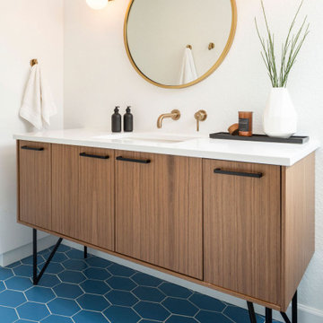
The floor tile in this bathroom still makes our hearts skip a beat. We designed the rest of the space to be a clean and bright white, and really let the lovely blue of the floor tile pop. The walnut vanity cabinet (complete with hairpin legs) adds a lovely level of warmth to this bathroom, and the black and brass accents add the sophisticated touch we were looking for.
[Office]
We loved the original built-ins in this space, and knew they needed to always be a part of this house, but these 60-year-old beauties definitely needed a little help. We cleaned up the cabinets and brass hardware, switched out the formica counter for a new quartz top, and painted wall a cheery accent color to liven it up a bit. And voila! We have an office that is the envy of the neighborhood.
 JRP Design & Remodel
Our client came to us with a desire to take an overgrown, neglected space and transform it into a clean contemporary backyard for the family to enjoy. Having had less than stellar experiences with other contractors, they wanted to find a trustworthy company; One that would complement their style and provide excellent communication. They saw a JRP banner at their son's baseball game at Westlake High School and decided to call. After meeting with the team, they knew JRP was the firm they needed to give their backyard a complete overhaul.
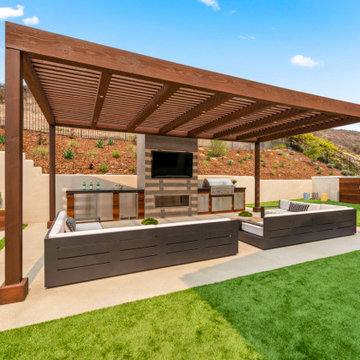
With a focus on sleek, clean lines, this contemporary backyard is captivating. The outdoor family room is a perfect blend of beauty, form, and function. JRP reworked the courtyard and dining area to create a space for the family to enjoy together. An outdoor pergola houses a media center and lounge. Restoration Hardware low profile furniture provides comfortable seating while maintaining a polished look. The adjacent barbecue is perfect for crafting up family dinners to enjoy amidst a Southern California sunset.
Before renovating, the landscaping was an unkempt mess that felt overwhelming. Synthetic grass and concrete decking was installed to give the backyard a fresh feel while offering easy maintenance. Gorgeous hardscaping takes the outdoor area to a whole new level. The resurfaced free-form pool joins to a lounge area that's perfect for soaking up the sun while watching the kids swim. Hedges and outdoor shrubs now maintain a clean, uniformed look.
A tucked-away area taken over by plants provided an opportunity to create an intimate outdoor dining space. JRP added wooden containers to accommodate touches of greenery that weren't overwhelming. Bold patterned statement flooring contrasts beautifully against a neutral palette. Additionally, our team incorporated a fireplace for a feel of coziness.
Once an overlooked space, the clients and their children are now eager to spend time outdoors together. This clean contemporary backyard renovation transformed what the client called "an overgrown jungle" into a space that allows for functional outdoor living and serene luxury.
Photographer: Andrew - OpenHouse VC

 Bilotta Kitchen & Home
This clean and classic Northern Westchester kitchen features a mix of colors and finishes. The perimeter of the kitchen including the desk area is painted in Benjamin Moore’s Nordic White with satin chrome hardware. The island features Benjamin Moore’s Blue Toile with satin brass hardware. The focal point of the space is the Cornu Fe range and custom hood in satin black with brass and chrome trim. Crisp white subway tile covers the backwall behind the cooking area and all the way up the sink wall to the ceiling. In place of wall cabinets, the client opted for thick white open shelves on either side of the window above the sink to keep the space more open and airier. Countertops are a mix of Neolith’s Estatuario on the island and Ash Grey marble on the perimeter. Hanging above the island are Circa Lighting’s the “Hicks Large Pendants” by designer Thomas O’Brien; above the dining table is Tom Dixon’s “Fat Pendant”.
Just off of the kitchen is a wet bar conveniently located next to the living area, perfect for entertaining guests. They opted for a contemporary look in the space. The cabinetry is Yosemite Bronzato laminate in a high gloss finish coupled with open glass shelves and a mirrored backsplash. The mirror and the abundance of windows makes the room appear larger than it is.
Bilotta Senior Designer: Rita LuisaGarces
Architect: Hirshson Design & Architecture
Photographer: Stefan Radtke

Sponsored
Delaware, OH

Buckeye Basements, Inc.
Central Ohio's Basement Finishing ExpertsBest Of Houzz '13-'21
 Casework Inter Design
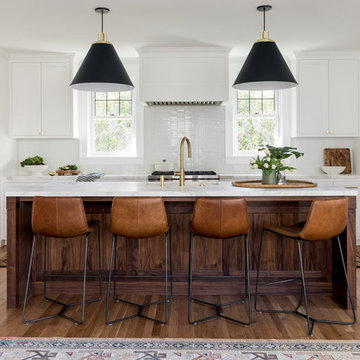
When the homeowners first purchased the 1925 house, it was compartmentalized, outdated, and completely unfunctional for their growing family. Casework designed the owner's previous kitchen and family room and was brought in to lead up the creative direction for the project. Casework teamed up with architect Paul Crowther and brother sister team Ainslie Davis on the addition and remodel of the Colonial.
The existing kitchen and powder bath were demoed and walls expanded to create a new footprint for the home. This created a much larger, more open kitchen and breakfast nook with mudroom, pantry and more private half bath. In the spacious kitchen, a large walnut island perfectly compliments the homes existing oak floors without feeling too heavy. Paired with brass accents, Calcutta Carrera marble countertops, and clean white cabinets and tile, the kitchen feels bright and open - the perfect spot for a glass of wine with friends or dinner with the whole family.
There was no official master prior to the renovations. The existing four bedrooms and one separate bathroom became two smaller bedrooms perfectly suited for the client’s two daughters, while the third became the true master complete with walk-in closet and master bath. There are future plans for a second story addition that would transform the current master into a guest suite and build out a master bedroom and bath complete with walk in shower and free standing tub.
Overall, a light, neutral palette was incorporated to draw attention to the existing colonial details of the home, like coved ceilings and leaded glass windows, that the homeowners fell in love with. Modern furnishings and art were mixed in to make this space an eclectic haven.
 Nar Design Group
This client grew up in this 1950’s family home and has now become owner in his adult life. Designing and remodeling this childhood home that the client was very bonded and familiar with was a tall order. This modern twist of original mid-century style combined with an eclectic fusion of modern day materials and concepts fills the room with a powerful presence while maintaining its clean lined austerity and elegance. The kitchen was part of a grander complete home re-design and remodel.
A modern version of a mid-century His and Hers grand master bathroom was created to include all the amenities and nothing left behind! This bathroom has so much noticeable and hidden “POW” that commands its peaceful spa feeling with a lot of attitude. Maintaining ultra-clean lines yet delivering ample design interest at every detail, This bathroom is eclectically a one of a kind luxury statement.
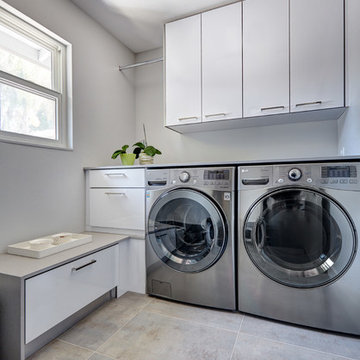
The concept in the laundry room was to create a simple, easy to use and clean space with ample storage and a place removed from the central part of the home to house the necessity of the cats and their litter box needs. There was no need for glamour in the laundry room yet we were able to create a simple highly utilitarian space.
If there is one room in the home that requires frequent visitors to thoroughly enjoy with a huge element of surprise, it’s the powder room! This is a room where you know that eventually, every guest will visit. Knowing this, we created a bold statement with layers of intrigue that would leave ample room for fun conversation with your guests upon their prolonged exit. We kept the lights dim here for that intriguing experience of crafted elegance and created ambiance. The walls of peeling metallic rust are the welcoming gesture to a powder room experience of defiance and elegant mystical complexity.
It's a lucky house guest indeed who gets to stay in this newly remodeled home. This on-suite bathroom allows them their own space and privacy. Both Bedroom and Bathroom offer plenty of storage for an extended stay. Rift White Oak cabinets and sleek Silestone counters make a lovely combination in the bathroom while the bedroom showcases textured white cabinets with a dark walnut wrap.
Photo credit: Fred Donham of PhotographerLink
 Envision Web
Stuart Wade, Envision Virtual Tours
Envision Virtual Tours and High Resolution Photography is your best choice to find just what you are looking for in the Lake Burton Area . Knowing the areas and resources of Lake Burton is our specialty
Lake Burton is a 2,775 acre man-made lake with 62 miles of shoreline located in the northeastern corner of Georgia in Rabun County. It is the first lake in a five-lake series called the Tallulah River Watershed that follows the original course of the Tallulah River. The series of lakes starts with Lake Burton as the northernmost lake followed by Lake Seed, Lake Rabun, Lake Tallulah Falls and the eastern arm of Lake Tugalo (the western arm is formed by the Chattooga River. The lakes are owned and operated by the Georgia Power Company to generate hydroelectric energy for Georgia's largest city, Atlanta. At one time these lakes were the largest producers of electricity in the state of Georgia. Now, they only provide peak power supply.
The lake was built in a deep valley located along a 10 mile section of the Tallulah River. The Lake Burton Dam was closed on December 22, 1919 and the lake started to fill. The dam is a gravity concrete dam, with a height of 128 feet and a span of 1,100 feet. The spillway is equipped with eight gates 22 feet wide by 6.6 feet high. The total capacity at an elevation of 1,866.6 feet is 108,000 acre-ft, of which 106,000 acre-ft is usable storage. The generating capacity of the dam is 6,120 kilowatts (two units).Lake Burton is the highest Georgia Power lake in Georgia.
Lake Burton gets its named from the town of Burton, which was the second largest town in Rabun County with a population of approximately 200 but now lies below the lake's surface. The town (and the lake) was named after local prominent citizen Jeremiah Burton and was situated along the road from Clayton, Georgia to the Nacoochee Valley. Andrew Jackson Ritchie served as the postmaster for the area for several years. Gold was first discovered in Rabun County where Dicks Creek and the Tallulah River come together and was the reason for the town's founding in the early 1800s.
The Lake Burton Fish Hatchery and Moccasin Creek State Park are located on the western side of the lake. Lake Burton is home to several species of fish, including Spotted Bass, Largemouth Bass, White Bass, Black Crappie, Bluegill, Redear Sunfish, White Catfish, Walleye, Brown Trout, Rainbow Trout, and Yellow Perch.
The residents of Lake Burton are a mix of permanent residents and seasonal vacationers who together make-up the Lake Burton Civic Association, a local organization who goal is to maintain the lake through volunteer clean-ups and other such events. Let a Lake Burton resident and expert show you the way
The Lake Burton Civic Association is an active homeowners association for residents of the Lake Burton area and sponsors many events throughout the year such as:
burton, custom, envision, georgia, lake, mountain, nc, north, photography, web, western, Lake Burton, Lake Rabun, Seed Lake,Virtual Tours.
4