
Search results for "Client lawyer romantic" in Home Design Ideas
 Susan Yeley Homes
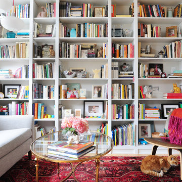
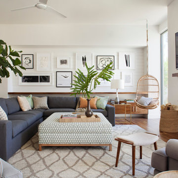
Our poster project for The Three P's, this small midcentury home south of campus has great bones but lacked vibrancy - a je ne sais quoi that the clients were searching to savoir once and for all. SYI worked with them to nail down a design direction and furniture plan, and they decided to invest in the big-impact items first: built-ins and lighting and a fresh paint job that included a beautiful deep blue-green line around the windows. The vintage rug was an Etsy score at an awesome price, but only after the client spent months scouring options and sources online that matched the vision and dimensions of the plan. A good year later, the West Elm sofa went on sale, so the client took advantage; some time after that, they painted the kitchen, created the drop zone / bench area, and rounded out the room with occasional tables and accessories. Their lesson: in patience, and details, there is beauty.
Photography by Gina Rogers Photography
 Dear Garden Associates, Inc.
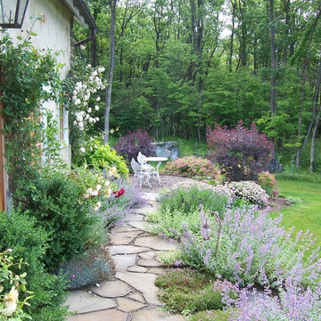
The pathway terminates just beyond the door to the guest cottage in a small, informal cigar patio.
Photo of a shabby-chic style backyard stone landscaping in Philadelphia for summer.
Photo of a shabby-chic style backyard stone landscaping in Philadelphia for summer.
 Shelley Morris Interiors
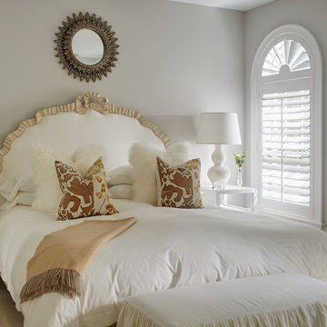
After just completing a project for a client's second home, the house accidentally caught fire and most of the exisiting structure and furnishings was burned. This unfortunate episode allowed us an opportunity to create the dream home that our clients always wanted. After the fire, we were able to remodel an entirely new space including a wood celing with beams, venetian plaster walls, and wide plank white oak flooring. The installation although eclectic, reflects a mediterranean atmosphere filled with light and texture.
Find the right local pro for your project
 emma delon
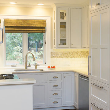
Maximizing the functionality of this space, and coordinating the new kitchen with the beautiful remodel completed previously by the client were the two most important aspects of this project. The existing spaces are elegantly decorated with an open plan, dark hardwood floors, and natural stone accents. The new, lighter, more open kitchen flows beautifully into the client’s existing dining room space. Satin nickel hardware blends with the stainless steel appliances and matches the satin nickel details throughout the home. The fully integrated refrigerator next to the narrow pull-out pantry cabinet, take up less visual weight than a traditional stainless steel appliance and the two combine to provide fantastic storage. The glass cabinet doors and decorative lighting beautifully highlight the client’s glassware and dishes. Finished with white subway tile, Dreamy Marfil quartz countertops, and a warm natural wood blind; the space warm, inviting, elegant, and extremely functional.
copyright 2013 marilyn peryer photography
 Brittany Stiles Design
Built on Frank Sinatra’s estate, this custom home was designed to be a fun and relaxing weekend retreat for our clients who live full time in Orange County. As a second home and playing up the mid-century vibe ubiquitous in the desert, we departed from our clients’ more traditional style to create a modern and unique space with the feel of a boutique hotel. Classic mid-century materials were used for the architectural elements and hard surfaces of the home such as walnut flooring and cabinetry, terrazzo stone and straight set brick walls, while the furnishings are a more eclectic take on modern style. We paid homage to “Old Blue Eyes” by hanging a 6’ tall image of his mug shot in the entry.
 Revision LLC
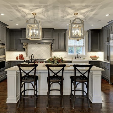
Large transitional u-shaped dark wood floor and brown floor kitchen photo in Minneapolis with gray cabinets, white backsplash, stainless steel appliances, an island, raised-panel cabinets, a farmhouse sink, solid surface countertops, white countertops and ceramic backsplash
 Karen Kempf Interiors
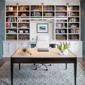
A farmhouse style was achieved in this new construction home by keeping the details clean and simple. Shaker style cabinets and square stair parts moldings set the backdrop for incorporating our clients’ love of Asian antiques. We had fun re-purposing the different pieces she already had: two were made into bathroom vanities; and the turquoise console became the star of the house, welcoming visitors as they walk through the front door.

Sponsored
Delaware, OH

Buckeye Basements, Inc.
Central Ohio's Basement Finishing ExpertsBest Of Houzz '13-'21
 place architecture:design
Tom Holdsworth Photography
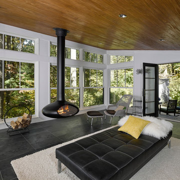
Our clients wanted to create a room that would bring them closer to the outdoors; a room filled with natural lighting; and a venue to spotlight a modern fireplace.
Early in the design process, our clients wanted to replace their existing, outdated, and rundown screen porch, but instead decided to build an all-season sun room. The space was intended as a quiet place to read, relax, and enjoy the view.
The sunroom addition extends from the existing house and is nestled into its heavily wooded surroundings. The roof of the new structure reaches toward the sky, enabling additional light and views.
The floor-to-ceiling magnum double-hung windows with transoms, occupy the rear and side-walls. The original brick, on the fourth wall remains exposed; and provides a perfect complement to the French doors that open to the dining room and create an optimum configuration for cross-ventilation.
To continue the design philosophy for this addition place seamlessly merged natural finishes from the interior to the exterior. The Brazilian black slate, on the sunroom floor, extends to the outdoor terrace; and the stained tongue and groove, installed on the ceiling, continues through to the exterior soffit.
The room's main attraction is the suspended metal fireplace; an authentic wood-burning heat source. Its shape is a modern orb with a commanding presence. Positioned at the center of the room, toward the rear, the orb adds to the majestic interior-exterior experience.
This is the client's third project with place architecture: design. Each endeavor has been a wonderful collaboration to successfully bring this 1960s ranch-house into twenty-first century living.
 ODS Architecture
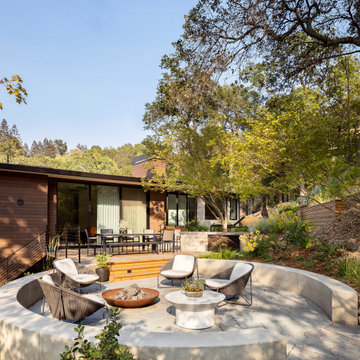
In a wooded area of Lafayette, a mid-century home was re-imagined for a graphic designer and kindergarten teacher couple and their three children. A major new design feature is a high ceiling great room that wraps from the front to the back yard, turning a corner at the kitchen and ending at the family room fireplace. This room was designed with a high flat roof to work in conjunction with existing roof forms to create a unified whole, and raise interior ceiling heights from eight to over ten feet. All new lighting and large floor to ceiling Fleetwood aluminum windows expand views of the trees beyond.
The existing home was enlarged by 700 square feet with a small exterior addition enlarging the kitchen over an existing deck, and a larger amount by excavating out crawlspace at the garage level to create a new home office with full bath, and separate laundry utility room. The remodeled residence became 3,847 square feet in total area including the garage.
Exterior curb appeal was improved with all new Fleetwood windows, stained wood siding and stucco. New steel railing and concrete steps lead up to the front entry. Front and rear yard new landscape design by Huettl Landscape Architecture dramatically alters the site. New planting was added at the front yard with landscape lighting and modern concrete pavers and the rear yard has multiple decks for family gatherings with the focal point a concrete conversation circle with central fire feature.
Everything revolves around the corner kitchen, large windows to the backyard, quartz countertops and cabinetry in painted and walnut finishes. The homeowners enjoyed the process of selecting Heath Tile for the kitchen backsplash and white oval tiles at the family room fireplace. Black brick tiles by Fireclay were used on the living room hearth. The kitchen flows into the family room all with views to the beautifully landscaped yards.
The primary suite has a built-in window seat with large windows overlooking the garden, walnut cabinetry in a skylit walk-in closet, and a large dramatic skylight bouncing light into the shower. The kid’s bath also has a skylight slot with light angling downward over double sinks. More colorful tile shows up in these spaces, as does a geometric patterned tile in the downstairs office bath shower.
The large yard is taken full advantage of with concrete paved walkways, stairs and firepit circle. New retaining walls in the rear yard helped to add more level usable outdoor space, with wood slats to visually blend them into the overall design.
The end result is a beautiful transformation of a mid-century home, that both captures the client’s personalities and elevates the house into the modern age.
 Sarah Montgomery Interiors
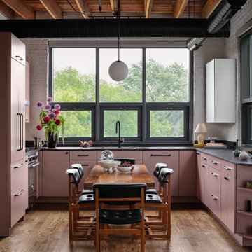
Set in a former cap-and-gown factory in Chicago’s North Center neighborhood, this 1,200-square-foot loft was reimagined as a layered, expressive home for an artistically minded client. What was once a tired builder-grade space is now a study in contrast: industrial bones softened by color, pattern, and personal history. Each room is defined by vibrant finishes—colorful cabinetry, statement tile, and a guest bath accented with unexpected purple grout (and a goose!)—all nodding to the client’s bold, creative spirit. Vintage family heirlooms mingle effortlessly with fresh textiles and sculptural lighting, weaving together nostalgia with a modern, eclectic space.
 Coddington Design
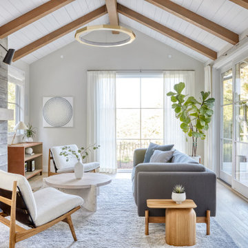
Minimal, mindful design meets stylish comfort in this family home filled with light and warmth. Using a serene, neutral palette filled with warm walnut and light oak finishes, with touches of soft grays and blues, we transformed our client’s new family home into an airy, functionally stylish, serene family retreat. The home highlights modern handcrafted wooden furniture pieces, soft, whimsical kids’ bedrooms, and a clean-lined, understated blue kitchen large enough for the whole family to gather.
 MMI Design
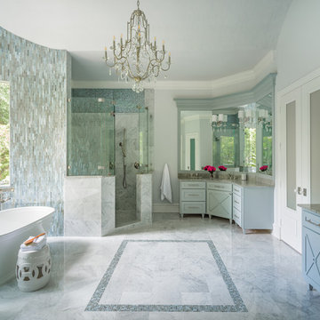
This existing client reached out to MMI Design for help shortly after the flood waters of Harvey subsided. Her home was ravaged by 5 feet of water throughout the first floor. What had been this client's long-term dream renovation became a reality, turning the nightmare of Harvey's wrath into one of the loveliest homes designed to date by MMI. We led the team to transform this home into a showplace. Our work included a complete redesign of her kitchen and family room, master bathroom, two powders, butler's pantry, and a large living room. MMI designed all millwork and cabinetry, adjusted the floor plans in various rooms, and assisted the client with all material specifications and furnishings selections. Returning these clients to their beautiful '"new" home is one of MMI's proudest moments!
 TKS Design Group
Free ebook, Creating the Ideal Kitchen. DOWNLOAD NOW
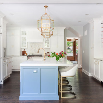
One of my favorite things to work on is older homes with a bit of history because I find it an interesting challenge to marry the historical architectural features of a home with modern design elements that work well for my client’s current lifestyle.
This home was particularly fun because it was the second kitchen we had done for this family and was quite a departure from the style of the first kitchen.
The before shot of the kitchen shows a view from the family room. See the dropped ceiling? We were curious, was this just part of the design or was the dropped ceiling there to hide mechanicals? Well we soon found out that it was mostly decorative (yay!), and with the exception of a little bit of work to some plumbing from an upstairs bathroom and rerouting of the ventilation system within the original floor joists, we were in the clear, phew! The shot of the completed kitchen from roughly the same vantage point shows how much taller the ceilings are. It makes a huge difference in the feel of the space. Dark and gloomy turned fresh and light!
Another serious consideration was what do we do with the skinny transom window above the refrigerator. After much back and forth, we decided to eliminate it and do some open shelving instead. This ended up being one of the nicest areas in the room. I am calling it the “fun zone” because it houses all the barware, wine cubbies and a bar fridge — the perfect little buffet spot for entertaining. It is flanked on either side by pull out pantries that I’m sure will get a ton of use. Since the neighboring room has literally three walls of almost full height windows, the kitchen gets plenty of light.
The gold shelving brackets, large pendant fixtures over the island and the tile mural behind the range all pay subtle homage to the home’s prairie style architecture and bring a bit of sparkle to the room.
Even though the room is quite large, the work triangle is very tight with the large Subzero fridge, sink and range all nearby for easy maneuvering during meal prep. There is seating for four at the island, and work aisles are generous.
Designed by: Susan Klimala, CKD, CBD
Photography by: LOMA Studios
For more information on kitchen and bath design ideas go to: www.kitchenstudio-ge.com

Sponsored
Columbus, OH

Snider & Metcalf Interior Design, LTD
Leading Interior Designers in Columbus, Ohio & Ponte Vedra, Florida
 Carolina V. Gentry, RID
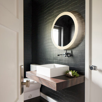
This forever home, perfect for entertaining and designed with a place for everything, is a contemporary residence that exudes warmth, functional style, and lifestyle personalization for a family of five. Our busy lawyer couple, with three close-knit children, had recently purchased a home that was modern on the outside, but dated on the inside. They loved the feel, but knew it needed a major overhaul. Being incredibly busy and having never taken on a renovation of this scale, they knew they needed help to make this space their own. Upon a previous client referral, they called on Pulp to make their dreams a reality. Then ensued a down to the studs renovation, moving walls and some stairs, resulting in dramatic results. Beth and Carolina layered in warmth and style throughout, striking a hard-to-achieve balance of livable and contemporary. The result is a well-lived in and stylish home designed for every member of the family, where memories are made daily.
 DHD Architecture and Interior Design
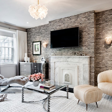
Located in stylish Chelsea, this updated five-floor townhouse incorporates both a bold, modern aesthetic and sophisticated, polished taste. Palettes range from vibrant and playful colors in the family and kids’ spaces to softer, rich tones in the master bedroom and formal dining room. DHD interiors embraced the client’s adventurous taste, incorporating dynamic prints and striking wallpaper into each room, and a stunning floor-to-floor stair runner. Lighting became one of the most crucial elements as well, as ornate vintage fixtures and eye-catching sconces are featured throughout the home.
Photography: Emily Andrews
Architect: Robert Young Architecture
3 Bedrooms / 4,000 Square Feet
 Niche Interiors
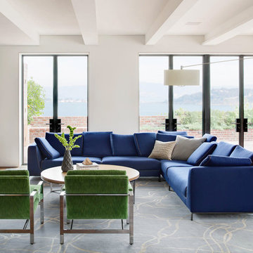
The media room features a wool sectional and a pair of vintage Milo Baughman armchairs reupholstered in a snappy green velvet. All upholstered items were made with natural latex cushions wrapped in organic wool in order to eliminate harmful chemicals for our eco and health conscious clients (who were passionate about green interior design). An oversized table functions as a desk or a serving table when our clients entertain large parties.
Thomas Kuoh Photography
 Drury Design
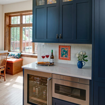
The 100-year old home’s kitchen was old and just didn’t function well. A peninsula in the middle of the main part of the kitchen blocked the path from the back door. This forced the homeowners to mostly use an odd, U-shaped corner of the kitchen.
Design objectives:
-Add an island
-Wow-factor design
-Incorporate arts and crafts with a touch of Mid-century modern style
-Allow for a better work triangle when cooking
-Create a seamless path coming into the home from the backdoor
-Make all the countertops in the space 36” high (the old kitchen had different base cabinet heights)
Design challenges to be solved:
-Island design
-Where to place the sink and dishwasher
-The family’s main entrance into the home is a back door located within the kitchen space. Samantha needed to find a way to make an unobstructed path through the kitchen to the outside
-A large eating area connected to the kitchen felt slightly misplaced – Samantha wanted to bring the kitchen and materials more into this area
-The client does not like appliance garages/cabinets to the counter. The more countertop space, the better!
Design solutions:
-Adding the right island made all the difference! Now the family has a couple of seats within the kitchen space. -Multiple walkways facilitate traffic flow.
-Multiple pantry cabinets (both shallow and deep) are placed throughout the space. A couple of pantry cabinets were even added to the back door wall and wrap around into the breakfast nook to give the kitchen a feel of extending into the adjoining eating area.
-Upper wall cabinets with clear glass offer extra lighting and the opportunity for the client to display her beautiful vases and plates. They add and an airy feel to the space.
-The kitchen had two large existing windows that were ideal for a sink placement. The window closest to the back door made the most sense due to the fact that the other window was in the corner. Now that the sink had a place, we needed to worry about the dishwasher. Samantha didn’t want the dishwasher to be in the way of people coming in the back door – it’s now in the island right across from the sink.
-The homeowners love Motawi Tile. Some fantastic pieces are placed within the backsplash throughout the kitchen. -Larger tiles with borders make for nice accent pieces over the rangetop and by the bar/beverage area.
-The adjacent area for eating is a gorgeous nook with massive windows. We added a built-in furniture-style banquette with additional lower storage cabinets in the same finish. It’s a great way to connect and blend the two areas into what now feels like one big space!
Sponsored
Columbus, OH

Trish Takacs Design
Award Winning & Highly Skilled Kitchen & Bath Designer in Columbus
 MossCreek
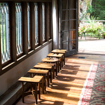
Envisioned as a country retreat for New York based clients, this collection of buildings was designed by MossCreek to meet the clients' wishes of using historical and antique structures. Serving as a country getaway, as well as a unique home for their art treasures, this was both an enjoyable and satisfying project for MossCreek and our clients. Photo by Bjorn Wallander.
 Flavin Architects
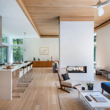
Our clients wanted to replace an existing suburban home with a modern house at the same Lexington address where they had lived for years. The structure the clients envisioned would complement their lives and integrate the interior of the home with the natural environment of their generous property. The sleek, angular home is still a respectful neighbor, especially in the evening, when warm light emanates from the expansive transparencies used to open the house to its surroundings. The home re-envisions the suburban neighborhood in which it stands, balancing relationship to the neighborhood with an updated aesthetic.
The floor plan is arranged in a “T” shape which includes a two-story wing consisting of individual studies and bedrooms and a single-story common area. The two-story section is arranged with great fluidity between interior and exterior spaces and features generous exterior balconies. A staircase beautifully encased in glass stands as the linchpin between the two areas. The spacious, single-story common area extends from the stairwell and includes a living room and kitchen. A recessed wooden ceiling defines the living room area within the open plan space.
Separating common from private spaces has served our clients well. As luck would have it, construction on the house was just finishing up as we entered the Covid lockdown of 2020. Since the studies in the two-story wing were physically and acoustically separate, zoom calls for work could carry on uninterrupted while life happened in the kitchen and living room spaces. The expansive panes of glass, outdoor balconies, and a broad deck along the living room provided our clients with a structured sense of continuity in their lives without compromising their commitment to aesthetically smart and beautiful design.
 Amazing Spaces
This project incorporated the main floor of the home. The existing kitchen was narrow and dated, and closed off from the rest of the common spaces. The client’s wish list included opening up the space to combine the dining room and kitchen, create a more functional entry foyer, and update the dark sunporch to be more inviting.
The concept resulted in swapping the kitchen and dining area, creating a perfect flow from the entry through to the sunporch.
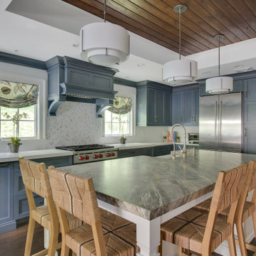
The new kitchen features blue-gray cabinets with polished white countertops and a white island with a dramatic Cielo Quartzite countertop. The soffit above features stained shiplap, helping to create the boundary of the kitchen. Custom window treatments and rattan chairs make the space feel casual and sophisticated.
2