
Search results for "Client support" in Home Design Ideas
 Knight Varga Interiors
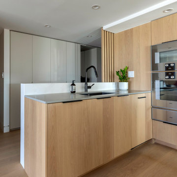
This large-scale condominium renovation marked our clients’ transition from a family home into a spacious 1980s-era residence that required a complete rethinking of its layout. Although generous in size, the original plan was dark and compartmentalized, with limited natural light and a kitchen that no longer supported the clients’ passion for cooking and entertaining.
Our design approach focused on opening the home to improve flow, sightlines, and functionality. Walls were removed to allow daylight to travel throughout, while a custom wood slat feature defines the entry with warmth and architectural interest. Relocating the dining area made it possible to expand the kitchen and integrate a temperature-controlled wine cellar, resulting in a light-filled, highly functional home designed to support the way our clients live today.
 MH Akers Custom Homes
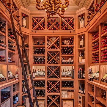
An old client and inveterate wine collector had purchased a new home and had asked MH Akers Custom Homes to transform an oversized upstairs closet into a wine cellar. He was looking for perfect wine storage conditions and functionality as well as a little jewel box of a space. We created, together with the client, a rough sketch of the layout and specifications then stripped the walls and ceiling of their drywall and the floor of its carpet and subfloor. A vapor barrier was installed on the warm sides of the walls, floor, and ceiling then polyurethane to seal cracks and finally blown cellulose insulation.
Grand_Wine_CellarFaced with an isolated second floor space, we didn’t have the luxury of access to the outside for placement of the cooling condenser unit. Working with our HVAC contractor and WineGuardian wine specialists, we chose a package unit to be placed in the attic above the wine storage room. In order to manage the ventilation of the unit itself, we ducted in from the shaded eaves of the home condenser intake air. Condenser exhaust air was ducted out of the attic through an existing large gable louver. A humidifier was added to the unit in order to optimize storage conditions, and a remote sensor was placed inside the storage space, while a thermo/humidistat was located in the hallway outside to allow easy monitoring and adjusting of the readings and settings…55 degrees Fahrenheit and 70% relative humidity last time I looked.
Storage cabinet design and selection of materials were finalized. We had vacillated between old growth heart pine and clear, all-heart redwood but chose the redwood in the end. We wanted to allow water vapor transmission all the way between the room itself and the warm-side barrier, so we clad walls and ceilings with unsealed 3/4” beaded tongue and groove redwood rather than glued up materials which might create an unwanted intermediate vapor barrier.
The entire conditioned wine storage space actually consists of the principal room plus a bulk storage area behind. In order to access the bulk storage area we fashioned the center section of the U-shaped cabinetry into an access door. Approximately 800 pounds loaded with wine, this seven foot high by five feet wide section pivots on two Igus slewing rings with the additional support of two heavy-duty rigid casters . . . a minor feat of engineering and completely imperceptible. We made double sure that the new stone floor was dead flat level and that the structural support under the bearing points was completely solid.
Steel library ladder, grape-cluster adorned chandelier, and nifty LED accent lighting completed the effect. A most satisfying project and a testament to the collaboration between client, builder, cabinetmaker, and sundry other tradesmen. A wine cellar de grand luxe and a little gem of a space. Let us help you create your very own special place.
 Lori Ramsay Design
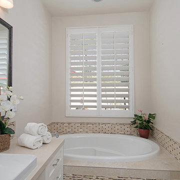
We created this beautiful accessible bathroom in Carlsbad to give our client a more functional space. We designed this unique bath, specific to the client's specifications to make it more wheel chair accessible. Features such as the roll in shower, roll up vanity and the ability to use her chair for flexibility over the fixed wall mounted seat allow her to be more independent in this bathroom. Safety was another significant factor for the room. We added support bars in all areas and with maximum flexibility to allow the client to perform all bathing functions independently, and all were positioned after carefully recreating her movements. We met the objectives of functionality and safety without compromising beauty in this aging in place bathroom. Travertine-look porcelain tile was used in a large format on the shower walls to minimize grout lines and maximize ease of maintenance. A crema marfil marble mosaic in an elongated hex pattern was used in the shower room for it’s beauty and flexibility in sloped shower. A custom cabinet was made to the height ideal for our client’s use of the sink and a protective panel placed over the pea trap.
Find the right local pro for your project
 TVL Creative Ltd.
Cramped kitchen be gone! That was the project motto and top priority. The goal was to transform the current layout from multiple smaller spaces into a connected whole that would activate the main level for our clients, a young family of four.
The biggest obstacle was the wall dividing the kitchen and the dining room. Removing this wall was central to opening up and integrating the main living spaces, but the existing ductwork that ran right through the center of the wall posed a design challenge, er design opportunity. The resulting design solution features a central pantry that captures the ductwork and provides valuable storage- especially when compared to the original kitchen's 18" wide pantry cabinet. The pantry also anchors the kitchen island and serves as a visual separation of space between the kitchen and homework area.
Through our design development process, we learned the formal living room was of no service to their lifestyle and therefore space they rarely spent time in. With that in mind, we proposed to eliminate the unused living room and make it the new dining room. Relocating the dining room to this space inherently felt right given the soaring ceiling and ample room for holiday dinners and celebrations. The new dining room was spacious enough for us to incorporate a conversational seating area in the warm, south-facing window alcove.
Now what to do with the old dining room?! To answer that question we took inspiration from our clients' shared profession in education and developed a craft area/homework station for both of their boys. The semi-custom cabinetry of the desk area carries over to the adjacent wall and forms window bench base with storage that we topped with butcher block for a touch of warmth. While the boys are young, the bench drawers are the perfect place for a stash of toys close to the kitchen.
The kitchen begins just beyond the window seat with their refrigerator enclosure. Opposite the refrigerator is the new pantry with twenty linear feet of shelving and space for brooms and a stick vacuum. Extending from the backside of the pantry the kitchen island design incorporates counter seating on the family room side and a cabinetry configuration on the kitchen side with drawer storage, a trashcan center, farmhouse sink, and dishwasher.
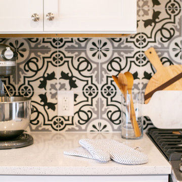
We took careful time in design and execution to align the range and sink because while it might seem like a small detail, it plays an important role in supporting the symmetrical configuration of the back wall of the kitchen. The rear wall design utilizes an appliance garage mirrors the visual impact of the refrigerator enclosure and helps keep the now open kitchen tidy. Between the appliance garage and refrigerator enclosure is the cooking zone with 30" of cabinetry and work surface on either side of the range, a chimney style vent hood, and a bold graphic tile backsplash.
The backsplash is just one of many personal touches we added to the space to reflect our client's modern eclectic style and love of color. Swooping lines of the mid-mod style barstools compliment the pendants and backsplash pattern. A pop of vibrant green on the frame of the pantry door adds a fresh wash of color to an otherwise neutral space. The big show stopper is the custom charcoal gray and copper chevron wall installation in the dining room. This was an idea our clients softly suggested, and we excitedly embraced the opportunity. It is also a kickass solution to the head-scratching design dilemma of how to fill a large and lofty wall.
We are so grateful to bring this design to life for our clients and now dear friends.
 Sabouri Interiors
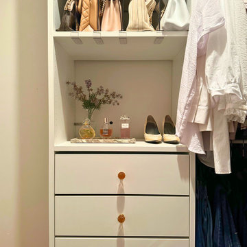
When our client approached us with a budget of $1,000 and a two-month timeline, she was looking to revive her outdated walk-in closet. The old setup was literally falling apart and so cramped that it hardly lived up to the name "walk-in." Our mission was to breathe new life into this space, transforming it into a functional and inviting retreat.
We kicked off the transformation by applying fresh paint and crafting custom storage solutions that precisely matched our client's needs. She had been struggling with locating her shoes, hidden away in old shoe boxes, and her handbags scattered throughout. Our solution was a wallet-friendly, adaptable shoe storage system that keeps everything in sight and easily accessible, evolving right along with her collection.
One of our client's priorities was ensuring comfort for her adorable, cuddly dogs who love spending time in the closet. We chose a washable rug that not only complements the decor but also withstands the occasional mess, maintaining a cozy vibe.
Adding a personal touch, we showcased her cherished wedding shoes and incorporated vintage knobs from her daughter's nursery into the design, making the closet feel uniquely hers.
To streamline her daily routine, we introduced a practical, stylish hamper on wheels, enabling easy transport of laundry from the closet to the laundry room.
The decluttering process was initially overwhelming for our client. With patience and a fresh perspective, we helped her let go of five bags of high-quality clothes and shoes. This not only cleared up physical space but also made room for new beginnings and experiences in her life.
This project was much more than a simple renovation; it was about creating a space that reflects and supports our client's lifestyle, complete with thoughtful touches that make it truly special.
 Knight Varga Interiors
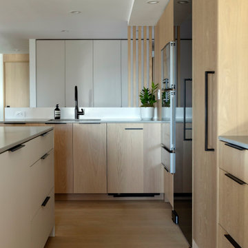
This large-scale condominium renovation marked our clients’ transition from a family home into a spacious 1980s-era residence that required a complete rethinking of its layout. Although generous in size, the original plan was dark and compartmentalized, with limited natural light and a kitchen that no longer supported the clients’ passion for cooking and entertaining.
Our design approach focused on opening the home to improve flow, sightlines, and functionality. Walls were removed to allow daylight to travel throughout, while a custom wood slat feature defines the entry with warmth and architectural interest. Relocating the dining area made it possible to expand the kitchen and integrate a temperature-controlled wine cellar, resulting in a light-filled, highly functional home designed to support the way our clients live today.
 Schulte Design Build
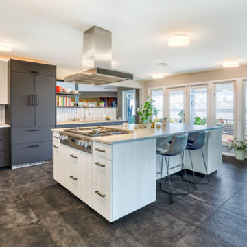
Our clients recently purchased a beautiful hillside home in Broadview. What started as a simple kitchen refresh turned into a full-scale renovation to address structural issues and achieve a modern aesthetic.
The top priorities for the client’s kitchen were a space for entertaining and to enjoy the sweeping Sound views. The existing late-90s kitchen was outdated and the walls separated the kitchen from the rest of the home. To achieve this, we removed both sides of internal walls and reconfigured plumbing and structural support.
The clients, who are artists and photographers, highly valued aesthetics. Collaborating with their designer, known for using industrial materials in commercial spaces, we aimed to bring these elements into the kitchen. We created a design that maximized the views and integrated industrial and mid-century styles, featuring steel shelving and quartz countertops that resembled concrete.
Instead of using traditional concrete flooring, we opted for concrete tiles. Believe it or not, those tiles are 2x4 feet long! It took two of our team to set each one. Recommended by their designer, large tiles like these are often used in commercial buildings, but the designer knew they were a cost effective (and beautiful) solution for this home.
The renovation also included: A much larger island for cooking and entertaining, custom-made faucets with hot and cold taps, a built-in refrigerator, and a double beverage fridge at the end of the island. We put in two laminated cabinets in two contrasting colors: Wilsonart White Cypress and Wilsonart Black Velvet Traceless. Lastly, we installed hydronic floor heating and AC, ensuring comfort year-round.
The result is a beautifully modern kitchen that is both functional and aesthetically pleasing. This project exceeded the clients' initial expectations, transforming their kitchen into the heart of their home.


 TVL Creative Ltd.
Cramped kitchen be gone! That was the project motto and top priority. The goal was to transform the current layout from multiple smaller spaces into a connected whole that would activate the main level for our clients, a young family of four.
The biggest obstacle was the wall dividing the kitchen and the dining room. Removing this wall was central to opening up and integrating the main living spaces, but the existing ductwork that ran right through the center of the wall posed a design challenge, er design opportunity. The resulting design solution features a central pantry that captures the ductwork and provides valuable storage- especially when compared to the original kitchen's 18" wide pantry cabinet. The pantry also anchors the kitchen island and serves as a visual separation of space between the kitchen and homework area.
Through our design development process, we learned the formal living room was of no service to their lifestyle and therefore space they rarely spent time in. With that in mind, we proposed to eliminate the unused living room and make it the new dining room. Relocating the dining room to this space inherently felt right given the soaring ceiling and ample room for holiday dinners and celebrations. The new dining room was spacious enough for us to incorporate a conversational seating area in the warm, south-facing window alcove.
Now what to do with the old dining room?! To answer that question we took inspiration from our clients' shared profession in education and developed a craft area/homework station for both of their boys. The semi-custom cabinetry of the desk area carries over to the adjacent wall and forms window bench base with storage that we topped with butcher block for a touch of warmth. While the boys are young, the bench drawers are the perfect place for a stash of toys close to the kitchen.
The kitchen begins just beyond the window seat with their refrigerator enclosure. Opposite the refrigerator is the new pantry with twenty linear feet of shelving and space for brooms and a stick vacuum. Extending from the backside of the pantry the kitchen island design incorporates counter seating on the family room side and a cabinetry configuration on the kitchen side with drawer storage, a trashcan center, farmhouse sink, and dishwasher.
We took careful time in design and execution to align the range and sink because while it might seem like a small detail, it plays an important role in supporting the symmetrical configuration of the back wall of the kitchen. The rear wall design utilizes an appliance garage mirrors the visual impact of the refrigerator enclosure and helps keep the now open kitchen tidy. Between the appliance garage and refrigerator enclosure is the cooking zone with 30" of cabinetry and work surface on either side of the range, a chimney style vent hood, and a bold graphic tile backsplash.
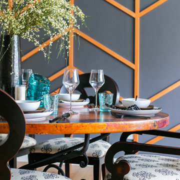
The backsplash is just one of many personal touches we added to the space to reflect our client's modern eclectic style and love of color. Swooping lines of the mid-mod style barstools compliment the pendants and backsplash pattern. A pop of vibrant green on the frame of the pantry door adds a fresh wash of color to an otherwise neutral space. The big show stopper is the custom charcoal gray and copper chevron wall installation in the dining room. This was an idea our clients softly suggested, and we excitedly embraced the opportunity. It is also a kickass solution to the head-scratching design dilemma of how to fill a large and lofty wall.
We are so grateful to bring this design to life for our clients and now dear friends.
 Knight Varga Interiors
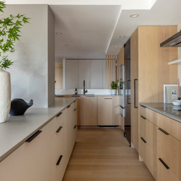
This large-scale condominium renovation marked our clients’ transition from a family home into a spacious 1980s-era residence that required a complete rethinking of its layout. Although generous in size, the original plan was dark and compartmentalized, with limited natural light and a kitchen that no longer supported the clients’ passion for cooking and entertaining.
Our design approach focused on opening the home to improve flow, sightlines, and functionality. Walls were removed to allow daylight to travel throughout, while a custom wood slat feature defines the entry with warmth and architectural interest. Relocating the dining area made it possible to expand the kitchen and integrate a temperature-controlled wine cellar, resulting in a light-filled, highly functional home designed to support the way our clients live today.
 Xtreme Renovations, LLC
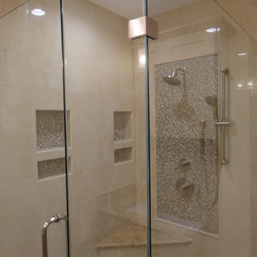
Xtreme Renovations just completed transforming a 1915 constructed Master Bathroom into a Modern Transformation for our clients in NW Harris County. The Master Bath had seen several updates throughout its 100 year history. When our clients desired to convert their pervious renovation into their dream Master Bath, they contact Xtreme Renovations and our Team of professionals that includes Design, Quality Craftsmanship and meticulous attention to details to deliver the final product and the ‘Wow Factor’ that Xtreme Renovations is known for.
The renovation project required removing an existing window, claw tub, extensive plumbing including moving and install new water and drain lines as well as adding an additional propane hot water heater. Many electrical upgrades were included in this renovation as well as extensive drywall work, painting and exterior siding to match the age of this portion of the home.
Our Xtreme Team went to work and presented a design concept that met the needs of our clients and delivered a modern and functional Master Bathroom that completed years of renovation on the Country Home. The project included Custom Built Vanity with full extension soft closing drawers and European hinge soft closing doors. A large shower enclosure was built with corner seating, shower niches, shower wand and stylish tile accents to enhance the shower area. Seamless Glass with heavy duty supports were included in the shower enclosure for ensured safety of our client’s young children and to provide piece of mind and total functionality of the family. The toilet was moved to add space due to the smaller size of this 1915 constructed Master Bath. Recessed LED lighting as well as above vanity light sconces on dimmers completed this amazing transformation.
 Maeser Master Services
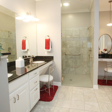
This unique shower has two shower heads, one for standing bathers and one for sitting bathers. The controls were mounted at a convenient height. A double-sink vanity was installed, plus a make-up vanity area.
Linda Doane Photography
 Schulte Design Build
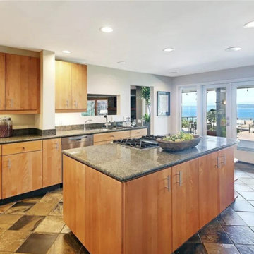
Our clients recently purchased a beautiful hillside home in Broadview. What started as a simple kitchen refresh turned into a full-scale renovation to address structural issues and achieve a modern aesthetic.
The top priorities for the client’s kitchen were a space for entertaining and to enjoy the sweeping Sound views. The existing late-90s kitchen was outdated and the walls separated the kitchen from the rest of the home. To achieve this, we removed both sides of internal walls and reconfigured plumbing and structural support.
The clients, who are artists and photographers, highly valued aesthetics. Collaborating with their designer, known for using industrial materials in commercial spaces, we aimed to bring these elements into the kitchen. We created a design that maximized the views and integrated industrial and mid-century styles, featuring steel shelving and quartz countertops that resembled concrete.
Instead of using traditional concrete flooring, we opted for concrete tiles. Believe it or not, those tiles are 2x4 feet long! It took two of our team to set each one. Recommended by their designer, large tiles like these are often used in commercial buildings, but the designer knew they were a cost effective (and beautiful) solution for this home.
The renovation also included: A much larger island for cooking and entertaining, custom-made faucets with hot and cold taps, a built-in refrigerator, and a double beverage fridge at the end of the island. We put in two laminated cabinets in two contrasting colors: Wilsonart White Cypress and Wilsonart Black Velvet Traceless. Lastly, we installed hydronic floor heating and AC, ensuring comfort year-round.
The result is a beautifully modern kitchen that is both functional and aesthetically pleasing. This project exceeded the clients' initial expectations, transforming their kitchen into the heart of their home.


Sponsored
Fredericksburg, OH

High Point Cabinets
Columbus' Experienced Custom Cabinet Builder | 4x Best of Houzz Winner
 Plain & Posh
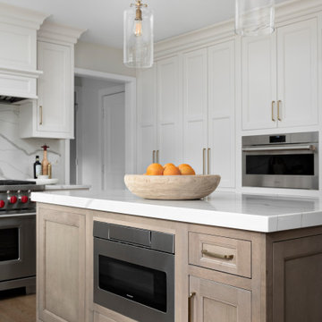
Thse clients came to me for a kitchen refresh. Keeping the existing floor plan but updating as much as possible. After explaining my thoughts, they chose to go with a much larger project. The wall to the garage wash pushed bach 12" to allow for the island to happen. This almost couldn't happen as there is a support post in the garage we had to keep. I designed the last pantry area as on 10" deep, allowing us to conceal that behind the cabinets. Then, we opend up the wall to the dining room to make the rooms one large space. The wall to the family room was also openend up, leaving the half wall to allow for the kitchen eating area. They wanted to incorporate a bar area, without it feeling like a "bar" The fabulous tall custom unit houses their wine collection and then half of the dining room buffet area holds glassware and other bar items. I helped the clients with all of the design choices.We all wanted to keep the space classic, war, functional and with mixed materials. I chose to use the same countertop material for the backsplash, to keep the space feeling as large as possible.
 Joe McGuire Design
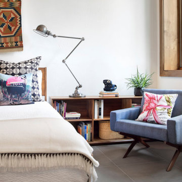
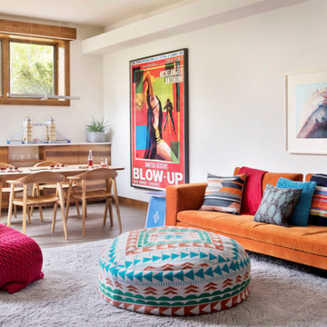
Embracing the challenge of grounding this open, light-filled space, our Boulder studio focused on comfort, ease, and high design. The built-in lounge is flanked by storage cabinets for puzzles and games for this client who loves having people over. The high-back Living Divani sofa is paired with U-Turn Benson chairs and a "Rabari" rug from Nanimarquina for casual gatherings. The throw pillows are a perfect mix of Norwegian tapestry fabric and contemporary patterns. In the child's bedroom, we added an organically shaped Vitra Living Tower, which also provides a cozy reading niche. Bold Marimekko fabric colorfully complements more traditional detailing and creates a contrast between old and new. We loved collaborating with our client on an eclectic bedroom, where everything is collected and combined in a way that allows distinctive pieces to work together. A custom walnut bed supports the owner's tatami mattress. Vintage rugs ground the space and pair well with a vintage Scandinavian chair and dresser.
Combining unexpected objects is one of our favorite ways to add liveliness and personality to a space. In the little guest bedroom, our client (a creative and passionate collector) was the inspiration behind an energetic and eclectic mix. Similarly, turning one of our client's favorite old sweaters into pillow covers and popping a Native American rug on the wall helped pull the space together. Slightly eclectic and invitingly cozy, the twin guestroom beckons for settling in to read, nap or daydream. A vintage poster from Omnibus Gallery in Aspen and an antique nightstand add period whimsy.
 Joe McGuire Design
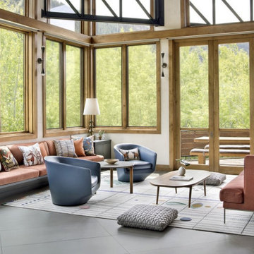
Embracing the challenge of grounding this open, light-filled space, our Aspen studio focused on comfort, ease, and high design. The built-in lounge is flanked by storage cabinets for puzzles and games for this client who loves having people over. The high-back Living Divani sofa is paired with U-Turn Benson chairs and a "Rabari" rug from Nanimarquina for casual gatherings. The throw pillows are a perfect mix of Norwegian tapestry fabric and contemporary patterns. In the child's bedroom, we added an organically shaped Vitra Living Tower, which also provides a cozy reading niche. Bold Marimekko fabric colorfully complements more traditional detailing and creates a contrast between old and new. We loved collaborating with our client on an eclectic bedroom, where everything is collected and combined in a way that allows distinctive pieces to work together. A custom walnut bed supports the owner's tatami mattress. Vintage rugs ground the space and pair well with a vintage Scandinavian chair and dresser.
Combining unexpected objects is one of our favorite ways to add liveliness and personality to a space. In the little guest bedroom, our client (a creative and passionate collector) was the inspiration behind an energetic and eclectic mix. Similarly, turning one of our client's favorite old sweaters into pillow covers and popping a Native American rug on the wall helped pull the space together. Slightly eclectic and invitingly cozy, the twin guestroom beckons for settling in to read, nap or daydream. A vintage poster from Omnibus Gallery in Aspen and an antique nightstand add period whimsy.
 Joe McGuire Design
Embracing the challenge of grounding this open, light-filled space, our Aspen studio focused on comfort, ease, and high design. The built-in lounge is flanked by storage cabinets for puzzles and games for this client who loves having people over. The high-back Living Divani sofa is paired with U-Turn Benson chairs and a "Rabari" rug from Nanimarquina for casual gatherings. The throw pillows are a perfect mix of Norwegian tapestry fabric and contemporary patterns. In the child's bedroom, we added an organically shaped Vitra Living Tower, which also provides a cozy reading niche. Bold Marimekko fabric colorfully complements more traditional detailing and creates a contrast between old and new. We loved collaborating with our client on an eclectic bedroom, where everything is collected and combined in a way that allows distinctive pieces to work together. A custom walnut bed supports the owner's tatami mattress. Vintage rugs ground the space and pair well with a vintage Scandinavian chair and dresser.
Combining unexpected objects is one of our favorite ways to add liveliness and personality to a space. In the little guest bedroom, our client (a creative and passionate collector) was the inspiration behind an energetic and eclectic mix. Similarly, turning one of our client's favorite old sweaters into pillow covers and popping a Native American rug on the wall helped pull the space together. Slightly eclectic and invitingly cozy, the twin guestroom beckons for settling in to read, nap or daydream. A vintage poster from Omnibus Gallery in Aspen and an antique nightstand add period whimsy.

 building Lab, inc.
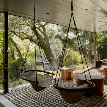
Modern Front Porch: covered terrace with hanging swing chairs, handcrafted sculptural furniture, and a floor of Black Locust wood pavers set in gravel.
building Lab is a design build firm specialized in modern architecture.
 JPM Construction
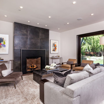
JPM Construction offers complete support for designing, building, and renovating homes in Atherton, Menlo Park, Portola Valley, and surrounding mid-peninsula areas. With a focus on high-quality craftsmanship and professionalism, our clients can expect premium end-to-end service.
The promise of JPM is unparalleled quality both on-site and off, where we value communication and attention to detail at every step. Onsite, we work closely with our own tradesmen, subcontractors, and other vendors to bring the highest standards to construction quality and job site safety. Off site, our management team is always ready to communicate with you about your project. The result is a beautiful, lasting home and seamless experience for you.
 TKS Design Group
Download our free ebook, Creating the Ideal Kitchen. DOWNLOAD NOW
This family from Wheaton was ready to remodel their kitchen, dining room and powder room. The project didn’t call for any structural or space planning changes but the makeover still had a massive impact on their home. The homeowners wanted to change their dated 1990’s brown speckled granite and light maple kitchen. They liked the welcoming feeling they got from the wood and warm tones in their current kitchen, but this style clashed with their vision of a deVOL type kitchen, a London-based furniture company. Their inspiration came from the country homes of the UK that mix the warmth of traditional detail with clean lines and modern updates.
To create their vision, we started with all new framed cabinets with a modified overlay painted in beautiful, understated colors. Our clients were adamant about “no white cabinets.” Instead we used an oyster color for the perimeter and a custom color match to a specific shade of green chosen by the homeowner. The use of a simple color pallet reduces the visual noise and allows the space to feel open and welcoming. We also painted the trim above the cabinets the same color to make the cabinets look taller. The room trim was painted a bright clean white to match the ceiling.
In true English fashion our clients are not coffee drinkers, but they LOVE tea. We created a tea station for them where they can prepare and serve tea. We added plenty of glass to showcase their tea mugs and adapted the cabinetry below to accommodate storage for their tea items. Function is also key for the English kitchen and the homeowners. They requested a deep farmhouse sink and a cabinet devoted to their heavy mixer because they bake a lot. We then got rid of the stovetop on the island and wall oven and replaced both of them with a range located against the far wall. This gives them plenty of space on the island to roll out dough and prepare any number of baked goods. We then removed the bifold pantry doors and created custom built-ins with plenty of usable storage for all their cooking and baking needs.
The client wanted a big change to the dining room but still wanted to use their own furniture and rug. We installed a toile-like wallpaper on the top half of the room and supported it with white wainscot paneling. We also changed out the light fixture, showing us once again that small changes can have a big impact.
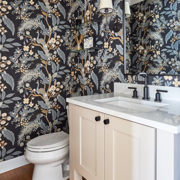
As the final touch, we also re-did the powder room to be in line with the rest of the first floor. We had the new vanity painted in the same oyster color as the kitchen cabinets and then covered the walls in a whimsical patterned wallpaper. Although the homeowners like subtle neutral colors they were willing to go a bit bold in the powder room for something unexpected. For more design inspiration go to: www.kitchenstudio-ge.com
47