
Search results for "Cloud based solutions" in Home Design Ideas

 Centoni Restoration & Development, Inc.
CLIENT GOALS
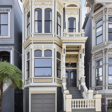
This spectacular Victorian was built in 1890 for Joseph Budde, an inventor, patent holder, and major manufacturer of the flush toilet. Through its more than 130-year life, this home evolved with the many incarnations of the Haight District. The most significant was the street modification that made way for the Haight Street railway line in the early 1920s. At that time, streets and sidewalks widened, causing the straight-line, two-story staircase to take a turn.
In the 1920s, stucco and terrazzo were considered modern and low-maintenance materials and were often used to replace the handmade residential carpentry that would have graced this spectacular staircase. Sometime during the 1990s, the entire entry door assembly was removed and replaced with another “modern” solution. Our clients challenged Centoni to recreate the original staircase and entry.
OUR DESIGN SOLUTION
Through a partnership with local artisans and support from San Francisco Historical Planners, team Centoni sourced information from the public library that included original photographs, writings on Cranston and Keenan, and the history of the Haight. Though no specific photo has yet to be sourced, we are confident the design choices are in the spirit of the original and are based on remnants of the original porch discovered under the 1920s stucco.
Through this journey, the staircase foundation was reengineered, the staircase designed and built, the original entry doors recreated, the stained glass transom created (including replication of the original hand-painted bird-theme rondels, many rotted decorated elements hand-carved, new and historic lighting installed, and a new iron handrail designed and fabricated.
 KE Interior Solutions
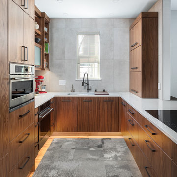
Note the large scale tile juxtaposed against the quilt style tile on the oven wall. This large and simple toned grey field allows the other area to stand out, yet this window wall detail also serves a purpose of showing how every area can be unique, but not glaring in contrast.
Find the right local pro for your project

 Klopf Architecture
Set in a quiet neighborhood and framed by mature trees, this residence presented a unique opportunity: to thoughtfully evolve a custom mid-century modern home into a space that supports the everyday rhythms of a growing family. With a deep respect for the home’s original architecture, Klopf Architecture reimagined the house to better meet the needs of its owners—introducing functional improvements while preserving the spirit and character of its mid-century roots.
The clients approached Klopf Architecture with a clear vision: refresh their home while seamlessly integrating new programmatic elements. Key goals included clarifying and enhancing the entry sequence; connecting the detached garage to the main house with a practical yet architecturally intentional intervention; adding functional spaces such as a mudroom and laundry room; expanding and remodeling the primary suite’s bathroom and closet; and creating a more engaging outdoor space that capitalized on the site’s impressive views, featuring a fire pit and outdoor kitchen.
As a couple with distinct yet complementary perspectives—one focused on modern functionality and technology, and the other dedicated to preserving the home’s architectural integrity—their collaboration with Klopf Architecture resulted in a solution that harmonized both ideals. Their shared commitment to improving the livability of their home led to a design dialogue rooted in balance. This dynamic partnership shaped the direction of the renovation, ensuring that every decision honored the spirit of the original home while aligning with the practical needs of their growing family.
Designing within the constraints of the sloped site posed one of the project’s central challenges. The detached garage sat at a higher elevation than the main house, requiring a solution that ensured architectural and geometric compatibility between the two structures. Rather than create a purely utilitarian link, Klopf Architecture introduced an intentional connection that contributes to the overall architectural language. A notable pinch point in the plan—where differing geometries converged—was treated as a hinge point, turning a potentially awkward juncture into an architectural feature. This area now functions as both a transition and a moment of design interest that unifies the overall plan.
The design also addressed the underutilized outdoor area, which was located in a shadowed portion of the site with geometrical limitations. A new connection to the rear deck was created in this same area, making the outdoor space more useful and inviting. Klopf Architecture introduced carefully positioned openings and spatial improvements that forged a strong visual and functional connection between indoor and outdoor spaces. The outdoor area now reads as a deliberate extension of the home, embracing natural light and emphasizing the dramatic views.
Working through multiple design iterations, Klopf Architecture crafted a solution that preserved the architectural language of the original home while supporting the functional needs of modern life. The garage-to-house connection became more than a passage—it evolved into an architectural moment of transition. A new mudroom and laundry space enhanced convenience without compromising the clean lines of the design. The primary suite was expanded to create a private, serene retreat. The reimagined backyard, complete with fire pit and kitchen, now plays a vital role in the family’s daily routine and social life.
Outcomes and Lasting Impact
The result is a home that balances heritage with contemporary design, technical precision with design sensibility. The redesign not only met the clients’ initial goals but also exceeded expectations in its ability to seamlessly blend past and present, function and beauty, making the outdoor kitchen a favorite gathering place.
Beyond aesthetics, the renovation has significantly improved daily life for the family. The newly integrated garage connection has streamlined routines, providing a seamless transition between arriving home, storing belongings, and entering the main living spaces. The expanded primary suite offers a retreat-like atmosphere, creating a private space to unwind at the end of the day. The redesigned outdoor areas have also become an extension of their lifestyle—whether it's casual family dinners around the fire pit, entertaining friends in the outdoor kitchen, or simply enjoying the view from the reimagined backyard.
Through a thoughtful and strategic approach, the house has been successfully evolved into a home that remains true to its mid-century modern roots while enhancing livability, functionality, and the overall quality of life for the modern-day owners.
Klopf Architecture Team: Geoffrey Campen, Fernanda Bernardes
Architectural Interior Design: Klopf Architecture
Structural Engineer: Base Design Inc.
Contractor: Golden Snail Builders
Photography: Mariko Reed
Year Completed:2022
 KBK Interior Design
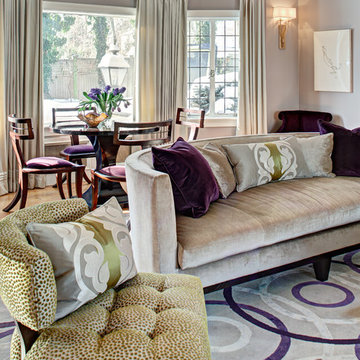
These clients, an entrepreneur and a physician with three kids, chose their Tudor home for the neighborhood, though it didn’t match their modern-transitional taste. They asked us to help them transform their into a place to play and entertain with clean lines and lively color, namely her favorites: bold purple and refreshing apple green.
Their previous layout had a stifled flow with a large sectional sofa that dominated the room, and an awkward assortment of furniture that they wanted to discard with the exception of a vintage stone dining table from her mother. The living room served as a pass through to both the family and dining rooms. The client wanted the living room to be less like a glorified hallway and become a destination. Our solution was to unify the design of this living space with the related rooms by using repetition of color and by creating usable areas for family game night, entertaining and small get togethers.
The generous proportions of the room enabled us to create three functional spaces: a game table with seating for four and adjacent pull up seating for family play; a seating area at the fireplace that accommodates a large group or small conversation; and seating at the front window that provides a view of the street (not seen in the photograph). The space went from awkward to one that is used daily for family activities and socializing.
As they were not interested in touching the existing architecture, transformations were made using new light fixtures, paint, distinctive furniture and art. The client had a strict budget but desired the highly styled look of couture design pieces with curves and movement. We accomplished this look by pairing a few distinctive couture items with inspired pieces that are budget balancers.
We combined the couture game table with more affordable chairs inspired by a classic klismos style, as one might pair Louboutins with stylish jeans. Right- and left-arm chairs with an interesting castle-like fret base detail flank windows.
To help the clients better understand the use of the color scheme, we keyed the floor plan to show how the greens and purples traveled in a balanced manner around the room and throughout the adjacent dining and family rooms. We paired apple green accents with layered hues of lavender, orchid and aubergine. Neutral taupe and ivory tones ground the bold colors.
The custom rug in ivory, aubergine, pale taupe, grey-lavender was inspired by a picture the client found, but we dramatically increased the scale of the pattern in proportion to our room size. This curvy movement is echoed in the sophisticated shapes of the furniture throughout the redesigned room—from the curved sofas to the circular cutouts in the cube end table.
At the windows the solid sateen panels with contrasting aubergine banding have the hand of silk, and are also cost conscious, creating room in the budget for the stunning custom pillows in Italian embroidered silk.
The distinctive color and shapes throughout provide the whimsy the clients' desired with the function they needed, creating an inviting living room that is now a daily destination.
Designed by KBK Interior Design
www.KBKInteriorDesign.com
Photo by Wing Wong
 AT&S Artistic Tile & Stone
Julie Mifsud Interior Design
www.juliemifsuddesign.com/
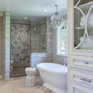
Inspiration for a timeless gray tile freestanding bathtub remodel in San Francisco with recessed-panel cabinets, white cabinets and gray walls
Inspiration for a timeless gray tile freestanding bathtub remodel in San Francisco with recessed-panel cabinets, white cabinets and gray walls
 Haven Design and Construction
Matthew Niemann Photography
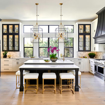
Example of a transitional u-shaped light wood floor and beige floor kitchen design in Austin with a farmhouse sink, raised-panel cabinets, gray backsplash, paneled appliances, an island, white countertops, quartz countertops, white cabinets and stone tile backsplash
Example of a transitional u-shaped light wood floor and beige floor kitchen design in Austin with a farmhouse sink, raised-panel cabinets, gray backsplash, paneled appliances, an island, white countertops, quartz countertops, white cabinets and stone tile backsplash

 Klopf Architecture
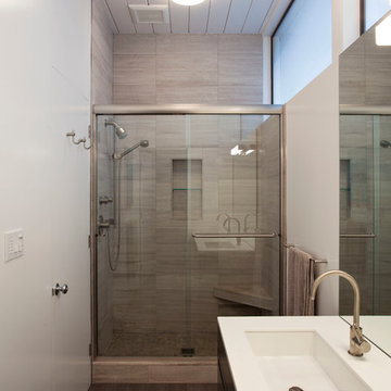
How do you expand an L shaped Eichler with the challenge of extending a long dark entry? Klopf Architecture's solution, to design a light filled atrium in the hallway to open up the bedroom expansion with green plants, sky lights and a glass wall. Not to mention the thoughtfulness of a blind door with wood siding similar to the rest of the home.
Klopf Architecture Project Team: John Klopf, AIA, Geoff Campen, Jeffrey Prose, and Angela Todorova
Contractor: William Lowe Construction
Photography ©2013 Mariko Reed
Location: Palo Alto, CA
Year completed: 2013
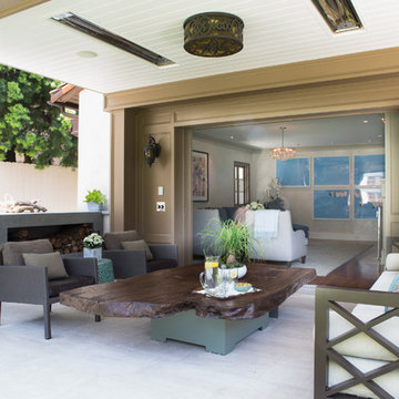
 Gregory Roth Design
Erika Bierman Photography
Inspiration for a transitional patio remodel in Los Angeles with a roof extension and a fireplace
Inspiration for a transitional patio remodel in Los Angeles with a roof extension and a fireplace
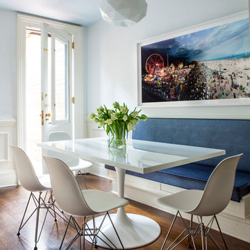
 ANA Woodwork Studio LLC
Painted Banquette with base to match existing trim
Trendy dark wood floor dining room photo in New York with white walls
Trendy dark wood floor dining room photo in New York with white walls
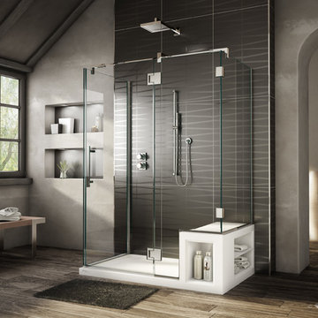
 Innovate Building Solutions
This 3 sided shower is not only very nice looking but it uses space very efficiently as well! The high end frameless wall gives a luxury look
Mid-sized transitional master doorless shower photo in Cleveland
Mid-sized transitional master doorless shower photo in Cleveland
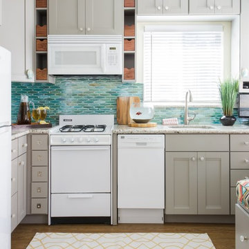
 DANIELLE Interior Design & Decor
This small studio has everything! It includes apartment size small white appliances, stunning colors (Diamond Cloud Gray cabinets), and great storage solutions!
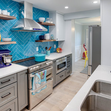
Besides the beauty of the turquoise backsplash and clean lines this small space is extremely functional! Warm wood boxes were custom made to house all of the cooking essentials in arms reach. The cabinets flow completely to the ceiling to allow for every inch of storage space to be used. Grey cabinets are even above the kitchen window.
Designed by Small Space Consultant Danielle Perkins @ DANIELLE Interior Design & Decor.
Photographed by Taylor Abeel Photography
 mackmiller design+build
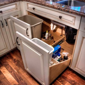
The sink base features two full extension rollouts that handle trash and recyclables in the front and have divided storage for cleaning supplies in the back. No more getting on your hands and knees to access this cabinet. Idea found in Fine Homebuilding magazine. Small tilt drawer holds sponges.
There is a stainless steel undermount sink and a Delta faucet and soap dispenser.
 Reico Kitchen & Bath
Designed by Akram Aljahmi of Reico Kitchen & Bath in King of Prussia, PA in collaboration with Property Remodeling Group, this transitional inspired kitchen design features white and grey finishes complemented by a bold splash of blue tile.
The kitchen design features Merillat Classic kitchen cabinets in Portrait door style with 5 piece drawer head in 2 finishes. The wall cabinets features a painted white Cotton finish and the base cabinets feature a painted grey Graphite finish. Kitchen countertops are engineered quartz in the color Carrera Marmi from Q by MSI. The kitchen also features a stunning blue herringbone tile back splash with 3x10 tiles.
According to the client, "Akram solved a fundamental function problem that I could not see a solution for. His re-imagining of how the main floor of our home could function was a dramatic shift that I can't wait to experience as part of day-to-day life. Really appreciate his space plan and layout, as well as his support selecting finishes. Akram and team were great to work with!".
Photos courtesy of BTW Images LLC.
 Vetter Architects
The owners requested that their home harmonize with the spirit of the surrounding Colorado mountain setting and enhance their outdoor recreational lifestyle - while reflecting their contemporary architectural tastes. The site was burdened with a myriad of strict design criteria enforced by the neighborhood covenants and architectural review board. Creating a distinct design challenge, the covenants included a narrow interpretation of a “mountain style” home which established predetermined roof pitches, glazing percentages and material palettes - at direct odds with the client‘s vision of a flat-roofed, glass, “contemporary” home.
Our solution finds inspiration and opportunities within the site covenant’s strict definitions. It promotes and celebrates the client’s outdoor lifestyle and resolves the definition of a contemporary “mountain style” home by reducing the architecture to its most basic vernacular forms and relying upon local materials.
The home utilizes a simple base, middle and top that echoes the surrounding mountains and vegetation. The massing takes its cues from the prevalent lodgepole pine trees that grow at the mountain’s high altitudes. These pine trees have a distinct growth pattern, highlighted by a single vertical trunk and a peaked, densely foliated growth zone above a sparse base. This growth pattern is referenced by placing the wood-clad body of the home at the second story above an open base composed of wood posts and glass. A simple peaked roof rests lightly atop the home - visually floating above a triangular glass transom. The home itself is neatly inserted amongst an existing grove of lodgepole pines and oriented to take advantage of panoramic views of the adjacent meadow and Continental Divide beyond.
The main functions of the house are arranged into public and private areas and this division is made apparent on the home’s exterior. Two large roof forms, clad in pre-patinated zinc, are separated by a sheltering central deck - which signals the main entry to the home. At this connection, the roof deck is opened to allow a cluster of aspen trees to grow – further reinforcing nature as an integral part of arrival.
Outdoor living spaces are provided on all levels of the house and are positioned to take advantage of sunrise and sunset moments. The distinction between interior and exterior space is blurred via the use of large expanses of glass. The dry stacked stone base and natural cedar cladding both reappear within the home’s interior spaces.
This home offers a unique solution to the client’s requests while satisfying the design requirements of the neighborhood covenants. The house provides a variety of indoor and outdoor living spaces that can be utilized in all seasons. Most importantly, the house takes its cues directly from its natural surroundings and local building traditions to become a prototype solution for the “modern mountain house”.
Overview
Ranch Creek Ranch
Winter Park, Colorado
Completion Date
October, 2007
Services
Architecture, Interior Design, Landscape Architecture
 TVL Creative Ltd.
Cramped kitchen be gone! That was the project motto and top priority. The goal was to transform the current layout from multiple smaller spaces into a connected whole that would activate the main level for our clients, a young family of four.
The biggest obstacle was the wall dividing the kitchen and the dining room. Removing this wall was central to opening up and integrating the main living spaces, but the existing ductwork that ran right through the center of the wall posed a design challenge, er design opportunity. The resulting design solution features a central pantry that captures the ductwork and provides valuable storage- especially when compared to the original kitchen's 18" wide pantry cabinet. The pantry also anchors the kitchen island and serves as a visual separation of space between the kitchen and homework area.
Through our design development process, we learned the formal living room was of no service to their lifestyle and therefore space they rarely spent time in. With that in mind, we proposed to eliminate the unused living room and make it the new dining room. Relocating the dining room to this space inherently felt right given the soaring ceiling and ample room for holiday dinners and celebrations. The new dining room was spacious enough for us to incorporate a conversational seating area in the warm, south-facing window alcove.
Now what to do with the old dining room?! To answer that question we took inspiration from our clients' shared profession in education and developed a craft area/homework station for both of their boys. The semi-custom cabinetry of the desk area carries over to the adjacent wall and forms window bench base with storage that we topped with butcher block for a touch of warmth. While the boys are young, the bench drawers are the perfect place for a stash of toys close to the kitchen.
The kitchen begins just beyond the window seat with their refrigerator enclosure. Opposite the refrigerator is the new pantry with twenty linear feet of shelving and space for brooms and a stick vacuum. Extending from the backside of the pantry the kitchen island design incorporates counter seating on the family room side and a cabinetry configuration on the kitchen side with drawer storage, a trashcan center, farmhouse sink, and dishwasher.
We took careful time in design and execution to align the range and sink because while it might seem like a small detail, it plays an important role in supporting the symmetrical configuration of the back wall of the kitchen. The rear wall design utilizes an appliance garage mirrors the visual impact of the refrigerator enclosure and helps keep the now open kitchen tidy. Between the appliance garage and refrigerator enclosure is the cooking zone with 30" of cabinetry and work surface on either side of the range, a chimney style vent hood, and a bold graphic tile backsplash.
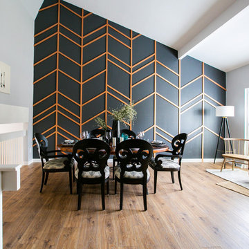
The backsplash is just one of many personal touches we added to the space to reflect our client's modern eclectic style and love of color. Swooping lines of the mid-mod style barstools compliment the pendants and backsplash pattern. A pop of vibrant green on the frame of the pantry door adds a fresh wash of color to an otherwise neutral space. The big show stopper is the custom charcoal gray and copper chevron wall installation in the dining room. This was an idea our clients softly suggested, and we excitedly embraced the opportunity. It is also a kickass solution to the head-scratching design dilemma of how to fill a large and lofty wall.
We are so grateful to bring this design to life for our clients and now dear friends.
 Adrienne DeRosa
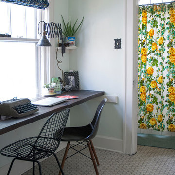
Utilizing extra space in their mudroom, the Mohrmans created a workspace for general daily operations and for Kiel's at-home furniture business MidWest Woods Furniture Co. "We had had our previous office in one of the upstairs bedrooms, but realized after some time that this made the office feel somewhat unaccessible", says Chelsea. With the perfect area already carved out in the mudroom, the couple got to work.
Kiel created a simple counter solution by spanning the length of the wall with reclaimed barn wood that he received from a friend. He scooped up the black molded chair when his former school was getting rid of them. At the time it was only the seat, however the couple sourced the Eames DSW base from Design Within Reach.
Wall Color, Lightest Sky, by Pantone for Valspar
Photo: Adrienne DeRosa Photography © 2014 Houzz

Sponsored
Columbus, OH

Wannemacher Interiors
Customized Award-Winning Interior Design Solutions in Franklin Cnty OH
 Building Solutions and Design, Inc
Photo credit: Charles-Ryan Barber
Architect: Nadav Rokach
Interior Design: Eliana Rokach
Staging: Carolyn Greco at Meredith Baer
Contractor: Building Solutions and Design, Inc.

 Control4
Contemporary high-tech kitchen features elegant furnishings and smart home automation from Control4 to enhance the ambiance and add the ultimate in convenience. Broadcast the music of your choice using a whole-home audio solution, powered by Control4. The recessed smart lighting and access lighting is designed to create the perfect personalized ambiance. Other automation options may include smart appliances, programmable thermostat control for comfort and energy management, home security system integration, shade automation, and full A/V control. And everything can be controlled from virtually anywhere - using your Control4 app with a smart phone or tablet device or a convenient touch screen.
 Karen Ellentuck. ASID
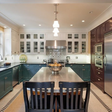
This kitchen was in a home dating from the early 20th century and located in the Mt. Baker neighborhood of Seattle. It is u-shaped with an island in the center topped with a zinc counter. Black and white tile was used on the floor in a tradition pattern with hexagon as the inset and a black and white border with a square mosaic around the perimeter framing the island. Cabinetry is inset traditional style with the hardware on the exterior. the base of each cabinet is framed with a footed detail. Base cabinet were painted with teal, upper cabinets are white and the full height cabinets are mahogany which is used throughout the residence. A tradition style faucet was used with the pull out attached. Cup pulls are used on the drawers and knobs have a back plate.
3