
Search results for "Communicate" in Home Design Ideas
 Christine Nelson Design
Ehlen Creative Communications
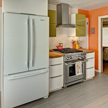
Enclosed kitchen - small traditional u-shaped linoleum floor enclosed kitchen idea in Minneapolis with a farmhouse sink, flat-panel cabinets, white cabinets, wood countertops, white backsplash, ceramic backsplash, stainless steel appliances and no island
Enclosed kitchen - small traditional u-shaped linoleum floor enclosed kitchen idea in Minneapolis with a farmhouse sink, flat-panel cabinets, white cabinets, wood countertops, white backsplash, ceramic backsplash, stainless steel appliances and no island
 JPM Construction
Cherie Cordellos - http://www.photosbycherie.net
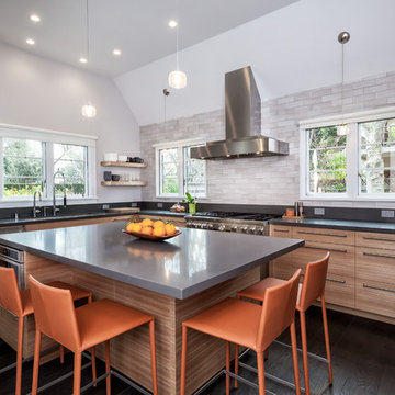
JPM Construction offers complete support for designing, building, and renovating homes in Atherton, Menlo Park, Portola Valley, and surrounding mid-peninsula areas. With a focus on high-quality craftsmanship and professionalism, our clients can expect premium end-to-end service.
The promise of JPM is unparalleled quality both on-site and off, where we value communication and attention to detail at every step. Onsite, we work closely with our own tradesmen, subcontractors, and other vendors to bring the highest standards to construction quality and job site safety. Off site, our management team is always ready to communicate with you about your project. The result is a beautiful, lasting home and seamless experience for you.
 Bravas Boca Raton
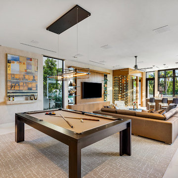
Fully integrated Signature Estate featuring Creston controls and Crestron panelized lighting, and Crestron motorized shades and draperies, whole-house audio and video, HVAC, voice and video communication atboth both the front door and gate. Modern, warm, and clean-line design, with total custom details and finishes. The front includes a serene and impressive atrium foyer with two-story floor to ceiling glass walls and multi-level fire/water fountains on either side of the grand bronze aluminum pivot entry door. Elegant extra-large 47'' imported white porcelain tile runs seamlessly to the rear exterior pool deck, and a dark stained oak wood is found on the stairway treads and second floor. The great room has an incredible Neolith onyx wall and see-through linear gas fireplace and is appointed perfectly for views of the zero edge pool and waterway. The center spine stainless steel staircase has a smoked glass railing and wood handrail.
Find the right local pro for your project
 Brian O'Keefe Architect, P.C.
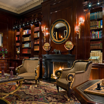
The mahogany wood paneling in the Formal Library has been French polished by hand to create a visibly stunning finish that is also wonderful to touch.
Historic New York City Townhouse | Renovation by Brian O'Keefe Architect, PC, with Interior Design by Richard Keith Langham
 Pacific Audio & Communications
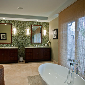
Example of a large island style master green tile and glass tile ceramic tile and beige floor freestanding bathtub design in Hawaii with furniture-like cabinets, dark wood cabinets, beige walls, an undermount sink and granite countertops
 Audio & Communications Experts, Inc.
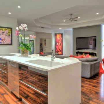
Example of a large minimalist open concept dark wood floor living room design in Tampa with a music area, green walls, a standard fireplace, a plaster fireplace and a concealed tv
 Interiors by Maite Granda
Feature In: Visit Miami Beach Magazine & Island Living
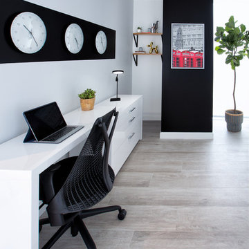
A nice young couple contacted us from Brazil to decorate their newly acquired apartment. We schedule a meeting through Skype and from the very first moment we had a very good feeling this was going to be a nice project and people to work with. We exchanged some ideas, comments, images and we explained to them how we were used to worked with clients overseas and how important was to keep communication opened.
They main concerned was to find a solution for a giant structure leaning column in the main room, as well as how to make the kitchen, dining and living room work together in one considerably small space with few dimensions.
Whether it was a holiday home or a place to rent occasionally, the requirements were simple, Scandinavian style, accent colors and low investment, and so we did it. Once the proposal was signed, we got down to work and in two months the apartment was ready to welcome them with nice scented candles, flowers and delicious Mojitos from their spectacular view at the 41th floor of one of Miami's most modern and tallest building.
Rolando Diaz Photography
 Bravas Boca Raton
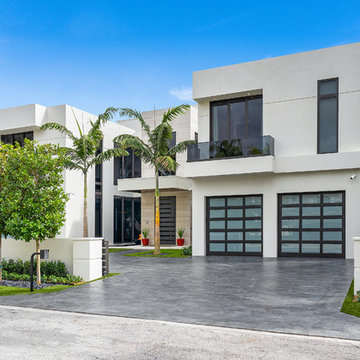
Modern home front entry features a voice over Internet Protocol Intercom Device to interface with the home's Crestron control system for voice communication at both the front door and gate.
Signature Estate featuring modern, warm, and clean-line design, with total custom details and finishes. The front includes a serene and impressive atrium foyer with two-story floor to ceiling glass walls and multi-level fire/water fountains on either side of the grand bronze aluminum pivot entry door. Elegant extra-large 47'' imported white porcelain tile runs seamlessly to the rear exterior pool deck, and a dark stained oak wood is found on the stairway treads and second floor. The great room has an incredible Neolith onyx wall and see-through linear gas fireplace and is appointed perfectly for views of the zero edge pool and waterway. The center spine stainless steel staircase has a smoked glass railing and wood handrail.
Photo courtesy Royal Palm Properties
 Advance Design Studio, Ltd.
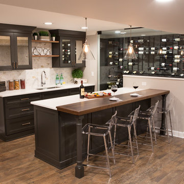
Karen and Chad of Tower Lakes, IL were tired of their unfinished basement functioning as nothing more than a storage area and depressing gym. They wanted to increase the livable square footage of their home with a cohesive finished basement design, while incorporating space for the kids and adults to hang out.
“We wanted to make sure that upon renovating the basement, that we can have a place where we can spend time and watch movies, but also entertain and showcase the wine collection that we have,” Karen said.
After a long search comparing many different remodeling companies, Karen and Chad found Advance Design Studio. They were drawn towards the unique “Common Sense Remodeling” process that simplifies the renovation experience into predictable steps focused on customer satisfaction.
“There are so many other design/build companies, who may not have transparency, or a focused process in mind and I think that is what separated Advance Design Studio from the rest,” Karen said.
Karen loved how designer Claudia Pop was able to take very high-level concepts, “non-negotiable items” and implement them in the initial 3D drawings. Claudia and Project Manager DJ Yurik kept the couple in constant communication through the project. “Claudia was very receptive to the ideas we had, but she was also very good at infusing her own points and thoughts, she was very responsive, and we had an open line of communication,” Karen said.
A very important part of the basement renovation for the couple was the home gym and sauna. The “high-end hotel” look and feel of the openly blended work out area is both highly functional and beautiful to look at. The home sauna gives them a place to relax after a long day of work or a tough workout. “The gym was a very important feature for us,” Karen said. “And I think (Advance Design) did a very great job in not only making the gym a functional area, but also an aesthetic point in our basement”.
An extremely unique wow-factor in this basement is the walk in glass wine cellar that elegantly displays Karen and Chad’s extensive wine collection. Immediate access to the stunning wet bar accompanies the wine cellar to make this basement a popular spot for friends and family.
The custom-built wine bar brings together two natural elements; Calacatta Vicenza Quartz and thick distressed Black Walnut. Sophisticated yet warm Graphite Dura Supreme cabinetry provides contrast to the soft beige walls and the Calacatta Gold backsplash. An undermount sink across from the bar in a matching Calacatta Vicenza Quartz countertop adds functionality and convenience to the bar, while identical distressed walnut floating shelves add an interesting design element and increased storage. Rich true brown Rustic Oak hardwood floors soften and warm the space drawing all the areas together.
Across from the bar is a comfortable living area perfect for the family to sit down at a watch a movie. A full bath completes this finished basement with a spacious walk-in shower, Cocoa Brown Dura Supreme vanity with Calacatta Vicenza Quartz countertop, a crisp white sink and a stainless-steel Voss faucet.
Advance Design’s Common Sense process gives clients the opportunity to walk through the basement renovation process one step at a time, in a completely predictable and controlled environment. “Everything was designed and built exactly how we envisioned it, and we are really enjoying it to it’s full potential,” Karen said.
Constantly striving for customer satisfaction, Advance Design’s success is heavily reliant upon happy clients referring their friends and family. “We definitely will and have recommended Advance Design Studio to friends who are looking to embark on a remodeling project small or large,” Karen exclaimed at the completion of her project.
 Guggenheim Architecture + Design Studio
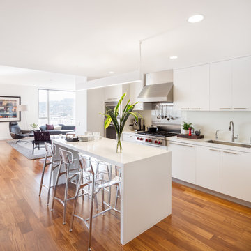
With sweeping views of the Willamette river and Mt. Hood, this Atwater Place condo was designed with a balance of minimalism and livability in mind. A complete kitchen remodel brought a dark interior kitchen to the light and a full furnishings package welcomed Los Angeles transplants home to their new modern and bright residence. Our clients, a retired camera operator for both feature films and television and a producer/production manager on numerous television series including Weeds and The Middle, relocated from their traditionally-styled LA bungalow to Portland in the Summer of 2014. The couple sought a design departure from their long-term California residence and a fresh start for their new life in the South Waterfront.
With only two pieces of sentimental furniture and a handful of artwork included in the plan, we set out to create a comfortable and clean-lined furnishings package complimenting the broad southeast views. Organically shaped upholstery pieces juxtaposed with angular steel and wood tables create a soft balance in the open floor plan. Several custom pieces, including a dining table designed by our studio and a custom hand-blown glass chandelier crafted by Scott Schiesel with Lightlite compliment timeless pieces from Knoll, Herman Miller, and B&B Italia.
The kitchen is designed to reflect light and create brilliance in a space that is otherwise naturally dark. A material balance of stainless steel, back painted glass, quartz composite, lacquer, and mirror all play their part in creating a vibrant cooking environment. We collectively decided to forgo the traditional island pendant for a linear commercial fixture that provides tremendous light to the prep surface and creates an unexpected architectural element. The mirrored prep island creates the illusion of open space while concealing casework and wine storage on the working side of the kitchen.
It is worth noting that this project was designed and installed almost entirely while our clients were still living in LA and wrapping up professional obligations and selling their home. This afforded us the tremendous opportunity to send our clients to showrooms not available in Portland to view key pieces before final specification. Textiles and finish samples were approved via mail and communication took place over e-mail, telephone, and an occasional office visit. This unique process lead to a successful result and a beautifully balanced living environment.

 Schrader & Companies
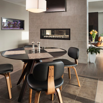
Photo Credit Landmark Photography. This home was designed with entertainment in mind. It has minimal detailing to give that contemporary transitional simplicity. The outdoor living and entertainment takes advantage of the lush wooded back lot. The see through aquarium and fireplace gives each space a feeling of coziness while allowing the open feel desired. In the basement the bar and wine cellar hosts more entertaining possibilities. Across from the bar is a sunken gulf simulator room and Theater. With the ongoing concept of open floor plan guests can communicate from the many exciting spaces in the basement.
 Zieba Builders, Inc.
Our clients loved the location of their duplex home with its peak-a-boo ocean view, but their existing kitchen was not suited for their growing family. They wanted a kitchen with a coastal vibe, plenty of storage space, and an eat-in area.
We started by bringing the far wall into the kitchen space to accommodate a large panty and communication center for the family. Doing this allowed us to move the refrigerator out of the main traffic area and doubled the amount of storage space. Several new windows were added to bring in natural light. A half wall was moved to allow more countertop area and open up sight lines. The previously awkwardly shaped island was slimmed down to create better flow.
There were a few venting challenges to overcome; gas lines and plumbing had to be re-routed without disturbing the unit below. To open up sight lines, soffits were eliminated which allowed the extension of cabinets to the ceiling. To stay within the homeowner’s budget, we match existing scraped flooring by lacing in and repairing patches.
The old dining area was too small for table, so we designed and built a custom banquette to maximize the space and take advantage of the outdoor views. The overall space works for family meals as well as entertaining.
A light summer palette was used to reflect the shades of the sand, sea and sky. Even though the new kitchen is actually smaller than the original space, its now far more functional and open.
 Simply Home Decorating
This beautiful North Vancouver home belongs to a nature-loving and health-conscious couple, Emma and Vince (names changed), their two young children, and their dog, Jasper. When they contacted us about renovating and furnishing their kitchen and family room, we walked in and saw a world of potential waiting to be uncovered.
Before: Larkhall Crescent Home:
Like many original North Vancouver homes, the interior was definitely dated. We encountered late ‘80s finishes in powder pink and teal green, old carpet, and a kitchen that wasn’t maximized to suit this family’s modern-day lifestyle. However, the size of the rooms offered us a ton of space with which to get creative.
Knowing our clients’ love of cooking, need for work spaces (Emma and Vince both work remotely), and growing family, we developed a design concept that would increase usable space, optimize storage, and create intimacy in this large area. As for the style, we were inspired by their European roots, inventing a new and modern take on “Belgian Farmhouse” style. Now, the home is truly one-of-a-kind.
After: Warm & Cozy Family Room:
Fresh, bright, and comfortable, this living area has been transformed! We started with the fireplace as a focal point, selecting aged brick tiles for added texture and a crisp wood mantle. The taupe-coloured sectional infuses the room with visual warmth and serves the added purpose of separating the family room from the kitchen.
Emma and Vince were also keen on using non-toxic materials in their home, and we were happy to oblige. To meet their needs, we sourced natural wood elements and sought out Canadian-made products - that adhere to high health standards - whenever possible.
Look closer at the elements of this space, and you will find this stunning, honeycomb-patterned rug in earthy gold, beige, and charcoal tones. It’s plush to the touch and full of visual texture that brings this room’s colour palette together. We sourced these two-tone chairs with caning, petrified wood side table, black sconces, and botanical prints in greyscale from local artist, Heather Johnston.
We topped off the space with this dark wood and rattan console that offers storage facing the kitchen and presents an opportunity to display cherished items. The result is a cozy lounging space brimming with comfort and functionality. It’s perfect for enjoying quality family time, or Emma can simply slide the coffee table away to make room for her morning yoga practice.
Now, let’s turn around and give some attention to the kitchen. Do you remember what the original kitchen looked like? If not, scroll back up, because the transformation is shocking…
Moody & Welcoming Kitchen for Healthy Living:
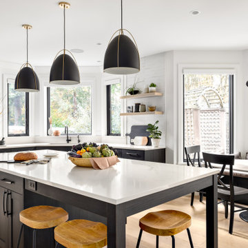
This kitchen looks very different from how it started, right? Though we didn’t touch any walls, the kitchen has almost doubled in usable space! We created a long, extended island with storage, an outlet for small appliances, and seating for comfortable prep, after-school snacking, or mingling among friends.
On the other side of the island, the family has even more storage and an integrated dishwasher within easy reach of the sink, perfect for quick clean-up. From this angle, you can also see the expansive custom Shaker cabinetry in white and the integrated double ovens. These facilitate their cooking experience and gave us the opportunity to add an additional surprise…
A coffee garage station and more hidden storage! Keeping these items located along the perimeter allows them to be accessed by the family or their guests without someone getting under the cook’s feet. These are the little details that make everyday life easier and more enjoyable.
Moving deeper into the kitchen, the seamless induction cooktop topped with a freestanding concealed hood fan commands attention in a soft yet prominent way. The natural wood accent mirrors the fireplace mantle, and the choice of off-black wood-grain cabinets not only continues our black-and-white colour palette but adds a sense of depth and contrast. The corner sink is located to the right and perfectly positioned with a view of their thriving backyard.
To invite more of this family’s character into the space, we mixed metals for interest — matte black, dark pewter, and warm brass — and created open shelves in white oak for their plants and decor. You can also glimpse the tumbled edge of the backsplash tile, which echoes the rustic brick of the fireplace. It adds that farmhouse charm while still feeling timeless and sophisticated.
Last but not least, we designed this dining banquette in the bay window (with integrated bench storage, of course), where the family can share a meal together, the kids can do homework, or Emma and Vince can work and enjoy a change of scenery from their offices. Like the other spaces in the home, it was designed to be beautiful, multi-functional, and long-lasting.
Praise from Our Clients:
It is clear that we love this home, but what did our clients have to say?
“Lori is a visionary and masters execution to the finest detail all at the same time. When she first met us to know more about who we are and how we live, she could right away envision how we could use the space in our kitchen and living room…The results exceeded our expectations.
Lori and her team were also a delight to work with — coordination with all the trades, fast problem-solving, regular updates, professional and friendly attitude of her entire team — made it the dream team. Thank you SHD for making our space so beautiful!”
In turn, we are so grateful for this family’s trust, their open communication, and for being wonderful people with whom to work. (So, thank you!)
 Zieba Builders, Inc.
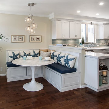
Our clients loved the location of their duplex home with its peak-a-boo ocean view, but their existing kitchen was not suited for their growing family. They wanted a kitchen with a coastal vibe, plenty of storage space, and an eat-in area.
We started by bringing the far wall into the kitchen space to accommodate a large panty and communication center for the family. Doing this allowed us to move the refrigerator out of the main traffic area and doubled the amount of storage space. Several new windows were added to bring in natural light. A half wall was moved to allow more countertop area and open up sight lines. The previously awkwardly shaped island was slimmed down to create better flow.
There were a few venting challenges to overcome; gas lines and plumbing had to be re-routed without disturbing the unit below. To open up sight lines, soffits were eliminated which allowed the extension of cabinets to the ceiling. To stay within the homeowner’s budget, we match existing scraped flooring by lacing in and repairing patches.
The old dining area was too small for table, so we designed and built a custom banquette to maximize the space and take advantage of the outdoor views. The overall space works for family meals as well as entertaining.
A light summer palette was used to reflect the shades of the sand, sea and sky. Even though the new kitchen is actually smaller than the original space, its now far more functional and open.
 Fidelity General Contractors Inc.
Mid-century modern white tile claw-foot bathtub photo in Los Angeles with a pedestal sink
 User
UserCall us for enquiry: (561) 654-3653
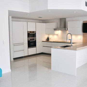
This beautiful, streamlined design broke open the space towards the dining area, that was completely blocked off before by a traditional half- walled island, that did not allow a structured communication or work in the kitchen.
The new layout as a U-shape with a generous breakfast bar generates a vivid contrast in core ash, that repeats the houses wooden staircase and brings warmth and comfort to compliment the quarzite countertops.
The european appliances from Miele are all fully integrated and flush installed to go harmonically with the minimalistic cabinetry. A 30" refrigerator from Liebherr shows the perfect integration with matching door panels, and hides practical storage and food management very tastefully.
 Expert Kitchen Designs, LLC
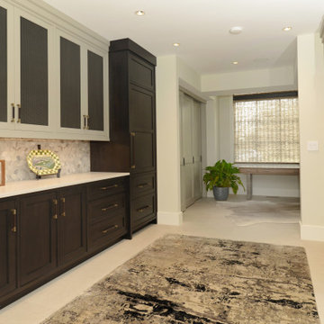
On the left is the "pantry".
Not seen on the far left is the Wolf Warming drawer. Far right on same run is the Sub Zero Designer Series refrigerator and freezer panel ready. The countertop is London Gray Honed by Caesarstone. Backsplash by Country Floors of America, Inc: "STUDIO" line "Autumn Leaves Skyline" marble.
Pennville Custom Cabinetry's 5/4 framed stepped inset construction with Rift Cut White Oak in Java stain and painted Sherwin Williams "Intellectual Gray" cabinetry.
 LDa Architecture & Interiors
TEAM
Architect: LDa Architecture & Interiors
Builder: Lou Boxer Builder
Photographer: Greg Premru Photography
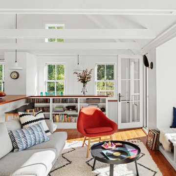
Example of a mid-sized cottage open concept medium tone wood floor, vaulted ceiling, brown floor and shiplap wall living room design in Boston with no tv and white walls
Example of a mid-sized cottage open concept medium tone wood floor, vaulted ceiling, brown floor and shiplap wall living room design in Boston with no tv and white walls
 The Brooklyn Studio
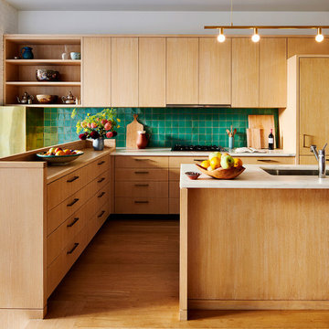
This residence was a complete gut renovation of a 4-story row house in Park Slope, and included a new rear extension and penthouse addition. The owners wished to create a warm, family home using a modern language that would act as a clean canvas to feature rich textiles and items from their world travels. As with most Brooklyn row houses, the existing house suffered from a lack of natural light and connection to exterior spaces, an issue that Principal Brendan Coburn is acutely aware of from his experience re-imagining historic structures in the New York area. The resulting architecture is designed around moments featuring natural light and views to the exterior, of both the private garden and the sky, throughout the house, and a stripped-down language of detailing and finishes allows for the concept of the modern-natural to shine.
Upon entering the home, the kitchen and dining space draw you in with views beyond through the large glazed opening at the rear of the house. An extension was built to allow for a large sunken living room that provides a family gathering space connected to the kitchen and dining room, but remains distinctly separate, with a strong visual connection to the rear garden. The open sculptural stair tower was designed to function like that of a traditional row house stair, but with a smaller footprint. By extending it up past the original roof level into the new penthouse, the stair becomes an atmospheric shaft for the spaces surrounding the core. All types of weather – sunshine, rain, lightning, can be sensed throughout the home through this unifying vertical environment. The stair space also strives to foster family communication, making open living spaces visible between floors. At the upper-most level, a free-form bench sits suspended over the stair, just by the new roof deck, which provides at-ease entertaining. Oak was used throughout the home as a unifying material element. As one travels upwards within the house, the oak finishes are bleached to further degrees as a nod to how light enters the home.
The owners worked with CWB to add their own personality to the project. The meter of a white oak and blackened steel stair screen was designed by the family to read “I love you” in Morse Code, and tile was selected throughout to reference places that hold special significance to the family. To support the owners’ comfort, the architectural design engages passive house technologies to reduce energy use, while increasing air quality within the home – a strategy which aims to respect the environment while providing a refuge from the harsh elements of urban living.
This project was published by Wendy Goodman as her Space of the Week, part of New York Magazine’s Design Hunting on The Cut.
Photography by Kevin Kunstadt
21