
Search results for "Compelled" in Home Design Ideas
 Cure Design Group
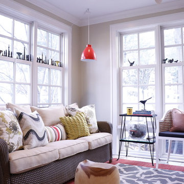
This designer client relationship is one based on friendship. Senior Designer Cori Dyer and client have an indescribable partnership and unmentioned understanding when it comes to decorating this home. A vintage charmer with a modern flair, filled with collectables and uncommon goods that make this space a unique and spectacular.
Cori Dyer:
I first met Sally when our boys became friends at Chaminade in 2007.
Since then, we have stayed close and become great friends.
Several years back she asked for my help giving her ideas on ways to spruce things up a bit and work with her on a major remodel.
A little intimidating as Sally has a beautiful home and is an avid collector of vintage finds.... way before the trend of blending old and new was popular.
She has an eye for unique ways to use vintage pieces and incorporating those into some of the most interesting and compelling displays. What has made this design relationship work is simply one of respect. I know when to give her that push outside of her comfort zone and incorporate her collections with selections that work with what she has, but that offer a new spin on putting it all together.
From that initial "spruce up" has come a makeover in her Living Room and currently one completed in her Family Room.
Although there are signs of my design throughout her home, the detail and selection of the collections and vintage finds are all Sally!!
I truly think that is how Design should be. Blending old and new, and a Designer listening to what makes the client happy.
Client: It was fun to be in style for a year or two, but it’s back to being the quirky lady. I started collecting in my teens and enjoy the hunt for new finds of all types. Cori helped me to enjoy my collections in a new and modern way! As always I had too many things. With her designer eye she taught me to blend the old and the new and to use different materials. The best part was going shopping with one of my best friends, who just happens to be a designer!! She is definitely the ying to my much needed yang.
 Morpurgo Architects
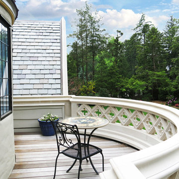
The English Tudor style of the historic Cheelcroft section of Hohokus is characterized by slate roofs, stucco, hand-cut siding, stonework and patterned brick. Morpurgo Architects incorporated each of these elements in a renovation that now embodies 1930’s Old World charm in a new, cohesive composition designed for modern times.
Though this house has been significantly enlarged, the additions are kept to a scale that is sensitive to the Tudor style. The street facade remains true to the original footprint, so that it continues to be situated comfortably among its neighbors. Beyond the front entrance, the house evolves from existing rooms with traditionally low ceilings to unexpected heights.
As a departure from original Tudor houses, our firm crafted the additions to this house with tall cathedral spaces resembling the great halls of European manor houses. Large steel casement double-insulated windows and doors flood the rooms with light and integrate these spaces with the surrounding gardens that offer compelling vistas to the landscape through historic-styled leaded glass panes.
 C. Boesch Design
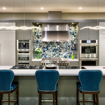
Extravagant design, touchable features and creative use of space intrigues from across the room, compelling one to draw nearer.
Refrigerators anchor each end and integrate seamlessly with adjacent cabinetry housing other appliances, which merge to become one with the cabinets. Sleek designs in ovens and cooktops blend with the neighboring pro style range, hood and contrasting cabinetry, showcasing the indulgent details of a wide array of different appliances.
An aquarium built into the base of the island creates that splash of unique character. Polished ‘Crystal Lagoon’ subway tile resembling underwater onyx, and ‘Wave’ pendants enhance the indulgent but tranquil ocean vibe.
Find the right local pro for your project
 Ground One Landscape Design + Build
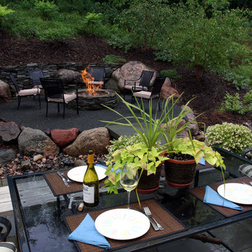
Ground One designed and built a deck off the back of the house for casual sitting, mirroring the house’s front porch. This deck and the screened porch steps descend to a patio terrace. To expand the entertaining space and accommodate the setback restrictions for a permitted gas firepit, we excavated the lot’s back slope to gain bonus space and create a rustic campfire spot. Large boulders found on the site during house construction are incorporated into a retaining wall. Colonial bluestone fills the gaps between these large accent stones and surrounds the firepit. Additional boulders hold up the patio and a slab of bluestone bridges the terrace and patio, preserving the overall drainage pattern. Bluestone is the common thread throughout the project, but it is used in different forms; clean lines closer to the house transition to a more weathered look as you move toward the natural area. The swale is a variety of boulder sizes and river rock to create a more visually-compelling creekbed.
The firepit patio is comfortable for just two people, but can also accommodate a larger group. It is close to the dining space, but physical separation allows for entertaining in different configurations: pre-dinner cocktails around the fire, a roaring flame as backdrop during dinner, kids roasting marshmallows while the adults linger within sight at the dining table, or the gang huddled around a bonfire.
 Cure Design Group
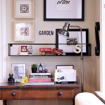
This designer client relationship is one based on friendship. Senior Designer Cori Dyer and client have an indescribable partnership and unmentioned understanding when it comes to decorating this home. A vintage charmer with a modern flair, filled with collectables and uncommon goods that make this space a unique and spectacular.
Cori Dyer:
I first met Sally when our boys became friends at Chaminade in 2007.
Since then, we have stayed close and become great friends.
Several years back she asked for my help giving her ideas on ways to spruce things up a bit and work with her on a major remodel.
A little intimidating as Sally has a beautiful home and is an avid collector of vintage finds.... way before the trend of blending old and new was popular.
She has an eye for unique ways to use vintage pieces and incorporating those into some of the most interesting and compelling displays. What has made this design relationship work is simply one of respect. I know when to give her that push outside of her comfort zone and incorporate her collections with selections that work with what she has, but that offer a new spin on putting it all together.
From that initial "spruce up" has come a makeover in her Living Room and currently one completed in her Family Room.
Although there are signs of my design throughout her home, the detail and selection of the collections and vintage finds are all Sally!!
I truly think that is how Design should be. Blending old and new, and a Designer listening to what makes the client happy.
Client: It was fun to be in style for a year or two, but it’s back to being the quirky lady. I started collecting in my teens and enjoy the hunt for new finds of all types. Cori helped me to enjoy my collections in a new and modern way! As always I had too many things. With her designer eye she taught me to blend the old and the new and to use different materials. The best part was going shopping with one of my best friends, who just happens to be a designer!! She is definitely the ying to my much needed yang.
 Morpurgo Architects
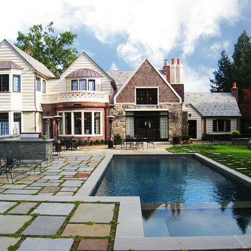
The English Tudor style of the historic Cheelcroft section of Hohokus is characterized by slate roofs, stucco, hand-cut siding, stonework and patterned brick. Morpurgo Architects incorporated each of these elements in a renovation that now embodies 1930's Old World charm in a new, cohesive composition designed for modern times.
Though this house has been significantly enlarged, the additions are kept to a scale that is sensitive to the Tudor style. The street facade remains true to the original footprint, so that it continues to be situated comfortably among its neighbors. Beyond the front entrance, the house evolves from existing rooms with traditionally low ceilings to unexpected heights.
As a departure from original Tudor houses, our firm crafted the additions to this house with tall cathedral spaces resembling the great halls of European manor houses. Large steel casement double-insulated windows and doors flood the rooms with light and integrate these spaces with the surrounding gardens that offer compelling vistas to the landscape through historic-styled leaded glass panes.
 VPC Builders, LLC
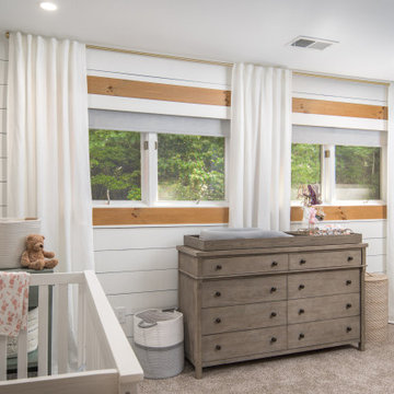
This spectacular two-story Boone Oaks Remodel reflects the exquisite style of the homeowners while accompanying the rhythmic needs required of daily living. Reclaimed timber beams are showcased throughout the home and as posts on the custom floating staircase and ceilings.
This remodel encompasses everyday luxury. The open floor plan boasts mountain views from every angle and the grand stone fireplace makes the living room the perfect spot to host family gatherings or curl up with a compelling read in hand. With the kitchen overlooking the living room, the oversized live edged island with a built-in beverage cooler and microwave provides the perfect setting for meal prepping. The kitchen also features a copper farm sink and range hood, a built-in breakfast nook, and floating shelves.
We believe this home renovation is a representation of fine craftsmanship and the success of effective communication between VPC and our clients.
 User
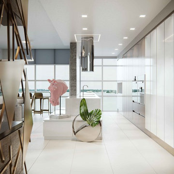
UserThis complete structural makeover of a two-story 1978 penthouse sought to integrate the kitchen and social area, creating an open layout allowing houseguests to interact more fluidly, while taking advantage of the natural light afforded by a reconfigured, double-height view of Miami’s Biscayne Bay. Materials were chosen to lend richness and texture to the space, defining proportions and ratios, with an emphasis on clean, compelling lines to complement the clients’ entertaining objectives while embodying a warmer, “Modern Eclectic Contemporary” feel. Custom furniture including a sleek, youthful bar and seating as well as oversized artwork emphasize proportion in the two-story space while maximizing the space’s relationship to the double-height view. The design aimed to toy with depth and drama, employing a custom geometric chandelier, streamlined furniture, and glimpses of color to create a welcoming, interesting, and eye-catching space.
- Sandra Diaz-Velasco
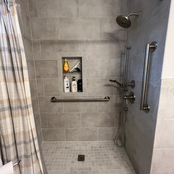
 Cabinetry by Better Bilt
Cabinetry- Showplace EVO
Door Style- Milan
Finish- Oak in Amber Stain
Countertop- Desert Breeze
Sink- SSU1813 Rectangle
Plumbing Fixtures- Delta- Compel Series Stainless Steel
Hardware- Richelieu BP8189128195
Tile- Atlas Concord Cove Linen 12 x 24 on floor & walls, 2 x 2 mosaic in niche & shower floor, bullnose
Designer- Alex Tooma
Contractor- Loyalty Contracting
 Klopf Architecture
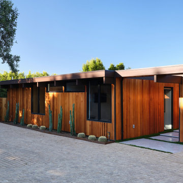
Malibu Glass Box House by Klopf Architecture
Following the devastating Woolsey Fire of 2018, the site in Malibu offered a unique opportunity to rebuild not just a home, but a new architectural composition that highlighted the property’s potential while navigating strict fire-rebuild codes in the area. Designed by Klopf Architecture, this project embraced a set of limitations and translated them into an architectural asset.
The city’s fire-rebuild process required the new structure to remain close to the original footprint, size and bulk, a constraint that ultimately clarified the architectural direction. Perched near the front of a long, narrow lot, the new home frames and overlooks a private, park-like rear expanse, an uncommon luxury especially in this part of Malibu .
Without a fixed program, the design process allowed for a different kind of creative focus allowing Klopf Architecture the opportunity to explore how a modernist home could best respond to this site. The team approached the project not with a list of requirements, but with a question: How might a modernist live here? What spatial qualities would inspire calm, connection, and a sense of wonder in this setting? The process became less about problem-solving and more about architectural storytelling—letting the site, the light, and the principles of modern design guide the form and flow of the home.
The response emerged in the form of a glass-box pavilion, an open, Mid-Century Modern inspired living, dining, and kitchen space that floats at the edge of the property’s natural descent. Connected to the more enclosed, private areas of the home by a glass-walled hallway, the living pavilion becomes a distinct centerpiece of the design. It opens on all four sides to the landscape with decks and patios on the flanks, an internal garden and water feature to the north, and a dramatic unguarded view of the expansive backyard and ocean horizon to the south.
Because of the mandated footprint, careful planning was required to ensure every space could still engage with light, landscape, or both. Strategic voids in the form of atriums and courtyards allow daylight to filter deep into the home’s core, while offering moments of surprise and retreat. These design gestures allow natural light to filter deep into the interior, creating a sense of brightness and openness throughout the day. At the same time, they expand the perceptual boundaries between inside and out, making the home feel more expansive while anchoring its connection to the surrounding landscape.
The siting of the house is what gives it its unique character. Rather than receding into the backyard like the neighboring homes, the house holds a slight prominence. From the central living pavilion, stepping down into the landscape feels more like entering a secluded park where a separate existing accessory structure, trail, and recreational areas await. The home’s modest street presence gives way to this unfolding drama of space, view, and nature.
Fire-resilient materials and assemblies are integrated seamlessly throughout including triple-pane glazing, under-slab and roof insulation, and locally sourced fire-rated cladding ensure the house not only meets Calfornia’s rigorous wildland-urban interface (WUI) standards, but feels effortlessly aligned with them. While technical decisions like fire-hardening and mechanical systems presented some construction challenges, particularly around the cantilevered glass box, the team found a functional compromise that preserved the integrity of the design.
Inside, a restrained palette and exposed post and beam design celebrate the ethos of mid-century modernism. A central circulation spine extends from the entry to the rear glass wall, offering a continuous visual link from street to ocean. Spaces such as the library and office, though more intimate in scale, are never cut off from nature as each opens to its own unique courtyard or garden view.
Though born out of a strict regulatory framework and developed without a specific client, the rebuild design unfolded with remarkable clarity. Grounded in site logic, refined by limitations and an emphasis on timeless spatial relationships – light, proportion, and a strong connection to nature, the resulting design feels both effortless and uplifting. The home lives lightly on the land, opens generously to its surroundings, and strikes a careful balance between privacy, openness, and calm. For Klopf Architecture, it stands as a compelling case study in how site, code, and circumstantial constraints can inspire enduring, modernist architecture. With years of experience reimagining mid-century modern design for how people live today, the firm took the project’s limitations as an opportunity. The result is a home shaped by open, flowing spaces, strong indoor-outdoor connections, and a calm, clear sense of structure. It’s a good reminder that even with strict constraints, there’s still room for architecture to breathe—and for modernism to keep moving forward.
Klopf Architecture project team: Geoff Campen, John Klopf, AIA, and Sherry Tan
Structural Engineer: ZFA
Contractor: Maison D’Artiste
Photography: ©2025 Mariko Reed
Year Completed: 2023
 lavish
When a professional office space needs to make a lasting impression on clients and create an inspiring environment for staff, the design details matter just as much as they do at home. This thoughtful commercial interior refresh transformed a dated, purely functional office into a warm, sophisticated, and beautifully layered space — one that feels more like a high-end boutique or luxury residence than a typical workplace.
The guiding philosophy throughout was clear: every space, no matter how utilitarian its purpose, deserves intentional design. From the reception corridor to the staff break room, from the client restrooms to the storage corridor, each area received careful attention to finish, color, and texture.
Restrooms Reimagined
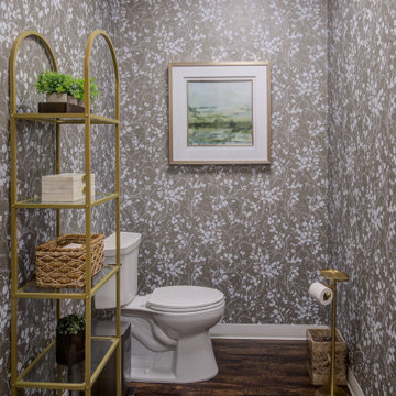
The two client-facing restrooms were the most dramatic transformations in the project. Rather than the builder-grade wallpaper and basic fixtures typically found in commercial spaces, both were treated as true design moments.
The first features floor-to-ceiling wallpaper in a rich taupe with a delicate white botanical branch pattern, creating an immersive, jewel-box feel. A white shaker vanity with dark granite countertop grounds the space, while an arched frameless mirror and brushed gold wall sconce add glamour. A tall gold and glass etagere serves as both decorative storage and a sculptural element, styled with woven baskets, greenery, and stacked accessories. Framed landscape watercolor art adds a serene, organic note, and a freestanding brass toilet paper holder elevates a typically overlooked detail.
The second restroom takes an entirely different but equally compelling direction — soft, dusty blue-grey grasscloth-style wallpaper printed with a tone-on-tone chevron leaf stripe wraps every wall, creating a calm, spa-like atmosphere. A weathered wood console provides casual charm beneath a large-scale botanical tulip artwork in sage and cream. The wall-mount sink with exposed plumbing adds an intentional, editorial touch. An arched mirror with a sleek multi-bulb bar sconce in brushed nickel completes the look, while a pair of sculptural brass branch wall sculptures mounted directly to the wallpaper serve as unexpected, memorable art.
Storage Made Beautiful
The internal storage corridor received a full wall of custom floor-to-ceiling white shaker cabinetry with chrome pulls, flanked by open shelving sections for accessible display and storage. Clean, crisp, and highly organized — this space proves that even a purely functional corridor can be architectural and refined.
The Break Room & Kitchenette
The staff break room was updated with white shaker cabinetry, light speckled granite countertops, stainless appliances — including a French door refrigerator, dishwasher, and over-counter microwave — and warm sage green walls that bring a restful, refreshing energy to the space. Dark hardwood luxury vinyl plank flooring runs throughout the room, warming the look considerably. A round walnut dining table with upholstered chairs creates a proper gathering space for the team, and framed landscape oil art in an ornate gold frame adds a touch of collected character to the room.
Reception & Corridor Details
The reception and corridor spaces were treated with deep navy blue paint — bold, sophisticated, and unexpected in a commercial setting. A large abstract landscape painting in warm blues, blush, and gold hangs in a gilded frame against the navy wall, making an immediate statement. A brass and lucite table lamp sits on a floating brass-trimmed shelf alongside a sculptural art object, creating a vignette that communicates creativity and intentionality from the moment clients arrive.
The result is a professional environment that communicates confidence, taste, and care — one that clients will remember long after their visit, and one that staff will genuinely enjoy working in every day.
 Spaces808
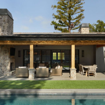
Check out this stunning island home in breathtaking Hawaii. The Big Island is a beautiful and unique place to call home, so make sure you highlight your Hawaii property best by using Spaces808. Visit our website, spaces808.com, to hire a professional real estate photographer who can create online marketing with compelling content.
 JRP Design & Remodel
Nestled in the exclusive North Ranch neighborhood of Westlake Village, this 6,600-square-foot masterpiece is a shining example of JRP’s tailored luxury and innovative design.
Our client’s vision for this home materialized as a single-story layout seamlessly blending the charm of a mountain aesthetic with a modern, rustic vibe.
Every element, from the meticulously crafted ceiling siding and beams to the flush base, narrates a compelling story of extraordinary living. Comprising five bathrooms, three bedrooms, a dedicated office, a gym, and a craft room, each corner of this home was thoughtfully curated to fulfill the unique needs of our discerning clients.
A particularly cherished aspect of the Rustic North Ranch project is the astonishing transformation of indoor-outdoor living. Separating the two spaces is a striking 18-foot-wide pocketing sliding door with a screen; when this door is open, the flow becomes seamless towards the reimagined outdoor living and new pool, inviting you to savor the indulgent pleasures of resort-style living within the sanctuary of a private retreat.
For more of this Rustic North Ranch project, including before and after images, behind-the-scenes, and design selections, follow along on our social media channels.
Photographer: Public 311 Design
 Cure Design Group
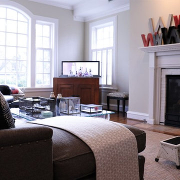
This designer client relationship is one based on friendship. Senior Designer Cori Dyer and client have an indescribable partnership and unmentioned understanding when it comes to decorating this home. A vintage charmer with a modern flair, filled with collectables and uncommon goods that make this space a unique and spectacular.
Cori Dyer:
I first met Sally when our boys became friends at Chaminade in 2007.
Since then, we have stayed close and become great friends.
Several years back she asked for my help giving her ideas on ways to spruce things up a bit and work with her on a major remodel.
A little intimidating as Sally has a beautiful home and is an avid collector of vintage finds.... way before the trend of blending old and new was popular.
She has an eye for unique ways to use vintage pieces and incorporating those into some of the most interesting and compelling displays. What has made this design relationship work is simply one of respect. I know when to give her that push outside of her comfort zone and incorporate her collections with selections that work with what she has, but that offer a new spin on putting it all together.
From that initial "spruce up" has come a makeover in her Living Room and currently one completed in her Family Room.
Although there are signs of my design throughout her home, the detail and selection of the collections and vintage finds are all Sally!!
I truly think that is how Design should be. Blending old and new, and a Designer listening to what makes the client happy.
Client: It was fun to be in style for a year or two, but it’s back to being the quirky lady. I started collecting in my teens and enjoy the hunt for new finds of all types. Cori helped me to enjoy my collections in a new and modern way! As always I had too many things. With her designer eye she taught me to blend the old and the new and to use different materials. The best part was going shopping with one of my best friends, who just happens to be a designer!! She is definitely the ying to my much needed yang.
 Black River Architects
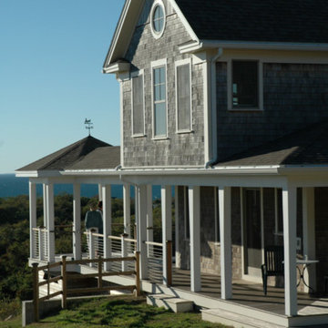
The view from this wooded, west facing site is dramatic, from the eastern tip of Long Island on the south to the Rhode Island coast on the north. Oddly, the existing house did not take full advantage of the view; only a single set of sliding glass doors faced the ocean. It was determined that the most sustainable strategy was to renovate the existing house, despite its shortcomings, and add a wing that would maximize the views and provide access to an existing grassy clearing in the woods to the south.
The expansive view is slowly revealed as one moves along the relocated driveway to the entry porch, into the house and then onto the west and south-facing decks. To encourage leisurely socializing, the plan concentrates the public spaces where the view, both from inside and on the decks, is most compelling.
 C. Boesch Design
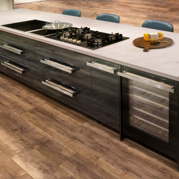
Extravagant design, touchable features and creative use of space intrigues from across the room, compelling one to draw nearer.
Refrigerators anchor each end and integrate seamlessly with adjacent cabinetry housing other appliances, which merge to become one with the cabinets. Sleek designs in ovens and cooktops blend with the neighboring pro style range, hood and contrasting cabinetry, showcasing the indulgent details of a wide array of different appliances.
An aquarium built into the base of the island creates that splash of unique character. Polished ‘Crystal Lagoon’ subway tile resembling underwater onyx, and ‘Wave’ pendants enhance the indulgent but tranquil ocean vibe.
 Canadian Timberframes Ltd
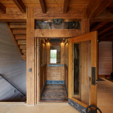
There are 8 bedrooms, five utility rooms a large comfortable kitchen, a 3,000 square foot great room with a vast clear span of 40’ that serves as a music studio and an attached 2,000 square foot indoor pool, a lower level sauna and steam room and a 4 storey elevator.
A creative triumph of Canadian Timberframes and Blue Sky Architecture produced a compelling structure that owes its strength to the quality of timber frame & design.
 Stipfold
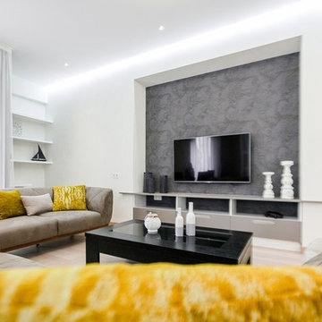
The house is spacious and the interior was designed in a manner, which kept this aspect highlighted: the entrance corridor leads to the large open area, uniting the kitchen, the living room and the dining room; The guest room wall, concealing the wardrobe, has two large incisions, making the wardrobe still part of the bedroom. Compelling design choice was also made for the master bedroom, where two sinks are not shying away from eye, but are rather put on display, as integral element of the bedroom.
CREDITS
Project Leader: Beka Pkhakadze
Copywriter: Mika Motskobili
Photos: Beka Pkhakadze
Location: Tbilisi / Georgia
Type: Residential Interior
Site: 210 sq.m.
Year: 2014
Status: Complete
 Stipfold
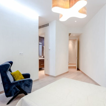
The house is spacious and the interior was designed in a manner, which kept this aspect highlighted: the entrance corridor leads to the large open area, uniting the kitchen, the living room and the dining room; The guest room wall, concealing the wardrobe, has two large incisions, making the wardrobe still part of the bedroom. Compelling design choice was also made for the master bedroom, where two sinks are not shying away from eye, but are rather put on display, as integral element of the bedroom.
CREDITS
Project Leader: Beka Pkhakadze
Copywriter: Mika Motskobili
Photos: Beka Pkhakadze
Location: Tbilisi / Georgia
Type: Residential Interior
Site: 210 sq.m.
Year: 2014
Status: Complete
 Stipfold
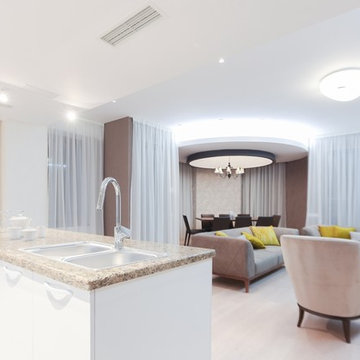
The house is spacious and the interior was designed in a manner, which kept this aspect highlighted: the entrance corridor leads to the large open area, uniting the kitchen, the living room and the dining room; The guest room wall, concealing the wardrobe, has two large incisions, making the wardrobe still part of the bedroom. Compelling design choice was also made for the master bedroom, where two sinks are not shying away from eye, but are rather put on display, as integral element of the bedroom.
CREDITS
Project Leader: Beka Pkhakadze
Copywriter: Mika Motskobili
Photos: Beka Pkhakadze
Location: Tbilisi / Georgia
Type: Residential Interior
Site: 210 sq.m.
Year: 2014
Status: Complete
45