
Search results for "Congestion" in Home Design Ideas
 TENTEN Kitchens
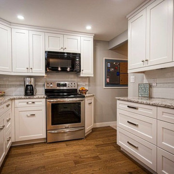
AFTER - a busy corner was opened up! We angled the cabinet next to the range so there wasn't a congestion point anymore.
Inspiration for a transitional kitchen remodel in Other
Inspiration for a transitional kitchen remodel in Other
 Altura Architects
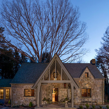
This Bent Creek renovation and addition gave the existing 1920s home a spacious interior and modern design while still maintaining its original character. The homeowners enjoy hosting large gatherings, but the narrow footprint and small spaces created a lot of congestion inside. To alleviate this problem, the homeowners wanted to expand the cramped kitchen and living spaces, but a huge oak tree sat only 5 feet from the kitchen window. The tree holds great sentimental value to the owners, so sacrificing the tree was out of the question, and locating the kitchen expansion elsewhere was not financially feasible. As a compromise, a large portion of the house adjacent to the kitchen was demolished, and most of the kitchen function was expanded in this direction. The end result is a beautiful and spacious home that we are very proud of.
Photography by Kevin Meechan
 Adrienne Oliver
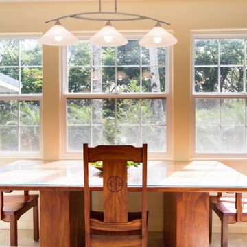
Out of date kitchen with a poor layout was remodeled and redesigned for an avid cook. The bent trapezoid shaped island provides both dining a cooking area with an induction cooktop. Opposite the island is a combination microwave and double wall oven with custom pullouts and storage. The Dining area off the kitchen is expanded and new windows are added to lighten the space. A separate coffee station opposite the dining area makes for less congestion in the cooking area.
Find the right local pro for your project
 Bianchi Design
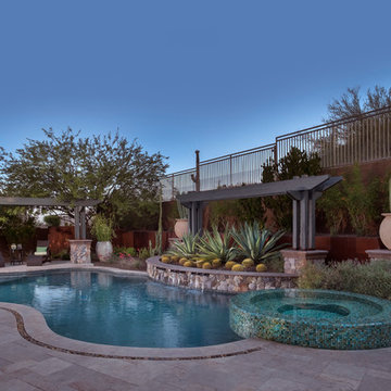
Previously, this yard was burdened by a typical boulder pile pool, that was heaped higher than typical, trying to hide the towering wall behind. At first, the clients sought merely to reconfigure the BBQ that was congesting the patio, but upon further analysis, they decided it was time to strip the entire yard, leaving only the pool shell. Bianchi’s solution introduced an array of four arbors to distract the eye from the wall behind, solving what the boulder waterfall could never do.
Additionally, the wall was painted a dark earth tone to add contrast and depth. This strategy enabled the wall to recede into the distance, while the agave blue grey arbors floated forward visually from the background. Previously, the patios were a hodgepodge of deck islands that were impossible to navigate, and were of insufficient size to arrange furniture on. A well organized patio streamlined the traffic flow and the living space, featuring a cast in place concrete fire pit and banco couch, as well as a new outdoor bistro, glowing with filtered light from the canvas shade sails overhead.
A turquoise glass overflow spa became the yards focal point, sharing the space between the pool and outdoor living. The striking symmetry of the spa and pot pedestal with regal cacti arrangement behind, flanked by the arbors on either side, created a stately first impression from the front door. This teaser was just a glimpse of what could not yet be seen serving as an invitation to explore and enjoy as the yard unfolds.
See more about this project & hear from the homeowner here: https://www.youtube.com/watch?v=7eT3RkLkg5w&feature=youtu.be
 Karen Berkemeyer Home
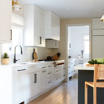
This lovely New York home was remodeled with a beautiful two-tone kitchen design and a functional walk-in pantry/coffee bar; as well as a large island with plenty of room for the family that doubles as work station. The refrigerator was recessed into a wall between the pantry and mudroom to avoid creating congestion in this highly trafficked area.
 Zengel Group
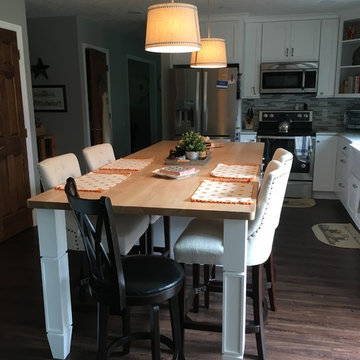
We expanded the island to included a dining area which provided more workspace and tied the dining area into the kitchen also removed congestion in front of the patio door,
 Bianchi Design
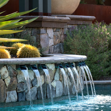
Previously, this yard was burdened by a typical boulder pile pool, that was heaped higher than typical, trying to hide the towering wall behind. At first, the clients sought merely to reconfigure the BBQ that was congesting the patio, but upon further analysis, they decided it was time to strip the entire yard, leaving only the pool shell. Bianchi’s solution introduced an array of four arbors to distract the eye from the wall behind, solving what the boulder waterfall could never do.
Additionally, the wall was painted a dark earth tone to add contrast and depth. This strategy enabled the wall to recede into the distance, while the agave blue grey arbors floated forward visually from the background. Previously, the patios were a hodgepodge of deck islands that were impossible to navigate, and were of insufficient size to arrange furniture on. A well organized patio streamlined the traffic flow and the living space, featuring a cast in place concrete fire pit and banco couch, as well as a new outdoor bistro, glowing with filtered light from the canvas shade sails overhead.
A turquoise glass overflow spa became the yards focal point, sharing the space between the pool and outdoor living. The striking symmetry of the spa and pot pedestal with regal cacti arrangement behind, flanked by the arbors on either side, created a stately first impression from the front door. This teaser was just a glimpse of what could not yet be seen serving as an invitation to explore and enjoy as the yard unfolds.
See more about this project & hear from the homeowner here: https://www.youtube.com/watch?v=7eT3RkLkg5w&feature=youtu.be
 GMT Home Designs Inc.
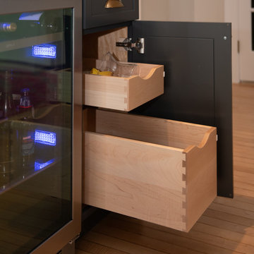
Cute but congested colonial needed some relief. The elimination of the wall between the kitchen and dining room opened up the space. Alterations to the living room and dining room, plus careful considerations to traffic flow welcomed the family on the first floor. The large island gained more gathering space for family and friends. The new mudroom carefully carved out from the existing farmers porch creates order in the entryway. The addition of new windows and doors adds natural light and creates more comfort in this old New England home.
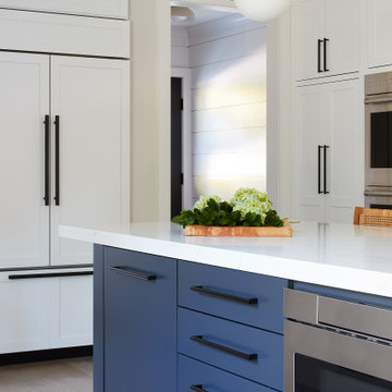 Karen Berkemeyer Home
This lovely New York home was remodeled with a beautiful two-tone kitchen design and a functional walk-in pantry/coffee bar; as well as a large island with plenty of room for the family that doubles as work station. The refrigerator was recessed into a wall between the pantry and mudroom to avoid creating congestion in this highly trafficked area.
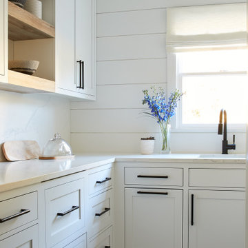 Karen Berkemeyer Home
This lovely New York home was remodeled with a beautiful two-tone kitchen design and a functional walk-in pantry/coffee bar; as well as a large island with plenty of room for the family that doubles as work station. The refrigerator was recessed into a wall between the pantry and mudroom to avoid creating congestion in this highly trafficked area.
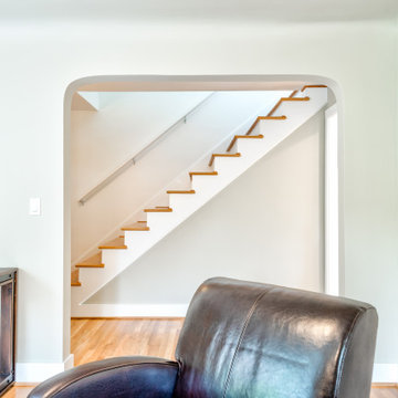
 Irons Brothers Construction Inc
This rambler’s small kitchen was dysfunctional and out of touch with our client’s needs. She desired a larger footprint without an addition or expanding the footprint to stay within a realistic budget for her homes size and neighborhood.
The existing kitchen was “boxed-in” at the back of the house. The entrance from
the hallway was very narrow causing congestion and cramping the cook. In the living room the existing fireplace was a room hog, taking up the middle of the house. The kitchen was isolated from the other room’s downstairs.
The design team and homeowner decided to open the kitchen, connecting it to the dining room by removing the fireplace. This expanded the interior floor space. To create further integration amongst the spaces, the wall opening between the dining and living room was also widened. An archway was built to replicate the existing arch at the hallway & living room, giving a more spacious feel.
The new galley kitchen includes generous workspaces and enhanced storage. All designed for this homeowners’ specific needs in her kitchen. We also created a kitchen peninsula where guests can sit and enjoy conversations with the cook. (After 5,6) The red Viking range gives a fun pop of color to offset the monochromatic floor, cabinets and counters. It also plays to her Stanford alumni colors.
One of our favorite and most notable features of this kitchen is the “flip-out” window at the sink. This creative solution allows for an enhanced outdoor living experience, without an expansive remodel or addition. When the window is open the party can happen inside and outside with an interactive experience between spaces. The countertop was installed flush to the window, specifically designed as a cocktail/counter rail surface.
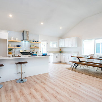
 Nandco Construction
The home was its normal, walled up and congested floor plan. The client wanted to vault the ceiling and open up the entire space.
Inspiration for a mid-sized modern single-wall eat-in kitchen remodel in Los Angeles with shaker cabinets, white cabinets, quartz countertops, an island and white countertops
Inspiration for a mid-sized modern single-wall eat-in kitchen remodel in Los Angeles with shaker cabinets, white cabinets, quartz countertops, an island and white countertops
 LaMantia Design and Remodeling
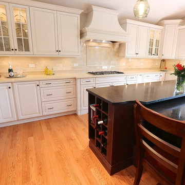
A recent fire in this Countryside home created the need for a completely new kitchen. Although the fire’s origin was in another area of the home, smoke damage to the kitchen required the entire area to be gutted. With a few changes and updated details, LaMantia designers James Campbell, CKD and Annessa Zaharis, NCIDQ, were able to freshen a once lovely kitchen into a stunning new look.
By removing the existing wood-framed and drywalled closet, Campbell and Zaharis were able to extend cabinetry further, offering the refrigerator the appearance of a much less congested installation. This added real estate also allowed a tall pantry cabinet with roll-out shelves designed to fill the need for storage and a second tall cabinet for the double ovens. The microwave, no longer languishing on the countertop, is tucked just below the counter in an easily accessible base cabinet.
The newly designed Island, with the table level seating at the back, is now the special anchor this Kitchen was calling for. Add to all of this the spectacular lighting fixtures, the soft inviting paint colors and the warmth of the wood flooring and the final is an absolute homerun!
 Lauren Perry Interior Design
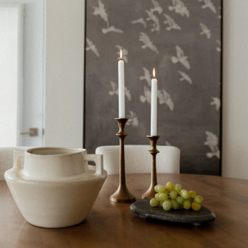
For many, the idea of downsizing can be daunting, especially when moving from a spacious rural home to a compact condo.
However, our clients were determined to embrace this change to simplify their lives and indulge in waterfront living. With panoramic views of Lake Nepahwin, they were eager to create a retreat maximizing space without compromising style.
To optimize space, we adopted a minimalist approach, focusing on multifunctional furniture and clever storage solutions. By strategically placing furniture and incorporating a pantry, disguised as an built-in armoire in the living room, we were able to make the most of every square inch while maximizing the expanse. “Every inch of real estate is valued,” says Lauren Perry “and that is how downsizing becomes a delight.”
The original pantry was excessive for the couple, but the primary bedroom was lacking closet space. Enter demolition. We opened a bathroom wall and converted the existing pantry into a walk-in closet for our client’s impressive wardrobe. Prioritizing the built-ins with plenty of drawers customized this space for our client’s personal needs and showcased her impeccable taste in clothes, shoes, and accessories.
Every selection had to be carefully considered so the space is inviting, without feeling congested. The fixtures and decor were curated to layer interest, but not detract from the beautiful views of the condo, a delicate balance best left to the professionals.
 User
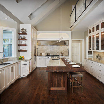
UserWhen these clients bought this home 15 years ago, they already knew the kitchen would need to be renovated to accommodate their passion for cooking and love for entertaining. The old kitchen layout caused a lot of congestion for the family and the design did not reflect the rest of the beautiful home. TruKitchens was employed to give the family a stunningly efficient space they could enjoy with friends and family.
Kitchen Designer: Todd Wiley, Tru Kitchens
Interior Designer: Lynn Hollander Interiors
Builder: Insignia Homes
Cabinets: Grabill Cabinetry in Glacier White and Nut Brown Walnut
Appliances: Bekins Appliances, Miele
Countertops: Natural quartzite from Great Lakes Granite, Custom etched stainless steel from Fidler Furniture and Walnut with oil finish wood from Grothouse
Photographer: Ashley Avila Photography
 rk MILES, Inc.
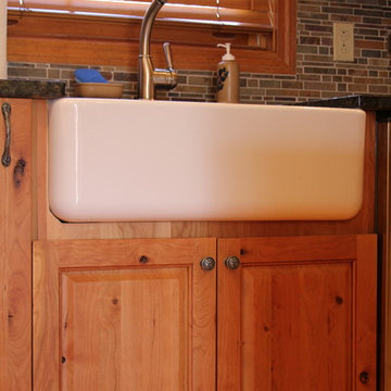
Cabinet Brand: Brookhaven
Door Style: Edgemont Raised
Finish Style/Color: Knotty Cherry in natural with dark glaze
Counter Top Material: Granite
Counter Top Color: Floresta Green
Special Notes: Opened up a congested layout in a busy ski house.
 Home Glow Design
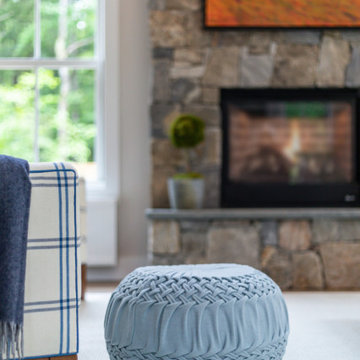
For the Cottages & Bungalows Magazine‘s 2019 Project House partnership with Yankee Barn Homes, we conceived our “Great NH Escape” Great Room for an active family from a suburban/Metro area who crave the quiet and rugged outdoors of New Hampshire for their getaway weekends, both winter and summer.
Though a second home, we felt that the parents truly saw Yankee Barn Homes’ spectacular post-and-beam Springfield Barn House as a “Forever Home-Away-from-Home” – the long-term backdrop for their family’s North Woods memories and a refuge to return to time and again from the noise of the more congested town where they live. As such, we furnished it with the same well-crafted, American-made décor that would stand the test of time in any investment home and a fresh classic style that would reflect the fun vitality of their family.
 LaMantia Design and Remodeling
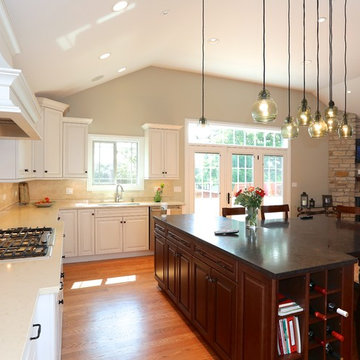
A recent fire in this Countryside home created the need for a completely new kitchen. Although the fire’s origin was in another area of the home, smoke damage to the kitchen required the entire area to be gutted. With a few changes and updated details, LaMantia designers James Campbell, CKD and Annessa Zaharis, NCIDQ, were able to freshen a once lovely kitchen into a stunning new look.
By removing the existing wood-framed and drywalled closet, Campbell and Zaharis were able to extend cabinetry further, offering the refrigerator the appearance of a much less congested installation. This added real estate also allowed a tall pantry cabinet with roll-out shelves designed to fill the need for storage and a second tall cabinet for the double ovens. The microwave, no longer languishing on the countertop, is tucked just below the counter in an easily accessible base cabinet.
The newly designed Island, with the table level seating at the back, is now the special anchor this Kitchen was calling for. Add to all of this the spectacular lighting fixtures, the soft inviting paint colors and the warmth of the wood flooring and the final is an absolute homerun!
 Adrienne Oliver
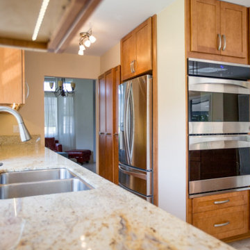
Out of date kitchen with a poor layout was remodeled and redesigned for an avid cook. The bent trapezoid shaped island provides both dining a cooking area with an induction cooktop. Opposite the island is a combination microwave and double wall oven with custom pullouts and storage. The Dining area off the kitchen is expanded and new windows are added to lighten the space. A separate coffee station opposite the dining area makes for less congestion in the cooking area.
 CUSTOM CRAFT - Design Build Remodel
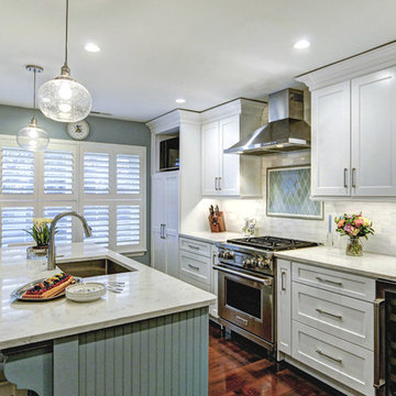
Our client's former kitchen was quite cramped. The reconfigured layout resolved the congestion and the white perimeter cabinetry and backsplash reinforce the spacious feel of this kitchen.
14