
Search results for "Consistency" in Home Design Ideas
 Extraordinary Structures
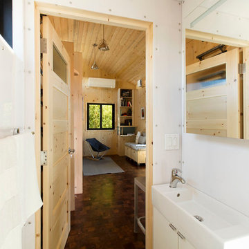
The acrylic-enclosed contemporary bath conveys a roomy and welcoming space despite its small size. Acrylic panels were cut on a CNC router to fit perfectly. The open door flows across the mesquite end grain floors and out into the living room. The mirror over the medicine cabinet slides open so as not to intrude into the space and a humidity sensor triggers the bathroom ventilation automatically to maintain consistent humidity.
Photo by Kate Russell

Saw palmetto (Serenoa repens). Photo: Miguel Vieira, licensed under Creative Commons Attribution- 2.0 Generic
Saw palmetto (Serenoa repens) and forest in Manatee Springs State Park

Find the right local pro for your project
 Lee Edwards - residential design
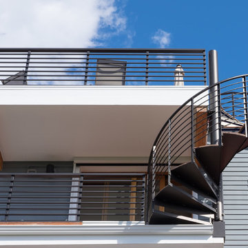
Situated on the west slope of Mt. Baker Ridge, this remodel takes a contemporary view on traditional elements to maximize space, lightness and spectacular views of downtown Seattle and Puget Sound. We were approached by Vertical Construction Group to help a client bring their 1906 craftsman into the 21st century. The original home had many redeeming qualities that were unfortunately compromised by an early 2000’s renovation. This left the new homeowners with awkward and unusable spaces. After studying numerous space plans and roofline modifications, we were able to create quality interior and exterior spaces that reflected our client’s needs and design sensibilities. The resulting master suite, living space, roof deck(s) and re-invented kitchen are great examples of a successful collaboration between homeowner and design and build teams.
 Searl Lamaster Howe Architects
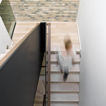
Looking down from the second floor landing. The rear wall is the same brick used on the exterior of the house. A series of skylights above flood the space with light. At the landing is an interior window that brings light into a back hallway that houses a bar and pantry. The staircase consists of a folded plate of metal, open white oak treads, and a winding walnut railing.
 S.J. Janis Company, Inc.
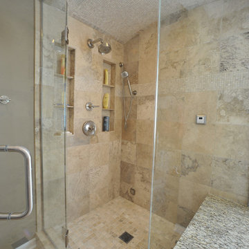
The shower ceiling was arched to prevent the steam condensation from dripping on the homeowners while they showered. The shower walls, floor, ceiling, and tub surround were covered with various size natural stone in an earth tone. The shower ceiling was tiled with 2" mosaic tiles, the tub desk and shower walls were covered with a 12" square tile. One 6" recessed light was added to the shower's arched ceiling as well.
The 3/8" heavy glass in-line panel, 74" door and buttress panel shower door included a pivoting transom at the top to allow for the dissipation of steam to the exhaust fan placed nearby. Brushed nickel panel hinges and pulls were selected for architectural detail and consistency.
One of the homeowner's goals for this remodel project was to eliminate the dark and boxy feel of the bathroom. By removing the shower wall, installing the new 90 degree glass surround to the tub deck, the space was opened and the natural light from the existing windows was allowed into the shower area accomplishing their goal.
 Artisan Kitchens and Baths
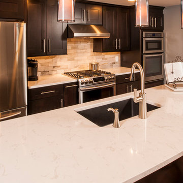
Cabinetry – Kemper Echo Cabinetry
Hardware- Jeffrey Alexander stainless bar pulls
Countertops- Cambria Quartz Torquay
Sinks and Faucets- Blanco Anthracite undermount Silgranite sink. Moen Faucet Nickel
Appliances- Samsung French door refrigerator in stainless, Samsung slide in gas range, Whirlpool wall Oven/ Microwave combination, Bosch 500 series dishwasher, and Broan Elite series pro range hood.
Flooring- prefinished 3/4 oak hardwood.
Backsplash- Natural stone subway tile.
-Inspiration and Design Challenges
The Original kitchen in this 1970’s raised ranch was bright an open yet left the dining room closed off from the home and wasn’t large enough for the island that Joe and his wife would have liked. Joe and Tim from THI Co. had developed a plan relocate the kitchen to one exterior wall and allow for an island that would function for both seating and entertaining. The challenge we faced was the original windows of the kitchen had to completely go. Relying solely on the open floor plan for natural light, Tim opened up the Dining room wall, removed the dividing half wall to the family room and widened doorways to the great room leading from the kitchen and dining room. The removal of the soffits and consistent wood flooring help tie together the adjacent rooms. The plan was for simple clean lines with subtle detail brought out in the trim on the cabinetry and custom 10ft island back panel. Finding a set of appliances was the next task. The kitchen was designed with the intention of being used. The Whirlpool convection wall ovens give the kitchen 3 possible functioning ovens with along with the Samsung 5 burner range. The end result is a simple elegant design that has all the functionality of galley kitchen yet the feel of an open kitchen with twice the square footage.
 O’Hara Interiors
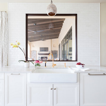
Martha O'Hara Interiors, Interior Design & Photo Styling | Meg Mulloy, Photography | Please Note: All “related,” “similar,” and “sponsored” products tagged or listed by Houzz are not actual products pictured. They have not been approved by Martha O’Hara Interiors nor any of the professionals credited. For info about our work: design@oharainteriors.com
 RG Design Studio Inc.
Builder - Westmark Construction;
Photography - Lance Sullivan of Concept Photo
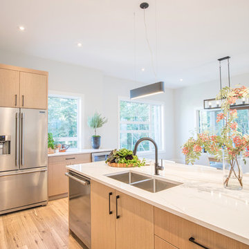
Example of a large trendy kitchen design in Vancouver
Example of a large trendy kitchen design in Vancouver
 Studio Industrielle
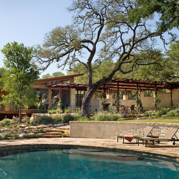
The program consists of a detached Guest House with full Kitchen, Living and Dining amenities, Carport and Office Building with attached Main house and Master Bedroom wing. The arrangement of buildings was dictated by the numerous majestic oaks and organized as a procession of spaces leading from the Entry arbor up to the front door. Large covered terraces and arbors were used to extend the interior living spaces out onto the site.
All the buildings are clad in Texas limestone with accent bands of Leuders limestone to mimic the local limestone cliffs in the area. Steel was used on the arbors and fences and left to rust. Vertical grain Douglas fir was used on the interior while flagstone and stained concrete floors were used throughout. The flagstone floors extend from the exterior entry arbors into the interior of the Main Living space and out onto the Main house terraces.
 Kimberlee Marie Interiors
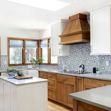
It’s always a blessing when your clients become friends - and that’s exactly what blossomed out of this two-phase remodel (along with three transformed spaces!). These clients were such a joy to work with and made what, at times, was a challenging job feel seamless. This project consisted of two phases, the first being a reconfiguration and update of their master bathroom, guest bathroom, and hallway closets, and the second a kitchen remodel.
In keeping with the style of the home, we decided to run with what we called “traditional with farmhouse charm” – warm wood tones, cement tile, traditional patterns, and you can’t forget the pops of color! The master bathroom airs on the masculine side with a mostly black, white, and wood color palette, while the powder room is very feminine with pastel colors.
When the bathroom projects were wrapped, it didn’t take long before we moved on to the kitchen. The kitchen already had a nice flow, so we didn’t need to move any plumbing or appliances. Instead, we just gave it the facelift it deserved! We wanted to continue the farmhouse charm and landed on a gorgeous terracotta and ceramic hand-painted tile for the backsplash, concrete look-alike quartz countertops, and two-toned cabinets while keeping the existing hardwood floors. We also removed some upper cabinets that blocked the view from the kitchen into the dining and living room area, resulting in a coveted open concept floor plan.
Our clients have always loved to entertain, but now with the remodel complete, they are hosting more than ever, enjoying every second they have in their home.
 Gardner Architects LLC
Photography by Ken Wyner
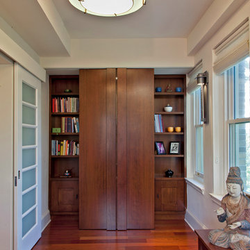
2101 Connecticut Avenue (c.1928), an 8-story brick and limestone Beaux Arts style building with spacious apartments, is said to have been “the finest apartment house to appear in Washington between the two World Wars.” (James M. Goode, Best Addresses, 1988.) As advertised for rent in 1928, the apartments were designed “to incorporate many details that would aid the residents in establishing a home atmosphere, one possessing charm and dignity usually found only in a private house… the character and tenancy (being) assured through careful selection of guests.” Home to Senators, Ambassadors, a Vice President and a Supreme Court Justice as well as numerous Washington socialites, the building still stands as one of the undisputed “best addresses” in Washington, DC.)
So well laid-out was this gracious 3,000 sf apartment that the basic floor plan remains unchanged from the original architect’s 1927 design. The organizing feature was, and continues to be, the grand “gallery” space in the center of the unit. Every room in the apartment can be accessed via the gallery, thus preserving it as the centerpiece of the “charm and dignity” which the original design intended. Programmatic modifications consisted of the addition of a small powder room off of the foyer, and the conversion of a corner “sun room” into a room for meditation and study. The apartment received a thorough updating of all systems, services and finishes, including a new kitchen and new bathrooms, several new built-in cabinetry units, and the consolidation of numerous small closets and passageways into more accessible and efficient storage spaces.
 Anjie Cho Architect PLLC
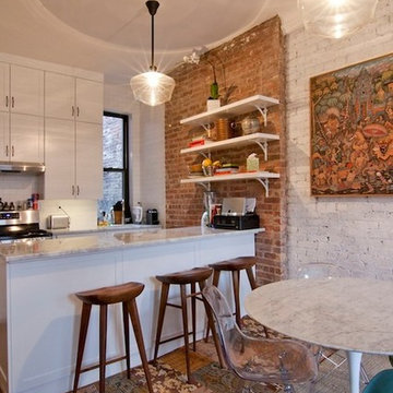
Project consisted of a full-gut renovation in a Chelsea apartment in New York City. This is the dining/kitchen area. The entire kitchen is new.
Example of a small eclectic galley medium tone wood floor and brown floor eat-in kitchen design in New York with an undermount sink, shaker cabinets, white cabinets, marble countertops, white backsplash, subway tile backsplash, white appliances and an island
Example of a small eclectic galley medium tone wood floor and brown floor eat-in kitchen design in New York with an undermount sink, shaker cabinets, white cabinets, marble countertops, white backsplash, subway tile backsplash, white appliances and an island
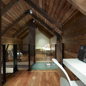
 BKA Architecture Pty Ltd
Baker Kavanagh Architects are a firm focused on creating architecture of honesty, imagination and integrity. Their heritage refurbishments have an optimism, are a delight. Wells Street is an exclusive residential development in Redfern on the edge of Sydney's CBD, consisting of a house, three contemporary terraces and the refurbishment of three heritage terraces. No stuffy refurb here. There is almost a sense of joy, a celebration of houses reborn, streetscapes renewed. Tomorrow I'll post an amazing church conversion that Baker Kavanagh Architects have shared.
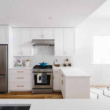
 Breathe Design Studio
Completed in 2015, this project incorporates a Scandinavian vibe to enhance the modern architecture and farmhouse details. The vision was to create a balanced and consistent design to reflect clean lines and subtle rustic details, which creates a calm sanctuary. The whole home is not based on a design aesthetic, but rather how someone wants to feel in a space, specifically the feeling of being cozy, calm, and clean. This home is an interpretation of modern design without focusing on one specific genre; it boasts a midcentury master bedroom, stark and minimal bathrooms, an office that doubles as a music den, and modern open concept on the first floor. It’s the winner of the 2017 design award from the Austin Chapter of the American Institute of Architects and has been on the Tribeza Home Tour; in addition to being published in numerous magazines such as on the cover of Austin Home as well as Dwell Magazine, the cover of Seasonal Living Magazine, Tribeza, Rue Daily, HGTV, Hunker Home, and other international publications.
Featured on Dwell!
https://www.dwell.com/article/sustainability-is-the-centerpiece-of-this-new-austin-development-071e1a55
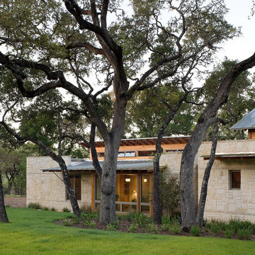 Studio Industrielle
The program consists of a detached Guest House with full Kitchen, Living and Dining amenities, Carport and Office Building with attached Main house and Master Bedroom wing. The arrangement of buildings was dictated by the numerous majestic oaks and organized as a procession of spaces leading from the Entry arbor up to the front door. Large covered terraces and arbors were used to extend the interior living spaces out onto the site.
All the buildings are clad in Texas limestone with accent bands of Leuders limestone to mimic the local limestone cliffs in the area. Steel was used on the arbors and fences and left to rust. Vertical grain Douglas fir was used on the interior while flagstone and stained concrete floors were used throughout. The flagstone floors extend from the exterior entry arbors into the interior of the Main Living space and out onto the Main house terraces.
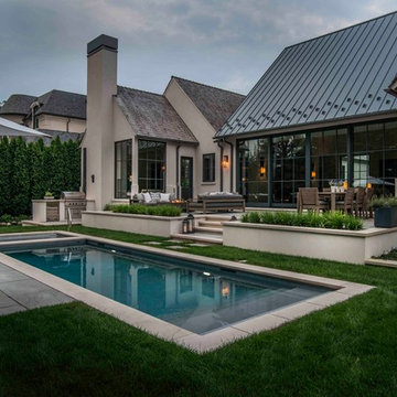
 Platinum Poolcare
This sleek rectilinear pool measures 10'0" x 27'0", and the hot tub is 10'0" x 6'0". The coping is Valders Wisconsin Limestone. Both the pool and hot tub have their own automatic pool safety covers with custom stone lid systems.
A large top step serves as a sunshelf for the pool-width steps. Adorned by lush turf on several sides, the hardscapes consist of New York Bluestone. Photos by Larry Huene.
 Flavin Architects
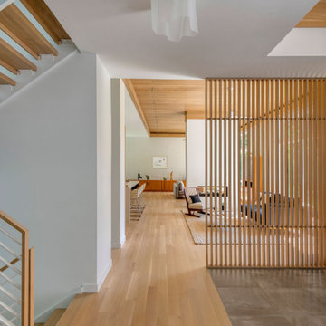
Our clients wanted to replace an existing suburban home with a modern house at the same Lexington address where they had lived for years. The structure the clients envisioned would complement their lives and integrate the interior of the home with the natural environment of their generous property. The sleek, angular home is still a respectful neighbor, especially in the evening, when warm light emanates from the expansive transparencies used to open the house to its surroundings. The home re-envisions the suburban neighborhood in which it stands, balancing relationship to the neighborhood with an updated aesthetic.
The floor plan is arranged in a “T” shape which includes a two-story wing consisting of individual studies and bedrooms and a single-story common area. The two-story section is arranged with great fluidity between interior and exterior spaces and features generous exterior balconies. A staircase beautifully encased in glass stands as the linchpin between the two areas. The spacious, single-story common area extends from the stairwell and includes a living room and kitchen. A recessed wooden ceiling defines the living room area within the open plan space.
Separating common from private spaces has served our clients well. As luck would have it, construction on the house was just finishing up as we entered the Covid lockdown of 2020. Since the studies in the two-story wing were physically and acoustically separate, zoom calls for work could carry on uninterrupted while life happened in the kitchen and living room spaces. The expansive panes of glass, outdoor balconies, and a broad deck along the living room provided our clients with a structured sense of continuity in their lives without compromising their commitment to aesthetically smart and beautiful design.
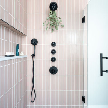
Example of a large transitional master pink tile and glass tile concrete floor, blue floor and single-sink corner shower design in Chicago with flat-panel cabinets, brown cabinets, a bidet, white walls, an undermount sink, quartz countertops, a hinged shower door, white countertops and a niche
 Carolyn Reyes
Carolyn Reyes Photography © 2017 Houzz
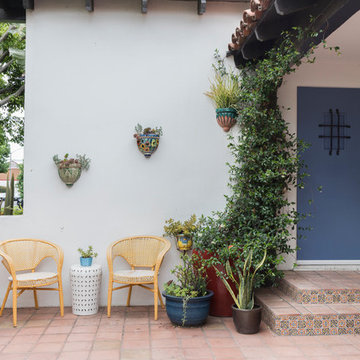
Inspiration for a mediterranean entryway remodel in Los Angeles
Inspiration for a mediterranean entryway remodel in Los Angeles
159