
Search results for "Continuing accessibility" in Home Design Ideas

 Studio Zung
A ground up design and build of a modern seven bedroom primary residence incorporating sustainable design principles built for an international family of four. The concept revolved around the need for environmental sustainability while having plentiful communal spaces to create ease for a vibrant family and their guests. Equally important was that the private spaces functioned as a retreat.
Natural light creates shifting patterns on the opposing wall of the glass paned hallway leading from the main house past the guest bedrooms and to the master suite. Subtle color palette and interior design use contrasting tactile elements to create an environment of luxury and accessibility. The views of the pool and garden through the large and continuous windows enable an ever-present connection to nature.

 Lenton Company, Inc.
A luxurious and accessible bathroom that will enable our clients to Live-in-Place for many years. The design and layout allows for ease of use and room to maneuver for someone physically challenged and a caretaker.

 Fine Fixtures
Sometimes, even a minimalist requires an illusion beyond all the structural efficiency. Featuring a well outlined pyramid incline on its center front panel, Imperial 2 combines simple structure with recessed architecture. An explorative form of design within reach, the entire frame of the vanity continues throughout the leg column and features a double groove indent directly above the leg base. Roomy cabinet space is accessible via super durable polished chrome handle plates for the futuristic tinge in an otherwise understated presentation.
Find the right local pro for your project

 Katie Hutchison Studio
Constructed in two phases, this renovation, with a few small additions, touched nearly every room in this late ‘50’s ranch house. The owners raised their family within the original walls and love the house’s location, which is not far from town and also borders conservation land. But they didn’t love how chopped up the house was and the lack of exposure to natural daylight and views of the lush rear woods. Plus, they were ready to de-clutter for a more stream-lined look. As a result, KHS collaborated with them to create a quiet, clean design to support the lifestyle they aspire to in retirement.
To transform the original ranch house, KHS proposed several significant changes that would make way for a number of related improvements. Proposed changes included the removal of the attached enclosed breezeway (which had included a stair to the basement living space) and the two-car garage it partially wrapped, which had blocked vital eastern daylight from accessing the interior. Together the breezeway and garage had also contributed to a long, flush front façade. In its stead, KHS proposed a new two-car carport, attached storage shed, and exterior basement stair in a new location. The carport is bumped closer to the street to relieve the flush front facade and to allow access behind it to eastern daylight in a relocated rear kitchen. KHS also proposed a new, single, more prominent front entry, closer to the driveway to replace the former secondary entrance into the dark breezeway and a more formal main entrance that had been located much farther down the facade and curiously bordered the bedroom wing.
Inside, low ceilings and soffits in the primary family common areas were removed to create a cathedral ceiling (with rod ties) over a reconfigured semi-open living, dining, and kitchen space. A new gas fireplace serving the relocated dining area -- defined by a new built-in banquette in a new bay window -- was designed to back up on the existing wood-burning fireplace that continues to serve the living area. A shared full bath, serving two guest bedrooms on the main level, was reconfigured, and additional square footage was captured for a reconfigured master bathroom off the existing master bedroom. A new whole-house color palette, including new finishes and new cabinetry, complete the transformation. Today, the owners enjoy a fresh and airy re-imagining of their familiar ranch house.
Photos by Katie Hutchison

 UltraCraft Cabinetry
Door Style: Shaker in Maple with Chocolate stain
Designer: Terri Saint and Brian Hall; Classica Homes
Photographer: Serena Apostal, Studio Design
Kitchen - contemporary kitchen idea in Raleigh
Kitchen - contemporary kitchen idea in Raleigh

 ZeroEnergy Design
This renovated brick rowhome in Boston’s South End offers a modern aesthetic within a historic structure, creative use of space, exceptional thermal comfort, a reduced carbon footprint, and a passive stream of income.
DESIGN PRIORITIES. The goals for the project were clear - design the primary unit to accommodate the family’s modern lifestyle, rework the layout to create a desirable rental unit, improve thermal comfort and introduce a modern aesthetic. We designed the street-level entry as a shared entrance for both the primary and rental unit. The family uses it as their everyday entrance - we planned for bike storage and an open mudroom with bench and shoe storage to facilitate the change from shoes to slippers or bare feet as they enter their home. On the main level, we expanded the kitchen into the dining room to create an eat-in space with generous counter space and storage, as well as a comfortable connection to the living space. The second floor serves as master suite for the couple - a bedroom with a walk-in-closet and ensuite bathroom, and an adjacent study, with refinished original pumpkin pine floors. The upper floor, aside from a guest bedroom, is the child's domain with interconnected spaces for sleeping, work and play. In the play space, which can be separated from the work space with new translucent sliding doors, we incorporated recreational features inspired by adventurous and competitive television shows, at their son’s request.
MODERN MEETS TRADITIONAL. We left the historic front facade of the building largely unchanged - the security bars were removed from the windows and the single pane windows were replaced with higher performing historic replicas. We designed the interior and rear facade with a vision of warm modernism, weaving in the notable period features. Each element was either restored or reinterpreted to blend with the modern aesthetic. The detailed ceiling in the living space, for example, has a new matte monochromatic finish, and the wood stairs are covered in a dark grey floor paint, whereas the mahogany doors were simply refinished. New wide plank wood flooring with a neutral finish, floor-to-ceiling casework, and bold splashes of color in wall paint and tile, and oversized high-performance windows (on the rear facade) round out the modern aesthetic.
RENTAL INCOME. The existing rowhome was zoned for a 2-family dwelling but included an undesirable, single-floor studio apartment at the garden level with low ceiling heights and questionable emergency egress. In order to increase the quality and quantity of space in the rental unit, we reimagined it as a two-floor, 1 or 2 bedroom, 2 bathroom apartment with a modern aesthetic, increased ceiling height on the lowest level and provided an in-unit washer/dryer. The apartment was listed with Jackie O'Connor Real Estate and rented immediately, providing the owners with a source of passive income.
ENCLOSURE WITH BENEFITS. The homeowners sought a minimal carbon footprint, enabled by their urban location and lifestyle decisions, paired with the benefits of a high-performance home. The extent of the renovation allowed us to implement a deep energy retrofit (DER) to address air tightness, insulation, and high-performance windows. The historic front facade is insulated from the interior, while the rear facade is insulated on the exterior. Together with these building enclosure improvements, we designed an HVAC system comprised of continuous fresh air ventilation, and an efficient, all-electric heating and cooling system to decouple the house from natural gas. This strategy provides optimal thermal comfort and indoor air quality, improved acoustic isolation from street noise and neighbors, as well as a further reduced carbon footprint. We also took measures to prepare the roof for future solar panels, for when the South End neighborhood’s aging electrical infrastructure is upgraded to allow them.
URBAN LIVING. The desirable neighborhood location allows the both the homeowners and tenant to walk, bike, and use public transportation to access the city, while each charging their respective plug-in electric cars behind the building to travel greater distances.
OVERALL. The understated rowhouse is now ready for another century of urban living, offering the owners comfort and convenience as they live life as an expression of their values.
Eric Roth Photo

 TATCOR DESIGN BUILD
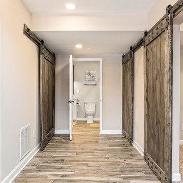
Basement Bar Dream Realized! Family and guests have convenient access to the bright, cozy full-bath with continued strategic lighting, neutral paints and vinyl light wood-style flooring. You can utilize the custom gray painted vanity with white and gray counter top, stainless steel faucet and pull-out drawers for easy storage of all toiletries.
Sponsored
Sunbury, OH

J.Holderby - Renovations
Franklin County's Leading General Contractors - 2X Best of Houzz!

 Truebuild Homes
Surrounded by trees to the north and old farm buildings, the Agnew Farmhouse naturally took shape to capture the expansive southern views of the prairie on which it resides. Inspired from the rural venacular of the property, the home was designed for an engaged couple looking to spend their days on the family farm. Built next to the original house on the property, a story of past, present, and future continues to be written. The south facing porch is shaded by the upper level and offers easy access from yard to the heart of the home. North Dakota offers challenging weather, so naturally a south-west facing garage to melt the snow from the driveway is often required. This also allowed for the the garage to be hidden from sight as you approach the home from the NE. Respecting its surroundings, the home emphasizes modern design and simple farmer logic to create a home for the couple to begin their marriage and grow old together. Cheers to what was, what is, and what's to come...
Tim Anderson

 Valia Design
Cottage u-shaped beige floor kitchen photo in Detroit with a farmhouse sink, shaker cabinets, gray cabinets, stainless steel appliances, no island and gray countertops
 Truebuild Homes
Surrounded by trees to the north and old farm buildings, the Agnew Farmhouse naturally took shape to capture the expansive southern views of the prairie on which it resides. Inspired from the rural venacular of the property, the home was designed for an engaged couple looking to spend their days on the family farm. Built next to the original house on the property, a story of past, present, and future continues to be written. The south facing porch is shaded by the upper level and offers easy access from yard to the heart of the home. North Dakota offers challenging weather, so naturally a south-west facing garage to melt the snow from the driveway is often required. This also allowed for the the garage to be hidden from sight as you approach the home from the NE. Respecting its surroundings, the home emphasizes modern design and simple farmer logic to create a home for the couple to begin their marriage and grow old together. Cheers to what was, what is, and what's to come...
Tim Anderson
 Nicole Arnold Interiors
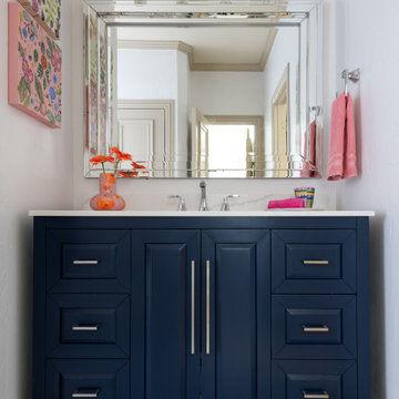
This quaint home, located in Plano’s prestigious Willow Bend Polo Club, underwent some super fun updates during our renovation and refurnishing project! The clients’ love for bright colors, mid-century modern elements, and bold looks led us to designing a black and white bathroom with black paned glass, colorful hues in the game room and bedrooms, and a sleek new “work from home” space for working in style. The clients love using their new spaces and have decided to let us continue designing these looks throughout additional areas in the home!

 Flavin Architects
Mid-Century Remodel on Tabor Hill
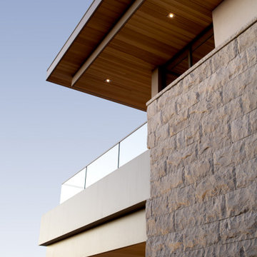
This sensitively sited house was designed by Robert Coolidge, a renowned architect and grandson of President Calvin Coolidge. The house features a symmetrical gable roof and beautiful floor to ceiling glass facing due south, smartly oriented for passive solar heating. Situated on a steep lot, the house is primarily a single story that steps down to a family room. This lower level opens to a New England exterior. Our goals for this project were to maintain the integrity of the original design while creating more modern spaces. Our design team worked to envision what Coolidge himself might have designed if he'd had access to modern materials and fixtures.
With the aim of creating a signature space that ties together the living, dining, and kitchen areas, we designed a variation on the 1950's "floating kitchen." In this inviting assembly, the kitchen is located away from exterior walls, which allows views from the floor-to-ceiling glass to remain uninterrupted by cabinetry.
We updated rooms throughout the house; installing modern features that pay homage to the fine, sleek lines of the original design. Finally, we opened the family room to a terrace featuring a fire pit. Since a hallmark of our design is the diminishment of the hard line between interior and exterior, we were especially pleased for the opportunity to update this classic work.
 Laney LA, Inc.
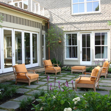
This residence represents the dynamic collaboration between artist and architect. The architectural experience seeks to unite the tactile warmth of earth and clay with the compositional elegance of craft. Against a textured canvas of linen and limestone, light is leveraged to bring dimension and life to the architecture on every level.
Through the radical embrace of nature, guests are greeted by a 16’ tall Australian Brachychiton tree as they enter the double-height entry. The home is organized around a large, outdoor courtyard which creates fluid continuity and access between the indoor and outdoors. From a chandelier of ceramic bells to a locally sourced, custom dining table, every major element has been calibrated to add to timeless composition of the home.
Sponsored
Columbus, OH
Free consultation for landscape design!

Peabody Landscape Group
Franklin County's Reliable Landscape Design & Contracting

 D2 Design and Works, inc.
Open plan _ powder / shower rooms.
Wooden floor look porcelain tile wall / floor.
Two contemporary adjustable hand showers.
White Shaker variant vanity cabinets.
Caesarstone counter top / backsplash.
Niche shelves ( recessed shelves).
Lots of grab bars.
Shower benches.
Linear drain.
Rain tile.

 Phantom Screens
This roomy balcony includes a kitchen ideal for any cook in the family, a dining area to enjoy all meals of the day and lots of seating to grant them comfort while enjoying the view of the lake. The space lets them enjoy the outdoors without having to deal with pesky mosquitoes. The manual wall screens were used for easy in and out of access while the motorized wall screens were used to close off the rest of the space for continual relaxation no matter the weather.
Photography: Jim Kruger

 Mark Brand Architecture
Our clients for this remodel of a 100 year old home in San Francisco’s Liberty Hill neighborhood recently moved to San Francisco. The house they purchased was very stately and had great bones, but lacked a true master suite and had recently been remodeled in a slightly generic modern style. We helped them with projects throughout the house. Our biggest project was creating a true master suite out of two bedrooms and an existing bathroom. We created an open concept bathroom with custom gray lacquer wardrobes and shoe storage units with a dramatic slot skylight overhead. Access to the master bedroom is through this room. The clean lines of the bathroom are complimented by a very long wall hung vanity with a CaesarStone counter which flows into the walk-in shower and becomes the curb. A variety of tiles including locally fabricated tile from Heath Ceramics were carefully selected to create a warm and inviting, yet modern, feeling. Oak floors similar to those in the rest of the house were used throughout the master suite for continuity. By using the same tile on the back wall of the bathroom we were able to create a visual unity from the shower through the vanity and the water closet. Our work also included a new fireplace in the living room. Photography by Christopher Stark.
 Simply Home Decorating
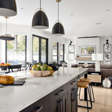
This beautiful North Vancouver home belongs to a nature-loving and health-conscious couple, Emma and Vince (names changed), their two young children, and their dog, Jasper. When they contacted us about renovating and furnishing their kitchen and family room, we walked in and saw a world of potential waiting to be uncovered.
Before: Larkhall Crescent Home:
Like many original North Vancouver homes, the interior was definitely dated. We encountered late ‘80s finishes in powder pink and teal green, old carpet, and a kitchen that wasn’t maximized to suit this family’s modern-day lifestyle. However, the size of the rooms offered us a ton of space with which to get creative.
Knowing our clients’ love of cooking, need for work spaces (Emma and Vince both work remotely), and growing family, we developed a design concept that would increase usable space, optimize storage, and create intimacy in this large area. As for the style, we were inspired by their European roots, inventing a new and modern take on “Belgian Farmhouse” style. Now, the home is truly one-of-a-kind.
After: Warm & Cozy Family Room:
Fresh, bright, and comfortable, this living area has been transformed! We started with the fireplace as a focal point, selecting aged brick tiles for added texture and a crisp wood mantle. The taupe-coloured sectional infuses the room with visual warmth and serves the added purpose of separating the family room from the kitchen.
Emma and Vince were also keen on using non-toxic materials in their home, and we were happy to oblige. To meet their needs, we sourced natural wood elements and sought out Canadian-made products - that adhere to high health standards - whenever possible.
Look closer at the elements of this space, and you will find this stunning, honeycomb-patterned rug in earthy gold, beige, and charcoal tones. It’s plush to the touch and full of visual texture that brings this room’s colour palette together. We sourced these two-tone chairs with caning, petrified wood side table, black sconces, and botanical prints in greyscale from local artist, Heather Johnston.
We topped off the space with this dark wood and rattan console that offers storage facing the kitchen and presents an opportunity to display cherished items. The result is a cozy lounging space brimming with comfort and functionality. It’s perfect for enjoying quality family time, or Emma can simply slide the coffee table away to make room for her morning yoga practice.
Now, let’s turn around and give some attention to the kitchen. Do you remember what the original kitchen looked like? If not, scroll back up, because the transformation is shocking…
Moody & Welcoming Kitchen for Healthy Living:
This kitchen looks very different from how it started, right? Though we didn’t touch any walls, the kitchen has almost doubled in usable space! We created a long, extended island with storage, an outlet for small appliances, and seating for comfortable prep, after-school snacking, or mingling among friends.
On the other side of the island, the family has even more storage and an integrated dishwasher within easy reach of the sink, perfect for quick clean-up. From this angle, you can also see the expansive custom Shaker cabinetry in white and the integrated double ovens. These facilitate their cooking experience and gave us the opportunity to add an additional surprise…
A coffee garage station and more hidden storage! Keeping these items located along the perimeter allows them to be accessed by the family or their guests without someone getting under the cook’s feet. These are the little details that make everyday life easier and more enjoyable.
Moving deeper into the kitchen, the seamless induction cooktop topped with a freestanding concealed hood fan commands attention in a soft yet prominent way. The natural wood accent mirrors the fireplace mantle, and the choice of off-black wood-grain cabinets not only continues our black-and-white colour palette but adds a sense of depth and contrast. The corner sink is located to the right and perfectly positioned with a view of their thriving backyard.
To invite more of this family’s character into the space, we mixed metals for interest — matte black, dark pewter, and warm brass — and created open shelves in white oak for their plants and decor. You can also glimpse the tumbled edge of the backsplash tile, which echoes the rustic brick of the fireplace. It adds that farmhouse charm while still feeling timeless and sophisticated.
Last but not least, we designed this dining banquette in the bay window (with integrated bench storage, of course), where the family can share a meal together, the kids can do homework, or Emma and Vince can work and enjoy a change of scenery from their offices. Like the other spaces in the home, it was designed to be beautiful, multi-functional, and long-lasting.
Praise from Our Clients:
It is clear that we love this home, but what did our clients have to say?
“Lori is a visionary and masters execution to the finest detail all at the same time. When she first met us to know more about who we are and how we live, she could right away envision how we could use the space in our kitchen and living room…The results exceeded our expectations.
Lori and her team were also a delight to work with — coordination with all the trades, fast problem-solving, regular updates, professional and friendly attitude of her entire team — made it the dream team. Thank you SHD for making our space so beautiful!”
In turn, we are so grateful for this family’s trust, their open communication, and for being wonderful people with whom to work. (So, thank you!)
Sponsored
Sunbury, OH
J.Holderby - Renovations
Franklin County's Leading General Contractors - 2X Best of Houzz!
 Klopf Architecture
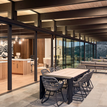
Inspired by another mid-century modern home the client owned, this new residence represents a much larger 21st-century version built into the gently sloping hillside to take advantage of the sprawling hilltop views of the Sonoma valley. The quiet front facade leads guests into a formal entry that divides the house into private and public spaces. Rounding the corner into the great room, one is immediately hit by the breathtaking view that extends outward beyond the infinity pool and deck through a continuous wall of glass. In the opposite direction, each of the three bedrooms was designed with its own seating area and bathroom, creating private suites for family members and guests alike.
The linear design and open, flowing living spaces provide almost every room with outdoor access to the expansive patio, protected from the Sonoma heat by deep overhangs. Warm woods, clean lines, and a rhythmic post and beam ceiling design create a homey feeling of rest and relaxation, evoking the essence of modern California living.
Klopf Architecture project team: Geoff Campen, Ethan Taylor, Noel Andrade, and John Klopf
Landscape Architects: Arterra Landscape Architects
Structural Engineer: ZFA
Contractor: Eames Construction
Photography: ©2022 Mariko Reed
Completion year: 2022
 Katie Hutchison Studio
Constructed in two phases, this renovation, with a few small additions, touched nearly every room in this late ‘50’s ranch house. The owners raised their family within the original walls and love the house’s location, which is not far from town and also borders conservation land. But they didn’t love how chopped up the house was and the lack of exposure to natural daylight and views of the lush rear woods. Plus, they were ready to de-clutter for a more stream-lined look. As a result, KHS collaborated with them to create a quiet, clean design to support the lifestyle they aspire to in retirement.
To transform the original ranch house, KHS proposed several significant changes that would make way for a number of related improvements. Proposed changes included the removal of the attached enclosed breezeway (which had included a stair to the basement living space) and the two-car garage it partially wrapped, which had blocked vital eastern daylight from accessing the interior. Together the breezeway and garage had also contributed to a long, flush front façade. In its stead, KHS proposed a new two-car carport, attached storage shed, and exterior basement stair in a new location. The carport is bumped closer to the street to relieve the flush front facade and to allow access behind it to eastern daylight in a relocated rear kitchen. KHS also proposed a new, single, more prominent front entry, closer to the driveway to replace the former secondary entrance into the dark breezeway and a more formal main entrance that had been located much farther down the facade and curiously bordered the bedroom wing.
Inside, low ceilings and soffits in the primary family common areas were removed to create a cathedral ceiling (with rod ties) over a reconfigured semi-open living, dining, and kitchen space. A new gas fireplace serving the relocated dining area -- defined by a new built-in banquette in a new bay window -- was designed to back up on the existing wood-burning fireplace that continues to serve the living area. A shared full bath, serving two guest bedrooms on the main level, was reconfigured, and additional square footage was captured for a reconfigured master bathroom off the existing master bedroom. A new whole-house color palette, including new finishes and new cabinetry, complete the transformation. Today, the owners enjoy a fresh and airy re-imagining of their familiar ranch house.
Photos by Katie Hutchison

 Visbeen Architects
Inspired by the surrounding landscape, the Craftsman/Prairie style is one of the few truly American architectural styles. It was developed around the turn of the century by a group of Midwestern architects and continues to be among the most comfortable of all American-designed architecture more than a century later, one of the main reasons it continues to attract architects and homeowners today. Oxbridge builds on that solid reputation, drawing from Craftsman/Prairie and classic Farmhouse styles. Its handsome Shingle-clad exterior includes interesting pitched rooflines, alternating rows of cedar shake siding, stone accents in the foundation and chimney and distinctive decorative brackets. Repeating triple windows add interest to the exterior while keeping interior spaces open and bright. Inside, the floor plan is equally impressive. Columns on the porch and a custom entry door with sidelights and decorative glass leads into a spacious 2,900-square-foot main floor, including a 19 by 24-foot living room with a period-inspired built-ins and a natural fireplace. While inspired by the past, the home lives for the present, with open rooms and plenty of storage throughout. Also included is a 27-foot-wide family-style kitchen with a large island and eat-in dining and a nearby dining room with a beadboard ceiling that leads out onto a relaxing 240-square-foot screen porch that takes full advantage of the nearby outdoors and a private 16 by 20-foot master suite with a sloped ceiling and relaxing personal sitting area. The first floor also includes a large walk-in closet, a home management area and pantry to help you stay organized and a first-floor laundry area. Upstairs, another 1,500 square feet awaits, with a built-ins and a window seat at the top of the stairs that nod to the home’s historic inspiration. Opt for three family bedrooms or use one of the three as a yoga room; the upper level also includes attic access, which offers another 500 square feet, perfect for crafts or a playroom. More space awaits in the lower level, where another 1,500 square feet (and an additional 1,000) include a recreation/family room with nine-foot ceilings, a wine cellar and home office.
Photographer: Jeff Garland
87