
Search results for "Continuous improvement" in Home Design Ideas
 Braswell Design+Build
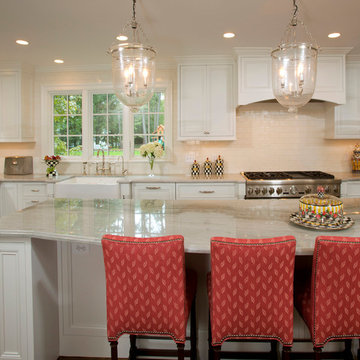
This client sought to update their recently purchased home in Alexandria. A gourmet kitchen that complemented the size of the home and property was a top priority. They wanted more light-filled and connected living spaces for their growing family. Updating the finishes throughout the home was also a necessity.
Design challenges included an existing utility space that occupied a large portion of the kitchen footprint, making the kitchen cramped and narrow. In addition, the foyer was dark, confined and uninviting as a result of its organization and enclosed nature of the main stair.
To overcome the challenges, we relocated the utilities, creating a more usable footprint for the kitchen. The aging furnace was replaced with a high efficiency furnace located in a newly insulated and conditioned crawl space. A new hot water heater was placed in the finished attic, and the electrical panel was also relocated. Then, we designed a portion of the kitchen to mask the need for dropped structural headers: the refrigerator, freezer and pantry were placed under the area that necessitated a drop bulkhead, creating a sleek built-in area for the appliances.
Once the utilities were moved, the kitchen could be opened up to a large family room and designed with a much-improved layout. Two new four-panel exterior doors replaced small doors at the family room to connect the main living space with the beautiful yard. In addition, white bead board was added to the family room ceiling, creating more visual continuity with the adjacent white kitchen.
To transform the foyer into a grand and welcoming entry, a small amount of space was taken from a large second floor bedroom, and the entire second floor structure was supported with a series of flush beams to allow the stair to be opened and expose the rail. New glass doors to the den, relocated at an angle from the main stair provide the foyer with more natural light and a wider, more inviting path to the kitchen.
In the master suite, the bedroom and bathroom entry doors were relocated to improve the room’s layout and offer more bathroom privacy and space for a walk-in closet. A room forgotten by the previous owner was turned into a family mudroom with built-ins and wainscoting to keep the family organized in style.
Photography by Greg Hadley
 Klopf Architecture
From Mid-Century Classic to the Present
An iconic design updated with comfort, function, and flow for today.
A Remodel That Balances Past and Present
What started as a desire to update a classic Eichler soon became an exploration of how Mid-Century Modern design can successfully evolve for today. The client, a tech professional with a passion for scuba diving and underwater photography, wanted a home that would both honor its original character and feel tailored to his daily life. A lifelong technology enthusiast, he still owns the very first Mac desktop he saved up for as a teenager working at Radio Shack, a detail that underscores his appreciation for design that melds function and form.
Honoring Separation While Expanding Possibility
Unlike many contemporary remodels where walls are opened up to create expansive living spaces, this project took a more restrained approach. The client valued the defined rooms of the original plan and wanted to preserve as much wall space as possible for displaying his large-format underwater photography. The emphasis was not on dramatic spatial reinvention, but on thoughtful refinements. Klopf Architecture shaped a gallery-like backdrop while also expanding the primary suite, modernizing materials and fixtures throughout the home, and improving the functionality and layout of the kitchen. The finished home feels at once timeless and renewed, an Eichler that continues to inspire while fully supporting the lifestyle of its present-day owner.
A major turning point came mid-design. The original project brief had not included an addition, but as the reconfiguration of the primary bedroom and bath unfolded, it became clear that an expansion was the best approach to achieve the client’s vision of a more spacious suite. Fortunately, the adjustment came at a stage when revisions were still manageable and was integrated seamlessly, showing how thoughtful course corrections can strengthen a project rather than hinder it.
Navigating Challenges With Precision
The design development included multiple conceptual rounds, balancing preservation with subtle expansion. During construction, an existing post previously thought to be load-bearing turned out not to be. The structural engineer was able to pivot quickly, and both the post and the cross beam that had been intended to replace it could be omitted, allowing the original rhythm of the Eichler beam bays to be preserved.
Sustainability was not just a checklist item, but a way to align the home with the client’s values of simplicity, efficiency, and long-term functionality. R-38 roof insulation reduced energy usage, solar panels with battery storage provided independence and resilience, and passive comfort strategies eliminated the need forenergy-intensive air conditioning. An electric vehicle charger and an on-demand hot water recirculation system (with call buttons as opposed to having constant circulation) add to the home’s long-term efficiency factors. Together, these moves created a home that is quieter, more comfortable, and better equipped for the future, qualities that supported the client’s pragmatic approach to design and living lightly.
Details That Respect the Eichler DNA
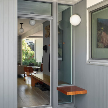
The remodel carries forward the Eichler’s original spirit while introducing new layers of modern livability. Originally, the house was approached along a deep, narrow walk, with the garage on one side and the house on the other, leaving the front door tucked far back within this chasm-like space. By pulling the entry forward, the design reshaped the arrival experience, creating a clearer threshold and a natural drop-off zone for bags, shoes, and keys. This shift also made room for a custom bench at the entry that extends seamlessly through the glass sidelight. The bench and drop-off zone now work together as a single, integrated sequence that supports everyday living while offering a tactile reminder of Eichler’s philosophy of connectedness.
At the client’s request, Klopf reintroduced a classic Eichler gesture by extending the exterior siding into the entry and living room. The detail reinforces a sense of indoor/outdoor continuity while providing a subtle architectural surface that allows the client’s photography to take visual precedence.
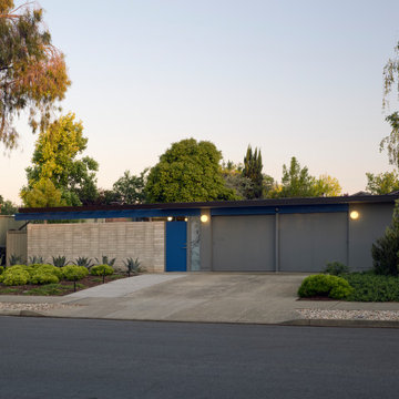
The signature concrete masonry wall at the front was reconstructed using blocks sourced to match the originals, now strengthened with rebar for seismic resilience while maintaining a private outdoor courtyard, visually extending the kitchen outward. A decorative trellis element, a detail borrowed from a neighboring Eichler, restores a familiar mid-century modern architectural motif. At the courtyard entry door, a custom etched glass sidelight with an ocean-themed design featuring kelp and jellyfish serves as a subtle homage to the client’s passion for deep-sea diving.
Landscaping became an integral part of the overall transformation. The homeowner engaged landscape architect Randi Johnsen of Third Nature Studio to shape a series of calm, inviting outdoor rooms that read as a natural extension of the interiors. While technically outside of the core construction scope, the landscape design proved central to achieving a sense of completeness and connectedness across the property. Such whole-property considerations often emerge as design ideas take shape, underscoring the importance of flexibility in planning and budgeting, as well as close collaboration among the design team starting early in the process.
The Value of Evolving Scope
As with many custom residential projects, the scope evolved during the design process. What began as a targeted remodel grew to include a new/expanded primary suite, a rebuilt CMU patio wall for strength and longevity, and a solar panel array and battery storage for energy resilience and carbon-reduction. Each thoughtful decision represented a conscious investment in the home’s performance and character, rather than a cost overrun.
The result was a project delivered on schedule, tailored precisely to the client’s lifestyle, and positioned to add long-term value both functionally and aesthetically. By embracing scope evolution as an opportunity rather than a challenge, and relying on good design paired with transparent communication, this remodel demonstrates how Eichler homes can be adapted for contemporary living without erasing their DNA.
Klopf Architecture project team: John Klopf, AIA, and Klara Kevane, Elise Webb and Nicholas LaNasa.
Contractor: Golden Cove Construction
Landscape Design: Third Nature Studio
Structural Engineer: Daniel Bastiao Design
Photography: ©2025 Mariko Reed
Year Completed: 2024
Location: Sunnyvale, CA
 Klopf Architecture
From Mid-Century Classic to the Present
An iconic design updated with comfort, function, and flow for today.
A Remodel That Balances Past and Present
What started as a desire to update a classic Eichler soon became an exploration of how Mid-Century Modern design can successfully evolve for today. The client, a tech professional with a passion for scuba diving and underwater photography, wanted a home that would both honor its original character and feel tailored to his daily life. A lifelong technology enthusiast, he still owns the very first Mac desktop he saved up for as a teenager working at Radio Shack, a detail that underscores his appreciation for design that melds function and form.
Honoring Separation While Expanding Possibility
Unlike many contemporary remodels where walls are opened up to create expansive living spaces, this project took a more restrained approach. The client valued the defined rooms of the original plan and wanted to preserve as much wall space as possible for displaying his large-format underwater photography. The emphasis was not on dramatic spatial reinvention, but on thoughtful refinements. Klopf Architecture shaped a gallery-like backdrop while also expanding the primary suite, modernizing materials and fixtures throughout the home, and improving the functionality and layout of the kitchen. The finished home feels at once timeless and renewed, an Eichler that continues to inspire while fully supporting the lifestyle of its present-day owner.
A major turning point came mid-design. The original project brief had not included an addition, but as the reconfiguration of the primary bedroom and bath unfolded, it became clear that an expansion was the best approach to achieve the client’s vision of a more spacious suite. Fortunately, the adjustment came at a stage when revisions were still manageable and was integrated seamlessly, showing how thoughtful course corrections can strengthen a project rather than hinder it.
Navigating Challenges With Precision
The design development included multiple conceptual rounds, balancing preservation with subtle expansion. During construction, an existing post previously thought to be load-bearing turned out not to be. The structural engineer was able to pivot quickly, and both the post and the cross beam that had been intended to replace it could be omitted, allowing the original rhythm of the Eichler beam bays to be preserved.
Sustainability was not just a checklist item, but a way to align the home with the client’s values of simplicity, efficiency, and long-term functionality. R-38 roof insulation reduced energy usage, solar panels with battery storage provided independence and resilience, and passive comfort strategies eliminated the need forenergy-intensive air conditioning. An electric vehicle charger and an on-demand hot water recirculation system (with call buttons as opposed to having constant circulation) add to the home’s long-term efficiency factors. Together, these moves created a home that is quieter, more comfortable, and better equipped for the future, qualities that supported the client’s pragmatic approach to design and living lightly.
Details That Respect the Eichler DNA
The remodel carries forward the Eichler’s original spirit while introducing new layers of modern livability. Originally, the house was approached along a deep, narrow walk, with the garage on one side and the house on the other, leaving the front door tucked far back within this chasm-like space. By pulling the entry forward, the design reshaped the arrival experience, creating a clearer threshold and a natural drop-off zone for bags, shoes, and keys. This shift also made room for a custom bench at the entry that extends seamlessly through the glass sidelight. The bench and drop-off zone now work together as a single, integrated sequence that supports everyday living while offering a tactile reminder of Eichler’s philosophy of connectedness.
At the client’s request, Klopf reintroduced a classic Eichler gesture by extending the exterior siding into the entry and living room. The detail reinforces a sense of indoor/outdoor continuity while providing a subtle architectural surface that allows the client’s photography to take visual precedence.
The signature concrete masonry wall at the front was reconstructed using blocks sourced to match the originals, now strengthened with rebar for seismic resilience while maintaining a private outdoor courtyard, visually extending the kitchen outward. A decorative trellis element, a detail borrowed from a neighboring Eichler, restores a familiar mid-century modern architectural motif. At the courtyard entry door, a custom etched glass sidelight with an ocean-themed design featuring kelp and jellyfish serves as a subtle homage to the client’s passion for deep-sea diving.
Landscaping became an integral part of the overall transformation. The homeowner engaged landscape architect Randi Johnsen of Third Nature Studio to shape a series of calm, inviting outdoor rooms that read as a natural extension of the interiors. While technically outside of the core construction scope, the landscape design proved central to achieving a sense of completeness and connectedness across the property. Such whole-property considerations often emerge as design ideas take shape, underscoring the importance of flexibility in planning and budgeting, as well as close collaboration among the design team starting early in the process.
The Value of Evolving Scope
As with many custom residential projects, the scope evolved during the design process. What began as a targeted remodel grew to include a new/expanded primary suite, a rebuilt CMU patio wall for strength and longevity, and a solar panel array and battery storage for energy resilience and carbon-reduction. Each thoughtful decision represented a conscious investment in the home’s performance and character, rather than a cost overrun.
The result was a project delivered on schedule, tailored precisely to the client’s lifestyle, and positioned to add long-term value both functionally and aesthetically. By embracing scope evolution as an opportunity rather than a challenge, and relying on good design paired with transparent communication, this remodel demonstrates how Eichler homes can be adapted for contemporary living without erasing their DNA.
Klopf Architecture project team: John Klopf, AIA, and Klara Kevane, Elise Webb and Nicholas LaNasa.
Contractor: Golden Cove Construction
Landscape Design: Third Nature Studio
Structural Engineer: Daniel Bastiao Design
Photography: ©2025 Mariko Reed
Year Completed: 2024
Location: Sunnyvale, CA
Find the right local pro for your project
 Jarrett Design
Jarrett Design is grateful for repeat clients, especially when they have impeccable taste.
In this case, we started with their guest bath. An antique-inspired, hand-pegged vanity from our Nest collection, in hand-planed quarter-sawn cherry with metal capped feet, sets the tone. Calcutta Gold marble warms the room while being complimented by a white marble top and traditional backsplash. Polished nickel fixtures, lighting, and hardware selected by the client add elegance. A special bathroom for special guests.
Next on the list were the laundry area, bar and fireplace. The laundry area greets those who enter through the casual back foyer of the home. It also backs up to the kitchen and breakfast nook. The clients wanted this area to be as beautiful as the other areas of the home and the visible washer and dryer were detracting from their vision. They also were hoping to allow this area to serve double duty as a buffet when they were entertaining. So, the decision was made to hide the washer and dryer with pocket doors. The new cabinetry had to match the existing wall cabinets in style and finish, which is no small task. Our Nest artist came to the rescue. A five-piece soapstone sink and distressed counter top complete the space with a nod to the past.
Our clients wished to add a beverage refrigerator to the existing bar. The wall cabinets were kept in place again. Inspired by a beloved antique corner cupboard also in this sitting room, we decided to use stained cabinetry for the base and refrigerator panel. Soapstone was used for the top and new fireplace surround, bringing continuity from the nearby back foyer.
Last, but definitely not least, the kitchen, banquette and powder room were addressed. The clients removed a glass door in lieu of a wide window to create a cozy breakfast nook featuring a Nest banquette base and table. Brackets for the bench were designed in keeping with the traditional details of the home. A handy drawer was incorporated. The double vase pedestal table with breadboard ends seats six comfortably.
The powder room was updated with another antique reproduction vanity and beautiful vessel sink.
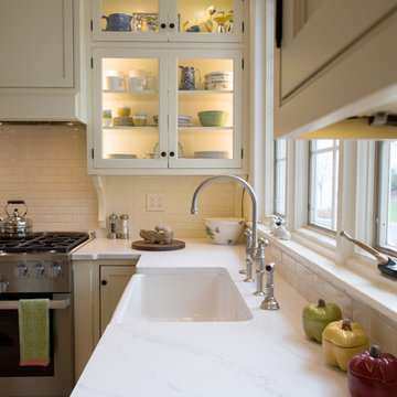
While the kitchen was beautifully done, it was showing its age and functional improvements were desired. This room, like the laundry room, was a project that included existing cabinetry mixed with matching new cabinetry. Precision was necessary. For better function and flow, the cooking surface was relocated from the island to the side wall. Instead of a cooktop with separate wall ovens, the clients opted for a pro style range. These design changes not only make prepping and cooking in the space much more enjoyable, but also allow for a wood hood flanked by bracketed glass cabinets to act a gorgeous focal point. Other changes included removing a small desk in lieu of a dresser style counter height base cabinet. This provided improved counter space and storage. The new island gave better storage, uninterrupted counter space and a perch for the cook or company. Calacatta Gold quartz tops are complimented by a natural limestone floor. A classic apron sink and faucet along with thoughtful cabinetry details are the icing on the cake. Don’t miss the clients’ fabulous collection of serving and display pieces! We told you they have impeccable taste!
 Studio 1200
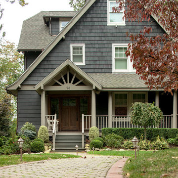
We had the pleasure of working with the new homeowners to design further improvements to the house necessitated by their growing family. We added a porte cochere, a family-room, and increased the ceiling height in their master bedroom. These improvements augmented our design work previously completed in 2008, and the house continues to be a blend of traditional old-house details with modern, contemporary furnishings that perfectly suite a family with young children.
 Michael Nash Design, Build & Homes
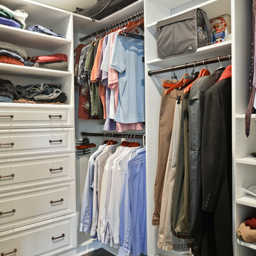
For this recently moved in military family, their old rambler home offered plenty of area for potential improvement. An entire new kitchen space was designed to create a greater feeling of family warmth.
It all started with gutting the old rundown kitchen. The kitchen space was cramped and disconnected from the rest of the main level. There was a large bearing wall separating the living room from the kitchen and the dining room.
A structure recessed beam was inserted into the attic space that enabled opening up of the entire main level. A large L-shaped island took over the wall placement giving a big work and storage space for the kitchen.
Installed wood flooring matched up with the remaining living space created a continuous seam-less main level.
By eliminating a side door and cutting through brick and block back wall, a large picture window was inserted to allow plenty of natural light into the kitchen.
Recessed and pendent lights also improved interior lighting.
By using offset cabinetry and a carefully selected granite slab to complement each other, a more soothing space was obtained to inspire cooking and entertaining. The fabulous new kitchen was completed with a new French door leading to the sun room.
This family is now very happy with the massive transformation, and are happy to join their new community.
 Drury Design
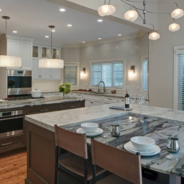
Maybe you can relate to these empty nesters who reached out to us to design and build a new kitchen for their current and long term needs. They do lots of entertaining, have an extensive wine collection and enjoy welcoming more grandchildren into the family. Both cook, although he prefers his grill. They wanted their new kitchen to be an open space that is easier to move around in. They were also looking forward to more storage and new, state-of-the-art appliances.
Design objectives:
-New layout to accommodate large groups for frequent entertaining
-Big island to seat as many people as possible
Improve traffic flow by omitting a counter peninsula by the family room and other cabinet barriers
-Main cooktop to face visitors with point-of-use spices, utensils, pots & pans nearby
-Multiple cooking & refrigeration appliances
-Plan for as much countertop space as possible for multiple cooks
-Dedicated spaces needed for wine, liquor, cold drinks & decorative glassware
-Incorporate special details such as thick or waterfall countertops, unique backsplash, wood accents
-Need better task, ambient and general lighting
-Make it beautiful – a kitchen the homeowners could be proud of
-Seamlessly join kitchen with breakfast room, given load-bearing wall & various ceiling heights
-Ensure the large, newly opened space remains intimate and inclusive
-Determine how to best utilize the breakfast room, given limited availability of wall space with two sets of French doors and a large window
-Relocating two ventilation ducts currently in a wall to be removed
-Incorporate multiple appliances while adding functional storage
-Integrate special details that wouldn’t be lost in a large room
-Utilize multiple finishes and colors that provide continuity
Design solutions:
-The wall between the kitchen & breakfast nook was completely removed – the structural beam was shortened, providing the largest opening possible
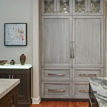
-One small wall section remained intact to relocate ductwork, which conveniently created an alcove for the dual refrigerator armoire
-Two islands in the same finish visually join the elongated room
-The cooking island includes necessary point-of-use storage along with a steam oven and additional storage on the opposite side
The wide cooking island allows for two cooks to comfortably share the counter space, allowing casual interaction
-The second island fills the center of the former breakfast room; tall cabinets in a contrasting finish flank the French doors and provide visual balance
-The sizable second island provides seating for six on a conversation-conducive curve. It houses freezer drawers, a microwave drawer, an under-counter refrigerator, plus additional storage
-Docking station inside drawer
-Two cabinet styles in three finishes provide continuity, balance and interest in the large room
While the clients didn’t have a specific vision of the remodeled space, they were completely open to new ideas and knew which features they wanted when they saw them. They were truly doing the project for their own enjoyment and that of their family and guests. We’re happy to know they are thrilled with the end result. In fact, we had so much fun working together we’re now talking about a new project!

 Drury Design
Maybe you can relate to these empty nesters who reached out to us to design and build a new kitchen for their current and long term needs. They do lots of entertaining, have an extensive wine collection and enjoy welcoming more grandchildren into the family. Both cook, although he prefers his grill. They wanted their new kitchen to be an open space that is easier to move around in. They were also looking forward to more storage and new, state-of-the-art appliances.
Design objectives:
-New layout to accommodate large groups for frequent entertaining
-Big island to seat as many people as possible
Improve traffic flow by omitting a counter peninsula by the family room and other cabinet barriers
-Main cooktop to face visitors with point-of-use spices, utensils, pots & pans nearby
-Multiple cooking & refrigeration appliances
-Plan for as much countertop space as possible for multiple cooks
-Dedicated spaces needed for wine, liquor, cold drinks & decorative glassware
-Incorporate special details such as thick or waterfall countertops, unique backsplash, wood accents
-Need better task, ambient and general lighting
-Make it beautiful – a kitchen the homeowners could be proud of
-Seamlessly join kitchen with breakfast room, given load-bearing wall & various ceiling heights
-Ensure the large, newly opened space remains intimate and inclusive
-Determine how to best utilize the breakfast room, given limited availability of wall space with two sets of French doors and a large window
-Relocating two ventilation ducts currently in a wall to be removed
-Incorporate multiple appliances while adding functional storage
-Integrate special details that wouldn’t be lost in a large room
-Utilize multiple finishes and colors that provide continuity
Design solutions:
-The wall between the kitchen & breakfast nook was completely removed – the structural beam was shortened, providing the largest opening possible
-One small wall section remained intact to relocate ductwork, which conveniently created an alcove for the dual refrigerator armoire
-Two islands in the same finish visually join the elongated room
-The cooking island includes necessary point-of-use storage along with a steam oven and additional storage on the opposite side
The wide cooking island allows for two cooks to comfortably share the counter space, allowing casual interaction
-The second island fills the center of the former breakfast room; tall cabinets in a contrasting finish flank the French doors and provide visual balance
-The sizable second island provides seating for six on a conversation-conducive curve. It houses freezer drawers, a microwave drawer, an under-counter refrigerator, plus additional storage
-Docking station inside drawer
-Two cabinet styles in three finishes provide continuity, balance and interest in the large room
While the clients didn’t have a specific vision of the remodeled space, they were completely open to new ideas and knew which features they wanted when they saw them. They were truly doing the project for their own enjoyment and that of their family and guests. We’re happy to know they are thrilled with the end result. In fact, we had so much fun working together we’re now talking about a new project!
 KCBR Design | Remodel
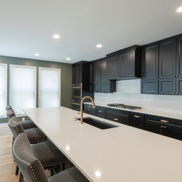
Designed for repeat clients, this Overland Park remodel focused on improving function, flow, and everyday livability across multiple spaces.
In the kitchen, the layout was refined to create a more open and efficient environment. An enlarged island now serves as a central hub for cooking, gathering, and daily use, while ceiling-height cabinetry maximizes storage and creates a clean, built-in aesthetic. New hardwood flooring ties the space together, adding warmth and continuity.
A key transformation involved reconfiguring the layout to better support storage needs. By relocating the laundry room door, a dedicated pantry was introduced, significantly improving organization and accessibility. The adjacent laundry room was also updated, along with the addition of custom cubbies to streamline daily routines.
For a bold contrast, the powder bath was reimagined as a moody, speakeasy-inspired space, bringing depth, character, and a memorable design moment to the home.
The result is a cohesive, thoughtfully redesigned interior that enhances how the family lives day to day, balancing function, storage, and distinctive style.
 Jarrett Design
Jarrett Design is grateful for repeat clients, especially when they have impeccable taste.
In this case, we started with their guest bath. An antique-inspired, hand-pegged vanity from our Nest collection, in hand-planed quarter-sawn cherry with metal capped feet, sets the tone. Calcutta Gold marble warms the room while being complimented by a white marble top and traditional backsplash. Polished nickel fixtures, lighting, and hardware selected by the client add elegance. A special bathroom for special guests.
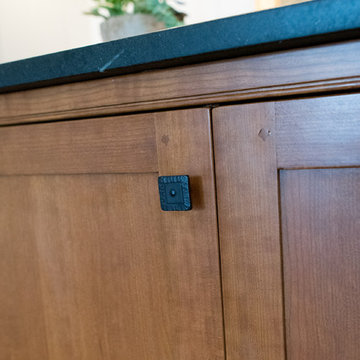
Next on the list were the laundry area, bar and fireplace. The laundry area greets those who enter through the casual back foyer of the home. It also backs up to the kitchen and breakfast nook. The clients wanted this area to be as beautiful as the other areas of the home and the visible washer and dryer were detracting from their vision. They also were hoping to allow this area to serve double duty as a buffet when they were entertaining. So, the decision was made to hide the washer and dryer with pocket doors. The new cabinetry had to match the existing wall cabinets in style and finish, which is no small task. Our Nest artist came to the rescue. A five-piece soapstone sink and distressed counter top complete the space with a nod to the past.
Our clients wished to add a beverage refrigerator to the existing bar. The wall cabinets were kept in place again. Inspired by a beloved antique corner cupboard also in this sitting room, we decided to use stained cabinetry for the base and refrigerator panel. Soapstone was used for the top and new fireplace surround, bringing continuity from the nearby back foyer.
Last, but definitely not least, the kitchen, banquette and powder room were addressed. The clients removed a glass door in lieu of a wide window to create a cozy breakfast nook featuring a Nest banquette base and table. Brackets for the bench were designed in keeping with the traditional details of the home. A handy drawer was incorporated. The double vase pedestal table with breadboard ends seats six comfortably.
The powder room was updated with another antique reproduction vanity and beautiful vessel sink.
While the kitchen was beautifully done, it was showing its age and functional improvements were desired. This room, like the laundry room, was a project that included existing cabinetry mixed with matching new cabinetry. Precision was necessary. For better function and flow, the cooking surface was relocated from the island to the side wall. Instead of a cooktop with separate wall ovens, the clients opted for a pro style range. These design changes not only make prepping and cooking in the space much more enjoyable, but also allow for a wood hood flanked by bracketed glass cabinets to act a gorgeous focal point. Other changes included removing a small desk in lieu of a dresser style counter height base cabinet. This provided improved counter space and storage. The new island gave better storage, uninterrupted counter space and a perch for the cook or company. Calacatta Gold quartz tops are complimented by a natural limestone floor. A classic apron sink and faucet along with thoughtful cabinetry details are the icing on the cake. Don’t miss the clients’ fabulous collection of serving and display pieces! We told you they have impeccable taste!
 THE Remodel Group
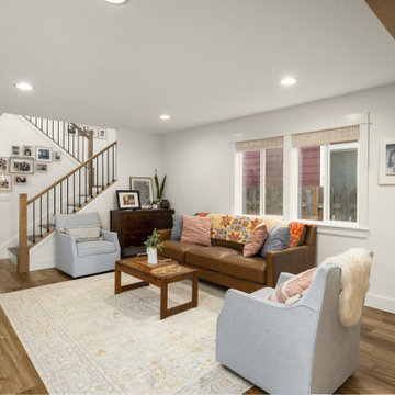
Sometimes the best solution isn't finding a bigger home, it's reimagining the one you already love. This Portland second-story addition demonstrates how strategic design-build planning can help a growing family gain the space they need while remaining in the neighborhood they never wanted to leave.
Originally, this home was a modest single-level residence with three bedrooms and two bathrooms. As the family's needs evolved, the layout no longer offered the functionality they required. Visiting relatives from California frequently stayed with them, yet the existing floor plan lacked a dedicated guest bathroom. The primary suite was undersized, storage was limited, and the main living room felt cramped for everyday family life. Complicating matters further, the narrow lot provided virtually no opportunity for expansion to the front, sides, or rear of the property. To create meaningful additional square footage, the only option was to build upward.
The transformation began with a complete rethinking of the home's interior organization. An existing bedroom, which had already transitioned into a home office, was removed to make way for a new staircase connecting the first and second floors. Rather than treating the staircase as simply a circulation element, the redesign used it to create a new living area while adding valuable storage beneath. The formerly enclosed dining room was opened to the kitchen and living spaces, resulting in a bright, cohesive great room that dramatically improved both sightlines and daily functionality.
The newly added second floor became the centerpiece of the project. On one side of the addition, a spacious bonus room with vaulted ceilings provides a flexible space for family gatherings, movie nights, homework sessions, and creative projects. Dedicated workstation areas ensure the room can evolve alongside the family's needs while taking advantage of abundant natural light from multiple windows.
On the opposite side, the homeowners finally gained the private retreat they had been missing. The new primary suite features soaring vaulted ceilings, expansive windows, and a walk-in closet approximately six times larger than the home's original primary closet. The adjoining bathroom was designed to balance comfort, practicality, and timeless style, with a double vanity, dedicated linen storage, a separate tiled shower, and a soaking tub that creates a true spa-like experience within the home.
Throughout the renovation, a contemporary transitional aesthetic guided the design selections. New luxury vinyl plank flooring was installed across both the existing first floor and the newly constructed second level, creating visual continuity throughout the home. Matching custom stair treads provide a seamless transition between floors, while updated baseboards and door casings help unify the original structure with the addition so the entire home feels intentionally designed rather than pieced together over time.
The staircase became an architectural focal point, featuring warm wood handrails stained to complement the flooring and black metal balusters that introduce a subtle modern influence. This combination successfully bridges the homeowners' appreciation for contemporary design while respecting the overall character of the home.
Material selections in the primary bathroom create depth through texture rather than bold color contrasts. Softly varied white wall tile ranges from crisp bright whites to subtle cloudy tones, while a gentle watercolor-like surface texture captures and reflects natural light throughout the day. Extending the same tile across both the shower walls and tub surround establishes clean architectural lines and emphasizes the room's spaciousness. Black marble pebble flooring in the shower, paired with matte black plumbing fixtures, mirrors, lighting, and trim details, adds contrast and sophistication without overwhelming the palette.
What makes this project especially meaningful is its ability to solve multiple challenges through a single integrated design-build solution. Through close collaboration with the homeowners and our architectural partner, Candid Design, every square foot was carefully considered to maximize functionality, comfort, and long-term livability. By building upward rather than outward, the homeowners gained a spacious primary suite, an additional living area, improved storage, a dedicated guest bath, and flexible family spaces while preserving the location, character, and community they already loved. The result is a home that feels larger, brighter, and better suited for the next chapter of family life without sacrificing the qualities that made it special in the first place.
 Jarrett Design
Jarrett Design is grateful for repeat clients, especially when they have impeccable taste.
In this case, we started with their guest bath. An antique-inspired, hand-pegged vanity from our Nest collection, in hand-planed quarter-sawn cherry with metal capped feet, sets the tone. Calcutta Gold marble warms the room while being complimented by a white marble top and traditional backsplash. Polished nickel fixtures, lighting, and hardware selected by the client add elegance. A special bathroom for special guests.
Next on the list were the laundry area, bar and fireplace. The laundry area greets those who enter through the casual back foyer of the home. It also backs up to the kitchen and breakfast nook. The clients wanted this area to be as beautiful as the other areas of the home and the visible washer and dryer were detracting from their vision. They also were hoping to allow this area to serve double duty as a buffet when they were entertaining. So, the decision was made to hide the washer and dryer with pocket doors. The new cabinetry had to match the existing wall cabinets in style and finish, which is no small task. Our Nest artist came to the rescue. A five-piece soapstone sink and distressed counter top complete the space with a nod to the past.
Our clients wished to add a beverage refrigerator to the existing bar. The wall cabinets were kept in place again. Inspired by a beloved antique corner cupboard also in this sitting room, we decided to use stained cabinetry for the base and refrigerator panel. Soapstone was used for the top and new fireplace surround, bringing continuity from the nearby back foyer.
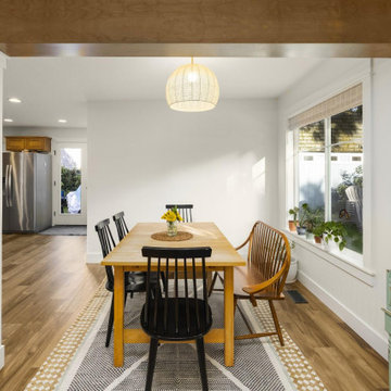
Last, but definitely not least, the kitchen, banquette and powder room were addressed. The clients removed a glass door in lieu of a wide window to create a cozy breakfast nook featuring a Nest banquette base and table. Brackets for the bench were designed in keeping with the traditional details of the home. A handy drawer was incorporated. The double vase pedestal table with breadboard ends seats six comfortably.
The powder room was updated with another antique reproduction vanity and beautiful vessel sink.
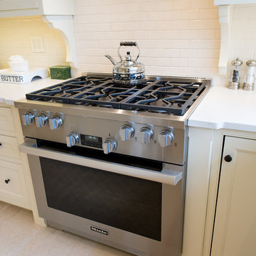
While the kitchen was beautifully done, it was showing its age and functional improvements were desired. This room, like the laundry room, was a project that included existing cabinetry mixed with matching new cabinetry. Precision was necessary. For better function and flow, the cooking surface was relocated from the island to the side wall. Instead of a cooktop with separate wall ovens, the clients opted for a pro style range. These design changes not only make prepping and cooking in the space much more enjoyable, but also allow for a wood hood flanked by bracketed glass cabinets to act a gorgeous focal point. Other changes included removing a small desk in lieu of a dresser style counter height base cabinet. This provided improved counter space and storage. The new island gave better storage, uninterrupted counter space and a perch for the cook or company. Calacatta Gold quartz tops are complimented by a natural limestone floor. A classic apron sink and faucet along with thoughtful cabinetry details are the icing on the cake. Don’t miss the clients’ fabulous collection of serving and display pieces! We told you they have impeccable taste!
 THE Remodel Group
Sometimes the best solution isn't finding a bigger home, it's reimagining the one you already love. This Portland second-story addition demonstrates how strategic design-build planning can help a growing family gain the space they need while remaining in the neighborhood they never wanted to leave.
Originally, this home was a modest single-level residence with three bedrooms and two bathrooms. As the family's needs evolved, the layout no longer offered the functionality they required. Visiting relatives from California frequently stayed with them, yet the existing floor plan lacked a dedicated guest bathroom. The primary suite was undersized, storage was limited, and the main living room felt cramped for everyday family life. Complicating matters further, the narrow lot provided virtually no opportunity for expansion to the front, sides, or rear of the property. To create meaningful additional square footage, the only option was to build upward.
The transformation began with a complete rethinking of the home's interior organization. An existing bedroom, which had already transitioned into a home office, was removed to make way for a new staircase connecting the first and second floors. Rather than treating the staircase as simply a circulation element, the redesign used it to create a new living area while adding valuable storage beneath. The formerly enclosed dining room was opened to the kitchen and living spaces, resulting in a bright, cohesive great room that dramatically improved both sightlines and daily functionality.
The newly added second floor became the centerpiece of the project. On one side of the addition, a spacious bonus room with vaulted ceilings provides a flexible space for family gatherings, movie nights, homework sessions, and creative projects. Dedicated workstation areas ensure the room can evolve alongside the family's needs while taking advantage of abundant natural light from multiple windows.
On the opposite side, the homeowners finally gained the private retreat they had been missing. The new primary suite features soaring vaulted ceilings, expansive windows, and a walk-in closet approximately six times larger than the home's original primary closet. The adjoining bathroom was designed to balance comfort, practicality, and timeless style, with a double vanity, dedicated linen storage, a separate tiled shower, and a soaking tub that creates a true spa-like experience within the home.
Throughout the renovation, a contemporary transitional aesthetic guided the design selections. New luxury vinyl plank flooring was installed across both the existing first floor and the newly constructed second level, creating visual continuity throughout the home. Matching custom stair treads provide a seamless transition between floors, while updated baseboards and door casings help unify the original structure with the addition so the entire home feels intentionally designed rather than pieced together over time.
The staircase became an architectural focal point, featuring warm wood handrails stained to complement the flooring and black metal balusters that introduce a subtle modern influence. This combination successfully bridges the homeowners' appreciation for contemporary design while respecting the overall character of the home.
Material selections in the primary bathroom create depth through texture rather than bold color contrasts. Softly varied white wall tile ranges from crisp bright whites to subtle cloudy tones, while a gentle watercolor-like surface texture captures and reflects natural light throughout the day. Extending the same tile across both the shower walls and tub surround establishes clean architectural lines and emphasizes the room's spaciousness. Black marble pebble flooring in the shower, paired with matte black plumbing fixtures, mirrors, lighting, and trim details, adds contrast and sophistication without overwhelming the palette.
What makes this project especially meaningful is its ability to solve multiple challenges through a single integrated design-build solution. Through close collaboration with the homeowners and our architectural partner, Candid Design, every square foot was carefully considered to maximize functionality, comfort, and long-term livability. By building upward rather than outward, the homeowners gained a spacious primary suite, an additional living area, improved storage, a dedicated guest bath, and flexible family spaces while preserving the location, character, and community they already loved. The result is a home that feels larger, brighter, and better suited for the next chapter of family life without sacrificing the qualities that made it special in the first place.
 Century Stair Company
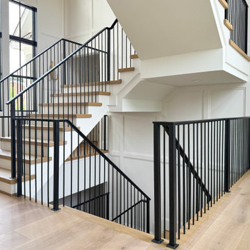
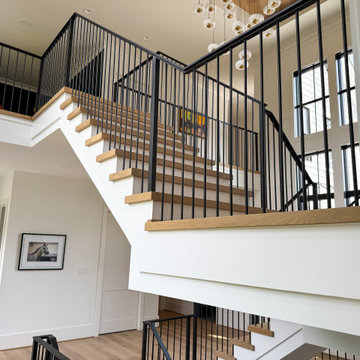
Some staircases are installed. This one was built, hand-welded, painted on site, and engineered from the ground up for the space.
This fully custom U-shaped staircase features white oak treads, white painted risers, and freestanding stringers. The forged iron railing was hand-welded and finished entirely on location, with a continuous handrail running throughout and solid balusters to match. Every component was fabricated in place, a process that reflects what fully custom actually means. A cascading pendant chandelier, a beautiful painting, and wainscoting detail on the walls round out a space where the staircase is clearly the architectural centerpiece.
1976-2026 © Century Stair Company
 Century Stair Company
Some staircases are installed. This one was built, hand-welded, painted on site, and engineered from the ground up for the space.
This fully custom U-shaped staircase features white oak treads, white painted risers, and freestanding stringers. The forged iron railing was hand-welded and finished entirely on location, with a continuous handrail running throughout and solid balusters to match. Every component was fabricated in place, a process that reflects what fully custom actually means. A cascading pendant chandelier, a beautiful painting, and wainscoting detail on the walls round out a space where the staircase is clearly the architectural centerpiece.
1976-2026 © Century Stair Company
 Drury Design
THE SETUP
Multiple ovens, multiple workspaces, multiple sinks – when you think about it, non-jewish kitchens have been adapting the criteria of kosher kitchens for years.
Gladys’ clients in West Rogers Park are Orthodox Jewish. The house they bought already had a kosher kitchen – it just wasn’t done that well. It needed some more things to be duplicated for the dairy side and the meat side. Plus, it was dark and the configuration wasn’t very conducive for a family of eight.
It was time for a remodel.
Design Objectives
Improve kosher kitchen
Add more storage in the island
Better lighting
More open, lighter feel
Change the wood floor in the kitchen to tile
THE REMODEL
Design Challenges
- We had originally planned on removing a wing wall by the breakfast area. During demolition, we learned it contained a support beam.
- The kitchen is a substantial size, but having two sinks, dishwashers, and ovens presented a challenge – how do we fit it all in and make it flow with the storage still accessible near the work areas?
Where do you stop the materials for the new space? - -- The right tile, paint, lighting, etc. would be needed to make the remodeled area cohesive with the rest of the main floor.
- An existing column limited cabinet options and thus, storage capacity. Could we conceal it without disrupting the cabinetry flow?
Design Solutions
- We had to keep the wing wall, but decided to continue the tile on the sides of the cabinets and maintain the height of the tile to line up with the rest of the backsplash. This actually presented a very nice and cohesive look, especially since the opposite side has a wing wall to the left of the refrigerator.
- We used “L-shaped” corner sinks instead of the rectangular ones set on an angle. This gave us more of the legs of the triangles versus the hypotenuse, which allowed for the two dishwashers, and the pullout utensil canisters and spice pullouts while still keeping the 3-drawer cabinets on either side of the range (by the sinks). The old island had the recess for stools which the family never used. By extending the width of the island 6” and utilizing this leg space, we were able to fit 18”-deep cabinets on this side – adding lots of accessible storage. The family can now work simultaneously on the dairy side (the side with the fridge) and the meat side (opposite) without getting in each other’s way. We separated the cooking by using the range oven for the meat and a built-in microwave in the base cabinet. The wall oven with built-in microwave on top is for dairy.
- Corner sinks opened up the middle area for a wider range – we went from a 30” to a 36”. Removing all the wall cabinets (on the range wall) made a big difference. That opened up the entire space while adding some visual impact. (Not pictured: We also made the cabinets directly opposite the range wall tall and removed the countertop, resulting in more room for rollouts and even more storage!) The kitchen now has more storage than it did before.
- We ended up painting the ceiling of the kitchen into the hallway that leads to the foyer. The living and dining rooms were separated by a soffit, so that became a natural boundary. We kept the tile in the kitchen by stopping it short of the hallway and lining it up with the pantry wall. This creates a border between the breakfast area and family room. The rest of the existing wood floors were refinished to refresh and make the hue darker. We also painted a dark accent wall and carried it into the breakfast area to make the rooms look deeper.
- The in-the-way column housed plumbing and couldn’t be moved. We still built cabinets in that spot – we just had to build a chase inside it to conceal the pipes. There was still plenty of room for new storage. We also took the cabinets all the way to the ceiling. The continuous tall cabinets added a functional elegance to the space.
THE RENEWED SPACE
The client’s long-awaited dream of a better kosher kitchen has finally been achieved, beautifully combining enhanced storage solutions with adherence to the family’s orthodox dietary laws. The kitchen’s standout feature, an expanded island, now offers a spacious and efficient workspace. This allows several family members to cook together comfortably, without the inconvenience of bumping into each other, ensuring a harmonious and productive cooking environment.
 Voar Construction
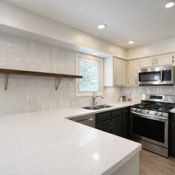
After – Kitchen Renovation: Open, Timeless, and Move-In Ready
The kitchen was fully remodeled to create a more open and connected layout. The outdated two-level countertop was replaced with a single-level peninsula, enhancing the sense of space and improving the flow between the kitchen, dining, and living areas.
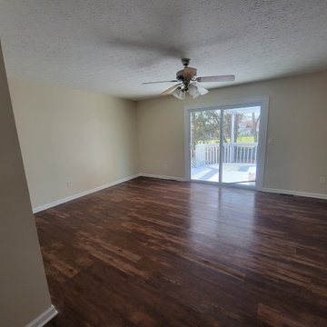
Neutral tones were used throughout, featuring white cabinetry and matte black finishes on hardware and lighting. The same light luxury vinyl flooring runs continuously through the home, creating a cohesive and spacious feel. The cabinet layout was reconfigured to improve functionality, and modern appliances were installed to bring both style and efficiency.
With clean lines, timeless materials, and a versatile design, this kitchen appeals to a wide range of buyers or renters—modern, beautiful, and ready to enjoy.
Sponsored
Columbus, OH

EverHome Improvement & Design
Top Choice for Reliable Tile & Stone | Franklin County, Ohio
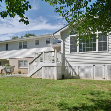 Michael Nash Design, Build & Homes
For this recently moved in military family, their old rambler home offered plenty of area for potential improvement. An entire new kitchen space was designed to create a greater feeling of family warmth.
It all started with gutting the old rundown kitchen. The kitchen space was cramped and disconnected from the rest of the main level. There was a large bearing wall separating the living room from the kitchen and the dining room.
A structure recessed beam was inserted into the attic space that enabled opening up of the entire main level. A large L-shaped island took over the wall placement giving a big work and storage space for the kitchen.
Installed wood flooring matched up with the remaining living space created a continuous seam-less main level.
By eliminating a side door and cutting through brick and block back wall, a large picture window was inserted to allow plenty of natural light into the kitchen.
Recessed and pendent lights also improved interior lighting.
By using offset cabinetry and a carefully selected granite slab to complement each other, a more soothing space was obtained to inspire cooking and entertaining. The fabulous new kitchen was completed with a new French door leading to the sun room.
This family is now very happy with the massive transformation, and are happy to join their new community.
 Costa del Sol Interiors | Interior Designer
This interior design project involved a comprehensive renovation that completely transformed the appearance and features of an apartment located on the Costa del Sol, Spain. The goal was to modernize the space, enhance functionality, and create a more sophisticated and welcoming atmosphere, aligned with a Nordic style that emphasizes warmth and natural elements.
### Space Redistribution:
Originally, the apartment had only one bedroom and one bathroom. The first phase of the renovation involved redistributing the space to add a second bathroom, with one of them becoming an en-suite connected directly to the master bedroom. This addition significantly improved comfort and privacy, allowing each bedroom to have its own bathroom. Additionally, a new laundry area was created, providing a dedicated space for the washing machine, water heater, and cleaning supplies, optimizing the home's functionality without compromising aesthetics.
### Flooring and Visual Continuity:
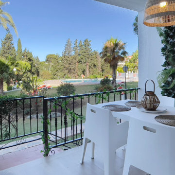
The old dark, square-patterned flooring was replaced with porcelain tiles that mimic the texture and tone of wood. This new material was extended from the interior to the terrace, creating a sense of continuity and spaciousness. This change not only modernized the apartment's appearance but also reinforced the visual harmony between indoor and outdoor spaces, inviting residents to enjoy the natural light and views offered by the coastal location.
### Bathroom Renovation:
With the addition of a second bathroom, both spaces were completely renovated. The old tiles and bathtub were removed in favor of a more modern and functional design. Light-colored ceramics reflecting the Nordic style were installed, along with contemporary fixtures and clean lines. The en-suite bathroom was designed to offer an intimate and luxurious space, while the second bathroom, though equally modern, provides comfort and accessibility for the rest of the home.
### Style and Décor:
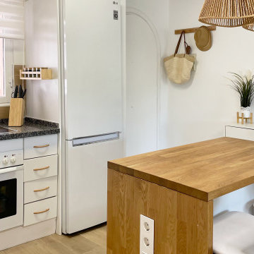
The predominant Nordic style was reflected in the choice of materials and colors. The walls were adorned with wooden slats, a detail that adds texture and warmth to the space, while the décor focused on natural elements like wood, linen, and plant fibers, creating a serene and relaxing atmosphere. Neutral tones and simple lines prevail, achieving a perfect balance between sophistication and comfort.
### Final Result:
The result is an apartment that not only looks more spacious and modern but also exudes a sense of tranquility and comfort. The renovation has transformed the space into a home that invites you to enjoy sunny days on the Costa del Sol, with a terrace seamlessly integrated with the interior and living spaces that reflect a sophisticated, functional, and inviting lifestyle.
Este proyecto de interiorismo consistió en una reforma integral que transformó por completo el aspecto y las características de un apartamento ubicado en la Costa del Sol, España. El objetivo era modernizar el espacio, mejorar la funcionalidad y crear un ambiente más sofisticado y acogedor, alineado con un estilo nórdico que resalta la calidez y la naturalidad.
### Redistribución del Espacio:
Inicialmente, el apartamento contaba con una sola habitación y un solo baño. La primera fase de la reforma implicó una redistribución del espacio, añadiendo un segundo baño, de los cuales uno se convirtió en suite, conectado directamente con la habitación principal. Esta ampliación mejoró significativamente la comodidad y privacidad, permitiendo que cada habitación tuviera su propio baño. Además, se creó una nueva zona de lavadero, un espacio dedicado para la lavadora, el termotanque y los elementos de limpieza, optimizando la funcionalidad del hogar sin sacrificar la estética.
### Suelos y Continuidad Visual:
Se reemplazaron los antiguos suelos de color oscuro, de apariencia cuadrada, por un porcelánico que imita la textura y el tono de la madera. Este nuevo material se extendió desde el interior hasta la terraza, creando una sensación de continuidad y amplitud. Este cambio no solo modernizó el aspecto del apartamento, sino que también reforzó la armonía visual entre los espacios interiores y exteriores, invitando a disfrutar de la luz natural y las vistas que ofrece la ubicación costera.
### Renovación de Baños:
Con la adición de un segundo baño, ambos espacios fueron completamente renovados. Se eliminaron los viejos azulejos y la bañera en favor de un diseño más moderno y funcional. Se instalaron cerámicas de tonos claros que reflejan el estilo nórdico, junto con elementos contemporáneos y líneas limpias. El baño en suite, en particular, fue diseñado para ofrecer un espacio íntimo y lujoso, mientras que el segundo baño, aunque igualmente moderno, ofrece comodidad y accesibilidad para el resto de la casa.
### Estilo y Decoración:
El estilo nórdico predominante se reflejó en la elección de materiales y colores. Las paredes fueron adornadas con palillería, un detalle que aporta textura y calidez al espacio, mientras que la decoración se basó en elementos naturales como madera, lino y fibras vegetales, creando una atmósfera serena y relajante. Los tonos neutros y las líneas simples predominan, logrando un equilibrio perfecto entre sofisticación y comodidad.
### Resultado Final:
El resultado es un apartamento que no solo se ve más amplio y moderno, sino que también transmite una sensación de tranquilidad y confort. La reforma ha transformado el espacio en un hogar que invita a disfrutar de los días soleados en la Costa del Sol, con una terraza que se integra perfectamente con el interior, y unos ambientes interiores que reflejan un estilo de vida sofisticado, funcional y acogedor.
 Costa del Sol Interiors | Interior Designer
This interior design project involved a comprehensive renovation that completely transformed the appearance and features of an apartment located on the Costa del Sol, Spain. The goal was to modernize the space, enhance functionality, and create a more sophisticated and welcoming atmosphere, aligned with a Nordic style that emphasizes warmth and natural elements.
### Space Redistribution:
Originally, the apartment had only one bedroom and one bathroom. The first phase of the renovation involved redistributing the space to add a second bathroom, with one of them becoming an en-suite connected directly to the master bedroom. This addition significantly improved comfort and privacy, allowing each bedroom to have its own bathroom. Additionally, a new laundry area was created, providing a dedicated space for the washing machine, water heater, and cleaning supplies, optimizing the home's functionality without compromising aesthetics.
### Flooring and Visual Continuity:
The old dark, square-patterned flooring was replaced with porcelain tiles that mimic the texture and tone of wood. This new material was extended from the interior to the terrace, creating a sense of continuity and spaciousness. This change not only modernized the apartment's appearance but also reinforced the visual harmony between indoor and outdoor spaces, inviting residents to enjoy the natural light and views offered by the coastal location.
### Bathroom Renovation:
With the addition of a second bathroom, both spaces were completely renovated. The old tiles and bathtub were removed in favor of a more modern and functional design. Light-colored ceramics reflecting the Nordic style were installed, along with contemporary fixtures and clean lines. The en-suite bathroom was designed to offer an intimate and luxurious space, while the second bathroom, though equally modern, provides comfort and accessibility for the rest of the home.
### Style and Décor:
The predominant Nordic style was reflected in the choice of materials and colors. The walls were adorned with wooden slats, a detail that adds texture and warmth to the space, while the décor focused on natural elements like wood, linen, and plant fibers, creating a serene and relaxing atmosphere. Neutral tones and simple lines prevail, achieving a perfect balance between sophistication and comfort.
### Final Result:
The result is an apartment that not only looks more spacious and modern but also exudes a sense of tranquility and comfort. The renovation has transformed the space into a home that invites you to enjoy sunny days on the Costa del Sol, with a terrace seamlessly integrated with the interior and living spaces that reflect a sophisticated, functional, and inviting lifestyle.
Este proyecto de interiorismo consistió en una reforma integral que transformó por completo el aspecto y las características de un apartamento ubicado en la Costa del Sol, España. El objetivo era modernizar el espacio, mejorar la funcionalidad y crear un ambiente más sofisticado y acogedor, alineado con un estilo nórdico que resalta la calidez y la naturalidad.
### Redistribución del Espacio:
Inicialmente, el apartamento contaba con una sola habitación y un solo baño. La primera fase de la reforma implicó una redistribución del espacio, añadiendo un segundo baño, de los cuales uno se convirtió en suite, conectado directamente con la habitación principal. Esta ampliación mejoró significativamente la comodidad y privacidad, permitiendo que cada habitación tuviera su propio baño. Además, se creó una nueva zona de lavadero, un espacio dedicado para la lavadora, el termotanque y los elementos de limpieza, optimizando la funcionalidad del hogar sin sacrificar la estética.
### Suelos y Continuidad Visual:
Se reemplazaron los antiguos suelos de color oscuro, de apariencia cuadrada, por un porcelánico que imita la textura y el tono de la madera. Este nuevo material se extendió desde el interior hasta la terraza, creando una sensación de continuidad y amplitud. Este cambio no solo modernizó el aspecto del apartamento, sino que también reforzó la armonía visual entre los espacios interiores y exteriores, invitando a disfrutar de la luz natural y las vistas que ofrece la ubicación costera.
### Renovación de Baños:
Con la adición de un segundo baño, ambos espacios fueron completamente renovados. Se eliminaron los viejos azulejos y la bañera en favor de un diseño más moderno y funcional. Se instalaron cerámicas de tonos claros que reflejan el estilo nórdico, junto con elementos contemporáneos y líneas limpias. El baño en suite, en particular, fue diseñado para ofrecer un espacio íntimo y lujoso, mientras que el segundo baño, aunque igualmente moderno, ofrece comodidad y accesibilidad para el resto de la casa.
### Estilo y Decoración:
El estilo nórdico predominante se reflejó en la elección de materiales y colores. Las paredes fueron adornadas con palillería, un detalle que aporta textura y calidez al espacio, mientras que la decoración se basó en elementos naturales como madera, lino y fibras vegetales, creando una atmósfera serena y relajante. Los tonos neutros y las líneas simples predominan, logrando un equilibrio perfecto entre sofisticación y comodidad.
### Resultado Final:
El resultado es un apartamento que no solo se ve más amplio y moderno, sino que también transmite una sensación de tranquilidad y confort. La reforma ha transformado el espacio en un hogar que invita a disfrutar de los días soleados en la Costa del Sol, con una terraza que se integra perfectamente con el interior, y unos ambientes interiores que reflejan un estilo de vida sofisticado, funcional y acogedor.
31