
Search results for "Corner space" in Home Design Ideas
 Paradise Tiny Homes LLC
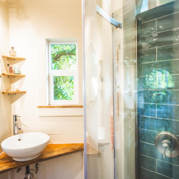
This tiny home has a very unique and spacious bathroom. This tiny home has utilized space-saving design and put the bathroom vanity in the corner of the bathroom. Natural light in addition to track lighting makes this vanity perfect for getting ready in the morning. Triangle corner shelves give an added space for personal items to keep from cluttering the wood counter.
This contemporary, costal Tiny Home features a bathroom with a shower built out over the tongue of the trailer it sits on saving space and creating space in the bathroom. This shower has it's own clear roofing giving the shower a skylight. This allows tons of light to shine in on the beautiful blue tiles that shape this corner shower. Stainless steel planters hold ferns giving the shower an outdoor feel. With sunlight, plants, and a rain shower head above the shower, it is just like an outdoor shower only with more convenience and privacy. The curved glass shower door gives the whole tiny home bathroom a bigger feel while letting light shine through to the rest of the bathroom. The blue tile shower has niches; built-in shower shelves to save space making your shower experience even better. The frosted glass pocket door also allows light to shine through.
 Harrell Design + Build
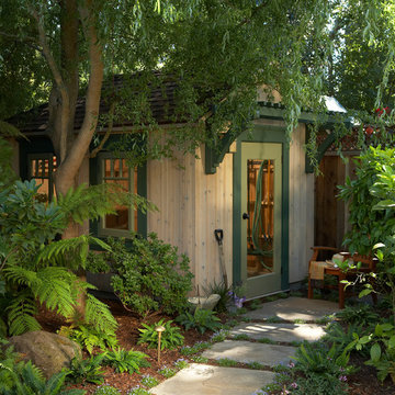
What our clients needed:
• Create a garden folly that doubles as a well-built shed for crafts and storage.
• Size the structure large enough for comfortable storage without dominating the garden.
• Discreetly locate the shed in the far corner of the rear yard while maintaining existing trees.
• Ensure that the structure is protected from the weather and carefully detailed to deter access of wildlife and rodents.
FUNCTION
• Construct the shed slab close to grade to permit easy access for bicycle storage, while building shed walls above grade to ensure against termites and dryrot.
• Install a French door and operable casement windows to admit plenty of daylight and provide views to the garden.
• Include rugged built-in work bench, shelves, bike racks and tool storage for a rustic well-organized and efficient space.
• Incorporate GFIC electrical service for safe access to power at this distant corner of the yard.
• Position energy-efficient interior lighting to ensure space can be used year-round.
• Switch control of exterior light from house and from shed for ease of command.
AESTHETICS
• Design and detail the shed to coordinate with the Arts and Crafts style house.
• Include an arbor for future flowering vines, further softening the shed’s garden presence.
• Simple and rustic interior surfaces ensure that the space is easy to clean.
• Create an aged and softly weathered appearance, and protect the exterior siding by finishing the cedar with a custom-colored semi-transparent stain.
INNOVATIVE MATERIALS AND CONSTRUCTION
• Factory-built components were pre-assembled to allow for a speedy assembly and for a shorter on-site construction schedule.
• Each component was easily transported through the yard without disturbing garden features.
• Decorative exterior trim frames the door and windows, while a simpler trim is used inside the unadorned shed.
OBSTACLE OVERCOME
• The structure is located in the corner of the yard to avoid disturbance of a curly willow tree.
• The low-profile structure is positioned close to property lines while staying beneath the allowable daylight plane for structures.
• To comply with daylight plane close to fence, the roof form combines hip and gable forms, with door located at gable end.
• The height of the modest interior is maximized, without exceeding the allowable building height.
CRAFTSMANSHIP
• The concrete slab was precisely formed and finished for ease of shed assembly before the factory-built components were delivered to site.
• Precision planning meant the pre-framed door fit exactly between raised concrete curb.
 House of L
Jason Miller, Pixelate LTD
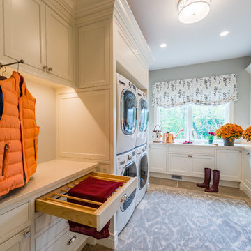
Elegant dedicated laundry room photo in Cleveland with beaded inset cabinets, white cabinets, gray walls and white countertops
Elegant dedicated laundry room photo in Cleveland with beaded inset cabinets, white cabinets, gray walls and white countertops
Find the right local pro for your project
 JMorris Design LLC
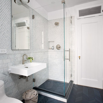
The bathroom was previously closed in and had a large tub off the door. Making this a glass stand up shower, left the space brighter and more spacious. Other tricks like the wall mount faucet and light finishes add to the open clean feel.
 Bria Hammel Interiors
Spacecrafting Photography
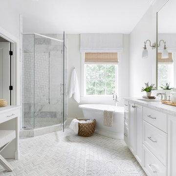
Beach style master white tile white floor freestanding bathtub photo in Minneapolis with recessed-panel cabinets, white cabinets, white walls, an undermount sink, a hinged shower door and white countertops
Beach style master white tile white floor freestanding bathtub photo in Minneapolis with recessed-panel cabinets, white cabinets, white walls, an undermount sink, a hinged shower door and white countertops
 WSM Craft
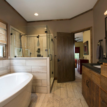
Embracing the notion of commissioning artists and hiring a General Contractor in a single stroke, the new owners of this Grove Park condo hired WSM Craft to create a space to showcase their collection of contemporary folk art. The entire home is trimmed in repurposed wood from the WNC Livestock Market, which continues to become headboards, custom cabinetry, mosaic wall installations, and the mantle for the massive stone fireplace. The sliding barn door is outfitted with hand forged ironwork, and faux finish painting adorns walls, doors, and cabinetry and furnishings, creating a seamless unity between the built space and the décor.
Michael Oppenheim Photography
 User
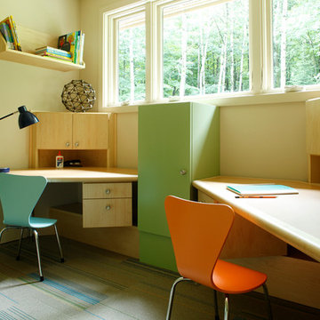
UserThe couple requested that an alcove be converted into a homework space for their two children. They hoped for 2 separate desks plus storage space.
The space is 5’-6” x 8’-6”. The long wall has a large bank of windows and a 12” x 12” electrical chase running along the floor under the windows. The children are aged 4 and 7 right now, and the space needs to accommodate them as they grow.
The space could not accommodate two back-to-back desks with sufficient circulation space. Thus, the corner space was leveraged for both desks and storage. The custom designed desks provide plenty of layout space and elbow room for the student along the front edge. The deep corners are fitted with custom wall units for storage. More storage is found above, below and between the desks.
The desk and deep corner storage units are designed to accommodate the children’s growth. The desks have a second set of legs to raise them to standard adult height. The corner units have an open storage space at the bottom that becomes hidden under the desk top when the desk top is raised in the coming years. The design provides a finished look now, when only one desk top is raised, and when both desks are eventually raised.
The design also encourages concentration. The desks face away from each other. Cabinet placement ensures that chairs won’t bump into one another when pushing away from the desk. The balance between neutral and colored surfaces is designed to provide enough color to attract a child’s interest, but not enough to overstimulate or distract.
Photo by Alex Steinberg Photography

Sponsored
Columbus, OH
Free consultation for landscape design!

Peabody Landscape Group
Franklin County's Reliable Landscape Design & Contracting
 Lars Remodeling & Design
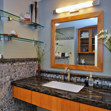
This Del Cerro bathroom remodel is a perfect example of how materials and textures can be layered to give a truly custom look to a space. Granite countertops, small stone tiles, and various glass tiles are featured throughout this bathroom with shower area being the true star of space. The walls feature neutral porcelain tile with an impressive dark grey glass tile accent. The end result is bold and perfectly suited to this client's taste. How do you feel about mixing materials and textures in one space?
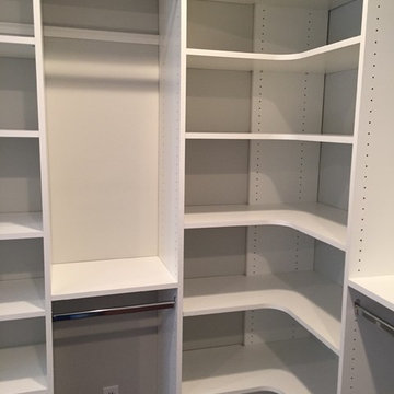
 Inspired Closets Pittsburgh
On the other side of the room, wrapped corner shelving increases storage for bulky items and creates a streamlined look.
Walk-in closet - traditional gender-neutral dark wood floor walk-in closet idea with white cabinets
Walk-in closet - traditional gender-neutral dark wood floor walk-in closet idea with white cabinets
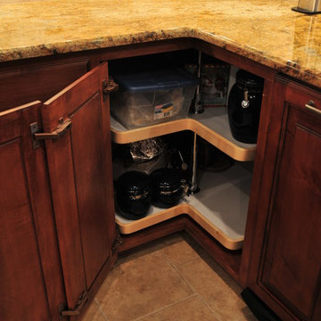
 DreamMaker Bath & Kitchen
Pie shape lazy susan
Example of a mid-sized classic u-shaped ceramic tile eat-in kitchen design in Dallas with a double-bowl sink, raised-panel cabinets, dark wood cabinets, granite countertops, beige backsplash, stone tile backsplash, stainless steel appliances, beige walls and an island
Example of a mid-sized classic u-shaped ceramic tile eat-in kitchen design in Dallas with a double-bowl sink, raised-panel cabinets, dark wood cabinets, granite countertops, beige backsplash, stone tile backsplash, stainless steel appliances, beige walls and an island

 DISC Interiors
D. Gilbert
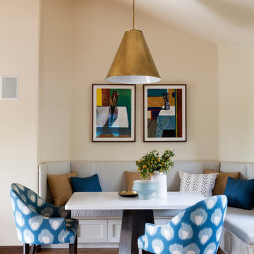
Example of a transitional medium tone wood floor dining room design in Los Angeles with beige walls
Example of a transitional medium tone wood floor dining room design in Los Angeles with beige walls
 Planning and Building, Inc
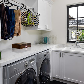
Example of a small transitional l-shaped dark wood floor and brown floor dedicated laundry room design in Miami with a drop-in sink, shaker cabinets, white cabinets, marble countertops, white walls, a side-by-side washer/dryer and white countertops

Sponsored
Sunbury, OH

J.Holderby - Renovations
Franklin County's Leading General Contractors - 2X Best of Houzz!

 Charmean Neithart Interiors
Erika Bierman Photography www.erikabiermanphotography.com
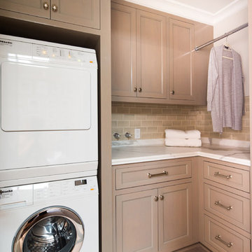
Example of a small classic l-shaped laundry room design in Los Angeles with recessed-panel cabinets, light wood cabinets, white walls, a stacked washer/dryer and white countertops
Example of a small classic l-shaped laundry room design in Los Angeles with recessed-panel cabinets, light wood cabinets, white walls, a stacked washer/dryer and white countertops

 Twelve Stones Designs, LLC
The owners of this kitchen had spent the money to upgrade the finishes in their kitchen upon building the home 12 years ago, but after living in the space for several years they realized how nonfunctional the layout really was. The (then) two preschool aged children had grown into busy, hungry teenagers with many friends who also liked to hang out at the house. So the family needed a more functional kitchen with better traffic flow, space for daily activities revolving around the kitchen at different times of day, and a kitchen that could accommodate cooking for and serving large groups. Furthermore, the dark, traditional finishes no longer reflected the homeowners’ style. They requested a brighter, more relaxed, coastal style that reflected their love of the seaside cities they like to visit.
Originally, the kitchen was U-shaped with a narrow island in the middle. The island created narrow aisles that bottle-necked at the dishwasher, refrigerator, and cooktop areas. There was a pass-through from the foyer into the kitchen, but the owners never liked that the pass-through was also located so close to the powder room. The awkward proximity was unappealing and made guests feel uncomfortable.
The kitchen’s storage was made up of lots of narrow cabinets, apothecary drawers, clipped corner units, and very few drawers. It lacked useful storage for the larger items the family used on a daily basis. And the kitchen’s only pantry was small closet that had only builder-grade, narrow shelving with no illumination to be able to see the contents inside.
Overall, the kitchen’s lighting plan was poorly executed. Only six recessed cans illuminated the entire kitchen and nook areas. The under cabinet lighting was not evenly distributed either. In fact, the builder had mis-placed the under cabinet lighting around the decorative pilasters which made for choppy, dark cubbies. Further, the builder didn’t include any lighting over the sink or the bar area, which meant whoever was doing the dishes was always in their own shadow. That, coupled with the steep overhang of the game room above made the bar area feel like a dim, cavernous space that wasn’t inviting or task oriented. The kitchen looked out into the main living space, but the raised bar and a narrow wall (which held the only large cabinet in the kitchen) created more of a barrier than a relationship to the living room or breakfast nook. In fact, one couldn’t even see the breakfast nook from the cooktop or sink areas due to its orientation. The raised bar top was too narrow to comfortably sit to either dine at or chat from due to the lack of knee space. The the homeowners confided that the kitchen felt more like a dark, dirty prison than place where the family, or their guests, wanted to gather and commune.
The clients' needs and desires were:
➢ to create a kitchen that would be a space the family loved to be in; to relate to the adjacent spaces all around, and to have better flow for entertaining large groups
➢ to remove the walls between the breakfast nook and living area and to be able to utilize the natural light from the windows in both those areas
➢ to incorporate a functional chopping block for prepping fresh food for home cooked meals, an island with a large sink and drain board, 2 pull out trash cans, and seating for at least the 2 teens to eat or do homework
➢ to design a kitchen and breakfast nook with an airy, coastal, relaxed vibe that blended with the rest of the house's coastal theme
➢ to integrate a layered lighting plan which would include ample general illumination, specific task lighting, decorative lighting, and lots of illuminated storage
➢ to design a kitchen with not only more storage for all the husband’s kitchen gadgets and collection of oils and spices, but smart storage, including a coffee/breakfast bar and a place to store and conceal the toaster oven and microwave
➢ to find a way to utilize the large open space between the kitchen, pantry area, and breakfast nook
Twelve Stones Designs achieved the owner's goals by:
➢ removing the walls between the kitchen and living room to allow the natural light to filter in from the adjacent rooms and to create a connection between the kitchen, nook, and living spaces for a sense of unity and communion
➢ removing the existing pantry and designing 3 large pantry style cabinets with LED tape lights and rollout drawers to house lots of kitchen appliances, gadgets, and tons of groceries. We also took the cabinets all the way up to the 9’ ceiling for additional storage for seasonal items and bulk storage.
➢ designing 2 islands - 1 with a gorgeous black walnut chopping block that houses a drawer for chopping and carving knives and a custom double pull out trash unit for point of use utilization - and 1 that houses the dishwasher, a large Blanco Gourmet sink with integrated drain board, woven baskets for fresh root vegetables and kitchen towels, plenty of drawer storage for kitchen items, and bar seating for up to 4 diners.
➢ closing off the space between the kitchen and the powder room to create a beautiful new private alcove for the powder room as well as adding some decorative storage. This also gave us space to include more tall storage near the new range for precision placement of the husband’s extensive oil and spice collection as well as a location for a combo-steam oven the wife wanted for baking and cooking healthy meals.
The project is enhanced functionally by:
➢ incorporated USB and standard receptacles for the kids’ laptops and phone charging in the large island
➢ designing the small island to include additional open shelving for items used on a daily basis such as a variety of bowls, plates, and colanders. This set up also works well for the husband who prefers to “plate” his dinners in restaurant-style fashion before presenting them to the table.
➢ the integration of specific storage units, such as double stacked cutlery drawers, a custom spice pull-out, a Kuerig coffee and tea pod drawer, and custom double stacked utensil drawers
➢ moving the refrigerator to the old oven location - this eliminated the bottle neck as well as created a better relationship to the eating table. It also utilizes the floor space between the pantry, nook, and kitchen
➢ creating a banquet style breakfast nook - this banquette seating not only doubles the amount of seating for large gatherings but it better utilizes the odd space between the kitchen and the previous nook area. It also helps to create a distinct pathway from the mudroom room through the pantry area, kitchen, nook, and living room.
➢ the coffee/breakfast bar area which includes the perfect location for the concealed microwave and toaster oven, convenient storage for the coffee pods and tea accoutrements. Roll-out drawers below also house the smoothie maker, hot water kettle, and a plethora of smoothie-making ingredients such as protein powders, smoothie additives, etc. Furthermore, the drawers below the Keurig house measuring utensil, cutlery, baking supplies and tupperware storage.
➢ incorporating lots of wide drawers and pullouts to accommodate large cookware.
➢ utilizing as much vertical space as possible by building storage to the ceiling which accommodates the family’s abundant amount of serving platters, baking sheets, bakeware, casserole dishes, and additional cutting boards.
The project is enhanced aesthetically by:
➢ new 5-piece Versailles pattern porcelain tile that now seamlessly joins the entire down stairs area together creating a bright, cohesiveness feeling instead of choppy separated spaces - it also adds a coastal feeling
➢ designing a cabinet to conceal the microwave and toaster oven
➢ the coastal influenced light fixtures over the nook table and island
➢ the sandy colors of the Langdon Cambria countertops. The swirling pattern and sparkling quartz pieces remind the homeowner of black-and-tan sandy beaches
➢ the striped banquet seating whose creamy white background and blue-green stripes were the inspiration for the cabinet and wall colors.
➢ All the interior doors were painted black to coordinate with the blacks and grays in the backsplash tile and countertop. This also adds a hint of tailored formality to an otherwise casual space.
➢ the use of WAC's Oculux small aperture LED units for the overhead lighting complimented with Diode LED strips for task lighting under the cabinets and inside the pantry and glass wall cabinets. All of the lighting applications are on separate dimmer switches.
Innovative uses of materials or construction methods by Realty Restoration LLC:
➢ Each 1-1/2” x 3” block of reclaimed end-grain black walnut that makes up the center island chopping block was hand milled and built in the shop. It was designed to look substantial and proportional to the surrounding elements, executed by creating the 4 inch tall top with a solid wood chamfered edge band.
➢ The metal doors on either side of the vent hood were also custom designed for this project and built in the Realty Restoration LLC shop. They are made 1x2, 11-gauge mild steel with ribbed glass. Weighing 60 lbs a piece, heavy duty cabinet hinges were added to support the weight of the door and keep them from sagging.
➢ Under-cabinet receptacles were added along the range wall in order to have a clean, uninterrupted backsplash.
Design obstacles to overcome:
➢ Because we were removing the demising walls between the kitchen and living room, we had to find a way to plumb and vent the new island. We did this by tunneling through the slab (the slab had post tension cables which prevented us from just trenching) to run a new wet vent through a nearby structural wall. We pulled the existing hot and cold lines between upper floor joists and ran them down the structural wall as well and up through a conduit in the tunnel.
➢ Since we were converting from wall overs to a gas range it allowed us to utilize the 220 feed for the wall ovens to provide a new sub panel for all the new kitchen circuits
➢ Due to framing deficiencies inherited from the original build there was a 1-1/2” differential in the floor-to-ceiling height over a 20 foot span; by utilizing the process of cutting and furring coupled with the crown moulding details on the cabinet elevations we were able to mask the problem and provide seamless transitions between the cabinet components.
Evidence of superior craftsmanship:
➢ uniquely designed, one-of-a-kind metal “X” end panels on the large island. The end panels were custom made in the Realty Restoration LLC shop and fitted to the exact dimensions of the island. The welding seams are completely indistinguishable - the posts look like they are cut from a single sheet of metal
➢ square metal posts on the small island were also custom made and designed to compliment and carry through the metal element s throughout the kitchen
➢ the beautiful, oversized end panels on the pantry cabinets which give the breakfast nook a tailored look
➢ integrating a large format 5 piece Versailles tile pattern to seamlessly flow from the existing spaces into the new kitchen space
➢ By constructing a custom cabinet that jogged around a corner we could not remodel (housing the entry way coat closet) we were able to camouflage the adjacent wall offset within the upper and lower cabinets. By designing around the existing jog in the structural walls we accomplished a few things: we were able to find the space to house, and hide, the microwave and toaster oven yet still have a clean cohesive appearance from the kitchen side. Additionally, the owners were able to keep their much needed coat closet and we didn’t have to increase the budget with unnecessary structural work.
 O’Hara Interiors
Martha O'Hara Interiors, Interior Design | Elevation Home, Builder | Murphy & Co. Design, Architect | Troy Thies, Photography | Shannon Gale, Photo Styling
Sponsored
Columbus, OH
Free consultation for landscape design!
Peabody Landscape Group
Franklin County's Reliable Landscape Design & Contracting
 BARRETT STUDIO architects
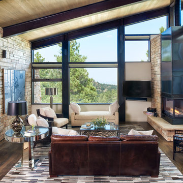
Pine Perch commands dramatic views to the eastern plains, from the Pine Brook Hills community just west of Boulder. Nestled into a sloping foothills site, the home is a lively beginning for a newly married couple and their visiting children and grandchildren.
The continuation of materials from interior to exterior creates visually engaging indoor-outdoor connections. Structural stone walls extend from living spaces to outside buttressed walls, and steel ceiling beams ascend continuously from the Great Room to the uplifted shed roof outdoors. Corner window walls further help to “break the container” of living in this natural setting.
Centered on food and good times, this sun-filled home expresses an uplifting spirit that the couple enthusiastically celebrates as life’s next chapter. The aesthetic is eclectic, while comfortably modern in its local response to site and materiality.
Photo: Ron Ruscio Photography
 Hurst Homes, LLC.
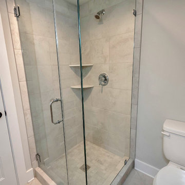
Example of a small trendy 3/4 gray tile and porcelain tile porcelain tile and beige floor corner shower design in DC Metro with a two-piece toilet, a pedestal sink, a hinged shower door and gray walls
 InnovationLand
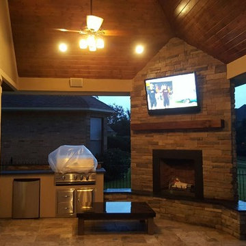
We are so excited about this stylish Houston patio addition!
It's one of our most recent outdoor living space design projects - and one of our new favorites!
We particularly love the rustic corner fireplace, the beautiful, vaulted pine ceiling and the Restoration Hardware furniture and accessories.
"Even though this space has an outdoor kitchen - often the highlight of our projects - the focus here is beautiful, comfortable outdoor living," says Outdoor Homescapes of Houston owner Wayne Franks. "And I have to say, I think this is one of the most gorgeous spaces we've created for doing that - in style."
"This project was special from the start, as we were creating this space for a friend of Wayne’s who had been a long time mentor to his boys growing up," adds Lisha Maxey, owner of LGH Designs in Houston (she coordinated furniture and finishes for the project). "This client was the principal of their high school and knew all of them very well and Wayne, too. This made it very personal, indeed, and we wanted everything to be perfect!"
The 23- by 16-foot addition, located at the back of the house in Cypress, looks out onto a manmade lake in the homeowners' subdivision. The focal point? A 9-foot-8-inch-high-by-7-foot-wide corner fireplace in Earth Grey rustic ledgestone from Colorstone in Houston. The fireplace features a custom wooden mantel, stone bench seating and a 52-inch Sunbrite outdoor TV.
Another highlight is the flooring - silver travertine tile laid out in a Versailles pattern. "We chose silver travertine in a 'Tumbled' color palette with variations of cream and brown," says Lisha. "So we had those two colors, plus grey, to pull from."
The 7-foot-long, stucco outdoor kitchen island's countertops are also noteworthy - Absolute Black granite in a leathered finish offering a modern look and a dark grey hue that works perfectly with the color palette. The kitchen island also houses an RCS 30-inch grill and fridge.
The seating area includes a sectional couch, coffee table, two swivel chairs and two ottomans - all from Restoration Hardware.
"We used Restoration Hardware's Biscayne sectional, swivel chairs and ottomans in gray, with textured linen weave in Sand and cushions and peacock accent pillows in gray," says Lisha. The coffee table is made of solid teak with a concrete top - as is the matching side table.
"We added a console table, also in teak, behind the sofa. And for accents, we added three Amalfi lanterns from Restoration Hardware in weathered zinc."
A Sunbrella® Heathered area rug (in Gray) was added to anchor the space and visually tie it together.
"The space as a whole leans towards a transitional style, in that it has many traditional cozy comforts and colors, but the furniture gives it a more contemporary look," says Lisha. "The idea from the beginning was to marry these two styles, as our clients wanted a look that would not age and be in vogue for years to come."
On the exterior, you can see how we worked to make the addition blend with the existing home - matching the shingles and stucco and continuing the landscaping.
3D graphic renderings and a virtual video tour allowed the clients to know exactly what the space would look like beforehand.
"It takes a lot of the guesswork out of the process," says Outdoor Homescapes' graphic designer, Kristy Buell Franks. "Floor plans and elevation drawings are good for giving an idea of the overall scope of the project, but it's the 3D renderings that really show what the space is going to look like."
The 3D graphics and video tours also help immensely when choosing finishing materials and furniture, she says: "The clients' choices can be put into the design to allow the clients to see how the materials will work with the existing materials on the house and how the furniture will look in the space."
What do you like about this space? Post a comment and let us know!
22