
Search results for "Creating" in Home Design Ideas
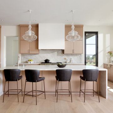
 Zaharias Design
Quartzite waterfall design on island with counter seating, panel ready appliances, plaster hood, stone backsplash wrapping into large window frame. Pocket doors closed for coffee station
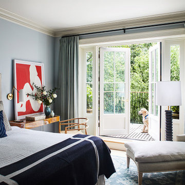
 The Brooklyn Studio
This Cobble Hill Brownstone for a family of five is a fun and captivating design, the perfect blend of the wife’s love of English country style and the husband’s preference for modern. The young power couple, her the co-founder of Maisonette and him an investor, have three children and a dog, requiring that all the surfaces, finishes and, materials used throughout the home are both beautiful and durable to make every room a carefree space the whole family can enjoy.
The primary design challenge for this project was creating both distinct places for the family to live their day to day lives and also a whole floor dedicated to formal entertainment. The clients entertain large dinners on a monthly basis as part of their profession. We solved this by adding an extension on the Garden and Parlor levels. This allowed the Garden level to function as the daily family operations center and the Parlor level to be party central. The kitchen on the garden level is large enough to dine in and accommodate a large catering crew.
On the parlor level, we created a large double parlor in the front of the house; this space is dedicated to cocktail hour and after-dinner drinks. The rear of the parlor is a spacious formal dining room that can seat up to 14 guests. The middle "library" space contains a bar and facilitates access to both the front and rear rooms; in this way, it can double as a staging area for the parties.
The remaining three floors are sleeping quarters for the family and frequent out of town guests. Designing a row house for private and public functions programmatically returns the building to a configuration in line with its original design.
This project was published in Architectural Digest.
Photography by Sam Frost
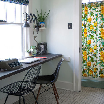
 Adrienne DeRosa
Utilizing extra space in their mudroom, the Mohrmans created a workspace for general daily operations and for Kiel's at-home furniture business MidWest Woods Furniture Co. "We had had our previous office in one of the upstairs bedrooms, but realized after some time that this made the office feel somewhat unaccessible", says Chelsea. With the perfect area already carved out in the mudroom, the couple got to work.
Kiel created a simple counter solution by spanning the length of the wall with reclaimed barn wood that he received from a friend. He scooped up the black molded chair when his former school was getting rid of them. At the time it was only the seat, however the couple sourced the Eames DSW base from Design Within Reach.
Wall Color, Lightest Sky, by Pantone for Valspar
Photo: Adrienne DeRosa Photography © 2014 Houzz
Find the right local pro for your project
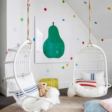
 Chango
Interior Design, Custom Furniture Design, & Art Curation by Chango & Co.
Photography by Raquel Langworthy
See the project in Architectural Digest
Kids' room - huge transitional gender-neutral carpeted kids' room idea in New York with multicolored walls
Kids' room - huge transitional gender-neutral carpeted kids' room idea in New York with multicolored walls
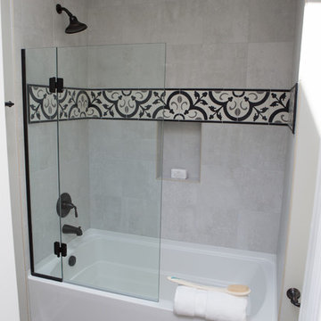
 Advance Design Studio, Ltd.
Mike and Anne of Barrington Hills desperately needed to update and renovate both their kid’s hall bath and guest bath, and in their 1980’s home each project presented a different set of unique challenges to overcome. When they set out to identify the right remodeling company to partner with, it was important to find a company that could help them to visualize design solutions for the bath renovations. When they came across Advance Design Studio’s website, they were immediately drawn to the solution-oriented remodeling process and the family friendly company.
They say they chose Advance Design because of the integrated approach of “Common Sense Remodeling”, making the design, project management and construction all happen in one place. When they met with Project Designer Michelle Lecinski, they knew they chose the right company. “Michelle’s excellent work on the initial designs made it easy to proceed with Advance Design Studio,” Mike said.
Like most homeowners anticipating a big renovation project, they had some healthy fears; with two bathrooms being remodeled at the same time they worried about timeframes and staying within budget. With the help of Michelle, and the “Common Sense” guidelines, they were confident that Advance Design would stay true, orchestrating all the moving parts to stay within both the estimated timeline and budget.
The guest bath offered the biggest design challenge. A dormer obstruction made the already cramped shower awkward to access. Mike and Anne also wanted the shower size to be expanded, making it more accommodating. Working with Advance’s construction expert DJ Yurik, Michelle relocated the shower concealing the original dormer and creating a larger, more comfortable and aesthetically pleasing guest shower.
The unsightly and not at all user-friendly closet was removed and replaced with elegant White Maple Dura Supreme cabinetry with much improved function featuring dual tall linen cabinets, a special makeup area and two sinks, providing a dual vanity which was extremely important for better guest use.
The Fossil Brown quartz countertop is in pleasing contrast to the white cabinetry, and coordinates nicely with the mocha porcelain tile gracing the shower for an accent. The decorative glazed turquoise tile backsplash, tile border, and bottle niche adds a taste of marine green to the room, while marble-looking porcelain tile makes guests feel they are staying in a 5-star hotel. Polished nickel Kohler plumbing fixtures were chosen to add a touch of sophistication. This renovated guest bath is comfortable and elegant, and Anne and Mike’s house guests may never want to leave!
“The end result was updated and restyled bathrooms that the client will enjoy and increase the value of their home,” Designer Michelle said.
The children’s hall bath had its own set of challenges. The current placement of the sink was not conducive to the best use of the existing space, nor did it allow for any visual interest, something Advance’s designers always work to achieve even within the tight confines of a small bath. Advance removed the linen closet and used the gain in wall space to create a dramatic focal point on the vanity wall. They also took additional space that wasn’t being used for new Storm Gray Dura Supreme tall built-in linen cabinets, creating functional storage space that the former bath lacked. A customized glass splash panel was created for the bath, and the high ceilings with skylights were accented with a custom-made track lighting fixture featuring industrial pipe and cage materials.
Authentic cement encaustic tile was used wall to wall surrounding the vanity to create a dramatic and interesting back drop for the new elegant and stately furniture-like double sink wall. Hand-made encaustic tile originated in Western Europe beginning in the 1850’s and reminded Mike and Anne of tile they had seen and loved from their travels overseas. Today, encaustic tile has made a re-appearance in today’s modern bath design with its wide array of appealing patterns and artistic use of color.
Oil rubbed bronze Kohler fixtures echo the black accents in the beautiful tile pattern and reflect the matte black of the unique lighting detail. Easy to maintain Blanca Arabescato Quartz countertops add practicality and natural beauty and compliments the warm wood porcelain tile floors. This handsome bath has generated praise from friends and family even before it’s complete unveiling as photos of the space leaked out on social media! It’s not only completely functional to use, but especially pretty to look at.
“Advance Design Studio did a terrific job for us. We really appreciated how easy it was to work with them on a complex project of the complete remodeling of two bathrooms. They very capably handled all the details from design, to project management, to construction. It is a great group of people to work with and we would welcome the opportunity to work with them again anytime,” Mike said.
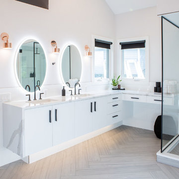
 TVL Creative Ltd.
Our clients were looking to erase the 90s from their master bathroom and create a space that blended their contemporary tastes with natural elements. This bathroom had wonderful bones with a high ceiling and plenty of space, but we were able to work with our clients to create a design that better met their needs and utilized the space to its full potential. We wanted to create a sense of warmth in this large master bathroom and adding a fireplace to the space did the trick. By moving the tub location, we were able to create a stunning accent wall of stacked stone that provided a home for the fireplace and a perfectly dramatic backdrop for the new freestanding bathtub. The sculptural copper light fixture helps to soften the stone wall and allowed us to emphasize those vaulted ceiling. Playing with metal finishes is one of our favorite pastimes, and this bathroom was the perfect opportunity to blend sleek matte black plumbing fixtures with a mirrored copper finish on the light fixtures. We tied the vanity wall sconces in with a dramatic sculptural chandelier above the bath tub by using copper finishes on both and allowing the light fixtures to be the shining stars of this space. We selected a clean white finish for the custom vanity cabinets and lit them from below to accentuate their floating design. We then completed the look with a waterfall quartz counter to add an elegant texture to the area and extended the stone onto the shower bench to bring the two elements together. The existing shower had been on the small side, so we expanded it into the room and gave them a more spacious shower complete with a built-in bench and recessed niche. Hard surfaces play an important role in any bathroom design, and we wanted to use this opportunity to create an interesting layer of texture through our tile selections. The bathroom floor utilizes a large-scale plank tile installed in a herringbone pattern, while the shower and walls are tiled in a polished white tile to add a bit of reflectivity. The newly transformed bathroom is now a sophisticated space the brings together sleek contemporary finishes with textured natural elements and provides the perfect retreat from the outside world.
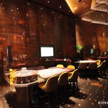
 Kinon Surface Design
The beautiful Aria Hotel and Casino in Las Vegas, Nevada utilizes Kinon resin surface design to create a bold, classy look.
Minimalist home design photo in Las Vegas
Minimalist home design photo in Las Vegas

Sponsored
Delaware, OH

Buckeye Basements, Inc.
Central Ohio's Basement Finishing ExpertsBest Of Houzz '13-'21
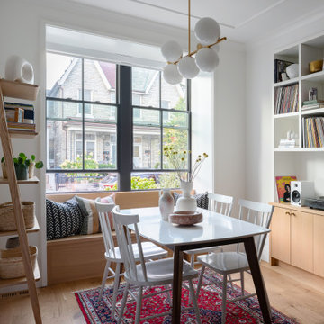

 Advance Design Studio, Ltd.
After six years of living in their Huntley IL home, Chris and Meghan were tired of their dark, dingy, outdated kitchen and it was finally time for a long-anticipated change. “The kitchen is the place where we live, it’s where we do everything,” Meghan said. “It was important that it be a space where we wanted to be.” Meghan loves cooking and enjoys including their girls in healthy meal prepping, this led them to want a brighter, more enjoyable kitchen with increased functionality and improved storage.
For Chris especially, the laundry room was an entirely dysfunctional eyesore. “We had a washer and a dryer, but it was all kind-of cobbled together!” Chris said. “There were always laundry piles everywhere, we weren’t really sure what we wanted to do in there, but it was time for us to make a change.” The mess of the space was stressful every time they walked in the door from the garage each day. Kids’ backpacks and shoes piled up haphazardly in the makeshift boot-bench closet left the family feeling disorganized and stressed. They needed space for folding clothes and locker cubbies to help keep the family organized.
Having known Christine and Todd in the Huntley community for years, Chris and Meghan were familiar with their work. “We already trusted them personally and having seen their projects for years we knew they did top notch work. After we reviewed the initial round of designs, we knew that hiring them was definitely the right choice,” Meghan and Chris said. Although Chris had done a lot of work in their home himself, the kitchen and laundry room renovation was such a large undertaking that he didn’t want to steal time away from his family to spend what would surely be many long weekends doing the job himself. “That would not have been a wise choice for us,” Chris laughed.
“Our designer, Michelle was very, very, easy to work with; anything we wanted to see or weren’t sure about, she went above and beyond to make this easy for us. She was easy to get hold of and always quick to respond,” the couple said. Michelle pulled ideas that mirrored the couple’s taste and style and was adept at directing the couple to limited choices that didn’t overwhelm them and kept the process moving. “I have a hard time making decisions. Michelle made the decision-making process so easy. I loved how she listened to what I liked and then presented three great options for me to choose from,” Meghan said.
The main objectives for the kitchen were better storage solutions, they wanted the space to reflect their lifestyle and taste, and they wanted it to last for years with low maintenance. One of the first steps in creating a more functional kitchen was relocating the refrigerator, creating an improved workflow for the busy family.
“We didn’t know that we could even move the refrigerator to a new location where it is now, that was something that we never would have thought of,” Chris said. “The new refrigerator location makes the kitchen feel so much bigger. We didn’t add any space, but our whole kitchen with the new design just seems like it’s so much larger than before!” Meghan said.
The perimeter mist colored cabinets helped warm and brighten the entire room, while the graphite colored cabinets on the island added contrast. Using this fresh, clean color palette satisfied the couple’s desire for a bright space that was the exact opposite of what they had before. Organization accessories were also added to the cabinets such as a spice drawer tray and roll outs to create hidden convenience.
“I absolutely love the hidden spices – it makes cooking so much more enjoyable!” Chris said. “And all the pull outs, and the double trash bin, who would think you could get so excited about organization!” the couple said in unison.
One thing they hated in their original kitchen was how dark the space felt. Added lighting on the ceiling with the new light fixtures combined with the lighter cabinetry colors throughout solved this problem. “Our new kitchen has this warm, almost cozy feeling that our old kitchen never had, it’s just a space that I love spending my time in now,” Meghan said. The light airy feeling was accentuated with the use of floating white shelves on either side of the decorative range hood. “We have so much cabinetry space, the new design is amazing we actually have more storage space than we will ever need,” Meghan said.
The island was extended to create more work surface and added space for stool seating. “The new island changes how we live. Now the kids can be in the kitchen with us, doing homework, eating breakfast, and the three of us have special dinners there when Chris is working late,” Meghan said.
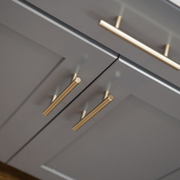
The Carrara Marmi Quartz countertops were chosen because they are, not only beautiful, but are made from hard-working material that doesn’t require maintenance. The white subway tile backsplash that wraps to the ceiling behind the focal point cooktop range/hood compliments the crisp white countertops perfectly, while brushed brass hardware and light fixtures keep the design fresh and new.
The couple had a few fears at the beginning of the project, as most homeowners do. Their biggest fear was being out of their kitchen and laundry room for an extended time. The crew made it very easy for the family to work in a limited space keeping the washer and dryer hooked up the majority of the time, and also getting appliances working with minimal downtime.
“They above and beyond accommodated us to get us through the process,” Meghan said. “They did a great job making sure we were as comfortable as possible throughout the process,” Chris added.
“Our project manager DJ did a great job. He was very good at updating us on schedule changes, getting guys in as quickly as possible. Everyone that stepped in the house was nice and did great work,” said Chris. They thought Advance’s carpenter was phenomenal and were impressed when he took a conceptual idea from a photograph and worked with designer Michelle to create a one of a kind range/hood that has become the topic of conversation with friends and family who visit the new kitchen. “He was in our house literally every day for several weeks. He was easy to work with and good at what he did,” Meghan and Chris said.
The focal point of the kitchen; a hand-crafted, custom-built ventilation hood was clad with handpicked reclaimed barnwood. Advance Design’s carpenter built the framework and the cladding to create a one-of-a-kind design element that the couple loves.
“I think it was especially fun for him to create something unique from scratch, showcasing his talent in this area,” Meghan said. “I love that my kitchen is not like everyone else’s. I got to pick out the wood on my hood and watch it being built and was able to choose what pieces of wood went where on it. It’s totally unique.”
Red Oak flooring was toothed-in throughout the kitchen and the rest of the first floor anywhere changes were made. Then the whole floor was refinished to tone down the orange undertones in the existing floor stain, ultimately changing the color complexion of the entire first floor. The result is a completely new feeling to the entire home.
Renovating the laundry room was extremely important to Meghan and Chris, but they had trouble visualizing what the possibilities were for the seemingly small space. Michelle produced beautiful 3D illustrations that helped them envision the space in a whole new way.
“I must have told Michelle 100 times that I am a visual person, seeing the designs in 3D made it so easy to make decisions and see what we could really do with our space,” Meghan said.
A dividing wall and doorway were removed between the existing laundry room and hallway formerly containing a coat closet, providing space to design specialized graphite colored cabinetry matching the kitchen island to house custom storage cubbies for each family member. Adding the tall utility cabinetry in the new laundry area helped solve the storage issue, tucking away cleaning supplies, household items, and even the cat got its own cubby.
“I love how everything is now hidden in its own space. I can’t tell you how much I hated coming home and seeing everything sitting around on counters,” Chris said.
Electrical outlets were planned for the inside of utility cabinets, so devices could charge in hidden locations. Stacking the washer and dryer allowed for wider countertop space to provide a folding area and a special space for clothes to hang. “The way I do laundry has been completely transformed! I can actually fold clothes and hang them now right out of the washer and dryer,” Meghan said.
“The end result in the kitchen and the laundry/mud room was an updated light and bright space, with a smarter work flow that better meets the needs of this family,” Michelle said.
“I would totally recommend Advance Design,” Meghan said. “Sometimes I sit and just look at my kitchen and laundry room and think ‘Wow, I can’t believe I get to live here!’ It’s an understatement to say we love our new space.”
 Sweet Smiling Landscape Design
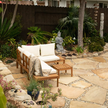
When I came to this property not only was the landscape a scrappy mess the property also had some very real grading and drainage issues that were jeopardizing the safety of this house. As recent transplants from New Jerseys to Southern California these clients were in awe of all the plants they were seeing in their neighborhood. Living on the water at the Ventura harbor they wanted to be able to take full advantage or the outdoor lifestyle and cool ocean breeze. Being environmentally conscious citizens, these clients were very concerned that their garden was designed with sustainability as a leading factor. As they said in our initial consultation, “Would want or garden be part of the solution not part of the problem.”
This property is the last house on the bottom of a gently sloping street. All the water from the neighbor’s houses drain onto this property. When I came into this project the back yard sloped into the house. When it would rain the water would pool up against the house causing water damage. To address the drainage we employed several tactics. Firstly, we had to invert the slope in the back yard so that water would not pool against the house. We created a very minor slope going away from the house so that water drains away but so the patio area feels flat.
The back of the back yard had an existing retaining wall made out of shabby looking slump stone. In front of that retaining wall we created a beautiful natural stone retaining wall. This retain wall severs many purposes. One it works as a place to put some of the soil removed from the grading giving this project a smaller carbon foot print (moving soil of a site burns a lot of fossil fuel). The retaining wall also helps obscure the shabby existing retaining wall and allows for planting space above the footing from the existing retaining wall. The soil behind the ne retaining wall is slightly lower than the top of the wall so that when the run on water on from the neighbor’s property flows it is slowed down and absorbed before it has a chance to get near the house. Finally, the wall is at a height designed to serve as overflow seating as these clients intend to have occasional large parties and gatherings.
Other efforts made to help keep the house safe and dry are that we used permeable paving. With the hardscape being comprised of flag stone with gravel in-between water has a chance to soak into the ground so it does not flow into spots where it will pool up.
The final element to help keep the house dry is the addition of infiltration swales. Infiltration swales are depressions in the landscape that capture rain water. The down spouts on the sides of the houses are connected to pipe that goes under the ground and conveys the water to the swales. In this project it helps move rain water away from the house. In general, these Infiltration swales are a powerful element in creating sustainable landscapes. These swales capture pollutants that accumulate on the roof and in the landscape. Biology in the soil in the swales can break down these pollutants. When run of watered is not captured by soil on a property the dirty water flows into water ways and then the ocean were the biology that breaks down the pollutants is not as prolific. This is particularly important in this project as it drains directly into the harbor. The water that is absorbed in to the swales can replenish aquafers as well as increasing the water available to the plants planted in that area recusing the amount of water that is needed from irrigation.
When it came to the planting we went with a California friendly tropical theme. Using lots of succulents and plants with colorful foliage we created vibrant lush landscape that will have year around color. We planted densely (the images in the picture were taken only a month after installation). Taller drought tolerant plants to help regulate the temperature and loss of water from the plants below them. The dense plantings will help keep the garden, the house and even the neighborhood cooler on hot days, will provide spaces for birds to enjoy and will create an illusion of depth in a somewhat narrow space.
Today this garden is a space these homeowners can fully enjoy while having the peace of mind that their house is protected from flooding and they are helping the environment.
 Urbanology Designs
A captivating transformation in the coveted neighborhood of University Park, Dallas
The heart of this home lies in the kitchen, where we embarked on a design endeavor that would leave anyone speechless. By opening up the main kitchen wall, we created a magnificent window system that floods the space with natural light and offers a breathtaking view of the picturesque surroundings. Suspended from the ceiling, a steel-framed marble vent hood floats a few inches from the window, showcasing a mesmerizing Lilac Marble. The same marble is skillfully applied to the backsplash and island, featuring a bold combination of color and pattern that exudes elegance.
Adding to the kitchen's allure is the Italian range, which not only serves as a showstopper but offers robust culinary features for even the savviest of cooks. However, the true masterpiece of the kitchen lies in the honed reeded marble-faced island. Each marble strip was meticulously cut and crafted by artisans to achieve a half-rounded profile, resulting in an island that is nothing short of breathtaking. This intricate process took several months, but the end result speaks for itself.
To complement the grandeur of the kitchen, we designed a combination of stain-grade and paint-grade cabinets in a thin raised panel door style. This choice adds an elegant yet simple look to the overall design. Inside each cabinet and drawer, custom interiors were meticulously designed to provide maximum functionality and organization for the day-to-day cooking activities. A vintage Turkish runner dating back to the 1960s, evokes a sense of history and character.
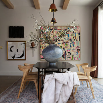
The breakfast nook boasts a stunning, vivid, and colorful artwork created by one of Dallas' top artist, Kyle Steed, who is revered for his mastery of his craft. Some of our favorite art pieces from the inspiring Haylee Yale grace the coffee station and media console, adding the perfect moment to pause and loose yourself in the story of her art.
The project extends beyond the kitchen into the living room, where the family's changing needs and growing children demanded a new design approach. Accommodating their new lifestyle, we incorporated a large sectional for family bonding moments while watching TV. The living room now boasts bolder colors, striking artwork a coffered accent wall, and cayenne velvet curtains that create an inviting atmosphere. Completing the room is a custom 22' x 15' rug, adding warmth and comfort to the space. A hidden coat closet door integrated into the feature wall adds an element of surprise and functionality.
This project is not just about aesthetics; it's about pushing the boundaries of design and showcasing the possibilities. By curating an out-of-the-box approach, we bring texture and depth to the space, employing different materials and original applications. The layered design achieved through repeated use of the same material in various forms, shapes, and locations demonstrates that unexpected elements can create breathtaking results.
The reason behind this redesign and remodel was the homeowners' desire to have a kitchen that not only provided functionality but also served as a beautiful backdrop to their cherished family moments. The previous kitchen lacked the "wow" factor they desired, prompting them to seek our expertise in creating a space that would be a source of joy and inspiration.
Inspired by well-curated European vignettes, sculptural elements, clean lines, and a natural color scheme with pops of color, this design reflects an elegant organic modern style. Mixing metals, contrasting textures, and utilizing clean lines were key elements in achieving the desired aesthetic. The living room introduces bolder moments and a carefully chosen color scheme that adds character and personality.
The client's must-haves were clear: they wanted a show stopping centerpiece for their home, enhanced natural light in the kitchen, and a design that reflected their family's dynamic. With the transformation of the range wall into a wall of windows, we fulfilled their desire for abundant natural light and breathtaking views of the surrounding landscape.
Our favorite rooms and design elements are numerous, but the kitchen remains a standout feature. The painstaking process of hand-cutting and crafting each reeded panel in the island to match the marble's veining resulted in a labor of love that emanates warmth and hospitality to all who enter.
In conclusion, this tastefully lux project in University Park, Dallas is an extraordinary example of a full gut remodel that has surpassed all expectations. The meticulous attention to detail, the masterful use of materials, and the seamless blend of functionality and aesthetics create an unforgettable space. It serves as a testament to the power of design and the transformative impact it can have on a home and its inhabitants.
Project by Texas' Urbanology Designs. Their North Richland Hills-based interior design studio serves Dallas, Highland Park, University Park, Fort Worth, and upscale clients nationwide.

 a.d.d. concept + design
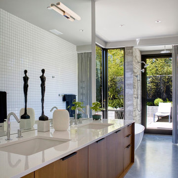
Small country master white tile and porcelain tile concrete floor bathroom photo in San Francisco with an undermount sink, solid surface countertops, a two-piece toilet, white walls and medium tone wood cabinets
Sponsored
Delaware, OH
Buckeye Basements, Inc.
Central Ohio's Basement Finishing ExpertsBest Of Houzz '13-'21
 Summer Thornton Design, Inc
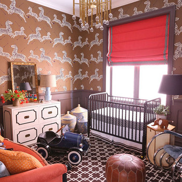
Zebra wallpaper straight from The Royal Tenenbaums makes a bold statement in this nursery. Dark, traditional furniture pops with bright velvets and a graphic, chocolatey carpet.
Summer Thornton Design, Inc.
 iCork Floor
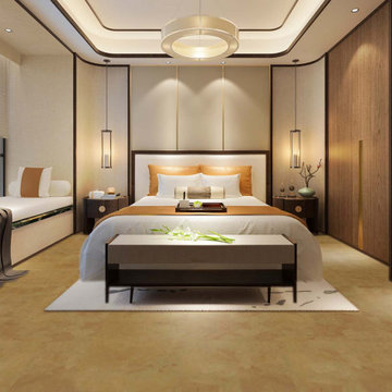
Fusion Cork flooring is clean, durable as stone, and warm to walk on, and is fabulous for people suffering from allergies and asthma
Bedroom photo
Bedroom photo
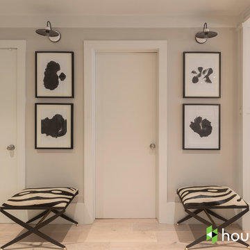
 Breeze Giannasio Interiors
Photo: Carolyn Reyes © 2017 Houzz
Transitional light wood floor and beige floor hallway photo in Los Angeles with gray walls
Transitional light wood floor and beige floor hallway photo in Los Angeles with gray walls

 Guggenheim Architecture + Design Studio
Josh Partee Photography
With sweeping views of the Willamette river and Mt. Hood, this Atwater Place condo was designed with a balance of minimalism and livability in mind. A complete kitchen remodel brought a dark interior kitchen to the light and a full furnishings package welcomed Los Angeles transplants home to their new modern and bright residence. Our clients, a retired camera operator for both feature films and television and a producer/production manager on numerous television series including Weeds and The Middle, relocated from their traditionally-styled LA bungalow to Portland in the Summer of 2014. The couple sought a design departure from their long-term California residence and a fresh start for their new life in the South Waterfront.
With only two pieces of sentimental furniture and a handful of artwork included in the plan, we set out to create a comfortable and clean-lined furnishings package complimenting the broad southeast views. Organically shaped upholstery pieces juxtaposed with angular steel and wood tables create a soft balance in the open floor plan. Several custom pieces, including a dining table designed by our studio and a custom hand-blown glass chandelier crafted by Scott Schiesel with Lightlite compliment timeless pieces from Knoll, Herman Miller, and B&B Italia.
The kitchen is designed to reflect light and create brilliance in a space that is otherwise naturally dark. A material balance of stainless steel, back painted glass, quartz composite, lacquer, and mirror all play their part in creating a vibrant cooking environment. We collectively decided to forgo the traditional island pendant for a linear commercial fixture that provides tremendous light to the prep surface and creates an unexpected architectural element. The mirrored prep island creates the illusion of open space while concealing casework and wine storage on the working side of the kitchen.
It is worth noting that this project was designed and installed almost entirely while our clients were still living in LA and wrapping up professional obligations and selling their home. This afforded us the tremendous opportunity to send our clients to showrooms not available in Portland to view key pieces before final specification. Textiles and finish samples were approved via mail and communication took place over e-mail, telephone, and an occasional office visit. This unique process lead to a successful result and a beautifully balanced living environment.

Sponsored
Columbus, OH

Hope Restoration & General Contracting
Columbus Design-Build, Kitchen & Bath Remodeling, Historic Renovations
 Granit Architects + Interiors
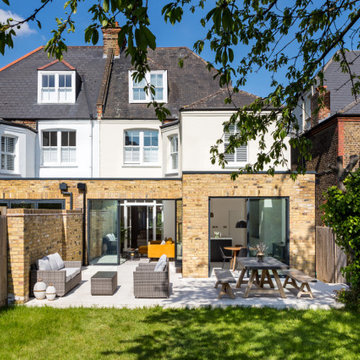
Our clients for this project are a professional couple with a young family. They approached us to help with extending and improving their home in London SW2 to create an enhanced space both aesthetically and functionally for their growing family. We were appointed to provide a full architectural and interior design service, including the design of some bespoke furniture too.
A core element of the brief was to design a kitchen living and dining space that opened into the garden and created clear links from inside to out. This new space would provide a large family area they could enjoy all year around. We were also asked to retain the good bits of the current period living spaces while creating a more modern day area in an extension to the rear.
It was also a key requirement to refurbish the upstairs bathrooms while the extension and refurbishment works were underway.
The solution was a 21m2 extension to the rear of the property that mirrored the neighbouring property in shape and size. However, we added some additional features, such as the projecting glass box window seat. The new kitchen features a large island unit to create a workspace with storage, but also room for seating that is perfect for entertaining friends, or homework when the family gets to that age.
The sliding folding doors, paired with floor tiling that ran from inside to out, created a clear link from the garden to the indoor living space. Exposed brick blended with clean white walls creates a very contemporary finish throughout the extension, while the period features have been retained in the original parts of the house.
 Elza B. Design, Inc.
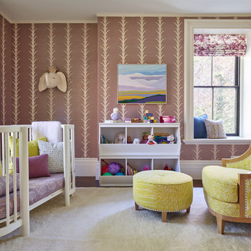
I designed a sophisticated, soothing room for a little girl. The goal was to make it whimsical enough but not so cute she could not grow into it. Notice the use of plants, animals and landscapes as a tool to create a peaceful environment. Large oil paintings evoke dreamy landscapes, the acanthus plant stripe of the grass cloth wallpaper makes one feel surrounded and safe. Birds, elephants and butterflies are part of the magical decor. Lots of texture and patterns create interest. Finally, old is blended with new (antique bird illustrations, old pine chest, modern crib, etc) to create an eclectic and inviting interior.
Photos by Jared Kuzia
 Dura Supreme Cabinetry
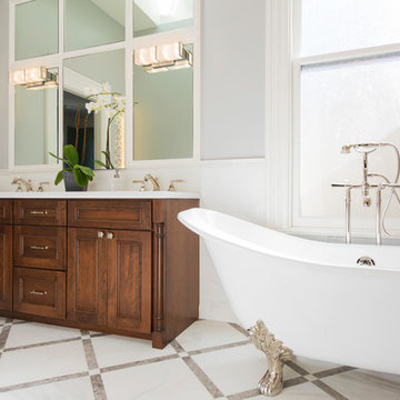
With an ideal location in the Pacific Heights neighborhood of San Francisco, this dated Victorian residence had "beautiful bones" but had been sitting on the market for a year before being purchased with plans to revitalize the interior. Interior designer, Noel Han, explained, "Historical Victorian homes in this area often have beautiful architectural elements that I aim to preserve, but the floor plan and layout tend to be stuffy, not live-able and not light filled. Modern families want bright, light-filled, spacious rooms that take advantage of outdoor views and living spaces, and function well for storage, meals and entertaining."
Preserving the architectural integrity and special features of the home was one of Han's goals but at the same time, she re-designed the space, moving walls and adding windows to create an open floorplan that flowed easily between the kitchen and outdoor living spaces. Where the range once stood in the original design, now an entire wall of windows provides panoramic views of the outdoors and fills the kitchen with light. Below the windows, Han designed a long bank of base cabinets with drawers to provide plenty of storage and work surface. Light now pours into the space even on foggy days. The range was moved to the opposite wall so that beautiful window views could be added to the kitchen.
Han selected a palette of finishes with an eye toward creating a "soft color aesthetic". "White painted finishes are very popular right now but would have felt stark and cold in this space," she explained. "The French grey paint from Dura Supreme was a perfect complement for this vintage Victorian home, to create a classic color scheme".
"This beautiful home already had hardware elements with a vintage brass finish, so I carefully selected antiqued, brushed brass hardware, plumbing and metal finishes to blend with the original elements," said Han. She continued, "The La Cornue French Range adds modern function with a French antique look."
"I appreciate working with Dura Supreme cabinetry because of the quality of the cabinetry, fast delivery and the custom options. I'm able to create beautiful architectural details like the pull-out columns on both sides of the range and the curved mullion doors on the furniture hutch, and they offer a stunning palette of finishes and styles," explained Han. For the bath cabinetry, Han created a similar palette of finishes and styles to create a complementary look throughout the entire home.
Product Details:
Perimeter: Dura Supreme Cabinetry shown in the St. Augustine door style and Mullion Pattern #15 door style with a “Zinc” painted finish.
Kitchen Island: Dura Supreme Cabinetry shown in the St. Augustine door style with a Clove stain and Black Accent finish on Cherry wood.
For more information about Noel Han, Interior Designer, click to her website here www.atelnoel.com.
For more information about Gilmans Kitchens and Baths, click to their website here www.gkandb.com.
Photography by: Ned Bonzi www.nedbonzi.com.
Request a FREE Dura Supreme Brochure Packet:
http://www.durasupreme.com/request-brochure
81