
Search results for "Crisp visuals" in Home Design Ideas
 Miriam Dillon, Barnes Vanze Architects, Inc.
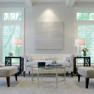
We first chose rugs to set the stage. Our client had found a pattern she liked for the living room, and we helped choose the silvery-gray color, which works as a foil for the champagne coffee table, the gray slipper chairs, and the white, curved-arm sofa. The dark console, which we moved from another room, along with the smart end tables provide visual anchors to the natural light that floods this room. Photo by Anice Hoachlander
 Miriam Dillon, Barnes Vanze Architects, Inc.
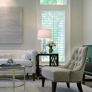
We first chose rugs to set the stage. Our client had found a pattern she liked for the living room, and we helped choose the silvery-gray color, which works as a foil for the champagne coffee table, the gray slipper chairs, and the white, curved-arm sofa. The dark console, which we moved from another room, along with the smart end tables provide visual anchors to the natural light that floods this room. Photo by Anice Hoachlander
 Beyond the Box Design Collective
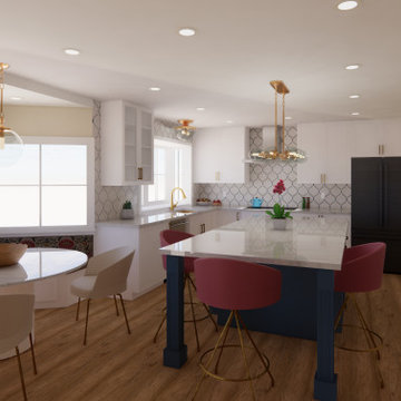
In the conceptual design phase of a Scandinavian modern kitchen rendered in Revit, with a color scheme of gold, blue, white, and green, we aim to create a sophisticated and harmonious space that combines Scandinavian minimalism with luxurious accents. Here's an overview of the key elements and features to consider:
Color Palette: We used a combination of crisp white as the base color, complemented by accents of gold, blue, and pink. The white walls and cabinetry create a clean and bright backdrop, while gold accents add a touch of luxury. Blue and green elements provide a refreshing and natural vibe.
Cabinetry: We opted for sleek, handle-less cabinetry in a bright white finish. This maintains the minimalist aesthetic and allows the gold, blue, and green accents to stand out. We incorporated gold hardware to add a touch of elegance and luxury to the cabinetry.
Countertops: We choose a light-colored countertop porcelain material shades of white with gold accents. This complements the overall color palette and provides a timeless and sophisticated look.
Backsplash: The cream, blue, and green mosaic tile backsplash to introduce color and visual interest. The sleek and simple design of the tile helps maintain the Scandinavian aesthetic.
Lighting: Incorporate ample natural light through windows to create a sense of openness. The natural light is complemented by modern gold pendant lights in a minimalist designwith an added a touch of luxury.
Appliances: Opt for stainless steel appliances with clean lines and a sleek appearance to blend seamlessly into the design. Choose energy-efficient models that offer modern features while maintaining a minimalist aesthetic.
Furniture and Accessories: Select furniture with clean lines and a mix of natural materials such as light wood, Scandinavian fabric, and metal. Greenery is introduced through potted plants or herb gardens to bring a natural element to the space.
Finishing Touches: The design is completed with additional gold accents through cabinet handles, faucets, or decorative elements. Add a touch of warmth with natural wood cutting boards or bowls.
Through Revit rendering, I help clients visualize and refine the design, ensuring that the gold, blue, white, and green color scheme is seamlessly integrated into the Scandinavian modern kitchen. We focused on simplicity, functionality, and the harmonious combination of luxurious and natural elements to achieve an inviting and visually stunning space.
Find the right local pro for your project
 Petite Surprise
Cecilia Anspach
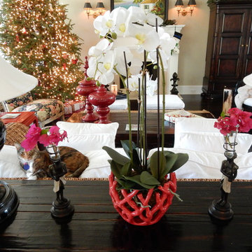
Large transitional enclosed dark wood floor living room photo in Miami with beige walls, a standard fireplace, a stone fireplace and a concealed tv
Large transitional enclosed dark wood floor living room photo in Miami with beige walls, a standard fireplace, a stone fireplace and a concealed tv
 Simply Home Decorating
This penthouse condo in Raven Woods is home to an adventurous, nature-loving couple. With their children grown and starting families of their own, Jeremy and Cynthia (names changed) chose to downsize their livable space and “upsize” in quality and luxury.
The couple hired us to help them achieve several well-defined goals: feeling immersed and connected to nature, having warm and welcoming spaces to host their family and friends, and selecting pieces that would support local makers and artisans. (If you know me, you know that nature, connection, and community are some of my most important values, personally and professionally — the perfect fit!)
Using our comprehensive design process, we spent months designing, procuring, and installing their new, long-time home. The resulting spaces are breathtaking, creating a daily living experience that is full of serenity and bliss.
Welcoming & Bright Home with Forest Views:
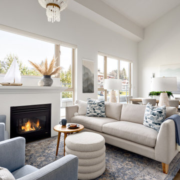
Ahhh… can you imagine coming home to a space as bright and soothing as this one? To find inspiration for this home’s interiors, we needed to look no further than out the windows, where mountain views greet us to the north and the ocean beckons from the south.
Paying homage to their locale, we curated a colour palette of subtle blues and grays, warm-toned woods, and natural materials, all set against a crisp, white backdrop. These help us create a seamless visual transition between the interior and exterior. Let’s start our tour in the living area…
A Cozy Living Area with Warmth & Dimension:
In the living area, the fireplace was the starting point for the design, as it determined the size of the space and the scale of our furnishings. To keep this area feeling cozy but not crowded, we selected this soft ottoman to serve as a table surface with a tray or as additional seating when Jeremy and Cynthia host guests. (Multi-purpose items are one of the 5 elements of The Simple Home.)
Additional textures — the sofa, upholstered swivel chairs, pillows, and ceramic wall art reminiscent of sand dollars — offer further depth and dimension in this simple yet layered space. The result is a cozy living room area perfect for a relaxing read on an overcast day or a social evening by the fire.
While daunting at first, this home’s small and open footprint offered a special opportunity for us to design thoughtful “zones”. To create a defined living space, we used an area rug to establish a border and situated the larger seating (the sofa) on the right. Its visual weight serves as a grounding barrier that naturally separates the living and dining areas.
Overhead, the centrally located brass and glass chandelier serves as another focal point, making the entire living area feel like one unit. Last but not least…
Styled with tall decorative lamps, this light oak and rattan console sits just behind the sofa, creating an additional visual barrier between the living and dining areas. We styled it with accessories that complement the overall palette, and it has the added benefit of providing storage right where Jeremy and Cynthia need it, the dining area.
An Art-Infused Dining Area:
The dining area is warm, woodsy, and filled with locally sourced art that Jeremy and Cynthia love. Next to the console is a custom textile piece from Vancouver artist, With Strings Attached, that mimics the scenic, mountain backdrop. The blue hues of the piece work in harmony with the warm wood dining table, cool gray upholstered chairs, and neutral stools at the kitchen bar.
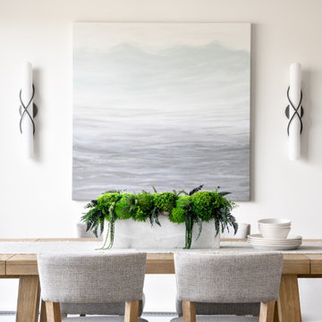
On the other side of the space, is Jeremy’s and Cynthia’s favourite piece, a commissioned work of art by local maker, Katie Napier. Carefully positioned in a central location and framed by two modern sconces, this piece captures the feel of gentle waters on a misty day and evokes calm.
Other curated pieces include this rectangular vessel centrepiece by sculptural artist, Martha Sturdy, bearing a stunning moss arrangement by Soul Roots Moss Art. As this couple can attest, a treasured memento or piece of art can transform your space and your mood, transporting you to a relaxed and peaceful state.
A Bedroom Full of Light & Texture:
This beautiful bedroom is another manifestation of Jeremy and Cynthia’s favourite experiences: hiking the rainforest trails and enjoying the spray of the sea. The blue-and-green branching pattern found in the window treatments and pillows ground the space, while bright turquoise lamps — akin to sea glass — infuse the room with a touch of coastal vibrance.
Similar to the living area, we added comfort through texture and warm tones, incorporating oak end tables, natural woven wall decor above the headboard, knitted ottomans at the foot of the bed, a textured duvet, and an extra plush area rug.
A Loft Inspired by Flora & Fauna:
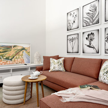
For the loft space, we moved away from coastal elements and decided to ground the space in the more earthy elements of nature: flora and fauna. We selected an umber-hued sofa complemented by floral decorative pillows and walls adorned with botanical prints by Heather Johnston.
This multi-purpose space serves as a reprieve for our clients to read, practice yoga, and relax. Alternatively, a Frame TV intentionally meant to blend as art allows the space to function as a secondary entertainment space or a place for their granddaughter to play and sleep over.
Praise from Our Clients:
This home’s small footprint pushed us to be more resourceful in our furniture sourcing and more creative in our space planning. The result is a home as livable, beautiful, and intentional as any larger home would be. Most importantly, Jeremy and Cynthia love it!
“Lori listened to our love of nature and designed our condo reflecting that love. It is beautiful, serene, and welcoming. We couldn't be happier.”
If you’re ready to uncover the hidden potential in your home, that is what we do best. Contact us here or download our complimentary guide below to discover more.
 Simply Home Decorating
This penthouse condo in Raven Woods is home to an adventurous, nature-loving couple. With their children grown and starting families of their own, Jeremy and Cynthia (names changed) chose to downsize their livable space and “upsize” in quality and luxury.
The couple hired us to help them achieve several well-defined goals: feeling immersed and connected to nature, having warm and welcoming spaces to host their family and friends, and selecting pieces that would support local makers and artisans. (If you know me, you know that nature, connection, and community are some of my most important values, personally and professionally — the perfect fit!)
Using our comprehensive design process, we spent months designing, procuring, and installing their new, long-time home. The resulting spaces are breathtaking, creating a daily living experience that is full of serenity and bliss.
Welcoming & Bright Home with Forest Views:
Ahhh… can you imagine coming home to a space as bright and soothing as this one? To find inspiration for this home’s interiors, we needed to look no further than out the windows, where mountain views greet us to the north and the ocean beckons from the south.
Paying homage to their locale, we curated a colour palette of subtle blues and grays, warm-toned woods, and natural materials, all set against a crisp, white backdrop. These help us create a seamless visual transition between the interior and exterior. Let’s start our tour in the living area…
A Cozy Living Area with Warmth & Dimension:
In the living area, the fireplace was the starting point for the design, as it determined the size of the space and the scale of our furnishings. To keep this area feeling cozy but not crowded, we selected this soft ottoman to serve as a table surface with a tray or as additional seating when Jeremy and Cynthia host guests. (Multi-purpose items are one of the 5 elements of The Simple Home.)
Additional textures — the sofa, upholstered swivel chairs, pillows, and ceramic wall art reminiscent of sand dollars — offer further depth and dimension in this simple yet layered space. The result is a cozy living room area perfect for a relaxing read on an overcast day or a social evening by the fire.
While daunting at first, this home’s small and open footprint offered a special opportunity for us to design thoughtful “zones”. To create a defined living space, we used an area rug to establish a border and situated the larger seating (the sofa) on the right. Its visual weight serves as a grounding barrier that naturally separates the living and dining areas.
Overhead, the centrally located brass and glass chandelier serves as another focal point, making the entire living area feel like one unit. Last but not least…
Styled with tall decorative lamps, this light oak and rattan console sits just behind the sofa, creating an additional visual barrier between the living and dining areas. We styled it with accessories that complement the overall palette, and it has the added benefit of providing storage right where Jeremy and Cynthia need it, the dining area.
An Art-Infused Dining Area:
The dining area is warm, woodsy, and filled with locally sourced art that Jeremy and Cynthia love. Next to the console is a custom textile piece from Vancouver artist, With Strings Attached, that mimics the scenic, mountain backdrop. The blue hues of the piece work in harmony with the warm wood dining table, cool gray upholstered chairs, and neutral stools at the kitchen bar.
On the other side of the space, is Jeremy’s and Cynthia’s favourite piece, a commissioned work of art by local maker, Katie Napier. Carefully positioned in a central location and framed by two modern sconces, this piece captures the feel of gentle waters on a misty day and evokes calm.
Other curated pieces include this rectangular vessel centrepiece by sculptural artist, Martha Sturdy, bearing a stunning moss arrangement by Soul Roots Moss Art. As this couple can attest, a treasured memento or piece of art can transform your space and your mood, transporting you to a relaxed and peaceful state.
A Bedroom Full of Light & Texture:
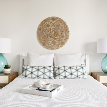
This beautiful bedroom is another manifestation of Jeremy and Cynthia’s favourite experiences: hiking the rainforest trails and enjoying the spray of the sea. The blue-and-green branching pattern found in the window treatments and pillows ground the space, while bright turquoise lamps — akin to sea glass — infuse the room with a touch of coastal vibrance.
Similar to the living area, we added comfort through texture and warm tones, incorporating oak end tables, natural woven wall decor above the headboard, knitted ottomans at the foot of the bed, a textured duvet, and an extra plush area rug.
A Loft Inspired by Flora & Fauna:
For the loft space, we moved away from coastal elements and decided to ground the space in the more earthy elements of nature: flora and fauna. We selected an umber-hued sofa complemented by floral decorative pillows and walls adorned with botanical prints by Heather Johnston.
This multi-purpose space serves as a reprieve for our clients to read, practice yoga, and relax. Alternatively, a Frame TV intentionally meant to blend as art allows the space to function as a secondary entertainment space or a place for their granddaughter to play and sleep over.
Praise from Our Clients:
This home’s small footprint pushed us to be more resourceful in our furniture sourcing and more creative in our space planning. The result is a home as livable, beautiful, and intentional as any larger home would be. Most importantly, Jeremy and Cynthia love it!
“Lori listened to our love of nature and designed our condo reflecting that love. It is beautiful, serene, and welcoming. We couldn't be happier.”
If you’re ready to uncover the hidden potential in your home, that is what we do best. Contact us here or download our complimentary guide below to discover more.
 Level One Construction
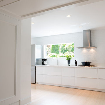
Seamless Elegance is a story bringing together both old and new. A cramped kitchen and a seldom-used den in a 100 year-old house were opened up to create a sprawling 300-sqft paradise. Obsessing over the little details was important to achieving our goal of seamless elegance.
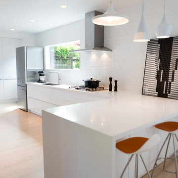
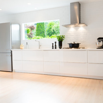
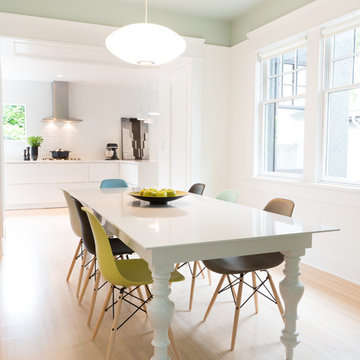
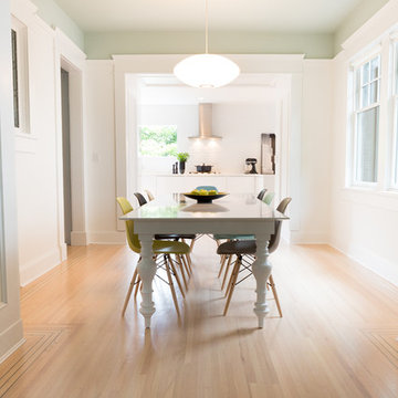
The archway and molding detail between the dining and living room was perfectly mirrored between the dining room and kitchen, right down to the hidden closets. A faux brick wall painted white was added to the back wall of the kitchen to give the illusion that the previous expansion was always there.
The existing 1.5” wide beautiful oak hardwood floor was matched to the rest of the house and continued into the kitchen. The flooring throughout the house was re-done at the same time to solidify the marriage between old and new; the result was a seamless transition into functionality. The character brought into the space by the oak hardwood floor and brick wall off sets the contemporary high gloss white cabinets.
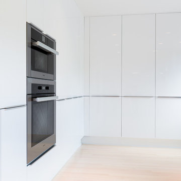
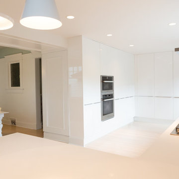
No upper cabinets were used in this design because we wanted to showcase the brick accent wall. The storage lost from zero upper kitchen cabinets was more than made up in floor-to-ceiling pantry. This corner pantry accommodates the bulk of storage for food and dishes in the kitchen. The subtraction of the upper cabinets allows the Tom Dixon pendant lights to be boldly featured over the eating peninsula.
Visual lines were a key aspect in this design helping the eye move throughout the space. The cabinet break lines are at the same height as the counter tops creating one continuous line. The paneled dishwasher blends perfectly with the rest of the kitchen cabinetry. The white quartz countertop flows down into a waterfall edge at the end of the eating peninsula, being the final grounding piece to visual lines.
Although the kitchen is all white, it is offset and given visual interest through texture and the use of different materials. The white allows the beautiful expensive appliances to be showcased along with the newly refinished flooring. The clean crisp kitchen will be the perfect backdrop to show case boldly colored art and accessories.


 Level One Construction
Seamless Elegance is a story bringing together both old and new. A cramped kitchen and a seldom-used den in a 100 year-old house were opened up to create a sprawling 300-sqft paradise. Obsessing over the little details was important to achieving our goal of seamless elegance.
The archway and molding detail between the dining and living room was perfectly mirrored between the dining room and kitchen, right down to the hidden closets. A faux brick wall painted white was added to the back wall of the kitchen to give the illusion that the previous expansion was always there.
The existing 1.5” wide beautiful oak hardwood floor was matched to the rest of the house and continued into the kitchen. The flooring throughout the house was re-done at the same time to solidify the marriage between old and new; the result was a seamless transition into functionality. The character brought into the space by the oak hardwood floor and brick wall off sets the contemporary high gloss white cabinets.
No upper cabinets were used in this design because we wanted to showcase the brick accent wall. The storage lost from zero upper kitchen cabinets was more than made up in floor-to-ceiling pantry. This corner pantry accommodates the bulk of storage for food and dishes in the kitchen. The subtraction of the upper cabinets allows the Tom Dixon pendant lights to be boldly featured over the eating peninsula.
Visual lines were a key aspect in this design helping the eye move throughout the space. The cabinet break lines are at the same height as the counter tops creating one continuous line. The paneled dishwasher blends perfectly with the rest of the kitchen cabinetry. The white quartz countertop flows down into a waterfall edge at the end of the eating peninsula, being the final grounding piece to visual lines.
Although the kitchen is all white, it is offset and given visual interest through texture and the use of different materials. The white allows the beautiful expensive appliances to be showcased along with the newly refinished flooring. The clean crisp kitchen will be the perfect backdrop to show case boldly colored art and accessories.
 Level One Construction
Seamless Elegance is a story bringing together both old and new. A cramped kitchen and a seldom-used den in a 100 year-old house were opened up to create a sprawling 300-sqft paradise. Obsessing over the little details was important to achieving our goal of seamless elegance.
The archway and molding detail between the dining and living room was perfectly mirrored between the dining room and kitchen, right down to the hidden closets. A faux brick wall painted white was added to the back wall of the kitchen to give the illusion that the previous expansion was always there.
The existing 1.5” wide beautiful oak hardwood floor was matched to the rest of the house and continued into the kitchen. The flooring throughout the house was re-done at the same time to solidify the marriage between old and new; the result was a seamless transition into functionality. The character brought into the space by the oak hardwood floor and brick wall off sets the contemporary high gloss white cabinets.
No upper cabinets were used in this design because we wanted to showcase the brick accent wall. The storage lost from zero upper kitchen cabinets was more than made up in floor-to-ceiling pantry. This corner pantry accommodates the bulk of storage for food and dishes in the kitchen. The subtraction of the upper cabinets allows the Tom Dixon pendant lights to be boldly featured over the eating peninsula.
Visual lines were a key aspect in this design helping the eye move throughout the space. The cabinet break lines are at the same height as the counter tops creating one continuous line. The paneled dishwasher blends perfectly with the rest of the kitchen cabinetry. The white quartz countertop flows down into a waterfall edge at the end of the eating peninsula, being the final grounding piece to visual lines.
Although the kitchen is all white, it is offset and given visual interest through texture and the use of different materials. The white allows the beautiful expensive appliances to be showcased along with the newly refinished flooring. The clean crisp kitchen will be the perfect backdrop to show case boldly colored art and accessories.
 Simply Home Decorating
This penthouse condo in Raven Woods is home to an adventurous, nature-loving couple. With their children grown and starting families of their own, Jeremy and Cynthia (names changed) chose to downsize their livable space and “upsize” in quality and luxury.
The couple hired us to help them achieve several well-defined goals: feeling immersed and connected to nature, having warm and welcoming spaces to host their family and friends, and selecting pieces that would support local makers and artisans. (If you know me, you know that nature, connection, and community are some of my most important values, personally and professionally — the perfect fit!)
Using our comprehensive design process, we spent months designing, procuring, and installing their new, long-time home. The resulting spaces are breathtaking, creating a daily living experience that is full of serenity and bliss.
Welcoming & Bright Home with Forest Views:
Ahhh… can you imagine coming home to a space as bright and soothing as this one? To find inspiration for this home’s interiors, we needed to look no further than out the windows, where mountain views greet us to the north and the ocean beckons from the south.
Paying homage to their locale, we curated a colour palette of subtle blues and grays, warm-toned woods, and natural materials, all set against a crisp, white backdrop. These help us create a seamless visual transition between the interior and exterior. Let’s start our tour in the living area…
A Cozy Living Area with Warmth & Dimension:
In the living area, the fireplace was the starting point for the design, as it determined the size of the space and the scale of our furnishings. To keep this area feeling cozy but not crowded, we selected this soft ottoman to serve as a table surface with a tray or as additional seating when Jeremy and Cynthia host guests. (Multi-purpose items are one of the 5 elements of The Simple Home.)
Additional textures — the sofa, upholstered swivel chairs, pillows, and ceramic wall art reminiscent of sand dollars — offer further depth and dimension in this simple yet layered space. The result is a cozy living room area perfect for a relaxing read on an overcast day or a social evening by the fire.
While daunting at first, this home’s small and open footprint offered a special opportunity for us to design thoughtful “zones”. To create a defined living space, we used an area rug to establish a border and situated the larger seating (the sofa) on the right. Its visual weight serves as a grounding barrier that naturally separates the living and dining areas.
Overhead, the centrally located brass and glass chandelier serves as another focal point, making the entire living area feel like one unit. Last but not least…
Styled with tall decorative lamps, this light oak and rattan console sits just behind the sofa, creating an additional visual barrier between the living and dining areas. We styled it with accessories that complement the overall palette, and it has the added benefit of providing storage right where Jeremy and Cynthia need it, the dining area.
An Art-Infused Dining Area:
The dining area is warm, woodsy, and filled with locally sourced art that Jeremy and Cynthia love. Next to the console is a custom textile piece from Vancouver artist, With Strings Attached, that mimics the scenic, mountain backdrop. The blue hues of the piece work in harmony with the warm wood dining table, cool gray upholstered chairs, and neutral stools at the kitchen bar.
On the other side of the space, is Jeremy’s and Cynthia’s favourite piece, a commissioned work of art by local maker, Katie Napier. Carefully positioned in a central location and framed by two modern sconces, this piece captures the feel of gentle waters on a misty day and evokes calm.
Other curated pieces include this rectangular vessel centrepiece by sculptural artist, Martha Sturdy, bearing a stunning moss arrangement by Soul Roots Moss Art. As this couple can attest, a treasured memento or piece of art can transform your space and your mood, transporting you to a relaxed and peaceful state.
A Bedroom Full of Light & Texture:
This beautiful bedroom is another manifestation of Jeremy and Cynthia’s favourite experiences: hiking the rainforest trails and enjoying the spray of the sea. The blue-and-green branching pattern found in the window treatments and pillows ground the space, while bright turquoise lamps — akin to sea glass — infuse the room with a touch of coastal vibrance.
Similar to the living area, we added comfort through texture and warm tones, incorporating oak end tables, natural woven wall decor above the headboard, knitted ottomans at the foot of the bed, a textured duvet, and an extra plush area rug.
A Loft Inspired by Flora & Fauna:
For the loft space, we moved away from coastal elements and decided to ground the space in the more earthy elements of nature: flora and fauna. We selected an umber-hued sofa complemented by floral decorative pillows and walls adorned with botanical prints by Heather Johnston.
This multi-purpose space serves as a reprieve for our clients to read, practice yoga, and relax. Alternatively, a Frame TV intentionally meant to blend as art allows the space to function as a secondary entertainment space or a place for their granddaughter to play and sleep over.
Praise from Our Clients:
This home’s small footprint pushed us to be more resourceful in our furniture sourcing and more creative in our space planning. The result is a home as livable, beautiful, and intentional as any larger home would be. Most importantly, Jeremy and Cynthia love it!
“Lori listened to our love of nature and designed our condo reflecting that love. It is beautiful, serene, and welcoming. We couldn't be happier.”
If you’re ready to uncover the hidden potential in your home, that is what we do best. Contact us here or download our complimentary guide below to discover more.
 Level One Construction
Seamless Elegance is a story bringing together both old and new. A cramped kitchen and a seldom-used den in a 100 year-old house were opened up to create a sprawling 300-sqft paradise. Obsessing over the little details was important to achieving our goal of seamless elegance.
The archway and molding detail between the dining and living room was perfectly mirrored between the dining room and kitchen, right down to the hidden closets. A faux brick wall painted white was added to the back wall of the kitchen to give the illusion that the previous expansion was always there.
The existing 1.5” wide beautiful oak hardwood floor was matched to the rest of the house and continued into the kitchen. The flooring throughout the house was re-done at the same time to solidify the marriage between old and new; the result was a seamless transition into functionality. The character brought into the space by the oak hardwood floor and brick wall off sets the contemporary high gloss white cabinets.
No upper cabinets were used in this design because we wanted to showcase the brick accent wall. The storage lost from zero upper kitchen cabinets was more than made up in floor-to-ceiling pantry. This corner pantry accommodates the bulk of storage for food and dishes in the kitchen. The subtraction of the upper cabinets allows the Tom Dixon pendant lights to be boldly featured over the eating peninsula.
Visual lines were a key aspect in this design helping the eye move throughout the space. The cabinet break lines are at the same height as the counter tops creating one continuous line. The paneled dishwasher blends perfectly with the rest of the kitchen cabinetry. The white quartz countertop flows down into a waterfall edge at the end of the eating peninsula, being the final grounding piece to visual lines.
Although the kitchen is all white, it is offset and given visual interest through texture and the use of different materials. The white allows the beautiful expensive appliances to be showcased along with the newly refinished flooring. The clean crisp kitchen will be the perfect backdrop to show case boldly colored art and accessories.
 Level One Construction
Seamless Elegance is a story bringing together both old and new. A cramped kitchen and a seldom-used den in a 100 year-old house were opened up to create a sprawling 300-sqft paradise. Obsessing over the little details was important to achieving our goal of seamless elegance.
The archway and molding detail between the dining and living room was perfectly mirrored between the dining room and kitchen, right down to the hidden closets. A faux brick wall painted white was added to the back wall of the kitchen to give the illusion that the previous expansion was always there.
The existing 1.5” wide beautiful oak hardwood floor was matched to the rest of the house and continued into the kitchen. The flooring throughout the house was re-done at the same time to solidify the marriage between old and new; the result was a seamless transition into functionality. The character brought into the space by the oak hardwood floor and brick wall off sets the contemporary high gloss white cabinets.
No upper cabinets were used in this design because we wanted to showcase the brick accent wall. The storage lost from zero upper kitchen cabinets was more than made up in floor-to-ceiling pantry. This corner pantry accommodates the bulk of storage for food and dishes in the kitchen. The subtraction of the upper cabinets allows the Tom Dixon pendant lights to be boldly featured over the eating peninsula.
Visual lines were a key aspect in this design helping the eye move throughout the space. The cabinet break lines are at the same height as the counter tops creating one continuous line. The paneled dishwasher blends perfectly with the rest of the kitchen cabinetry. The white quartz countertop flows down into a waterfall edge at the end of the eating peninsula, being the final grounding piece to visual lines.
Although the kitchen is all white, it is offset and given visual interest through texture and the use of different materials. The white allows the beautiful expensive appliances to be showcased along with the newly refinished flooring. The clean crisp kitchen will be the perfect backdrop to show case boldly colored art and accessories.
 Level One Construction
Seamless Elegance is a story bringing together both old and new. A cramped kitchen and a seldom-used den in a 100 year-old house were opened up to create a sprawling 300-sqft paradise. Obsessing over the little details was important to achieving our goal of seamless elegance.
The archway and molding detail between the dining and living room was perfectly mirrored between the dining room and kitchen, right down to the hidden closets. A faux brick wall painted white was added to the back wall of the kitchen to give the illusion that the previous expansion was always there.
The existing 1.5” wide beautiful oak hardwood floor was matched to the rest of the house and continued into the kitchen. The flooring throughout the house was re-done at the same time to solidify the marriage between old and new; the result was a seamless transition into functionality. The character brought into the space by the oak hardwood floor and brick wall off sets the contemporary high gloss white cabinets.
No upper cabinets were used in this design because we wanted to showcase the brick accent wall. The storage lost from zero upper kitchen cabinets was more than made up in floor-to-ceiling pantry. This corner pantry accommodates the bulk of storage for food and dishes in the kitchen. The subtraction of the upper cabinets allows the Tom Dixon pendant lights to be boldly featured over the eating peninsula.
Visual lines were a key aspect in this design helping the eye move throughout the space. The cabinet break lines are at the same height as the counter tops creating one continuous line. The paneled dishwasher blends perfectly with the rest of the kitchen cabinetry. The white quartz countertop flows down into a waterfall edge at the end of the eating peninsula, being the final grounding piece to visual lines.
Although the kitchen is all white, it is offset and given visual interest through texture and the use of different materials. The white allows the beautiful expensive appliances to be showcased along with the newly refinished flooring. The clean crisp kitchen will be the perfect backdrop to show case boldly colored art and accessories.

Sponsored
Columbus, OH

Snider & Metcalf Interior Design, LTD
Leading Interior Designers in Columbus, Ohio & Ponte Vedra, Florida
 Level One Construction
Seamless Elegance is a story bringing together both old and new. A cramped kitchen and a seldom-used den in a 100 year-old house were opened up to create a sprawling 300-sqft paradise. Obsessing over the little details was important to achieving our goal of seamless elegance.
The archway and molding detail between the dining and living room was perfectly mirrored between the dining room and kitchen, right down to the hidden closets. A faux brick wall painted white was added to the back wall of the kitchen to give the illusion that the previous expansion was always there.
The existing 1.5” wide beautiful oak hardwood floor was matched to the rest of the house and continued into the kitchen. The flooring throughout the house was re-done at the same time to solidify the marriage between old and new; the result was a seamless transition into functionality. The character brought into the space by the oak hardwood floor and brick wall off sets the contemporary high gloss white cabinets.
No upper cabinets were used in this design because we wanted to showcase the brick accent wall. The storage lost from zero upper kitchen cabinets was more than made up in floor-to-ceiling pantry. This corner pantry accommodates the bulk of storage for food and dishes in the kitchen. The subtraction of the upper cabinets allows the Tom Dixon pendant lights to be boldly featured over the eating peninsula.
Visual lines were a key aspect in this design helping the eye move throughout the space. The cabinet break lines are at the same height as the counter tops creating one continuous line. The paneled dishwasher blends perfectly with the rest of the kitchen cabinetry. The white quartz countertop flows down into a waterfall edge at the end of the eating peninsula, being the final grounding piece to visual lines.
Although the kitchen is all white, it is offset and given visual interest through texture and the use of different materials. The white allows the beautiful expensive appliances to be showcased along with the newly refinished flooring. The clean crisp kitchen will be the perfect backdrop to show case boldly colored art and accessories.
 Simply Home Decorating
This penthouse condo in Raven Woods is home to an adventurous, nature-loving couple. With their children grown and starting families of their own, Jeremy and Cynthia (names changed) chose to downsize their livable space and “upsize” in quality and luxury.
The couple hired us to help them achieve several well-defined goals: feeling immersed and connected to nature, having warm and welcoming spaces to host their family and friends, and selecting pieces that would support local makers and artisans. (If you know me, you know that nature, connection, and community are some of my most important values, personally and professionally — the perfect fit!)
Using our comprehensive design process, we spent months designing, procuring, and installing their new, long-time home. The resulting spaces are breathtaking, creating a daily living experience that is full of serenity and bliss.
Welcoming & Bright Home with Forest Views:
Ahhh… can you imagine coming home to a space as bright and soothing as this one? To find inspiration for this home’s interiors, we needed to look no further than out the windows, where mountain views greet us to the north and the ocean beckons from the south.
Paying homage to their locale, we curated a colour palette of subtle blues and grays, warm-toned woods, and natural materials, all set against a crisp, white backdrop. These help us create a seamless visual transition between the interior and exterior. Let’s start our tour in the living area…
A Cozy Living Area with Warmth & Dimension:
In the living area, the fireplace was the starting point for the design, as it determined the size of the space and the scale of our furnishings. To keep this area feeling cozy but not crowded, we selected this soft ottoman to serve as a table surface with a tray or as additional seating when Jeremy and Cynthia host guests. (Multi-purpose items are one of the 5 elements of The Simple Home.)
Additional textures — the sofa, upholstered swivel chairs, pillows, and ceramic wall art reminiscent of sand dollars — offer further depth and dimension in this simple yet layered space. The result is a cozy living room area perfect for a relaxing read on an overcast day or a social evening by the fire.
While daunting at first, this home’s small and open footprint offered a special opportunity for us to design thoughtful “zones”. To create a defined living space, we used an area rug to establish a border and situated the larger seating (the sofa) on the right. Its visual weight serves as a grounding barrier that naturally separates the living and dining areas.
Overhead, the centrally located brass and glass chandelier serves as another focal point, making the entire living area feel like one unit. Last but not least…
Styled with tall decorative lamps, this light oak and rattan console sits just behind the sofa, creating an additional visual barrier between the living and dining areas. We styled it with accessories that complement the overall palette, and it has the added benefit of providing storage right where Jeremy and Cynthia need it, the dining area.
An Art-Infused Dining Area:
The dining area is warm, woodsy, and filled with locally sourced art that Jeremy and Cynthia love. Next to the console is a custom textile piece from Vancouver artist, With Strings Attached, that mimics the scenic, mountain backdrop. The blue hues of the piece work in harmony with the warm wood dining table, cool gray upholstered chairs, and neutral stools at the kitchen bar.
On the other side of the space, is Jeremy’s and Cynthia’s favourite piece, a commissioned work of art by local maker, Katie Napier. Carefully positioned in a central location and framed by two modern sconces, this piece captures the feel of gentle waters on a misty day and evokes calm.
Other curated pieces include this rectangular vessel centrepiece by sculptural artist, Martha Sturdy, bearing a stunning moss arrangement by Soul Roots Moss Art. As this couple can attest, a treasured memento or piece of art can transform your space and your mood, transporting you to a relaxed and peaceful state.
A Bedroom Full of Light & Texture:
This beautiful bedroom is another manifestation of Jeremy and Cynthia’s favourite experiences: hiking the rainforest trails and enjoying the spray of the sea. The blue-and-green branching pattern found in the window treatments and pillows ground the space, while bright turquoise lamps — akin to sea glass — infuse the room with a touch of coastal vibrance.
Similar to the living area, we added comfort through texture and warm tones, incorporating oak end tables, natural woven wall decor above the headboard, knitted ottomans at the foot of the bed, a textured duvet, and an extra plush area rug.
A Loft Inspired by Flora & Fauna:
For the loft space, we moved away from coastal elements and decided to ground the space in the more earthy elements of nature: flora and fauna. We selected an umber-hued sofa complemented by floral decorative pillows and walls adorned with botanical prints by Heather Johnston.
This multi-purpose space serves as a reprieve for our clients to read, practice yoga, and relax. Alternatively, a Frame TV intentionally meant to blend as art allows the space to function as a secondary entertainment space or a place for their granddaughter to play and sleep over.
Praise from Our Clients:
This home’s small footprint pushed us to be more resourceful in our furniture sourcing and more creative in our space planning. The result is a home as livable, beautiful, and intentional as any larger home would be. Most importantly, Jeremy and Cynthia love it!
“Lori listened to our love of nature and designed our condo reflecting that love. It is beautiful, serene, and welcoming. We couldn't be happier.”
If you’re ready to uncover the hidden potential in your home, that is what we do best. Contact us here or download our complimentary guide below to discover more.
 Level One Construction
Seamless Elegance is a story bringing together both old and new. A cramped kitchen and a seldom-used den in a 100 year-old house were opened up to create a sprawling 300-sqft paradise. Obsessing over the little details was important to achieving our goal of seamless elegance.
The archway and molding detail between the dining and living room was perfectly mirrored between the dining room and kitchen, right down to the hidden closets. A faux brick wall painted white was added to the back wall of the kitchen to give the illusion that the previous expansion was always there.
The existing 1.5” wide beautiful oak hardwood floor was matched to the rest of the house and continued into the kitchen. The flooring throughout the house was re-done at the same time to solidify the marriage between old and new; the result was a seamless transition into functionality. The character brought into the space by the oak hardwood floor and brick wall off sets the contemporary high gloss white cabinets.
No upper cabinets were used in this design because we wanted to showcase the brick accent wall. The storage lost from zero upper kitchen cabinets was more than made up in floor-to-ceiling pantry. This corner pantry accommodates the bulk of storage for food and dishes in the kitchen. The subtraction of the upper cabinets allows the Tom Dixon pendant lights to be boldly featured over the eating peninsula.
Visual lines were a key aspect in this design helping the eye move throughout the space. The cabinet break lines are at the same height as the counter tops creating one continuous line. The paneled dishwasher blends perfectly with the rest of the kitchen cabinetry. The white quartz countertop flows down into a waterfall edge at the end of the eating peninsula, being the final grounding piece to visual lines.
Although the kitchen is all white, it is offset and given visual interest through texture and the use of different materials. The white allows the beautiful expensive appliances to be showcased along with the newly refinished flooring. The clean crisp kitchen will be the perfect backdrop to show case boldly colored art and accessories.
 Simply Home Decorating
This penthouse condo in Raven Woods is home to an adventurous, nature-loving couple. With their children grown and starting families of their own, Jeremy and Cynthia (names changed) chose to downsize their livable space and “upsize” in quality and luxury.
The couple hired us to help them achieve several well-defined goals: feeling immersed and connected to nature, having warm and welcoming spaces to host their family and friends, and selecting pieces that would support local makers and artisans. (If you know me, you know that nature, connection, and community are some of my most important values, personally and professionally — the perfect fit!)
Using our comprehensive design process, we spent months designing, procuring, and installing their new, long-time home. The resulting spaces are breathtaking, creating a daily living experience that is full of serenity and bliss.
Welcoming & Bright Home with Forest Views:
Ahhh… can you imagine coming home to a space as bright and soothing as this one? To find inspiration for this home’s interiors, we needed to look no further than out the windows, where mountain views greet us to the north and the ocean beckons from the south.
Paying homage to their locale, we curated a colour palette of subtle blues and grays, warm-toned woods, and natural materials, all set against a crisp, white backdrop. These help us create a seamless visual transition between the interior and exterior. Let’s start our tour in the living area…
A Cozy Living Area with Warmth & Dimension:
In the living area, the fireplace was the starting point for the design, as it determined the size of the space and the scale of our furnishings. To keep this area feeling cozy but not crowded, we selected this soft ottoman to serve as a table surface with a tray or as additional seating when Jeremy and Cynthia host guests. (Multi-purpose items are one of the 5 elements of The Simple Home.)
Additional textures — the sofa, upholstered swivel chairs, pillows, and ceramic wall art reminiscent of sand dollars — offer further depth and dimension in this simple yet layered space. The result is a cozy living room area perfect for a relaxing read on an overcast day or a social evening by the fire.
While daunting at first, this home’s small and open footprint offered a special opportunity for us to design thoughtful “zones”. To create a defined living space, we used an area rug to establish a border and situated the larger seating (the sofa) on the right. Its visual weight serves as a grounding barrier that naturally separates the living and dining areas.
Overhead, the centrally located brass and glass chandelier serves as another focal point, making the entire living area feel like one unit. Last but not least…
Styled with tall decorative lamps, this light oak and rattan console sits just behind the sofa, creating an additional visual barrier between the living and dining areas. We styled it with accessories that complement the overall palette, and it has the added benefit of providing storage right where Jeremy and Cynthia need it, the dining area.
An Art-Infused Dining Area:
The dining area is warm, woodsy, and filled with locally sourced art that Jeremy and Cynthia love. Next to the console is a custom textile piece from Vancouver artist, With Strings Attached, that mimics the scenic, mountain backdrop. The blue hues of the piece work in harmony with the warm wood dining table, cool gray upholstered chairs, and neutral stools at the kitchen bar.
On the other side of the space, is Jeremy’s and Cynthia’s favourite piece, a commissioned work of art by local maker, Katie Napier. Carefully positioned in a central location and framed by two modern sconces, this piece captures the feel of gentle waters on a misty day and evokes calm.
Other curated pieces include this rectangular vessel centrepiece by sculptural artist, Martha Sturdy, bearing a stunning moss arrangement by Soul Roots Moss Art. As this couple can attest, a treasured memento or piece of art can transform your space and your mood, transporting you to a relaxed and peaceful state.
A Bedroom Full of Light & Texture:
This beautiful bedroom is another manifestation of Jeremy and Cynthia’s favourite experiences: hiking the rainforest trails and enjoying the spray of the sea. The blue-and-green branching pattern found in the window treatments and pillows ground the space, while bright turquoise lamps — akin to sea glass — infuse the room with a touch of coastal vibrance.
Similar to the living area, we added comfort through texture and warm tones, incorporating oak end tables, natural woven wall decor above the headboard, knitted ottomans at the foot of the bed, a textured duvet, and an extra plush area rug.
A Loft Inspired by Flora & Fauna:
For the loft space, we moved away from coastal elements and decided to ground the space in the more earthy elements of nature: flora and fauna. We selected an umber-hued sofa complemented by floral decorative pillows and walls adorned with botanical prints by Heather Johnston.
This multi-purpose space serves as a reprieve for our clients to read, practice yoga, and relax. Alternatively, a Frame TV intentionally meant to blend as art allows the space to function as a secondary entertainment space or a place for their granddaughter to play and sleep over.
Praise from Our Clients:
This home’s small footprint pushed us to be more resourceful in our furniture sourcing and more creative in our space planning. The result is a home as livable, beautiful, and intentional as any larger home would be. Most importantly, Jeremy and Cynthia love it!
“Lori listened to our love of nature and designed our condo reflecting that love. It is beautiful, serene, and welcoming. We couldn't be happier.”
If you’re ready to uncover the hidden potential in your home, that is what we do best. Contact us here or download our complimentary guide below to discover more.
Sponsored
Columbus, OH
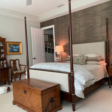
Snider & Metcalf Interior Design, LTD
Leading Interior Designers in Columbus, Ohio & Ponte Vedra, Florida
 Level One Construction
Seamless Elegance is a story bringing together both old and new. A cramped kitchen and a seldom-used den in a 100 year-old house were opened up to create a sprawling 300-sqft paradise. Obsessing over the little details was important to achieving our goal of seamless elegance.
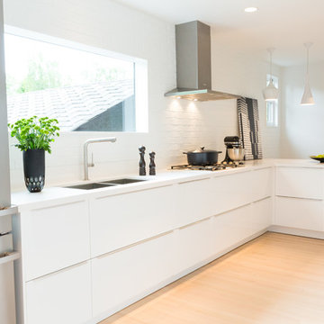
The archway and molding detail between the dining and living room was perfectly mirrored between the dining room and kitchen, right down to the hidden closets. A faux brick wall painted white was added to the back wall of the kitchen to give the illusion that the previous expansion was always there.
The existing 1.5” wide beautiful oak hardwood floor was matched to the rest of the house and continued into the kitchen. The flooring throughout the house was re-done at the same time to solidify the marriage between old and new; the result was a seamless transition into functionality. The character brought into the space by the oak hardwood floor and brick wall off sets the contemporary high gloss white cabinets.
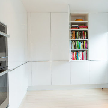
No upper cabinets were used in this design because we wanted to showcase the brick accent wall. The storage lost from zero upper kitchen cabinets was more than made up in floor-to-ceiling pantry. This corner pantry accommodates the bulk of storage for food and dishes in the kitchen. The subtraction of the upper cabinets allows the Tom Dixon pendant lights to be boldly featured over the eating peninsula.
Visual lines were a key aspect in this design helping the eye move throughout the space. The cabinet break lines are at the same height as the counter tops creating one continuous line. The paneled dishwasher blends perfectly with the rest of the kitchen cabinetry. The white quartz countertop flows down into a waterfall edge at the end of the eating peninsula, being the final grounding piece to visual lines.
Although the kitchen is all white, it is offset and given visual interest through texture and the use of different materials. The white allows the beautiful expensive appliances to be showcased along with the newly refinished flooring. The clean crisp kitchen will be the perfect backdrop to show case boldly colored art and accessories.
 Level One Construction
Seamless Elegance is a story bringing together both old and new. A cramped kitchen and a seldom-used den in a 100 year-old house were opened up to create a sprawling 300-sqft paradise. Obsessing over the little details was important to achieving our goal of seamless elegance.
The archway and molding detail between the dining and living room was perfectly mirrored between the dining room and kitchen, right down to the hidden closets. A faux brick wall painted white was added to the back wall of the kitchen to give the illusion that the previous expansion was always there.
The existing 1.5” wide beautiful oak hardwood floor was matched to the rest of the house and continued into the kitchen. The flooring throughout the house was re-done at the same time to solidify the marriage between old and new; the result was a seamless transition into functionality. The character brought into the space by the oak hardwood floor and brick wall off sets the contemporary high gloss white cabinets.
No upper cabinets were used in this design because we wanted to showcase the brick accent wall. The storage lost from zero upper kitchen cabinets was more than made up in floor-to-ceiling pantry. This corner pantry accommodates the bulk of storage for food and dishes in the kitchen. The subtraction of the upper cabinets allows the Tom Dixon pendant lights to be boldly featured over the eating peninsula.
Visual lines were a key aspect in this design helping the eye move throughout the space. The cabinet break lines are at the same height as the counter tops creating one continuous line. The paneled dishwasher blends perfectly with the rest of the kitchen cabinetry. The white quartz countertop flows down into a waterfall edge at the end of the eating peninsula, being the final grounding piece to visual lines.
Although the kitchen is all white, it is offset and given visual interest through texture and the use of different materials. The white allows the beautiful expensive appliances to be showcased along with the newly refinished flooring. The clean crisp kitchen will be the perfect backdrop to show case boldly colored art and accessories.
 Level One Construction
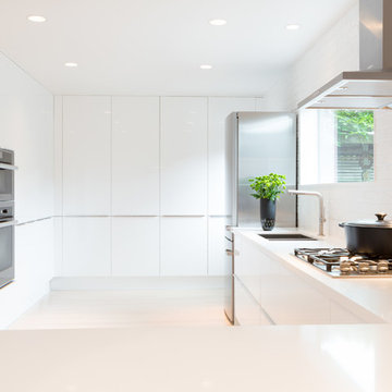
Seamless Elegance is a story bringing together both old and new. A cramped kitchen and a seldom-used den in a 100 year-old house were opened up to create a sprawling 300-sqft paradise. Obsessing over the little details was important to achieving our goal of seamless elegance.
The archway and molding detail between the dining and living room was perfectly mirrored between the dining room and kitchen, right down to the hidden closets. A faux brick wall painted white was added to the back wall of the kitchen to give the illusion that the previous expansion was always there.
The existing 1.5” wide beautiful oak hardwood floor was matched to the rest of the house and continued into the kitchen. The flooring throughout the house was re-done at the same time to solidify the marriage between old and new; the result was a seamless transition into functionality. The character brought into the space by the oak hardwood floor and brick wall off sets the contemporary high gloss white cabinets.
No upper cabinets were used in this design because we wanted to showcase the brick accent wall. The storage lost from zero upper kitchen cabinets was more than made up in floor-to-ceiling pantry. This corner pantry accommodates the bulk of storage for food and dishes in the kitchen. The subtraction of the upper cabinets allows the Tom Dixon pendant lights to be boldly featured over the eating peninsula.
Visual lines were a key aspect in this design helping the eye move throughout the space. The cabinet break lines are at the same height as the counter tops creating one continuous line. The paneled dishwasher blends perfectly with the rest of the kitchen cabinetry. The white quartz countertop flows down into a waterfall edge at the end of the eating peninsula, being the final grounding piece to visual lines.
Although the kitchen is all white, it is offset and given visual interest through texture and the use of different materials. The white allows the beautiful expensive appliances to be showcased along with the newly refinished flooring. The clean crisp kitchen will be the perfect backdrop to show case boldly colored art and accessories.
22