
Search results for "Criticisms" in Home Design Ideas
 Creating Sustainable Landscapes, LLC
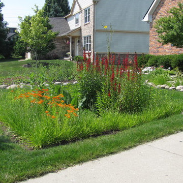
Home office landscape using native plants. Front yard rain garden. July.
This is an example of a full sun front yard landscaping in Detroit.
This is an example of a full sun front yard landscaping in Detroit.

 Kaplan Thompson Architects
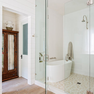
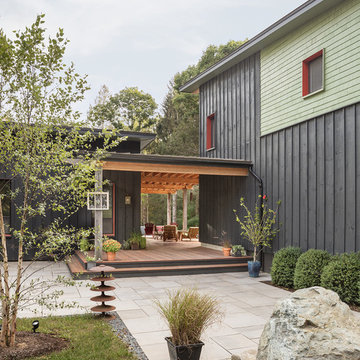
A young family with a wooded, triangular lot in Ipswich, Massachusetts wanted to take on a highly creative, organic, and unrushed process in designing their new home. The parents of three boys had contemporary ideas for living, including phasing the construction of different structures over time as the kids grew so they could maximize the options for use on their land.
They hoped to build a net zero energy home that would be cozy on the very coldest days of winter, using cost-efficient methods of home building. The house needed to be sited to minimize impact on the land and trees, and it was critical to respect a conservation easement on the south border of the lot.
Finally, the design would be contemporary in form and feel, but it would also need to fit into a classic New England context, both in terms of materials used and durability. We were asked to honor the notions of “surprise and delight,” and that inspired everything we designed for the family.
The highly unique home consists of a three-story form, composed mostly of bedrooms and baths on the top two floors and a cross axis of shared living spaces on the first level. This axis extends out to an oversized covered porch, open to the south and west. The porch connects to a two-story garage with flex space above, used as a guest house, play room, and yoga studio depending on the day.
A floor-to-ceiling ribbon of glass wraps the south and west walls of the lower level, bringing in an abundance of natural light and linking the entire open plan to the yard beyond. The master suite takes up the entire top floor, and includes an outdoor deck with a shower. The middle floor has extra height to accommodate a variety of multi-level play scenarios in the kids’ rooms.
Many of the materials used in this house are made from recycled or environmentally friendly content, or they come from local sources. The high performance home has triple glazed windows and all materials, adhesives, and sealants are low toxicity and safe for growing kids.
Photographer credit: Irvin Serrano
Find the right local pro for your project
 Dan Brunn Architecture
Brandon Shigeta
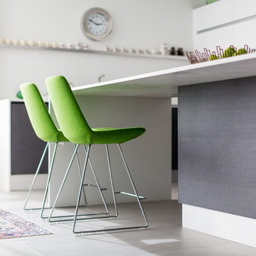
Inspiration for a large modern l-shaped porcelain tile open concept kitchen remodel in Los Angeles with a double-bowl sink, flat-panel cabinets, dark wood cabinets, quartz countertops, white backsplash, stainless steel appliances and an island
Inspiration for a large modern l-shaped porcelain tile open concept kitchen remodel in Los Angeles with a double-bowl sink, flat-panel cabinets, dark wood cabinets, quartz countertops, white backsplash, stainless steel appliances and an island
 TKS Design Group
Free ebook, Creating the Ideal Kitchen. DOWNLOAD NOW
Our clients came in after thinking a long time about what to do with their kitchen – new cabinets or paint them, white kitchen or wood, custom or is semi-custom? All good questions to ask! They were committed to making this home for a while, they decided to do a full remodel. The kitchen was not living up to its potential both visually and functionally. The dark cabinets and countertop made the room feel dull. And the major drawback, a large corner pantry that was eating into the room, make it appear smaller than it was.
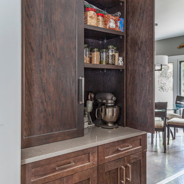
We started by ditching the corner pantry. It created a perfectly centered spot for the new professional range and made room for a much larger island that now houses a beverage center, microwave drawer, seating for three and tons of storage. The multi-generational family does a ton of cooking, so this kitchen gets used! We spent lots of time fine tuning the storage devices and planning where critical items would be stored. This included the new pantry area across from the refrigerator that houses small appliances and food staples.
Designed by: Susan Klimala, CKBD
Photography by: LOMA Studios
For more information on kitchen and bath design ideas go to: www.kitchenstudio-ge.com
 Mary Anne Smiley Interiors
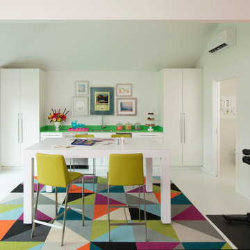
The Goody Nook, named by the owners in honor of one of their Great Grandmother's and Great Aunts after their bake shop they ran in Ohio to sell baked goods, thought it fitting since this space is a place to enjoy all things that bring them joy and happiness. This studio, which functions as an art studio, workout space, and hangout spot, also doubles as an entertaining hub. Used daily, the large table is usually covered in art supplies, but can also function as a place for sweets, treats, and horderves for any event, in tandem with the kitchenette adorned with a bright green countertop. An intimate sitting area with 2 lounge chairs face an inviting ribbon fireplace and TV, also doubles as space for them to workout in. The powder room, with matching green counters, is lined with a bright, fun wallpaper, that you can see all the way from the pool, and really plays into the fun art feel of the space. With a bright multi colored rug and lime green stools, the space is finished with a custom neon sign adorning the namesake of the space, "The Goody Nook”.

 Michael Nash Design, Build & Homes
2011 NARI CAPITAL COTY FINALIST AWARD WINNER
Project Scope--
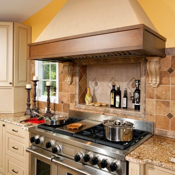
The owners of this 1990’s colonial home were seeking to convert the existing space-constricted builder-grade kitchen into a generously-apportioned Tuscan-style country kitchen with lots of natural light, high-end appointments and a warmly textured interior design concept. Among other features they sought a mid-room island that would house critical appliances, complete the work triangle and provide dining counter space for three. They also wanted to include a professional-grade gas range.
Challenges--
Situated between dining room and family room, the existing kitchen was small and poorly planned. The sink faced a blank wall and the appliances were inadequate for the owner’s gourmet cooking ambitions.
To create the desired footprint, the contractor, Michael Nash Design, Build & Homes, created a plan that called for consolidating square footage in several rooms adjacent to the kitchen. This entailed removing two load bearing walls– one between the kitchen and dining room, a second separating the kitchen and family room– and shifting loads to newly installed structural supports carefully concealed within the resultant “open” floor plan.
To accommodate new appliances (and work efficiencies) called for by this radically altered space plan, the design located the new professional gas range and other key features in the footprint formerly occupied by the breakfast room, a change that takes advantage of opportunities for a higher cathedral ceiling, better natural lighting and greater space.
Solutions--
With this space plan resolved, the design team could now eliminate a picture window on the west elevation, designing a new elevation to accommodate a stucco cooktop flanked by a pair of custom Palladium windows. A side elevation slider was replaced with a French door.
Infrastructure considerations included introducing gas lines needed for the 48” Viking cooktop range and re-routing plumbing. The 5’ x 9’ granite-surfaced custom designed island includes the primary kitchen sink, a dishwasher, microwave and dining overhang that provided seating for up to four.
On another wall, the design called for installing ceiling flush “beaded” display pantries with open bookcases, and routed-in plumbing for a water fountain, a faucet and an ice-making machine.
Glazed maple and cherry cabinetry increased available storage by over 50%. A recessed space was also created for a built-in vertical wine rack. Style-appropriate terra cotta tiling with mosaic bordering detailing extends into the home’s foyer. Other finishing work elements include crown molding with rounded turn posts and corbels.
 Studio 1200
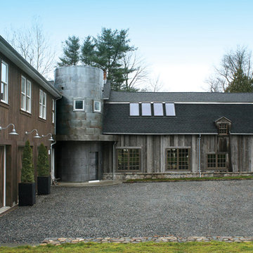
While most people in town considered this building a "tear-down", the new homeowners wanted to revive the property with an ambitions renovation and addition project. Two major challenges needed to be overcome on this project: the first was preserving the integrity of the original 200 year old barn; the second was designing a complementary structure that would co-exist on the site without looking like a 21st century addition.
In order to achieve these goals, our team studied how farm buildings evolve on a site over time. Additions are usually constructed based on need and function. With this protocol in mind, a grain silo was designed to act as our entry tower and buffer the intersection of the two buildings. The silo acts as our focal point and allowed us to construct very simple buildings to house the balance of the owner’s program. The team paid very close attention to scale, use of materials (many of which were recycled) and developed a vocabulary of modern interior detailing that would complement the original house.
Specific program requirements for the project included: large entertainment spaces, gourmet kitchen with adjacent family room, a squash court, multiple bedrooms and bathrooms, master suite, and plenty of storage space. In addition, since both adults work from home and receive clients in their offices, two offices needed to be created and it was critical to separate the work areas for the more private family spaces. The new silo, with central stair, became the element that allowed these different program needs to coexist effectively.
 TKS Design Group
Free ebook, Creating the Ideal Kitchen. DOWNLOAD NOW
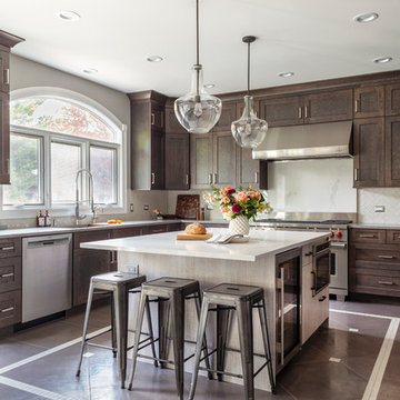
Our clients came in after thinking a long time about what to do with their kitchen – new cabinets or paint them, white kitchen or wood, custom or is semi-custom? All good questions to ask! They were committed to making this home for a while, they decided to do a full remodel. The kitchen was not living up to its potential both visually and functionally. The dark cabinets and countertop made the room feel dull. And the major drawback, a large corner pantry that was eating into the room, make it appear smaller than it was.
We started by ditching the corner pantry. It created a perfectly centered spot for the new professional range and made room for a much larger island that now houses a beverage center, microwave drawer, seating for three and tons of storage. The multi-generational family does a ton of cooking, so this kitchen gets used! We spent lots of time fine tuning the storage devices and planning where critical items would be stored. This included the new pantry area across from the refrigerator that houses small appliances and food staples.
Designed by: Susan Klimala, CKBD
Photography by: LOMA Studios
For more information on kitchen and bath design ideas go to: www.kitchenstudio-ge.com
 Sunspace Design, Inc.
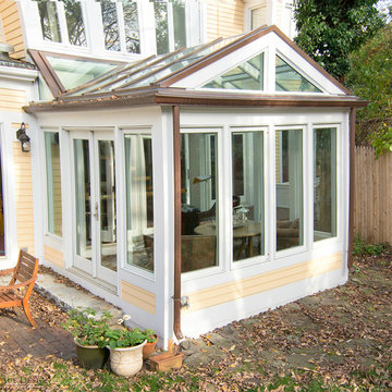
This contemporary conservatory is located just off of historic Harvard Square in Cambridge, Massachusetts. The stately home featured many classic exterior details and was located in the heart of the famous district, so Sunspace worked closely with the owners and their architect to design a space that would blend with the existing home and ultimately be approved for construction by the Cambridge Historical Commission.
The project began with the removal of an old greenhouse structure which had outlived its usefulness. The removal of the greenhouse gave the owners the perfect opportunity substantially upgrade the space. Sunspace opened the wall between the conservatory and the existing home to allow natural light to penetrate the building. We used Marvin windows and doors to help create the look we needed for the exterior, thereby creating a seamless blend between the existing and new construction.
The clients requested a space that would be comfortable year-round, so the use of energy efficient doors and windows as well as high performance roof glass was critically important. We chose a PPG Solar Ban 70 XL treatment and added Argon glass. The efficiency of the roof glass and the Marvin windows allowed us to provide an economical approach to the client’s heating and air conditioning needs.
The final result saw the transformation of an outdated space and into a historically appropriate custom glass space which allows for beautiful, natural light to enter the home. The clients now use this space every day.
 Décor Aid
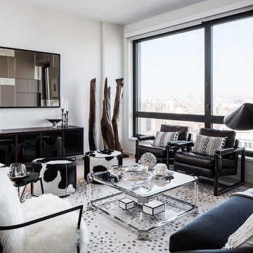
Million Dollar Listing’s celebrity broker Ryan Serhant reached out to Decor Aid to stage a luxurious Brooklyn condo development. The only caveat was that our interior designers had 48 hours to come up with the design, concept, and source all the furniture. Always up for a challenge, we partnered with Mitchell Gold & Bob Williams to create this contemporary gem.
Staying true to their contemporary vision, our interior decorators sourced all pieces through MGBW. Starting in the living room, we placed the Gunner Sofa, a piece that offers clean-lined living. The thin arms and slanted profile emphasize the modern elegance of the home. Through the use of various contemporary patterns and textures we were able to avoid the one-dimensional ambiance, and instead, the apartment’s living room feels detailed and thought out, without making anyone who enters overcrowded with home decor.
The Melrose cocktail table was sourced for its sleek, stainless steel and glass design that contrasts with more substantial pieces in the space, while also complementing the contemporary style. The glass design gives the illusion that this table takes up less space, giving the living room design a light and airy feel all around. The living space transformed into something out of a decor catalog with just the right amount of personality, creating a room that follows through with our starting design, yet functional for everyday use.
After the living room area, we set our eyes on designing the master bedroom. Our interior decorators were immediately drawn to the Celina Floating Rail Bed, it’s opulent nailhead trim, and dramatic design brings fresh sophistication to the bedroom design, while also standing out as a timeless piece that can complement various trends or styles that might be added later on to the bedroom decoration. We sourced the Roland Table Lamp to add texture, with its elaborate ribbed design, that compliments the air of masculinity the Carmen Leather Ottoman add while contrasting with the light, sleeker pieces. This difference in weight left us with a bedroom decoration that lives up to the trending modern standards, yet a space that is timeless and stylish no matter the decor trends.
Once we finished and the project was completed, our senior designers took a step back and took in all of their hard labor. Decor Aid was able to make this newly built blank space and design it into a modern wonder small brooklyn apartment. The MGBW furnishings were all hand-picked to keep an even balance of complementing and contrasting contemporary pieces, which was one of our more critical apartment decorating ideas. The apartment home decor brings to life this modern concept in a way that isn’t overbearing and shows off their style making the space in every sense an accurate reflection of a chic contemporary style.
 Wright Jenkins Home Design
This second-story addition to an already 'picture perfect' Naples home presented many challenges. The main tension between adding the many 'must haves' the client wanted on their second floor, but at the same time not overwhelming the first floor. Working with David Benner of Safety Harbor Builders was key in the design and construction process – keeping the critical aesthetic elements in check. The owners were very 'detail oriented' and actively involved throughout the process. The result was adding 924 sq ft to the 1,600 sq ft home, with the addition of a large Bonus/Game Room, Guest Suite, 1-1/2 Baths and Laundry. But most importantly — the second floor is in complete harmony with the first, it looks as it was always meant to be that way.
©Energy Smart Home Plans, Safety Harbor Builders, Glenn Hettinger Photography

 Zola European Windows
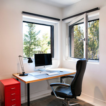
Located in, Summit Park, Park City UT lies one of the most efficient houses in the country. The Summit Haus – designed and built by Chris Price of PCD+B, is an exploration in design and construction of advanced high performance housing. Seeing a rising demand for sustainable housing along with rising Carbon emissions leading to global warming, this house strives to show that sensible, good design can create spaces adequate for today’s housing demands while adhering to strict standards. The house was designed to meet the very rigid Passiv House rating system – 90% more efficient than a typical home in the area.
The house itself was intended to nestle neatly into the 45 degree sloped site and to take full advantage of the limited solar access and views. The views range from short, highly wooded views to a long corridor out towards the Uinta Mountain range towards the east. The house was designed and built based off Passiv Haus standards, and the framing and ventilation became critical elements to maintain such minimal energy requirements.
Zola triple-pane, tilt-and-turn Thermo uPVC windows contribute substantially to the home’s energy efficiency, and takes advantage of the beautiful surrounding of the location, including forrest views from the deck off of the kitchen.
Photographer: Douglas Burke
 Ferguson Bath, Kitchen & Lighting Gallery
Synergy Design & Construction
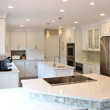
Example of a large transitional porcelain tile and brown floor eat-in kitchen design in DC Metro with an undermount sink, white cabinets, beige backsplash, stainless steel appliances, two islands, shaker cabinets, quartzite countertops and stone tile backsplash
Example of a large transitional porcelain tile and brown floor eat-in kitchen design in DC Metro with an undermount sink, white cabinets, beige backsplash, stainless steel appliances, two islands, shaker cabinets, quartzite countertops and stone tile backsplash
 Mary Anne Smiley Interiors
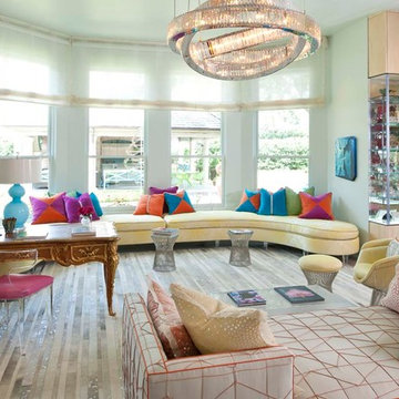
An intriguing triple ring of crystals hovers over the room like a diamond necklace creating sparkle and panache. The cowhide rug creates cohesion, and adds textural contrast. A custom designed settee floats cozily next to the fireplace.
It is quite unique to start with a collection of purses for the theme of a bedroom space. It was important to achieve appropriate presentation of the collection, without looking like an uptown purse boutique. Opened up a myriad of possibilities for ornamentation! So fun!
An intentional approach to lighting making maximum use of day-lighting, and critical LED art and task lighting used to strategic advantage. Also, the chrome strips of bedside cabinets, bed and headboard, were drilled for over 5000 individually hand inserted and glued Swarovski crystals. Every element of the custom furnishings is of regal quality.
Photographer: Dan Piassick
 Andover Landscape Design & Construction
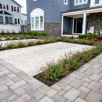
The client asked us to create a low maintenance, highly functional front entry to this beachfront retreat. As with most beach homes, guest parking is critical and creating an easy to navigate parking area is paramount to design success. We chose to maximize the front yard without turning it into a parking lot. Native crushed stone parking pads surrounded by sun loving, drought tolerant plants create exactly what the client was looking for.
 TVL Creative Ltd.
This 1910 West Highlands home was so compartmentalized that you couldn't help to notice you were constantly entering a new room every 8-10 feet. There was also a 500 SF addition put on the back of the home to accommodate a living room, 3/4 bath, laundry room and back foyer - 350 SF of that was for the living room. Needless to say, the house needed to be gutted and replanned.
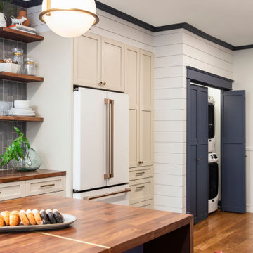
Kitchen+Dining+Laundry-Like most of these early 1900's homes, the kitchen was not the heartbeat of the home like they are today. This kitchen was tucked away in the back and smaller than any other social rooms in the house. We knocked out the walls of the dining room to expand and created an open floor plan suitable for any type of gathering. As a nod to the history of the home, we used butcherblock for all the countertops and shelving which was accented by tones of brass, dusty blues and light-warm greys. This room had no storage before so creating ample storage and a variety of storage types was a critical ask for the client. One of my favorite details is the blue crown that draws from one end of the space to the other, accenting a ceiling that was otherwise forgotten.
Primary Bath-This did not exist prior to the remodel and the client wanted a more neutral space with strong visual details. We split the walls in half with a datum line that transitions from penny gap molding to the tile in the shower. To provide some more visual drama, we did a chevron tile arrangement on the floor, gridded the shower enclosure for some deep contrast an array of brass and quartz to elevate the finishes.
Powder Bath-This is always a fun place to let your vision get out of the box a bit. All the elements were familiar to the space but modernized and more playful. The floor has a wood look tile in a herringbone arrangement, a navy vanity, gold fixtures that are all servants to the star of the room - the blue and white deco wall tile behind the vanity.
Full Bath-This was a quirky little bathroom that you'd always keep the door closed when guests are over. Now we have brought the blue tones into the space and accented it with bronze fixtures and a playful southwestern floor tile.
Living Room & Office-This room was too big for its own good and now serves multiple purposes. We condensed the space to provide a living area for the whole family plus other guests and left enough room to explain the space with floor cushions. The office was a bonus to the project as it provided privacy to a room that otherwise had none before.
 McKinney York Architects
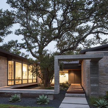
This property came with a house which proved ill-matched to our clients’ needs but which nestled neatly amid beautiful live oaks. In choosing to commission a new home, they asked that it also tuck under the limbs of the oaks and maintain a subdued presence to the street. Extraordinary efforts such as cantilevered floors and even bridging over critical root zones allow the design to be truly fitted to the site and to co-exist with the trees, the grandest of which is the focal point of the entry courtyard.
Of equal importance to the trees and view was to provide, conversely, for walls to display 35 paintings and numerous books. From form to smallest detail, the house is quiet and subtle.
33