
Search results for "Current multi year" in Home Design Ideas
 Architecture Studio
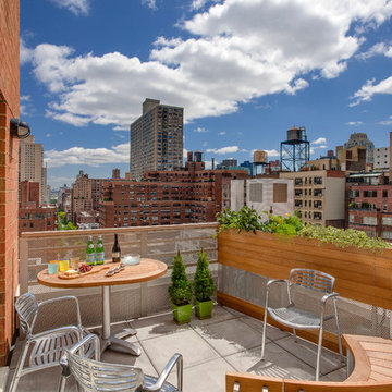
This Manhattan Upper East side apartment renovation introduces memories of California into a New York setting for clients who embrace the Big Apple lifestyle but didn’t want to give up their Marin County, California comforts. The carved out ceilings and walls add a new dimension to the space; while the blond color woods and curved shapes bring memories of a calmer life. The overall result of the apartment design is a fun, warm and relaxing refuge from their current, higher energy lives.
Photography: Charles Callister Jr.
 TKS Design Group
Download our free ebook, Creating the Ideal Kitchen. DOWNLOAD NOW
The homeowners built their traditional Colonial style home 17 years’ ago. It was in great shape but needed some updating. Over the years, their taste had drifted into a more contemporary realm, and they wanted our help to bridge the gap between traditional and modern.
We decided the layout of the kitchen worked well in the space and the cabinets were in good shape, so we opted to do a refresh with the kitchen. The original kitchen had blond maple cabinets and granite countertops. This was also a great opportunity to make some updates to the functionality that they were hoping to accomplish.
After re-finishing all the first floor wood floors with a gray stain, which helped to remove some of the red tones from the red oak, we painted the cabinetry Benjamin Moore “Repose Gray” a very soft light gray. The new countertops are hardworking quartz, and the waterfall countertop to the left of the sink gives a bit of the contemporary flavor.
We reworked the refrigerator wall to create more pantry storage and eliminated the double oven in favor of a single oven and a steam oven. The existing cooktop was replaced with a new range paired with a Venetian plaster hood above. The glossy finish from the hood is echoed in the pendant lights. A touch of gold in the lighting and hardware adds some contrast to the gray and white. A theme we repeated down to the smallest detail illustrated by the Jason Wu faucet by Brizo with its similar touches of white and gold (the arrival of which we eagerly awaited for months due to ripples in the supply chain – but worth it!).
The original breakfast room was pleasant enough with its windows looking into the backyard. Now with its colorful window treatments, new blue chairs and sculptural light fixture, this space flows seamlessly into the kitchen and gives more of a punch to the space.
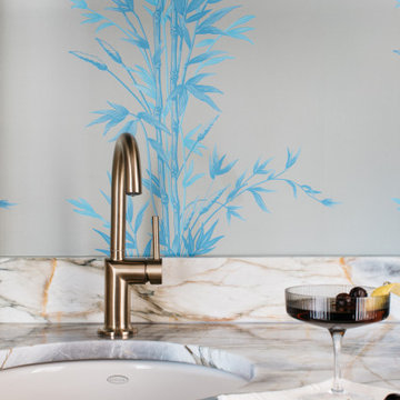
The original butler’s pantry was functional but was also starting to show its age. The new space was inspired by a wallpaper selection that our client had set aside as a possibility for a future project. It worked perfectly with our pallet and gave a fun eclectic vibe to this functional space. We eliminated some upper cabinets in favor of open shelving and painted the cabinetry in a high gloss finish, added a beautiful quartzite countertop and some statement lighting. The new room is anything but cookie cutter.
Next the mudroom. You can see a peek of the mudroom across the way from the butler’s pantry which got a facelift with new paint, tile floor, lighting and hardware. Simple updates but a dramatic change! The first floor powder room got the glam treatment with its own update of wainscoting, wallpaper, console sink, fixtures and artwork. A great little introduction to what’s to come in the rest of the home.
The whole first floor now flows together in a cohesive pallet of green and blue, reflects the homeowner’s desire for a more modern aesthetic, and feels like a thoughtful and intentional evolution. Our clients were wonderful to work with! Their style meshed perfectly with our brand aesthetic which created the opportunity for wonderful things to happen. We know they will enjoy their remodel for many years to come!
Photography by Margaret Rajic Photography
 LaCantina Doors
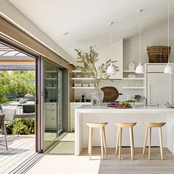
Danish galley light wood floor and beige floor kitchen photo with flat-panel cabinets, white cabinets, white backsplash, paneled appliances, an island and white countertops
Find the right local pro for your project
 Paradise City
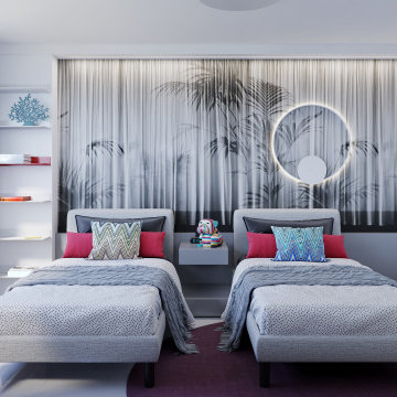
I am proud to present New, Stylish, Practical, and just Awesome ) design for your new kid's room. Ta -da...
The space in this room is minimal, and it's tough to have two beds there and have a useful and pretty design. This design was built on the idea to have a bed that transforms from king to two tweens and back with ease.
I do think most of the time better to keep it as a single bed and, when needed, slide bed over and have two beds. The single bed will give you more space and air in the room.
You will have easy access to the closet and a much more comfortable bed to sleep on it.
On the left side, we are going to build costume wardrobe style closet
On the right side is a column. We install some exposed shelving to bring this architectural element to proportions with the room.
Behind the bed, we use accent wallpaper. This particular mural wallpaper looks like fabric has those waves that will softener this room. Also, it brings that three-dimension effect that makes the room look larger without using mirrors.
Led lighting over that wall will make shadows look alive. There are some Miami vibes it this picture. Without dominating overall room design, these art graphics are producing luxury filing of living in a tropical paradise. ( Miami Style)
On the front is console/table cabinetry. In this combination, it is in line with bed design and the overall geometrical proportions of the room. It is a multi-function. It will be used as a console for a TV/play station and a small table for computer activities.
In the end wall in the hallway is a costume made a mirror with Led lights. Girls need mirrors )
Our concept is timeless. We design this room to be the best for any age. We look into the future ) Your girl will grow very fast. And you do not have to change a thing in this room. This room will be comfortable and stylish for the next 20 years. I do guarantee that )
Your daughter will love it!
 Advance Design Studio, Ltd.
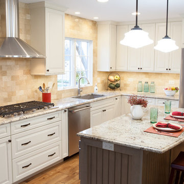
Bud Kane has remodeled nearly every room in his own home over many years. Now reaching his 70’s, he contemplated heading up a major kitchen and laundry room renovation himself, planning on doing the carpentry work with his own hands. “I was not convinced I would ever meet anyone who could do it as well as I could do it myself”, said Bud. Ruth and Bud spent 5 years visiting kitchen firms and interviewing designers. They couldn’t however bring themselves to pull the trigger on the project, until they met Advance Design Studio in 2015.
“No one understood what I wanted”, said Ruth. She was continually frustrated by experiences with designers who weren’t hearing what was important to her. “Everyone kept designing my kitchen with what they thought it should look like; I couldn’t find anyone who would listen to me”!
When they met designer Scott Christensen from Advance Design Studio, they liked him right away. He listened to Ruth and designed a kitchen that she loved, all the while interjecting years of wisdom and design expertise that Ruth appreciated. “The finished product is better than I expected”, says Ruth. “I respected Scott’s opinions and together we created the perfect place for me to bake with my grandkids and truly enjoy the kitchen and laundry room I’ve been dreaming of for many years!”
The kitchen transformation began with removing the home’s soffits, and extending new painted maple cabinetry to the ceiling with the addition of an elegant crown molding. Ruth’s new Vita Mix holds a coveted place on her counter, and adjustments were planned to size the cabinets in conjunction with the under cabinet decorative light molding to fit this appliance just right. “This one small detail was really important to me”, says Ruth smiling. An elegant new island replaced the original island, complete with room for 3 stools where her grandchildren will sit to make home-made pasta every Thanksgiving, and cookies at Christmas time. “Traditions are very important in my family, and making my kitchen work to suit cherished activities with my family was the number one reason this renovation was so desired”, replied Ruth when asked about the island.
A picture perfect new tea station replaced a cluttered unused desk area, creating a wonderful place to prepare hot drinks for sipping any season of the year while overlooking the couple’s wonderfully manicured gardens from the lovely 3 season’s room just off the kitchen. The soft sage island bead panel detail was repeated on the backsplash, replicating the feel of a fine old piece of furniture.
The biggest problem with the laundry room was 3 doors, one from the garage, one from the closet, and one to the hallway. “Scott designed a pocket door, and oh what a dream it is now to bring groceries in from the garage!” exclaims Bud who grew to disdain this task! Doing laundry is now a breeze in this attractive new space that doubles as a wonderful pantry for the kitchen with room to store food items that didn’t have a home in the poorly designed original space.
New Hickory distressed wood flooring was laid both in the kitchen and leading to the hall foyer. Soft gray wood-replicating porcelain was placed in the laundry area, making for an easily cleanable surface for what doubles as a mud room from the garage. Creamy tumbled marble graces an unobtrusive backsplash spilling onto shiny granite counter tops in a rich earthy pattern of fall colors that mimic colors throughout the home. Advance is known details that included custom crafted furniture toe kicks, luxurious crown moldings, and beaded under cabinet moldings. The kitchen is complete with a glass display cabinet showing Ruth’s treasured china tea collection.
Early on, it was initially only their intention of purchasing cabinets for the new design. They were so impressed however with Advance Design’s complete program for budgeting, design, installation and management that it became clear to them both that they wanted Advance to handle the entire project from start to finish. “After seeing the quality work they did, coupled with the in-house team completely dedicated to our satisfaction, it became apparent there was no other choice but to hire them to handle everything. And we’re so glad we did, we have not one regret”, says Bud.
“The attention to detail by the carpentry crew more than satisfied my perfectionist expectations of the finished carpentry,” exclaimed Bud. “Every one of Advance Design’s people we encountered from design through construction was wonderful. We’ve never met a group of people so dedicated to making sure we were happy with every single detail, and every single part of this experience”, said Ruth and Bud.
Joe Nowak
 Spring Creek Design
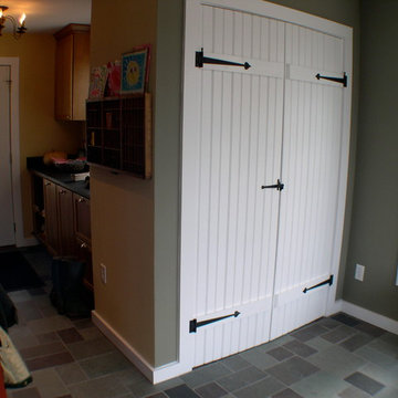
This old farmhouse (ca. late 18th century) has undergone many renovations over the years. Spring Creek Design added its stamp in 2008, with a small mudroom addition and a complete interior renovation.
The addition encompasses a 1st floor mudroom with extensive cabinetry and closetry. Upon entering the space from the driveway, cabinet and countertop space is provided to accommodate incoming grocery bags. Next in line are a series of “lockers” and cubbies - just right for coats, hats and book bags. Further inside is a wrap-around window seat with cedar shoe racks beneath. A stainless steel dog feeding station rounds out the amenities - all built atop a natural Vermont slate floor.
On the lower level, the addition features a full bathroom and a “Dude Pod” - a compact work and play space for the resident code monkey. Outfitted with a stand-up desk and an electronic drum kit, one needs only emerge for Mountain Dew refills and familial visits.
Within the existing space, we added an ensuite bathroom for the third floor bedroom. The second floor bathroom and first floor powder room were also gutted and remodeled.
The master bedroom was extensively remodeled - given a vaulted ceiling and a wall of floor-to-roof built-ins accessed with a rolling ladder.
An extensive, multi-level deck and screen house was added to provide outdoor living space, with secure, dry storage below.
Design Criteria:
- Update house with a high sustainability standard.
- Provide bathroom for daughters’ third floor bedroom.
- Update remaining bathrooms
- Update cramped, low ceilinged master bedroom
- Provide mudroom/entryway solutions.
- Provide a window seating space with good visibility of back and side yards – to keep an eye on the kids at play.
- Replace old deck with a updated deck/screen porch combination.
- Update sitting room with a wood stove and mantle.
Special Features:
- Insulated Concrete Forms used for Dude Pod foundation.
- Soy-based spray foam insulation used in the addition and master bedroom.
- Paperstone countertops in mudroom.
- Zero-VOC paints and finishes used throughout the project.
- All decking and trim for the deck/screen porch is made from 100% recycled HDPE (milk jugs, soda, water bottles)
- High efficiency combination washer/dryer.
 Studio Bergtraun AIA
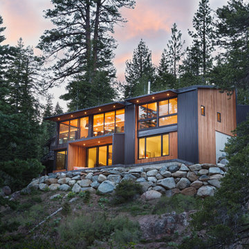
Natural ventilation occurs through high hopper windows and multi-slide floor-to-ceiling windows, positioned to convect cool air currents from the nearby creek. The roof and exterior walls are clad in lifetime corrugated dark steel reducing maintenance and replacement waste, and insulated with high-rated green material – soy-foam.
Sponsored
Columbus, OH

Trish Takacs Design
Award Winning & Highly Skilled Kitchen & Bath Designer in Columbus
 PB Kitchen Design
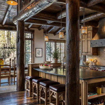
At first glance this rustic kitchen looks so authentic, one would think it was constructed 100 years ago. Situated in the Rocky Mountains, this second home is the gathering place for family ski vacations and is the definition of luxury among the beautiful yet rough terrain. A hand-forged hood boldly stands in the middle of the room, commanding attention even through the sturdy log beams both above and to the sides of the work/gathering space. The view just might get jealous of this kitchen!
Project specs: Custom cabinets by Premier Custom-Built, constructed out of quartered oak. Sub Zero refrigerator and Wolf 48” range. Pendants and hood by Dragon Forge in Colorado.
(Photography, Kimberly Gavin)
 Marquise Pools
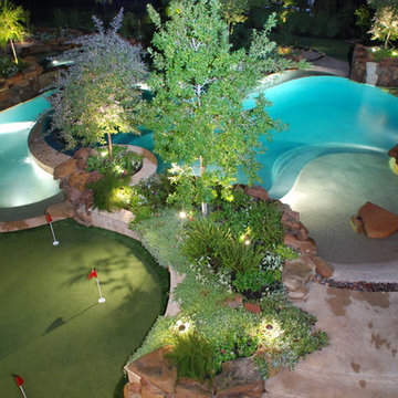
This shot shows the large island accessed by the travertine bridge that spans over lower lazy river. The entertaining island has a firepit, sitting area, and a 10 person spa with stacked stone spilways, and the spa has its own small beach entry.
 MainStreet Design Build
Originally built in the early twentieth century, this Orchard Lake cottage was purchased almost 10 years ago by a wonderful couple—empty nesters with an appreciation for stunning views, modern amenities and quality craftsmanship. They hired MainStreet Design Build to design and remodel their home to fit their needs exactly.
Upon initial inspection, it was apparent that the original home had been modified over the years, sustaining multiple room additions. Consequently, this mid-size cottage home had little character or cohesiveness. Even more concerning, after conducting a thorough inspection, it became apparent that the structure was inadequate to sustain major modifications. As a result, a plan was formulated to take the existing structure down to its original floor deck.
The clients’ needs that fueled the design plan included:
-Preserving and capitalizing on the lake view
-A large, welcoming entry from the street
-A warm, inviting space for entertaining guests and family
-A large, open kitchen with room for multiple cooks
-Built-ins for the homeowner’s book collection
-An in-law suite for the couple’s aging parents
The space was redesigned with the clients needs in mind. Building a completely new structure gave us the opportunity to create a large, welcoming main entrance. The dining and kitchen areas are now open and spacious for large family gatherings. A custom Grabill kitchen was designed with professional grade Wolf and Thermador appliances for an enjoyable cooking and dining experience. The homeowners loved the Grabill cabinetry so much that they decided to use it throughout the home in the powder room, (2) guest suite bathrooms and the laundry room, complete with dog wash. Most breathtaking; however, might be the luxury master bathroom which included extensive use of marble, a 2-person Maax whirlpool tub, an oversized walk-in-shower with steam and bench seating for two, and gorgeous custom-built inset cherry cabinetry.
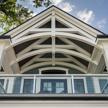
The new wide plank oak flooring continues throughout the entire first and second floors with a lovely open staircase lit by a chandelier, skylights and flush in-wall step lighting. Plenty of custom built-ins were added on walls and seating areas to accommodate the client’s sizeable book collection. Fitting right in to the gorgeous lakefront lot, the home’s exterior is reminiscent of East Coast “beachy” shingle-style that includes an attached, oversized garage with Mahogany carriage style garage doors that leads directly into a mud room and first floor laundry.
These Orchard Lake property homeowners love their new home, with a combined first and second floor living space totaling 4,429 sq. ft. To further add to the amenities of this home, MainStreet Design Build is currently under design contract for another major lower-level / basement renovation in the fall of 2017.
Kate Benjamin Photography
 Granit Architects + Interiors
Our clients for this project are a professional couple with a young family. They approached us to help with extending and improving their home in London SW2 to create an enhanced space both aesthetically and functionally for their growing family. We were appointed to provide a full architectural and interior design service, including the design of some bespoke furniture too.
A core element of the brief was to design a kitchen living and dining space that opened into the garden and created clear links from inside to out. This new space would provide a large family area they could enjoy all year around. We were also asked to retain the good bits of the current period living spaces while creating a more modern day area in an extension to the rear.
It was also a key requirement to refurbish the upstairs bathrooms while the extension and refurbishment works were underway.
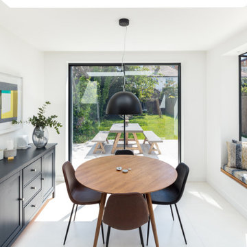
The solution was a 21m2 extension to the rear of the property that mirrored the neighbouring property in shape and size. However, we added some additional features, such as the projecting glass box window seat. The new kitchen features a large island unit to create a workspace with storage, but also room for seating that is perfect for entertaining friends, or homework when the family gets to that age.
The sliding folding doors, paired with floor tiling that ran from inside to out, created a clear link from the garden to the indoor living space. Exposed brick blended with clean white walls creates a very contemporary finish throughout the extension, while the period features have been retained in the original parts of the house.
 High Camp Home
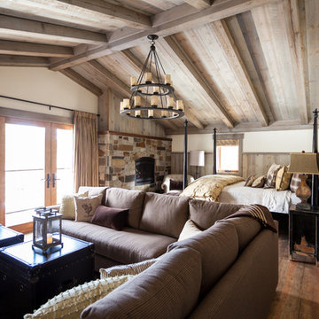
Bedroom - rustic master medium tone wood floor bedroom idea in Sacramento with white walls, a standard fireplace and a stone fireplace
 TKS Design Group
Download our free ebook, Creating the Ideal Kitchen. DOWNLOAD NOW
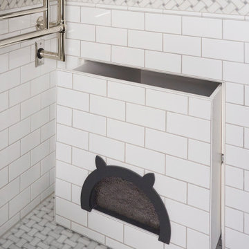
This master bath remodel is the cat's meow for more than one reason! The materials in the room are soothing and give a nice vintage vibe in keeping with the rest of the home. We completed a kitchen remodel for this client a few years’ ago and were delighted when she contacted us for help with her master bath!
The bathroom was fine but was lacking in interesting design elements, and the shower was very small. We started by eliminating the shower curb which allowed us to enlarge the footprint of the shower all the way to the edge of the bathtub, creating a modified wet room. The shower is pitched toward a linear drain so the water stays in the shower. A glass divider allows for the light from the window to expand into the room, while a freestanding tub adds a spa like feel.
The radiator was removed and both heated flooring and a towel warmer were added to provide heat. Since the unit is on the top floor in a multi-unit building it shares some of the heat from the floors below, so this was a great solution for the space.
The custom vanity includes a spot for storing styling tools and a new built in linen cabinet provides plenty of the storage. The doors at the top of the linen cabinet open to stow away towels and other personal care products, and are lighted to ensure everything is easy to find. The doors below are false doors that disguise a hidden storage area. The hidden storage area features a custom litterbox pull out for the homeowner’s cat! Her kitty enters through the cutout, and the pull out drawer allows for easy clean ups.
The materials in the room – white and gray marble, charcoal blue cabinetry and gold accents – have a vintage vibe in keeping with the rest of the home. Polished nickel fixtures and hardware add sparkle, while colorful artwork adds some life to the space.

Sponsored
Columbus, OH

Structural Remodeling
Franklin County's Heavy Timber Specialists | Best of Houzz 2020!
 Livingspace
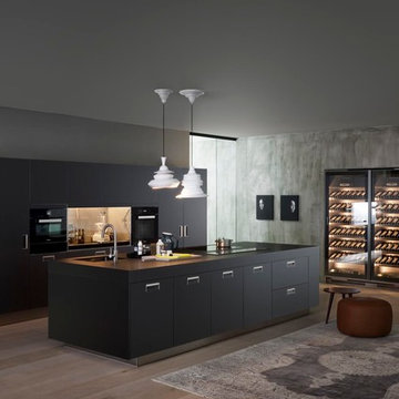
Arclinea Armour:
The kitchen design industry changed again with the launch of Armour last year. With a natural core in kraft paper mixed with new-gen resins, it is produced using high pressure lamination to create a highly evolved technical material with design capabilities for both horizontal and vertical applications, from cabinet fronts to countertops. The result, is an extremely durable surface that is scratch, abrasion, and finger proof resistant, buttery smooth to the touch, with velvety matte finish. It's water repellent and hygienic properties make it a smart choice for kitchen surfaces and the appearance of a matte lacquer to achieve that high-end modern look, for less. Armour meets the budget restraints of a multi-unit project or the savvy designer or homeowner.
 Klopf Architecture
The Roger Lee designed house from 1962 was purchased by the current homeowners in almost original condition, as the previous owners elected to defer most maintenance projects over the years. The clients were able to see beyond the dated materials and finishes, single-paned glass and uninsulated walls and they approached Klopf Architecture to help them expand and update the entire home, one the family could settle into and enjoy for years to come. It was important that the new designs were aligned with Lee's original intent not only because of the client's appreciation for mid-century modern architecture, but also because the house was deemed historical. The Stanford Real Estate Office requires a stringent design review which safeguards the integrity of the community, which Klopf Architecture was happy to oblige going into their updated designs.
As with many original mid-century modern homes, the house was scaled to the 1960s lifestyle where rooms were smaller and openings to views were limited and tightly framed. The original conditions defined the direction the family of four would take in updating the house and making it comfortable for their modern lifestyle. Klopf designed a full gut remodel and major addition to bring the house into the 21st century and provide the living area needed for the client's family. The newly expanded house added just about 1,100 sf to create an airy, comfortable and family friendly house, taking full advantage of the beautiful southwestern views that extend out to the hills beyond. The enclosed garage created an additional 240 sf of covered space for long-term storage.
A cracked swimming pool created an eyesore taking up a majority of the backyard landscape, so it was one of the first elements to go during the transformation. Working with Outer Space Landscape Architects, the family asked for a mix of relaxing outdoor patio spaces that eventually blend into the native landscaping, extending their views outward toward the natural greenery of the trees beyond their property. Filling in the old pool was a smart way to expand the living spaces outward. The orientation of the house was designed to enjoy the views, but the original architecture provided the first homeowners with mere glimpses of the landscape outside.
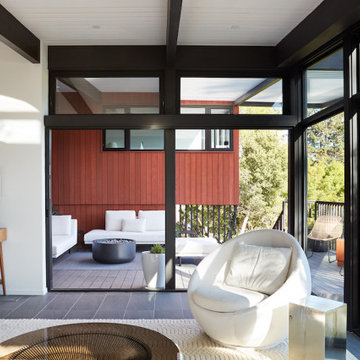
Klopf was able to broaden those views, continuing and extending on the original architecture to take full advantage of the unobstructed natural views across the rear facade of the house. Small horizontal openings in the primary bedroom and office were replaced with much taller windows that now follow the angled roof line upward, extending across almost all of the facade. We worked with Western Windows, whose designs included an oblique-shaped, operable casement that allowed our design to rise with the slope. A new corner office added to the primary suite, offers a bright and functional work-from-home solution that looks out at the distant views and added natural light from the expanded window configuration that now wraps around the corner.
The existing lower level was designed by Lee as a utilitarian space, serving as a wet pool room with a drain in the center of the floor, bathroom, laundry and storage areas. Without the need for a pool room, Klopf was able to convert the area into a much more comfortable and functional living space with a new family room and guest suite. The new spaces enjoy easy access to a new outdoor patio through floor to ceiling, full-width glass sliders.
Continuing along the rear facade, a previously exposed deck extending from the living room and hallway provided access to the backyard through a single set of stairs leading toward the side of the house which made sense when the pool was in place. The new deck was re-envisioned as an extension of the main living room and now serves as a second outdoor living room. A new slatted pergola above provides the homeowners welcome relief from the hot afternoon sun. A second set of stairs now creates a better connection to the redesigned lower level. Klopf was able to reconfigure the spaces, extending the living room outward toward the views, where the family now claims it as the heart of the home, spending a large majority of their time outdoors.
Back inside, the original wood-burning Malm fireplace was beautifully restored and a gas burner installed to comply with California's strict air standards. It now rests in front of a wall of Heath accent tiles where a dated red brick wall used to stand. A new taller window brings more light and views into the refreshed interior living room. The original glass doors opposite the fireplace were replaced by larger sliders that when fully opened, create a seamless transition to the new outdoor living area so the two spaces feel like one connected space. The original utilitarian kitchen was needlessly tucked into the far back corner and closed-off, out of sight from the living room, so the clients asked Klopf to open it up and expand the kitchen forward so it felt more connected. Today the much larger kitchen is connected to the living area where a short wall with a cutout offers a visual glimpse into the kitchen and a handy pass-through counter for serving guests. A new breakfast nook was also added to create another spot where the family can gather for casual meals. Just outside, a new built-in outdoor grill and prep area extends the kitchen outside and connects to a new outdoor dining spot nestled amongst the trees, taking advantage of the views out back.
Klopf was able to expand the other two bedrooms, add a new laundry room and half-bath and convert the carport to an enclosed garage to add more storage areas which was lost when the pool house was converted to the family and guest room.
To maintain a historical connection to the original designs, the exterior siding was repeated on all exterior walls, a full-height stained glass window at the front entryway restored, and an interior slatted screen element repeated outside at the exterior entry courtyard and over the new outdoor living room to create a shade trellis. The new house stands proudly and shines against it's new landscaping features, while respecting and expanding on the original intent of Roger Lee's designs epitomizing the comforts of indoor-outdoor living in Northern California.
Completion year: 2020
Klopf Architecture project team: John Klopf, Klara Kevane, Noel Andrade
Contractor: ORB Construction, Brendan O'Reilly
Structural engineer: Sezen and Moon
Landscape architect: Outer space
Furnishings and decoration: Urbanism Designs
Photographer: Mariko Reed
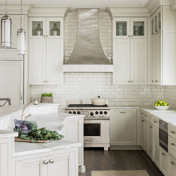
 Anita Clark
Our clients lived in a wonderful home they designed and built which they referred to as their dream home until this property they admired for many years became available. Its location on a point with spectacular ocean views made it impossible to resist. This 40-year-old home was state of the art for its time. It was perfectly sited but needed to be renovated to accommodate their lifestyle and make use of current materials. Thus began the 3-year journey. They decided to capture one of the most exquisite views of Boston’s North Shore and do a full renovation inside and out. This project was a complete gut renovation with the addition of a guest suite above the garage and a new front entry.
 Klopf Architecture
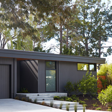
Klopf Architecture, Arterra Landscape Architects and Henry Calvert of Calvert Ventures Designed and built a new warm, modern, Eichler-inspired, open, indoor-outdoor home on a deeper-than-usual San Mateo Highlands property where an original Eichler house had burned to the ground.
The owners wanted multi-generational living and larger spaces than the original home offered, but all parties agreed that the house should respect the neighborhood and blend in stylistically with the other Eichlers. At first the Klopf team considered re-using what little was left of the original home and expanding on it. But after discussions with the owner and builder, all parties agreed that the last few remaining elements of the house were not practical to re-use, so Klopf Architecture designed a new home that pushes the Eichler approach in new directions.
One disadvantage of Eichler production homes is that the house designs were not optimized for each specific lot. A new custom home offered the team a chance to start over. In this case, a longer house that opens up sideways to the south fit the lot better than the original square-ish house that used to open to the rear (west). Accordingly, the Klopf team designed an L-shaped “bar” house with a large glass wall with large sliding glass doors that faces sideways instead of to the rear like a typical Eichler. This glass wall opens to a pool and landscaped yard designed by Arterra Landscape Architects.
Driving by the house, one might assume at first glance it is an Eichler because of the horizontality, the overhanging flat roof eaves, the dark gray vertical siding, and orange solid panel front door, but the house is designed for the 21st Century and is not meant to be a “Likeler.” You won't see any posts and beams in this home. Instead, the ceiling decking is a western red cedar that covers over all the beams. Like Eichlers, this cedar runs continuously from inside to out, enhancing the indoor / outdoor feeling of the house, but unlike Eichlers it conceals a cavity for lighting, wiring, and insulation. Ceilings are higher, rooms are larger and more open, the master bathroom is light-filled and more generous, with a separate tub and shower and a separate toilet compartment, and there is plenty of storage. The garage even easily fits two of today's vehicles with room to spare.
A massive 49-foot by 12-foot wall of glass and the continuity of materials from inside to outside enhance the inside-outside living concept, so the owners and their guests can flow freely from house to pool deck to BBQ to pool and back.
During construction in the rough framing stage, Klopf thought the front of the house appeared too tall even though the house had looked right in the design renderings (probably because the house is uphill from the street). So Klopf Architecture paid the framer to change the roofline from how we had designed it to be lower along the front, allowing the home to blend in better with the neighborhood. One project goal was for people driving up the street to pass the home without immediately noticing there is an "imposter" on this lot, and making that change was essential to achieve that goal.
This 2,606 square foot, 3 bedroom, 3 bathroom Eichler-inspired new house is located in San Mateo in the heart of the Silicon Valley.
Klopf Architecture Project Team: John Klopf, AIA, Klara Kevane
Landscape Architect: Arterra Landscape Architects
Contractor: Henry Calvert of Calvert Ventures
Photography ©2016 Mariko Reed
Location: San Mateo, CA
Year completed: 2016


 New Explode Construction
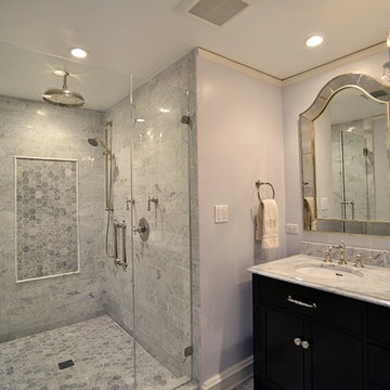
In this Lake Forest master bathroom remodel, elegance meets functionality in a design that feels as though it has always belonged to the home. The centerpiece is a stunning glass-enclosed walk-in shower, featuring floor-to-ceiling marble tile accented with a custom mosaic inlay. The marble continues onto the vanity countertop, creating a harmonious flow throughout the space. Every detail — from the polished chrome fixtures to the beveled glass mirrors — was chosen to reflect a timeless sophistication while incorporating the conveniences of modern living.
The double vanity offers generous storage with rich espresso cabinetry, bringing warmth and contrast against the cooler marble tones. Above, crystal-accented sconces and a delicate chandelier cast a flattering light, making daily routines feel like a moment of indulgence. The blend of soft, neutral walls with crisp white trim frames the space beautifully, allowing the finishes to take center stage without overwhelming the senses.
This remodel was designed not only for beauty but also for enduring quality. Materials were selected for their resilience as well as their aesthetics, ensuring that the bathroom will remain a serene and luxurious retreat for years to come. Every element — from the tile pattern to the placement of each fixture — was thoughtfully considered to enhance flow, maximize natural light, and create a sense of spa-like tranquility. This is more than just a bathroom; it's a personal sanctuary where style and comfort live side by side.
 Archadeck of Austin
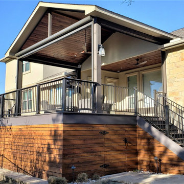
Horizontal cedar deck skirting brings the space together from the ground to the roof. We included an access door for storage under the deck.
Large mountain style backyard second story metal railing deck photo in Austin with a roof extension
Large mountain style backyard second story metal railing deck photo in Austin with a roof extension
36