
Search results for "Cutting process" in Home Design Ideas
 Kathleen Jennison
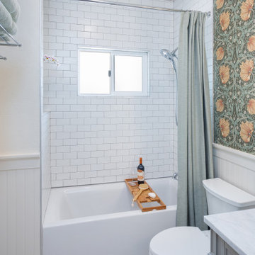
An Arts & Crafts Bungalow is one of my favorite styles of homes. We have quite a few of them in our Stockton Mid-Town area. And when C&L called us to help them remodel their 1923 American Bungalow, I was beyond thrilled.
As per usual, when we get a new inquiry, we quickly Google the project location while we are talking to you on the phone. My excitement escalated when I saw the Google Earth Image of the sweet Sage Green bungalow in Mid-Town Stockton. "Yes, we would be interested in working with you," I said trying to keep my cool.
But what made it even better was meeting C&L and touring their home, because they are the nicest young couple, eager to make their home period perfect. Unfortunately, it had been slightly molested by some bad house-flippers, and we needed to bring the bathroom back to it "roots."
We knew we had to banish the hideous brown tile and cheap vanity quickly. But C&L complained about the condensation problems and the constant fight with mold. This immediately told me that improper remodeling had occurred and we needed to remedy that right away.
The Before: Frustrations with a Botched Remodel
The bathroom needed to be brought back to period appropriate design with all the functionality of a modern bathroom. We thought of things like marble countertop, white mosaic floor tiles, white subway tile, board and batten molding, and of course a fabulous wallpaper.
This small (and only) bathroom on a tight budget required a little bit of design sleuthing to figure out how we could get the proper look and feel. Our goal was to determine where to splurge and where to economize and how to complete the remodel as quickly as possible because C&L would have to move out while construction was going on.
The Process: Hard Work to Remedy Design and Function
During our initial design study, (which included 2 hours in the owners’ home), we noticed framed images of William Morris Arts and Crafts textile patterns and knew this would be our design inspiration. We presented C&L with three options and they quickly selected the Pimpernel Design Concept.
We had originally selected the Black and Olive colors with a black vanity, mirror, and black and white floor tile. C&L liked it but weren’t quite sure about the black, We went back to the drawing board and decided the William & Co Pimpernel Wallpaper in Bayleaf and Manilla color with a softer gray painted vanity and mirror and white floor tile was more to their liking.
After the Design Concept was approved, we went to work securing the building permit, procuring all the elements, and scheduling our trusted tradesmen to perform the work.
We did uncover some shoddy work by the flippers such as live electrical wires hidden behind the wall, plumbing venting cut-off and buried in the walls (hence the constant dampness), the tub barely balancing on two fence boards across the floor joist, and no insulation on the exterior wall.
All of the previous blunders were fixed and the bathroom put back to its previous glory. We could feel the house thanking us for making it pretty again.
The After Reveal: Cohesive Design Decisions
We selected a simple white subway tile for the tub/shower. This is always classic and in keeping with the style of the house.
We selected a pre-fab vanity and mirror, but they look rich with the quartz countertop. There is much more storage in this small vanity than you would think.
The Transformation: A Period Perfect Refresh
We began the remodel just as the pandemic reared and stay-in-place orders went into effect. As C&L were already moved out and living with relatives, we got the go-ahead from city officials to get the work done (after all, how can you shelter in place without a bathroom?).
All our tradesmen were scheduled to work so that only one crew was on the job site at a time. We stayed on the original schedule with only a one week delay.
The end result is the sweetest little bathroom I've ever seen (and I can't wait to start work on C&L's kitchen next).
Thank you for joining me in this project transformation. I hope this inspired you to think about being creative with your design projects, determining what works best in keeping with the architecture of your space, and carefully assessing how you can have the best life in your home.
 Janice Parker Landscape Architects
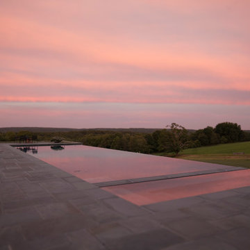
The pool slices above the fields creating a mirror of the sky, day and night.
Photo credit: Neil Landino
Inspiration for a large country backyard stone and rectangular infinity pool remodel in New York
Inspiration for a large country backyard stone and rectangular infinity pool remodel in New York
 Hursthouse Landscape - Architect, Build, Maintain
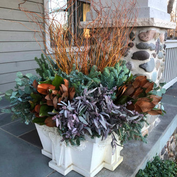
Big bunches of only five items creates a strong winter display on this Craftsman front porch. Primary pieces are curly willow, Magnolia leaves, silver dollar and mixed greens.
Find the right local pro for your project
 L Carter Interiors
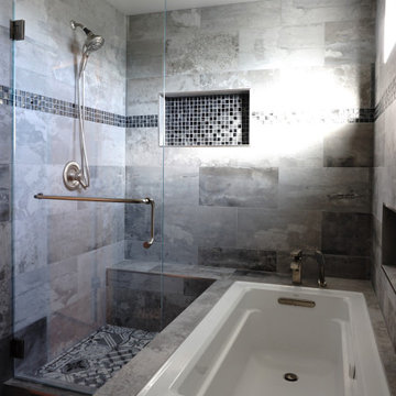
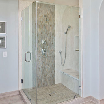
Complete remodel and addition to the master bathroom. We took the original tiny bathroom, and tore down a wall to an oversized walk in closet, to make room for this luxurious walk in shower and tub combo. There's generous room in the shower to allow for a built in bench that carries over to the deck mounted tub filler. The large ledge around the tub serves multiple functions; first as seating space for the owners to be able to bathe their young children and second, for them to rest a glass of wine while soaking to relax at the end of a long day.
 Edgewater Design Group
As written in Northern Home & Cottage by Elizabeth Edwards
Sara and Paul Matthews call their head-turning home, located in a sweet neighborhood just up the hill from downtown Petoskey, “a very human story.” Indeed it is. Sara and her husband, Paul, have a special-needs son as well as an energetic middle-school daughter. This home has an answer for everyone. Located down the street from the school, it is ideally situated for their daughter and a self-contained apartment off the great room accommodates all their son’s needs while giving his caretakers privacy—and the family theirs. The Matthews began the building process by taking their thoughts and
needs to Stephanie Baldwin and her team at Edgewater Design Group. Beyond the above considerations, they wanted their new home to be low maintenance and to stand out architecturally, “But not so much that anyone would complain that it didn’t work in our neighborhood,” says Sara. “We
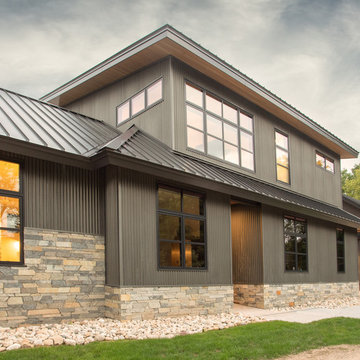
were thrilled that Edgewater listened to us and were able to give us a unique-looking house that is meeting all our needs.” Lombardy LLC built this handsome home with Paul working alongside the construction crew throughout the project. The low maintenance exterior is a cutting-edge blend of stacked stone, black corrugated steel, black framed windows and Douglas fir soffits—elements that add up to an organic contemporary look. The use of black steel, including interior beams and the staircase system, lend an industrial vibe that is courtesy of the Matthews’ friend Dan Mello of Trimet Industries in Traverse City. The couple first met Dan, a metal fabricator, a number of years ago, right around the time they found out that their then two-year-old son would never be able to walk. After the couple explained to Dan that they couldn’t find a solution for a child who wasn’t big enough for a wheelchair, he designed a comfortable, rolling chair that was just perfect. They still use it. The couple’s gratitude for the chair resulted in a trusting relationship with Dan, so it was natural for them to welcome his talents into their home-building process. A maple floor finished to bring out all of its color-tones envelops the room in warmth. Alder doors and trim and a Doug fir ceiling reflect that warmth. Clearstory windows and floor-to-ceiling window banks fill the space with light—and with views of the spacious grounds that will
become a canvas for Paul, a retired landscaper. The couple’s vibrant art pieces play off against modernist furniture and lighting that is due to an inspired collaboration between Sara and interior designer Kelly Paulsen. “She was absolutely instrumental to the project,” Sara says. “I went through
two designers before I finally found Kelly.” The open clean-lined kitchen, butler’s pantry outfitted with a beverage center and Miele coffee machine (that allows guests to wait on themselves when Sara is cooking), and an outdoor room that centers around a wood-burning fireplace, all make for easy,
fabulous entertaining. A den just off the great room houses the big-screen television and Sara’s loom—
making for relaxing evenings of weaving, game watching and togetherness. Tourgoers will leave understanding that this house is everything great design should be. Form following function—and solving very human issues with soul-soothing style.
 TaylorPro Design and Remodeling, Inc.
"The home remodeling process, from concept to a finished product, can be a long and stressful time for many couples. An endless number of questions always come to mind and timely decisions must be made if a successful project is desired. This is why we picked Taylor Pro Design and the reason we are so happy with the finished product! Kerry clearly explained what could and couldn’t be done from a design standpoint and the cost implications of the various options we were considering. In terms of the end product we couldn’t be happier. The attention to detail by his contractors is superb and Kerry’s willingness to make sure we were completely satisfied with everything is genuine and trustworthy. We would recommend Kerry Pro Design to anyone."
~ Julie S, Client
Designer: Kerry Taylor
Photos by: Jon Upson
 Passacantando Architects AIA
Photographer: Kevin Colquhoun
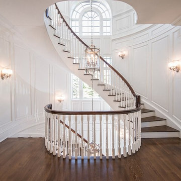
Staircase - huge traditional wooden straight staircase idea in New York with wooden risers
Staircase - huge traditional wooden straight staircase idea in New York with wooden risers

Sponsored
Columbus, OH

Hope Restoration & General Contracting
Columbus Design-Build, Kitchen & Bath Remodeling, Historic Renovations
 Vetter Architects
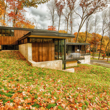
The client’s request was quite common - a typical 2800 sf builder home with 3 bedrooms, 2 baths, living space, and den. However, their desire was for this to be “anything but common.” The result is an innovative update on the production home for the modern era, and serves as a direct counterpoint to the neighborhood and its more conventional suburban housing stock, which focus views to the backyard and seeks to nullify the unique qualities and challenges of topography and the natural environment.
The Terraced House cautiously steps down the site’s steep topography, resulting in a more nuanced approach to site development than cutting and filling that is so common in the builder homes of the area. The compact house opens up in very focused views that capture the natural wooded setting, while masking the sounds and views of the directly adjacent roadway. The main living spaces face this major roadway, effectively flipping the typical orientation of a suburban home, and the main entrance pulls visitors up to the second floor and halfway through the site, providing a sense of procession and privacy absent in the typical suburban home.
Clad in a custom rain screen that reflects the wood of the surrounding landscape - while providing a glimpse into the interior tones that are used. The stepping “wood boxes” rest on a series of concrete walls that organize the site, retain the earth, and - in conjunction with the wood veneer panels - provide a subtle organic texture to the composition.
The interior spaces wrap around an interior knuckle that houses public zones and vertical circulation - allowing more private spaces to exist at the edges of the building. The windows get larger and more frequent as they ascend the building, culminating in the upstairs bedrooms that occupy the site like a tree house - giving views in all directions.
The Terraced House imports urban qualities to the suburban neighborhood and seeks to elevate the typical approach to production home construction, while being more in tune with modern family living patterns.
Overview:
Elm Grove
Size:
2,800 sf,
3 bedrooms, 2 bathrooms
Completion Date:
September 2014
Services:
Architecture, Landscape Architecture
Interior Consultants: Amy Carman Design

 Innovative Design Build
"I cannot say enough good things about the Innovative Construction team and work product.
They remodeled our water-damaged, 1930s basement, and exceeded all of our expectations - before and after photos simply cannot do this project justice. The original basement included an awkward staircase in an awkward location, one bedroom, one bathroom, a kitchen and small living space. We had a difficult time imagining that it could be much more than that. Innovative Construction's design team was creative, and thought completely out of the box. They relocated the stairwell in a way we did not think was possible, opening up the basement to reconfigure the bedroom, bathroom, kitchenette, living space, but also adding an office and finished storage room. The end result is as functional as it is beautiful.
As with all construction, particularly a renovation of an old house, there will be inconveniences, it will be messy, and plenty of surprises behind the old walls. The Innovative Construction team maintained a clean and safe work site for 100% of the project, with minimal disruption to our daily lives, even when there was a large hole cut into our main living room floor to accommodate new stairs down to the basement. The team showed creativity and an eye for design when working around some of the unexpected "character" revealed when opening the walls.
The team effectively uses technology to keep everyone on the same page about changes, requests, schedules, contracts, invoices, etc. Everyone is friendly, competent, helpful, and responsive. I felt heard throughout the process, and my requests were responded to quickly and thoroughly. I recommend Innovative Construction without reservation."
 Dura Supreme Cabinetry
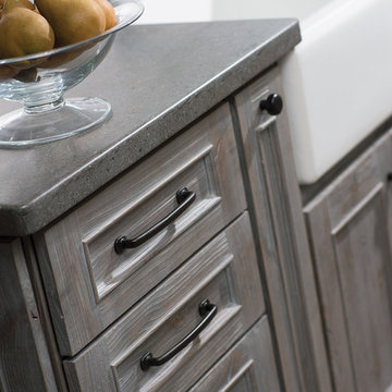
Reminiscent of softly weathered wood, Dura Supreme’s Weathered collection of finishes looks as if it has been exposed to years of sun, wind and rain. Like an old drift fence, tumbled driftwood, or seasoned barn planks; each of Dura Supreme’s Weathered finishes portrays wood that has been exposed to the elements.
Dura Supreme’s special finishing process raises the grain to expose swirls and patterns with a uniquely textured surface. The wood is then lightly distressed by hand to replicate age and wear. After staining, glaze is applied to highlight the grain and then lightly buffed on edges and around knots to reveal the stain color shown. Because each cut of wood is unique, every Weathered finish is a one-of-a-kind rendition that appears to have been aged and worn by time itself.
Dura Supreme’s Weathered finish collection includes an array of colors that evoke images of driftwood, dock planks or charred campfire wood. Choose from Dura Supreme’s four different wood species, each with their own charm and character marks. Select from any of Dura Supreme’s wood door styles to create a look that’s uniquely your own.
Find a Dura Supreme Showroom near you today: http://www.durasupreme.com/dealer-locator
Request a FREE Dura Supreme Brochure Packet: http://www.durasupreme.com/request-brochure
 TKS Design Group
Free ebook, Creating the Ideal Kitchen. DOWNLOAD NOW
The Klimala’s and their three kids are no strangers to moving, this being their fifth house in the same town over the 20-year period they have lived there. “It must be the 7-year itch, because every seven years, we seem to find ourselves antsy for a new project or a new environment. I think part of it is being a designer, I see my own taste evolve and I want my environment to reflect that. Having easy access to wonderful tradesmen and a knowledge of the process makes it that much easier”.
This time, Klimala’s fell in love with a somewhat unlikely candidate. The 1950’s ranch turned cape cod was a bit of a mutt, but it’s location 5 minutes from their design studio and backing up to the high school where their kids can roll out of bed and walk to school, coupled with the charm of its location on a private road and lush landscaping made it an appealing choice for them.
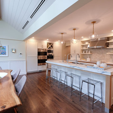
“The bones of the house were really charming. It was typical 1,500 square foot ranch that at some point someone added a second floor to. Its sloped roofline and dormered bedrooms gave it some charm.” With the help of architect Maureen McHugh, Klimala’s gutted and reworked the layout to make the house work for them. An open concept kitchen and dining room allows for more frequent casual family dinners and dinner parties that linger. A dingy 3-season room off the back of the original house was insulated, given a vaulted ceiling with skylights and now opens up to the kitchen. This room now houses an 8’ raw edge white oak dining table and functions as an informal dining room. “One of the challenges with these mid-century homes is the 8’ ceilings. I had to have at least one room that had a higher ceiling so that’s how we did it” states Klimala.
The kitchen features a 10’ island which houses a 5’0” Galley Sink. The Galley features two faucets, and double tiered rail system to which accessories such as cutting boards and stainless steel bowls can be added for ease of cooking. Across from the large sink is an induction cooktop. “My two teen daughters and I enjoy cooking, and the Galley and induction cooktop make it so easy.” A wall of tall cabinets features a full size refrigerator, freezer, double oven and built in coffeemaker. The area on the opposite end of the kitchen features a pantry with mirrored glass doors and a beverage center below.
The rest of the first floor features an entry way, a living room with views to the front yard’s lush landscaping, a family room where the family hangs out to watch TV, a back entry from the garage with a laundry room and mudroom area, one of the home’s four bedrooms and a full bath. There is a double sided fireplace between the family room and living room. The home features pops of color from the living room’s peach grass cloth to purple painted wall in the family room. “I’m definitely a traditionalist at heart but because of the home’s Midcentury roots, I wanted to incorporate some of those elements into the furniture, lighting and accessories which also ended up being really fun. We are not formal people so I wanted a house that my kids would enjoy, have their friends over and feel comfortable.”
The second floor houses the master bedroom suite, two of the kids’ bedrooms and a back room nicknamed “the library” because it has turned into a quiet get away area where the girls can study or take a break from the rest of the family. The area was originally unfinished attic, and because the home was short on closet space, this Jack and Jill area off the girls’ bedrooms houses two large walk-in closets and a small sitting area with a makeup vanity. “The girls really wanted to keep the exposed brick of the fireplace that runs up the through the space, so that’s what we did, and I think they feel like they are in their own little loft space in the city when they are up there” says Klimala.
Designed by: Susan Klimala, CKD, CBD
Photography by: Carlos Vergara
For more information on kitchen and bath design ideas go to: www.kitchenstudio-ge.com
 Dura Supreme Cabinetry
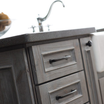
Reminiscent of softly weathered wood, Dura Supreme’s Weathered collection of finishes looks as if it has been exposed to years of sun, wind and rain. Like an old drift fence, tumbled driftwood, or seasoned barn planks; each of Dura Supreme’s Weathered finishes portrays wood that has been exposed to the elements.
Dura Supreme’s special finishing process raises the grain to expose swirls and patterns with a uniquely textured surface. The wood is then lightly distressed by hand to replicate age and wear. After staining, glaze is applied to highlight the grain and then lightly buffed on edges and around knots to reveal the stain color shown. Because each cut of wood is unique, every Weathered finish is a one-of-a-kind rendition that appears to have been aged and worn by time itself.
Dura Supreme’s Weathered finish collection includes an array of colors that evoke images of driftwood, dock planks or charred campfire wood. Choose from Dura Supreme’s four different wood species, each with their own charm and character marks. Select from any of Dura Supreme’s wood door styles to create a look that’s uniquely your own.
Find a Dura Supreme Showroom near you today: http://www.durasupreme.com/dealer-locator
Request a FREE Dura Supreme Brochure Packet: http://www.durasupreme.com/request-brochure
 Wesley-Wayne Interiors, LLC
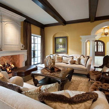
Larger pieces of furniture fill the room to make it feel more comfortable.
Design: Wesley-Wayne Interiors
Photo: Dan Piassick
Inspiration for a large mediterranean formal and open concept medium tone wood floor and brown floor living room remodel in Other with yellow walls and a standard fireplace
Inspiration for a large mediterranean formal and open concept medium tone wood floor and brown floor living room remodel in Other with yellow walls and a standard fireplace
Sponsored
Columbus, OH
Hope Restoration & General Contracting
Columbus Design-Build, Kitchen & Bath Remodeling, Historic Renovations
 Klopf Architecture
Built for the Bluff, A Sea Ranch Home is Remade from the Inside Out
The house had always been grounded, on an ocean bluff at The Sea Ranch. It sits unencumbered, adjacent to one of the most dramatic stretches of the Sonoma coast with protected commons meadow to the east, uninterrupted Pacific views to the west, and a bluff trail running alongside. What it lacked was the feeling of home, one that could hold up its own against the natural landscape.
The owners are entrepreneurs with deep involvement across tech, real estate, and development and they know how things are built. The Sea Ranch house had been in their lives for years, a second residence and a place for family to gather. Built for a different time, it felt more compromising than comfortable. Sitting in a closed off nook, the kitchen fit one cook at a time and turned its back on the rest of the house. The entry was dim and compressed, divided by a structural column that presented itself at exactly the wrong moment. The primary suite was small relative to the view outside it. A large rear bedroom sat behind a lowered ceiling with a bathroom that had never been added. The house was certainly worth the trouble of doing it right.
What followed was not one project but four, each with its own design challenge, each addressed over a period of time.
Where the House Meets the Ocean
The most complex piece of the project, in both structural and spatial terms, was the kitchen expansion. The existing room was a single-person galley squeezed in as an afterthought with no meaningful connection to the dining room, the living space, or the deck outside. To make it useful for a family that cooks and gathers, it needed to grow outward into an existing patio and flow into the rooms around it.
A big challenge was the roofline. Several planes at different pitches and angles converged directly where additional volume was needed. A new form had to join that geometry without reading as a correction. The solution found the simplest possible connection between the existing angles, a roofline that from outside the structure, appears entirely original. From the bluff trail where the addition is visible, there is no discernible seam.
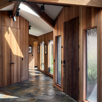
Inside, the kitchen is now open to the living and dining rooms without interruption. A large sliding glass door connects the space onto the rear deck. The deck itself was expanded and oriented so that the body of the house shields it from the coastal wind which is a common consideration that determines whether outdoor space at The Sea Ranch actually gets used. The result is a room that works for large family gatherings where no one feels cutoff, and one that makes the boundary between being inside and outside easy to ignore.
Welcoming Light
A structural column stood at the convergence of eight distinct roof planes in the entry. It was load-bearing, but it was also the reason the entry had always felt like a hallway rather than a welcoming arrival.
With the structural engineer, a custom steel connector was designed to receive beams from six separate directions, redistributing the load through a single new continuous beam. The column was surgically removed. Three triangular skylights were then cut into the roof above, their shapes drawn from the
existing geometry of the planes around them. The entry is now bright and open. The skylights feel native to the structure because they follow the logic already present in the roof.
Two Suites, Two Views
At opposite ends of the house, the two bedroom suites were each reconfigured, and each found a different way to introduce more of the landscape into the room.
An addition to the primary suite extended the structure outward to create a wraparound plan with a loop from the bedroom through bath and closet that had not been possible before. The expansion opened a slot view from the tub and shower toward the ocean. The view is precise and private. The ocean view is present and deliberate.
The rear bedroom absorbed an adjacent storage room to transform it into a full second suite with a vaulted ceiling, a large bathroom with a tub, a shower, and a sauna. A private fenced garden courtyard sits just beyond the glass bringing the outdoors inside. The tub was placed so that, looking past the courtyard and through the bedroom beyond, the ocean is visible at the far end. It is a long view and it makes the room feel larger and more settled than its footprint would suggest.
Glass on Four Sides, Fire at the Center
The main living and gathering room had always been caught between two competing facts: glass on four sides meant exceptional views but at The Sea Ranch, it also meant a cold room. A 360-degree cylindrical fireplace was added at the center on a raised stone base, providing radiant heat in every direction and giving the room a focal point around which a group naturally orients itself, whether that means two people at the end of the day or the whole family after dinner.
Owners Who Picked Up the Tools
The owner was not a passive client. they came with construction knowledge, specific ideas, and the desire to be an active part of the process, a dynamic that other architects may had found difficult, which Klopf Architecture accepted as an asset. They took it upon themselves to complete some of the work during construction, including the installation of a new radiant heating system beneath the floors.
The radiant system added to the older and less-desirable forced-air setup. At The Sea Ranch, that change matters as the house sits close enough to the ocean and moving air competes with the sound of it, where radiant heat does not. Solar panels were added to the roof as part of the new system. Insulation was upgraded throughout the walls, roof, and crawl space. The house that had always had the right setting now holds warmth the way a house on the bluff should.
They were also deeply involved in the design and selections throughout, and the finished house reflects both of them in ways that are specific rather than generic. The process took longer and moved through more iterations than a more arms-length relationship might have allowed. The result is more defined and personal because of it.
The Landscape Holds Priority
Every exterior decision was shaped by The Sea Ranch Design Standards, which require that buildings defer to the landscape around them rather than compete with it. Because this house sits on the bluff and is visible from the public trail, the additions faced a close review. Existing materials were matched. Geometries were resolved. The additions had to become indistinguishable from the original building.
From the trail, the house reads exactly as it always has — low, cedar-clad, secondary to the meadow and the water. The setting holds priority. Inside, the house has been remade.
Klopf Architecture Project Team: Geoff Campen and Trenton Jewett
Contractor: Shawn Bettega Construction
Photography: ©2025 Mariko Reed
Year Completed: 2023
Location: The Sea Ranch, CA
 Klopf Architecture
Built for the Bluff, A Sea Ranch Home is Remade from the Inside Out
The house had always been grounded, on an ocean bluff at The Sea Ranch. It sits unencumbered, adjacent to one of the most dramatic stretches of the Sonoma coast with protected commons meadow to the east, uninterrupted Pacific views to the west, and a bluff trail running alongside. What it lacked was the feeling of home, one that could hold up its own against the natural landscape.
The owners are entrepreneurs with deep involvement across tech, real estate, and development and they know how things are built. The Sea Ranch house had been in their lives for years, a second residence and a place for family to gather. Built for a different time, it felt more compromising than comfortable. Sitting in a closed off nook, the kitchen fit one cook at a time and turned its back on the rest of the house. The entry was dim and compressed, divided by a structural column that presented itself at exactly the wrong moment. The primary suite was small relative to the view outside it. A large rear bedroom sat behind a lowered ceiling with a bathroom that had never been added. The house was certainly worth the trouble of doing it right.
What followed was not one project but four, each with its own design challenge, each addressed over a period of time.
Where the House Meets the Ocean
The most complex piece of the project, in both structural and spatial terms, was the kitchen expansion. The existing room was a single-person galley squeezed in as an afterthought with no meaningful connection to the dining room, the living space, or the deck outside. To make it useful for a family that cooks and gathers, it needed to grow outward into an existing patio and flow into the rooms around it.
A big challenge was the roofline. Several planes at different pitches and angles converged directly where additional volume was needed. A new form had to join that geometry without reading as a correction. The solution found the simplest possible connection between the existing angles, a roofline that from outside the structure, appears entirely original. From the bluff trail where the addition is visible, there is no discernible seam.
Inside, the kitchen is now open to the living and dining rooms without interruption. A large sliding glass door connects the space onto the rear deck. The deck itself was expanded and oriented so that the body of the house shields it from the coastal wind which is a common consideration that determines whether outdoor space at The Sea Ranch actually gets used. The result is a room that works for large family gatherings where no one feels cutoff, and one that makes the boundary between being inside and outside easy to ignore.
Welcoming Light
A structural column stood at the convergence of eight distinct roof planes in the entry. It was load-bearing, but it was also the reason the entry had always felt like a hallway rather than a welcoming arrival.
With the structural engineer, a custom steel connector was designed to receive beams from six separate directions, redistributing the load through a single new continuous beam. The column was surgically removed. Three triangular skylights were then cut into the roof above, their shapes drawn from the
existing geometry of the planes around them. The entry is now bright and open. The skylights feel native to the structure because they follow the logic already present in the roof.
Two Suites, Two Views
At opposite ends of the house, the two bedroom suites were each reconfigured, and each found a different way to introduce more of the landscape into the room.
An addition to the primary suite extended the structure outward to create a wraparound plan with a loop from the bedroom through bath and closet that had not been possible before. The expansion opened a slot view from the tub and shower toward the ocean. The view is precise and private. The ocean view is present and deliberate.
The rear bedroom absorbed an adjacent storage room to transform it into a full second suite with a vaulted ceiling, a large bathroom with a tub, a shower, and a sauna. A private fenced garden courtyard sits just beyond the glass bringing the outdoors inside. The tub was placed so that, looking past the courtyard and through the bedroom beyond, the ocean is visible at the far end. It is a long view and it makes the room feel larger and more settled than its footprint would suggest.
Glass on Four Sides, Fire at the Center
The main living and gathering room had always been caught between two competing facts: glass on four sides meant exceptional views but at The Sea Ranch, it also meant a cold room. A 360-degree cylindrical fireplace was added at the center on a raised stone base, providing radiant heat in every direction and giving the room a focal point around which a group naturally orients itself, whether that means two people at the end of the day or the whole family after dinner.
Owners Who Picked Up the Tools
The owner was not a passive client. they came with construction knowledge, specific ideas, and the desire to be an active part of the process, a dynamic that other architects may had found difficult, which Klopf Architecture accepted as an asset. They took it upon themselves to complete some of the work during construction, including the installation of a new radiant heating system beneath the floors.
The radiant system added to the older and less-desirable forced-air setup. At The Sea Ranch, that change matters as the house sits close enough to the ocean and moving air competes with the sound of it, where radiant heat does not. Solar panels were added to the roof as part of the new system. Insulation was upgraded throughout the walls, roof, and crawl space. The house that had always had the right setting now holds warmth the way a house on the bluff should.
They were also deeply involved in the design and selections throughout, and the finished house reflects both of them in ways that are specific rather than generic. The process took longer and moved through more iterations than a more arms-length relationship might have allowed. The result is more defined and personal because of it.
The Landscape Holds Priority
Every exterior decision was shaped by The Sea Ranch Design Standards, which require that buildings defer to the landscape around them rather than compete with it. Because this house sits on the bluff and is visible from the public trail, the additions faced a close review. Existing materials were matched. Geometries were resolved. The additions had to become indistinguishable from the original building.
From the trail, the house reads exactly as it always has — low, cedar-clad, secondary to the meadow and the water. The setting holds priority. Inside, the house has been remade.
Klopf Architecture Project Team: Geoff Campen and Trenton Jewett
Contractor: Shawn Bettega Construction
Photography: ©2025 Mariko Reed
Year Completed: 2023
Location: The Sea Ranch, CA
 Rhodes Architecture + Light
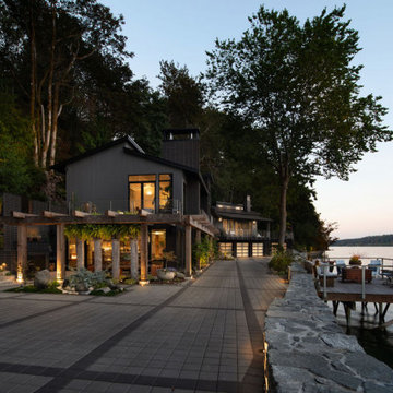
The renovation of an extensive linear residence and site facing Port Orchard waterway embraces water, greenspace and forested hillside. The home, completed this fall, serves as an artist’s studio, galleries, family space, game room, outdoor living areas and peaceful retreat.
New interiors and exterior spaces and finishes, cabinetry, lighting, paving, landscape and courtyards become settings for the owner’s art + collections, three-generations of family and the wonderful colors and textures of the land + water.
Inside, a monumental central stair and tapered two-story tall red cedar and steel column was designed as the residence’s entry focal point and internal landmarks, guiding the visitor’s eye to the main atrium…. and upward. Heavy wide-flange steel moment frames support the house and enable whole walls of glass. Rough, mill-finished steel contrasts refined cabinetry, stone, wood structure and defining dropped ceilings, reflecting the opener’s love of the tension between highly polished and detailed + rough, found art.
Outside, A new southern “dining room” was designed for warm summer evening gatherings under a heavy-timber trellis. The focus, opposite water and island views, is a metal perforated screen. The final screen is composed of the lyrics from a Joe Cocker song of great meaning to the owners, cut from ½” marine bronze, set into dark-fired brick. “Oh My Darling, Be Home Soon….”
Natural daylight and high-efficiency lighting are central players as in any gallery. From a high clerestory and extensive southern and eastern window-walls to carefully selected up-lighting, pendants, and accent fixtures, Rhodes Architecture + Light worked closely with the owner to ensure that their dark existing house would become one filled with light…. night and day.
The owners, Ken and Jane, allowed us to interview them about their experience working with Rhodes Architecture + Light, and how they are feeling about living with the architecture today.
What was your experience like, working with Rhodes Architecture + Light?
“They worked with us because it was a remodel, an existing thing, and we had to try to make it work for all of our interests and how our family operated. They listened, and we listened, and it was a great communication back and forth.”–Jane
How has the renovation changed the way you live and enjoy your home?
“I remember saying to them that I want the whole floor heated because it gets so chilly down here. And we had the wood burning stove, but it was over there and now we just turn the floor heat on and we can come down. It’s cozy and nice. So we’re looking forward to winter now.”–Ken
“We have 5 kids together and now a bunch of grandchildren. I wanted a marble countertop, but there’s just no way. I didn’t want it to be a place where I had to say, ‘No, no, no. Wipe up your drink, do this, do that.’ I wanted it to be a place where everybody can come with all the kids, and we make a big mess, and I can clean it up. And we can enjoy ourselves here, because that room upstairs, we almost never went in. And now we’re in there eating pizza and watching the game.” –Jane
As an artist, Jane enjoyed the collaborative process.
“I can’t believe it was as positive as it was. I went into it thinking it would be a great, creative, fun, collaborative thing, and I have to say, with our architects, it was. I like that creative process. I always say when I am doing a painting, it’s a series of problem solving so it wasn’t unusual for me. I am completely blown away by them and had fun with that part of it.” –Jane
Architect: Tim James Rhodes RA AIA, Rhodes Architecture + Light
Builder: Fairbank Construction Company
Structural: Swensen Say Faget
 Reico Kitchen & Bath
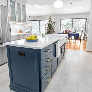
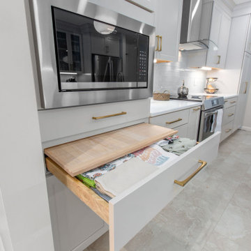
Emma Gerancher from Reico Kitchen & Bath in Charlottesville, VA, partnered with Luis Dorta of LED Construction to design a transitional kitchen featuring Masterpiece cabinetry. The kitchen includes the Barton door style in a Cottage finish for the perimeter and a custom Sherwin-Williams Mount Etna painted finish for the island.
The space also features MSI W Calacatta Safyra countertops, along with a Frigidaire canopy hood and microwave.
The client shared, “Gutting our old kitchen to reconfigure the space for better flow, workspace, and storage was a challenge. Emma listened to my needs and offered helpful tips and options, which made the process work. The layout followed the workflow, and my habits and style guided the final details. Reico gave me the options and confidence to trust the process, and the outcome is seamless and beautiful.”
Emma explained, “This kitchen is one of my favorites. The homeowners wanted to replace the peninsula with a custom painted island in Sherwin-Williams Mount Etna, which paired well with the Cottage perimeter cabinets, Calacatta Safyra countertops, sea glass backsplash, and honey bronze hardware. It was a pleasure working with both the homeowners and the contractors throughout the remodel.”
Photos courtesy of Regarday, LLC.
 Reico Kitchen & Bath
Emma Gerancher from Reico Kitchen & Bath in Charlottesville, VA, partnered with Luis Dorta of LED Construction to design a transitional kitchen featuring Masterpiece cabinetry. The kitchen includes the Barton door style in a Cottage finish for the perimeter and a custom Sherwin-Williams Mount Etna painted finish for the island.
The space also features MSI W Calacatta Safyra countertops, along with a Frigidaire canopy hood and microwave.
The client shared, “Gutting our old kitchen to reconfigure the space for better flow, workspace, and storage was a challenge. Emma listened to my needs and offered helpful tips and options, which made the process work. The layout followed the workflow, and my habits and style guided the final details. Reico gave me the options and confidence to trust the process, and the outcome is seamless and beautiful.”
Emma explained, “This kitchen is one of my favorites. The homeowners wanted to replace the peninsula with a custom painted island in Sherwin-Williams Mount Etna, which paired well with the Cottage perimeter cabinets, Calacatta Safyra countertops, sea glass backsplash, and honey bronze hardware. It was a pleasure working with both the homeowners and the contractors throughout the remodel.”
Photos courtesy of Regarday, LLC.
 United Porte Inc
Your front door is your best defender. It protects you, your family, and your most valuable personal belongings from theft and damage.
Furthermore, VDom Doors insulate your home from extreme weather conditions, as well as unwanted animals, insects, and dust from entering. Due to its versatility, metal-plastic entrance doors are perfect for both private houses and shops, offices, and administrative buildings.
Our doors have several superior features:
Metal-plastic doors – lighter (around 120lbs for a door unit) than iron and steel doors, but no less strong and reliable! Scratch and impact resistance, ease of care, and environmentally friendly.
In principle, we use only all-welded reinforcement, 1/10" thick (!) for the entrance doors. Such reinforcement is a necessary condition for real burglary resistance.
We use an aluminum threshold with a special thermal insert that cuts off the cold from the room. We also complete with an amplifier to securely fix the bottom of the door and cut off the cold.
1 1/4" thick HPL sandwich panel, consists of foamed extruded Styrofoam, with rigid PVC overlays high pressure on both sides.
Energy savings double-glazed safety windows.
Stiffening Ribs: These non-visible details add to our door's security.
Quality insulation serves to reduce unwanted external noise, as well as protect against extreme heat, and severe cold.
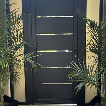
Introducing the Manux collection of modern metal-plastic doors in a sleek Black Matte color. These doors are expertly crafted from durable metal-plastic material and feature European roller hinges and an aluminum threshold, ensuring both longevity and security for your home.
The exterior design boasts five No Glass panels, creating a modern and stylish look that will enhance the curb appeal of any home. The Black Matte color provides a sophisticated and contemporary feel, perfect for those who want to make a bold statement with their entrance.
The interior design also features five No Glass panels, creating a cohesive and stylish look throughout the home.
With the Manux collection, you can have both style and function. These modern front doors are perfect for homeowners who want to elevate the look of their home's exterior while also ensuring their property's safety and security. And with our easy ordering process and user-friendly website, you can have your new door delivered right to your doorstep.
Upgrade your home's curb appeal and make a statement with the Manux collection of modern metal-plastic doors in sleek Black Matte. Order yours today and experience the perfect combination of style and function.
Specifications:
Model - 8415 Manux
Core - Metal-plastic
Color - Black Matte
Door thickness - 2 1/3"
Door slab width — 31"
Frame thickness - 2 3/4"
Swing direction - Inswing only, right or left
Hardware included:
Metal-plastic 2 3/4" thick frame - dimensions of the door with frame is 34" x 82".
Aluminum threshold.
European roller hinges (3D adjustment).
Handle set with lock Vorne and cylinder (5 keys included).
Sealants - 2 rows of seals protect against blowing.
 Cantoni Irvine
Brad Haines knows a thing or two about building things. The intensely creative and innovative founder of Oklahoma City-based Haines Capital is the driving force behind numerous successful companies including Bank 7 (NASDAQ BSVN), which proudly reported record year-end earnings since going public in September of last year. He has beautifully built, renovated, and personally thumb printed all of his commercial spaces and residences. “Our theory is to keep things sophisticated but comfortable,” Brad says.
That’s the exact approach he took in his personal haven in Nichols Hills, Oklahoma. Painstakingly renovated over the span of two years by Candeleria Foster Design-Build of Oklahoma City, his home boasts museum-white, authentic Venetian plaster walls and ceilings; charcoal tiled flooring; imported marble in the master bath; and a pretty kitchen you’ll want to emulate.
Reminiscent of an edgy luxury hotel, it is a vibe conjured by Cantoni designer Nicole George. “The new remodel plan was all about opening up the space and layering monochromatic color with lots of texture,” says Nicole, who collaborated with Brad on two previous projects. “The color palette is minimal, with charcoal, bone, amber, stone, linen and leather.”
“Sophisticated“Sophisticated“Sophisticated“Sophisticated“Sophisticated
Nicole helped oversee space planning and selection of interior finishes, lighting, furnishings and fine art for the entire 7,000-square-foot home. It is now decked top-to-bottom in pieces sourced from Cantoni, beginning with the custom-ordered console at entry and a pair of Glacier Suspension fixtures over the stairwell. “Every angle in the house is the result of a critical thought process,” Nicole says. “We wanted to make sure each room would be purposeful.”
To that end, “we reintroduced the ‘parlor,’ and also redefined the formal dining area as a bar and drink lounge with enough space for 10 guests to comfortably dine,” Nicole says. Brad’s parlor holds the Swing sectional customized in a silky, soft-hand charcoal leather crafted by prominent Italian leather furnishings company Gamma. Nicole paired it with the Kate swivel chair customized in a light grey leather, the sleek DK writing desk, and the Black & More bar cabinet by Malerba. “Nicole has a special design talent and adapts quickly to what we expect and like,” Brad says.
To create the restaurant-worthy dining space, Nicole brought in a black-satin glass and marble-topped dining table and mohair-velvet chairs, all by Italian maker Gallotti & Radice. Guests can take a post-dinner respite on the adjoining room’s Aston sectional by Gamma.
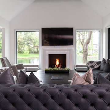
In the formal living room, Nicole paired Cantoni’s Fashion Affair club chairs with the Black & More cocktail table, and sofas sourced from Désirée, an Italian furniture upholstery company that creates cutting-edge yet comfortable pieces. The color-coordinating kitchen and breakfast area, meanwhile, hold a set of Guapa counter stools in ash grey leather, and the Ray dining table with light-grey leather Cattelan Italia chairs. The expansive loggia also is ideal for entertaining and lounging with the Versa grand sectional, the Ido cocktail table in grey aged walnut and Dolly chairs customized in black nubuck leather. Nicole made most of the design decisions, but, “she took my suggestions seriously and then put me in my place,” Brad says.
She had the master bedroom’s Marlon bed by Gamma customized in a remarkably soft black leather with a matching stitch and paired it with onyx gloss Black & More nightstands. “The furnishings absolutely complement the style,” Brad says. “They are high-quality and have a modern flair, but at the end of the day, are still comfortable and user-friendly.”
The end result is a home Brad not only enjoys, but one that Nicole also finds exceptional. “I honestly love every part of this house,” Nicole says. “Working with Brad is always an adventure but a privilege that I take very seriously, from the beginning of the design process to installation.”
32