
Search results for "Decision" in Home Design Ideas

 Alair Homes Plano
This project is a Houzz Kitchen of the Week! Click below to read the full story!
https://www.houzz.com/ideabooks/116547325/list/kitchen-of-the-week-better-brighter-and-no-longer-basic
Our clients came to us wanting an elegant and functional kitchen and brighter living room. Their kitchen was dark and inefficient. The cabinets felt cluttered and the storage was there, but not functional for this family. They wanted all new finishes; especially new cabinets, but the floors were going to stay and be refinished. No wall relocation was needed but adding a door into the dining room to block the view from the front into the kitchen was discussed. They wanted to bring in more light somehow and preferably natural light. There was an unused sink in the butler’s pantry that they wanted capped, giving them more space and organized storage was a must! In their living room, they love their fireplace because it reminds her of her home in Colorado, so that definitely had to stay but everything else was left to the designers.
After all decisions were made, this gorgeous kitchen and living space came to life! It is bright, open and airy, just like our clients wanted. Soft White Shiloh cabinetry was installed with a contrasting Cocoa island. Honed Levantina Taj Mahal quartzite was a beautiful countertop for this space. Bedrosians Grace 4”x 12” wall tile in Panna was the backsplash throughout the kitchen. The stove wall is flanked with dark wooden shelves on either side of vent-a-hood creating a feature area to the cook area. A beautiful maple barn door with seeded baroque tempered glass inserts was installed to close off the pantry and giving them more room than a traditional door. The original wainscoting remained in the kitchen and living areas but was modified in the kitchen where the cabinets were slightly extended and painted white throughout. LED tape lighting was installed under the cabinets, LED lighting was also added to the top of the upper glass cabinets, in addition to the grow lights installed for their herbs. All of the light fixtures were updated to a timeless classic look and feel. Imbrie articulating wall sconces were installed over the kitchen window/sink and in the butler’s pantry and aged brass Hood classic globe pendants were hung over the island, really drawing your attention to the kitchen. The Alturas fixture from SeaGull Lighing now hangs in the center of the living room, where there was once an outdated ceiling fan. In the living room, the walls were painted white, while leaving the wood and stone fireplace, as requested, leaving an absolutely amazing contrast!
Design/Remodel by Hatfield Builders & Remodelers | Photography by Versatile Imaging

 User
Those objects of affection in your prized, personalized collections are meant to be seen and admired, and Jeff put together a unique place for keepsakes with not one but three of our Ducar bookcases. You can even remove and rearrange the adjustable shelves, as Jeff did here, to install a mini art gallery. It’s clever decisions like this that give your space an unexpected twist and catch everyone’s attention.

 Brookfield Stairs
Photographed By: David Deviou (DMD)
Small minimalist side yard balcony deck photo in Seattle with no cover
Small minimalist side yard balcony deck photo in Seattle with no cover
Find the right local pro for your project

 Betz Pools Limited
The decision was made to install a 15’ x 30’ vinyl pool so they would have sufficient budget to create a fully featured backyard. The important features include an outdoor living room, dining area, poolside lounge areas and low maintenance planting beds which add colour and texture.

 Brooks and Falotico Associates, Inc.
waterfront shingle style residence
Beach style beige three-story wood exterior home photo in New York
Beach style beige three-story wood exterior home photo in New York
 Alair Homes Plano
This project is a Houzz Kitchen of the Week! Click below to read the full story!
https://www.houzz.com/ideabooks/116547325/list/kitchen-of-the-week-better-brighter-and-no-longer-basic
Our clients came to us wanting an elegant and functional kitchen and brighter living room. Their kitchen was dark and inefficient. The cabinets felt cluttered and the storage was there, but not functional for this family. They wanted all new finishes; especially new cabinets, but the floors were going to stay and be refinished. No wall relocation was needed but adding a door into the dining room to block the view from the front into the kitchen was discussed. They wanted to bring in more light somehow and preferably natural light. There was an unused sink in the butler’s pantry that they wanted capped, giving them more space and organized storage was a must! In their living room, they love their fireplace because it reminds her of her home in Colorado, so that definitely had to stay but everything else was left to the designers.
After all decisions were made, this gorgeous kitchen and living space came to life! It is bright, open and airy, just like our clients wanted. Soft White Shiloh cabinetry was installed with a contrasting Cocoa island. Honed Levantina Taj Mahal quartzite was a beautiful countertop for this space. Bedrosians Grace 4”x 12” wall tile in Panna was the backsplash throughout the kitchen. The stove wall is flanked with dark wooden shelves on either side of vent-a-hood creating a feature area to the cook area. A beautiful maple barn door with seeded baroque tempered glass inserts was installed to close off the pantry and giving them more room than a traditional door. The original wainscoting remained in the kitchen and living areas but was modified in the kitchen where the cabinets were slightly extended and painted white throughout. LED tape lighting was installed under the cabinets, LED lighting was also added to the top of the upper glass cabinets, in addition to the grow lights installed for their herbs. All of the light fixtures were updated to a timeless classic look and feel. Imbrie articulating wall sconces were installed over the kitchen window/sink and in the butler’s pantry and aged brass Hood classic globe pendants were hung over the island, really drawing your attention to the kitchen. The Alturas fixture from SeaGull Lighing now hangs in the center of the living room, where there was once an outdated ceiling fan. In the living room, the walls were painted white, while leaving the wood and stone fireplace, as requested, leaving an absolutely amazing contrast!
Design/Remodel by Hatfield Builders & Remodelers | Photography by Versatile Imaging

 Lorin Hill, Architect
John Bedell Photography
Mid-sized trendy open concept living room photo in San Francisco with white walls and no tv
Mid-sized trendy open concept living room photo in San Francisco with white walls and no tv

 Design Fixation [Faith Provencher]
Photo: Faith Towers © 2016 Houzz
Example of a transitional bedroom design in Burlington
Example of a transitional bedroom design in Burlington

 DK Homes
Uniquely situated on a double lot high above the river, this home stands proudly amongst the wooded backdrop. The homeowner's decision for the two-toned siding with dark stained cedar beams fits well with the natural setting. Tour this 2,000 sq ft open plan home with unique spaces above the garage and in the daylight basement.

 Lisa Lev Design
Photo Credit to Alex Lukey
Mid-sized minimalist light wood floor and white floor mudroom photo in Toronto with white walls and a black front door
Mid-sized minimalist light wood floor and white floor mudroom photo in Toronto with white walls and a black front door

 Heather Garrett Design
How to help a young couple who loved the location and bones of a traditional home, but wanted a decisive shift in its decor and vibe to modern luxe? Begin by pulling down the 2-story walls of oak paneling, heavy fireplace mantle, and scraping out the dimly lit kitchen. Opening the kitchen into the family room and reworking the architecture of the space was the solution to creating the fresh feeling we were after.
Photos by John Bessler
 Xpress Rendering
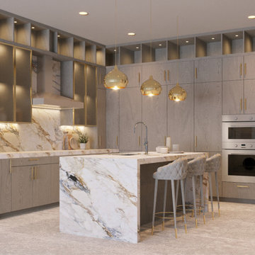
This kitchen design is a perfect balance of luxury and calm. Warm veined marble wraps the island and backsplash, while golden accents and pendant lights add a touch of glam. The soft gray cabinetry and clean layout make it as functional as it is beautiful.
Xpress Rendering brings this space to life through high-quality 3D visualization, helping designers and homeowners make confident design decisions.
? Which detail do you love most—the lighting, the marble, or the cabinetry?
 User
To move or not to move: This 1970's ranch style home was in the perfect location and the perfect size for this family but the layout didn't work. This family did their homework by pricing what it would cost to transform this home into one they would love for years to come. The prices helped them make the decision to stay and remodel.
An open floor plan was at the top of their design wish list. To create it, they were pleased to find out that the walls they wanted to remove were not load bearing. Walls that originally separated the Kitchen, Dining Room and Great Room quickly became history as this project progressed. The result was dramatic and with each stage this family fell more in love with the home they really didn't want to leave in the first place.
PHOTOGRAPHER: SHANNON NICHOLSON

 Nistenhaus Design LLC
Daring black walls with white trim tie back to the black and white kitchen finishes and bring a modern, dramatic look to the fireplace.
The decision to tear down the wall that was by the refrigerator opened up the space physically as well as visually and makes the space seem much bigger.

 Nathan Taylor for Obelisk Home
Objective: The clients childhood memories of a home previously stayed in as a young girl played a vital
role in the decision to totally transform a part of history into a modern retreat for this couple.
Solution: Demo of every room began. One brick wall and center support wall stayed while everything
else was demolished. We rearranged each room to create the perfect home for the soon to
be retired couple. The clients love being outside which is the reasoning for all of large window and
sliding doors which lead to the pool and manicured grounds.
A new master suite was created, new guest room with ensuite bath, laundry room, small family
room, oversized living room, dining room, kitchen, dish pantry, and powder bath were all totally
reimagined to give this family everything they wanted. Furnishings brought from the previous home,
revived heirlooms, and new pieces all combined to create this modern, yet warm inviting home.
In the powder bath a classic pedestal sink, marble mosaic floors, and simple baseboards were the
perfect pairing for this dramatic wallpaper. After construction, a vintage art piece was revived from
storage to become the perfect juxtaposed piece to complete the powder bath.
The kitchen is a chef’s dream with clean lined cabinets, white quartz countertops and plenty of seating
for casual eating.

 Isaman design, Inc.
On a quiet cul-de-sac not too far from downtown San Luis Obispo lies the contemporary craftsman styled Clausen Residence. The challenges that accompanied this project were what, in the end, made it so interesting. The buildable area of the site is very small due to the fact that almost half of the property is occupied by a biological open space easement, established to protect the creek that runs behind the lot. In addition to this, the site is incredibly steep, which lent itself well to a stair stepped 3-story floor plan. Strict height restrictions set by the local jurisdiction governed the decision to bury the garage in the hill, and set the main living space on top of it, accompanied by the children’s bedrooms and game room further back on the site. The 3rd floor is occupied fully by the master suite, which looks down on the back yard below. Off of the great room is a vast deck, with built in barbecue, fire place and heaters, ideal for outdoor entertaining year round.
The house, adorned in lap siding and true craftsman details is flanked by gorgeous oak trees and the creek beyond.

 Eden LA Furniture and Interiors
Modern living with ocean breezes
__
This is another development project EdenLA assisted the client to finish quickly and for top dollar. The fun challenge of more contemporary spaces is how to make them warm and inviting while still maintaining the overall masculine appeal of their architecture. Water features, playful custom abstract art, unique furniture layouts, and warm stone and cabinetry decisions all helped to achieve that in this space. Beach Life Construction implemented the architect's indoor-outdoor flow on the top floor beautifully as well.
__
Kim Pritchard Photography

 ZeroEnergy Design
This renovated brick rowhome in Boston’s South End offers a modern aesthetic within a historic structure, creative use of space, exceptional thermal comfort, a reduced carbon footprint, and a passive stream of income.
DESIGN PRIORITIES. The goals for the project were clear - design the primary unit to accommodate the family’s modern lifestyle, rework the layout to create a desirable rental unit, improve thermal comfort and introduce a modern aesthetic. We designed the street-level entry as a shared entrance for both the primary and rental unit. The family uses it as their everyday entrance - we planned for bike storage and an open mudroom with bench and shoe storage to facilitate the change from shoes to slippers or bare feet as they enter their home. On the main level, we expanded the kitchen into the dining room to create an eat-in space with generous counter space and storage, as well as a comfortable connection to the living space. The second floor serves as master suite for the couple - a bedroom with a walk-in-closet and ensuite bathroom, and an adjacent study, with refinished original pumpkin pine floors. The upper floor, aside from a guest bedroom, is the child's domain with interconnected spaces for sleeping, work and play. In the play space, which can be separated from the work space with new translucent sliding doors, we incorporated recreational features inspired by adventurous and competitive television shows, at their son’s request.
MODERN MEETS TRADITIONAL. We left the historic front facade of the building largely unchanged - the security bars were removed from the windows and the single pane windows were replaced with higher performing historic replicas. We designed the interior and rear facade with a vision of warm modernism, weaving in the notable period features. Each element was either restored or reinterpreted to blend with the modern aesthetic. The detailed ceiling in the living space, for example, has a new matte monochromatic finish, and the wood stairs are covered in a dark grey floor paint, whereas the mahogany doors were simply refinished. New wide plank wood flooring with a neutral finish, floor-to-ceiling casework, and bold splashes of color in wall paint and tile, and oversized high-performance windows (on the rear facade) round out the modern aesthetic.
RENTAL INCOME. The existing rowhome was zoned for a 2-family dwelling but included an undesirable, single-floor studio apartment at the garden level with low ceiling heights and questionable emergency egress. In order to increase the quality and quantity of space in the rental unit, we reimagined it as a two-floor, 1 or 2 bedroom, 2 bathroom apartment with a modern aesthetic, increased ceiling height on the lowest level and provided an in-unit washer/dryer. The apartment was listed with Jackie O'Connor Real Estate and rented immediately, providing the owners with a source of passive income.
ENCLOSURE WITH BENEFITS. The homeowners sought a minimal carbon footprint, enabled by their urban location and lifestyle decisions, paired with the benefits of a high-performance home. The extent of the renovation allowed us to implement a deep energy retrofit (DER) to address air tightness, insulation, and high-performance windows. The historic front facade is insulated from the interior, while the rear facade is insulated on the exterior. Together with these building enclosure improvements, we designed an HVAC system comprised of continuous fresh air ventilation, and an efficient, all-electric heating and cooling system to decouple the house from natural gas. This strategy provides optimal thermal comfort and indoor air quality, improved acoustic isolation from street noise and neighbors, as well as a further reduced carbon footprint. We also took measures to prepare the roof for future solar panels, for when the South End neighborhood’s aging electrical infrastructure is upgraded to allow them.
URBAN LIVING. The desirable neighborhood location allows the both the homeowners and tenant to walk, bike, and use public transportation to access the city, while each charging their respective plug-in electric cars behind the building to travel greater distances.
OVERALL. The understated rowhouse is now ready for another century of urban living, offering the owners comfort and convenience as they live life as an expression of their values.
Eric Roth Photo

 Penza Bailey Architects
PBA was brought in to solve many issues throughout the first floor of this home, the most pressing of which was to create a larger and more functional kitchen. After examining several options, the decision was made to create a narrow addition to the side of the house which allowed the design to meet all of the clients objectives. The floor plan was also opened up to allow for entertaining, and a long corridor was enhanced with trim-work to visually break up the length of the corridor, including the creation of a focal point wall at the end of the corridor. Other renovations included a new mud room, and a guest bathroom and awkwardly proportioned music room were completely reconfigured to create a formal powder room, a significantly improved guest bathroom, and a more intimate music room / sitting room.
Photographer: Anne Gummerson
 Widespread Solutions
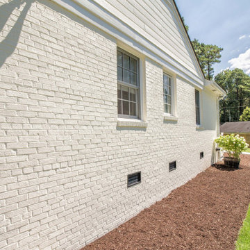
This beautiful one-story brick rancher located in Henrico County is impressive. Painting brick can be a
hard decision to make but it’s a tried and true way of updating your home’s exterior without replacing
the masonry. While some brick styles have stood the test of time, others have become dated more
quickly. Moreover, many homeowners prefer a solid color for their home as compared to the natural
variety of brick. This home was painted with Benjamin Moore’s Mayonnaise, a versatile bright white
with a touch of creamy yellow.
140