
Search results for "Decision" in Home Design Ideas

 Orion Design, Inc.
Bob Greenspan
Eat-in kitchen - mid-sized craftsman l-shaped light wood floor eat-in kitchen idea in Kansas City with an undermount sink, shaker cabinets, light wood cabinets, quartz countertops, gray backsplash, subway tile backsplash, stainless steel appliances and an island
Eat-in kitchen - mid-sized craftsman l-shaped light wood floor eat-in kitchen idea in Kansas City with an undermount sink, shaker cabinets, light wood cabinets, quartz countertops, gray backsplash, subway tile backsplash, stainless steel appliances and an island

 Advance Design Studio, Ltd.
After six years of living in their Huntley IL home, Chris and Meghan were tired of their dark, dingy, outdated kitchen and it was finally time for a long-anticipated change. “The kitchen is the place where we live, it’s where we do everything,” Meghan said. “It was important that it be a space where we wanted to be.” Meghan loves cooking and enjoys including their girls in healthy meal prepping, this led them to want a brighter, more enjoyable kitchen with increased functionality and improved storage.
For Chris especially, the laundry room was an entirely dysfunctional eyesore. “We had a washer and a dryer, but it was all kind-of cobbled together!” Chris said. “There were always laundry piles everywhere, we weren’t really sure what we wanted to do in there, but it was time for us to make a change.” The mess of the space was stressful every time they walked in the door from the garage each day. Kids’ backpacks and shoes piled up haphazardly in the makeshift boot-bench closet left the family feeling disorganized and stressed. They needed space for folding clothes and locker cubbies to help keep the family organized.
Having known Christine and Todd in the Huntley community for years, Chris and Meghan were familiar with their work. “We already trusted them personally and having seen their projects for years we knew they did top notch work. After we reviewed the initial round of designs, we knew that hiring them was definitely the right choice,” Meghan and Chris said. Although Chris had done a lot of work in their home himself, the kitchen and laundry room renovation was such a large undertaking that he didn’t want to steal time away from his family to spend what would surely be many long weekends doing the job himself. “That would not have been a wise choice for us,” Chris laughed.
“Our designer, Michelle was very, very, easy to work with; anything we wanted to see or weren’t sure about, she went above and beyond to make this easy for us. She was easy to get hold of and always quick to respond,” the couple said. Michelle pulled ideas that mirrored the couple’s taste and style and was adept at directing the couple to limited choices that didn’t overwhelm them and kept the process moving. “I have a hard time making decisions. Michelle made the decision-making process so easy. I loved how she listened to what I liked and then presented three great options for me to choose from,” Meghan said.
The main objectives for the kitchen were better storage solutions, they wanted the space to reflect their lifestyle and taste, and they wanted it to last for years with low maintenance. One of the first steps in creating a more functional kitchen was relocating the refrigerator, creating an improved workflow for the busy family.
“We didn’t know that we could even move the refrigerator to a new location where it is now, that was something that we never would have thought of,” Chris said. “The new refrigerator location makes the kitchen feel so much bigger. We didn’t add any space, but our whole kitchen with the new design just seems like it’s so much larger than before!” Meghan said.
The perimeter mist colored cabinets helped warm and brighten the entire room, while the graphite colored cabinets on the island added contrast. Using this fresh, clean color palette satisfied the couple’s desire for a bright space that was the exact opposite of what they had before. Organization accessories were also added to the cabinets such as a spice drawer tray and roll outs to create hidden convenience.
“I absolutely love the hidden spices – it makes cooking so much more enjoyable!” Chris said. “And all the pull outs, and the double trash bin, who would think you could get so excited about organization!” the couple said in unison.
One thing they hated in their original kitchen was how dark the space felt. Added lighting on the ceiling with the new light fixtures combined with the lighter cabinetry colors throughout solved this problem. “Our new kitchen has this warm, almost cozy feeling that our old kitchen never had, it’s just a space that I love spending my time in now,” Meghan said. The light airy feeling was accentuated with the use of floating white shelves on either side of the decorative range hood. “We have so much cabinetry space, the new design is amazing we actually have more storage space than we will ever need,” Meghan said.
The island was extended to create more work surface and added space for stool seating. “The new island changes how we live. Now the kids can be in the kitchen with us, doing homework, eating breakfast, and the three of us have special dinners there when Chris is working late,” Meghan said.
The Carrara Marmi Quartz countertops were chosen because they are, not only beautiful, but are made from hard-working material that doesn’t require maintenance. The white subway tile backsplash that wraps to the ceiling behind the focal point cooktop range/hood compliments the crisp white countertops perfectly, while brushed brass hardware and light fixtures keep the design fresh and new.
The couple had a few fears at the beginning of the project, as most homeowners do. Their biggest fear was being out of their kitchen and laundry room for an extended time. The crew made it very easy for the family to work in a limited space keeping the washer and dryer hooked up the majority of the time, and also getting appliances working with minimal downtime.
“They above and beyond accommodated us to get us through the process,” Meghan said. “They did a great job making sure we were as comfortable as possible throughout the process,” Chris added.
“Our project manager DJ did a great job. He was very good at updating us on schedule changes, getting guys in as quickly as possible. Everyone that stepped in the house was nice and did great work,” said Chris. They thought Advance’s carpenter was phenomenal and were impressed when he took a conceptual idea from a photograph and worked with designer Michelle to create a one of a kind range/hood that has become the topic of conversation with friends and family who visit the new kitchen. “He was in our house literally every day for several weeks. He was easy to work with and good at what he did,” Meghan and Chris said.
The focal point of the kitchen; a hand-crafted, custom-built ventilation hood was clad with handpicked reclaimed barnwood. Advance Design’s carpenter built the framework and the cladding to create a one-of-a-kind design element that the couple loves.
“I think it was especially fun for him to create something unique from scratch, showcasing his talent in this area,” Meghan said. “I love that my kitchen is not like everyone else’s. I got to pick out the wood on my hood and watch it being built and was able to choose what pieces of wood went where on it. It’s totally unique.”
Red Oak flooring was toothed-in throughout the kitchen and the rest of the first floor anywhere changes were made. Then the whole floor was refinished to tone down the orange undertones in the existing floor stain, ultimately changing the color complexion of the entire first floor. The result is a completely new feeling to the entire home.
Renovating the laundry room was extremely important to Meghan and Chris, but they had trouble visualizing what the possibilities were for the seemingly small space. Michelle produced beautiful 3D illustrations that helped them envision the space in a whole new way.
“I must have told Michelle 100 times that I am a visual person, seeing the designs in 3D made it so easy to make decisions and see what we could really do with our space,” Meghan said.
A dividing wall and doorway were removed between the existing laundry room and hallway formerly containing a coat closet, providing space to design specialized graphite colored cabinetry matching the kitchen island to house custom storage cubbies for each family member. Adding the tall utility cabinetry in the new laundry area helped solve the storage issue, tucking away cleaning supplies, household items, and even the cat got its own cubby.
“I love how everything is now hidden in its own space. I can’t tell you how much I hated coming home and seeing everything sitting around on counters,” Chris said.
Electrical outlets were planned for the inside of utility cabinets, so devices could charge in hidden locations. Stacking the washer and dryer allowed for wider countertop space to provide a folding area and a special space for clothes to hang. “The way I do laundry has been completely transformed! I can actually fold clothes and hang them now right out of the washer and dryer,” Meghan said.
“The end result in the kitchen and the laundry/mud room was an updated light and bright space, with a smarter work flow that better meets the needs of this family,” Michelle said.
“I would totally recommend Advance Design,” Meghan said. “Sometimes I sit and just look at my kitchen and laundry room and think ‘Wow, I can’t believe I get to live here!’ It’s an understatement to say we love our new space.”
 TreHus Architects+Interior Designers+Builders
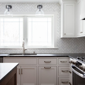
Example of a large classic u-shaped dark wood floor eat-in kitchen design in Minneapolis with a double-bowl sink, recessed-panel cabinets, white cabinets, white backsplash, stainless steel appliances, an island and black countertops
Find the right local pro for your project

 dRemodeling Design-Build
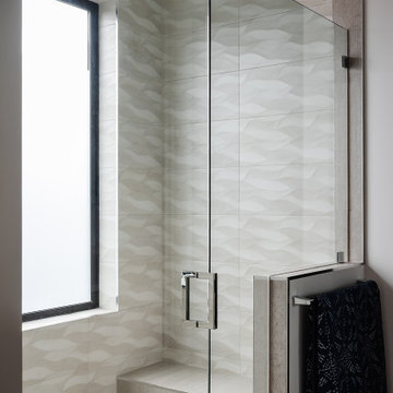
When given the opportunity to design spaces with multiple uses, the designer is given an exponential amount of design opportunities to incorporate the spaces with one another. Utilizing a partition wall between the walk in shower and the rest of the bathroom, it increases the level of intimacy of the space. This design decision is extended by welcoming the user to sit within the space, providing an area of leisure and recreation.

 Sarah Dowlin
Photo: Sarah Dowlin © 2019 Houzz
Inspiration for an eclectic living room remodel in Cincinnati
Inspiration for an eclectic living room remodel in Cincinnati

 Herald Gardell, Ltd. Design Services
Jeff McCutcheon
A large space that was made narrow by a second staircase. We took the stairs out and turned it into the principle gathering space for the family, combining the functionalities of living room, great room, family room and media room.

 Just in Thyme Landscape Design
The hot tub is seamlessly sunk into a flagstone step & covered to keep the heat in. Besides the tremendous cost-savings, features such as smooth contoured seats, cup holders, jets especially for feet, neck or back, multi-colored lights and neck pillows helped make the decision to have a separate, store-bought hot tub easy. Tropical plants surround the pool area.
 Neil Kelly Company
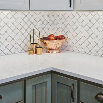
The decision to keep the original cabinet boxes meant simply replacing the cabinet drawers and drawer fronts for a refreshing transformation. The porcelain tile floor has the unmistakable look of brick without the struggle to keep it clean. New appliances, stylish range hood, and a new cabinet box for the refrigerator. A custom island located in the original dining nook satisfies the client's number one request, providing a place to drink wine and make cookies.

 We Make It Our Home
The living room was long and narrow but with an amazing bay window. Instead of a galley style living room used by the previous owner, we decided to change the furniture arrangement by putting one big comfy L-shaped sectional all the way to one side to create a pass-through area enabling a better foot traffic. We then added two side chairs for extra seats. We also mounted our TV on top of the fireplace to gain more space. Although it's not my favorite design choice to have TV on top of the fireplace because I think it takes away from the fireplace but we had to work within the limitation of the space.
For the fireplace, we bought wood stove insert and inserted it into the existing masonry fireplace. The look was updated by granite tiles around the insert and custom built wood mantel.
Buying wood fireplace insert was the best decision we made. First of all, it created a memorable space in our home. I LOVE the sound of wood cracking and the smell of wood burning. In winter nights we would sit around the fireplace and make s'mores like it's a campfire. Second, it's a clean burning and efficient heater. You don't lose the majority the fire’s heat up the chimney thereby saving money on your heating bill.
The coffee table is purchased from Wicker Emporium and it's made from reclaimed pine timbers giving the house a rustic feel.
The side chair by the fireplace is the perfect spot for me to relax, put my feet up on the large ball shaped knitted foot rest and enjoy a cup of cappuccino or cozy up with a good book.
 JuniperOats Studio
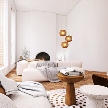
A new take on Japandi living. Distinct architectural elements found in European architecture from Spain and France, mixed with layout decisions of eastern philosophies, grounded in a warm minimalist color scheme, with lots of natural elements and textures. The room has been cleverly divided into different zones, for reading, gathering, relaxing by the fireplace, or playing the family’s heirloom baby grand piano.

 Furnitalia
Tratto is the decisive choice for urban living, thanks to its timeless, elegant design and compact size. It's characterised by interesting "zig-zag" stitching on the slim arms and the backrest cushions, and by the special base in glossy chrome metal. This compact sofa is ideal for creating that added value in everyday environments.

 DK Homes
Uniquely situated on a double lot high above the river, this home stands proudly amongst the wooded backdrop. The homeowner's decision for the two-toned siding with dark stained cedar beams fits well with the natural setting. Tour this 2,000 sq ft open plan home with unique spaces above the garage and in the daylight basement.
 JuniperOats Studio
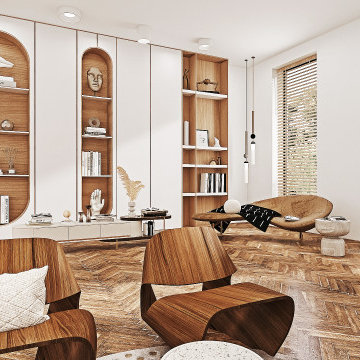
A new take on Japandi living. Distinct architectural elements found in European architecture from Spain and France, mixed with layout decisions of eastern philosophies, grounded in a warm minimalist color scheme, with lots of natural elements and textures. The room has been cleverly divided into different zones, for reading, gathering, relaxing by the fireplace, or playing the family’s heirloom baby grand piano.
 Neil Kelly Company
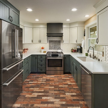
The decision to keep the original cabinet boxes meant simply replacing the cabinet drawers and drawer fronts for a refreshing transformation. The porcelain tile floor has the unmistakable look of brick without the struggle to keep it clean. New appliances, stylish range hood, and a new cabinet box for the refrigerator. A custom island located in the original dining nook satisfies the client's number one request, providing a place to drink wine and make cookies.
 Eden LA Furniture and Interiors
These two though....
This retired "simple beach couple" are a couple of our faves. This was a collaboration in every sense of the word from start to finish. This was not a "throw us the keys and we'll do it all for you" type of project. They were very involved in every decision from architect plans all the way to bedside lamp placement. They had this land and former bungalow on a walkstreet in their beloved Hermosa Beach for over 30 years before they enlisted us to help them design and build their dream home. We worked with Lane Design Build and the client in wonderful harmony, and everyone is very pleased with the results.

 Kathleen Jennison
An Arts & Crafts Bungalow is one of my favorite styles of homes. We have quite a few of them in our Stockton Mid-Town area. And when C&L called us to help them remodel their 1923 American Bungalow, I was beyond thrilled.
As per usual, when we get a new inquiry, we quickly Google the project location while we are talking to you on the phone. My excitement escalated when I saw the Google Earth Image of the sweet Sage Green bungalow in Mid-Town Stockton. "Yes, we would be interested in working with you," I said trying to keep my cool.
But what made it even better was meeting C&L and touring their home, because they are the nicest young couple, eager to make their home period perfect. Unfortunately, it had been slightly molested by some bad house-flippers, and we needed to bring the bathroom back to it "roots."
We knew we had to banish the hideous brown tile and cheap vanity quickly. But C&L complained about the condensation problems and the constant fight with mold. This immediately told me that improper remodeling had occurred and we needed to remedy that right away.
The Before: Frustrations with a Botched Remodel
The bathroom needed to be brought back to period appropriate design with all the functionality of a modern bathroom. We thought of things like marble countertop, white mosaic floor tiles, white subway tile, board and batten molding, and of course a fabulous wallpaper.
This small (and only) bathroom on a tight budget required a little bit of design sleuthing to figure out how we could get the proper look and feel. Our goal was to determine where to splurge and where to economize and how to complete the remodel as quickly as possible because C&L would have to move out while construction was going on.
The Process: Hard Work to Remedy Design and Function
During our initial design study, (which included 2 hours in the owners’ home), we noticed framed images of William Morris Arts and Crafts textile patterns and knew this would be our design inspiration. We presented C&L with three options and they quickly selected the Pimpernel Design Concept.
We had originally selected the Black and Olive colors with a black vanity, mirror, and black and white floor tile. C&L liked it but weren’t quite sure about the black, We went back to the drawing board and decided the William & Co Pimpernel Wallpaper in Bayleaf and Manilla color with a softer gray painted vanity and mirror and white floor tile was more to their liking.
After the Design Concept was approved, we went to work securing the building permit, procuring all the elements, and scheduling our trusted tradesmen to perform the work.
We did uncover some shoddy work by the flippers such as live electrical wires hidden behind the wall, plumbing venting cut-off and buried in the walls (hence the constant dampness), the tub barely balancing on two fence boards across the floor joist, and no insulation on the exterior wall.
All of the previous blunders were fixed and the bathroom put back to its previous glory. We could feel the house thanking us for making it pretty again.
The After Reveal: Cohesive Design Decisions
We selected a simple white subway tile for the tub/shower. This is always classic and in keeping with the style of the house.
We selected a pre-fab vanity and mirror, but they look rich with the quartz countertop. There is much more storage in this small vanity than you would think.
The Transformation: A Period Perfect Refresh
We began the remodel just as the pandemic reared and stay-in-place orders went into effect. As C&L were already moved out and living with relatives, we got the go-ahead from city officials to get the work done (after all, how can you shelter in place without a bathroom?).
All our tradesmen were scheduled to work so that only one crew was on the job site at a time. We stayed on the original schedule with only a one week delay.
The end result is the sweetest little bathroom I've ever seen (and I can't wait to start work on C&L's kitchen next).
Thank you for joining me in this project transformation. I hope this inspired you to think about being creative with your design projects, determining what works best in keeping with the architecture of your space, and carefully assessing how you can have the best life in your home.
 UpScapers: Landscape, Elevated
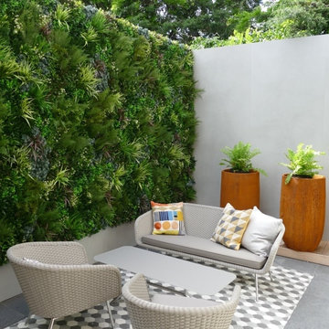
Our team have been extensively trained in the application of Vistafolia® panels and our customer service is second to none. They can advise on the practicalities of the installation, provide an accurate quote and outline some of the best features and benefits of the product so you can make an informed decision.

 Studio McGee
Freestanding bathtub - large transitional master ceramic tile and gray floor freestanding bathtub idea in Salt Lake City with light wood cabinets, white walls, marble countertops, a hinged shower door and multicolored countertops
 Design Line Construction, Inc.
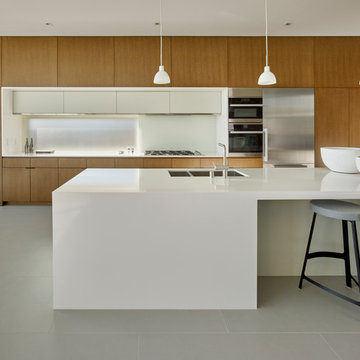
This new ground-up home sits on a formerly empty lot, and enjoys exceedingly beautiful views of downtown San Francisco. Built in just 10 months, the project moved so efficiently due to thorough preconstruction decision-making and consideration.
A continuous wall of rift-sawn oak veneer cabinetry runs the full length of the home’s main level, serving the living and dining areas and kitchen. The structural package was complicated due to this level’s completely open plan, fortified by steel moment frames throughout, and the extreme slope of the site, requiring us to drill piers for stability.
 Neil Kelly Company
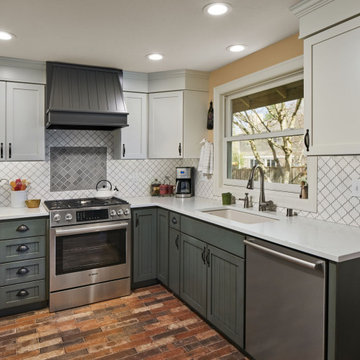
The decision to keep the original cabinet boxes meant simply replacing the cabinet drawers and drawer fronts for a refreshing transformation. The porcelain tile floor has the unmistakable look of brick without the struggle to keep it clean. New appliances, stylish range hood, and a new cabinet box for the refrigerator. A custom island located in the original dining nook satisfies the client's number one request, providing a place to drink wine and make cookies.
141