
Search results for "Decor began" in Home Design Ideas

 Advance Design Studio, Ltd.
Jennifer and Dan have lived in their Deer Park Illinois home for 15 years, slowly making minor fixes like painting and decorating; but they had a new plan for their kitchen the entire time. An awkwardly placed garage door, and an island cooktop with a terrible downdraft made a full-scale kitchen remodel an absolute must. Jennifer had many ideas in mind and wanted to work with a company that could provide high-end work, while partnering with a designer that would tailor the kitchen to her ideas.
She was intrigued by the phrase “Common Sense Remodeling” in Advance Design’s feature she discovered while perusing an issue of the community’s Quintessential Barrington Magazine. Doing further research on the company’s website, as she looked through project profiles and read about Advance Design’s “Common Sense Remodeling” philosophy, she promptly scheduled an appointment to see if the people and ideas she read about were truly who they said they were. The more she read, the more she knew that the “Common Sense” approach to remodeling they described was exactly the type of company she was looking for.
The partnership was sealed after an initial consultation with Owner Todd Jurs and Project Designer Michelle Lecinski. They displayed a combination of friendliness, professionalism and respect that was unmatched by any of the other companies Jennifer talked to. She knew that with Advance Design, she would be able to retain the vision that she had in mind with high-quality craftsmanship.
“I reached out to Advance Design because of the ‘Common Sense Remodeling’ tagline,” Jennifer said. “That’s what lingered for me”. “Advance Design was the most respectful- of the house and of my design ideas, and the most professional of the handful of companies that looked at my project”.
Soon after the meeting Jennifer began working with Michelle on the project design. They quickly developed chemistry. Jennifer loved how Michelle researched and located every detail that Jennifer wanted for the kitchen. Between the two of them, every concept and idea was worked through and perfected. “Jennifer had definite ideas about what she wanted the new kitchen to look like, she just didn’t know how to bring it all together. We worked together really well to make her ideas into the practical reality necessary for a well-functioning kitchen, with the look and feel that she had envisioned”, says Michelle.
“Michelle was wonderful in using the CAD system she would show me new drawings every time we changed the layout while working through the design,” Jennifer said. “She was a really wonderful partner in execution, she made sure everything happened quickly and easily.”
The finished design drew out elements of Jennifer’s style and personality. The pair call the look “sophisticated farmhouse” to describe the kitchen renovation to family and friends. The result was a beautifully crafted, authentic-feeling space that satisfied Jennifer’s dreams 15 years in the making. The whole project consisted of a kitchen remodel, mudroom upgrade with powder room, and garage entry relocation. “The projects I personally like the best, are the ones that put the client’s dreams on display,” Project Designer Michelle said. “And this is one of those projects.”
The main focal point of the kitchen is custom zinc and brass ventilation hood with a vintage sheen, which was hand made to order by a small company in Indiana named Vogler Metalworking. “It’s like sculpture, a true work of art”, says Jennifer. Your eye is immediately drawn towards this elegant yet practical hood that eliminated the home’s downdraft problem and added a striking conversation piece at the same time. The carpenters had to use special gloves when transporting and installing it, so they didn’t smudge it with fingerprints. The beautiful hood centers proudly over the stunning black enamel and brass LaCornue Range. “I had a friend who had a LaCornue range and after learning how easy it was to cook perfect meals, I was convinced I wanted to have one”, says Jennifer. This unique, breathtaking combination anchors the entire kitchen and is apparent immediately as you walk into the great room the surrounds the space.
DuraSupreme Crestwood cabinets with a Kendall Panel add function and sophistication. A custom gray paint color paired with a storm blue was developed so that the new kitchen looked like it belonged to the existing space. Unlacquered brass faucets and hardware were important to Jennifer because she wanted the living finishes to age over time. Remarkable brass diamond mesh cabinet door inserts imported from the UK continue to add this one-of-a-kind kitchen renovation; giving it a “you won’t see this everywhere” quality. The use of old railcar flooring for the coffee bar countertop and reclaimed oak for the open shelving gives an authenticity to the space uncommon in kitchens today.
Jennifer and Michelle fell in love with the Limestone Grey Stone while they were investigating unique island countertop ideas. They liked the fact that the limestone as a living finish will age and change over time. Calcutta Miel Quartz countertops made for an excellent pairing around the perimeter, as it’s durable and perfect for cooking preparations. A textured white subway tile backsplash that runs to the ceiling keeps your eye moving towards the open shelving, and to the main focal point of the stunning range hood combination.
“The kitchen functions beautifully, and it’s gorgeous,” beams Jennifer as she gestures with both hands while smiling ear to ear. “The most important thing was I wanted a kitchen that had a wonderful flow, cooked beautiful meals and was a great gathering place for family and friends, and this space does that perfectly! Beauty wise, it turned out exactly how I had envisioned. I felt the function part was the hardest part, and that was nailed”!
Relocating the garage entry to the new mudroom was a huge priority and has finally separated the family’s arriving home functions from their kitchen. Now coats and shoes and bags have their own area for dropping once members arrive home. Matching gray DuraSupreme cabinetry helped create gorgeous, purposeful lockers for the family. A reclaimed vintage sink and custom wall paper were added to the tiny powder room to beautify the once previously only functional space. Advance Design was even able to create a custom space for their dog to sleep while the family is away.
“It was unbelievable that a project of this size was completed in such a short time, and I think that’s because of the large amount of planning and preparation that went into it,” Jennifer marveled, “When we started, we were ready, and everything was prepared”.
When it came to execution, Project Manager Justin Davis and his crew were quick, accessible, and organized. Projects like this kitchen are typically completed in as little as 8-10 weeks. Jennifer’s kitchen however despite the relocation of some challenging HVAC in a soffit and moving of an exterior door was completed remarkably fast in part because the team was working with an existing tile floor that ran throughout the first floor that the client really loved.
“You get to know these people really well because they’re living in your house while you’re living in your house. They were so fast and really good, it didn’t take as long as even planned” reported Jennifer. “I would text Justin and he always responded almost immediately. I got to know all the guys who were working in our house and they were all wonderful people”.
Details in a customized kitchen like this one require skill and care from the people who install it. “All the guys on the job were skilled at what the did. I wanted small details like little feet to look like furniture, that is where their carpentry skill came in to make these all perfect”, said Jennifer. “The tile guys were wonderful. They even let me determine how I wanted the texture with the grout to appear for a salt and pepper look; now that is a very skilled trade person making it custom”.
In Jennifer’s interview, she continued to reference Advance Design’s “Common Sense Remodeling”, so I took a minute to ask her exactly what that phrase meant to her and how it played out in her experience with her project and the Advance Design team. Here is what she said: “I was intrigued about Common Sense Remodeling and in my head that there would be clear costs and prices, great communication between the design team, the execution team and me”, said Jennifer. They did deliver on that, it was so clear about the cost breakdown, what I could expect from everyone who came to my house, and everything that we had ordered. That to me is the Common Sense”!
It’s great to see a client take literally our assertion that a well-planned remodeling project is simply “Common Sense”! She anticipated each step of the way would be clear, concise, and predictable, all the while protecting the outcome due to the careful upfront planning. “Advance Design delivered on their ‘Common Sense Remodeling’ promise,” Jennifer said. “From the design team, to the execution team - everything was straight forward like I imagined. The project turned out exactly how I envisioned, I enjoyed this process and absolutely would recommend Advance Design Studio to anyone.”

 Liz Schupanitz Designs
Cooking for Two
Location: Plymouth, MN, United States
When this couple’s last child graduated from college they began the process of looking for a new home. After a lengthy search they decided to stay with the neighborhood they loved, saving money by remodeling rather than starting over.
The top priorities on their wish list were adding character to their 1990’s era home with a classic white kitchen and a larger island while keeping within the existing footprint. With the intention of honing their cooking skills, they were also considering better appliances and two ovens.
Challenges and Solutions
Design a larger island with seating for at least two. The existing island was small and the area behind the seating was less than recommended clearances.
To solve this challenge, the seating area of the island was extended out into the open area of the kitchen. This created a larger island with seating for three, extra storage and a bookshelf across from the range.
The original kitchen had a range with microwave above, so adding another oven was a challenge with limited wall space.
Because the adjoining dining room is used infrequently, the homeowner was open to placing the second oven and microwave in the walkway. This made room for the small buffet between the built in refrigerator and ovens, creating one of her favorite areas.
The client requested a white painted kitchen but wanted to make sure it had warmth and character. To achieve this the following elements were chosen:
1) Cabinets painted with Benjamin Moore Capitol White, a luminous and warm shade of white.
2) The Range hood was painted with warm metallic shades to reflect the bronze of the Ashley Norton hardware.
3) Black Aqua Grantique granite was chosen for countertops because it looks like soapstone and adds contrast.
4) Walker Zanger Café tile in Latte was chosen for it’s handmade look with uneven edges.
5) The to-the-counter-cabinet with glass door shows off serving dishes and lends sophisticated charm.
The result is a welcoming classic kitchen, where this couple enjoys cooking more often and sharpening their skills with gourmet appliances.
Liz Schupanitz Designs
Photographed by: Andrea Rugg Photography
 Advance Design Studio, Ltd.
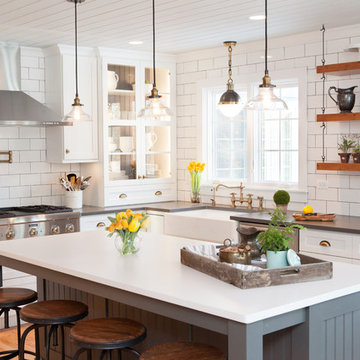
When this suburban family decided to renovate their kitchen, they knew that they wanted a little more space. Advance Design worked together with the homeowner to design a kitchen that would work for a large family who loved to gather regularly and always ended up in the kitchen! So the project began with extending out an exterior wall to accommodate a larger island and more moving-around space between the island and the perimeter cabinetry.
Style was important to the cook, who began collecting accessories and photos of the look she loved for months prior to the project design. She was drawn to the brightness of whites and grays, and the design accentuated this color palette brilliantly with the incorporation of a warm shade of brown woods that originated from a dining room table that was a family favorite. Classic gray and white cabinetry from Dura Supreme hits the mark creating a perfect balance between bright and subdued. Hints of gray appear in the bead board detail peeking just behind glass doors, and in the application of the handsome floating wood shelves between cabinets. White subway tile is made extra interesting with the application of dark gray grout lines causing it to be a subtle but noticeable detail worthy of attention.
Suede quartz Silestone graces the countertops with a soft matte hint of color that contrasts nicely with the presence of white painted cabinetry finished smartly with the brightness of a milky white farm sink. Old melds nicely with new, as antique bronze accents are sprinkled throughout hardware and fixtures, and work together unassumingly with the sleekness of stainless steel appliances.
The grace and timelessness of this sparkling new kitchen maintains the charm and character of a space that has seen generations past. And now this family will enjoy this new space for many more generations to come in the future with the help of the team at Advance Design Studio.
Photographer: Joe Nowak
Dura Supreme Cabinetry
Find the right local pro for your project
 LaMantia Design and Remodeling
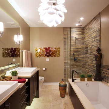
The owner of this urban residence, which exhibits many natural materials, i.e., exposed brick and stucco interior walls, originally signed a contract to update two of his bathrooms. But, after the design and material phase began in earnest, he opted to removed the second bathroom from the project and focus entirely on the Master Bath. And, what a marvelous outcome!
With the new design, two fullheight walls were removed (one completely and the second lowered to kneewall height) allowing the eye to sweep the entire space as one enters. The views, no longer hindered by walls, have been completely enhanced by the materials chosen.
The limestone counter and tub deck are mated with the Riftcut Oak, Espresso stained, custom cabinets and panels. Cabinetry, within the extended design, that appears to float in space, is highlighted by the undercabinet LED lighting, creating glowing warmth that spills across the buttercolored floor.
Stacked stone wall and splash tiles are balanced perfectly with the honed travertine floor tiles; floor tiles installed with a linear stagger, again, pulling the viewer into the restful space.
The lighting, introduced, appropriately, in several layers, includes ambient, task (sconces installed through the mirroring), and “sparkle” (undercabinet LED and mirrorframe LED).
The final detail that marries this beautifully remodeled bathroom was the removal of the entry slab hinged door and in the installation of the new custom five glass panel pocket door. It appears not one detail was overlooked in this marvelous renovation.
Follow the link below to learn more about the designer of this project James L. Campbell CKD http://lamantia.com/designers/james-l-campbell-ckd/
 Isler Homes
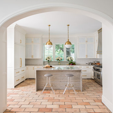
Enclosed kitchen - large transitional u-shaped terra-cotta tile enclosed kitchen idea in Dallas with an undermount sink, shaker cabinets, white cabinets, quartzite countertops, white backsplash, ceramic backsplash, paneled appliances and an island
 Home Glow Design
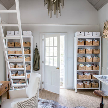
This home office was created from an outbuilding on the property. Seagrass wall-to-wall carpet was installed for ultimate durability and a relaxed vibe. We employed a high-low aesthetic to create a space that was unique but still within budget, utilizing the owner's Stickley desk, a custom desk chair, custom blush Roman shades, a Hudson Valley Fenwater chandelier and sconces, and multiple office items from budget sources like IKEA and The Container Store. The ceiling is painted Quicksand and walls and trim in White Dove by Benjamin Moore. Photo by Sabrina Cole Quinn Photography.
 Plain & Posh
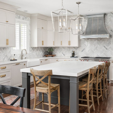
This large space did not function well for this family of 6. The cabinetry they had did not go to the ceiling and offered very poor storage options. The island that existed was tiny in comparrison to the space.
By taking the cabinets to the ceiling, enlarging the island and adding large pantry's we were able to achieve the storage needed. Then the fun began, all of the decorative details that make this space so stunning. Beautiful tile for the backsplash and a custom metal hood. Lighting and hardware to complement the hood.
Then, the vintage runner and natural wood elements to make the space feel more homey.
Sponsored
Sunbury, OH

J.Holderby - Renovations
Franklin County's Leading General Contractors - 2X Best of Houzz!
 IDF Studio
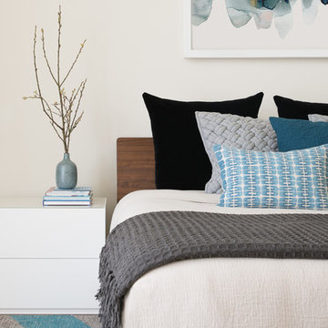
A zoomed-in view of a bedroom highlights thoughtful layering of textures and color. A walnut wood headboard anchors the space, complemented by a white nightstand and an abstract blue-and-gold watercolor artwork above. Blue, white, black, and grey throw pillows sit atop the bed, paired with a grey waffle throw blanket. The geometric blue-and-grey area rug adds pattern and visual interest, creating a cozy and cohesive design detail in the room. Photo by Thomas Kuoh.
 3 Fold Design Studio
Tre Dunham, Fine Focus Photography
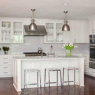
Open concept kitchen - mid-sized transitional u-shaped dark wood floor open concept kitchen idea in Austin with shaker cabinets, white cabinets, gray backsplash, subway tile backsplash, stainless steel appliances, an island and quartz countertops
Open concept kitchen - mid-sized transitional u-shaped dark wood floor open concept kitchen idea in Austin with shaker cabinets, white cabinets, gray backsplash, subway tile backsplash, stainless steel appliances, an island and quartz countertops

 Advance Design Studio, Ltd.
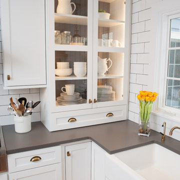
When this suburban family decided to renovate their kitchen, they knew that they wanted a little more space. Advance Design worked together with the homeowner to design a kitchen that would work for a large family who loved to gather regularly and always ended up in the kitchen! So the project began with extending out an exterior wall to accommodate a larger island and more moving-around space between the island and the perimeter cabinetry.
Style was important to the cook, who began collecting accessories and photos of the look she loved for months prior to the project design. She was drawn to the brightness of whites and grays, and the design accentuated this color palette brilliantly with the incorporation of a warm shade of brown woods that originated from a dining room table that was a family favorite. Classic gray and white cabinetry from Dura Supreme hits the mark creating a perfect balance between bright and subdued. Hints of gray appear in the bead board detail peeking just behind glass doors, and in the application of the handsome floating wood shelves between cabinets. White subway tile is made extra interesting with the application of dark gray grout lines causing it to be a subtle but noticeable detail worthy of attention.
Suede quartz Silestone graces the countertops with a soft matte hint of color that contrasts nicely with the presence of white painted cabinetry finished smartly with the brightness of a milky white farm sink. Old melds nicely with new, as antique bronze accents are sprinkled throughout hardware and fixtures, and work together unassumingly with the sleekness of stainless steel appliances.
The grace and timelessness of this sparkling new kitchen maintains the charm and character of a space that has seen generations past. And now this family will enjoy this new space for many more generations to come in the future with the help of the team at Advance Design Studio.
Dura Supreme Cabinetry
Photographer: Joe Nowak
 Drewett Works
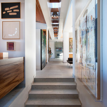
Believe it or not, this award-winning home began as a speculative project. Typically speculative projects involve a rather generic design that would appeal to many in a style that might be loved by the masses. But the project’s developer loved modern architecture and his personal residence was the first project designed by architect C.P. Drewett when Drewett Works launched in 2001. Together, the architect and developer envisioned a fictitious art collector who would one day purchase this stunning piece of desert modern architecture to showcase their magnificent collection.
The primary views from the site were southwest. Therefore, protecting the interior spaces from the southwest sun while making the primary views available was the greatest challenge. The views were very calculated and carefully managed. Every room needed to not only capture the vistas of the surrounding desert, but also provide viewing spaces for the potential collection to be housed within its walls.
The core of the material palette is utilitarian including exposed masonry and locally quarried cantera stone. An organic nature was added to the project through millwork selections including walnut and red gum veneers.
The eventual owners saw immediately that this could indeed become a home for them as well as their magnificent collection, of which pieces are loaned out to museums around the world. Their decision to purchase the home was based on the dimensions of one particular wall in the dining room which was EXACTLY large enough for one particular painting not yet displayed due to its size. The owners and this home were, as the saying goes, a perfect match!
Project Details | Desert Modern for the Magnificent Collection, Estancia, Scottsdale, AZ
Architecture: C.P. Drewett, Jr., AIA, NCARB | Drewett Works, Scottsdale, AZ
Builder: Shannon Construction | Phoenix, AZ
Interior Selections: Janet Bilotti, NCIDQ, ASID | Naples, FL
Custom Millwork: Linear Fine Woodworking | Scottsdale, AZ
Photography: Dino Tonn | Scottsdale, AZ
Awards: 2014 Gold Nugget Award of Merit
Feature Article: Luxe. Interiors and Design. Winter 2015, “Lofty Exposure”
 Curated Nest
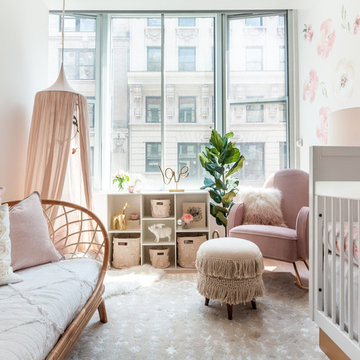
This nursery began in an empty white-box room with incredible natural light, the challenge being to give it warmth and add multi-functionality. Through floral motifs and hints of gold, we created a boho glam room perfect for a little girl. We played with texture to give depth to the soft color palette. The upholstered crib is convertible to a toddler bed, and the daybed can serve as a twin bed, offering a nursery that can grow with baby. The changing table doubles as a dresser, while the hanging canopy play area serves as a perfect play and reading nook.
Sponsored
Sunbury, OH
J.Holderby - Renovations
Franklin County's Leading General Contractors - 2X Best of Houzz!
 Bleue Design Inc.
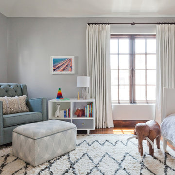
Originally a home office, this space was converted into a dreamy nursery. The design began with a whimsical wallpaper, primarily neutral with subtle pinks and turquoise. The gender of the baby was to be a surprise, so the design remained gender neutral, focusing on texture and pattern rather than a traditional color scheme.
Amy Bartlam
 Annie Hall Interiors
Michael Lee
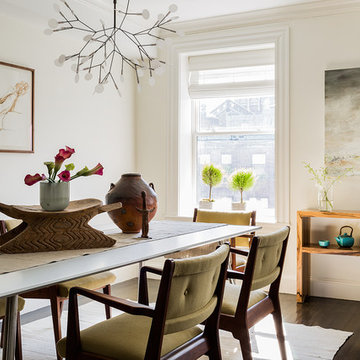
Example of a large transitional dark wood floor and brown floor great room design in Boston with white walls
Example of a large transitional dark wood floor and brown floor great room design in Boston with white walls
 Cape Associates, Inc.
The overarching design intent for this 1,455-square-foot West Vine Street condominium was to make the spaces contemporary and functional. The renovation began with an unexpected structural deficiency in the form of a post located in the middle of the living room that was causing a three-inch dip in the floor. It was removed and replaced with steel columns running down through the walls and into a footing pad with a three-foot depth.
The main living spaces underwent significant changes; the kitchen was reconfigured to open up a formerly cramped space, and the removal of a wall made room for a cascading island with Cesarstone countertops—a crowning feature. Additionally, an electrical panel was relocated to be able to wrap the refrigerator with a wood veneer frame. Notable materials include eight-inch-wide ‘Esplanade’ French oak plank floors chosen to complement the reclaimed wood-wrapped ceiling beams, which feature a combination of LED downlighting and uplighting. A sleek gas fireplace with horizontal slate surround and paneled wall backing replaced an old wood-burning stove—furthering the design program.
Pacheco-Robb Architects dismantled an existing spiral stair and replaced it with a cable-rail system—a nautical nod—which is noteworthy for the way it meets code; by running a contiguous oak banister for the entire length of the stair, they were able to avoid having to add a second railing, which would shrink the already narrow stairwell.
Upstairs, a tight bedroom with gabled ceilings was addressed by adding a solar-operated skylight with built-in shade, plus minimalistic furnishings. Structural changes in the master bedroom included eliminating a closest to widen the room, and reconfiguring a bathroom to fit a small walk-in closet in lieu of a long, thin hallway.
The formerly unfinished rooftop deck is now accessed via a six-foot door that opens more than 90 degrees. Azek decking was laid over the rubber roof, and two-inch stanchions were located around the rail’s outer edge. By opening the floor plan and streamlining the aesthetic, the place now breathes.


Sponsored
Sunbury, OH
J.Holderby - Renovations
Franklin County's Leading General Contractors - 2X Best of Houzz!
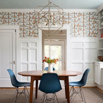
 Manlove and Company Interiors
To obtain sources, copy and paste this link into your browser.
https://www.arlingtonhomeinteriors.com/playful-dining-room
Photographer: Jenn Verrier
 Jacobson Construction
This is the story about a kitchen that was showing it’s age with white countertops and dark oak cabinets on a dark oak floor. It all worked once, but now the kitchen felt dark, cramped and dysfunctional. The owners were looking for a total kitchen transformation.
After a disastrous beginning with a contractor taking their money and vanishing into thin air, the owners were left with a completely gutted kitchen that consisted of only the walls. They hired Rick Jacobson to rescue them and restart the project.
The new kitchen design began with the idea of using Cobalt Blue as a primary color. The blue seen on many glassware pieces is Cobalt Blue, and it was decided to use it in the tile for the kitchen, as well as the pendant lights. Another goal was to make the kitchen brighter with an easier traffic flow, as well as completely updated cabinetry. And there were traffic patterns to improve, a refrigerator to move, and exhaust vents to reroute.
Rick Jacobson listened to the owners and worked to create the kitchen that the owners imagined. He began by thinking through the traffic flow patterns. He noted that the doorway from the dining room needed to be widened. He added rounded doorway headers to match the home’s existing décor.
He carefully thought through where the kitchen island should be, including how opening the oven doors would be in relation to people sitting at the kitchen island at a family gathering. Kitchen cabinet touches include off edge flat panel doors, soft close wooden drawers, and a spice cabinet with two slide-out racks. The new longer center island features a drawer microwave that opens and closes automatically with the push of a button. The center island also features two recycling bins and seating for four. Rick even thought of adding decorative elements to the existing half wall to make it look in line with the kitchen island. The kitchen’s black granite countertops offer an unusually appealing view: There are lots of interesting reflections throughout the kitchen.
Another of Rick’s touches is that all of the lights, including recessed ceiling lights, three cobalt blue pendant lights and below cabinet lights are on dimmers which work to balance daytime and nighttime lighting.
The under mounted stainless steel single sink is complemented with a gooseneck faucet. The stainless steel gas range is thin enough to allow for a wide drawer below for utensils, and the stainless steel vent hood is vented through the ceiling to outdoors, allowing additional storage space in the top cabinets. Double ovens with white doors are the perfect match to the cabinets, with a location that makes baking and roasting easier with the two large vertical storage for baking sheets and supplies nearby.
The result: A functional, open, bright and Cobalt blue kitchen.
 Design Directives, LLC
This lovely home began as a complete remodel to a 1960 era ranch home. Warm, sunny colors and traditional details fill every space. The colorful gazebo overlooks the boccii court and a golf course. Shaded by stately palms, the dining patio is surrounded by a wrought iron railing. Hand plastered walls are etched and styled to reflect historical architectural details. The wine room is located in the basement where a cistern had been.
Project designed by Susie Hersker’s Scottsdale interior design firm Design Directives. Design Directives is active in Phoenix, Paradise Valley, Cave Creek, Carefree, Sedona, and beyond.
For more about Design Directives, click here: https://susanherskerasid.com/
2