
Search results for "Definitive difference" in Home Design Ideas
 Alair Homes Plano
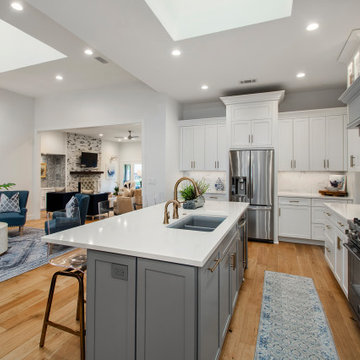
Our clients came to us wanting to maximize the space they had. They were not planning on moving anytime soon, as they loved their neighborhood. They wanted to renovate the front of their house, which included the front atrium, living room, kitchen, and powder bath. They hated their kitchen because it was completely closed off, had low ceilings, was dark and outdated, not to mention the floors were different in each of these rooms! The pantry was in the breakfast area and the kitchen table became a junk catcher, being the first thing you see when coming in from the garage/laundry room. In their living room, they wanted the spaces on either side of the fireplace to be symmetrical, whether that be bookshelves, a wet bar or closed off. Both parents are working professionals with no time and/or desire to design, create and figure this out on their own. They needed help figuring out how to reconfigure their current space in order to maximize what they already had, as they could not see an obvious solution. They could not envision how it would look so the fact that our designers were able to show them their new kitchen in 3D was pertinent.
We removed the pass-through windows that surrounded the atrium and front dining room, as well as the entire kitchen wall, completely opening up those two rooms. We removed a hall that used to lead between the kitchen and the living room since it was a complete waste of space! The ceilings were raised to 10’ in the kitchen and we were able to leave the skylight, letting in that natural light they wanted. We were able to give them a much larger pantry with tons of shelving and increase the size of their laundry room by utilizing the space of their old breakfast nook.
We relocated the door to the garage into their new elongated laundry room, built a wet bar across from their new larger pantry (with a pocket door) and the flow and functionality of these new spaces is just perfect! All new Waypoint cabinets were installed one two main kitchen surrounding walls painted Linen. Calacatta Bianco Polished Porcelain Tile 4x12 was used for the backsplash. A large eat-at island was installed, painted Stone, where the family can now gather for homework, meals, and mingling. The soft champagne bronze hardware and accent lighting really give this white and gray kitchen a soft classic look.
In the living room, we removed the built-in bookshelves to the left of the fireplace and closed off the wet-bar on the other side, giving them more space in their master suite. White Oak wood flooring, stained Putney, was installed throughout the entire new space, giving it the continuity they were looking for.
In the guest bathroom, Carrara white herringbone marble mosaic 12x12 tile was used on the shower floor and niche, while basic marble Bianco polished 12x24 porcelain tile was used on the walls. Luxart polished chrome traditional hardware gives this timeless bathroom the perfect shine.
Our clients are so happy with the new functionality and look of their space. It has definitely changed their lives in a way they could have never imagined!
 Alair Homes Plano
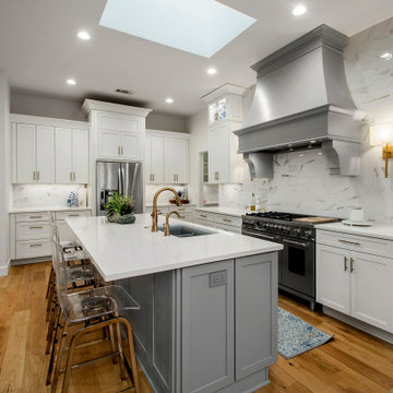
Our clients came to us wanting to maximize the space they had. They were not planning on moving anytime soon, as they loved their neighborhood. They wanted to renovate the front of their house, which included the front atrium, living room, kitchen, and powder bath. They hated their kitchen because it was completely closed off, had low ceilings, was dark and outdated, not to mention the floors were different in each of these rooms! The pantry was in the breakfast area and the kitchen table became a junk catcher, being the first thing you see when coming in from the garage/laundry room. In their living room, they wanted the spaces on either side of the fireplace to be symmetrical, whether that be bookshelves, a wet bar or closed off. Both parents are working professionals with no time and/or desire to design, create and figure this out on their own. They needed help figuring out how to reconfigure their current space in order to maximize what they already had, as they could not see an obvious solution. They could not envision how it would look so the fact that our designers were able to show them their new kitchen in 3D was pertinent.
We removed the pass-through windows that surrounded the atrium and front dining room, as well as the entire kitchen wall, completely opening up those two rooms. We removed a hall that used to lead between the kitchen and the living room since it was a complete waste of space! The ceilings were raised to 10’ in the kitchen and we were able to leave the skylight, letting in that natural light they wanted. We were able to give them a much larger pantry with tons of shelving and increase the size of their laundry room by utilizing the space of their old breakfast nook.
We relocated the door to the garage into their new elongated laundry room, built a wet bar across from their new larger pantry (with a pocket door) and the flow and functionality of these new spaces is just perfect! All new Waypoint cabinets were installed one two main kitchen surrounding walls painted Linen. Calacatta Bianco Polished Porcelain Tile 4x12 was used for the backsplash. A large eat-at island was installed, painted Stone, where the family can now gather for homework, meals, and mingling. The soft champagne bronze hardware and accent lighting really give this white and gray kitchen a soft classic look.
In the living room, we removed the built-in bookshelves to the left of the fireplace and closed off the wet-bar on the other side, giving them more space in their master suite. White Oak wood flooring, stained Putney, was installed throughout the entire new space, giving it the continuity they were looking for.
In the guest bathroom, Carrara white herringbone marble mosaic 12x12 tile was used on the shower floor and niche, while basic marble Bianco polished 12x24 porcelain tile was used on the walls. Luxart polished chrome traditional hardware gives this timeless bathroom the perfect shine.
Our clients are so happy with the new functionality and look of their space. It has definitely changed their lives in a way they could have never imagined!
 Advance Design Studio, Ltd.
Karen and Chad of Tower Lakes, IL were tired of their unfinished basement functioning as nothing more than a storage area and depressing gym. They wanted to increase the livable square footage of their home with a cohesive finished basement design, while incorporating space for the kids and adults to hang out.
“We wanted to make sure that upon renovating the basement, that we can have a place where we can spend time and watch movies, but also entertain and showcase the wine collection that we have,” Karen said.
After a long search comparing many different remodeling companies, Karen and Chad found Advance Design Studio. They were drawn towards the unique “Common Sense Remodeling” process that simplifies the renovation experience into predictable steps focused on customer satisfaction.
“There are so many other design/build companies, who may not have transparency, or a focused process in mind and I think that is what separated Advance Design Studio from the rest,” Karen said.
Karen loved how designer Claudia Pop was able to take very high-level concepts, “non-negotiable items” and implement them in the initial 3D drawings. Claudia and Project Manager DJ Yurik kept the couple in constant communication through the project. “Claudia was very receptive to the ideas we had, but she was also very good at infusing her own points and thoughts, she was very responsive, and we had an open line of communication,” Karen said.
A very important part of the basement renovation for the couple was the home gym and sauna. The “high-end hotel” look and feel of the openly blended work out area is both highly functional and beautiful to look at. The home sauna gives them a place to relax after a long day of work or a tough workout. “The gym was a very important feature for us,” Karen said. “And I think (Advance Design) did a very great job in not only making the gym a functional area, but also an aesthetic point in our basement”.
An extremely unique wow-factor in this basement is the walk in glass wine cellar that elegantly displays Karen and Chad’s extensive wine collection. Immediate access to the stunning wet bar accompanies the wine cellar to make this basement a popular spot for friends and family.
The custom-built wine bar brings together two natural elements; Calacatta Vicenza Quartz and thick distressed Black Walnut. Sophisticated yet warm Graphite Dura Supreme cabinetry provides contrast to the soft beige walls and the Calacatta Gold backsplash. An undermount sink across from the bar in a matching Calacatta Vicenza Quartz countertop adds functionality and convenience to the bar, while identical distressed walnut floating shelves add an interesting design element and increased storage. Rich true brown Rustic Oak hardwood floors soften and warm the space drawing all the areas together.
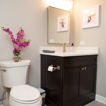
Across from the bar is a comfortable living area perfect for the family to sit down at a watch a movie. A full bath completes this finished basement with a spacious walk-in shower, Cocoa Brown Dura Supreme vanity with Calacatta Vicenza Quartz countertop, a crisp white sink and a stainless-steel Voss faucet.
Advance Design’s Common Sense process gives clients the opportunity to walk through the basement renovation process one step at a time, in a completely predictable and controlled environment. “Everything was designed and built exactly how we envisioned it, and we are really enjoying it to it’s full potential,” Karen said.
Constantly striving for customer satisfaction, Advance Design’s success is heavily reliant upon happy clients referring their friends and family. “We definitely will and have recommended Advance Design Studio to friends who are looking to embark on a remodeling project small or large,” Karen exclaimed at the completion of her project.
Find the right local pro for your project
 Unique Home Solutions Inc.
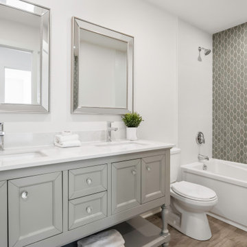
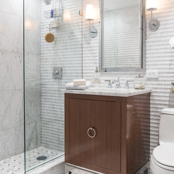
Love the tiles in the bathtub area! The accent wall of grey tiles is definitely the feature of the room!
If you are looking to sell your home, give us a call. We work with realtors, homeowners, house flippers and investors. How your home looks, matters more today than it ever had since many are shopping online for their 'forever home'!
 Paul Lopa Designs
See what our client say about Paul Lopa Designs:
We recently remodeled a studio we purchased for guests who visit us. The project included the demolition of a kitchenettem and a bathroom, and the installation of new cabinets, wood flooring, granite countertops, appliances, wood molding and a custom Murphy bed in the sleeping area.
My husband and I wanted a contractor who specializes in high end kitchens. We hired Paul Lopa (who had previously done two projects for us—a kitchen remodel and a bathroom remodel) as we were extremely impressed with his work, from beginning to end.
For the studio project, Paul brought many samples to our home before the project commenced. It was very easy for us to select the materials, from the wood used for the cabinets and Murphy bed to the granite countertop and wood floor. We were also very pleased with the appliances he helped us select as well, as the kitchen was transformed into a full-fledged kitchen with an eat-at counter. Paul helped us select custom marble for the bathroom which is gorgeous! Every suggestion he made was great. The studio is now worthy of being photographed by Architectural Digest!
Paul and his crew are very professional. His staff is friendly and were always on time. Upon completion of the job, the whole area was clean and ready to use.
Paul was always accessible and available to answer questions whenever we had one. We were impressed that the project finished on time and on budget!
We will definitely use Paul for all future work. He is a consummate professional and very nice to work with.
 Karndean Designflooring
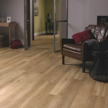
VGW85T French Oak, 48" x 7" plank
French Oak from the Van Gogh collection has the attractive knot and grain details of a traditional oak timber, in a subtly variable light blond tone. Gentle enough in design to work throughout an open-plan space, but with the flexibility to play with different angles and border details to create definition.



 Alair Homes Plano
Our clients came to us wanting to maximize the space they had. They were not planning on moving anytime soon, as they loved their neighborhood. They wanted to renovate the front of their house, which included the front atrium, living room, kitchen, and powder bath. They hated their kitchen because it was completely closed off, had low ceilings, was dark and outdated, not to mention the floors were different in each of these rooms! The pantry was in the breakfast area and the kitchen table became a junk catcher, being the first thing you see when coming in from the garage/laundry room. In their living room, they wanted the spaces on either side of the fireplace to be symmetrical, whether that be bookshelves, a wet bar or closed off. Both parents are working professionals with no time and/or desire to design, create and figure this out on their own. They needed help figuring out how to reconfigure their current space in order to maximize what they already had, as they could not see an obvious solution. They could not envision how it would look so the fact that our designers were able to show them their new kitchen in 3D was pertinent.
We removed the pass-through windows that surrounded the atrium and front dining room, as well as the entire kitchen wall, completely opening up those two rooms. We removed a hall that used to lead between the kitchen and the living room since it was a complete waste of space! The ceilings were raised to 10’ in the kitchen and we were able to leave the skylight, letting in that natural light they wanted. We were able to give them a much larger pantry with tons of shelving and increase the size of their laundry room by utilizing the space of their old breakfast nook.
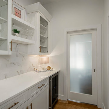
We relocated the door to the garage into their new elongated laundry room, built a wet bar across from their new larger pantry (with a pocket door) and the flow and functionality of these new spaces is just perfect! All new Waypoint cabinets were installed one two main kitchen surrounding walls painted Linen. Calacatta Bianco Polished Porcelain Tile 4x12 was used for the backsplash. A large eat-at island was installed, painted Stone, where the family can now gather for homework, meals, and mingling. The soft champagne bronze hardware and accent lighting really give this white and gray kitchen a soft classic look.
In the living room, we removed the built-in bookshelves to the left of the fireplace and closed off the wet-bar on the other side, giving them more space in their master suite. White Oak wood flooring, stained Putney, was installed throughout the entire new space, giving it the continuity they were looking for.
In the guest bathroom, Carrara white herringbone marble mosaic 12x12 tile was used on the shower floor and niche, while basic marble Bianco polished 12x24 porcelain tile was used on the walls. Luxart polished chrome traditional hardware gives this timeless bathroom the perfect shine.
Our clients are so happy with the new functionality and look of their space. It has definitely changed their lives in a way they could have never imagined!
 Pawling Closet Company
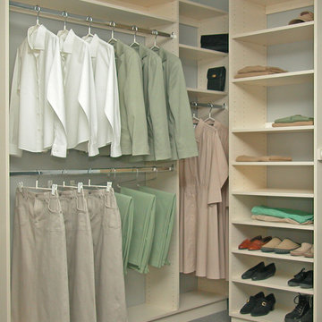
Example of a mid-sized classic gender-neutral carpeted walk-in closet design in New York with open cabinets and white cabinets

 David Morello Garden Enterprises, Inc.
David Morello
This is an example of a traditional landscaping in Houston.
This is an example of a traditional landscaping in Houston.
 Sarah Susanka, FAIA
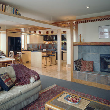
Architect: Sarah Susanka, FAIA, while at Mulfinger, Susanka, Mahady & Partners.
Photo: Grey Crawford
Living room - living room idea in Minneapolis
Living room - living room idea in Minneapolis
 River Valley Landscapes
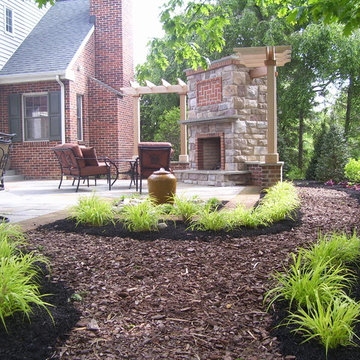
 After many years of having no outdoor living space and dealing with overgrown plants and trees the owner’s decided it was time to revitalize their backyard. They knew they wanted a large sitting area with a wood burning fireplace, room for outdoor dining and a place for the grill. A connecting walk would be needed to get guests from the driveway to the outdoor space. Last but not least, the owners wanted the ability to and a reason for stepping out of their unusable patio doors.
The designers decided from the start the fireplace would be the prominent feature and focal point for the entire project. A large fireplace accented with sitting walls and arbors was positioned to anchor the corner of the patio. Stone was chosen to set the fireplace apart as its own element. Brick was used for the sitting walls and brick accents were added to the fireplace to tie into the house. An inlaid herringbone brick detail was incorporated above the stone mantle to simulate artwork which is typically found above indoor fireplaces. Flagstone was used for the wall caps and hearth to match the patio and thicker flagstone tread stock was used for the mantle and top. The arbors were added to visually balance the pergolas at the opposite side of the patio.
For the patio the designers created a series of offset spaces to help subtly divide the space into two areas, sitting and dining. Two large existing trees also help dictate the shape of the patio. Cut flagstone was chosen for the surface bordered by a double soldier edge of brick. The brick edging also surrounds a decorative gravel area topped with an urn fountain which provides a secondary focal point and the sound of water. Large flagstone treads were used for the steps leading to the previously unused patio doors. Opposite the fireplace a short walk leads to a square transition area with a statue chosen by the owner. The statue provides a strong focal point when entering from the driveway. A longer walk leads from this space along the house to the driveway.
The pergolas and arbors were designed by the landscape designer as part of this project but were ultimately contracted separately by the owner. The larger square pergola was intended as an area for a bench or two separate from the main patio. The longer pergola was added later in the design phase to help provide shade to the interior of the house. The arbors at the fireplace were added to balance out the wood elements at the opposite side while adding additional architectural interest to the fireplace.
While this project was predominantly hardscaping, planting and lighting were also incorporated into the design. Several large existing trees were retained and serious of smaller understory trees were added to help enclose the space. The designer’s took advantage of the large trees to place down lights on the branches to achieve a moonlight effect at night. Additional lighting was used on the pergola, to accent focal points, to up light the smaller trees and around the patio. Massed planting of Japanese forest grass provides bold foliage color for the shady garden. A mulch path leads off behind the fireplace to another garden and a secluded area ideal for a bench or small table and chairs. Additional plantings were added along the rear property line to screen and unsightly fence.
This project has obviously completely changed the way the owners use their backyard. They now have a seamless transition from indoors to outdoors with the use of the patio doors. The large patio allows for entertaining small gatherings outdoors for the first time. The fireplace has definitely become the primary gathering place for family and friends.
 Smart Interiors
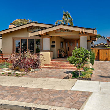
1929, Craftsman Bungalow in South Mission Hills, San Diego. This house is definitely not stuck in the past. The home owner wanted a modern, hip, Zen vibe. The outside use to be “Barney” purple with little to no landscaping. The inside was a jumble of do–it-yourself “improvements ” over the last 80 years by different homeowners.
Today, this 1,100 square foot house is fresh! It has lots of low maintenance and cost effective additions. It has been remodeled with hardwood floors, new windows, casings, doors, tile, LED lighting, Trex decking, water efficient landscaping, faux grass, an art glass installation in the backyard and a home gym. Plus, a creative mix of high and low end furnishings throughout.
Sponsored
Columbus, OH

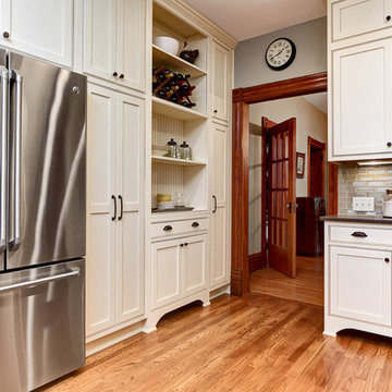
Hope Restoration & General Contracting
Columbus Design-Build, Kitchen & Bath Remodeling, Historic Renovations
 Jim Morrison Construction INC
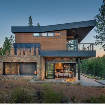
Example of a large minimalist brown two-story wood exterior home design in Sacramento with a metal roof
 Scavolini Store Detroit
Photo by Boswell Hardwick.
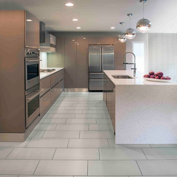
This kitchen is the heart of the home, with dining and bar areas adjacent. The homeowners host friends and family regulary and wanted a comfortable way to entertain. The large island seats at least 4 at the Cambria quartz countertop with 'waterfall' edge. The cabinets are Scavolini Tundra Gray glossy lacquer, accented by white tempered glass hung in an aluminum frame on either side of the chimney stainless steel hood vent. Gray tiles travel throughout the open floor plan add a clean aesthetic, and are also very easy to maintain for the homeowners who have two large dogs!
 Alair Homes Plano
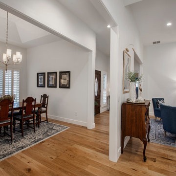
Our clients came to us wanting to maximize the space they had. They were not planning on moving anytime soon, as they loved their neighborhood. They wanted to renovate the front of their house, which included the front atrium, living room, kitchen, and powder bath. They hated their kitchen because it was completely closed off, had low ceilings, was dark and outdated, not to mention the floors were different in each of these rooms! The pantry was in the breakfast area and the kitchen table became a junk catcher, being the first thing you see when coming in from the garage/laundry room. In their living room, they wanted the spaces on either side of the fireplace to be symmetrical, whether that be bookshelves, a wet bar or closed off. Both parents are working professionals with no time and/or desire to design, create and figure this out on their own. They needed help figuring out how to reconfigure their current space in order to maximize what they already had, as they could not see an obvious solution. They could not envision how it would look so the fact that our designers were able to show them their new kitchen in 3D was pertinent.
We removed the pass-through windows that surrounded the atrium and front dining room, as well as the entire kitchen wall, completely opening up those two rooms. We removed a hall that used to lead between the kitchen and the living room since it was a complete waste of space! The ceilings were raised to 10’ in the kitchen and we were able to leave the skylight, letting in that natural light they wanted. We were able to give them a much larger pantry with tons of shelving and increase the size of their laundry room by utilizing the space of their old breakfast nook.
We relocated the door to the garage into their new elongated laundry room, built a wet bar across from their new larger pantry (with a pocket door) and the flow and functionality of these new spaces is just perfect! All new Waypoint cabinets were installed one two main kitchen surrounding walls painted Linen. Calacatta Bianco Polished Porcelain Tile 4x12 was used for the backsplash. A large eat-at island was installed, painted Stone, where the family can now gather for homework, meals, and mingling. The soft champagne bronze hardware and accent lighting really give this white and gray kitchen a soft classic look.
In the living room, we removed the built-in bookshelves to the left of the fireplace and closed off the wet-bar on the other side, giving them more space in their master suite. White Oak wood flooring, stained Putney, was installed throughout the entire new space, giving it the continuity they were looking for.
In the guest bathroom, Carrara white herringbone marble mosaic 12x12 tile was used on the shower floor and niche, while basic marble Bianco polished 12x24 porcelain tile was used on the walls. Luxart polished chrome traditional hardware gives this timeless bathroom the perfect shine.
Our clients are so happy with the new functionality and look of their space. It has definitely changed their lives in a way they could have never imagined!
 In Detail Interiors
Colorful and rich style
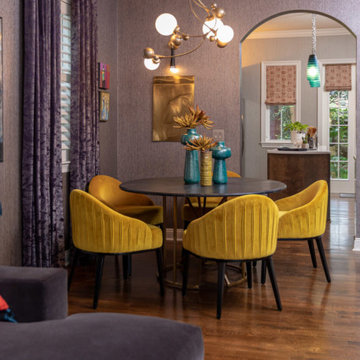
When a repeat client shows up on your doorstep with his third home to furnish and wants to start from scratch and go really bold, you just embrace him, scoot him right up to the resource room, and don’t ask questions! I mean, who does not love a client that embraces velvet, leather, silk and wallcoverings?
This lush, vibrant lounge space was all created from the want to really deep dive into something different, eclectic and more traveled. The original small, narrow, dimly lit room totally delivered on helping accomplish that mood. Mixing a little of that Ming dynasty-inspired strawberry red with a deep chocolate mohair on the sectional and cladding the room in a soft, amethyst woven wallcovering. We loved the interplay and “non-matchiness” that this space embraced.
Lighting and art were both about telling a story in this room – accenting conversational opportunities and an almost gallery-esque feel. Designating a more dynamic and unusual, sculptural feel – from the harder lines of the statement floor lamp in the living room across to the sprawling, slightly modern bloom of the dining area fixture.
Jewel of a space
The area rug had to ground the already bold furniture and lend itself to the darker wood floors, and a dusky green wool proved the ticket. We loved the almost pixelated pattern the hand-knotted wool lent to the overall design. A little hint of oxblood, chocolate and blue picked up in accents elsewhere, but the tone of almost jade really caught us about this piece.
Not enough can be said about the accent of a dining space either (which in terms of space planning was the only way to balance this long, narrow “hallway” of a room off the kitchen). Citron velvet on the low-profile chairs left the space feeling open, but fun for games and cocktail parties. Plus, the cerused wood dining table was a great complement – offering depth without a conflict to the existing flooring or nearby sectional.
Being able to view this space as a whole was very important to us! From the selection of sconces carried throughout (that wonky placement was existing and with so little opportunity to add cans we had to play up the new fixtures in a way that make them feel purposeful and desirable.), to the balance of color and temperature in each furniture grouping. Sometimes working floor to ceiling in an existing space can pose a lot of unique challenges when it comes to furnishing projects. However, we loved that the client embraced our drive to really punch up the visual feel of this living/dining combo. Also, we know the enjoyment he gets from the finished product is a testament to hunting for the right pieces, designing with unusual and luxe fabric combinations, and managing the inclusion of budget-friendly surprises that always balance a job well done.
What the client says
“From the moment that Cheryl arrived, I felt that she was definitely the designer that I needed to help facilitate & execute my vision for the space. I’m not the “cookie cutter” type, and I immediately realized that Cheryl had a knack for envisioning ideas that were unique, yet tasteful, timeless, and sophisticated.”
From its beginnings as a plain Jane envelope, this combination living/dining space becomes a study in texture and color!
Sponsored
Sunbury, OH

J.Holderby - Renovations
Franklin County's Leading General Contractors - 2X Best of Houzz!
 Alair Homes Plano
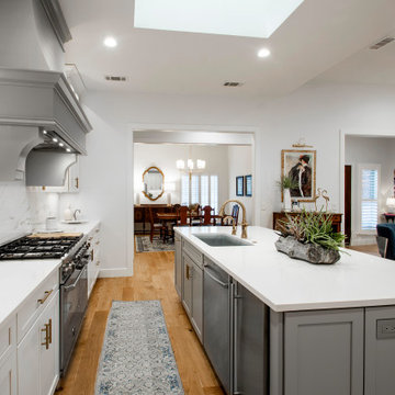
Our clients came to us wanting to maximize the space they had. They were not planning on moving anytime soon, as they loved their neighborhood. They wanted to renovate the front of their house, which included the front atrium, living room, kitchen, and powder bath. They hated their kitchen because it was completely closed off, had low ceilings, was dark and outdated, not to mention the floors were different in each of these rooms! The pantry was in the breakfast area and the kitchen table became a junk catcher, being the first thing you see when coming in from the garage/laundry room. In their living room, they wanted the spaces on either side of the fireplace to be symmetrical, whether that be bookshelves, a wet bar or closed off. Both parents are working professionals with no time and/or desire to design, create and figure this out on their own. They needed help figuring out how to reconfigure their current space in order to maximize what they already had, as they could not see an obvious solution. They could not envision how it would look so the fact that our designers were able to show them their new kitchen in 3D was pertinent.
We removed the pass-through windows that surrounded the atrium and front dining room, as well as the entire kitchen wall, completely opening up those two rooms. We removed a hall that used to lead between the kitchen and the living room since it was a complete waste of space! The ceilings were raised to 10’ in the kitchen and we were able to leave the skylight, letting in that natural light they wanted. We were able to give them a much larger pantry with tons of shelving and increase the size of their laundry room by utilizing the space of their old breakfast nook.
We relocated the door to the garage into their new elongated laundry room, built a wet bar across from their new larger pantry (with a pocket door) and the flow and functionality of these new spaces is just perfect! All new Waypoint cabinets were installed one two main kitchen surrounding walls painted Linen. Calacatta Bianco Polished Porcelain Tile 4x12 was used for the backsplash. A large eat-at island was installed, painted Stone, where the family can now gather for homework, meals, and mingling. The soft champagne bronze hardware and accent lighting really give this white and gray kitchen a soft classic look.
In the living room, we removed the built-in bookshelves to the left of the fireplace and closed off the wet-bar on the other side, giving them more space in their master suite. White Oak wood flooring, stained Putney, was installed throughout the entire new space, giving it the continuity they were looking for.
In the guest bathroom, Carrara white herringbone marble mosaic 12x12 tile was used on the shower floor and niche, while basic marble Bianco polished 12x24 porcelain tile was used on the walls. Luxart polished chrome traditional hardware gives this timeless bathroom the perfect shine.
Our clients are so happy with the new functionality and look of their space. It has definitely changed their lives in a way they could have never imagined!
 Cabinets & Designs
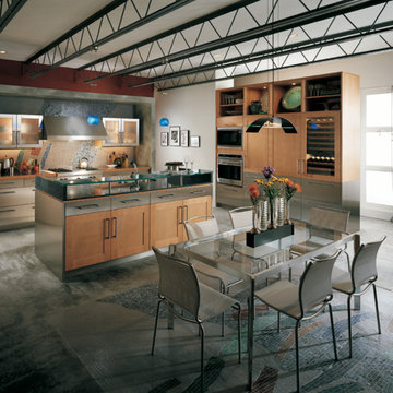
Here we have a very sleek and modern kitchen that features cabinetry from Wood-Mode. In the kitchen, the cabinet doors have frosted glass doors, which have definitely made a comeback in kitchen design! The kitchen also has stainless steel appliances, which includes a stainless steel vent hood. In the dining area, there is a glass table with a beautiful flower arrangement to add life to the room. The floors are concrete, but under the dining table there is a tile floor made up of different blues. There is a red accent wall to give the room color along with some blue lights above the kitchen island.
 All Marble Tiles
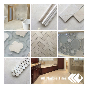
Crema Marfil Marble Tile and Mosaic
Crema Marfil marble tile is not new in construction; its popularity spreads worldwide thanks to its qualities as a stone tile. It is tough, durable and has a unique gloss that gives any home that hotel styled theme. It may feel expensive to buy at first, but when you window shop for discounts you will have the tiles with you sooner than you think.
This stone tile is appreciated by most builders and home owners because of the swirling and diversity seen on its surface patterns. It is easy to work with as well, and one doesn’t have to hire help to install if you have a little DIY skill in you. Though tough in nature, Crema Marfil Marble is easy to cut with a normal tile cutter and you can shape it to whatever style or size you want. Speaking more on size, the stone tile is normally cut in large sizes which make it easy to cover as much room as possible within a short time.
The Crema look is definitely covetable whether used on walls or floors. Marfil marble suits any area of your house where you need some sophisticated tweak. It beautifies your bathroom décor and accentuates the details of your kitchen. Its color is a perfect backdrop for your living room furniture and you are at will to add any other decorative details like paintings or sculptors. The best way to decorate with Crema Marfil marble tile is to play around with neutral tones, then build up interesting color designs with your furniture or other items in your house.
This Crema luxurious feel is available in the market at different prices. You can purchase it locally if there is a local store available or alternatively ship it from overseas. While buying, you can choose to be creative and order mosaic Marfil marble. It still bears the Crema hue like its counterparts but it adds other colors, texture feel or even veining on the surface. Crema Marfil Mosaic tile is perfect if you have an artistic mind in interior décor.
There are certain pointers you need to know while purchasing this stone tile. Make sure you are available to inspect the delivery to make sure all tiles match the colors you ordered and are also in the shape required. The tile condition is also important as some may arrive chipped or broken and may need replacing.
Let a mosaic interior inspire you while purchasing Crema Marfil marble tile, you won’t regret the decision.
44