
Search results for "Deliberation" in Home Design Ideas
 Moss Building & Design
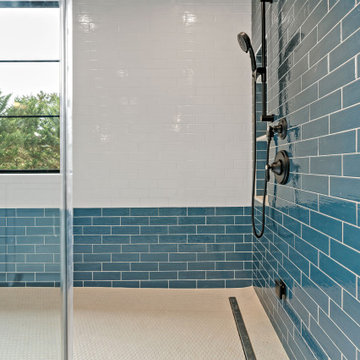
This Centreville, Virginia primary bath remodel completely transformed the space. The customers' goals were to update the bathroom to a more contemporary design from its traditional look and feel (original to the home). Their vision was to remove the large, walk up bathtub completely and replace it with a massive walk-in shower with steam shower capabilities and a completely tiled bench at one end. The choice of a bright blue tile for (almsot all the) walls, ceiling, bench and backsplash was done deliberately to complement the bright white cabinetry and the warm brown tiled floor. Previous to the remodel, the bathroom had a variety of somewhat ornate columns and heavy cabinetry which dominated the room. Now, the space is clean, bright, and spacious with just as much storage as before.
 Karen Berkemeyer Home
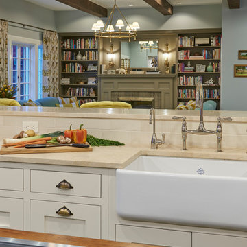
Wanting some of the familiarity of British country living, we deliberately incorporated details that echoed homeland into the design such as a ceramic farm sink. Amy designed the cabinetry using Signature Custom Cabinets, the construction is inset with a recessed panel door style. The simple shaker style door she modified with fuller stiles and rails to provide that country look and by alternating flush toe kicks and furniture legs also helped to achieve details and the country look the client was after. Adding subzero drawers at the end of the island offers quick access to snacks and drinks for the boys! The pretty green island was a color the client identified with her British roots. Bringing memories together with color really connects the homeowner personally to the space.
This distressed butternut island top with bread board ends is complete with natural wormholes, a true Raging River work of art. It really warms up the space and will patina further over time. The simplicity of the ultra modern Gaggenau induction cook top and sleek lines of the exhaust hood really allows that feature counter to take all the glory!
Lastly, the backsplash is crafted with textured, hand-made ceramic tiles that add a subtle bit of charm along with the warm touch of the antiqued brass cabinet hardware! Leaving the client with a beautiful and functional new kitchen.
 Torrence Architects
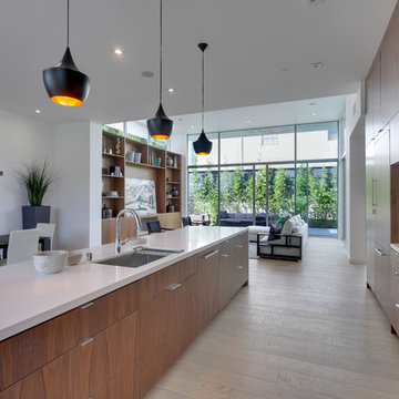
The kitchen has clear views of the living room and outdoor living room. Storage, storage, storage, this kitchen contains thoughtful solutions for all types of kitchen appliances, utensils, and cookware. Careful deliberations on function, ease of use, and types of cooking are all considered when designing a new kitchen.
Find the right local pro for your project
 EAG Studio
Reimagining an Urban Classic
Perched high above San Francisco’s Cow Hollow neighborhood, this meticulously reimagined residence represents a thoughtful transformation of a classic urban home into a contemporary, light-filled sanctuary. The project involved a comprehensive renovation paired with both vertical and horizontal expansion, dramatically increasing the home’s footprint while enhancing its relationship to sweeping views of the Bay, the Palace of Fine Arts, and the surrounding hillside neighborhoods.
The design strategy focused on opening the home to light, air, and vistas—elements often constrained in the dense urban fabric of San Francisco. By extending the structure upward and outward, the architects created a dynamic four-level residence that unfolds gradually, culminating in expansive living spaces and rooftop terraces oriented toward panoramic city and water views.
Architecture that Frames the View
At the heart of the design is a careful orchestration of sightlines and natural light. Large black-framed windows punctuate the façade and interior spaces, deliberately positioned to capture iconic San Francisco vistas while flooding the home with daylight. The architecture prioritizes openness, allowing rooms to flow seamlessly while maintaining a strong visual connection to the surrounding landscape.
A dramatic skylight above the central stairwell anchors the vertical circulation of the home. This architectural gesture not only brings daylight deep into the interior but also reinforces the sense of spatial continuity between floors.
Warm Modern Interiors
Inside, the home balances architectural clarity with warm materiality. Wide-plank oak floors run throughout the residence, creating visual cohesion and grounding the interiors with natural warmth. Custom walnut millwork—integrated shelving, cabinetry, and wall panels—introduces depth and texture while complementing the clean lines of the architecture.
The interiors are intentionally restrained yet richly layered. Contemporary furnishings, sculptural lighting, and curated artwork add personality while maintaining the calm, sophisticated palette that defines the home.
The Social Heart of the Home
The main living level serves as the social centerpiece of the residence. An open-plan kitchen, dining area, and lounge space unfold toward the view, creating an environment that feels both expansive and intimate.
A sculptural marble island anchors the kitchen, functioning as both workspace and gathering hub. Surrounded by walnut cabinetry and professional-grade appliances, the kitchen merges elegance with functionality. Above, a cascading chandelier introduces a sense of vertical movement, reflecting the home’s emphasis on light and architectural rhythm.
Living areas are arranged to encourage conversation and connection. Generous seating, layered rugs, and thoughtful lighting define distinct zones within the open plan while maintaining uninterrupted sightlines toward the cityscape beyond.
Private Retreats Above the City
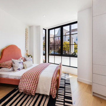
Upper levels of the home are dedicated to quieter, more intimate spaces. The primary suite is conceived as a private retreat, where expansive windows frame treetop views and invite natural light throughout the day.
The accompanying bathroom continues the home’s refined material palette. Marble surfaces, warm wood cabinetry, and brushed brass fixtures create a spa-like environment that balances luxury with tranquility.
Additional bedrooms and flexible living spaces offer comfort for family and guests, each designed with the same attention to light, proportion, and material richness.
Spaces for Entertaining
Lower levels provide additional areas for gathering and entertaining. A lounge and bar area offer a relaxed setting for hosting, while custom wine storage adds a sophisticated touch for collectors and enthusiasts.
These spaces transition easily to outdoor areas, reinforcing the home’s emphasis on indoor-outdoor living.
A Rooftop Above the Neighborhood
The transformation extends beyond the interior to include thoughtfully designed outdoor spaces. A landscaped rear yard introduces greenery and privacy at ground level, offering a serene urban escape.
Above it all, the rooftop terrace becomes the crown jewel of the residence. Elevated above the neighborhood, it provides sweeping views of the San Francisco Bay and the Palace of Fine Arts. Comfortable seating areas, lush planters, and open sky create an ideal setting for outdoor entertaining, sunset gatherings, or quiet moments overlooking the city.
A Contemporary Urban Sanctuary
The completed residence demonstrates the power of thoughtful renovation and expansion within a historic urban neighborhood. By combining contemporary architecture, warm materiality, and an intentional relationship to the surrounding landscape, the project transforms a traditional San Francisco home into a modern sanctuary above the city.
 Fiorito Interior Design
It’s rare when a client comes to me with a brief for a complete home from scratch, but that is exactly what happened here. My client, a professional musician and singer, was having a luxury three-story condo built and wanted help choosing not only all the hardscape materials like tile, flooring, carpet, and cabinetry, but also all furniture and furnishings. I even outfitted his new home with plates, flatware, pots and pans, towels, sheets, and window coverings. Like I said, this was from scratch!
We defined his style direction for the new home including dark colors, minimalistic furniture, and a modern industrial sensibility, and I set about creating a fluid expression of that style. The tone is set at the entry where a custom laser-cut industrial steel sign requests visitors be shoeless. We deliberately limited the color palette for the entire house to black, grey, and deep blue, with grey-washed or dark stained neutral woods.
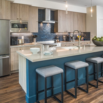
The navy zellige tiles on the backsplash in the kitchen add depth between the cement-textured quartz counters and cerused cabinetry. The island is painted in a coordinating navy and features hand-forged iron stools. In the dining room, horizontal and vertical lines play with each other in the form of an angular linear chandelier, lighted acrylic light columns, and a dining table with a special faceted wave edge. Chair backs echo the shape of the art maps on the wall.
We chose a unique, three dimensional wall treatment for the living room where a plush sectional and LED tunable lights set the stage for comfy movie nights. Walls with a repeating whimsical black and white whale skeleton named Bruce adorn the walls of the powder room. The adjacent patio boasts a resort-like feeling with a cozy fire table, a wall of up-lit boxwoods, and a black sofa and chairs for star gazing.
A gallery wall featuring a roster of some of my client’s favorite rock, punk, and jazz musicians adorns the stairwell. On the third floor, the primary and guest bathrooms continue with the cement-textured quartz counters and same cerused cabinetry.
We completed this well-appointed home with a serene guest room in the established limited color palette and a lounge/office/recording room.
All photos by Bernardo Grijalva
 Kon-strux Developments
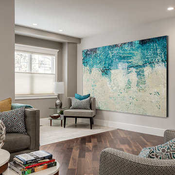
A view of the entry from the livingroom. This space is restful in its palette and its design: space to breathe and move deliberately. (Rob Moroto, Calgary Photos)
 Natural Stone Institute
As Sheila Gibson Stoodley writes in an article about this project in Robb Report, “Brian Hemingway is sensitive to light in the best way possible.”
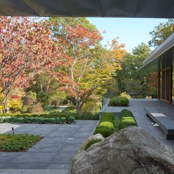
“The Vancouver, British Columbia-based architect wanted this 22,000-square-foot home near Boston to glow like a lantern at night, and he attained that goal on behalf of the homeowners.” The wood and stone
that Hemingway favored for the home informed the space’s color palette. So critical were these materials that settling on a shade of stain for the Douglas fir and the finishes to be used on the Virginia Mist granite took
months of consultation.
Walker Zanger, the stone supplier, worked with the owner and with Colin Flavin, a Boston-based architect who partnered with Hemingway, to choose, detail, and fabricate the granite.
The stone is used indoors and out, heightening the boundary-blurring effect that the design team desired. Though the owners are ardent art collectors, they did not build their home to showcase specific works; the
real artists here are the architects, Hemingway and Flavin. So deft were they at inviting nature into their creation that, from certain angles, it can be hard to tell where the outdoors stops and starts.
“There are deliberately no window treatments so that Mother Nature weaves the most beautiful textural backgrounds,” said interior designer Andrew Sheinman, of New York’s Pembrooke & Ives. He oversaw the
interiors, working alongside his colleague Michael Lewis. “The seasons change the look and aspect of the house,” said Sheinman, “and we wanted to play on this.”
Bleu de Savoie marble, from France, is used in the baths, to contrast with the Virginia Mist granite and soften the palette and give the baths a spa-like serenity. Hand-chiseled Oxford Black granite is used on exterior landscape walls, to tie the Virginia Mist seamlessly to the natural stone outcroppings.
 lavish
This Raleigh, NC home was reimagined from the ground up — not room by room, but as a single, cohesive expression of how a family lives, gathers, and rests.
The architecture drove every decision. Custom millwork and panel molding were carried through every space, creating a visual language that connects the entry to the living room, the dining room to the primary suite. It's what makes the home feel complete — not like a collection of individually finished rooms.
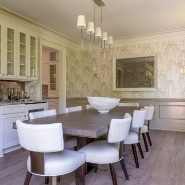
In the kitchen, a full marble slab backsplash reads as one uninterrupted surface — giving the room its presence without competing with the custom white inset cabinetry and brushed nickel hardware. The dining room lives in deliberate contrast: deep-toned oak table, delicate botanical wallpaper, antique mirror. Light and organic, yet entirely considered.
The living room was designed around its connection to the outside — French doors that open directly to a substantial outdoor kitchen and entertaining space, anchored on the interior by a cast stone fireplace with an arched surround that commands the room.
The entry sets the expectation for everything that follows: a double-height foyer, geometric pendants cascading from above, large-scale original artwork, and a carved console that makes the first impression without overstating it.
Designed and executed by Lavish — Raleigh, NC's full-service interior design and remodeling firm.
 Eugene Pintail LLC
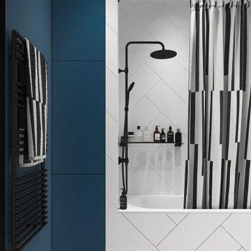
Minimalism isn’t supposed to be vanilla—this one actually earns the label. Clean, modern simplicity is the core, but it’s rich in intention. Every line, surface, and texture is deliberate; emptiness feels calculated, not lazy. The subdued palette and essentialist layout speak to refined restraint, yet the space still communicates a quiet, confident presence. Real minimalism with character—not stripped, but sharpened.
 Whitefish Architecture
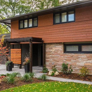
This garage addition and rehabilitation of a mid century modern home expands and enhances the original while respecting the scale and low, linear feel.
All exterior finishes are updated with the exception of the stone. A new entrance creates layers of screening to invite inquiry as well as create privacy and a sense of place. The garage is downplayed with dark materials to allow it to recede relative to the main house, which is deliberately brighter, warmer, and varied to remain the visual focus.
Lead Designer - Alex Jenkins
Designer - Valerie Wright
Photography - Steve Edgar
 Metropolis Drafting and Construction Inc
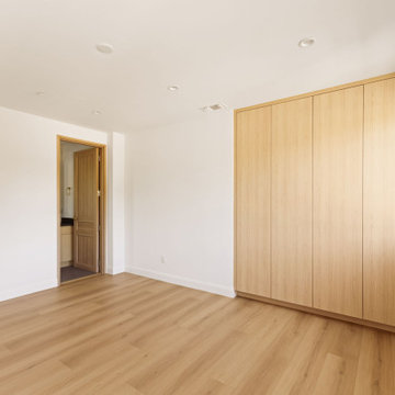
Today’s investment landscape in California features a surge in transforming single-family lots into vibrant multi-family residences, facilitated by recent SB9 and ADU laws. This project exemplifies how a modest 6,750-square-foot lot can accommodate a 1,500-square-foot primary home alongside a 2,500-square-foot duplex, seamlessly integrating design, functionality, and neighborhood aesthetics.
The primary residence underwent a meticulous interior transformation, evolving from a 3-bedroom, 1.5-bath layout into a spacious 4-bedroom, 2-bath home. Strategic reconfigurations centered around creating an expansive great room—an open-concept space adorned with vaulted ceilings—where the kitchen, dining, and living areas converge into a magnificent communal zone.
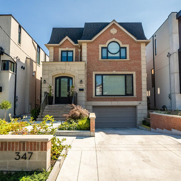
Exterior updates further distinguish the property. The front and side yards are enclosed with fencing and privacy hedges, linked by concrete pathways that enhance outdoor functionality while compensating for backyard space lost during renovations. The exterior façade was refreshed with darker tones, deliberately contrasting with the duplex to emphasize architectural separation.
Designed to preserve the suburban charm, the duplex visually mimics a single-family home from the street. Its facade creates an illusion of a two-story residence, maintaining harmony within the neighborhood fabric. The main unit, developed under SB9 guidelines, features three bedrooms and two bathrooms, with a luxurious parents’ suite situated upstairs. Downstairs, two bedrooms share a full bath, creating a balanced family-oriented layout.
The duplex’s interior boasts 9-foot ceilings throughout, elevating the sense of space and openness. The design thoughtfully places the kitchen at the front, inviting guests into the home, while stairs on the right lead to the private upstairs bedroom suite.
The ADU offers a two bedroom and two & half baths. the unit is accessible via a private side entrance with a dedicated walkway. Its layout includes a ground-floor living room, a galley kitchen, and a discreet powder room beneath the stairs, designed to contain guest traffic and maintain privacy upstairs. The upstairs bedrooms each feature luxurious bathrooms with expansive showers, adding an element of modern elegance.
Both units enjoy thoughtfully landscaped outdoor spaces—private patios, backyard areas, and gated front yards—creating welcoming environments for residents and visitors alike.
This project exemplifies innovative urban infill solutions, blending architectural elegance with legal compliance and community harmony—an inspiring blueprint for the future of residential development in California.
 bsq Landscape Architects
Creating a contemporary garden with an existing landscape can sometimes be a challenge especially if the existing architecture and landscape features may not be as modern feeling as one might want. Introducing carefully chosen elements with clean linear features and strong lines can all help to update a landscape to a much more modern standard.
Deliberate materials and paving elements combined with stainless steel, glass and composite decking along with colourful planters to add that “pop” have all done much to transform this existing landscape while working with the existing pool and house architecture.
 4Ever Remodeling
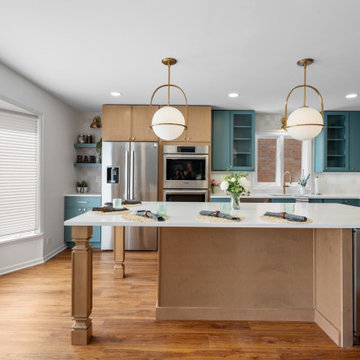
The seating side of this island includes a subtle but deliberate detail: decorative turned legs that reference traditional craftsmanship without pulling the design into a specific era. Paired with a clean white quartz countertop, it's the kind of choice that feels at home in both a 1950s Park Ridge bungalow and a fully contemporary remodel. Details like this are what give a kitchen longevity.
 Marie-Pierre Ayoul Decorative painting
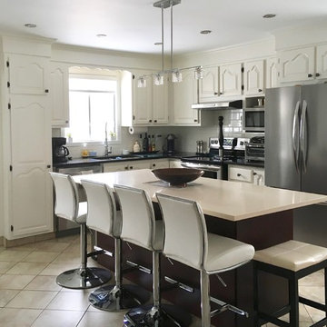
The wood grain was filled in and the cabinets painted a soft white, while the new dark countertop brought a nice contrast. The owners decided to pick dark hinges and handles as well to deliberately echo the countertop since it would have gone over budget to modify all the doors to make them compatible with invisible hinges.
The result is fresh and luminous.
Photography: Marie-Pierre Ayoul
 Sheri Haby Architects
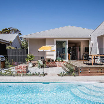
Internal spaces look to the garden and pool, vistas that pulls your eye out, a deliberate strategy to make the spaces feel larger.
Inspiration for a mid-sized mid-century modern backyard stone pool landscaping remodel in Melbourne
Inspiration for a mid-sized mid-century modern backyard stone pool landscaping remodel in Melbourne
 George Ocampo
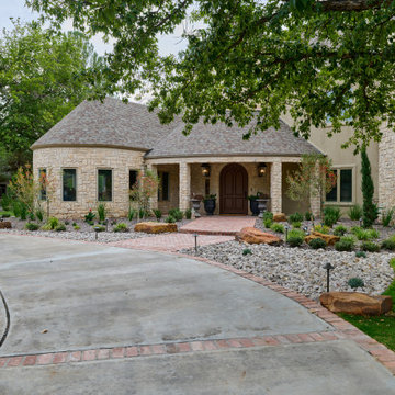
Upper Valley Estate Curb Appeal – El Paso, Texas
This curb appeal transformation was conceived as a deliberate sequence—an arrival experience where architecture, landscape, and lighting work together as one. Every element was designed to honor the home’s stone construction, turreted forms, and Old World character while responding precisely to the Upper Valley climate and lifestyle.
By day, the experience is grounded and composed. Brick-edged concrete drives establish order and permanence, guiding movement through the property with clarity and intention. Natural stone walls and columns anchor the architecture, while layered gravel beds, drought-tolerant plantings, and manicured turf soften transitions and connect the home to its desert setting. Mature trees were preserved and carefully integrated, providing scale, shade, and a sense of continuity.
As afternoon shifts toward sunset, the materials begin to speak differently. Stone warms, textures deepen, and sightlines subtly draw the eye toward the front entry. The landscape narrows the focus, creating a moment of pause before arrival—calm, quiet, and refined.
At night, the design reveals its final layer. Low-voltage lighting is integrated with precision, washing stone surfaces, tracing architectural curves, and uplighting specimen trees to create depth without glare. The drive, walkways, and entry feel safe, legible, and inviting, while the home itself glows with a restrained elegance. Coming home after dark feels intentional—protected, welcoming, and unmistakably yours.
What was created is more than curb appeal. It is a cohesive design-build solution where nothing is ornamental without purpose and nothing is built without intention. A daily experience of arrival that reflects craftsmanship, care, and the enduring character of the Upper Valley.
 Ward+Blake Architects
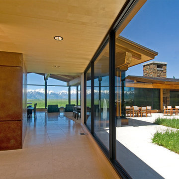
Located on a flat, open, grass-covered site amid wraparound views of the Teton and Gros Ventre ranges, the deliberately unobtrusive Tennican residence facilitates a clear dialogue between enclosed and natural space. Designed by Ward+Blake Architects in Jackson, Wyoming.
Photo Credit: Douglas Khan
 Modern Habitat
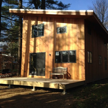
Positioned a short walk from the main house, the Bunk House has 3 bedrooms, a small kitchen, half bath (assuming use of the outdoor shower at the main house) and a small living area adjacent a water facing deck with a sliding door.
The bunk house deliberately is purposed as a 3 season structure with open uninsulated walls reminiscent of the lake front "camps" that still populate the lake. A wood stove, provides adequate heat in shoulder seasons or cold summer days.
 Ward+Blake Architects
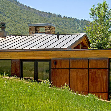
Located on a flat, open, grass-covered site amid wraparound views of the Teton and Gros Ventre ranges, the deliberately unobtrusive Tennican residence facilitates a clear dialogue between enclosed and natural space. Designed by Ward+Blake Architects in Jackson, Wyoming.
Photo Credit: Douglas Khan
 George Ocampo
Central El Paso Backyard Renovation:
Fifteen years is a long time for a backyard to quietly wait.
At first, it was full of intention—a pool that promised summers, laughter, and long evenings. But time has a way of settling in. The water turned still, then green. Edges cracked. The space became less of a destination and more of something you looked past. Life moved forward, but the backyard stayed behind.
Then came the decision: it was time.
Not a patch job. Not a quick fix. A complete reset.
The transformation didn’t begin beautifully—it began with demolition. The old pool was drained, exposing years of neglect etched into its surface. Crews stepped in, breaking, clearing, reshaping. What once held stagnant water became an open cavity of possibility. Steel rebar formed a new skeleton, precise and intentional. Every line measured. Every elevation reconsidered.
This wasn’t just construction—it was rethinking how the space should live.
The shell was rebuilt. Surfaces were refined. Plumbing, structure, and flow were corrected at their core. What had once been outdated and failing was now engineered to last.
Then the shift happened.
Hardscape came in—clean, warm-toned concrete replacing worn decking. Stone walls, once just boundaries, were elevated into features. Subtle textures, intentional lines. A visual language that matched the architecture of the home instead of competing with it.
The pool returned—but not as it was.
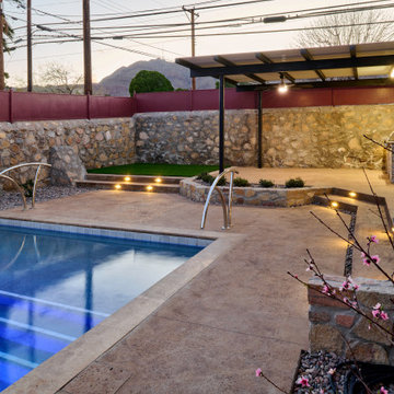
Now it was sharp, modern, and inviting. A long, clean body of water with a shallow tanning ledge that catches the sun just right. Stainless steel scuppers arc water into the pool—movement, sound, life. Steps are crisp, geometry is balanced, and the water reflects clarity instead of neglect.
Around it, the yard found purpose.
Artificial turf introduced contrast—green, controlled, low-maintenance. A pergola structure rose in the corner, creating a destination within the destination. Beneath it, a built-in outdoor kitchen turned the backyard into a place to gather, not just pass through. Lighting stitched everything together, making the space just as alive at dusk as it is under the midday sun.
By the end, nothing felt accidental.
What was once forgotten is now deliberate. What was once avoided is now the center of attention.
Fifteen years later, the backyard didn’t just come back—it finally became what it was always supposed to be.
21