
Search results for "Derivation" in Home Design Ideas
 French Creek Designs Kitchen & Bath Design Center
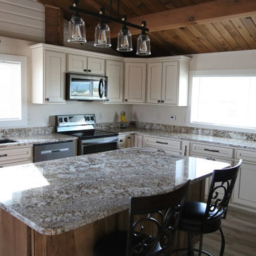
Duo contrasting cabinets perfectly designed and laid out for this log cabin kitchen remodel. Choosing natural wood cabinets for the island with contrasting stark white cabinets for the perimeter of the kitchen is stunning! First, client came to showroom looking to make their kitchen more function. Being a log cabin and prior remodels made this a bit tricky from the previous owners. Next, we began working around support beams with the client. However, a solution from owner was derived to make the space more functional by bringing the wall out further. This allotted more space for the wall cabinets and made the space more appealing.
Cabinet selection and designing was next in process. Island selection is natural hickory cabinets with a liquid toffee glaze. Which added richness to the island bringing warmth into the kitchen. Tying in the woods from the ceiling and various walls. Additionally, the painted alder cabinets with a glaze along the perimeter brighten up the cozy kitchen. Finally, adding beautiful desert beach granite countertops tops off the project. This kitchen will be enjoyable for years to come.
 French Creek Designs Kitchen & Bath Design Center
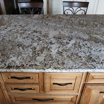
Duo contrasting cabinets perfectly designed and laid out for this log cabin kitchen remodel. Choosing natural wood cabinets for the island with contrasting stark white cabinets for the perimeter of the kitchen is stunning! First, client came to showroom looking to make their kitchen more function. Being a log cabin and prior remodels made this a bit tricky from the previous owners. Next, we began working around support beams with the client. However, a solution from owner was derived to make the space more functional by bringing the wall out further. This allotted more space for the wall cabinets and made the space more appealing.
Cabinet selection and designing was next in process. Island selection is natural hickory cabinets with a liquid toffee glaze. Which added richness to the island bringing warmth into the kitchen. Tying in the woods from the ceiling and various walls. Additionally, the painted alder cabinets with a glaze along the perimeter brighten up the cozy kitchen. Finally, adding beautiful desert beach granite countertops tops off the project. This kitchen will be enjoyable for years to come.
 Waleed Architects
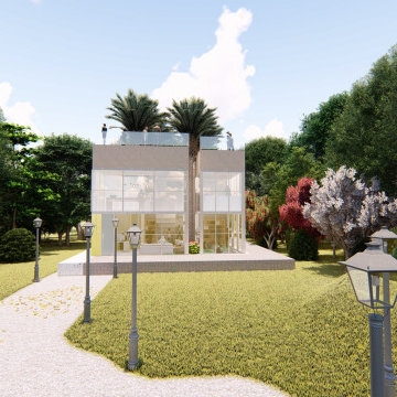
Lahore's origins reach into antiquity. The city has been controlled by numerous empires throughout the course of its history, including the Hindu Shahis, Ghaznavids, Ghurids, and Delhi Sultanate by the medieval era.
According to Hindu legend, Lahore's name derives from Lavpur or Lavapuri ("City of Lava"), and is said to have been founded by Prince Lava, the son of Sita and Rama. So the Design is inspired by the Hindu religious icon 'The Swastika' and in Later years Lahore was ruled by Muslim Rulers. So the design Elements were inspired by Muslim Architecture, such as the the Glass watered which is in shape of plus (+). As the concept of this theory is the 4 pious rivers meeting each other as also seen in other Mughal's Architecture.
And Later Modernism Concept in this building is inspired when the British Rulers took over.
Find the right local pro for your project
 Southern Yellow Pine Direct
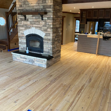
. The rustic grade will have more frequent knots and the sapwood will generally be within this grade. The select or prime grade will have in frequent knots, a darker color, and a more consistent color range. Tongue and Groove and End Matched One-to-twelve-foot lengths with average 6-8’. Our rustic grade of Caribbean Heart Pine has more of its heartwood derived from sap and thus has more color variations and those gorgeous knots. Our prime grade of Caribbean Heart Pine is uniform in color over a range from golden brown to red brown heartwood to lighter brown sapwood. While both rustic and prime grades contain a minimum of 85% heartwood, rustic contains more sapwood (Knot) whereas prime grade consist of more heartwood. Prime grade is virtually clear except occasional small pin knots. Color is more consistent and harmonious, with a high degree of red heartwood and limited sapwood.
 Carlton Edwards
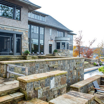
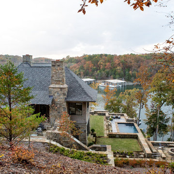
The exterior of the home was designed to feel as though it was a summer lodge from the 1930s or 1940s with the idea that it would feel like it's always been there. Careful attention was paid to the detailing of the exterior and the material and color pallet. Water oaks found on the site were inspirational to the color pallet. So the stain for the shingle siding was derived from the bark on the tree. Paint colors for the trim and shutters and doors were all developed from that pallet, including the dark mossy bronze green.
The orientation of the house is situated to take advantage of the long panoramic views of golf and the lake with sunset views from the cooking porch and entertainment terraces on the waterside centered around a large pool and outdoor chairs. Because of its vertical nature, retaining walls of Arkansas fieldstone were used in several outdoor spaces.
Sarah Rossi, Photographer
 Aquatica Plumbing Group
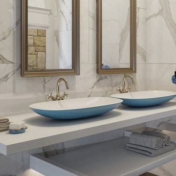
Experience the power of Coletta's unique sink style, long, low dish-shaped rectangular basin with softly rounded corners, crafted from quality stone composite AquateX™ in new Jaffa Blue color that will have you feeling relaxed faster than ever. Bringing the clean pop of color, Coletta A Bathroom Sink in Jaffa Blue is a stunning new addition to Aquatica's Coletta range, deriving its outstanding uniqueness from the heart of Jaffa Old Town.
Jaffa’s wondrous and indescribable blues provided the impetus for our designers to create a superb blend of the old and new, taking the crisp minimal lines and advanced technology of our popular Coletta model and adding a whole new layer of warmth and character.
Team up Coletta A Bathroom Vessel Sink with Aquatica Coletta™ Jaffa Blue Freestanding Bathtub for complete Jaffa Old town vibe.
 French Creek Designs Kitchen & Bath Design Center
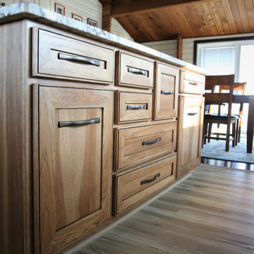
Duo contrasting cabinets perfectly designed and laid out for this log cabin kitchen remodel. Choosing natural wood cabinets for the island with contrasting stark white cabinets for the perimeter of the kitchen is stunning! First, client came to showroom looking to make their kitchen more function. Being a log cabin and prior remodels made this a bit tricky from the previous owners. Next, we began working around support beams with the client. However, a solution from owner was derived to make the space more functional by bringing the wall out further. This allotted more space for the wall cabinets and made the space more appealing.
Cabinet selection and designing was next in process. Island selection is natural hickory cabinets with a liquid toffee glaze. Which added richness to the island bringing warmth into the kitchen. Tying in the woods from the ceiling and various walls. Additionally, the painted alder cabinets with a glaze along the perimeter brighten up the cozy kitchen. Finally, adding beautiful desert beach granite countertops tops off the project. This kitchen will be enjoyable for years to come.
 French Creek Designs Kitchen & Bath Design Center
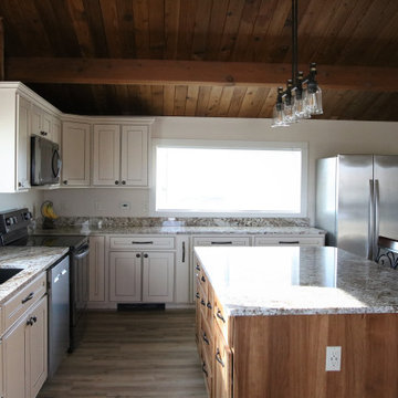
Duo contrasting cabinets perfectly designed and laid out for this log cabin kitchen remodel. Choosing natural wood cabinets for the island with contrasting stark white cabinets for the perimeter of the kitchen is stunning! First, client came to showroom looking to make their kitchen more function. Being a log cabin and prior remodels made this a bit tricky from the previous owners. Next, we began working around support beams with the client. However, a solution from owner was derived to make the space more functional by bringing the wall out further. This allotted more space for the wall cabinets and made the space more appealing.
Cabinet selection and designing was next in process. Island selection is natural hickory cabinets with a liquid toffee glaze. Which added richness to the island bringing warmth into the kitchen. Tying in the woods from the ceiling and various walls. Additionally, the painted alder cabinets with a glaze along the perimeter brighten up the cozy kitchen. Finally, adding beautiful desert beach granite countertops tops off the project. This kitchen will be enjoyable for years to come.
 Field Architecture
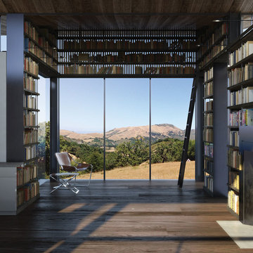
The Grasslands home was born out of and celebrates the beautiful but fragile grassland ecology of the Carmel Valley. Our client’s desire to actively simplify his lifestyle to the most essential elements inclusive of space clearly drove sensibilities in the design. In addition the home features a precision, derived from the client’s love of flight, a grounded-ness from his love of books and the love of his horse.
To meet the simplistic beauty of the scope, the home consists of three interconnected glass pavilions and a detached barn which wrap to the bowl shape of the land. The pavilions are comprised of a master suite, a library/living room, kitchen, and a meditation sanctuary; the barn, his horse and car.
The design focuses on preserving the delicate ecosystem of the surrounding grasslands, while concurrently incorporate views and maximize solar orientation. In support, the pavilions sit on the perimeter of an existing bowl shaped depression in the hillside. Three primary landscape walls run parallel to the topography, emphasizing the shape and spatial definition of the land as well as providing locations to anchor the structures. Pulled up and out of the landscape, the buildings jut over the anchor walls, hovering above the native grasses. In section, the land appears to flow through the pavilions, undisturbed and collaborative to the architecture.
 French Creek Designs Kitchen & Bath Design Center
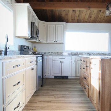
Duo contrasting cabinets perfectly designed and laid out for this log cabin kitchen remodel. Choosing natural wood cabinets for the island with contrasting stark white cabinets for the perimeter of the kitchen is stunning! First, client came to showroom looking to make their kitchen more function. Being a log cabin and prior remodels made this a bit tricky from the previous owners. Next, we began working around support beams with the client. However, a solution from owner was derived to make the space more functional by bringing the wall out further. This allotted more space for the wall cabinets and made the space more appealing.
Cabinet selection and designing was next in process. Island selection is natural hickory cabinets with a liquid toffee glaze. Which added richness to the island bringing warmth into the kitchen. Tying in the woods from the ceiling and various walls. Additionally, the painted alder cabinets with a glaze along the perimeter brighten up the cozy kitchen. Finally, adding beautiful desert beach granite countertops tops off the project. This kitchen will be enjoyable for years to come.
 French Creek Designs Kitchen & Bath Design Center
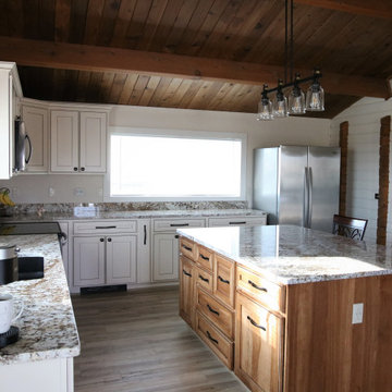
Duo contrasting cabinets perfectly designed and laid out for this log cabin kitchen remodel. Choosing natural wood cabinets for the island with contrasting stark white cabinets for the perimeter of the kitchen is stunning! First, client came to showroom looking to make their kitchen more function. Being a log cabin and prior remodels made this a bit tricky from the previous owners. Next, we began working around support beams with the client. However, a solution from owner was derived to make the space more functional by bringing the wall out further. This allotted more space for the wall cabinets and made the space more appealing.
Cabinet selection and designing was next in process. Island selection is natural hickory cabinets with a liquid toffee glaze. Which added richness to the island bringing warmth into the kitchen. Tying in the woods from the ceiling and various walls. Additionally, the painted alder cabinets with a glaze along the perimeter brighten up the cozy kitchen. Finally, adding beautiful desert beach granite countertops tops off the project. This kitchen will be enjoyable for years to come.
 HR DESIGN DEPT
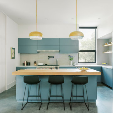
The Watonga residence was commissioned by a woman with a big heart for animal fostering. She wanted a house that felt private from the street but visually and physically connected to the backyard. The house needed to consider the typology and scale of the existing neighborhood, and it needed durable materials to accommodate little paws. Finally, it had to support an environmentally conscientious life. The house was intentionally placed on the short end of an irregularly shaped lot, allowing the living spaces to open up to a large native landscape and adjacent lot containing a significant tree grove. This siting allowed for a passive orientation where window walls face north and exposure to the south and west is minimal.
The interior is light-filled, capturing expansive landscape views of an established oak grove to the North and bayou views to the East. A carefully choreographed entry vestibule and screen shield create interior privacy from the street. A two-story volume fills the center of the home with warm, southern light. A palette of tile, Texas stone, and concrete are used for budget friendly durability. The house is derived from a simple diagram with utilitarian functions placed in the stone box and living in a minimal gabled roof that supports solar panel orientation and rainwater collection.
At its core, this home is designed for family, foster dogs, well-curated music, and Aggie game days.
 Carlton Edwards
The exterior of the home was designed to feel as though it was a summer lodge from the 1930s or 1940s with the idea that it would feel like it's always been there. Careful attention was paid to the detailing of the exterior and the material and color pallet. Water oaks found on the site were inspirational to the color pallet. So the stain for the shingle siding was derived from the bark on the tree. Paint colors for the trim and shutters and doors were all developed from that pallet, including the dark mossy bronze green. The orientation of the house is situated to take advantage of the long panoramic views of golf and the lake with sunset views from the cooking porch and entertainment terraces on the waterside centered around a large pool and outdoor chairs. Because of its vertical nature, retaining walls of Arkansas fieldstone were used in several outdoor spaces.
Sarah Rossi, Photographer
 SV Design
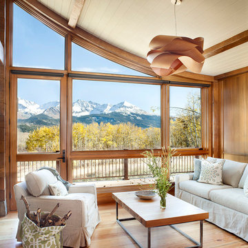
When full-time Massachusetts residents contemplate building a second home in Telluride, Colorado the question immediately arises; does it make most sense to hire a regionally based Rocky Mountain architect or a sea level architect conveniently located for all of the rigorous collaboration required for successful bespoke home design. Determined to prove the latter true, Siemasko + Verbridge accompanied the potential client as they scoured the undulating Telluride landscape in search of the perfect house site.
The selected site’s harmonious balance of untouched meadow rising up to meet the edge of an aspen grove and the opposing 180 degree view of Wilson’s Range spoke to everyone. A plateau just beyond a fork in the meadow provided a natural flatland, requiring little excavation and yet the right amount of upland slope to capture the views. The intrinsic character of the site was only enriched by an elk trail and snake-rail fence.
Establishing the expanse of Wilson’s range would be best served by rejecting the notion of selected views, the central sweeping curve of the roof inverts a small saddle in the range with which it is perfectly aligned. The soaring wave of custom windows and the open floor plan make the relatively modest house feel sizable despite its footprint of just under 2,000 square feet. Officially a two bedroom home, the bunk room and loft allow the home to comfortably sleep ten, encouraging large gatherings of family and friends. The home is completely off the grid in response to the unique and fragile qualities of the landscape. Great care was taken to respect the regions vernacular through the use of mostly native materials and a palette derived from the terrain found at 9,820 feet above sea level.
Photographer: Gibeon Photography
 Thomas Roszak Architecture, LLC
Photo credit: Scott McDonald @ Hedrich Blessing
7RR-Ecohome:
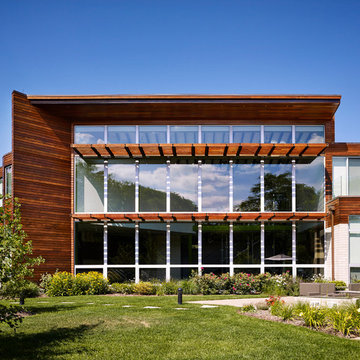
The design objective was to build a house for a couple recently married who both had kids from previous marriages. How to bridge two families together?
The design looks forward in terms of how people live today. The home is an experiment in transparency and solid form; removing borders and edges from outside to inside the house, and to really depict “flowing and endless space”. The house floor plan is derived by pushing and pulling the house’s form to maximize the backyard and minimize the public front yard while welcoming the sun in key rooms by rotating the house 45-degrees to true north. The angular form of the house is a result of the family’s program, the zoning rules, the lot’s attributes, and the sun’s path. We wanted to construct a house that is smart and efficient in terms of construction and energy, both in terms of the building and the user. We could tell a story of how the house is built in terms of the constructability, structure and enclosure, with a nod to Japanese wood construction in the method in which the siding is installed and the exposed interior beams are placed in the double height space. We engineered the house to be smart which not only looks modern but acts modern; every aspect of user control is simplified to a digital touch button, whether lights, shades, blinds, HVAC, communication, audio, video, or security. We developed a planning module based on a 6-foot square room size and a 6-foot wide connector called an interstitial space for hallways, bathrooms, stairs and mechanical, which keeps the rooms pure and uncluttered. The house is 6,200 SF of livable space, plus garage and basement gallery for a total of 9,200 SF. A large formal foyer celebrates the entry and opens up to the living, dining, kitchen and family rooms all focused on the rear garden. The east side of the second floor is the Master wing and a center bridge connects it to the kid’s wing on the west. Second floor terraces and sunscreens provide views and shade in this suburban setting. The playful mathematical grid of the house in the x, y and z axis also extends into the layout of the trees and hard-scapes, all centered on a suburban one-acre lot.
Many green attributes were designed into the home; Ipe wood sunscreens and window shades block out unwanted solar gain in summer, but allow winter sun in. Patio door and operable windows provide ample opportunity for natural ventilation throughout the open floor plan. Minimal windows on east and west sides to reduce heat loss in winter and unwanted gains in summer. Open floor plan and large window expanse reduces lighting demands and maximizes available daylight. Skylights provide natural light to the basement rooms. Durable, low-maintenance exterior materials include stone, ipe wood siding and decking, and concrete roof pavers. Design is based on a 2' planning grid to minimize construction waste. Basement foundation walls and slab are highly insulated. FSC-certified walnut wood flooring was used. Light colored concrete roof pavers to reduce cooling loads by as much as 15%. 2x6 framing allows for more insulation and energy savings. Super efficient windows have low-E argon gas filled units, and thermally insulated aluminum frames. Permeable brick and stone pavers reduce the site’s storm-water runoff. Countertops use recycled composite materials. Energy-Star rated furnaces and smart thermostats are located throughout the house to minimize duct runs and avoid energy loss. Energy-Star rated boiler that heats up both radiant floors and domestic hot water. Low-flow toilets and plumbing fixtures are used to conserve water usage. No VOC finish options and direct venting fireplaces maintain a high interior air quality. Smart home system controls lighting, HVAC, and shades to better manage energy use. Plumbing runs through interior walls reducing possibilities of heat loss and freezing problems. A large food pantry was placed next to kitchen to reduce trips to the grocery store. Home office reduces need for automobile transit and associated CO2 footprint. Plan allows for aging in place, with guest suite than can become the master suite, with no need to move as family members mature.
 Wendy O'Brien Interior Planning & Design
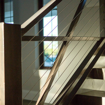
This beautiful showcase home offers a blend of crisp, uncomplicated modern lines and a touch of farmhouse architectural details. The 5,100 square feet single level home with 5 bedrooms, 3 ½ baths with a large vaulted bonus room over the garage is delightfully welcoming.
For more photos of this project visit our website: https://wendyobrienid.com.
 Stripe Design Services
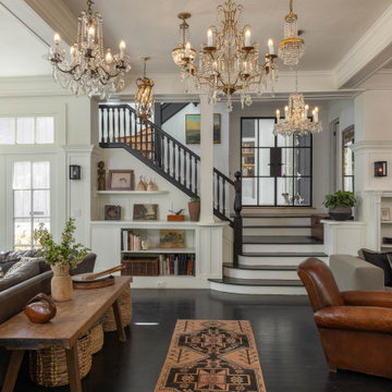
The front elevation of this house consists of the original 1910 farmhouse. The rest of the house had been augmented incrementally over time and the roofline beyond the original structure had become convoluted and the flanking elevations nonsensical. The current owners preserved the original 1910 farmhouse portion of the home and took the rest of the structure down to the foundation. A simple modern black barn was designed to run perpendicular with the old farmhouse structure and painted black in stark contrast to its old, white counterpart. Siding runs vertically on the new section as opposed to the horizontal shiplapped siding on the old. The new structure houses the kitchen with 12’ cathedral ceilings, a pantry / mudroom and a study.
The kitchen boasts a 1930’s island reclaimed from a commercial bakery and pendant lights from an old schoolhouse in Ohio as its nucleus, against a quiet backdrop of black stained oak cabinetry. Gently veined quartzite slabs serve as countertop, backsplash and wrap the stove hood to accentuate the ceiling height.
The interior design of this home is a carefully balanced alchemy of antiquity and modernity. It has an overriding monochromatic theme with layers of pattern and texture for depth. The color interest is derived from the lush outside landscape, with the exception of their daughter’s bedroom which is a tasteful symphony of pink, landed by a hand painted mural.
The theme of the home is framed around comfortable family living against curated backdrops of beloved collected items. The living room boasts no less than nineteen vintage crystal
 Gail Green
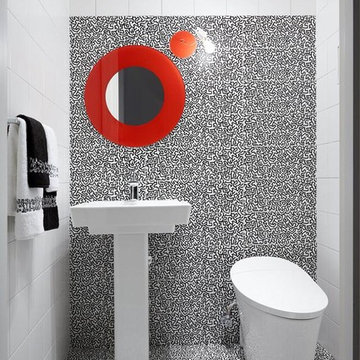
Direct inspiration for my Powder Room derives from Ascot’s Keith Haring ceramic tile collection, “Game of Fifteen.” Upon seeing the series, I knew that, in order to make a significant impact, the bathroom would have to be small in size, as the tile itself was high impact. Thus, we needed to keep the theme sharp and chic, graphic and poignant. The room had to maintain a proportional balance between the recessive background of the white tiles and the strength of the accent tile’s imagery. Thus equal elements of visual proportion and harmony was essential to a successfully designed room. In terms of color, the boldness of the tiles black and white pattern with its overall whimsical pattern made the selection a perfect fit for a playful and innovative room.
.
I liked the way the different shapes blend into each other, hardly indistinguishable from one another, yet decipherable. His shapes are visual mazes, archetypal ideograms of a sort. At a distance, they form a pattern; up close, they form a story. Many of the themes are about people and their connections to each other. Some are visually explicit; others are more reflective and discreet. Most are just fun and whimsical, appealing to children and to the uninhibited in us. They are also primitive in their bold lines and graphic imagery. Many shapes are of monsters and scary beings, relaying the innate fears of childhood and the exterior landscape of the reality of city life. In effect, they are graffiti like patterns, yet indelibly marked in our subconscious. In addition, the basic black, white, and red colors so essential to Haring’s work express the boldness and basic instincts of color and form.
In addition, my passion for both design and art found their aesthetic confluence in the expression of this whimsical statement of idea and function.
 Field Architecture
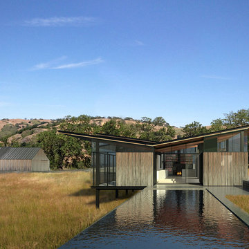
The Grasslands home was born out of and celebrates the beautiful but fragile grassland ecology of the Carmel Valley. Our client’s desire to actively simplify his lifestyle to the most essential elements inclusive of space clearly drove sensibilities in the design. In addition the home features a precision, derived from the client’s love of flight, a grounded-ness from his love of books and the love of his horse.
To meet the simplistic beauty of the scope, the home consists of three interconnected glass pavilions and a detached barn which wrap to the bowl shape of the land. The pavilions are comprised of a master suite, a library/living room, kitchen, and a meditation sanctuary; the barn, his horse and car.
The design focuses on preserving the delicate ecosystem of the surrounding grasslands, while concurrently incorporate views and maximize solar orientation. In support, the pavilions sit on the perimeter of an existing bowl shaped depression in the hillside. Three primary landscape walls run parallel to the topography, emphasizing the shape and spatial definition of the land as well as providing locations to anchor the structures. Pulled up and out of the landscape, the buildings jut over the anchor walls, hovering above the native grasses. In section, the land appears to flow through the pavilions, undisturbed and collaborative to the architecture.
 Vetter Architects
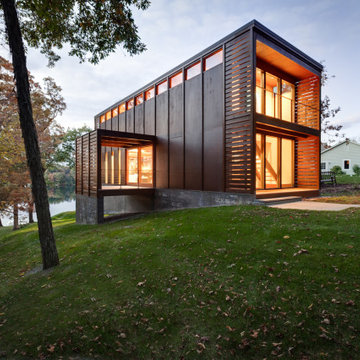
In early 2002 Vetter Denk Architects undertook the challenge to create a highly designed affordable home. Working within the constraints of a narrow lake site, the Aperture House utilizes a regimented four-foot grid and factory prefabricated panels. Construction was completed on the home in the Fall of 2002.
The Aperture House derives its name from the expansive walls of glass at each end framing specific outdoor views – much like the aperture of a camera. It was featured in the March 2003 issue of Milwaukee Magazine and received a 2003 Honor Award from the Wisconsin Chapter of the AIA. Vetter Denk Architects is pleased to present the Aperture House – an award-winning home of refined elegance at an affordable price.
Overview
Moose Lake
Size
2 bedrooms, 3 bathrooms, recreation room
Completion Date
2004
Services
Architecture, Interior Design, Landscape Architecture
27