
Search results for "Determine" in Home Design Ideas
 Housetrends Magazine
Since moving into her Dublin home two and a half years ago, Nancy Sanford has been peeling off the decades—quite literally. Built in the 1980s, the home was “very well-maintained, but very little had been done to it” in terms of updating the finishes or style, Sanford says. Plush white carpet ran from wall-to-wall-to-wall, almond-colored laminate coated the kitchen cabinets and wallpaper ran rampant—even covering some ceilings.
Despite her efforts, Sanford knew it was going to take more than cosmetic editing to shake the ‘80s and make the home her own. Although she lives in the traditional-leaning Muirfield community, Sanford adores a minimalist, contemporary style—and admits to devouring design magazines “ad nauseam.”
To implement her thoroughly modern vision, Sanford turned to Brigid Norton, an interior designer and family friend, and Kristi Youles, a kitchen designer with The JAE Company. Working together, the trio created a carefully considered contemporary design that’s easy on the eyes, and the body.
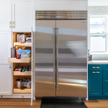
In addition to improving the flow of the kitchen—by removing a V-shaped peninsula that angled out into the room—and adding appliances like a stainless steel refrigerator, Sanford’s short list of must-haves included clean, uncluttered lines and no wall cabinets over the countertops. “I’ve found as I’ve aged, I’ve gotten shorter and just don’t use the upper cabinets,” Sanford explains.
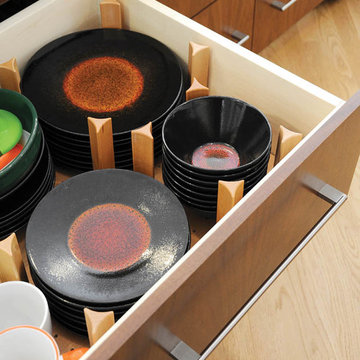
Easy-access, smooth-slide drawers with clean slab fronts were the answer—resulting in strong visual lines, an open, airy feel and enhanced ergonomics. Starting with a “needs assessment,” Youles and Norton designed the space quite literally around Nancy. By looking at factors such as her height and which items she uses most frequently, they were able to determine the optimum placement for everything from canned goods in the pantry to cutlery, pans and plates in the customized drawers, all of which helped to achieve the ultimate kitchen organization.
But there’s more to the kitchen cabinets smooth façade than clean-lined storage. Walnut drawer fronts—found on the oven and the base of the island—are book-matched, allowing the grain to continue from drawer to drawer. And even in spaces where drawers weren’t feasible, beneath the sink and in a desk area, the designers continued the look with cabinet doors crafted to resemble drawers.
The visual continuity of these lines might not be as impactful if it weren’t for the careful selection of contrasting finishes. The designers filled the space with pure, glossy white—using a specific type of quartz, White Cliff by Cambria, to accent the bold rectangular design of the island. Then, to break up the expanse of accompanying white painted drawers, walnut was selected to bring the contrasting warmth and grain of wood without red undertones. It is commonly found in modern furniture design, as well as current productions of mid-century designs like the iconic Eames Lounge Chair from Herman Miller, Youles says.
 Ernest M. Ferizi
German Embassy in Pristina - Kosovo, contracted the architecture office “Ferizi + Ferizi Architects” to plan and implement an Annex Office building for their purposes. As detached part of this building is designed the waiting area, as alone standing structure.
This Office Building is constructed by assembling of Eight used office containers that were delivered on trucks and set up after only a few hours on the basis of the LEGO principle, according to the planning on strip foundations.
By removing the flexible exterior wall panels, a large room of 115 m² was created, with the counter wall as a room partition between two office spaces, each with seven workstations as well as three counters for agents on one side and a room for visitors on the other side.
With this system, room solutions can be easily implemented in all dimensions.
The container, seen as a geometric shape, is a simple, octagonal, solid box.
The standardized perfection of its dimensions is striking: 2.44 meters wide, 2.59 meters high and 6.06 meters or 12.19 meters long.
Since its introduction in 1956 by the American transport entrepreneur Malcom McLean, the container has become a standardized transport module worldwide, whether on ships, trucks or construction sites.
The shipping containers have additionally revolutionized the transport industry, pushed the globalization noticeably, and thus directly or indirectly influenced all our lives.
But after only a few years, when the first overseas containers wore out, many engineers recognized the positive properties of used shipping containers for building houses, especially since they are robust, flexible, multifunctional and second-hand relatively inexpensive to purchase. The time has long passed by to treat containers exclusively as transport objects.
As a "measure of all things", containers can hardly be ignored in construction.
Their use is no longer limited to temporary use since school containers, information containers, office containers or entire residential buildings are now part of our everyday life in the construction industry.
However, current examples of the container architecture prove that even the most demanding solutions for container building are feasible. For their specific aesthetic and spatial qualities, containers also serve as design parameters for the development of new forms of architecture and urbanity.
The office building as an extension of the visa section, characterized by modern materials and contemporary aesthetics has been designed and built mainly as a low-energy building.
Extensive insulation to achieve a comfortable and sustainable constant temperature in the interior, high window quality and low energy consumption make the building energy-efficient.
The sophisticated lighting technology, networks, heating systems and air-conditioning systems are also components of this equipment.
It creates an overall harmonic picture and guarantees the highest standard in sustainable construction, taking into consideration the fact that environmentally friendly recycling and reutilization have become an increasingly important issue in our society.
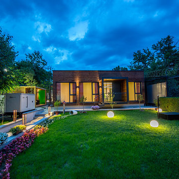
West and East side of the wooden facade is compact and has few openings, while the southern facade is completely open with lot of glass. Its spatial openness ensures a transparent, friendly work environment, which allows a lot of light into the space.
This openness allows an uninterrupted, pleasant and close-to-nature view from interior spaces into the beautiful garden. During the installation of sophisticated light sources in the garden, emphasis was not only put on functionality and security, but also on the beauty of the garden shown through the illumination in the evening.
Large, horizontal white “brisole” serve as external sun protection systems, mounted on the canopies of the entrance areas of the modular construction and the enclosure, adeptly cast shade on these areas and at the same time shape the entire architectural language.
While on one hand, the two quadratic ledges suspended in the air, are docked with steel stairs and match the wooden façade, lead the staff to their office space, the artful modern interior, on the other hand, perfectly unites the functionality, innovative technology, culture and positive effects on the employees' efficiency and wellbeing.
A lot of white, interjected by warm wooden and colored accents, determines the ambience.
In the case of the lighting solution, the mainly linear ceiling lighting is used as the overlapping design element both for the offices of the visa section as well as for the counters and the waiting area for the visitors.
They underline the puristic design in order to create a pleasant light for a desired general illumination and ensure optimal light conditions without causing disturbing reflections on the computer screens.
In addition, precisely positioned pendant luminaires are installed at the workstations, which ensure pleasant room brightness.
In the entrance area, the harmonic and uniform lighting effect from the ground highlights the integration of photography and architecture.
Photographs of landscapes, people, places, expressing unforgettable, impressive moments and memories have been lovingly engraved on 8 x 8cm square oak blocks.
The idea of an effective, impressive environment that stimulates and inspires the work was the premiss on which the whole design concept was based. Consequently, the modular construction was no longer viewed through its history of utilization and scars, but rather as a structure of work ambiance, art and elegance.
FERIZI + FERIZI Architects
Photo: Arben Llapashtica
 Factor Design Build
Many people can’t see beyond the current aesthetics when looking to buy a house, but this innovative couple recognized the good bones of their mid-century style home in Golden’s Applewood neighborhood and were determined to make the necessary updates to create the perfect space for their family.
In order to turn this older residence into a modern home that would meet the family’s current lifestyle, we replaced all the original windows with new, wood-clad black windows. The design of window is a nod to the home’s mid-century roots with modern efficiency and a polished appearance. We also wanted the interior of the home to feel connected to the awe-inspiring outside, so we opened up the main living area with a vaulted ceiling. To add a contemporary but sleek look to the fireplace, we crafted the mantle out of cold rolled steel. The texture of the cold rolled steel conveys a natural aesthetic and pairs nicely with the walnut mantle we built to cap the steel, uniting the design in the kitchen and the built-in entryway.
Everyone at Factor developed rich relationships with this beautiful family while collaborating through the design and build of their freshly renovated, contemporary home. We’re grateful to have the opportunity to work with such amazing people, creating inspired spaces that enhance the quality of their lives.
Find the right local pro for your project

 Flooret
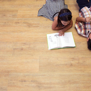
Classic color with refined texture. Picking up on the natural blonde tones of oak, but adding in a light wire brush. Santal can either dress up a space or just create a comfortable canvas. The range of color allows a lot of versatility with furniture and complimenting elements.
REDEFINING DURABILITY
The most important specification for determining the durability of vinyl flooring is the thickness of the wear-layer. The best wear-layers are made of thick, clear virgin PVC, which covers the paper print-film that gives the floor its unique appearance. Once the wear-layer wears through, the paper is damaged and the floor will need replacement.
Most vinyl floors come with a 8-12 mil wear-layer (0.2-3 mm). The top commercial specs in the industry are higher, at 20-22 mil (0.5 mm). A select few manufacturers offer a “super” commercial spec of 28 mil (0.7 mm).
For Modin, we decided to set a new standard: 40 mil (1.0 mm) of premium virgin PVC. This allows us to offer an industry-leading 20 year Commercial Warranty (Lifetime Residential), compared to nearly all other commercial vinyl floors’ 10 year Commercial Warranty.
Beyond our superior wear-layer, we also use a patented click mechanism for superior hold, and a ceramic-bead coating.
SIZE MATTERS
Wider and longer planks create a sense of space and luxury. Most vinyl floors come in 6” or 7” widths, and 36” or 48” lengths.
For Modin, we designed our planks to be 9” wide, and 60” long. This extra large size allows our gorgeous designs to be fully expressed.
DETAILS THAT COUNT
We made sure to get all the details right. Real texture, to create the feel of wire-brushed wood. Low sheen level, to ensure a natural look that wears well over time. 4-sided bevels, to more accurately emulate the look of real planks. When added together they help create the unique look that is Modin.
DESIGNS THAT INSPIRE
We spent nearly a year just focusing on our designs, to ensure they provide the right mix of color and depth. Focusing on timeless wire-brush and European Oak styles, as well as more contemporary modern washes, our collection offers truly beautiful design that is both functional and inspiring.
 a-designstudio
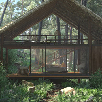
Hidden away amidst the wilderness in the outskirts of the central province of Sri Lanka, is a modern take of a lightweight timber Eco-Cottage consisting of 2 living levels. The cottage takes up a mere footprint of 500 square feet of land, and the structure is raised above ground level and held by stilts, reducing the disturbance to the fauna and flora. The entrance to the cottage is across a suspended timber bridge hanging over the ground cover. The timber planks are spaced apart to give a delicate view of the green living belt below.
Even though an H-iron framework is used for the formation of the shell, it is finished with earthy toned materials such as timber flooring, timber cladded ceiling and trellis, feature rock walls and a hay-thatched roof.
The bedroom and the open washroom is placed on the ground level closer to the natural ground cover filled with delicate living things to make the sleeper or the user of the space feel more in one with nature, and the use of sheer glass around the bedroom further enhances the experience of living outdoors with the luxuries of indoor living.
The living and dining spaces are on the upper deck level. The steep set roof hangs over the spaces giving ample shelter underneath. The living room and dining spaces are fully open to nature with a minimal handrail to determine the usable space from the outdoors. The cottage is lit up by the use of floor lanterns made up of pale cloth, again maintaining the minimal disturbance to the surroundings.
 Metropolis Drafting and Construction Inc
Master suite addition to an existing 20's Spanish home in the heart of Sherman Oaks, approx. 300+ sq. added to this 1300sq. home to provide the needed master bedroom suite. the large 14' by 14' bedroom has a 1 lite French door to the back yard and a large window allowing much needed natural light, the new hardwood floors were matched to the existing wood flooring of the house, a Spanish style arch was done at the entrance to the master bedroom to conform with the rest of the architectural style of the home.
The master bathroom on the other hand was designed with a Scandinavian style mixed with Modern wall mounted toilet to preserve space and to allow a clean look, an amazing gloss finish freestanding vanity unit boasting wall mounted faucets and a whole wall tiled with 2x10 subway tile in a herringbone pattern.
For the floor tile we used 8x8 hand painted cement tile laid in a pattern pre determined prior to installation.
The wall mounted toilet has a huge open niche above it with a marble shelf to be used for decoration.
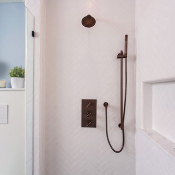
The huge shower boasts 2x10 herringbone pattern subway tile, a side to side niche with a marble shelf, the same marble material was also used for the shower step to give a clean look and act as a trim between the 8x8 cement tiles and the bark hex tile in the shower pan.
Notice the hidden drain in the center with tile inserts and the great modern plumbing fixtures in an old work antique bronze finish.
A walk-in closet was constructed as well to allow the much needed storage space.
 SV Design
When full-time Massachusetts residents contemplate building a second home in Telluride, Colorado the question immediately arises; does it make most sense to hire a regionally based Rocky Mountain architect or a sea level architect conveniently located for all of the rigorous collaboration required for successful bespoke home design. Determined to prove the latter true, Siemasko + Verbridge accompanied the potential client as they scoured the undulating Telluride landscape in search of the perfect house site.
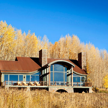
The selected site’s harmonious balance of untouched meadow rising up to meet the edge of an aspen grove and the opposing 180 degree view of Wilson’s Range spoke to everyone. A plateau just beyond a fork in the meadow provided a natural flatland, requiring little excavation and yet the right amount of upland slope to capture the views. The intrinsic character of the site was only enriched by an elk trail and snake-rail fence.
Establishing the expanse of Wilson’s range would be best served by rejecting the notion of selected views, the central sweeping curve of the roof inverts a small saddle in the range with which it is perfectly aligned. The soaring wave of custom windows and the open floor plan make the relatively modest house feel sizable despite its footprint of just under 2,000 square feet. Officially a two bedroom home, the bunk room and loft allow the home to comfortably sleep ten, encouraging large gatherings of family and friends. The home is completely off the grid in response to the unique and fragile qualities of the landscape. Great care was taken to respect the regions vernacular through the use of mostly native materials and a palette derived from the terrain found at 9,820 feet above sea level.
Photographer: Gibeon Photography
 Vintage Cellars & Saunas
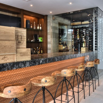
This gorgeous contemporary glass front custom wine cellar in Corona Del Mar, Newport Beach, California is an eye catcher. The sleek, glass ultra modern wine room was a unique and exciting project for our team here at Vintage Cellars. The stone bar extends into the wine cellar itself, but due to mechanical, cooling, and condensation concerns, our expert custom wine cellar team knew that extra measures needed to be taken to ensure the end quality remained top notch.
The bar itself was divided into two sections, one cut section outside to make up the main seating area and the other inside the glass wine room. The stone bar, which is porous, takes up a good portion of the front facing glass panel. Had the bar simply extended into the wine cellar and been sealed off at the joints, the stone would have eventually transferred in enough heat and moisture to cause condensation. Proper wine cellar design and planning enabled this wine cellar to not only look fantastic, but function perfectly as well.
One interesting unique feature in this Corona Del Mar, Newport Beach, Orange County, California glass and metal wine cellar is an extension of floor to ceiling frames mounted to the backside of the stone bar. This feature was made to seamlessly show consistency in floor to ceiling vintageview frames throughout.
Corona Del Mar, Newport Beach, Laguna Beach, Huntington Beach, Newport Coast, Ladera Ranch, Coto De Caza, Laguna Hills, San Clemente, Dana Point, Seal Beach, Laguna Niguel still remain the areas in Orange County that we build wine cellars most often.
Contemporary wine cellars such as this are becoming more and more popular in modern design trends. Interior Design, Architecture, and Construction all play a part in ensuring that the client’s vision comes to reality. This project was no different. Working closely with David Close Homes, Vintage Cellars was able to meet with the client and team involved, determine the ultimate wine cellar wine room wine closet goals, and see them to the finish.
Upon walking into this glass and metal modern contemporary wine cellar, you become quickly surrounded with triple deep bottles from many of the world’s best wineries. On the left below the countertop is a black stained poplar wine racking system for single 750ml bottles. Above lies room for display case storage, room for large format bottles, and label forward vintageview design racking to the ceiling. On the middle wall of this wine room is room for case storage below, similarly with triple deep vintageview floor to ceiling frames dying into more case storage above. On the right side of this wall lies a vertical space for single large format case storage.
Ultra Modern wine cellars such as this are all the rage in contemporary homes in San Diego, Orange County, and Los Angeles. This glass enclosed wine cellar with a sleek modern contemporary racking system is truly a showpiece in this home in Corona Del Mar, Newport Beach, California. Wine Racking, Wine Cellar Cooling, Wine Cellar design, Wine Cellar Build out and Wine Cellar Installation is what Vintage Cellars does best. Timeless Luxury.
 Period Architecture Ltd.
Angle Eye Photography
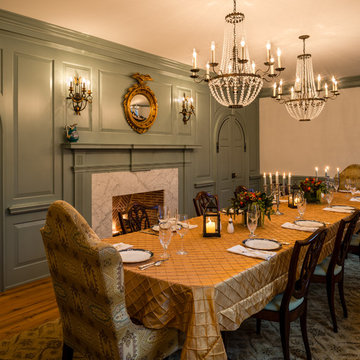
Example of a large classic medium tone wood floor great room design in Philadelphia with a standard fireplace, a stone fireplace and white walls
Example of a large classic medium tone wood floor great room design in Philadelphia with a standard fireplace, a stone fireplace and white walls

 Kerry Lewis Landscape Architecture
the rain gully, planted with native grasses and forbs; tupelo and oak lit up by the late day sun.
Inspiration for a large craftsman partial sun front yard concrete paver landscaping in Boston for fall.
Inspiration for a large craftsman partial sun front yard concrete paver landscaping in Boston for fall.
 Tish Landscape Design
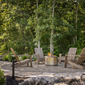
A rustic wellness retreat steps from downtown.
Inspiration for a patio remodel in Boston
Inspiration for a patio remodel in Boston
 Minosa | Design Life Better
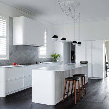
Bespoke and unique design inspired from a period gone by. The Devil is in the detail. The more you look the more you find.
Inspiration for a large contemporary l-shaped dark wood floor kitchen pantry remodel in Sydney with an undermount sink, shaker cabinets, white cabinets, marble countertops, white backsplash, stone slab backsplash, black appliances, an island and white countertops
Inspiration for a large contemporary l-shaped dark wood floor kitchen pantry remodel in Sydney with an undermount sink, shaker cabinets, white cabinets, marble countertops, white backsplash, stone slab backsplash, black appliances, an island and white countertops
 Black + Vernooy Architects
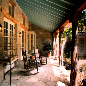
Inspired by the owners' travels in the Mediterranean region yet rooted firmly in Texas soil, this single family residence is designed to provide a secluded, comfortable environment for observing nature, relaxing, entertaining, living, and working. The oddly shaped site determined a house that is removed from the street, resulting in a long drive through a wooded area that leads to the gently sloping house site. The house is designed around a large, central public living area. The basic "H" shaped plan reaches out to define the entry court as well as the rear yard area. The building can only be seen in small vignettes as one moves around and through it, and is finally understood from inside the main room. The public space is central to the plan, where rooms overlay and flow through and into one another. Private rooms are tucked away in more remote parts of the site. The guest bedrooms are located at a slightly lower level, and a remote study, reached by a ship's ladder, overlooks the main living area and enjoys its own roof terrace. The central part of the house is designed as a solid, strong, "original" building to which other wings are added as if built over time. The client desired that the house appear to be of no discernible style or period, and seem older rather than newer.
Built By: Dalgleish Construction Co.
Photography By: Paul Bardagjy
 Betsy Bassett Interiors
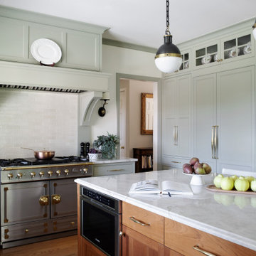
Mid-sized elegant u-shaped medium tone wood floor enclosed kitchen photo in Boston with ceramic backsplash, stainless steel appliances and an island
 Megan Dearie @ Closet Factory (Fort Lauderdale)
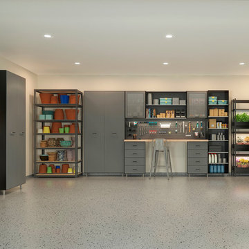
Who says a garage has to house only cars and tools? We specialize in transforming your garage into a craft room, home gym, playroom, or the ultimate man cave. Our designers will work with you to determine the best built-in shelves and cabinets for your gym equipment, pool cues and home bar for socializing. We also offer overhead storage, organizers for the walls and racks for sports equipment, not to mention a full line of flooring options that give your garage floor a sleek appearance while being slip resistant and easy to clean.
 Susi Builders Supply Inc.
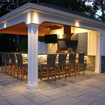
Patio kitchen - large transitional backyard stone patio kitchen idea in Other with a gazebo
 Advance Design Studio, Ltd.
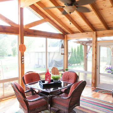
When Bill and Jackie Fox decided it was time for a 3 Season room, they worked with Todd Jurs at Advance Design Studio to make their back yard dream come true. Situated on an acre lot in Gilberts, the Fox’s wanted to enjoy their yard year round, get away from the mosquitoes, and enhance their home’s living space with an indoor/outdoor space the whole family could enjoy.
“Todd and his team at Advance Design Studio did an outstanding job meeting my needs. Todd did an excellent job helping us determine what we needed and how to design the space”, says Bill.
The 15’ x 18’ 3 Season’s Room was designed with an open end gable roof, exposing structural open beam cedar rafters and a beautiful tongue and groove Knotty Pine ceiling. The floor is a tongue and groove Douglas Fir, and amenities include a ceiling fan, a wall mounted TV and an outdoor pergola. Adjustable plexi-glass windows can be opened and closed for ease of keeping the space clean, and use in the cooler months. “With this year’s mild seasons, we have actually used our 3 season’s room year round and have really enjoyed it”, reports Bill.
“They built us a beautiful 3-season room. Everyone involved was great. Our main builder DJ, was quite a craftsman. Josh our Project Manager was excellent. The final look of the project was outstanding. We could not be happier with the overall look and finished result. I have already recommended Advance Design Studio to my friends”, says Bill Fox.
Photographer: Joe Nowak
 Advance Design Studio, Ltd.
Jennifer and Dan have lived in their Deer Park Illinois home for 15 years, slowly making minor fixes like painting and decorating; but they had a new plan for their kitchen the entire time. An awkwardly placed garage door, and an island cooktop with a terrible downdraft made a full-scale kitchen remodel an absolute must. Jennifer had many ideas in mind and wanted to work with a company that could provide high-end work, while partnering with a designer that would tailor the kitchen to her ideas.
She was intrigued by the phrase “Common Sense Remodeling” in Advance Design’s feature she discovered while perusing an issue of the community’s Quintessential Barrington Magazine. Doing further research on the company’s website, as she looked through project profiles and read about Advance Design’s “Common Sense Remodeling” philosophy, she promptly scheduled an appointment to see if the people and ideas she read about were truly who they said they were. The more she read, the more she knew that the “Common Sense” approach to remodeling they described was exactly the type of company she was looking for.
The partnership was sealed after an initial consultation with Owner Todd Jurs and Project Designer Michelle Lecinski. They displayed a combination of friendliness, professionalism and respect that was unmatched by any of the other companies Jennifer talked to. She knew that with Advance Design, she would be able to retain the vision that she had in mind with high-quality craftsmanship.
“I reached out to Advance Design because of the ‘Common Sense Remodeling’ tagline,” Jennifer said. “That’s what lingered for me”. “Advance Design was the most respectful- of the house and of my design ideas, and the most professional of the handful of companies that looked at my project”.
Soon after the meeting Jennifer began working with Michelle on the project design. They quickly developed chemistry. Jennifer loved how Michelle researched and located every detail that Jennifer wanted for the kitchen. Between the two of them, every concept and idea was worked through and perfected. “Jennifer had definite ideas about what she wanted the new kitchen to look like, she just didn’t know how to bring it all together. We worked together really well to make her ideas into the practical reality necessary for a well-functioning kitchen, with the look and feel that she had envisioned”, says Michelle.
“Michelle was wonderful in using the CAD system she would show me new drawings every time we changed the layout while working through the design,” Jennifer said. “She was a really wonderful partner in execution, she made sure everything happened quickly and easily.”
The finished design drew out elements of Jennifer’s style and personality. The pair call the look “sophisticated farmhouse” to describe the kitchen renovation to family and friends. The result was a beautifully crafted, authentic-feeling space that satisfied Jennifer’s dreams 15 years in the making. The whole project consisted of a kitchen remodel, mudroom upgrade with powder room, and garage entry relocation. “The projects I personally like the best, are the ones that put the client’s dreams on display,” Project Designer Michelle said. “And this is one of those projects.”
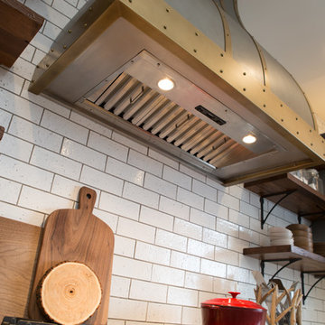
The main focal point of the kitchen is custom zinc and brass ventilation hood with a vintage sheen, which was hand made to order by a small company in Indiana named Vogler Metalworking. “It’s like sculpture, a true work of art”, says Jennifer. Your eye is immediately drawn towards this elegant yet practical hood that eliminated the home’s downdraft problem and added a striking conversation piece at the same time. The carpenters had to use special gloves when transporting and installing it, so they didn’t smudge it with fingerprints. The beautiful hood centers proudly over the stunning black enamel and brass LaCornue Range. “I had a friend who had a LaCornue range and after learning how easy it was to cook perfect meals, I was convinced I wanted to have one”, says Jennifer. This unique, breathtaking combination anchors the entire kitchen and is apparent immediately as you walk into the great room the surrounds the space.
DuraSupreme Crestwood cabinets with a Kendall Panel add function and sophistication. A custom gray paint color paired with a storm blue was developed so that the new kitchen looked like it belonged to the existing space. Unlacquered brass faucets and hardware were important to Jennifer because she wanted the living finishes to age over time. Remarkable brass diamond mesh cabinet door inserts imported from the UK continue to add this one-of-a-kind kitchen renovation; giving it a “you won’t see this everywhere” quality. The use of old railcar flooring for the coffee bar countertop and reclaimed oak for the open shelving gives an authenticity to the space uncommon in kitchens today.
Jennifer and Michelle fell in love with the Limestone Grey Stone while they were investigating unique island countertop ideas. They liked the fact that the limestone as a living finish will age and change over time. Calcutta Miel Quartz countertops made for an excellent pairing around the perimeter, as it’s durable and perfect for cooking preparations. A textured white subway tile backsplash that runs to the ceiling keeps your eye moving towards the open shelving, and to the main focal point of the stunning range hood combination.
“The kitchen functions beautifully, and it’s gorgeous,” beams Jennifer as she gestures with both hands while smiling ear to ear. “The most important thing was I wanted a kitchen that had a wonderful flow, cooked beautiful meals and was a great gathering place for family and friends, and this space does that perfectly! Beauty wise, it turned out exactly how I had envisioned. I felt the function part was the hardest part, and that was nailed”!
Relocating the garage entry to the new mudroom was a huge priority and has finally separated the family’s arriving home functions from their kitchen. Now coats and shoes and bags have their own area for dropping once members arrive home. Matching gray DuraSupreme cabinetry helped create gorgeous, purposeful lockers for the family. A reclaimed vintage sink and custom wall paper were added to the tiny powder room to beautify the once previously only functional space. Advance Design was even able to create a custom space for their dog to sleep while the family is away.
“It was unbelievable that a project of this size was completed in such a short time, and I think that’s because of the large amount of planning and preparation that went into it,” Jennifer marveled, “When we started, we were ready, and everything was prepared”.
When it came to execution, Project Manager Justin Davis and his crew were quick, accessible, and organized. Projects like this kitchen are typically completed in as little as 8-10 weeks. Jennifer’s kitchen however despite the relocation of some challenging HVAC in a soffit and moving of an exterior door was completed remarkably fast in part because the team was working with an existing tile floor that ran throughout the first floor that the client really loved.
“You get to know these people really well because they’re living in your house while you’re living in your house. They were so fast and really good, it didn’t take as long as even planned” reported Jennifer. “I would text Justin and he always responded almost immediately. I got to know all the guys who were working in our house and they were all wonderful people”.
Details in a customized kitchen like this one require skill and care from the people who install it. “All the guys on the job were skilled at what the did. I wanted small details like little feet to look like furniture, that is where their carpentry skill came in to make these all perfect”, said Jennifer. “The tile guys were wonderful. They even let me determine how I wanted the texture with the grout to appear for a salt and pepper look; now that is a very skilled trade person making it custom”.
In Jennifer’s interview, she continued to reference Advance Design’s “Common Sense Remodeling”, so I took a minute to ask her exactly what that phrase meant to her and how it played out in her experience with her project and the Advance Design team. Here is what she said: “I was intrigued about Common Sense Remodeling and in my head that there would be clear costs and prices, great communication between the design team, the execution team and me”, said Jennifer. They did deliver on that, it was so clear about the cost breakdown, what I could expect from everyone who came to my house, and everything that we had ordered. That to me is the Common Sense”!
It’s great to see a client take literally our assertion that a well-planned remodeling project is simply “Common Sense”! She anticipated each step of the way would be clear, concise, and predictable, all the while protecting the outcome due to the careful upfront planning. “Advance Design delivered on their ‘Common Sense Remodeling’ promise,” Jennifer said. “From the design team, to the execution team - everything was straight forward like I imagined. The project turned out exactly how I envisioned, I enjoyed this process and absolutely would recommend Advance Design Studio to anyone.”
 Amy Martin Landscape Design
Location: Cohasset, MA, USA
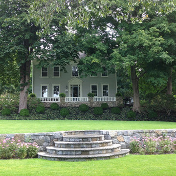
When my clients purchased this historic house, they saw that this garden held great potential, even though the property had been somewhat neglected. They wanted the new landscape to evoke the feeling of an Olde Maine house that time had forgotten. Sitting on the front veranda in the shade of the treasured Horse Chestnut and Maple trees that flank each side of the house, we explored the possibilities together.
The front yard sloped a bit too much for comfort, so we determined that building a stone wall in the middle would create a terrace, making both parts of the lawn more usable. Visions of parties and children's weddings came to mind. We put a set of elegant arching steps in the middle, leading down to the sunken garden.
Large, mature Rhododendrons were planted at the base of the Horse Chestnut and Maple trees just off the front veranda. Boxwoods undulate beneath the trees with Vinca as a ground cover.
Ticonderoga stone was used for the walls and steps, which was the closest match to the existing stone foundation. The exquisite masonry by Doug Brooks Masonry makes this staircase as elegant as a tiered wedding cake.
78