
Search results for "Element refers" in Home Design Ideas
 Fiorito Interior Design
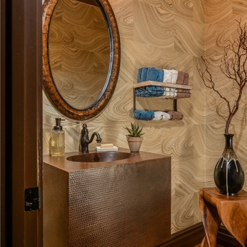
This formerly dull powder room was part of a whole house remodel. The overall concept for the home was to bring in natural, organic colors and elements and to reference stone, metals, wood, trees, and leaves. A powder room is always a great canvas on which to build a dramatic scene and the amazing sliced agate wallpaper for this powder room fits that bill perfectly. A hammered copper vanity and sink, a copper-colored pendant light, and a new ceramic wood floor give the space a clean but hearty outdoor feeling.
Photo by Bernardo Grijalva
 Forward Design Build Remodel
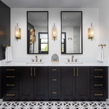
Our design vision was to create a home that was one of a kind, and fit each and every need of the client. We created an open floor plan on the first floor with 10 ft ceilings and expansive views out to the main floor balcony.
The first floor also features a primary suite, also referred to as “the apartment” where our homeowners have a primary bath, walk-in closet, coffee bar and laundry room.
The primary bedroom includes a vaulted ceiling with direct access to the outside deck and an accent trim wall. The primary bath features a large open shower with multiple showering options and separate water closet.
The second floor has unique elements for each of their children. As you walk up the stairs, there is a bonus room and study area for them. The second floor features a unique split level design, giving the bonus room a 10 ft ceiling.
As you continue down the hallway there are individual bedrooms, second floor laundry, and a bathroom that won’t slow anyone down while getting ready in the morning.
 Fox Interiors
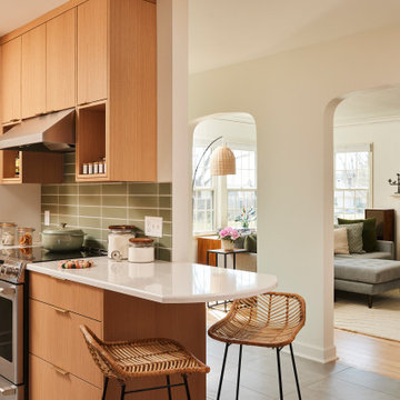
Inspired by their years in Japan and California and their Scandinavian heritage, we updated this 1938 home with a earthy palette and clean lines.
Rift-cut white oak cabinetry, white quartz counters and a soft green tile backsplash are balanced with details that reference the home's history.
Classic light fixtures soften the modern elements.
We created a new arched opening to the living room and removed the trim around other doorways to enlarge them and mimic original arched openings.
Removing an entry closet and breakfast nook opened up the overall footprint and allowed for a functional work zone that includes great counter space on either side of the range, when they had none before.
Find the right local pro for your project
 Studio41 Home Design Showroom
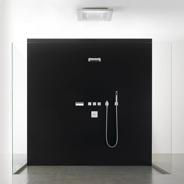
THE PLANNED BATHROOM. | The modular Symetrics system opens up new perspectives in interior design for architects and planners. Symetrics comprises numerous individual modules for the entire bathroom area, which are tailored to a defined grid size. The modules can be arranged and combined freely within this grid. Because the spouts and controls are clearly separate, the overall appearance of the bathroom is redefined by the arrangement of the modules. Planning is based on a grid of vertical and horizontal reference lines. This grid also specifies the dimensions for the individual Symetrics modules, on the basis of a 60 x 60 mm base unit. | Available at www.shopstudio41.com
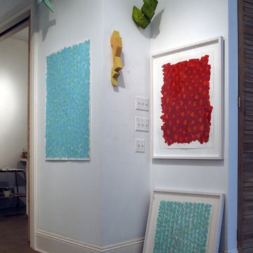
 Kayla Stark
Photo: Kayla Stark © 2015 Houzz
Inspiration for a transitional home design remodel in New Orleans
Inspiration for a transitional home design remodel in New Orleans
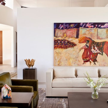
 Drewett Works
Designed to embrace an extensive and unique art collection including sculpture, paintings, tapestry, and cultural antiquities, this modernist home located in north Scottsdale’s Estancia is the quintessential gallery home for the spectacular collection within. The primary roof form, “the wing” as the owner enjoys referring to it, opens the home vertically to a view of adjacent Pinnacle peak and changes the aperture to horizontal for the opposing view to the golf course. Deep overhangs and fenestration recesses give the home protection from the elements and provide supporting shade and shadow for what proves to be a desert sculpture. The restrained palette allows the architecture to express itself while permitting each object in the home to make its own place. The home, while certainly modern, expresses both elegance and warmth in its material selections including canterra stone, chopped sandstone, copper, and stucco.
Project Details | Lot 245 Estancia, Scottsdale AZ
Architect: C.P. Drewett, Drewett Works, Scottsdale, AZ
Interiors: Luis Ortega, Luis Ortega Interiors, Hollywood, CA
Publications: luxe. interiors + design. November 2011.
Featured on the world wide web: luxe.daily
Photos by Grey Crawford
 Haus Interior Design
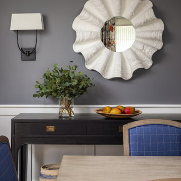
The new-construction house in Bethesda, Maryland, had lovely millwork, including coffered ceilings, wainscoting, crown moldings and tall baseboards. But it lacked our clients' personality and style that reflected their Southern roots and love of coastal settings. We incorporated elements like wallpaper, paint and furnishings and without having to remodel, which made a huge transformation for this home and family of six. There is a varying but also consistent blue and white theme throughout the home from navy to slate, interspersed with cheerful patterns through the throw pillows and accent fabrics, as well as bold colors in the drapery and custom sitting room built-ins. There are also coastal vibes make an appearance through several paintings, woven grass shade, jute area rugs, and driftwood finishes, to create a light and breezy organic feel.

Sponsored
Columbus, OH

Hope Restoration & General Contracting
Columbus Design-Build, Kitchen & Bath Remodeling, Historic Renovations
 TKS Design Group
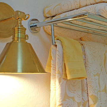
Free ebook, Creating the Ideal Kitchen. DOWNLOAD NOW
The Klimala’s and their three kids are no strangers to moving, this being their fifth house in the same town over the 20-year period they have lived there. “It must be the 7-year itch, because every seven years, we seem to find ourselves antsy for a new project or a new environment. I think part of it is being a designer, I see my own taste evolve and I want my environment to reflect that. Having easy access to wonderful tradesmen and a knowledge of the process makes it that much easier”.
This time, Klimala’s fell in love with a somewhat unlikely candidate. The 1950’s ranch turned cape cod was a bit of a mutt, but it’s location 5 minutes from their design studio and backing up to the high school where their kids can roll out of bed and walk to school, coupled with the charm of its location on a private road and lush landscaping made it an appealing choice for them.
“The bones of the house were really charming. It was typical 1,500 square foot ranch that at some point someone added a second floor to. Its sloped roofline and dormered bedrooms gave it some charm.” With the help of architect Maureen McHugh, Klimala’s gutted and reworked the layout to make the house work for them. An open concept kitchen and dining room allows for more frequent casual family dinners and dinner parties that linger. A dingy 3-season room off the back of the original house was insulated, given a vaulted ceiling with skylights and now opens up to the kitchen. This room now houses an 8’ raw edge white oak dining table and functions as an informal dining room. “One of the challenges with these mid-century homes is the 8’ ceilings. I had to have at least one room that had a higher ceiling so that’s how we did it” states Klimala.
The kitchen features a 10’ island which houses a 5’0” Galley Sink. The Galley features two faucets, and double tiered rail system to which accessories such as cutting boards and stainless steel bowls can be added for ease of cooking. Across from the large sink is an induction cooktop. “My two teen daughters and I enjoy cooking, and the Galley and induction cooktop make it so easy.” A wall of tall cabinets features a full size refrigerator, freezer, double oven and built in coffeemaker. The area on the opposite end of the kitchen features a pantry with mirrored glass doors and a beverage center below.
The rest of the first floor features an entry way, a living room with views to the front yard’s lush landscaping, a family room where the family hangs out to watch TV, a back entry from the garage with a laundry room and mudroom area, one of the home’s four bedrooms and a full bath. There is a double sided fireplace between the family room and living room. The home features pops of color from the living room’s peach grass cloth to purple painted wall in the family room. “I’m definitely a traditionalist at heart but because of the home’s Midcentury roots, I wanted to incorporate some of those elements into the furniture, lighting and accessories which also ended up being really fun. We are not formal people so I wanted a house that my kids would enjoy, have their friends over and feel comfortable.”
The second floor houses the master bedroom suite, two of the kids’ bedrooms and a back room nicknamed “the library” because it has turned into a quiet get away area where the girls can study or take a break from the rest of the family. The area was originally unfinished attic, and because the home was short on closet space, this Jack and Jill area off the girls’ bedrooms houses two large walk-in closets and a small sitting area with a makeup vanity. “The girls really wanted to keep the exposed brick of the fireplace that runs up the through the space, so that’s what we did, and I think they feel like they are in their own little loft space in the city when they are up there” says Klimala.
Designed by: Susan Klimala, CKD, CBD
Photography by: Carlos Vergara
For more information on kitchen and bath design ideas go to: www.kitchenstudio-ge.com
 Donald Lococo Architects
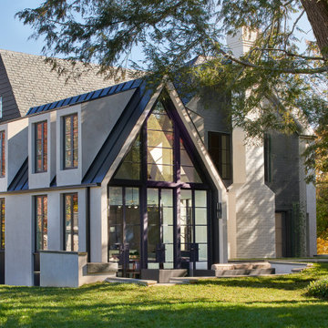
Subsequent additions are covered with living green walls to deemphasize stylistic conflicts imposed on a 1940’s Tudor and become backdrop surrounding a kitchen addition. On the interior, further added architectural inconsistencies are edited away, and the language of the Tudor’s original reclaimed integrity is referenced for the addition. Sympathetic to the home, windows and doors remain untrimmed and stark plaster walls contrast the original black metal windows. Sharp black elements contrast fields of white. With a ceiling pitch matching the existing and chiseled dormers, a stark ceiling hovers over the kitchen space referencing the existing homes plaster walls. Grid members in windows and on saw scored paneled walls and cabinetry mirror the machine age windows as do exposed steel beams. The exaggerated white field is pierced by an equally exaggerated 13 foot black steel tower that references the existing homes steel door and window members. Glass shelves in the tower further the window parallel. Even though it held enough dinner and glassware for eight, its thin members and transparent shelves defy its massive nature, allow light to flow through it and afford the kitchen open views and the feeling of continuous space. The full glass at the end of the kitchen reveres a grouping of 50 year old Hemlocks. At the opposite end, a window close to the peak looks up to a green roof.
 Hearthstone Inc
Richard Herman is in the hospitality business and owns several upscale hotels in Florida and in other states as well as cattle ranches in both Florida and Missouri. Their farm in Ocala is by farm their most unique. The property serves as a 4-H demonstration project for the purpose of children’s education. They have been working with the Academy Prep of St. Pete which is dedicated to inner-city youths that are selected on the basis of need and achievement. Wife Diane spends her time on the farm raising Gypsy Vanners, a diminutive draft horse named after the job they did in Eastern Europe, pulling the wagons (vans) for gypsies that wandered across the continent. On the Ocala farm, there are several mules with a unique profession.
Richard had visited the Hearthstone display at a Log & Timber Home Shows at the Orlando Convention Center many years ago. He was impressed that Hearthstone had stayed in touch with him over the years by mailings, invitations to shows, and periodic phone calls. When the time came to start serious consideration of the design of barn, Hearthstone responded promptly and professionally to Richard and Diane’s requests for information and a review of their ideas for their barn, which would serve as the centerpiece for their new farm.
They wanted a multipurpose facility that could accommodate an educational environment and a large hall suitable for the fundraising events for his charities. Richard wanted a barn that reflected the look and feel of barns built at the dawn of the 20th century. Besides the rustic chicken houses and vegetable gardens, they have completely renovated a 1020’s era farmhouse to be as historically correct as possible and serves as the entry to the farm.
“They very careful to feel us out, get comfortable with our capabilities, and be convinced that we could perform as promised,” said Project Manager John Ricketson of Hearthstone.
Design Process
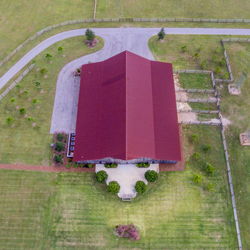
There were some initial drawings that gave us a start on the basic shape and size of the barn. From there, it was a process of narrowing down the uses of each area and the spans that could be achieved. The barn was going to have the traditional “board & batten” exterior siding and a metal roof. There is a cantilevered ‘hay hood” on the north gable end above the large sliding barn doors that open into the foyer and horse stalls. The wings house a combination of areas, beginning with the large restrooms to accommodate crowds for events. Other parts of the wings have garage areas for the farm vehicles, feed room, tack room, wash rack, storage, offices, and smaller restrooms.
Keeping with the look and feel of the turn of the century, Hearthstone developed a process for giving the timbers a surface texture that mimicked the circular cuts of timbers that had just come out of an old sawmill. This was easier said than done. Randy Giles guided his millwright (Wolfgang) in designing a machine that would do this effectively.
The barn was delivered in October of 2014 and was erected over the course of two weeks, thanks to a hardworking crew (Eric Foster) and near-perfect weather. After the Hearthstone crew completed the erection and roof dry-in, it was time for the local carpenters to step up and install some light conventional framing on the gable ends before applying the roof fascia and exterior board & batten siding. Next came the big sliding barn doors, plumbing, electrical, heating, and cooling. Large rustic fixtures were hung from the great hall roof timbers.
Exterior
The board & batten siding was cypress and allowed to turn color naturally as rain hit it and the sun started working on it with UV rays. This method causes a much grayer look closer to the ground and less so where the roof overhang provides protection. The North end has some large limestone boulders and planters arranged around the pad with tall pampas grass. The planters provide casual seating before events and during outside receptions. The entire area was sodded with lush St. Augustine grass and split rail fences were added to enclose the barn area. The corrugated metal roof was a special order material that immediately rusted after being exposed to moisture. The layer of rust protects the metal from the elements.
Interior
The board & batten theme was carried throughout most of the interior with the timbers left natural to show off the circular saw texture. All of the tongue & groove decking was shipped in advance to allow the local painter to pre-stain it with a dark brown transparent stain that is a beautiful background to the light color Eastern White Pine timbers.
“Everything was unique in this project” said Project Manager John Ricketson. “The setting on a small demonstration farm close to Ocala, the multipurpose design, the circular saw texture on the timbers.”
The Hermans are very proud of their farm’s outcome. Richard sent a note to Randy Giles, owner of Hearthstone: “The Barn is fantastic, not a single problem, period. Next month, we have Jo Dee Messina coming in to help with a fundraiser for a local center for abused kids. Folks love the farm, ...... but that barn gets all of the attention. I would encourage you to use me as a reference for your sales team, feel free to extend my cell phone to any prospective purchasers.”
 M. Designs Architects
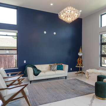
A mix of architecture and interior design expertise. The white elegant tiled floor with a matching bench. The contrast of royal blue on the North wall and emerald accents in the interior. High ceiling and off centered windows adding character to this formal lounge with the show stopper chandelier and the subtle white furniture.
 PPG Pittsburgh Paints
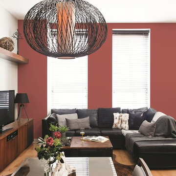
In this earthy & understate living room space a red painted accent wall is balanced by natural wood tones and other nature inspired elements. A natural color palette and natural design materials drive the overall aesthetic mixing industrial artistry with global references. The red paint color used here is Red Clay PPG16-32 by PPG Pittsburgh Paints paired with a creamy white paint color called Brandied Pears PPG1086-2
 Drewett Works
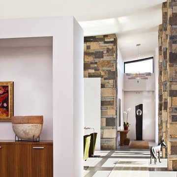
Designed to embrace an extensive and unique art collection including sculpture, paintings, tapestry, and cultural antiquities, this modernist home located in north Scottsdale’s Estancia is the quintessential gallery home for the spectacular collection within. The primary roof form, “the wing” as the owner enjoys referring to it, opens the home vertically to a view of adjacent Pinnacle peak and changes the aperture to horizontal for the opposing view to the golf course. Deep overhangs and fenestration recesses give the home protection from the elements and provide supporting shade and shadow for what proves to be a desert sculpture. The restrained palette allows the architecture to express itself while permitting each object in the home to make its own place. The home, while certainly modern, expresses both elegance and warmth in its material selections including canterra stone, chopped sandstone, copper, and stucco.
Project Details | Lot 245 Estancia, Scottsdale AZ
Architect: C.P. Drewett, Drewett Works, Scottsdale, AZ
Interiors: Luis Ortega, Luis Ortega Interiors, Hollywood, CA
Publications: luxe. interiors + design. November 2011.
Featured on the world wide web: luxe.daily
Photos by Grey Crawford
Sponsored
Columbus, OH
Hope Restoration & General Contracting
Columbus Design-Build, Kitchen & Bath Remodeling, Historic Renovations
 Sato Architects, Inc.
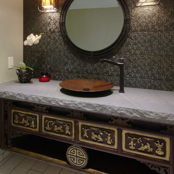
Earthy and zen, this powder room utilizes texture and detail to create a moody escape. The initial inspiration for this space came from an old wood carving that Audrey Sato Design Studio sourced for the custom vanity. The textural tile, lava stone countertop, and copper vessel sink were then selected to complement the carving.
 Domus Constructors, LLC.
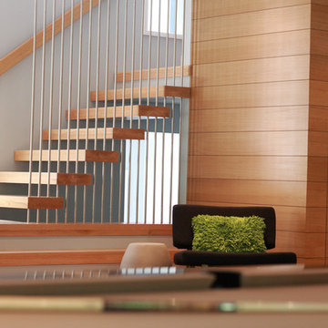
“Compelling.” That’s how one of our judges characterized this stair, which manages to embody both reassuring solidity and airy weightlessness. Architect Mahdad Saniee specified beefy maple treads—each laminated from two boards, to resist twisting and cupping—and supported them at the wall with hidden steel hangers. “We wanted to make them look like they are floating,” he says, “so they sit away from the wall by about half an inch.” The stainless steel rods that seem to pierce the treads’ opposite ends are, in fact, joined by threaded couplings hidden within the thickness of the wood. The result is an assembly whose stiffness underfoot defies expectation, Saniee says. “It feels very solid, much more solid than average stairs.” With the rods working in tension from above and compression below, “it’s very hard for those pieces of wood to move.”
The interplay of wood and steel makes abstract reference to a Steinway concert grand, Saniee notes. “It’s taking elements of a piano and playing with them.” A gently curved soffit in the ceiling reinforces the visual rhyme. The jury admired the effect but was equally impressed with the technical acumen required to achieve it. “The rhythm established by the vertical rods sets up a rigorous discipline that works with the intricacies of stair dimensions,” observed one judge. “That’s really hard to do.”
 Fox Interiors
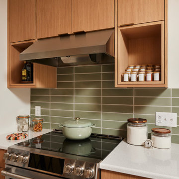
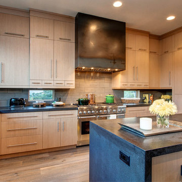
Inspired by their years in Japan and California and their Scandinavian heritage, we updated this 1938 home with a earthy palette and clean lines.
Rift-cut white oak cabinetry, white quartz counters and a soft green tile backsplash are balanced with details that reference the home's history.
Classic light fixtures soften the modern elements.
We created a new arched opening to the living room and removed the trim around other doorways to enlarge them and mimic original arched openings.
Removing an entry closet and breakfast nook opened up the overall footprint and allowed for a functional work zone that includes great counter space on either side of the range, when they had none before.

Sponsored
Columbus, OH

Trish Takacs Design
Award Winning & Highly Skilled Kitchen & Bath Designer in Columbus
 Margot Designs
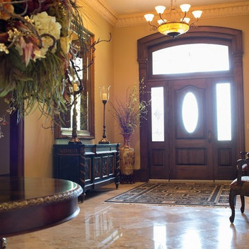
This Grand Entrance Hall features a solid walnut door, protected from the elements by the exterior front porch. Marble 18"square tiles set diagonally grace the floors, sealed and polished. A nod to the orient refers to memorable vacation. Alabaster glows in the reproduction Victorian chandelier. The mahogany hall table is from Century Furniture.
The crown holding is plaster, customized for the home.
 EAG Studio
On a quiet street just steps from San Francisco’s beloved Dolores Park, a formerly modest urban structure has been transformed into a luminous vertical residence that quietly redefines contemporary city living. Through a comprehensive remodel and both vertical and horizontal expansion, the project turns a constrained urban footprint into a sequence of serene, art-forward living spaces that unfold upward toward expansive city views.
The architecture balances restraint and warmth: crisp contemporary geometry softened by natural materials, artful lighting, and carefully curated interiors. The result is a home that feels simultaneously grounded and elevated—deeply connected to its neighborhood yet remarkably private.
Reimagining the Urban Envelope
The original building has been almost entirely reconceived. The facade now reads as a disciplined composition of plaster volumes and precisely detailed window openings framed by subtle projecting bands. The geometry references San Francisco’s classic rhythm of bayed facades while stripping the language down to a refined modern expression.
Behind this quiet exterior lies a dramatically expanded interior volume. The redesign adds both additional floor area and new vertical circulation, transforming what was once a conventional city house into a multi-level architectural sequence organized around light, art, and views.
At the roofline, planted terraces soften the building’s silhouette and create a green crown visible from surrounding hillsides.
Interiors as a Sequence of Galleries
Inside, the home unfolds as a series of spatial moments connected by a sculptural stair and gallery-like corridors.
Wide plank oak floors run throughout, providing continuity and warmth against a palette of plaster walls, dark steel detailing, and natural stone. The hallways function almost as curated galleries, with layered artworks suspended in front of mesh panels that create depth and subtle shadow.
Light filters through carefully placed windows and stair openings, transforming circulation spaces into contemplative transitions rather than mere passageways.
A Living Room Anchored by Stone and Light
The primary living room occupies one of the home’s central floors, where a quiet interplay of texture and geometry defines the space.
A monumental fireplace wrapped in dark stone forms the room’s anchor, its mass contrasting with a recessed ceiling plane that seems to float above the seating area. Integrated perimeter lighting creates a soft architectural glow that washes the ceiling and walls.
Furniture is sculptural yet understated—rounded lounge chairs in warm ochre velvet, tailored sofas, and a striking marble cocktail table whose expressive veining becomes a focal artwork in itself. Deep blue carpeting grounds the seating arrangement and subtly absorbs light, enhancing the calm atmosphere.
Above the fireplace, a delicate projection artwork introduces a moment of visual poetry—an unexpected cinematic gesture that transforms the wall into a quietly animated canvas.
Kitchen as Architectural Furniture
The kitchen expresses a different register: crisp, tactile, and materially rich.
Custom walnut cabinetry spans the wall in a continuous plane, punctuated only by the sculpted hood and integrated appliances. The wood’s depth and warmth are balanced by expanses of pale marble that flow seamlessly from countertop to backsplash.
Three dome pendants hover above the island like industrial sculptures, casting pools of warm light onto the stone surface.
A row of vivid red stools introduces a controlled burst of color, a small but confident departure from the otherwise restrained palette.
Dining With a Living Backdrop
Adjacent to the kitchen, the dining room opens toward a glass wall overlooking a vertical garden of climbing ivy. The greenery becomes a constantly changing backdrop—lush and shadowy during the day, atmospheric and cinematic after sunset.
A dark wood table anchors the room, surrounded by pale oak chairs whose understated forms echo Scandinavian design traditions. The simplicity of the furniture allows the view and natural light to become the dominant experience.
Intimate Spaces and Material Contrast
Throughout the home, smaller rooms offer moments of intimacy and material experimentation.
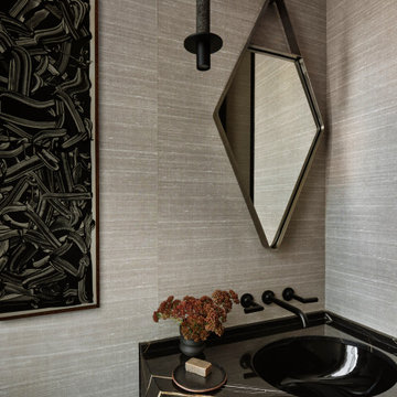
The powder room pairs textured wall coverings with a dramatic black marble vanity whose bold veining feels almost geological. A suspended mirror and slender pendant create a sculptural composition against the tactile backdrop.
The primary bedroom, by contrast, feels serene and expansive. Floor-to-ceiling glazing frames sweeping views of the city, while soft textiles and warm wood paneling create a cocooning effect. Slender black columns subtly define a sitting area without interrupting the openness of the space.
Bathing Above the City
In the primary bathroom, a sculptural freestanding tub sits beside a panoramic window overlooking San Francisco’s hills and rooftops.
The room’s palette—light oak, grey stone, and matte metals—reinforces the spa-like atmosphere. Floating cabinetry and integrated lighting maintain a sense of visual lightness despite the richness of the materials.
Entertaining Above the Park
Higher in the house, a lounge and bar area becomes the social heart of the home. Here, dark stone slabs with dramatic veining wrap the bar wall like a piece of monumental art.
Open shelving displays glassware and spirits, while integrated wine storage hints at the home’s entertaining ambitions. A soft leather sectional and low glass table create a relaxed setting for conversation, framed by expansive views of the city skyline.
Cinema and Retreat
The lower level introduces yet another atmosphere: a dedicated media room designed for immersive viewing.
Dark walls, plush seating, and soft lighting create a cinematic environment that contrasts intentionally with the airy upper floors. It’s a retreat within the home—intimate, quiet, and removed from the brightness above.
Architecture That Balances Discipline and Warmth
What makes the project particularly compelling is its balance between architectural discipline and lived warmth.
Every element—from the carefully framed views to the restrained material palette—contributes to a cohesive spatial narrative. Yet the home never feels austere. Natural materials, curated art, and layered lighting create a sense of comfort and depth.
The result is a house that feels both architecturally rigorous and deeply human.
A Contemporary Interpretation of San Francisco Living
In a neighborhood defined by historic homes and iconic park views, this transformation offers a contemporary interpretation of San Francisco living.
It respects the city’s urban density while embracing openness, light, and vertical living. The home rises quietly above its surroundings, culminating in panoramic vistas that stretch across rooftops, hills, and sky.
What began as a conventional structure has become something far more nuanced: a modern urban sanctuary—part gallery, part retreat, and wholly connected to the vibrant city just beyond its walls.
 KoDA
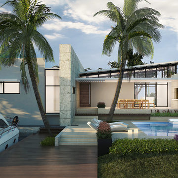
KoDAThe design concept revolved around this paradox. A large, 3-foot thick wall - used for built in storage, is clad in locally sourced Florida Keystone. The wall helps to serve as a sound buffer between the two primary functions public vs private/ entertainment vs sleep.
The “party pavilion” is set to the east of the stone-clad wall and is set between the BBQ and pool deck to the south and a formal garden to the north. The sloping roof constructed of steel sits atop clerestory windows and a simple concrete box below. The sloping gesture in the roof makes reference to the architectural context while remaining modern and of its age through the selection of materials. The quieter functions to the west of the stone-clad wall are housed within a simpler stucco box. Therefore, the articulation of the architecture speaks to the functions within. That is to say that the entertaining volume contains elements that suggest movement and activity while the volume containing the sleeping rooms remain architecturally quiet with less articulation.
29