
Search results for "Element refers" in Home Design Ideas
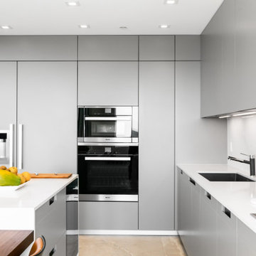
 Pedini by Daruso Miami Custom Cabinetry & Millwork
“Arts & Crafts” refers to the progression of vintage to innovation. This is intended as a vocation towards the past and sets new lifestyle and design for the future. The Arts & Crafts product selections allow for maximum customization to create a modern “kitchen studio” where the elements thought in the concept planning of the “broke up” kitchen can merge perfectly into a space dedicated to conviviality.
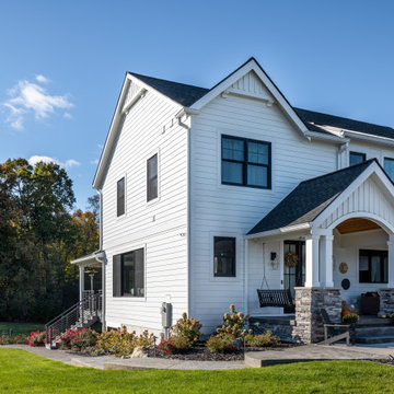
 Forward Design Build Remodel
Our design vision was to create a home that was one of a kind, and fit each and every need of the client. We created an open floor plan on the first floor with 10 ft ceilings and expansive views out to the main floor balcony.
The first floor also features a primary suite, also referred to as “the apartment” where our homeowners have a primary bath, walk-in closet, coffee bar and laundry room.
The primary bedroom includes a vaulted ceiling with direct access to the outside deck and an accent trim wall. The primary bath features a large open shower with multiple showering options and separate water closet.
The second floor has unique elements for each of their children. As you walk up the stairs, there is a bonus room and study area for them. The second floor features a unique split level design, giving the bonus room a 10 ft ceiling.
As you continue down the hallway there are individual bedrooms, second floor laundry, and a bathroom that won’t slow anyone down while getting ready in the morning.
 H2D Architecture + Design
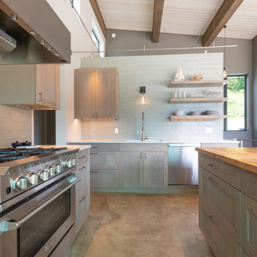
The kitchen was designed with the water views in mind. A dramatic 45-foot lift-and-slide door system that opens directly to the deck and expansive waterfront views. The seamless connection between the kitchen, dining, and living areas creates an open gathering space ideal for entertaining and everyday living, while strengthening the relationship between the interior and the surrounding landscape.
Vaulted ceilings with exposed beams and a high-performance SIP roof system bring warmth, structure, and volume to the space, emphasizing the home’s modern coastal character. Transom windows introduce additional natural light deep into the interior, enhancing the bright and airy atmosphere throughout the day. Custom nautical-inspired light fixtures reference the shoreline setting and add a subtle beach-inspired design element to the contemporary interior palette.
+ Architecture: H2D Architecture + Design
www.h2darchitects.com
+ Interior Design: Karlee Coble Interiors
+ Built by: Carlisle Classic Homes
+ Photography: Chad Coleman Photography
Find the right local pro for your project
 Pedini by Daruso Miami Custom Cabinetry & Millwork
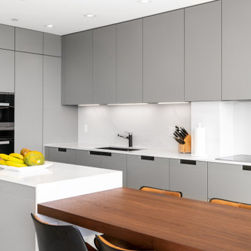
“Arts & Crafts” refers to the progression of vintage to innovation. This is intended as a vocation towards the past and sets new lifestyle and design for the future. The Arts & Crafts product selections allow for maximum customization to create a modern “kitchen studio” where the elements thought in the concept planning of the “broke up” kitchen can merge perfectly into a space dedicated to conviviality.
 Bureau Namas
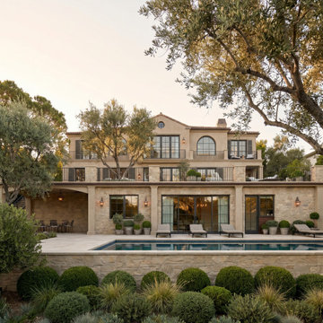
Perched along the hillside of Via De La Paz, this residence is defined by the way it negotiates elevation. At its core, the project is an exploration of proportion and hierarchy — a multi-level home shaped by the site’s natural topography and oriented to capture ocean views. The design works with the constraints of the hillside, using changes in elevation to create a layered sequence of indoor and outdoor spaces.
Traditional Spanish elements inform the overall character, while a more restrained approach keeps the home grounded and livable. Stone and stucco cladding, a tiled roof, and arched openings reference classic precedents, while steel doors and windows introduce a quieter transitional quality.
The layout was designed to support California’s indoor–outdoor lifestyle without sacrificing intimacy. Terraces, balconies, and connected living spaces create openness, while the scale and flow of each level remain thoughtful and contained.
 My Bali Living
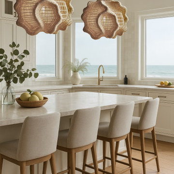
Incorporating organic-shaped lighting into monochrome interior design is a transformative strategy that adds depth, character, and warmth to spaces that might otherwise feel flat or overly structured.
Monochrome interiors, often defined by their clean lines and uniform tones, can sometimes feel too stark or clinical. Organic-shaped lighting, like the sculptural woven pendants in the coastal kitchen you provided, introduces visual softness and fluidity, gently breaking up the monotony without disrupting the minimalist color story.
Lighting with irregular, nature-inspired forms becomes an instant conversation piece. In a monochromatic setting, where variation is subtle, organic lighting stands out as a focal element, guiding the eye and adding architectural intrigue without the need for bold color contrasts.
Monochrome designs rely heavily on texture to evoke emotion and interest. Organic lighting—especially when crafted from natural materials like rattan, wicker, or woven fibers—adds a tactile dimension that contrasts beautifully with sleek countertops, smooth cabinetry, and polished finishes.
Designers aiming to create serene, grounding environments can use organic lighting to subtly reference the outdoors. The flowing, shell-like shapes in the image evoke the natural rhythm of the sea—perfectly complementing the ocean view. This connection to nature fosters a calming, biophilic effect within even the most curated, color-restricted spaces.
Beyond aesthetics, organic-shaped fixtures often diffuse light in a more gentle, ambient manner due to their irregular forms and natural materials. This soft lighting effect supports the calm, cohesive tone of a monochrome interior while making the space feel more inviting and livable.
For designers striving to balance form, function, and feeling within a limited color range, organic lighting is a powerful tool. It’s not just decorative—it’s atmospheric, sculptural, and emotionally resonant. In short, it’s the poetic contrast every monochrome room needs.
 Donald Lococo Architects
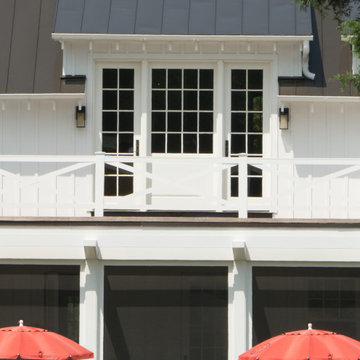
Located on farmland in McLean, Virginia, the American Farmhouse balances the expected comforts of a new home with the bucolic beauty of an old farmhouse. The final site plan still has evidence showing parallel courses of the barn’s destiny. The house mass is broken and lowered so that the home can remain secondary to the monolithic barn structure. Earthy and elemental materials are selected for the home that reference the barn without directly mimicking it. Wooden members found inside the barn and from other barns bridge ceilings and are used in floors along with rustic slate adding to a sense of simplicity to the farmhouse design.
The age and patina of the barn is reflected in the house’s textural use of board and batten and field stone layered similar to stone foundations. The original development plan was to demolish the existing barn and construct three suburban homes. Part of an endangered breed, as one of the few remaining barns in the area, it was originally viewed as a challenge in a luxury home construction with several difficulties posed to the impending project: it would be expensive to renovate, vulnerable to demolition, and threatened by urban sprawl. However, instead of trying to alter or destroy the barn, the structure was fully embraced into the traditional architecture project as a centerpiece and was used as the inspiration for the home. The new house was sited parallel to the barn so that views to the barn gable were accessible.

Sponsored
Columbus, OH

Hope Restoration & General Contracting
Columbus Design-Build, Kitchen & Bath Remodeling, Historic Renovations
 Forward Design Build Remodel
Our design vision was to create a home that was one of a kind, and fit each and every need of the client. We created an open floor plan on the first floor with 10 ft ceilings and expansive views out to the main floor balcony.
The first floor also features a primary suite, also referred to as “the apartment” where our homeowners have a primary bath, walk-in closet, coffee bar and laundry room.
The primary bedroom includes a vaulted ceiling with direct access to the outside deck and an accent trim wall. The primary bath features a large open shower with multiple showering options and separate water closet.
The second floor has unique elements for each of their children. As you walk up the stairs, there is a bonus room and study area for them. The second floor features a unique split level design, giving the bonus room a 10 ft ceiling.
As you continue down the hallway there are individual bedrooms, second floor laundry, and a bathroom that won’t slow anyone down while getting ready in the morning.
 Donald Lococo Architects
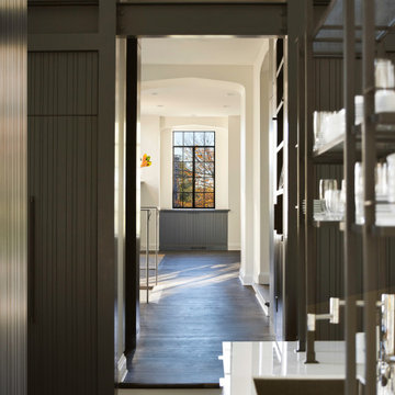
Subsequent additions are covered with living green walls to deemphasize stylistic conflicts imposed on a 1940’s Tudor and become backdrop surrounding a kitchen addition. On the interior, further added architectural inconsistencies are edited away, and the language of the Tudor’s original reclaimed integrity is referenced for the addition. Sympathetic to the home, windows and doors remain untrimmed and stark plaster walls contrast the original black metal windows. Sharp black elements contrast fields of white. With a ceiling pitch matching the existing and chiseled dormers, a stark ceiling hovers over the kitchen space referencing the existing homes plaster walls. Grid members in windows and on saw scored paneled walls and cabinetry mirror the machine age windows as do exposed steel beams. The exaggerated white field is pierced by an equally exaggerated 13 foot black steel tower that references the existing homes steel door and window members. Glass shelves in the tower further the window parallel. Even though it held enough dinner and glassware for eight, its thin members and transparent shelves defy its massive nature, allow light to flow through it and afford the kitchen open views and the feeling of continuous space. The full glass at the end of the kitchen reveres a grouping of 50 year old Hemlocks. At the opposite end, a window close to the peak looks up to a green roof.
 Kay Green Design
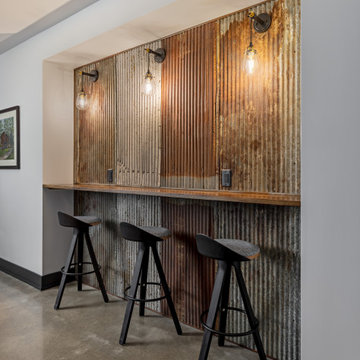
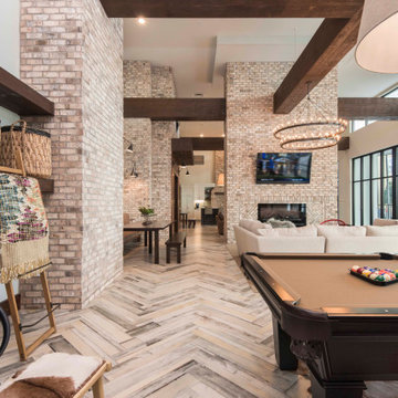
Chic is a French word associated with stylishness, while Rustic means related to, or suitable for the country.Together, Rustic Chic is an interior design alchemy, the chic suggesting culture, fashion and trendiness, while the Rustic element idealizes a natural pastoral charm.
This style tends to reclaim the old, and reinvent materials characterized by imperfect finishes. Rough-hewn finishes, marks, divots, scratches and imperfections are purposeful. The materials themselves often provide historical reference (either real or imagined) and are incorporated to balance hardness (think steel, iron and brick) with the softness of modern furniture and softgoods.
Exposed brick walls can be a key component of this look, but wallpapers can do the job if you aren’t fortunate enough to have the real thing.
Scaffold planks, exposed conduit, timber and fencing can be added to create a depth of character; and when paired with modern styled furnishings and accoutrements – this is a fresh, nostalgic minded trend that we’ll be seeing well through 2020.
 Create Construction
This custom new construction home is a full ground-up build, designed to merge modern architectural features with subtle mid-century references for a timeless yet family-friendly home. Built for a young family, the design achieves the perfect balance of style, comfort, and luxury detail.
Exterior & Architecture
The home features a clean modern profile with dove gray smooth stucco, black frame Milgard Tuscany windows, and a standing seam metal roof with multiple monopitched overhangs that create striking rooflines.
First Floor
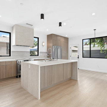
The interior layout flows with an open concept kitchen and living room, complemented by a home office/bedroom and guest spaces. The kitchen is the heart of the home, designed with custom oak Euro-style flat door cabinetry, Dekton Marmorio stone countertops and backsplash, and a waterfall island centerpiece. A custom limestone plaster hood cover provides a sculptural focal point. The space is elevated with Bosch appliances and statement lighting choices that bring warmth and character.
Second Floor
The upper level includes bedrooms for the children, each with private bathrooms styled with wallpaper and playful lighting. The laundry room was designed for functionality, featuring two-tone cabinetry, quartzite countertops, and rounded subway tile backsplash.
Primary Suite
The primary bedroom features a white oak paneling statement wall set on a dark backdrop with pendant lighting. The suite includes a spacious walk-in closet and a luxurious bathroom with a freestanding tub, curbless shower with custom quartzite shelving, a smart toilet nook, and a custom oak vanity with stone-fabricated sinks. 48x48 ceramic tiles with precise mitered edges complete the spa-like atmosphere.
General Highlights
Throughout the home, thoughtful modern elements tie everything together: SPC natural oak-look plank flooring, custom black iron railings, trimless kerfed doors, 9’ ceilings, recessed lighting, dual HVAC systems, and an interior fire sprinkler system.
This new construction showcases what’s possible when combining modern architecture, warm custom details, and functional family living into one cohesive home.
 Mez Works Furniture
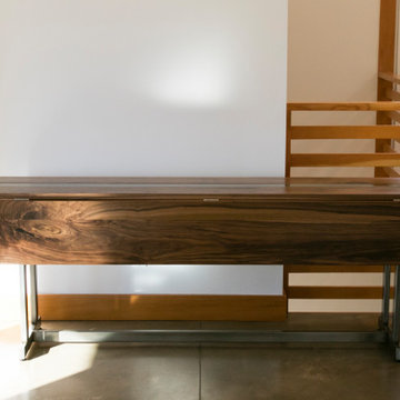
We named this design the 'Insignia' as to reference the building in Seattle where the original table (and bench set) now reside. The concept for the 'Insignia' table was motivated by minimalist-modern design and inspiration that arose from an admiration for Nakashima-style trestle bases. With our traditional 'Mez Works' style, we used dimensional walnut with a steel stretcher through the center of the tabletop to trace our 'Zeeva' and ‘Martis’ series tables, and the steel is treated with a ‘black-magic patina’ and clear powder-coat finish for an industrial element. The leaf mechanisms are drop leaf supports that are solidly built, structurally stable and sturdy to eliminate sagging. They lock in place automatically when raised, and are simple and quick to release.
This design is very versatile, and as shown in the photos the table can be purposed as use for a desk. While folded down, the drop leaf hides a charging outlet that is secured to the base directly under the tabletop, while power is integrated by feeding the cord through the base all the way out through the bottom to a fixed outlet in the floor.
WATCH ‘INSIGNIA’ VIDEO HERE: https://vimeo.com/188453410
 JMDG Architecture | Planning + Interiors
 Photos by Michael McVay Photography
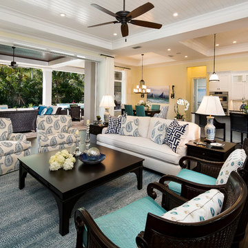
Large beach style open concept dark wood floor living room photo in Miami with yellow walls, no fireplace and a wall-mounted tv
Large beach style open concept dark wood floor living room photo in Miami with yellow walls, no fireplace and a wall-mounted tv
Sponsored
Columbus, OH
Hope Restoration & General Contracting
Columbus Design-Build, Kitchen & Bath Remodeling, Historic Renovations
 Tobin Dougherty Architects
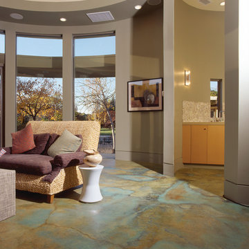
The Portola Valley Residence and Pavilion is a composition of staggered and interlocking rectangular spaces that cling to the slope as it gradually wraps around the hillside. As the interior floor level slowly steps down, echoing the natural grade, it increases the floor-to-ceiling height, flooding the space with expanded views and abundant natural light. Carefully defined interior spaces with plaster and stone veneer walls offer a fitting backdrop for the owner's dramatic art collection. The home’s terraced roof design and careful selection of natural materials equally complement its human and natural environments.
In a stylistic departure from the main house, the 750 sf guest pavilion combines three small geometric elements to form a pleasant guest, entertainment space . . . and yard sculpture.
 Kraft Custom Construction
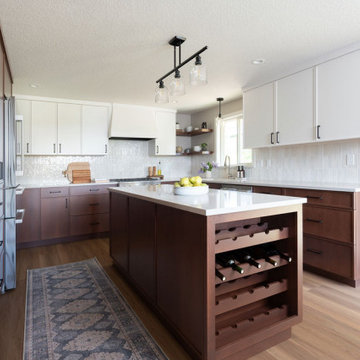
The refreshed aesthetic achieves a transitional design with a touch of rustic charm and hints of mid-century elements. Dual-finish custom cabinets provide a warm and refined backdrop, with a bourbon stain grounding the lower cabinets and an off-white painted finish on the uppers that adds contrast while brightening the space. A vertically stacked rustic Zellige tile backsplash complements the design and adds a subtle reference to the vineyard landscape.
 DANE AUSTIN INTERIOR DESIGN Boston & Cambridge
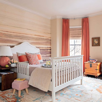
These fun-loving homeowners were referred by past clients during a mutual friend’s 40th Birthday party. Dane and his team were originally hired to shift a few rooms around when their son left for college. “Dane created well-functioning spaces for all, spreading color along the way. And he didn’t waste a thing. The homeowner, who has since tasked the designer with revamping the roof deck, characterizes the updates as “crisp” and “sharp.” Austin says, “I look at every element and ask, ‘Is it special, interesting, and unique?’” Now, every room is all of the above.”
Project designed by Boston interior design Dane Austin Design. Dane serves Boston, Cambridge, Hingham, Cohasset, Newton, Weston, Lexington, Concord, Dover, Andover, Gloucester, as well as surrounding areas.
For more about Dane Austin Design, click here: https://daneaustindesign.com/
To learn more about this project, click here:
https://daneaustindesign.com/south-end-brownstone
 Domus Constructors, LLC.
“Compelling.” That’s how one of our judges characterized this stair, which manages to embody both reassuring solidity and airy weightlessness. Architect Mahdad Saniee specified beefy maple treads—each laminated from two boards, to resist twisting and cupping—and supported them at the wall with hidden steel hangers. “We wanted to make them look like they are floating,” he says, “so they sit away from the wall by about half an inch.” The stainless steel rods that seem to pierce the treads’ opposite ends are, in fact, joined by threaded couplings hidden within the thickness of the wood. The result is an assembly whose stiffness underfoot defies expectation, Saniee says. “It feels very solid, much more solid than average stairs.” With the rods working in tension from above and compression below, “it’s very hard for those pieces of wood to move.”
The interplay of wood and steel makes abstract reference to a Steinway concert grand, Saniee notes. “It’s taking elements of a piano and playing with them.” A gently curved soffit in the ceiling reinforces the visual rhyme. The jury admired the effect but was equally impressed with the technical acumen required to achieve it. “The rhythm established by the vertical rods sets up a rigorous discipline that works with the intricacies of stair dimensions,” observed one judge. “That’s really hard to do.”
Sponsored
Columbus, OH

Trish Takacs Design
Award Winning & Highly Skilled Kitchen & Bath Designer in Columbus
 HouseHome
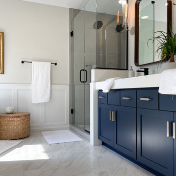
This dated Master Bathroom went from dark, neutral, and lackluster to bright, modern, and luxurious by adding modern elements including custom board and batten, and marble tile. We updated the vanity and repainted cabinets, added new hardware and fixtures, and extended the shower to create space for “his and hers” shower heads. The adjacent floating tub sits caddy-cornered to the rest of the bathroom, with a matte black faucet and wand. This modern navy blue bathroom will soon be a reference point for every model in their neighborhood!
 Wanda Ely Architect Inc.
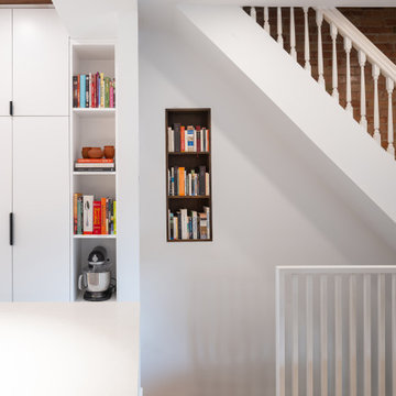
Modern details in the design reference existing elements in the home. A minimal, simplified railing to the basement stair takes its cues from the Victorian railing on the stair to the second floor.
Photo by Scott Norsworthy
 Villa Verona Design
www.press1photos.com
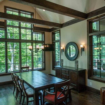
Inspiration for a large transitional dark wood floor enclosed dining room remodel in Other with beige walls and no fireplace
Inspiration for a large transitional dark wood floor enclosed dining room remodel in Other with beige walls and no fireplace
30