
Search results for "Element separate" in Home Design Ideas
 Wolfgang Pichler Design Inc.
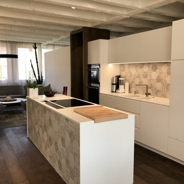
A vacant, worn office space should be transformed into a show apartment / showroom. The existing space had been used as an office structure since the 1960s. Located on the 4th floor of a ten-floor reinforced concrete skeleton, the area is already high enough to receive a great amount of light, which is particularly noticeable at dawn and dusk: sunrises and sunsets conjure up the most spellbinding blends of light.
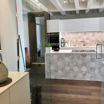
The existing structure and also the technical equipment were completely outdated and needed to be completely rebuilt: suspended ceilings were removed and walls changed. The result is a modern city apartment of almost 100 m2 (about 1,070 sqft) – divided into a large living space, 2 rooms, 1 bathroom, 1 powder room and 1 utility room. The existing window facades could not be changed, but they are part of the concept anyway, namely to bring as much light as possible into the room. A controlled ventilation system ensures optimal air quality even with closed windows. The central kitchen element serves as a kind of separation of the living area and the dining area. Here customers and guests are served, people communicate, cook together, drink a glass of wine. Clients experience living.
The rough reinforced concrete ribbed slaps were uncovered and painted white to give the room more height, which is accentuated by the lighting concept with ceiling-mounted spotlights. The dark oak floor creates a successful contrast to the brightly designed rooms. The wittily positioned pedestal areas hide all technical elements, such as the supply air openings of the living room ventilation. Flush-fitting door elements in the walls with a chalked brick look show in detail the special feature of the room. The central wall elements were deliberately not pulled up to the ceiling, but are separated by a glass element to show the continuity of the construction.
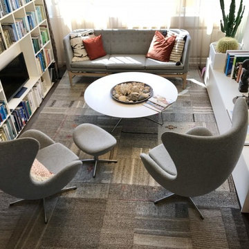
Most of the furniture was designed by Wolfgang Pichler. Within the course of this project he was able to implement his holistic approach in the field of construction technology, architecture and furniture design and skillfully combine it with design classics. Scandinavian classics can be found in the concept just as much as pieces he collected during his career and furniture he developed for the company VITEO, which he founded in 2002. The project illustrates the added value of an architectural holistic approach.
 Wolfgang Pichler Design Inc.
A vacant, worn office space should be transformed into a show apartment / showroom. The existing space had been used as an office structure since the 1960s. Located on the 4th floor of a ten-floor reinforced concrete skeleton, the area is already high enough to receive a great amount of light, which is particularly noticeable at dawn and dusk: sunrises and sunsets conjure up the most spellbinding blends of light.
The existing structure and also the technical equipment were completely outdated and needed to be completely rebuilt: suspended ceilings were removed and walls changed. The result is a modern city apartment of almost 100 m2 (about 1,070 sqft) – divided into a large living space, 2 rooms, 1 bathroom, 1 powder room and 1 utility room. The existing window facades could not be changed, but they are part of the concept anyway, namely to bring as much light as possible into the room. A controlled ventilation system ensures optimal air quality even with closed windows. The central kitchen element serves as a kind of separation of the living area and the dining area. Here customers and guests are served, people communicate, cook together, drink a glass of wine. Clients experience living.
The rough reinforced concrete ribbed slaps were uncovered and painted white to give the room more height, which is accentuated by the lighting concept with ceiling-mounted spotlights. The dark oak floor creates a successful contrast to the brightly designed rooms. The wittily positioned pedestal areas hide all technical elements, such as the supply air openings of the living room ventilation. Flush-fitting door elements in the walls with a chalked brick look show in detail the special feature of the room. The central wall elements were deliberately not pulled up to the ceiling, but are separated by a glass element to show the continuity of the construction.
Most of the furniture was designed by Wolfgang Pichler. Within the course of this project he was able to implement his holistic approach in the field of construction technology, architecture and furniture design and skillfully combine it with design classics. Scandinavian classics can be found in the concept just as much as pieces he collected during his career and furniture he developed for the company VITEO, which he founded in 2002. The project illustrates the added value of an architectural holistic approach.
 Wolfgang Pichler Design Inc.
A vacant, worn office space should be transformed into a show apartment / showroom. The existing space had been used as an office structure since the 1960s. Located on the 4th floor of a ten-floor reinforced concrete skeleton, the area is already high enough to receive a great amount of light, which is particularly noticeable at dawn and dusk: sunrises and sunsets conjure up the most spellbinding blends of light.
The existing structure and also the technical equipment were completely outdated and needed to be completely rebuilt: suspended ceilings were removed and walls changed. The result is a modern city apartment of almost 100 m2 (about 1,070 sqft) – divided into a large living space, 2 rooms, 1 bathroom, 1 powder room and 1 utility room. The existing window facades could not be changed, but they are part of the concept anyway, namely to bring as much light as possible into the room. A controlled ventilation system ensures optimal air quality even with closed windows. The central kitchen element serves as a kind of separation of the living area and the dining area. Here customers and guests are served, people communicate, cook together, drink a glass of wine. Clients experience living.
The rough reinforced concrete ribbed slaps were uncovered and painted white to give the room more height, which is accentuated by the lighting concept with ceiling-mounted spotlights. The dark oak floor creates a successful contrast to the brightly designed rooms. The wittily positioned pedestal areas hide all technical elements, such as the supply air openings of the living room ventilation. Flush-fitting door elements in the walls with a chalked brick look show in detail the special feature of the room. The central wall elements were deliberately not pulled up to the ceiling, but are separated by a glass element to show the continuity of the construction.
Most of the furniture was designed by Wolfgang Pichler. Within the course of this project he was able to implement his holistic approach in the field of construction technology, architecture and furniture design and skillfully combine it with design classics. Scandinavian classics can be found in the concept just as much as pieces he collected during his career and furniture he developed for the company VITEO, which he founded in 2002. The project illustrates the added value of an architectural holistic approach.
Find the right local pro for your project
 Wolfgang Pichler Design Inc.
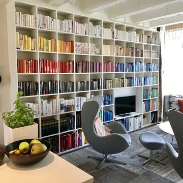
A vacant, worn office space should be transformed into a show apartment / showroom. The existing space had been used as an office structure since the 1960s. Located on the 4th floor of a ten-floor reinforced concrete skeleton, the area is already high enough to receive a great amount of light, which is particularly noticeable at dawn and dusk: sunrises and sunsets conjure up the most spellbinding blends of light.
The existing structure and also the technical equipment were completely outdated and needed to be completely rebuilt: suspended ceilings were removed and walls changed. The result is a modern city apartment of almost 100 m2 (about 1,070 sqft) – divided into a large living space, 2 rooms, 1 bathroom, 1 powder room and 1 utility room. The existing window facades could not be changed, but they are part of the concept anyway, namely to bring as much light as possible into the room. A controlled ventilation system ensures optimal air quality even with closed windows. The central kitchen element serves as a kind of separation of the living area and the dining area. Here customers and guests are served, people communicate, cook together, drink a glass of wine. Clients experience living.
The rough reinforced concrete ribbed slaps were uncovered and painted white to give the room more height, which is accentuated by the lighting concept with ceiling-mounted spotlights. The dark oak floor creates a successful contrast to the brightly designed rooms. The wittily positioned pedestal areas hide all technical elements, such as the supply air openings of the living room ventilation. Flush-fitting door elements in the walls with a chalked brick look show in detail the special feature of the room. The central wall elements were deliberately not pulled up to the ceiling, but are separated by a glass element to show the continuity of the construction.
Most of the furniture was designed by Wolfgang Pichler. Within the course of this project he was able to implement his holistic approach in the field of construction technology, architecture and furniture design and skillfully combine it with design classics. Scandinavian classics can be found in the concept just as much as pieces he collected during his career and furniture he developed for the company VITEO, which he founded in 2002. The project illustrates the added value of an architectural holistic approach.
 Wolfgang Pichler Design Inc.
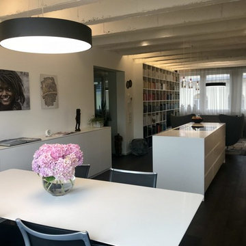
A vacant, worn office space should be transformed into a show apartment / showroom. The existing space had been used as an office structure since the 1960s. Located on the 4th floor of a ten-floor reinforced concrete skeleton, the area is already high enough to receive a great amount of light, which is particularly noticeable at dawn and dusk: sunrises and sunsets conjure up the most spellbinding blends of light.
The existing structure and also the technical equipment were completely outdated and needed to be completely rebuilt: suspended ceilings were removed and walls changed. The result is a modern city apartment of almost 100 m2 (about 1,070 sqft) – divided into a large living space, 2 rooms, 1 bathroom, 1 powder room and 1 utility room. The existing window facades could not be changed, but they are part of the concept anyway, namely to bring as much light as possible into the room. A controlled ventilation system ensures optimal air quality even with closed windows. The central kitchen element serves as a kind of separation of the living area and the dining area. Here customers and guests are served, people communicate, cook together, drink a glass of wine. Clients experience living.
The rough reinforced concrete ribbed slaps were uncovered and painted white to give the room more height, which is accentuated by the lighting concept with ceiling-mounted spotlights. The dark oak floor creates a successful contrast to the brightly designed rooms. The wittily positioned pedestal areas hide all technical elements, such as the supply air openings of the living room ventilation. Flush-fitting door elements in the walls with a chalked brick look show in detail the special feature of the room. The central wall elements were deliberately not pulled up to the ceiling, but are separated by a glass element to show the continuity of the construction.
Most of the furniture was designed by Wolfgang Pichler. Within the course of this project he was able to implement his holistic approach in the field of construction technology, architecture and furniture design and skillfully combine it with design classics. Scandinavian classics can be found in the concept just as much as pieces he collected during his career and furniture he developed for the company VITEO, which he founded in 2002. The project illustrates the added value of an architectural holistic approach.
 C3 Studio, LLC
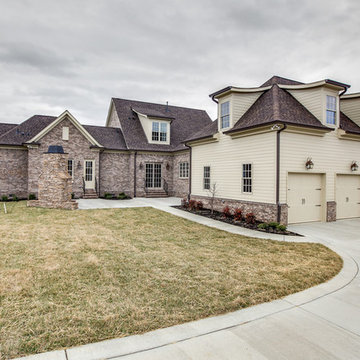
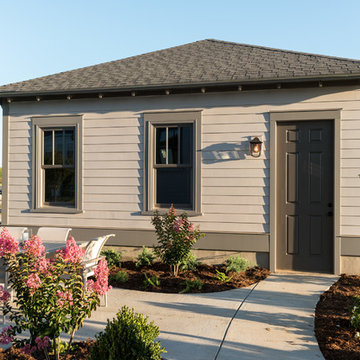
Example of a mid-sized transitional gray one-story wood exterior home design in Louisville with a hip roof

Sponsored
Sunbury, OH

J.Holderby - Renovations
Franklin County's Leading General Contractors - 2X Best of Houzz!
 Element Home Builders
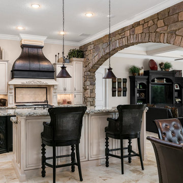
Inspiration for a large mediterranean l-shaped travertine floor eat-in kitchen remodel in Orlando with raised-panel cabinets, white cabinets, granite countertops, beige backsplash, two islands, an undermount sink and black appliances
 Jessica Dauray Interiors/Elements Of Style
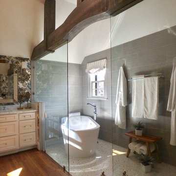
View of left side of wet room and soaking tub with chrome tub filler. Plenty of natural light fills the space and the room has layers of texture by incorporating wood, tile, glass and patterned wallpaper, which adds visual interest.
Jessica Dauray - photography
 Le jardinet
Design credit; Mitch Evans, Redmond, WA
Photo credit; Le jardinet
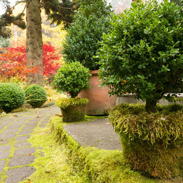
Design ideas for a traditional landscaping in Seattle.
Design ideas for a traditional landscaping in Seattle.
 Laura Lee Home
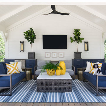
Building a covered deck has transformed the way this client's home. With separate areas for the pool, seating, and dining; they entertain outside all the time.
The easy care dining chairs are both very comfortable and easy to hose off. Outdoor rugs anchor the separate areas for dining and lounging. Umbrellas at the dining and pool ledge lounge area keep the Texas sun at bay.
Facing sofas and a pair of comfy spring chairs under the covered roof offer a break from the sun and a large ceiling fan keeps the air moving.
 Twisted Elements
David Kopfmann
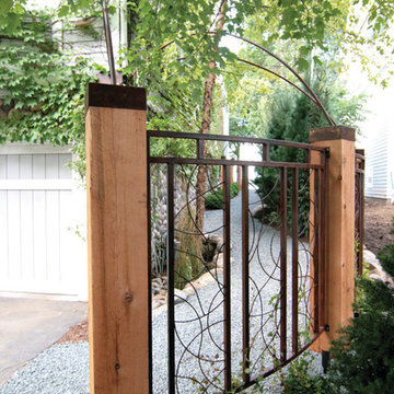
Design ideas for a mid-sized transitional courtyard mulch garden path in Minneapolis.
Design ideas for a mid-sized transitional courtyard mulch garden path in Minneapolis.
 Manou Design Group
Jeremy Fukunaga
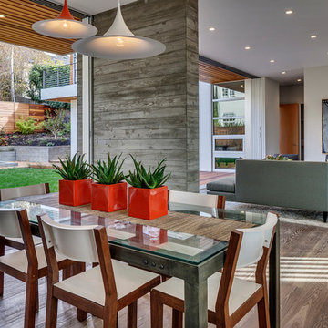
Great room - contemporary medium tone wood floor great room idea in San Francisco
Great room - contemporary medium tone wood floor great room idea in San Francisco
Sponsored
Sunbury, OH
J.Holderby - Renovations
Franklin County's Leading General Contractors - 2X Best of Houzz!
 Twelve Stones Designs, LLC
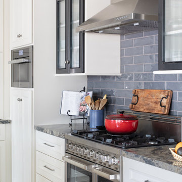
The owners of this kitchen had spent the money to upgrade the finishes in their kitchen upon building the home 12 years ago, but after living in the space for several years they realized how nonfunctional the layout really was. The (then) two preschool aged children had grown into busy, hungry teenagers with many friends who also liked to hang out at the house. So the family needed a more functional kitchen with better traffic flow, space for daily activities revolving around the kitchen at different times of day, and a kitchen that could accommodate cooking for and serving large groups. Furthermore, the dark, traditional finishes no longer reflected the homeowners’ style. They requested a brighter, more relaxed, coastal style that reflected their love of the seaside cities they like to visit.
Originally, the kitchen was U-shaped with a narrow island in the middle. The island created narrow aisles that bottle-necked at the dishwasher, refrigerator, and cooktop areas. There was a pass-through from the foyer into the kitchen, but the owners never liked that the pass-through was also located so close to the powder room. The awkward proximity was unappealing and made guests feel uncomfortable.
The kitchen’s storage was made up of lots of narrow cabinets, apothecary drawers, clipped corner units, and very few drawers. It lacked useful storage for the larger items the family used on a daily basis. And the kitchen’s only pantry was small closet that had only builder-grade, narrow shelving with no illumination to be able to see the contents inside.
Overall, the kitchen’s lighting plan was poorly executed. Only six recessed cans illuminated the entire kitchen and nook areas. The under cabinet lighting was not evenly distributed either. In fact, the builder had mis-placed the under cabinet lighting around the decorative pilasters which made for choppy, dark cubbies. Further, the builder didn’t include any lighting over the sink or the bar area, which meant whoever was doing the dishes was always in their own shadow. That, coupled with the steep overhang of the game room above made the bar area feel like a dim, cavernous space that wasn’t inviting or task oriented. The kitchen looked out into the main living space, but the raised bar and a narrow wall (which held the only large cabinet in the kitchen) created more of a barrier than a relationship to the living room or breakfast nook. In fact, one couldn’t even see the breakfast nook from the cooktop or sink areas due to its orientation. The raised bar top was too narrow to comfortably sit to either dine at or chat from due to the lack of knee space. The the homeowners confided that the kitchen felt more like a dark, dirty prison than place where the family, or their guests, wanted to gather and commune.
The clients' needs and desires were:
➢ to create a kitchen that would be a space the family loved to be in; to relate to the adjacent spaces all around, and to have better flow for entertaining large groups
➢ to remove the walls between the breakfast nook and living area and to be able to utilize the natural light from the windows in both those areas
➢ to incorporate a functional chopping block for prepping fresh food for home cooked meals, an island with a large sink and drain board, 2 pull out trash cans, and seating for at least the 2 teens to eat or do homework
➢ to design a kitchen and breakfast nook with an airy, coastal, relaxed vibe that blended with the rest of the house's coastal theme
➢ to integrate a layered lighting plan which would include ample general illumination, specific task lighting, decorative lighting, and lots of illuminated storage
➢ to design a kitchen with not only more storage for all the husband’s kitchen gadgets and collection of oils and spices, but smart storage, including a coffee/breakfast bar and a place to store and conceal the toaster oven and microwave
➢ to find a way to utilize the large open space between the kitchen, pantry area, and breakfast nook
Twelve Stones Designs achieved the owner's goals by:
➢ removing the walls between the kitchen and living room to allow the natural light to filter in from the adjacent rooms and to create a connection between the kitchen, nook, and living spaces for a sense of unity and communion
➢ removing the existing pantry and designing 3 large pantry style cabinets with LED tape lights and rollout drawers to house lots of kitchen appliances, gadgets, and tons of groceries. We also took the cabinets all the way up to the 9’ ceiling for additional storage for seasonal items and bulk storage.
➢ designing 2 islands - 1 with a gorgeous black walnut chopping block that houses a drawer for chopping and carving knives and a custom double pull out trash unit for point of use utilization - and 1 that houses the dishwasher, a large Blanco Gourmet sink with integrated drain board, woven baskets for fresh root vegetables and kitchen towels, plenty of drawer storage for kitchen items, and bar seating for up to 4 diners.
➢ closing off the space between the kitchen and the powder room to create a beautiful new private alcove for the powder room as well as adding some decorative storage. This also gave us space to include more tall storage near the new range for precision placement of the husband’s extensive oil and spice collection as well as a location for a combo-steam oven the wife wanted for baking and cooking healthy meals.
The project is enhanced functionally by:
➢ incorporated USB and standard receptacles for the kids’ laptops and phone charging in the large island
➢ designing the small island to include additional open shelving for items used on a daily basis such as a variety of bowls, plates, and colanders. This set up also works well for the husband who prefers to “plate” his dinners in restaurant-style fashion before presenting them to the table.
➢ the integration of specific storage units, such as double stacked cutlery drawers, a custom spice pull-out, a Kuerig coffee and tea pod drawer, and custom double stacked utensil drawers
➢ moving the refrigerator to the old oven location - this eliminated the bottle neck as well as created a better relationship to the eating table. It also utilizes the floor space between the pantry, nook, and kitchen
➢ creating a banquet style breakfast nook - this banquette seating not only doubles the amount of seating for large gatherings but it better utilizes the odd space between the kitchen and the previous nook area. It also helps to create a distinct pathway from the mudroom room through the pantry area, kitchen, nook, and living room.
➢ the coffee/breakfast bar area which includes the perfect location for the concealed microwave and toaster oven, convenient storage for the coffee pods and tea accoutrements. Roll-out drawers below also house the smoothie maker, hot water kettle, and a plethora of smoothie-making ingredients such as protein powders, smoothie additives, etc. Furthermore, the drawers below the Keurig house measuring utensil, cutlery, baking supplies and tupperware storage.
➢ incorporating lots of wide drawers and pullouts to accommodate large cookware.
➢ utilizing as much vertical space as possible by building storage to the ceiling which accommodates the family’s abundant amount of serving platters, baking sheets, bakeware, casserole dishes, and additional cutting boards.
The project is enhanced aesthetically by:
➢ new 5-piece Versailles pattern porcelain tile that now seamlessly joins the entire down stairs area together creating a bright, cohesiveness feeling instead of choppy separated spaces - it also adds a coastal feeling
➢ designing a cabinet to conceal the microwave and toaster oven
➢ the coastal influenced light fixtures over the nook table and island
➢ the sandy colors of the Langdon Cambria countertops. The swirling pattern and sparkling quartz pieces remind the homeowner of black-and-tan sandy beaches
➢ the striped banquet seating whose creamy white background and blue-green stripes were the inspiration for the cabinet and wall colors.
➢ All the interior doors were painted black to coordinate with the blacks and grays in the backsplash tile and countertop. This also adds a hint of tailored formality to an otherwise casual space.
➢ the use of WAC's Oculux small aperture LED units for the overhead lighting complimented with Diode LED strips for task lighting under the cabinets and inside the pantry and glass wall cabinets. All of the lighting applications are on separate dimmer switches.
Innovative uses of materials or construction methods by Realty Restoration LLC:
➢ Each 1-1/2” x 3” block of reclaimed end-grain black walnut that makes up the center island chopping block was hand milled and built in the shop. It was designed to look substantial and proportional to the surrounding elements, executed by creating the 4 inch tall top with a solid wood chamfered edge band.
➢ The metal doors on either side of the vent hood were also custom designed for this project and built in the Realty Restoration LLC shop. They are made 1x2, 11-gauge mild steel with ribbed glass. Weighing 60 lbs a piece, heavy duty cabinet hinges were added to support the weight of the door and keep them from sagging.
➢ Under-cabinet receptacles were added along the range wall in order to have a clean, uninterrupted backsplash.
Design obstacles to overcome:
➢ Because we were removing the demising walls between the kitchen and living room, we had to find a way to plumb and vent the new island. We did this by tunneling through the slab (the slab had post tension cables which prevented us from just trenching) to run a new wet vent through a nearby structural wall. We pulled the existing hot and cold lines between upper floor joists and ran them down the structural wall as well and up through a conduit in the tunnel.
➢ Since we were converting from wall overs to a gas range it allowed us to utilize the 220 feed for the wall ovens to provide a new sub panel for all the new kitchen circuits
➢ Due to framing deficiencies inherited from the original build there was a 1-1/2” differential in the floor-to-ceiling height over a 20 foot span; by utilizing the process of cutting and furring coupled with the crown moulding details on the cabinet elevations we were able to mask the problem and provide seamless transitions between the cabinet components.
Evidence of superior craftsmanship:
➢ uniquely designed, one-of-a-kind metal “X” end panels on the large island. The end panels were custom made in the Realty Restoration LLC shop and fitted to the exact dimensions of the island. The welding seams are completely indistinguishable - the posts look like they are cut from a single sheet of metal
➢ square metal posts on the small island were also custom made and designed to compliment and carry through the metal element s throughout the kitchen
➢ the beautiful, oversized end panels on the pantry cabinets which give the breakfast nook a tailored look
➢ integrating a large format 5 piece Versailles tile pattern to seamlessly flow from the existing spaces into the new kitchen space
➢ By constructing a custom cabinet that jogged around a corner we could not remodel (housing the entry way coat closet) we were able to camouflage the adjacent wall offset within the upper and lower cabinets. By designing around the existing jog in the structural walls we accomplished a few things: we were able to find the space to house, and hide, the microwave and toaster oven yet still have a clean cohesive appearance from the kitchen side. Additionally, the owners were able to keep their much needed coat closet and we didn’t have to increase the budget with unnecessary structural work.
 Medallion Cabinetry
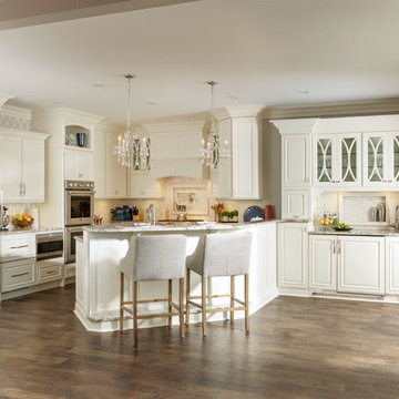
"The homeowners wanted a kitchen that reflected their personalities and cooking styles. Sophisticated but still elegant." designer Rodney Lee of York, PA.
After designing a successful home office space remodel, our same client came back to us to discuss plans and possibilities for their kitchen renovation. After a few discussions with the client, we decided the overall design concept for their kitchen would be “Sophisticated Elegance.” The homeowners wanted a kitchen that reflected their personalities and their cooking styles. Sophisticated but still elegant. The space had to be extremely functional and the color scheme had to have a certain warmth that matched the rest of their home.
The Medallion line has a wide range of architectural elements that helped us achieve that “Sophisticated Elegance”; curved/arched range hood, openings, valances, and corbels and trim. The “Sophistication” lies purely in the detail, the fixtures, the angles in the peninsula, and the changes in height and depth.
We wanted the color scheme to be as warm as possible as it would be in a bright, elegant space. We considered two colors and ended up choosing Divinity over the White Icing. The grey tones in the marble backsplash tile kept the colors modern but warm. We used natural stone versus the more aggregated quartz to maintain the use of natural product and unpredictable patterns and natural elements. We also used a dark rich stain on walnut wood as a good break from all the bright painted finishes. Oak and walnut reflect the “heart” of Pennsylvania and was a great way to maintain the use of natural elements.
The kitchen was divided into individual areas, each one focused on a particular need and/or function. My biggest challenge was transitioning the peninsula into the wet bar/hutch area while maintaining proper separation from the kitchen cabinetry and still tying it into the rest of the space.
A wealth of storage solutions.
•Desk Area. The client wanted a functional work area so we created a furniture look with ogee edging in the walnut, provincial toe space detail in solid walnut, and open display storage at top. The desk has plenty of storage.
•Main Kitchen. We were able to open up this space by creating smart transitions and separations using custom Medallion products that cater to the clients’ lifestyle. Each piece is functional while staying true to the sophisticated elegance design throughout the home.
◦Main Cabinetry: Medallion Gold Wellington Maple Divinity Classic Paint
◦48" uppers around range area; glass eclipse mullion-arched hood design
◦Mixer lift base left of range; drawer warmer with custom panel
•The main work station, or power spot, can hold up to five work stations comfortably. The cook can work within the confines of the peninsula design and access everything needed to prepare complete meals in 1-2 steps. Every cabinet has deluxe roll-out trays and/or drawers, making this kitchen fully accessible. The client wanted to be able to display and stage different pieces and concepts during holidays and gatherings. We chose to go with the more modern Mission arch above the wall oven and fridge, which complimented many of the hard angles and distinct lines used in the kitchen space.
My favorite part of this kitchen remodel came about just by listening to our client talk about how much they adored their daughter’s artwork. After numerous conversations, we landed on installing an artwork wall that was designed as a conversation piece and provides the ability to install different works of art.
 Drury Design
THE SETUP
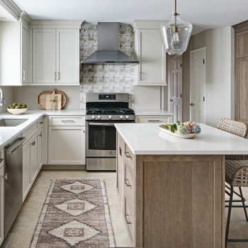
Client Background: Our clients, a couple who have transitioned into the empty nest phase, have cherished their home for over three decades without undergoing any significant renovations. With a newfound desire to adapt their living space to better suit their current lifestyle, they’ve embarked on a journey to reimagine their kitchen — the heart of their home. Their aspiration is to cultivate a serene, neutral-toned sanctuary on the first floor that seamlessly merges with their family room, ensuring a harmonious and inviting environment.
Design Inspiration: The renovation is inspired by the couple’s penchant for soft, calming neutrals, using their cherished family room and the kitchen’s existing tile flooring as the cornerstone for the color scheme. This approach aims to foster a sense of warmth and tranquility throughout.
Design Objectives:
Harmonize the kitchen with the family room by adopting a soothing, neutral color scheme, ensuring a seamless flow across the first floor.
Enhance kitchen functionality with thoughtfully designed cabinetry, providing a designated place for every item and maximizing storage efficiency.
Cultivate an inviting and comfortable atmosphere that reflects the homeowners’ desire for a calm and relaxing space.
Design Challenges:
The homeowners wish to retain the existing kitchen tile flooring and integrate it into a refreshed, modern design.
Accommodating a dining area spacious enough for family visits without compromising the kitchen’s open feel or functional layout.
Despite liking the current placement of plumbing and appliances, the homeowners aspire for a more open floor plan to facilitate better movement and interaction.
The need to amplify natural light in the kitchen, especially around the sink area, where existing lighting is insufficient.
Preserving the half-wall between the kitchen and family room, a feature the homeowners want to keep, while ensuring it complements the new design.
THE RENEWED SPACE
Design Solutions:
By choosing a neutral color palette that complements the existing tile, the design unifies the kitchen with the adjacent spaces. The tile’s grout was cleaned and restored, enhancing the floor’s appearance and integrating it seamlessly with the new kitchen aesthetic.
The inclusion of a larger island with seating for two, alongside maintaining a substantial dining table, was achieved by optimizing the spatial layout. This allowed for a sociable yet functional kitchen, accommodating large family gatherings without feeling crowded.
Minor adjustments to the kitchen’s layout maintained the preferred locations for plumbing and appliances while introducing an ‘open’ design concept. Strategic modifications, such as angling the pantry wall, improved the flow and accessibility within the space.
Replacing the garden window with a broader, standard window significantly increased natural light, transforming the sink area into a bright, welcoming space with enhanced views of the outdoors.
The decision to keep the half-wall was ingeniously leveraged to define the dining area while maintaining an open connection to the family room. This feature not only serves as a visual separator but also ties the two spaces together through the shared color scheme and design elements.
The homeowners are thrilled with their newly remodeled kitchen, which has become a hub of warmth and hospitality. Hosting a wedding shower and a birthday party, they have shared their renewed space with friends and family, who have been equally enamored. This remodel has not only met their functional and aesthetic desires but has also enriched their home with a fresh sense of serenity and joy.
The upstairs part of the home is shaping up nicely. Here’s their newly remodeled primary bathroom.


Sponsored
Columbus, OH

Structural Remodeling
Franklin County's Heavy Timber Specialists | Best of Houzz 2020!
 Narofsky Architecture + ways2design
Phillip Ennis
Example of a mid-sized trendy pool house design in New York
Example of a mid-sized trendy pool house design in New York
 River Valley Landscapes
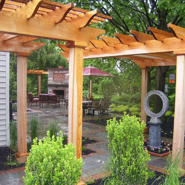
 After many years of having no outdoor living space and dealing with overgrown plants and trees the owner’s decided it was time to revitalize their backyard. They knew they wanted a large sitting area with a wood burning fireplace, room for outdoor dining and a place for the grill. A connecting walk would be needed to get guests from the driveway to the outdoor space. Last but not least, the owners wanted the ability to and a reason for stepping out of their unusable patio doors.
The designers decided from the start the fireplace would be the prominent feature and focal point for the entire project. A large fireplace accented with sitting walls and arbors was positioned to anchor the corner of the patio. Stone was chosen to set the fireplace apart as its own element. Brick was used for the sitting walls and brick accents were added to the fireplace to tie into the house. An inlaid herringbone brick detail was incorporated above the stone mantle to simulate artwork which is typically found above indoor fireplaces. Flagstone was used for the wall caps and hearth to match the patio and thicker flagstone tread stock was used for the mantle and top. The arbors were added to visually balance the pergolas at the opposite side of the patio.
For the patio the designers created a series of offset spaces to help subtly divide the space into two areas, sitting and dining. Two large existing trees also help dictate the shape of the patio. Cut flagstone was chosen for the surface bordered by a double soldier edge of brick. The brick edging also surrounds a decorative gravel area topped with an urn fountain which provides a secondary focal point and the sound of water. Large flagstone treads were used for the steps leading to the previously unused patio doors. Opposite the fireplace a short walk leads to a square transition area with a statue chosen by the owner. The statue provides a strong focal point when entering from the driveway. A longer walk leads from this space along the house to the driveway.
The pergolas and arbors were designed by the landscape designer as part of this project but were ultimately contracted separately by the owner. The larger square pergola was intended as an area for a bench or two separate from the main patio. The longer pergola was added later in the design phase to help provide shade to the interior of the house. The arbors at the fireplace were added to balance out the wood elements at the opposite side while adding additional architectural interest to the fireplace.
While this project was predominantly hardscaping, planting and lighting were also incorporated into the design. Several large existing trees were retained and serious of smaller understory trees were added to help enclose the space. The designer’s took advantage of the large trees to place down lights on the branches to achieve a moonlight effect at night. Additional lighting was used on the pergola, to accent focal points, to up light the smaller trees and around the patio. Massed planting of Japanese forest grass provides bold foliage color for the shady garden. A mulch path leads off behind the fireplace to another garden and a secluded area ideal for a bench or small table and chairs. Additional plantings were added along the rear property line to screen and unsightly fence.
This project has obviously completely changed the way the owners use their backyard. They now have a seamless transition from indoors to outdoors with the use of the patio doors. The large patio allows for entertaining small gatherings outdoors for the first time. The fireplace has definitely become the primary gathering place for family and friends.

11