
Search results for "Element separate" in Home Design Ideas
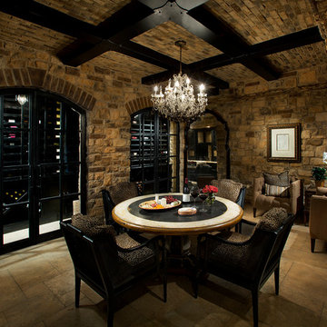
 Fratantoni Design / Residential Architects
We adore the use of exposed beams, the stone arches and facade, and the travertine flooring to name just a few of our favorite architectural design elements.
 Klopf Architecture
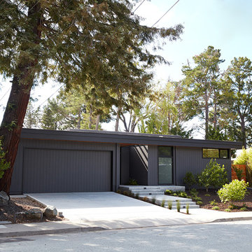
Klopf Architecture, Arterra Landscape Architects and Henry Calvert of Calvert Ventures Designed and built a new warm, modern, Eichler-inspired, open, indoor-outdoor home on a deeper-than-usual San Mateo Highlands property where an original Eichler house had burned to the ground.
The owners wanted multi-generational living and larger spaces than the original home offered, but all parties agreed that the house should respect the neighborhood and blend in stylistically with the other Eichlers. At first the Klopf team considered re-using what little was left of the original home and expanding on it. But after discussions with the owner and builder, all parties agreed that the last few remaining elements of the house were not practical to re-use, so Klopf Architecture designed a new home that pushes the Eichler approach in new directions.
One disadvantage of Eichler production homes is that the house designs were not optimized for each specific lot. A new custom home offered the team a chance to start over. In this case, a longer house that opens up sideways to the south fit the lot better than the original square-ish house that used to open to the rear (west). Accordingly, the Klopf team designed an L-shaped “bar” house with a large glass wall with large sliding glass doors that faces sideways instead of to the rear like a typical Eichler. This glass wall opens to a pool and landscaped yard designed by Arterra Landscape Architects.
Driving by the house, one might assume at first glance it is an Eichler because of the horizontality, the overhanging flat roof eaves, the dark gray vertical siding, and orange solid panel front door, but the house is designed for the 21st Century and is not meant to be a “Likeler.” You won't see any posts and beams in this home. Instead, the ceiling decking is a western red cedar that covers over all the beams. Like Eichlers, this cedar runs continuously from inside to out, enhancing the indoor / outdoor feeling of the house, but unlike Eichlers it conceals a cavity for lighting, wiring, and insulation. Ceilings are higher, rooms are larger and more open, the master bathroom is light-filled and more generous, with a separate tub and shower and a separate toilet compartment, and there is plenty of storage. The garage even easily fits two of today's vehicles with room to spare.
A massive 49-foot by 12-foot wall of glass and the continuity of materials from inside to outside enhance the inside-outside living concept, so the owners and their guests can flow freely from house to pool deck to BBQ to pool and back.
During construction in the rough framing stage, Klopf thought the front of the house appeared too tall even though the house had looked right in the design renderings (probably because the house is uphill from the street). So Klopf Architecture paid the framer to change the roofline from how we had designed it to be lower along the front, allowing the home to blend in better with the neighborhood. One project goal was for people driving up the street to pass the home without immediately noticing there is an "imposter" on this lot, and making that change was essential to achieve that goal.
This 2,606 square foot, 3 bedroom, 3 bathroom Eichler-inspired new house is located in San Mateo in the heart of the Silicon Valley.
Klopf Architecture Project Team: John Klopf, AIA, Klara Kevane
Landscape Architect: Arterra Landscape Architects
Contractor: Henry Calvert of Calvert Ventures
Photography ©2016 Mariko Reed
Location: San Mateo, CA
Year completed: 2016
 Klopf Architecture
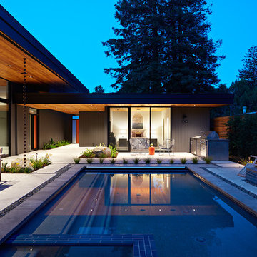
Klopf Architecture, Arterra Landscape Architects and Henry Calvert of Calvert Ventures Designed and built a new warm, modern, Eichler-inspired, open, indoor-outdoor home on a deeper-than-usual San Mateo Highlands property where an original Eichler house had burned to the ground.
The owners wanted multi-generational living and larger spaces than the original home offered, but all parties agreed that the house should respect the neighborhood and blend in stylistically with the other Eichlers. At first the Klopf team considered re-using what little was left of the original home and expanding on it. But after discussions with the owner and builder, all parties agreed that the last few remaining elements of the house were not practical to re-use, so Klopf Architecture designed a new home that pushes the Eichler approach in new directions.
One disadvantage of Eichler production homes is that the house designs were not optimized for each specific lot. A new custom home offered the team a chance to start over. In this case, a longer house that opens up sideways to the south fit the lot better than the original square-ish house that used to open to the rear (west). Accordingly, the Klopf team designed an L-shaped “bar” house with a large glass wall with large sliding glass doors that faces sideways instead of to the rear like a typical Eichler. This glass wall opens to a pool and landscaped yard designed by Arterra Landscape Architects.
Driving by the house, one might assume at first glance it is an Eichler because of the horizontality, the overhanging flat roof eaves, the dark gray vertical siding, and orange solid panel front door, but the house is designed for the 21st Century and is not meant to be a “Likeler.” You won't see any posts and beams in this home. Instead, the ceiling decking is a western red cedar that covers over all the beams. Like Eichlers, this cedar runs continuously from inside to out, enhancing the indoor / outdoor feeling of the house, but unlike Eichlers it conceals a cavity for lighting, wiring, and insulation. Ceilings are higher, rooms are larger and more open, the master bathroom is light-filled and more generous, with a separate tub and shower and a separate toilet compartment, and there is plenty of storage. The garage even easily fits two of today's vehicles with room to spare.
A massive 49-foot by 12-foot wall of glass and the continuity of materials from inside to outside enhance the inside-outside living concept, so the owners and their guests can flow freely from house to pool deck to BBQ to pool and back.
During construction in the rough framing stage, Klopf thought the front of the house appeared too tall even though the house had looked right in the design renderings (probably because the house is uphill from the street). So Klopf Architecture paid the framer to change the roofline from how we had designed it to be lower along the front, allowing the home to blend in better with the neighborhood. One project goal was for people driving up the street to pass the home without immediately noticing there is an "imposter" on this lot, and making that change was essential to achieve that goal.
This 2,606 square foot, 3 bedroom, 3 bathroom Eichler-inspired new house is located in San Mateo in the heart of the Silicon Valley.
Klopf Architecture Project Team: John Klopf, AIA, Klara Kevane
Landscape Architect: Arterra Landscape Architects
Contractor: Henry Calvert of Calvert Ventures
Photography ©2016 Mariko Reed
Location: San Mateo, CA
Year completed: 2016
Find the right local pro for your project
 Klopf Architecture
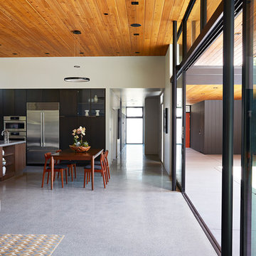
Klopf Architecture, Arterra Landscape Architects and Henry Calvert of Calvert Ventures Designed and built a new warm, modern, Eichler-inspired, open, indoor-outdoor home on a deeper-than-usual San Mateo Highlands property where an original Eichler house had burned to the ground.
The owners wanted multi-generational living and larger spaces than the original home offered, but all parties agreed that the house should respect the neighborhood and blend in stylistically with the other Eichlers. At first the Klopf team considered re-using what little was left of the original home and expanding on it. But after discussions with the owner and builder, all parties agreed that the last few remaining elements of the house were not practical to re-use, so Klopf Architecture designed a new home that pushes the Eichler approach in new directions.
One disadvantage of Eichler production homes is that the house designs were not optimized for each specific lot. A new custom home offered the team a chance to start over. In this case, a longer house that opens up sideways to the south fit the lot better than the original square-ish house that used to open to the rear (west). Accordingly, the Klopf team designed an L-shaped “bar” house with a large glass wall with large sliding glass doors that faces sideways instead of to the rear like a typical Eichler. This glass wall opens to a pool and landscaped yard designed by Arterra Landscape Architects.
Driving by the house, one might assume at first glance it is an Eichler because of the horizontality, the overhanging flat roof eaves, the dark gray vertical siding, and orange solid panel front door, but the house is designed for the 21st Century and is not meant to be a “Likeler.” You won't see any posts and beams in this home. Instead, the ceiling decking is a western red cedar that covers over all the beams. Like Eichlers, this cedar runs continuously from inside to out, enhancing the indoor / outdoor feeling of the house, but unlike Eichlers it conceals a cavity for lighting, wiring, and insulation. Ceilings are higher, rooms are larger and more open, the master bathroom is light-filled and more generous, with a separate tub and shower and a separate toilet compartment, and there is plenty of storage. The garage even easily fits two of today's vehicles with room to spare.
A massive 49-foot by 12-foot wall of glass and the continuity of materials from inside to outside enhance the inside-outside living concept, so the owners and their guests can flow freely from house to pool deck to BBQ to pool and back.
During construction in the rough framing stage, Klopf thought the front of the house appeared too tall even though the house had looked right in the design renderings (probably because the house is uphill from the street). So Klopf Architecture paid the framer to change the roofline from how we had designed it to be lower along the front, allowing the home to blend in better with the neighborhood. One project goal was for people driving up the street to pass the home without immediately noticing there is an "imposter" on this lot, and making that change was essential to achieve that goal.
This 2,606 square foot, 3 bedroom, 3 bathroom Eichler-inspired new house is located in San Mateo in the heart of the Silicon Valley.
Klopf Architecture Project Team: John Klopf, AIA, Klara Kevane
Landscape Architect: Arterra Landscape Architects
Contractor: Henry Calvert of Calvert Ventures
Photography ©2016 Mariko Reed
Location: San Mateo, CA
Year completed: 2016
 TKS Design Group
WATCH the time lapse video of this kitchen remodel: https://youtu.be/caemXXlauLU
Free ebook, Creating the Ideal Kitchen. DOWNLOAD NOW
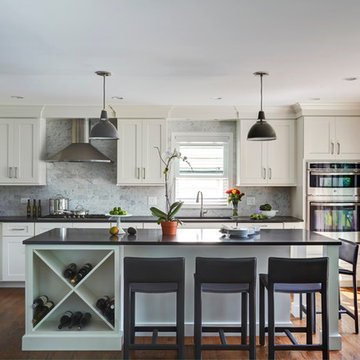
This Glen Ellyn homeowner came to us, frustrated with the layout and size of their current kitchen, looking for help generating ideas for how to maximize functionality within the constraints of the space. After visiting with them and seeing the home’s layout, I realized that looking at the bigger picture of how they used the entire first floor might bring us some dramatic solutions. We ended up flipping the kitchen and family room and taking down the wall separating the two creating one big open floor plan for the family to enjoy. There is still a visual separation between the rooms because of their different lengths and the overall space now relates nicely to the dining room which was also opened up to both rooms.
The new kitchen is an L-shaped space that is no longer cramped and small and is truly a cook’s dream. The fridge is on one end, a large cooktop and sink are located along the main perimeter and double ovens located at the end of the “L” complete the layout. Ample work surface along the perimeter and on the large island makes entertaining a breeze. An existing door to the patio remains, floods the room with light and provides easy access to the existing outdoor deck for entertaining and grilling.
White cabinetry with quartz countertops, Carrera marble backsplash tile and a contrasting gray island give the space a clean and modern feel. The gray pendant lights and stainless appliances bring a slight industrial feel to the space letting you know that some serious cooking will take place here.
Once we had their Dream Kitchen design completed, the homeowners decided to tackle another project at the same time. We made plans to create a master suite upstairs by combining two existing bedrooms into a larger bedroom, bathroom and walk-in closet. The existing spaces were not overly large so getting everything on the wish list into the design was a challenge. In the end, we came up with a design that works. The two bedrooms were adjoined, one wall moved back slightly to make for a slightly larger bedroom, and the remaining space was allotted to the new bathroom and a walk in closet.
The bathroom consists of a double vanity and a large shower with a barn door shower door. A skylight brings light into the space and helps make it feel larger and more open. The new walk-in closet is accessible through the bathroom, and we even managed to fit in a small entry vestibule that houses some additional storage and makes a nice transition from the hallway. A white vanity, Carrera tops and gray floor tile make for a serene space that feels just right for this home.
Designed by: Susan Klimala, CKD, CBD
Photography by: Mike Kaskel
For more information on kitchen and bath design ideas go to: www.kitchenstudio-ge.com
 River Valley Landscapes
 After many years of having no outdoor living space and dealing with overgrown plants and trees the owner’s decided it was time to revitalize their backyard. They knew they wanted a large sitting area with a wood burning fireplace, room for outdoor dining and a place for the grill. A connecting walk would be needed to get guests from the driveway to the outdoor space. Last but not least, the owners wanted the ability to and a reason for stepping out of their unusable patio doors.
The designers decided from the start the fireplace would be the prominent feature and focal point for the entire project. A large fireplace accented with sitting walls and arbors was positioned to anchor the corner of the patio. Stone was chosen to set the fireplace apart as its own element. Brick was used for the sitting walls and brick accents were added to the fireplace to tie into the house. An inlaid herringbone brick detail was incorporated above the stone mantle to simulate artwork which is typically found above indoor fireplaces. Flagstone was used for the wall caps and hearth to match the patio and thicker flagstone tread stock was used for the mantle and top. The arbors were added to visually balance the pergolas at the opposite side of the patio.
For the patio the designers created a series of offset spaces to help subtly divide the space into two areas, sitting and dining. Two large existing trees also help dictate the shape of the patio. Cut flagstone was chosen for the surface bordered by a double soldier edge of brick. The brick edging also surrounds a decorative gravel area topped with an urn fountain which provides a secondary focal point and the sound of water. Large flagstone treads were used for the steps leading to the previously unused patio doors. Opposite the fireplace a short walk leads to a square transition area with a statue chosen by the owner. The statue provides a strong focal point when entering from the driveway. A longer walk leads from this space along the house to the driveway.
The pergolas and arbors were designed by the landscape designer as part of this project but were ultimately contracted separately by the owner. The larger square pergola was intended as an area for a bench or two separate from the main patio. The longer pergola was added later in the design phase to help provide shade to the interior of the house. The arbors at the fireplace were added to balance out the wood elements at the opposite side while adding additional architectural interest to the fireplace.
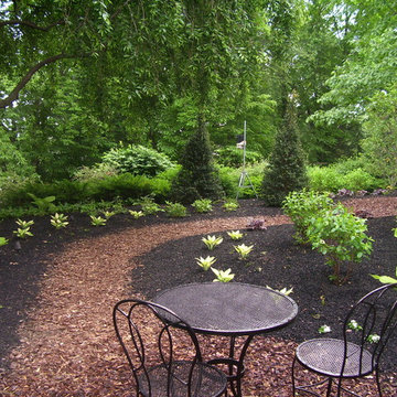
While this project was predominantly hardscaping, planting and lighting were also incorporated into the design. Several large existing trees were retained and serious of smaller understory trees were added to help enclose the space. The designer’s took advantage of the large trees to place down lights on the branches to achieve a moonlight effect at night. Additional lighting was used on the pergola, to accent focal points, to up light the smaller trees and around the patio. Massed planting of Japanese forest grass provides bold foliage color for the shady garden. A mulch path leads off behind the fireplace to another garden and a secluded area ideal for a bench or small table and chairs. Additional plantings were added along the rear property line to screen and unsightly fence.
This project has obviously completely changed the way the owners use their backyard. They now have a seamless transition from indoors to outdoors with the use of the patio doors. The large patio allows for entertaining small gatherings outdoors for the first time. The fireplace has definitely become the primary gathering place for family and friends.
 Medallion Cabinetry
"The homeowners wanted a kitchen that reflected their personalities and cooking styles. Sophisticated but still elegant." designer Rodney Lee of York, PA.
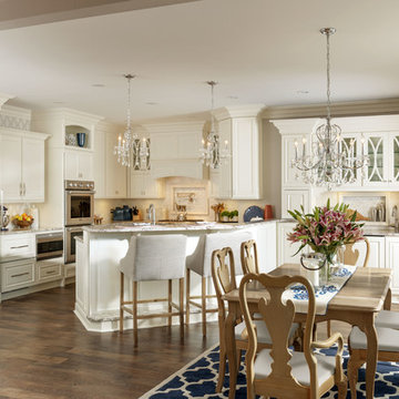
After designing a successful home office space remodel, our same client came back to us to discuss plans and possibilities for their kitchen renovation. After a few discussions with the client, we decided the overall design concept for their kitchen would be “Sophisticated Elegance.” The homeowners wanted a kitchen that reflected their personalities and their cooking styles. Sophisticated but still elegant. The space had to be extremely functional and the color scheme had to have a certain warmth that matched the rest of their home.
The Medallion line has a wide range of architectural elements that helped us achieve that “Sophisticated Elegance”; curved/arched range hood, openings, valances, and corbels and trim. The “Sophistication” lies purely in the detail, the fixtures, the angles in the peninsula, and the changes in height and depth.
We wanted the color scheme to be as warm as possible as it would be in a bright, elegant space. We considered two colors and ended up choosing Divinity over the White Icing. The grey tones in the marble backsplash tile kept the colors modern but warm. We used natural stone versus the more aggregated quartz to maintain the use of natural product and unpredictable patterns and natural elements. We also used a dark rich stain on walnut wood as a good break from all the bright painted finishes. Oak and walnut reflect the “heart” of Pennsylvania and was a great way to maintain the use of natural elements.
The kitchen was divided into individual areas, each one focused on a particular need and/or function. My biggest challenge was transitioning the peninsula into the wet bar/hutch area while maintaining proper separation from the kitchen cabinetry and still tying it into the rest of the space.
A wealth of storage solutions.
•Desk Area. The client wanted a functional work area so we created a furniture look with ogee edging in the walnut, provincial toe space detail in solid walnut, and open display storage at top. The desk has plenty of storage.
•Main Kitchen. We were able to open up this space by creating smart transitions and separations using custom Medallion products that cater to the clients’ lifestyle. Each piece is functional while staying true to the sophisticated elegance design throughout the home.
◦Main Cabinetry: Medallion Gold Wellington Maple Divinity Classic Paint
◦48" uppers around range area; glass eclipse mullion-arched hood design
◦Mixer lift base left of range; drawer warmer with custom panel
•The main work station, or power spot, can hold up to five work stations comfortably. The cook can work within the confines of the peninsula design and access everything needed to prepare complete meals in 1-2 steps. Every cabinet has deluxe roll-out trays and/or drawers, making this kitchen fully accessible. The client wanted to be able to display and stage different pieces and concepts during holidays and gatherings. We chose to go with the more modern Mission arch above the wall oven and fridge, which complimented many of the hard angles and distinct lines used in the kitchen space.
My favorite part of this kitchen remodel came about just by listening to our client talk about how much they adored their daughter’s artwork. After numerous conversations, we landed on installing an artwork wall that was designed as a conversation piece and provides the ability to install different works of art.

Sponsored
Sunbury, OH

J.Holderby - Renovations
Franklin County's Leading General Contractors - 2X Best of Houzz!
 Advance Design Studio, Ltd.
Karen and Chad of Tower Lakes, IL were tired of their unfinished basement functioning as nothing more than a storage area and depressing gym. They wanted to increase the livable square footage of their home with a cohesive finished basement design, while incorporating space for the kids and adults to hang out.
“We wanted to make sure that upon renovating the basement, that we can have a place where we can spend time and watch movies, but also entertain and showcase the wine collection that we have,” Karen said.
After a long search comparing many different remodeling companies, Karen and Chad found Advance Design Studio. They were drawn towards the unique “Common Sense Remodeling” process that simplifies the renovation experience into predictable steps focused on customer satisfaction.
“There are so many other design/build companies, who may not have transparency, or a focused process in mind and I think that is what separated Advance Design Studio from the rest,” Karen said.
Karen loved how designer Claudia Pop was able to take very high-level concepts, “non-negotiable items” and implement them in the initial 3D drawings. Claudia and Project Manager DJ Yurik kept the couple in constant communication through the project. “Claudia was very receptive to the ideas we had, but she was also very good at infusing her own points and thoughts, she was very responsive, and we had an open line of communication,” Karen said.
A very important part of the basement renovation for the couple was the home gym and sauna. The “high-end hotel” look and feel of the openly blended work out area is both highly functional and beautiful to look at. The home sauna gives them a place to relax after a long day of work or a tough workout. “The gym was a very important feature for us,” Karen said. “And I think (Advance Design) did a very great job in not only making the gym a functional area, but also an aesthetic point in our basement”.
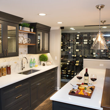
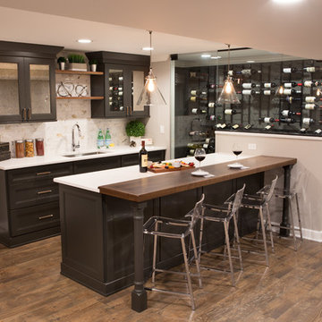
An extremely unique wow-factor in this basement is the walk in glass wine cellar that elegantly displays Karen and Chad’s extensive wine collection. Immediate access to the stunning wet bar accompanies the wine cellar to make this basement a popular spot for friends and family.
The custom-built wine bar brings together two natural elements; Calacatta Vicenza Quartz and thick distressed Black Walnut. Sophisticated yet warm Graphite Dura Supreme cabinetry provides contrast to the soft beige walls and the Calacatta Gold backsplash. An undermount sink across from the bar in a matching Calacatta Vicenza Quartz countertop adds functionality and convenience to the bar, while identical distressed walnut floating shelves add an interesting design element and increased storage. Rich true brown Rustic Oak hardwood floors soften and warm the space drawing all the areas together.
Across from the bar is a comfortable living area perfect for the family to sit down at a watch a movie. A full bath completes this finished basement with a spacious walk-in shower, Cocoa Brown Dura Supreme vanity with Calacatta Vicenza Quartz countertop, a crisp white sink and a stainless-steel Voss faucet.
Advance Design’s Common Sense process gives clients the opportunity to walk through the basement renovation process one step at a time, in a completely predictable and controlled environment. “Everything was designed and built exactly how we envisioned it, and we are really enjoying it to it’s full potential,” Karen said.
Constantly striving for customer satisfaction, Advance Design’s success is heavily reliant upon happy clients referring their friends and family. “We definitely will and have recommended Advance Design Studio to friends who are looking to embark on a remodeling project small or large,” Karen exclaimed at the completion of her project.
 Charleston Home + Design Mag
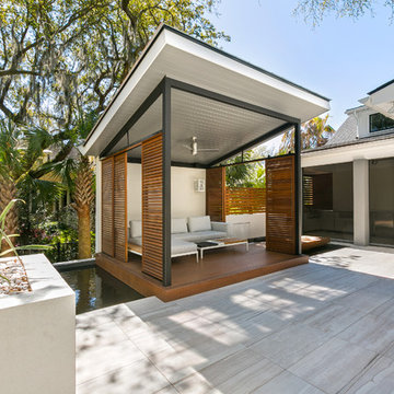
Inspiration for a tropical backyard tile patio remodel in Charleston with a gazebo
 Drewett Works
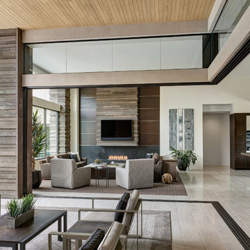
This photo: An exterior living room encourages outdoor living, a key feature of the house. Perpendicular glass doors disappear into columns of stacked Cantera Negra stone builder Rich Brock found at Stone Source. When the doors retract, the space joins the interior's great room, and much of the house is opened to the elements. The quartet of chairs and the coffee table are from All American Outdoor Living.
Positioned near the base of iconic Camelback Mountain, “Outside In” is a modernist home celebrating the love of outdoor living Arizonans crave. The design inspiration was honoring early territorial architecture while applying modernist design principles.
Dressed with undulating negra cantera stone, the massing elements of “Outside In” bring an artistic stature to the project’s design hierarchy. This home boasts a first (never seen before feature) — a re-entrant pocketing door which unveils virtually the entire home’s living space to the exterior pool and view terrace.
A timeless chocolate and white palette makes this home both elegant and refined. Oriented south, the spectacular interior natural light illuminates what promises to become another timeless piece of architecture for the Paradise Valley landscape.
Project Details | Outside In
Architect: CP Drewett, AIA, NCARB, Drewett Works
Builder: Bedbrock Developers
Interior Designer: Ownby Design
Photographer: Werner Segarra
Publications:
Luxe Interiors & Design, Jan/Feb 2018, "Outside In: Optimized for Entertaining, a Paradise Valley Home Connects with its Desert Surrounds"
Awards:
Gold Nugget Awards - 2018
Award of Merit – Best Indoor/Outdoor Lifestyle for a Home – Custom
The Nationals - 2017
Silver Award -- Best Architectural Design of a One of a Kind Home - Custom or Spec
http://www.drewettworks.com/outside-in/
 Advance Design Studio, Ltd.
Karen and Chad of Tower Lakes, IL were tired of their unfinished basement functioning as nothing more than a storage area and depressing gym. They wanted to increase the livable square footage of their home with a cohesive finished basement design, while incorporating space for the kids and adults to hang out.
“We wanted to make sure that upon renovating the basement, that we can have a place where we can spend time and watch movies, but also entertain and showcase the wine collection that we have,” Karen said.
After a long search comparing many different remodeling companies, Karen and Chad found Advance Design Studio. They were drawn towards the unique “Common Sense Remodeling” process that simplifies the renovation experience into predictable steps focused on customer satisfaction.
“There are so many other design/build companies, who may not have transparency, or a focused process in mind and I think that is what separated Advance Design Studio from the rest,” Karen said.
Karen loved how designer Claudia Pop was able to take very high-level concepts, “non-negotiable items” and implement them in the initial 3D drawings. Claudia and Project Manager DJ Yurik kept the couple in constant communication through the project. “Claudia was very receptive to the ideas we had, but she was also very good at infusing her own points and thoughts, she was very responsive, and we had an open line of communication,” Karen said.
A very important part of the basement renovation for the couple was the home gym and sauna. The “high-end hotel” look and feel of the openly blended work out area is both highly functional and beautiful to look at. The home sauna gives them a place to relax after a long day of work or a tough workout. “The gym was a very important feature for us,” Karen said. “And I think (Advance Design) did a very great job in not only making the gym a functional area, but also an aesthetic point in our basement”.
An extremely unique wow-factor in this basement is the walk in glass wine cellar that elegantly displays Karen and Chad’s extensive wine collection. Immediate access to the stunning wet bar accompanies the wine cellar to make this basement a popular spot for friends and family.
The custom-built wine bar brings together two natural elements; Calacatta Vicenza Quartz and thick distressed Black Walnut. Sophisticated yet warm Graphite Dura Supreme cabinetry provides contrast to the soft beige walls and the Calacatta Gold backsplash. An undermount sink across from the bar in a matching Calacatta Vicenza Quartz countertop adds functionality and convenience to the bar, while identical distressed walnut floating shelves add an interesting design element and increased storage. Rich true brown Rustic Oak hardwood floors soften and warm the space drawing all the areas together.
Across from the bar is a comfortable living area perfect for the family to sit down at a watch a movie. A full bath completes this finished basement with a spacious walk-in shower, Cocoa Brown Dura Supreme vanity with Calacatta Vicenza Quartz countertop, a crisp white sink and a stainless-steel Voss faucet.
Advance Design’s Common Sense process gives clients the opportunity to walk through the basement renovation process one step at a time, in a completely predictable and controlled environment. “Everything was designed and built exactly how we envisioned it, and we are really enjoying it to it’s full potential,” Karen said.
Constantly striving for customer satisfaction, Advance Design’s success is heavily reliant upon happy clients referring their friends and family. “We definitely will and have recommended Advance Design Studio to friends who are looking to embark on a remodeling project small or large,” Karen exclaimed at the completion of her project.

 Pine Street Carpenters & The Kitchen Studio
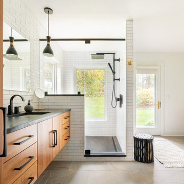
Trendy master white tile and subway tile double-sink bathroom photo in Philadelphia with flat-panel cabinets, white walls, soapstone countertops, black countertops and a floating vanity
Sponsored
Sunbury, OH
J.Holderby - Renovations
Franklin County's Leading General Contractors - 2X Best of Houzz!
 Eldorado Stone
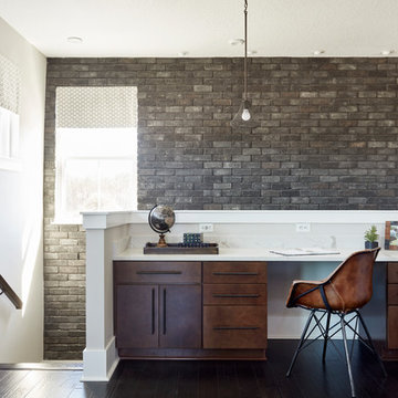
Stone: TundraBrick - Ironside
TundraBrick is a classically-shaped profile with all the surface character you could want. Slightly squared edges are chiseled and worn as if they’d braved the elements for decades. TundraBrick is roughly 2.5″ high and 7.875″ long.
Get a Sample of TundraBriclk: https://shop.eldoradostone.com/products/tundrabrick-sample
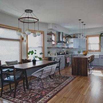
Example of a mid-sized transitional light wood floor kitchen/dining room combo design in Portland with gray walls and no fireplace
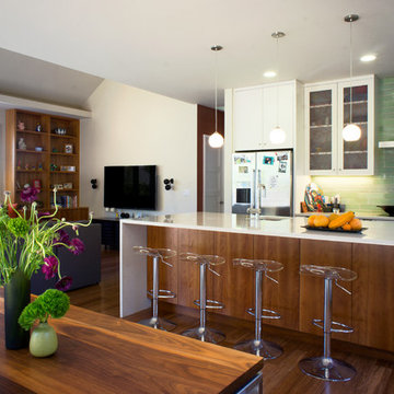
 Hoi Ning Wong
Photo: Hoi Ning Wong © 2014 Houzz
Architect: square three design studios
Interior designer: GoGo Creations
Builder: Clarum Homes
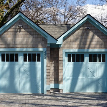
Trendy kitchen photo in San Francisco
Trendy kitchen photo in San Francisco


Sponsored
Columbus, OH

Wannemacher Interiors
Customized Award-Winning Interior Design Solutions in Franklin Cnty OH
 Jordan Design Build Group
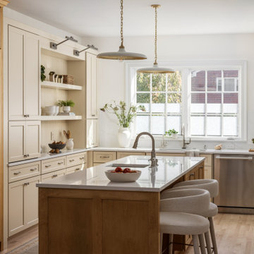
Our clients wanted their renovation to blend classic design features with modern elements to reflect their elegant, yet comfortable style. The space that needed the most attention was the kitchen which felt dark, cold, and unwelcoming with its traditional espresso-colored cabinets and stainless steel countertops. A two-level peninsula interrupted flow and connectivity with the adjacent spaces. To have the biggest impact and accommodate the kitchen’s expansion and redesign, we relocated a hallway to an exterior wall allowing natural light to flood in.
With Craftsman details throughout the rest of the home, our Our clients wanted a double-sided island (with seating) in their redesigned kitchen, something their old one lacked. To maintain good circulation, we designed a shallow ‘hutch’ and recessed the paneled refrigerator/freezer, so they are perfectly aligned. The creamy tone of the painted cabinets complements the champagne-stained maple, adding softness and warmth to the space. We incorporated traditional details such as a beadboard backsplash, library sconces, and a Venetian plaster hood, but balanced these with more modern features such as a continuous quartz backsplash, updated hardware, fixtures and lighting. Blending old and new creates a space with a sense of history and character – it feels fresh, modern, and comfortable.
The kitchen is a chef’s dream with a suite of professional appliances including a 48” double gas range and separate 24” refrigerator and freezer columns, paneled to integrate seamlessly. Two sinks allow for separate prep and cleaning zones. Open shelves and glass-front cabinets are the perfect way to showcase treasured items and favorite dishware, while hidden accessories keep the cook and kitchen well-organized. Replacing the old peninsula with an island created better flow and connectivity with the adjacent rooms. The kitchen is now brighter, cozier, and more inviting.
An informal dining area connects the new kitchen to the living room and a nearby butler’s pantry got a top-to-bottom makeover. We paired moody blue-green cabinets with a stunning Nero Marquina marble countertop and black sink. Brushed brass was used throughout, from the bar faucet to the hardware and mosaic tile accent. A distinctive drink rail gives a nod to the past while the saturated color on the walls, ceiling and trim feels simultaneously contemporary and timeless.
 About Space Studios
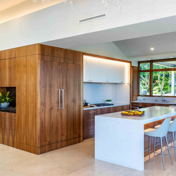
Example of L-Shaped kitchen with marble waterfall island and custom woodwork and cabinetry.
Inspiration for a contemporary kitchen remodel in Los Angeles
Inspiration for a contemporary kitchen remodel in Los Angeles

26