
Search results for "Element separate" in Home Design Ideas
 Medallion Cabinetry
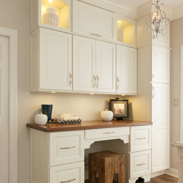
"The homeowners wanted a kitchen that reflected their personalities and cooking styles. Sophisticated but still elegant." designer Rodney Lee of York, PA.
After designing a successful home office space remodel, our same client came back to us to discuss plans and possibilities for their kitchen renovation. After a few discussions with the client, we decided the overall design concept for their kitchen would be “Sophisticated Elegance.” The homeowners wanted a kitchen that reflected their personalities and their cooking styles. Sophisticated but still elegant. The space had to be extremely functional and the color scheme had to have a certain warmth that matched the rest of their home.
The Medallion line has a wide range of architectural elements that helped us achieve that “Sophisticated Elegance”; curved/arched range hood, openings, valances, and corbels and trim. The “Sophistication” lies purely in the detail, the fixtures, the angles in the peninsula, and the changes in height and depth.
We wanted the color scheme to be as warm as possible as it would be in a bright, elegant space. We considered two colors and ended up choosing Divinity over the White Icing. The grey tones in the marble backsplash tile kept the colors modern but warm. We used natural stone versus the more aggregated quartz to maintain the use of natural product and unpredictable patterns and natural elements. We also used a dark rich stain on walnut wood as a good break from all the bright painted finishes. Oak and walnut reflect the “heart” of Pennsylvania and was a great way to maintain the use of natural elements.
The kitchen was divided into individual areas, each one focused on a particular need and/or function. My biggest challenge was transitioning the peninsula into the wet bar/hutch area while maintaining proper separation from the kitchen cabinetry and still tying it into the rest of the space.
A wealth of storage solutions.
•Desk Area. The client wanted a functional work area so we created a furniture look with ogee edging in the walnut, provincial toe space detail in solid walnut, and open display storage at top. The desk has plenty of storage.
•Main Kitchen. We were able to open up this space by creating smart transitions and separations using custom Medallion products that cater to the clients’ lifestyle. Each piece is functional while staying true to the sophisticated elegance design throughout the home.
◦Main Cabinetry: Medallion Gold Wellington Maple Divinity Classic Paint
◦48" uppers around range area; glass eclipse mullion-arched hood design
◦Mixer lift base left of range; drawer warmer with custom panel
•The main work station, or power spot, can hold up to five work stations comfortably. The cook can work within the confines of the peninsula design and access everything needed to prepare complete meals in 1-2 steps. Every cabinet has deluxe roll-out trays and/or drawers, making this kitchen fully accessible. The client wanted to be able to display and stage different pieces and concepts during holidays and gatherings. We chose to go with the more modern Mission arch above the wall oven and fridge, which complimented many of the hard angles and distinct lines used in the kitchen space.
My favorite part of this kitchen remodel came about just by listening to our client talk about how much they adored their daughter’s artwork. After numerous conversations, we landed on installing an artwork wall that was designed as a conversation piece and provides the ability to install different works of art.
 Décor Aid
When Charlene’s family of four decided to move out of Manhattan, she reached out to Decor Aid, for assistance in furnishing and decorating the family’s new home in Westchester. Although she had already decorated a few upstairs rooms, Charlene needed help in sourcing and decorating the entire bottom floor of her house, and wanted the new home to feel reflective of her young family.
The original goal for the project was to infuse three separate design influences. First and foremost, we had to account for Charlene’s personal taste, which is a contemporary take on the mid-century modernist aesthetic. Second, we had to account for the house’s country-modern stylings. And finally, at the request of Charlene’s two young children, we had to incorporate primary colors, to fit the family’s fun and comfortable vibe.
Charlene wanted to furnish her home with a blue and grey color scheme, but didn’t want her new space to be stifled by this preference. To keep the home from feeling sterile, we incorporated heavily-textured accessories, fabrics, and rugs. And to contrast the modern with the familial, primary-colored art pieces were set against larger, neutral furnishings. We sourced a custom-made wood dining-room table, and other wood furniture pieces, to bridge the gap between the house’s country-modern vibe and Charlene’s own personal aesthetic.
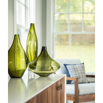
Because of the home’s open floor plan, all of the rooms had to feel continuous, while being differentiated from each-other. So we added large area rugs, in the dining room, living room, and foyer, to distinguish each room. A large sectional sofa faces away from the kitchen, and is backed by a custom-made wood console table, to further separate the rooms.
Colorful accent pillows and decorative geometric objects were added throughout the home, to further distinguish each room, and to offset the tasteful, neutral palette. The final effect is a highly elegant and wholly modern interpretation of the American suburban home.
 Patagonia Development, LLC
PROJECT SCOPE & OBJECTIVES
The homeowners are avid admirers of the Versace lifestyle and aesthetic and challenged our team to create a highly personalized primary suite that embodied the drama, sophistication, glamour, and artistic expression associated with the iconic fashion house. The objective was not simply to renovate an aging bathroom, but to completely reimagine the entire primary suite experience—including both the bathroom and adjoining walk-in closet—as a luxury wellness and dressing retreat.
The existing bathroom and closet featured traditional finishes, compartmentalized spaces, builder-grade storage solutions, and a dated design vocabulary that no longer reflected the homeowners’ tastes or lifestyle. The scope of work included a complete demolition and redesign of the primary bathroom and custom walk-in closet, encompassing all finishes, cabinetry, plumbing fixtures, lighting, architectural details, decorative elements, custom storage systems, and specialty millwork.
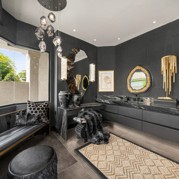
The design intent centered on creating a bold, immersive environment utilizing dramatic monochromatic tones, custom fabricated elements, statement lighting, oversized stone applications, curated artwork, and a sophisticated interplay of texture and materiality. Every component was carefully selected to contribute to a cohesive luxury experience where the bathroom and closet function as a unified extension of one another.
The resulting design transformed a conventional primary suite into a highly customized sanctuary that reflects the owners’ passion for fashion, art, luxury, and contemporary design.
PROJECT CHALLENGES
One of the primary challenges was translating the essence of the Versace brand into a residential environment without creating a literal or themed interpretation. The goal was to capture the emotion, elegance, and drama associated with high fashion while ensuring the spaces remained timeless, refined, and highly functional.
Another significant challenge involved balancing a predominantly dark color palette throughout both the bathroom and dressing room environments. Dark materials can easily feel heavy or oppressive if not carefully executed. Particular attention had to be given to lighting design, material selection, visual layering, and texture to ensure the spaces remained inviting while maintaining their dramatic character.
The walk-in closet presented its own unique design challenge. The owners desired a dressing room that would function as an extension of the luxury bathroom experience rather than a separate utilitarian storage area. The challenge was to transform a standard builder-grade closet into a sophisticated fashion-inspired environment capable of displaying clothing, handbags, accessories, and collectibles in a manner consistent with the overall design vision.
Additionally, the project required the successful integration of numerous statement elements—including oversized stone surfaces, custom lighting installations, decorative mirrors, artwork, architectural wall treatments, bespoke cabinetry, and specialty storage systems—while maintaining visual harmony and preventing the space from feeling overly busy or cluttered.
PROJECT SOLUTIONS
To achieve the desired aesthetic, our team developed a comprehensive design strategy centered around contrast, texture, craftsmanship, and visual drama. A sophisticated palette of charcoal, black, graphite, and metallic gold tones was employed throughout the suite, creating an atmosphere reminiscent of luxury hospitality environments and haute couture fashion houses.
The focal point of the bathroom became the sculptural freestanding soaking tub positioned on a custom stone platform with LED lighting and framed by an oversized feature wall clad in dramatically veined stone. This installation establishes an immediate sense of luxury and serves as the visual anchor of the entire suite.
The walk-in closet was reimagined as a boutique-inspired dressing room featuring custom-designed black oak cabinetry, integrated LED lighting, specialty display shelving, illuminated storage niches, custom accessory organization, and a central dressing vanity. The design intentionally blurs the line between residential closet and luxury retail environment, allowing fashion, accessories, and personal collections to become part of the overall design composition.
To offset the darker finishes throughout both spaces, layered lighting was incorporated using recessed illumination, integrated LED accents, decorative fixtures, display lighting, and reflective surfaces. These elements create depth and dimension while highlighting the richness of the materials and craftsmanship.
Custom fabricated cabinetry, oversized stone surfaces, designer mirrors, curated artwork, architectural wall treatments, and carefully selected decorative elements were utilized throughout the suite to create a fully immersive environment where every detail contributes to a unified design narrative.
The completed project successfully transformed a dated primary suite into an extraordinary luxury retreat that merges the worlds of fashion, hospitality, wellness, and residential design. The result is a highly personalized environment that reflects the homeowners’ lifestyle while demonstrating exceptional craftsmanship, innovative design thinking, and meticulous execution.
Find the right local pro for your project
 River Valley Landscapes
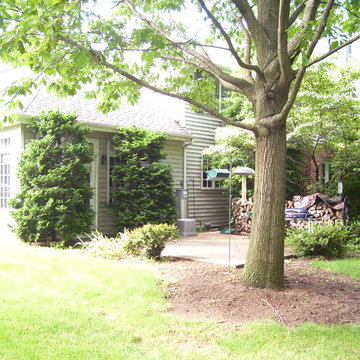
Before - After many years of having no outdoor living space and dealing with overgrown plants and trees the owner’s decided it was time to revitalize their backyard. They knew they wanted a large sitting area with a wood burning fireplace, room for outdoor dining and a place for the grill. A connecting walk would be needed to get guests from the driveway to the outdoor space. Last but not least, the owners wanted the ability to and a reason for stepping out of their unusable patio doors.
The designers decided from the start the fireplace would be the prominent feature and focal point for the entire project. A large fireplace accented with sitting walls and arbors was positioned to anchor the corner of the patio. Stone was chosen to set the fireplace apart as its own element. Brick was used for the sitting walls and brick accents were added to the fireplace to tie into the house. An inlaid herringbone brick detail was incorporated above the stone mantle to simulate artwork which is typically found above indoor fireplaces. Flagstone was used for the wall caps and hearth to match the patio and thicker flagstone tread stock was used for the mantle and top. The arbors were added to visually balance the pergolas at the opposite side of the patio.
For the patio the designers created a series of offset spaces to help subtly divide the space into two areas, sitting and dining. Two large existing trees also help dictate the shape of the patio. Cut flagstone was chosen for the surface bordered by a double soldier edge of brick. The brick edging also surrounds a decorative gravel area topped with an urn fountain which provides a secondary focal point and the sound of water. Large flagstone treads were used for the steps leading to the previously unused patio doors. Opposite the fireplace a short walk leads to a square transition area with a statue chosen by the owner. The statue provides a strong focal point when entering from the driveway. A longer walk leads from this space along the house to the driveway.
The pergolas and arbors were designed by the landscape designer as part of this project but were ultimately contracted separately by the owner. The larger square pergola was intended as an area for a bench or two separate from the main patio. The longer pergola was added later in the design phase to help provide shade to the interior of the house. The arbors at the fireplace were added to balance out the wood elements at the opposite side while adding additional architectural interest to the fireplace.
While this project was predominantly hardscaping, planting and lighting were also incorporated into the design. Several large existing trees were retained and serious of smaller understory trees were added to help enclose the space. The designer’s took advantage of the large trees to place down lights on the branches to achieve a moonlight effect at night. Additional lighting was used on the pergola, to accent focal points, to up light the smaller trees and around the patio. Massed planting of Japanese forest grass provides bold foliage color for the shady garden. A mulch path leads off behind the fireplace to another garden and a secluded area ideal for a bench or small table and chairs. Additional plantings were added along the rear property line to screen and unsightly fence.
This project has obviously completely changed the way the owners use their backyard. They now have a seamless transition from indoors to outdoors with the use of the patio doors. The large patio allows for entertaining small gatherings outdoors for the first time. The fireplace has definitely become the primary gathering place for family and friends.
 Skill Construction & Design, LLC
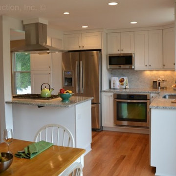
There are so many design elements to this kitchen, I almost don’t know where to start. Bright and airy with crisp clean white cabinets, the kitchen is open and welcoming. Still crisp but gently contrasting, the stainless steel appliance add depth amid the white. To keep this kitchen warm, natural oak covers the floors and a toasted wheat color washes the walls. And then there is the architectural elements. You know. That post and beam in the middle of the room. It’s the center of attention.
When you walk into a room your eyes roam around, establishing the size and shape of the room as your feet take you forward. From the front door of this home straight ahead you encountered this wall. The dining area to the right gives you a glimpse of things to come. Where there is a dining room you will usually find a kitchen.
The architecture of years gone by consistently hides the kitchen, the heart of the home, behind walls. I sympathize with my Mom, and all the other Moms, who have had to spend so much time tucked into a tight kitchen, away from the family. This wall had to go, but it was structural. We needed its support but not its bulk.
So we got rid of the bulk and only the bulk. Instead of a wall we have a post and beam, offering all of the structure we need. We could have installed a huge steel beam and reconfigure the joists to upset the beam, but why? The small beam and post add an incredible architectural element. It’s turning lemons into lemon, we simply made the most of what we had. It may be functional but it’s so fantastic. It looks like we created the effect just for the drama.
The original kitchen may have had a working triangle and some counter space, but it was fairly small, with each area only a step or two away. The dark cabinets made the space feel even smaller and the butcher block patterned laminate counter tops were very dated. The appliances were feeling their age as well, from a coil burner electric stove to a top freezer refrigerator. To keep this kitchen within its space, a half wall separated it from the dining area.
With the wall gone we borrowed some space from the living room and extended what was a U shaped kitchen into an L. At the living room window we start our new kitchen. We kept a small part of the wall to support the other end of our decorative beam. Sandwiched between a large pantry and our new French door refrigerator, the wall disappears. With our new open floor plan a sizable island was in order.
We split our cooking areas and installed a continuous grill gas cooktop into the island. A sleek island hood takes care of exhaust and adds an extra element to our architectural feature. Under the cooktop we added over-sized drawers for pots and pan storage. The frameless cabinets from New River Cabinetry are maple, painted white, with the Herndon door style. With the cooktop safely nestled into our island, we still had to add an oven.
We used the space where the old range sat for a large single oven of stainless steel and glass. If it worked for one, why not two? We created a home for a microwave in the wall cabinets. It’s perfect for heating leftovers so close to the refrigerator.
An important consideration for hot spots in your kitchen is landing zones. Each of our cooking areas have generous landing zones, one on each side of the cooktop and an entire counter area above or below the ovens, depending on which one you’re using.
We wanted to give the sink area more room so the half wall had to come out. We moved the trash and recycle cans into a cabinet, removed the heavy soffits and kept the sink under the window.
With that little bit of extra space we were able to add a larger cabinet above the dishwasher and slide it all down. This used to be where the carpeting met the vinyl floor, but all of it is gone. Long oak planks eliminate that final divide between the kitchen and the dining area, while adding visual length to the area. White wall cabinets on each side of the window reflect the sunlight for a brighter view.
With all of the darker cabinetry the backsplash walls had been painted white. Even still, there was a darkness in the corners and it wasn’t very exciting. We wanted to add visual interest and reflect the new under-cabinet lighting, eliminating the shadows in this corner.
With 1″x 2″ Arabescato Honed marble mosaics and those under-cabinet lights, we achieved the perfect balance. The marble has subtle swirls in gray and beige on a clean white background, but with the honed finish the light is softly reflected instead of glaring. For granite, we chose the soft gray tones of Luna Pearl. The speckles of gray and beige are a gentle contrast to the white cabinets and emulate the color of the stainless steel.
Between the carpet, red half wall, dark railing and dated light fixture, the dining area felt tired. Since the kitchen lacked sufficient storage, a large utility cabinet crowded the table space without adding any decorate elements.
Although it didn’t get any bigger, our dining area feels fresher and more open too. With the oak flooring joining the area to the rest of our space and the toasted wheat on the walls, the white table and chairs compliment the cabinetry while contrasting the warmer colors. We replaced the chandelier with recessed lighting and changed that railing too.
With our new open floor plan, we ended up with a fairly open area in between our foyer closet and the living room window. Not one to miss an opportunity, we filled the space with a multi-functional work space.
With the sunlight streaming in this bright corner works for anything this family needs.
There’s plenty of space for a chair under this large desk drawer. A closed cabinet below, glass doors above and lots of open shelving let you store and or showcase your belongings. We added a lite area at the top to keep away the darker corners.
The transformation is complete. This kitchen and all of its features are truly the center of attention in this home.
http://www.designsbyskill.com/
http://www.rjkconstructioninc.com/
 Skill Construction & Design, LLC
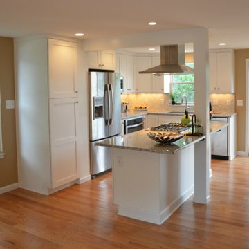
There are so many design elements to this kitchen, I almost don’t know where to start. Bright and airy with crisp clean white cabinets, the kitchen is open and welcoming. Still crisp but gently contrasting, the stainless steel appliance add depth amid the white. To keep this kitchen warm, natural oak covers the floors and a toasted wheat color washes the walls. And then there is the architectural elements. You know. That post and beam in the middle of the room. It’s the center of attention.
When you walk into a room your eyes roam around, establishing the size and shape of the room as your feet take you forward. From the front door of this home straight ahead you encountered this wall. The dining area to the right gives you a glimpse of things to come. Where there is a dining room you will usually find a kitchen.
The architecture of years gone by consistently hides the kitchen, the heart of the home, behind walls. I sympathize with my Mom, and all the other Moms, who have had to spend so much time tucked into a tight kitchen, away from the family. This wall had to go, but it was structural. We needed its support but not its bulk.
So we got rid of the bulk and only the bulk. Instead of a wall we have a post and beam, offering all of the structure we need. We could have installed a huge steel beam and reconfigure the joists to upset the beam, but why? The small beam and post add an incredible architectural element. It’s turning lemons into lemon, we simply made the most of what we had. It may be functional but it’s so fantastic. It looks like we created the effect just for the drama.
The original kitchen may have had a working triangle and some counter space, but it was fairly small, with each area only a step or two away. The dark cabinets made the space feel even smaller and the butcher block patterned laminate counter tops were very dated. The appliances were feeling their age as well, from a coil burner electric stove to a top freezer refrigerator. To keep this kitchen within its space, a half wall separated it from the dining area.
With the wall gone we borrowed some space from the living room and extended what was a U shaped kitchen into an L. At the living room window we start our new kitchen. We kept a small part of the wall to support the other end of our decorative beam. Sandwiched between a large pantry and our new French door refrigerator, the wall disappears. With our new open floor plan a sizable island was in order.
We split our cooking areas and installed a continuous grill gas cooktop into the island. A sleek island hood takes care of exhaust and adds an extra element to our architectural feature. Under the cooktop we added over-sized drawers for pots and pan storage. The frameless cabinets from New River Cabinetry are maple, painted white, with the Herndon door style. With the cooktop safely nestled into our island, we still had to add an oven.
We used the space where the old range sat for a large single oven of stainless steel and glass. If it worked for one, why not two? We created a home for a microwave in the wall cabinets. It’s perfect for heating leftovers so close to the refrigerator.
An important consideration for hot spots in your kitchen is landing zones. Each of our cooking areas have generous landing zones, one on each side of the cooktop and an entire counter area above or below the ovens, depending on which one you’re using.
We wanted to give the sink area more room so the half wall had to come out. We moved the trash and recycle cans into a cabinet, removed the heavy soffits and kept the sink under the window.
With that little bit of extra space we were able to add a larger cabinet above the dishwasher and slide it all down. This used to be where the carpeting met the vinyl floor, but all of it is gone. Long oak planks eliminate that final divide between the kitchen and the dining area, while adding visual length to the area. White wall cabinets on each side of the window reflect the sunlight for a brighter view.
With all of the darker cabinetry the backsplash walls had been painted white. Even still, there was a darkness in the corners and it wasn’t very exciting. We wanted to add visual interest and reflect the new under-cabinet lighting, eliminating the shadows in this corner.
With 1″x 2″ Arabescato Honed marble mosaics and those under-cabinet lights, we achieved the perfect balance. The marble has subtle swirls in gray and beige on a clean white background, but with the honed finish the light is softly reflected instead of glaring. For granite, we chose the soft gray tones of Luna Pearl. The speckles of gray and beige are a gentle contrast to the white cabinets and emulate the color of the stainless steel.
Between the carpet, red half wall, dark railing and dated light fixture, the dining area felt tired. Since the kitchen lacked sufficient storage, a large utility cabinet crowded the table space without adding any decorate elements.
Although it didn’t get any bigger, our dining area feels fresher and more open too. With the oak flooring joining the area to the rest of our space and the toasted wheat on the walls, the white table and chairs compliment the cabinetry while contrasting the warmer colors. We replaced the chandelier with recessed lighting and changed that railing too.
With our new open floor plan, we ended up with a fairly open area in between our foyer closet and the living room window. Not one to miss an opportunity, we filled the space with a multi-functional work space.
With the sunlight streaming in this bright corner works for anything this family needs.
There’s plenty of space for a chair under this large desk drawer. A closed cabinet below, glass doors above and lots of open shelving let you store and or showcase your belongings. We added a lite area at the top to keep away the darker corners.
The transformation is complete. This kitchen and all of its features are truly the center of attention in this home.
http://www.designsbyskill.com/
http://www.rjkconstructioninc.com/
 River Valley Landscapes
Before - After many years of having no outdoor living space and dealing with overgrown plants and trees the owner’s decided it was time to revitalize their backyard. They knew they wanted a large sitting area with a wood burning fireplace, room for outdoor dining and a place for the grill. A connecting walk would be needed to get guests from the driveway to the outdoor space. Last but not least, the owners wanted the ability to and a reason for stepping out of their unusable patio doors.
The designers decided from the start the fireplace would be the prominent feature and focal point for the entire project. A large fireplace accented with sitting walls and arbors was positioned to anchor the corner of the patio. Stone was chosen to set the fireplace apart as its own element. Brick was used for the sitting walls and brick accents were added to the fireplace to tie into the house. An inlaid herringbone brick detail was incorporated above the stone mantle to simulate artwork which is typically found above indoor fireplaces. Flagstone was used for the wall caps and hearth to match the patio and thicker flagstone tread stock was used for the mantle and top. The arbors were added to visually balance the pergolas at the opposite side of the patio.
For the patio the designers created a series of offset spaces to help subtly divide the space into two areas, sitting and dining. Two large existing trees also help dictate the shape of the patio. Cut flagstone was chosen for the surface bordered by a double soldier edge of brick. The brick edging also surrounds a decorative gravel area topped with an urn fountain which provides a secondary focal point and the sound of water. Large flagstone treads were used for the steps leading to the previously unused patio doors. Opposite the fireplace a short walk leads to a square transition area with a statue chosen by the owner. The statue provides a strong focal point when entering from the driveway. A longer walk leads from this space along the house to the driveway.
The pergolas and arbors were designed by the landscape designer as part of this project but were ultimately contracted separately by the owner. The larger square pergola was intended as an area for a bench or two separate from the main patio. The longer pergola was added later in the design phase to help provide shade to the interior of the house. The arbors at the fireplace were added to balance out the wood elements at the opposite side while adding additional architectural interest to the fireplace.
While this project was predominantly hardscaping, planting and lighting were also incorporated into the design. Several large existing trees were retained and serious of smaller understory trees were added to help enclose the space. The designer’s took advantage of the large trees to place down lights on the branches to achieve a moonlight effect at night. Additional lighting was used on the pergola, to accent focal points, to up light the smaller trees and around the patio. Massed planting of Japanese forest grass provides bold foliage color for the shady garden. A mulch path leads off behind the fireplace to another garden and a secluded area ideal for a bench or small table and chairs. Additional plantings were added along the rear property line to screen and unsightly fence.
This project has obviously completely changed the way the owners use their backyard. They now have a seamless transition from indoors to outdoors with the use of the patio doors. The large patio allows for entertaining small gatherings outdoors for the first time. The fireplace has definitely become the primary gathering place for family and friends.

Sponsored
Columbus, OH

Structural Remodeling
Franklin County's Heavy Timber Specialists | Best of Houzz 2020!
 Skill Construction & Design, LLC
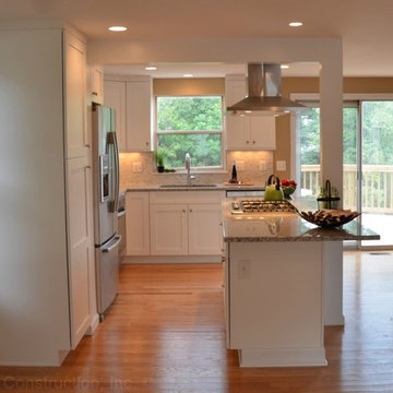
There are so many design elements to this kitchen, I almost don’t know where to start. Bright and airy with crisp clean white cabinets, the kitchen is open and welcoming. Still crisp but gently contrasting, the stainless steel appliance add depth amid the white. To keep this kitchen warm, natural oak covers the floors and a toasted wheat color washes the walls. And then there is the architectural elements. You know. That post and beam in the middle of the room. It’s the center of attention.
When you walk into a room your eyes roam around, establishing the size and shape of the room as your feet take you forward. From the front door of this home straight ahead you encountered this wall. The dining area to the right gives you a glimpse of things to come. Where there is a dining room you will usually find a kitchen.
The architecture of years gone by consistently hides the kitchen, the heart of the home, behind walls. I sympathize with my Mom, and all the other Moms, who have had to spend so much time tucked into a tight kitchen, away from the family. This wall had to go, but it was structural. We needed its support but not its bulk.
So we got rid of the bulk and only the bulk. Instead of a wall we have a post and beam, offering all of the structure we need. We could have installed a huge steel beam and reconfigure the joists to upset the beam, but why? The small beam and post add an incredible architectural element. It’s turning lemons into lemon, we simply made the most of what we had. It may be functional but it’s so fantastic. It looks like we created the effect just for the drama.
The original kitchen may have had a working triangle and some counter space, but it was fairly small, with each area only a step or two away. The dark cabinets made the space feel even smaller and the butcher block patterned laminate counter tops were very dated. The appliances were feeling their age as well, from a coil burner electric stove to a top freezer refrigerator. To keep this kitchen within its space, a half wall separated it from the dining area.
With the wall gone we borrowed some space from the living room and extended what was a U shaped kitchen into an L. At the living room window we start our new kitchen. We kept a small part of the wall to support the other end of our decorative beam. Sandwiched between a large pantry and our new French door refrigerator, the wall disappears. With our new open floor plan a sizable island was in order.
We split our cooking areas and installed a continuous grill gas cooktop into the island. A sleek island hood takes care of exhaust and adds an extra element to our architectural feature. Under the cooktop we added over-sized drawers for pots and pan storage. The frameless cabinets from New River Cabinetry are maple, painted white, with the Herndon door style. With the cooktop safely nestled into our island, we still had to add an oven.
We used the space where the old range sat for a large single oven of stainless steel and glass. If it worked for one, why not two? We created a home for a microwave in the wall cabinets. It’s perfect for heating leftovers so close to the refrigerator.
An important consideration for hot spots in your kitchen is landing zones. Each of our cooking areas have generous landing zones, one on each side of the cooktop and an entire counter area above or below the ovens, depending on which one you’re using.
We wanted to give the sink area more room so the half wall had to come out. We moved the trash and recycle cans into a cabinet, removed the heavy soffits and kept the sink under the window.
With that little bit of extra space we were able to add a larger cabinet above the dishwasher and slide it all down. This used to be where the carpeting met the vinyl floor, but all of it is gone. Long oak planks eliminate that final divide between the kitchen and the dining area, while adding visual length to the area. White wall cabinets on each side of the window reflect the sunlight for a brighter view.
With all of the darker cabinetry the backsplash walls had been painted white. Even still, there was a darkness in the corners and it wasn’t very exciting. We wanted to add visual interest and reflect the new under-cabinet lighting, eliminating the shadows in this corner.
With 1″x 2″ Arabescato Honed marble mosaics and those under-cabinet lights, we achieved the perfect balance. The marble has subtle swirls in gray and beige on a clean white background, but with the honed finish the light is softly reflected instead of glaring. For granite, we chose the soft gray tones of Luna Pearl. The speckles of gray and beige are a gentle contrast to the white cabinets and emulate the color of the stainless steel.
Between the carpet, red half wall, dark railing and dated light fixture, the dining area felt tired. Since the kitchen lacked sufficient storage, a large utility cabinet crowded the table space without adding any decorate elements.
Although it didn’t get any bigger, our dining area feels fresher and more open too. With the oak flooring joining the area to the rest of our space and the toasted wheat on the walls, the white table and chairs compliment the cabinetry while contrasting the warmer colors. We replaced the chandelier with recessed lighting and changed that railing too.
With our new open floor plan, we ended up with a fairly open area in between our foyer closet and the living room window. Not one to miss an opportunity, we filled the space with a multi-functional work space.
With the sunlight streaming in this bright corner works for anything this family needs.
There’s plenty of space for a chair under this large desk drawer. A closed cabinet below, glass doors above and lots of open shelving let you store and or showcase your belongings. We added a lite area at the top to keep away the darker corners.
The transformation is complete. This kitchen and all of its features are truly the center of attention in this home.
http://www.designsbyskill.com/
http://www.rjkconstructioninc.com/
 Medallion Cabinetry
"The homeowners wanted a kitchen that reflected their personalities and cooking styles. Sophisticated but still elegant." designer Rodney Lee of York, PA.
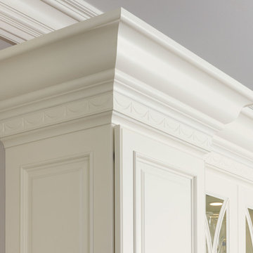
After designing a successful home office space remodel, our same client came back to us to discuss plans and possibilities for their kitchen renovation. After a few discussions with the client, we decided the overall design concept for their kitchen would be “Sophisticated Elegance.” The homeowners wanted a kitchen that reflected their personalities and their cooking styles. Sophisticated but still elegant. The space had to be extremely functional and the color scheme had to have a certain warmth that matched the rest of their home.
The Medallion line has a wide range of architectural elements that helped us achieve that “Sophisticated Elegance”; curved/arched range hood, openings, valances, and corbels and trim. The “Sophistication” lies purely in the detail, the fixtures, the angles in the peninsula, and the changes in height and depth.
We wanted the color scheme to be as warm as possible as it would be in a bright, elegant space. We considered two colors and ended up choosing Divinity over the White Icing. The grey tones in the marble backsplash tile kept the colors modern but warm. We used natural stone versus the more aggregated quartz to maintain the use of natural product and unpredictable patterns and natural elements. We also used a dark rich stain on walnut wood as a good break from all the bright painted finishes. Oak and walnut reflect the “heart” of Pennsylvania and was a great way to maintain the use of natural elements.
The kitchen was divided into individual areas, each one focused on a particular need and/or function. My biggest challenge was transitioning the peninsula into the wet bar/hutch area while maintaining proper separation from the kitchen cabinetry and still tying it into the rest of the space.
A wealth of storage solutions.
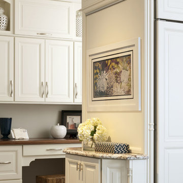
•Desk Area. The client wanted a functional work area so we created a furniture look with ogee edging in the walnut, provincial toe space detail in solid walnut, and open display storage at top. The desk has plenty of storage.
•Main Kitchen. We were able to open up this space by creating smart transitions and separations using custom Medallion products that cater to the clients’ lifestyle. Each piece is functional while staying true to the sophisticated elegance design throughout the home.
◦Main Cabinetry: Medallion Gold Wellington Maple Divinity Classic Paint
◦48" uppers around range area; glass eclipse mullion-arched hood design
◦Mixer lift base left of range; drawer warmer with custom panel
•The main work station, or power spot, can hold up to five work stations comfortably. The cook can work within the confines of the peninsula design and access everything needed to prepare complete meals in 1-2 steps. Every cabinet has deluxe roll-out trays and/or drawers, making this kitchen fully accessible. The client wanted to be able to display and stage different pieces and concepts during holidays and gatherings. We chose to go with the more modern Mission arch above the wall oven and fridge, which complimented many of the hard angles and distinct lines used in the kitchen space.
My favorite part of this kitchen remodel came about just by listening to our client talk about how much they adored their daughter’s artwork. After numerous conversations, we landed on installing an artwork wall that was designed as a conversation piece and provides the ability to install different works of art.
 Skill Construction & Design, LLC
There are so many design elements to this kitchen, I almost don’t know where to start. Bright and airy with crisp clean white cabinets, the kitchen is open and welcoming. Still crisp but gently contrasting, the stainless steel appliance add depth amid the white. To keep this kitchen warm, natural oak covers the floors and a toasted wheat color washes the walls. And then there is the architectural elements. You know. That post and beam in the middle of the room. It’s the center of attention.
When you walk into a room your eyes roam around, establishing the size and shape of the room as your feet take you forward. From the front door of this home straight ahead you encountered this wall. The dining area to the right gives you a glimpse of things to come. Where there is a dining room you will usually find a kitchen.
The architecture of years gone by consistently hides the kitchen, the heart of the home, behind walls. I sympathize with my Mom, and all the other Moms, who have had to spend so much time tucked into a tight kitchen, away from the family. This wall had to go, but it was structural. We needed its support but not its bulk.
So we got rid of the bulk and only the bulk. Instead of a wall we have a post and beam, offering all of the structure we need. We could have installed a huge steel beam and reconfigure the joists to upset the beam, but why? The small beam and post add an incredible architectural element. It’s turning lemons into lemon, we simply made the most of what we had. It may be functional but it’s so fantastic. It looks like we created the effect just for the drama.
The original kitchen may have had a working triangle and some counter space, but it was fairly small, with each area only a step or two away. The dark cabinets made the space feel even smaller and the butcher block patterned laminate counter tops were very dated. The appliances were feeling their age as well, from a coil burner electric stove to a top freezer refrigerator. To keep this kitchen within its space, a half wall separated it from the dining area.
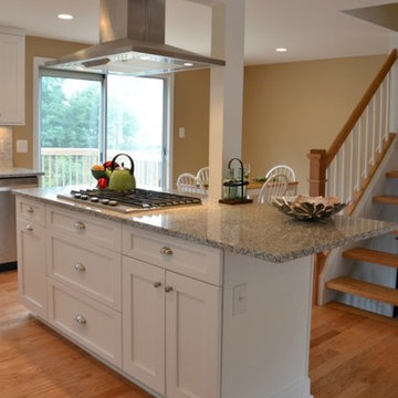
With the wall gone we borrowed some space from the living room and extended what was a U shaped kitchen into an L. At the living room window we start our new kitchen. We kept a small part of the wall to support the other end of our decorative beam. Sandwiched between a large pantry and our new French door refrigerator, the wall disappears. With our new open floor plan a sizable island was in order.
We split our cooking areas and installed a continuous grill gas cooktop into the island. A sleek island hood takes care of exhaust and adds an extra element to our architectural feature. Under the cooktop we added over-sized drawers for pots and pan storage. The frameless cabinets from New River Cabinetry are maple, painted white, with the Herndon door style. With the cooktop safely nestled into our island, we still had to add an oven.
We used the space where the old range sat for a large single oven of stainless steel and glass. If it worked for one, why not two? We created a home for a microwave in the wall cabinets. It’s perfect for heating leftovers so close to the refrigerator.
An important consideration for hot spots in your kitchen is landing zones. Each of our cooking areas have generous landing zones, one on each side of the cooktop and an entire counter area above or below the ovens, depending on which one you’re using.
We wanted to give the sink area more room so the half wall had to come out. We moved the trash and recycle cans into a cabinet, removed the heavy soffits and kept the sink under the window.
With that little bit of extra space we were able to add a larger cabinet above the dishwasher and slide it all down. This used to be where the carpeting met the vinyl floor, but all of it is gone. Long oak planks eliminate that final divide between the kitchen and the dining area, while adding visual length to the area. White wall cabinets on each side of the window reflect the sunlight for a brighter view.
With all of the darker cabinetry the backsplash walls had been painted white. Even still, there was a darkness in the corners and it wasn’t very exciting. We wanted to add visual interest and reflect the new under-cabinet lighting, eliminating the shadows in this corner.
With 1″x 2″ Arabescato Honed marble mosaics and those under-cabinet lights, we achieved the perfect balance. The marble has subtle swirls in gray and beige on a clean white background, but with the honed finish the light is softly reflected instead of glaring. For granite, we chose the soft gray tones of Luna Pearl. The speckles of gray and beige are a gentle contrast to the white cabinets and emulate the color of the stainless steel.
Between the carpet, red half wall, dark railing and dated light fixture, the dining area felt tired. Since the kitchen lacked sufficient storage, a large utility cabinet crowded the table space without adding any decorate elements.
Although it didn’t get any bigger, our dining area feels fresher and more open too. With the oak flooring joining the area to the rest of our space and the toasted wheat on the walls, the white table and chairs compliment the cabinetry while contrasting the warmer colors. We replaced the chandelier with recessed lighting and changed that railing too.
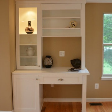
With our new open floor plan, we ended up with a fairly open area in between our foyer closet and the living room window. Not one to miss an opportunity, we filled the space with a multi-functional work space.
With the sunlight streaming in this bright corner works for anything this family needs.
There’s plenty of space for a chair under this large desk drawer. A closed cabinet below, glass doors above and lots of open shelving let you store and or showcase your belongings. We added a lite area at the top to keep away the darker corners.
The transformation is complete. This kitchen and all of its features are truly the center of attention in this home.
http://www.designsbyskill.com/
http://www.rjkconstructioninc.com/
 Medallion Cabinetry
"The homeowners wanted a kitchen that reflected their personalities and cooking styles. Sophisticated but still elegant." designer Rodney Lee of York, PA.
After designing a successful home office space remodel, our same client came back to us to discuss plans and possibilities for their kitchen renovation. After a few discussions with the client, we decided the overall design concept for their kitchen would be “Sophisticated Elegance.” The homeowners wanted a kitchen that reflected their personalities and their cooking styles. Sophisticated but still elegant. The space had to be extremely functional and the color scheme had to have a certain warmth that matched the rest of their home.
The Medallion line has a wide range of architectural elements that helped us achieve that “Sophisticated Elegance”; curved/arched range hood, openings, valances, and corbels and trim. The “Sophistication” lies purely in the detail, the fixtures, the angles in the peninsula, and the changes in height and depth.
We wanted the color scheme to be as warm as possible as it would be in a bright, elegant space. We considered two colors and ended up choosing Divinity over the White Icing. The grey tones in the marble backsplash tile kept the colors modern but warm. We used natural stone versus the more aggregated quartz to maintain the use of natural product and unpredictable patterns and natural elements. We also used a dark rich stain on walnut wood as a good break from all the bright painted finishes. Oak and walnut reflect the “heart” of Pennsylvania and was a great way to maintain the use of natural elements.
The kitchen was divided into individual areas, each one focused on a particular need and/or function. My biggest challenge was transitioning the peninsula into the wet bar/hutch area while maintaining proper separation from the kitchen cabinetry and still tying it into the rest of the space.
A wealth of storage solutions.
•Desk Area. The client wanted a functional work area so we created a furniture look with ogee edging in the walnut, provincial toe space detail in solid walnut, and open display storage at top. The desk has plenty of storage.
•Main Kitchen. We were able to open up this space by creating smart transitions and separations using custom Medallion products that cater to the clients’ lifestyle. Each piece is functional while staying true to the sophisticated elegance design throughout the home.
◦Main Cabinetry: Medallion Gold Wellington Maple Divinity Classic Paint
◦48" uppers around range area; glass eclipse mullion-arched hood design
◦Mixer lift base left of range; drawer warmer with custom panel
•The main work station, or power spot, can hold up to five work stations comfortably. The cook can work within the confines of the peninsula design and access everything needed to prepare complete meals in 1-2 steps. Every cabinet has deluxe roll-out trays and/or drawers, making this kitchen fully accessible. The client wanted to be able to display and stage different pieces and concepts during holidays and gatherings. We chose to go with the more modern Mission arch above the wall oven and fridge, which complimented many of the hard angles and distinct lines used in the kitchen space.
My favorite part of this kitchen remodel came about just by listening to our client talk about how much they adored their daughter’s artwork. After numerous conversations, we landed on installing an artwork wall that was designed as a conversation piece and provides the ability to install different works of art.
 Skill Construction & Design, LLC
There are so many design elements to this kitchen, I almost don’t know where to start. Bright and airy with crisp clean white cabinets, the kitchen is open and welcoming. Still crisp but gently contrasting, the stainless steel appliance add depth amid the white. To keep this kitchen warm, natural oak covers the floors and a toasted wheat color washes the walls. And then there is the architectural elements. You know. That post and beam in the middle of the room. It’s the center of attention.
When you walk into a room your eyes roam around, establishing the size and shape of the room as your feet take you forward. From the front door of this home straight ahead you encountered this wall. The dining area to the right gives you a glimpse of things to come. Where there is a dining room you will usually find a kitchen.
The architecture of years gone by consistently hides the kitchen, the heart of the home, behind walls. I sympathize with my Mom, and all the other Moms, who have had to spend so much time tucked into a tight kitchen, away from the family. This wall had to go, but it was structural. We needed its support but not its bulk.
So we got rid of the bulk and only the bulk. Instead of a wall we have a post and beam, offering all of the structure we need. We could have installed a huge steel beam and reconfigure the joists to upset the beam, but why? The small beam and post add an incredible architectural element. It’s turning lemons into lemon, we simply made the most of what we had. It may be functional but it’s so fantastic. It looks like we created the effect just for the drama.
The original kitchen may have had a working triangle and some counter space, but it was fairly small, with each area only a step or two away. The dark cabinets made the space feel even smaller and the butcher block patterned laminate counter tops were very dated. The appliances were feeling their age as well, from a coil burner electric stove to a top freezer refrigerator. To keep this kitchen within its space, a half wall separated it from the dining area.
With the wall gone we borrowed some space from the living room and extended what was a U shaped kitchen into an L. At the living room window we start our new kitchen. We kept a small part of the wall to support the other end of our decorative beam. Sandwiched between a large pantry and our new French door refrigerator, the wall disappears. With our new open floor plan a sizable island was in order.
We split our cooking areas and installed a continuous grill gas cooktop into the island. A sleek island hood takes care of exhaust and adds an extra element to our architectural feature. Under the cooktop we added over-sized drawers for pots and pan storage. The frameless cabinets from New River Cabinetry are maple, painted white, with the Herndon door style. With the cooktop safely nestled into our island, we still had to add an oven.
We used the space where the old range sat for a large single oven of stainless steel and glass. If it worked for one, why not two? We created a home for a microwave in the wall cabinets. It’s perfect for heating leftovers so close to the refrigerator.
An important consideration for hot spots in your kitchen is landing zones. Each of our cooking areas have generous landing zones, one on each side of the cooktop and an entire counter area above or below the ovens, depending on which one you’re using.
We wanted to give the sink area more room so the half wall had to come out. We moved the trash and recycle cans into a cabinet, removed the heavy soffits and kept the sink under the window.
With that little bit of extra space we were able to add a larger cabinet above the dishwasher and slide it all down. This used to be where the carpeting met the vinyl floor, but all of it is gone. Long oak planks eliminate that final divide between the kitchen and the dining area, while adding visual length to the area. White wall cabinets on each side of the window reflect the sunlight for a brighter view.
With all of the darker cabinetry the backsplash walls had been painted white. Even still, there was a darkness in the corners and it wasn’t very exciting. We wanted to add visual interest and reflect the new under-cabinet lighting, eliminating the shadows in this corner.
With 1″x 2″ Arabescato Honed marble mosaics and those under-cabinet lights, we achieved the perfect balance. The marble has subtle swirls in gray and beige on a clean white background, but with the honed finish the light is softly reflected instead of glaring. For granite, we chose the soft gray tones of Luna Pearl. The speckles of gray and beige are a gentle contrast to the white cabinets and emulate the color of the stainless steel.
Between the carpet, red half wall, dark railing and dated light fixture, the dining area felt tired. Since the kitchen lacked sufficient storage, a large utility cabinet crowded the table space without adding any decorate elements.
Although it didn’t get any bigger, our dining area feels fresher and more open too. With the oak flooring joining the area to the rest of our space and the toasted wheat on the walls, the white table and chairs compliment the cabinetry while contrasting the warmer colors. We replaced the chandelier with recessed lighting and changed that railing too.
With our new open floor plan, we ended up with a fairly open area in between our foyer closet and the living room window. Not one to miss an opportunity, we filled the space with a multi-functional work space.
With the sunlight streaming in this bright corner works for anything this family needs.
There’s plenty of space for a chair under this large desk drawer. A closed cabinet below, glass doors above and lots of open shelving let you store and or showcase your belongings. We added a lite area at the top to keep away the darker corners.
The transformation is complete. This kitchen and all of its features are truly the center of attention in this home.
http://www.designsbyskill.com/
http://www.rjkconstructioninc.com/
 Skill Construction & Design, LLC
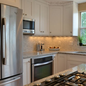
There are so many design elements to this kitchen, I almost don’t know where to start. Bright and airy with crisp clean white cabinets, the kitchen is open and welcoming. Still crisp but gently contrasting, the stainless steel appliance add depth amid the white. To keep this kitchen warm, natural oak covers the floors and a toasted wheat color washes the walls. And then there is the architectural elements. You know. That post and beam in the middle of the room. It’s the center of attention.
When you walk into a room your eyes roam around, establishing the size and shape of the room as your feet take you forward. From the front door of this home straight ahead you encountered this wall. The dining area to the right gives you a glimpse of things to come. Where there is a dining room you will usually find a kitchen.
The architecture of years gone by consistently hides the kitchen, the heart of the home, behind walls. I sympathize with my Mom, and all the other Moms, who have had to spend so much time tucked into a tight kitchen, away from the family. This wall had to go, but it was structural. We needed its support but not its bulk.
So we got rid of the bulk and only the bulk. Instead of a wall we have a post and beam, offering all of the structure we need. We could have installed a huge steel beam and reconfigure the joists to upset the beam, but why? The small beam and post add an incredible architectural element. It’s turning lemons into lemon, we simply made the most of what we had. It may be functional but it’s so fantastic. It looks like we created the effect just for the drama.
The original kitchen may have had a working triangle and some counter space, but it was fairly small, with each area only a step or two away. The dark cabinets made the space feel even smaller and the butcher block patterned laminate counter tops were very dated. The appliances were feeling their age as well, from a coil burner electric stove to a top freezer refrigerator. To keep this kitchen within its space, a half wall separated it from the dining area.
With the wall gone we borrowed some space from the living room and extended what was a U shaped kitchen into an L. At the living room window we start our new kitchen. We kept a small part of the wall to support the other end of our decorative beam. Sandwiched between a large pantry and our new French door refrigerator, the wall disappears. With our new open floor plan a sizable island was in order.
We split our cooking areas and installed a continuous grill gas cooktop into the island. A sleek island hood takes care of exhaust and adds an extra element to our architectural feature. Under the cooktop we added over-sized drawers for pots and pan storage. The frameless cabinets from New River Cabinetry are maple, painted white, with the Herndon door style. With the cooktop safely nestled into our island, we still had to add an oven.
We used the space where the old range sat for a large single oven of stainless steel and glass. If it worked for one, why not two? We created a home for a microwave in the wall cabinets. It’s perfect for heating leftovers so close to the refrigerator.
An important consideration for hot spots in your kitchen is landing zones. Each of our cooking areas have generous landing zones, one on each side of the cooktop and an entire counter area above or below the ovens, depending on which one you’re using.
We wanted to give the sink area more room so the half wall had to come out. We moved the trash and recycle cans into a cabinet, removed the heavy soffits and kept the sink under the window.
With that little bit of extra space we were able to add a larger cabinet above the dishwasher and slide it all down. This used to be where the carpeting met the vinyl floor, but all of it is gone. Long oak planks eliminate that final divide between the kitchen and the dining area, while adding visual length to the area. White wall cabinets on each side of the window reflect the sunlight for a brighter view.
With all of the darker cabinetry the backsplash walls had been painted white. Even still, there was a darkness in the corners and it wasn’t very exciting. We wanted to add visual interest and reflect the new under-cabinet lighting, eliminating the shadows in this corner.
With 1″x 2″ Arabescato Honed marble mosaics and those under-cabinet lights, we achieved the perfect balance. The marble has subtle swirls in gray and beige on a clean white background, but with the honed finish the light is softly reflected instead of glaring. For granite, we chose the soft gray tones of Luna Pearl. The speckles of gray and beige are a gentle contrast to the white cabinets and emulate the color of the stainless steel.
Between the carpet, red half wall, dark railing and dated light fixture, the dining area felt tired. Since the kitchen lacked sufficient storage, a large utility cabinet crowded the table space without adding any decorate elements.
Although it didn’t get any bigger, our dining area feels fresher and more open too. With the oak flooring joining the area to the rest of our space and the toasted wheat on the walls, the white table and chairs compliment the cabinetry while contrasting the warmer colors. We replaced the chandelier with recessed lighting and changed that railing too.
With our new open floor plan, we ended up with a fairly open area in between our foyer closet and the living room window. Not one to miss an opportunity, we filled the space with a multi-functional work space.
With the sunlight streaming in this bright corner works for anything this family needs.
There’s plenty of space for a chair under this large desk drawer. A closed cabinet below, glass doors above and lots of open shelving let you store and or showcase your belongings. We added a lite area at the top to keep away the darker corners.
The transformation is complete. This kitchen and all of its features are truly the center of attention in this home.
http://www.designsbyskill.com/
http://www.rjkconstructioninc.com/

Sponsored
Sunbury, OH

J.Holderby - Renovations
Franklin County's Leading General Contractors - 2X Best of Houzz!
 Skill Construction & Design, LLC
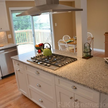
There are so many design elements to this kitchen, I almost don’t know where to start. Bright and airy with crisp clean white cabinets, the kitchen is open and welcoming. Still crisp but gently contrasting, the stainless steel appliance add depth amid the white. To keep this kitchen warm, natural oak covers the floors and a toasted wheat color washes the walls. And then there is the architectural elements. You know. That post and beam in the middle of the room. It’s the center of attention.
When you walk into a room your eyes roam around, establishing the size and shape of the room as your feet take you forward. From the front door of this home straight ahead you encountered this wall. The dining area to the right gives you a glimpse of things to come. Where there is a dining room you will usually find a kitchen.
The architecture of years gone by consistently hides the kitchen, the heart of the home, behind walls. I sympathize with my Mom, and all the other Moms, who have had to spend so much time tucked into a tight kitchen, away from the family. This wall had to go, but it was structural. We needed its support but not its bulk.
So we got rid of the bulk and only the bulk. Instead of a wall we have a post and beam, offering all of the structure we need. We could have installed a huge steel beam and reconfigure the joists to upset the beam, but why? The small beam and post add an incredible architectural element. It’s turning lemons into lemon, we simply made the most of what we had. It may be functional but it’s so fantastic. It looks like we created the effect just for the drama.
The original kitchen may have had a working triangle and some counter space, but it was fairly small, with each area only a step or two away. The dark cabinets made the space feel even smaller and the butcher block patterned laminate counter tops were very dated. The appliances were feeling their age as well, from a coil burner electric stove to a top freezer refrigerator. To keep this kitchen within its space, a half wall separated it from the dining area.
With the wall gone we borrowed some space from the living room and extended what was a U shaped kitchen into an L. At the living room window we start our new kitchen. We kept a small part of the wall to support the other end of our decorative beam. Sandwiched between a large pantry and our new French door refrigerator, the wall disappears. With our new open floor plan a sizable island was in order.
We split our cooking areas and installed a continuous grill gas cooktop into the island. A sleek island hood takes care of exhaust and adds an extra element to our architectural feature. Under the cooktop we added over-sized drawers for pots and pan storage. The frameless cabinets from New River Cabinetry are maple, painted white, with the Herndon door style. With the cooktop safely nestled into our island, we still had to add an oven.
We used the space where the old range sat for a large single oven of stainless steel and glass. If it worked for one, why not two? We created a home for a microwave in the wall cabinets. It’s perfect for heating leftovers so close to the refrigerator.
An important consideration for hot spots in your kitchen is landing zones. Each of our cooking areas have generous landing zones, one on each side of the cooktop and an entire counter area above or below the ovens, depending on which one you’re using.
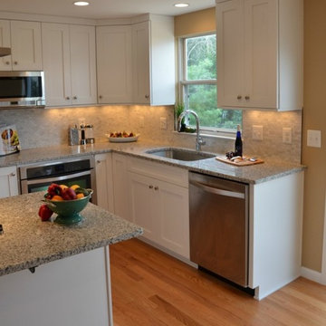
We wanted to give the sink area more room so the half wall had to come out. We moved the trash and recycle cans into a cabinet, removed the heavy soffits and kept the sink under the window.
With that little bit of extra space we were able to add a larger cabinet above the dishwasher and slide it all down. This used to be where the carpeting met the vinyl floor, but all of it is gone. Long oak planks eliminate that final divide between the kitchen and the dining area, while adding visual length to the area. White wall cabinets on each side of the window reflect the sunlight for a brighter view.
With all of the darker cabinetry the backsplash walls had been painted white. Even still, there was a darkness in the corners and it wasn’t very exciting. We wanted to add visual interest and reflect the new under-cabinet lighting, eliminating the shadows in this corner.
With 1″x 2″ Arabescato Honed marble mosaics and those under-cabinet lights, we achieved the perfect balance. The marble has subtle swirls in gray and beige on a clean white background, but with the honed finish the light is softly reflected instead of glaring. For granite, we chose the soft gray tones of Luna Pearl. The speckles of gray and beige are a gentle contrast to the white cabinets and emulate the color of the stainless steel.
Between the carpet, red half wall, dark railing and dated light fixture, the dining area felt tired. Since the kitchen lacked sufficient storage, a large utility cabinet crowded the table space without adding any decorate elements.
Although it didn’t get any bigger, our dining area feels fresher and more open too. With the oak flooring joining the area to the rest of our space and the toasted wheat on the walls, the white table and chairs compliment the cabinetry while contrasting the warmer colors. We replaced the chandelier with recessed lighting and changed that railing too.
With our new open floor plan, we ended up with a fairly open area in between our foyer closet and the living room window. Not one to miss an opportunity, we filled the space with a multi-functional work space.
With the sunlight streaming in this bright corner works for anything this family needs.
There’s plenty of space for a chair under this large desk drawer. A closed cabinet below, glass doors above and lots of open shelving let you store and or showcase your belongings. We added a lite area at the top to keep away the darker corners.
The transformation is complete. This kitchen and all of its features are truly the center of attention in this home.
http://www.designsbyskill.com/
http://www.rjkconstructioninc.com/
 Skill Construction & Design, LLC
There are so many design elements to this kitchen, I almost don’t know where to start. Bright and airy with crisp clean white cabinets, the kitchen is open and welcoming. Still crisp but gently contrasting, the stainless steel appliance add depth amid the white. To keep this kitchen warm, natural oak covers the floors and a toasted wheat color washes the walls. And then there is the architectural elements. You know. That post and beam in the middle of the room. It’s the center of attention.
When you walk into a room your eyes roam around, establishing the size and shape of the room as your feet take you forward. From the front door of this home straight ahead you encountered this wall. The dining area to the right gives you a glimpse of things to come. Where there is a dining room you will usually find a kitchen.
The architecture of years gone by consistently hides the kitchen, the heart of the home, behind walls. I sympathize with my Mom, and all the other Moms, who have had to spend so much time tucked into a tight kitchen, away from the family. This wall had to go, but it was structural. We needed its support but not its bulk.
So we got rid of the bulk and only the bulk. Instead of a wall we have a post and beam, offering all of the structure we need. We could have installed a huge steel beam and reconfigure the joists to upset the beam, but why? The small beam and post add an incredible architectural element. It’s turning lemons into lemon, we simply made the most of what we had. It may be functional but it’s so fantastic. It looks like we created the effect just for the drama.
The original kitchen may have had a working triangle and some counter space, but it was fairly small, with each area only a step or two away. The dark cabinets made the space feel even smaller and the butcher block patterned laminate counter tops were very dated. The appliances were feeling their age as well, from a coil burner electric stove to a top freezer refrigerator. To keep this kitchen within its space, a half wall separated it from the dining area.
With the wall gone we borrowed some space from the living room and extended what was a U shaped kitchen into an L. At the living room window we start our new kitchen. We kept a small part of the wall to support the other end of our decorative beam. Sandwiched between a large pantry and our new French door refrigerator, the wall disappears. With our new open floor plan a sizable island was in order.
We split our cooking areas and installed a continuous grill gas cooktop into the island. A sleek island hood takes care of exhaust and adds an extra element to our architectural feature. Under the cooktop we added over-sized drawers for pots and pan storage. The frameless cabinets from New River Cabinetry are maple, painted white, with the Herndon door style. With the cooktop safely nestled into our island, we still had to add an oven.
We used the space where the old range sat for a large single oven of stainless steel and glass. If it worked for one, why not two? We created a home for a microwave in the wall cabinets. It’s perfect for heating leftovers so close to the refrigerator.
An important consideration for hot spots in your kitchen is landing zones. Each of our cooking areas have generous landing zones, one on each side of the cooktop and an entire counter area above or below the ovens, depending on which one you’re using.
We wanted to give the sink area more room so the half wall had to come out. We moved the trash and recycle cans into a cabinet, removed the heavy soffits and kept the sink under the window.
With that little bit of extra space we were able to add a larger cabinet above the dishwasher and slide it all down. This used to be where the carpeting met the vinyl floor, but all of it is gone. Long oak planks eliminate that final divide between the kitchen and the dining area, while adding visual length to the area. White wall cabinets on each side of the window reflect the sunlight for a brighter view.
With all of the darker cabinetry the backsplash walls had been painted white. Even still, there was a darkness in the corners and it wasn’t very exciting. We wanted to add visual interest and reflect the new under-cabinet lighting, eliminating the shadows in this corner.
With 1″x 2″ Arabescato Honed marble mosaics and those under-cabinet lights, we achieved the perfect balance. The marble has subtle swirls in gray and beige on a clean white background, but with the honed finish the light is softly reflected instead of glaring. For granite, we chose the soft gray tones of Luna Pearl. The speckles of gray and beige are a gentle contrast to the white cabinets and emulate the color of the stainless steel.
Between the carpet, red half wall, dark railing and dated light fixture, the dining area felt tired. Since the kitchen lacked sufficient storage, a large utility cabinet crowded the table space without adding any decorate elements.
Although it didn’t get any bigger, our dining area feels fresher and more open too. With the oak flooring joining the area to the rest of our space and the toasted wheat on the walls, the white table and chairs compliment the cabinetry while contrasting the warmer colors. We replaced the chandelier with recessed lighting and changed that railing too.
With our new open floor plan, we ended up with a fairly open area in between our foyer closet and the living room window. Not one to miss an opportunity, we filled the space with a multi-functional work space.
With the sunlight streaming in this bright corner works for anything this family needs.
There’s plenty of space for a chair under this large desk drawer. A closed cabinet below, glass doors above and lots of open shelving let you store and or showcase your belongings. We added a lite area at the top to keep away the darker corners.
The transformation is complete. This kitchen and all of its features are truly the center of attention in this home.
http://www.designsbyskill.com/
http://www.rjkconstructioninc.com/
 Skill Construction & Design, LLC
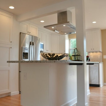
There are so many design elements to this kitchen, I almost don’t know where to start. Bright and airy with crisp clean white cabinets, the kitchen is open and welcoming. Still crisp but gently contrasting, the stainless steel appliance add depth amid the white. To keep this kitchen warm, natural oak covers the floors and a toasted wheat color washes the walls. And then there is the architectural elements. You know. That post and beam in the middle of the room. It’s the center of attention.
When you walk into a room your eyes roam around, establishing the size and shape of the room as your feet take you forward. From the front door of this home straight ahead you encountered this wall. The dining area to the right gives you a glimpse of things to come. Where there is a dining room you will usually find a kitchen.
The architecture of years gone by consistently hides the kitchen, the heart of the home, behind walls. I sympathize with my Mom, and all the other Moms, who have had to spend so much time tucked into a tight kitchen, away from the family. This wall had to go, but it was structural. We needed its support but not its bulk.
So we got rid of the bulk and only the bulk. Instead of a wall we have a post and beam, offering all of the structure we need. We could have installed a huge steel beam and reconfigure the joists to upset the beam, but why? The small beam and post add an incredible architectural element. It’s turning lemons into lemon, we simply made the most of what we had. It may be functional but it’s so fantastic. It looks like we created the effect just for the drama.
The original kitchen may have had a working triangle and some counter space, but it was fairly small, with each area only a step or two away. The dark cabinets made the space feel even smaller and the butcher block patterned laminate counter tops were very dated. The appliances were feeling their age as well, from a coil burner electric stove to a top freezer refrigerator. To keep this kitchen within its space, a half wall separated it from the dining area.
With the wall gone we borrowed some space from the living room and extended what was a U shaped kitchen into an L. At the living room window we start our new kitchen. We kept a small part of the wall to support the other end of our decorative beam. Sandwiched between a large pantry and our new French door refrigerator, the wall disappears. With our new open floor plan a sizable island was in order.
We split our cooking areas and installed a continuous grill gas cooktop into the island. A sleek island hood takes care of exhaust and adds an extra element to our architectural feature. Under the cooktop we added over-sized drawers for pots and pan storage. The frameless cabinets from New River Cabinetry are maple, painted white, with the Herndon door style. With the cooktop safely nestled into our island, we still had to add an oven.
We used the space where the old range sat for a large single oven of stainless steel and glass. If it worked for one, why not two? We created a home for a microwave in the wall cabinets. It’s perfect for heating leftovers so close to the refrigerator.
An important consideration for hot spots in your kitchen is landing zones. Each of our cooking areas have generous landing zones, one on each side of the cooktop and an entire counter area above or below the ovens, depending on which one you’re using.
We wanted to give the sink area more room so the half wall had to come out. We moved the trash and recycle cans into a cabinet, removed the heavy soffits and kept the sink under the window.
With that little bit of extra space we were able to add a larger cabinet above the dishwasher and slide it all down. This used to be where the carpeting met the vinyl floor, but all of it is gone. Long oak planks eliminate that final divide between the kitchen and the dining area, while adding visual length to the area. White wall cabinets on each side of the window reflect the sunlight for a brighter view.
With all of the darker cabinetry the backsplash walls had been painted white. Even still, there was a darkness in the corners and it wasn’t very exciting. We wanted to add visual interest and reflect the new under-cabinet lighting, eliminating the shadows in this corner.
With 1″x 2″ Arabescato Honed marble mosaics and those under-cabinet lights, we achieved the perfect balance. The marble has subtle swirls in gray and beige on a clean white background, but with the honed finish the light is softly reflected instead of glaring. For granite, we chose the soft gray tones of Luna Pearl. The speckles of gray and beige are a gentle contrast to the white cabinets and emulate the color of the stainless steel.
Between the carpet, red half wall, dark railing and dated light fixture, the dining area felt tired. Since the kitchen lacked sufficient storage, a large utility cabinet crowded the table space without adding any decorate elements.
Although it didn’t get any bigger, our dining area feels fresher and more open too. With the oak flooring joining the area to the rest of our space and the toasted wheat on the walls, the white table and chairs compliment the cabinetry while contrasting the warmer colors. We replaced the chandelier with recessed lighting and changed that railing too.
With our new open floor plan, we ended up with a fairly open area in between our foyer closet and the living room window. Not one to miss an opportunity, we filled the space with a multi-functional work space.
With the sunlight streaming in this bright corner works for anything this family needs.
There’s plenty of space for a chair under this large desk drawer. A closed cabinet below, glass doors above and lots of open shelving let you store and or showcase your belongings. We added a lite area at the top to keep away the darker corners.
The transformation is complete. This kitchen and all of its features are truly the center of attention in this home.
http://www.designsbyskill.com/
http://www.rjkconstructioninc.com/
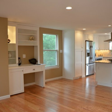 Skill Construction & Design, LLC
There are so many design elements to this kitchen, I almost don’t know where to start. Bright and airy with crisp clean white cabinets, the kitchen is open and welcoming. Still crisp but gently contrasting, the stainless steel appliance add depth amid the white. To keep this kitchen warm, natural oak covers the floors and a toasted wheat color washes the walls. And then there is the architectural elements. You know. That post and beam in the middle of the room. It’s the center of attention.
When you walk into a room your eyes roam around, establishing the size and shape of the room as your feet take you forward. From the front door of this home straight ahead you encountered this wall. The dining area to the right gives you a glimpse of things to come. Where there is a dining room you will usually find a kitchen.
The architecture of years gone by consistently hides the kitchen, the heart of the home, behind walls. I sympathize with my Mom, and all the other Moms, who have had to spend so much time tucked into a tight kitchen, away from the family. This wall had to go, but it was structural. We needed its support but not its bulk.
So we got rid of the bulk and only the bulk. Instead of a wall we have a post and beam, offering all of the structure we need. We could have installed a huge steel beam and reconfigure the joists to upset the beam, but why? The small beam and post add an incredible architectural element. It’s turning lemons into lemon, we simply made the most of what we had. It may be functional but it’s so fantastic. It looks like we created the effect just for the drama.
The original kitchen may have had a working triangle and some counter space, but it was fairly small, with each area only a step or two away. The dark cabinets made the space feel even smaller and the butcher block patterned laminate counter tops were very dated. The appliances were feeling their age as well, from a coil burner electric stove to a top freezer refrigerator. To keep this kitchen within its space, a half wall separated it from the dining area.
With the wall gone we borrowed some space from the living room and extended what was a U shaped kitchen into an L. At the living room window we start our new kitchen. We kept a small part of the wall to support the other end of our decorative beam. Sandwiched between a large pantry and our new French door refrigerator, the wall disappears. With our new open floor plan a sizable island was in order.
We split our cooking areas and installed a continuous grill gas cooktop into the island. A sleek island hood takes care of exhaust and adds an extra element to our architectural feature. Under the cooktop we added over-sized drawers for pots and pan storage. The frameless cabinets from New River Cabinetry are maple, painted white, with the Herndon door style. With the cooktop safely nestled into our island, we still had to add an oven.
We used the space where the old range sat for a large single oven of stainless steel and glass. If it worked for one, why not two? We created a home for a microwave in the wall cabinets. It’s perfect for heating leftovers so close to the refrigerator.
An important consideration for hot spots in your kitchen is landing zones. Each of our cooking areas have generous landing zones, one on each side of the cooktop and an entire counter area above or below the ovens, depending on which one you’re using.
We wanted to give the sink area more room so the half wall had to come out. We moved the trash and recycle cans into a cabinet, removed the heavy soffits and kept the sink under the window.
With that little bit of extra space we were able to add a larger cabinet above the dishwasher and slide it all down. This used to be where the carpeting met the vinyl floor, but all of it is gone. Long oak planks eliminate that final divide between the kitchen and the dining area, while adding visual length to the area. White wall cabinets on each side of the window reflect the sunlight for a brighter view.
With all of the darker cabinetry the backsplash walls had been painted white. Even still, there was a darkness in the corners and it wasn’t very exciting. We wanted to add visual interest and reflect the new under-cabinet lighting, eliminating the shadows in this corner.
With 1″x 2″ Arabescato Honed marble mosaics and those under-cabinet lights, we achieved the perfect balance. The marble has subtle swirls in gray and beige on a clean white background, but with the honed finish the light is softly reflected instead of glaring. For granite, we chose the soft gray tones of Luna Pearl. The speckles of gray and beige are a gentle contrast to the white cabinets and emulate the color of the stainless steel.
Between the carpet, red half wall, dark railing and dated light fixture, the dining area felt tired. Since the kitchen lacked sufficient storage, a large utility cabinet crowded the table space without adding any decorate elements.
Although it didn’t get any bigger, our dining area feels fresher and more open too. With the oak flooring joining the area to the rest of our space and the toasted wheat on the walls, the white table and chairs compliment the cabinetry while contrasting the warmer colors. We replaced the chandelier with recessed lighting and changed that railing too.
With our new open floor plan, we ended up with a fairly open area in between our foyer closet and the living room window. Not one to miss an opportunity, we filled the space with a multi-functional work space.
With the sunlight streaming in this bright corner works for anything this family needs.
There’s plenty of space for a chair under this large desk drawer. A closed cabinet below, glass doors above and lots of open shelving let you store and or showcase your belongings. We added a lite area at the top to keep away the darker corners.
The transformation is complete. This kitchen and all of its features are truly the center of attention in this home.
http://www.designsbyskill.com/
http://www.rjkconstructioninc.com/

Sponsored
Columbus, OH
Structural Remodeling
Franklin County's Heavy Timber Specialists | Best of Houzz 2020!
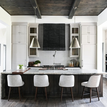
 By Design Interiors Inc
This modern transitional home boasts an elegant kitchen that looks onto a large informal living room and shares space with the dining room and butler's pantry. Senior designer, Ayca, selected design elements that flow throughout the entire space to create a dynamic kitchen. The result is a perfect mix of industrial and organic materials, including a leathered quartzite countertop for the island with an unusual single-sided waterfall edge. The honed soapstone perimeter countertops complement the marble fireplace of the living room. A custom zinc vent hood, burnished brass mesh cabinet fronts, and leather finish slabs contrast against the dark wood floors, ceiling, and upper beams.
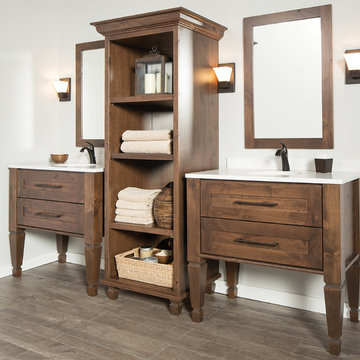
 Kitchens By Design
Plunge in your new bath with darling design elements to create a coordinated bathroom with surprising appeal. Small spaces call for big design details like the ornate turn posts that frame the sink area to create a compelling look for the bath vanity. Select the most inviting and luxurious materials to create a relaxing space that rejuvenates as it soothes and calms. Coordinating bath furniture from Dura Supreme brings all the details together with your choice of beautiful styles and finishes.
A linen cabinet with a mirrored back beautifully displays stacks of towels and bathroom sundries. These furniture vanities showcase Dura Supreme’s “Style Five” furniture series. Style Five is designed with a selection of turned posts for iconic furniture style to meet your personal tastes. The two individual vanities separated by the free standing linen cabinet provide each spouse their own divided space to organize their personal bath supplies, while the linen cabinet provides universal storage for items the couple will both use.
Style Five furniture series offers 10 different configurations (for single sink vanities, double sink vanities, or offset sinks), 15 turn post designs and an optional floor with either plain or slatted detail. A selection of classic post designs offers personalized design choices. Any combination of Dura Supreme’s many door styles, wood species and finishes can be selected to create a one-of-a-kind bath furniture collection.
The bathroom has evolved from its purist utilitarian roots to a more intimate and reflective sanctuary in which to relax and reconnect. A refreshing spa-like environment offers a brisk welcome at the dawning of a new day or a soothing interlude as your day concludes.
Our busy and hectic lifestyles leave us yearning for a private place where we can truly relax and indulge. With amenities that pamper the senses and design elements inspired by luxury spas, bathroom environments are being transformed form the mundane and utilitarian to the extravagant and luxurious.
Bath cabinetry from Dura Supreme offers myriad design directions to create the personal harmony and beauty that are a hallmark of the bath sanctuary. Immerse yourself in our expansive palette of finishes and wood species to discover the look that calms your senses and soothes your soul. Your Dura Supreme designer will guide you through the selections and transform your bath into a beautiful retreat.
Request a FREE Dura Supreme Cabinetry Brochure Packet at:
http://www.durasupreme.com/request-brochure
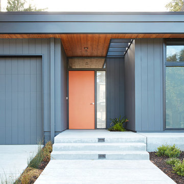
 Klopf Architecture
Klopf Architecture, Arterra Landscape Architects and Henry Calvert of Calvert Ventures Designed and built a new warm, modern, Eichler-inspired, open, indoor-outdoor home on a deeper-than-usual San Mateo Highlands property where an original Eichler house had burned to the ground.
The owners wanted multi-generational living and larger spaces than the original home offered, but all parties agreed that the house should respect the neighborhood and blend in stylistically with the other Eichlers. At first the Klopf team considered re-using what little was left of the original home and expanding on it. But after discussions with the owner and builder, all parties agreed that the last few remaining elements of the house were not practical to re-use, so Klopf Architecture designed a new home that pushes the Eichler approach in new directions.
One disadvantage of Eichler production homes is that the house designs were not optimized for each specific lot. A new custom home offered the team a chance to start over. In this case, a longer house that opens up sideways to the south fit the lot better than the original square-ish house that used to open to the rear (west). Accordingly, the Klopf team designed an L-shaped “bar” house with a large glass wall with large sliding glass doors that faces sideways instead of to the rear like a typical Eichler. This glass wall opens to a pool and landscaped yard designed by Arterra Landscape Architects.
Driving by the house, one might assume at first glance it is an Eichler because of the horizontality, the overhanging flat roof eaves, the dark gray vertical siding, and orange solid panel front door, but the house is designed for the 21st Century and is not meant to be a “Likeler.” You won't see any posts and beams in this home. Instead, the ceiling decking is a western red cedar that covers over all the beams. Like Eichlers, this cedar runs continuously from inside to out, enhancing the indoor / outdoor feeling of the house, but unlike Eichlers it conceals a cavity for lighting, wiring, and insulation. Ceilings are higher, rooms are larger and more open, the master bathroom is light-filled and more generous, with a separate tub and shower and a separate toilet compartment, and there is plenty of storage. The garage even easily fits two of today's vehicles with room to spare.
A massive 49-foot by 12-foot wall of glass and the continuity of materials from inside to outside enhance the inside-outside living concept, so the owners and their guests can flow freely from house to pool deck to BBQ to pool and back.
During construction in the rough framing stage, Klopf thought the front of the house appeared too tall even though the house had looked right in the design renderings (probably because the house is uphill from the street). So Klopf Architecture paid the framer to change the roofline from how we had designed it to be lower along the front, allowing the home to blend in better with the neighborhood. One project goal was for people driving up the street to pass the home without immediately noticing there is an "imposter" on this lot, and making that change was essential to achieve that goal.
This 2,606 square foot, 3 bedroom, 3 bathroom Eichler-inspired new house is located in San Mateo in the heart of the Silicon Valley.
Klopf Architecture Project Team: John Klopf, AIA, Klara Kevane
Landscape Architect: Arterra Landscape Architects
Contractor: Henry Calvert of Calvert Ventures
Photography ©2016 Mariko Reed
Location: San Mateo, CA
Year completed: 2016
28