
Search results for "Excessive" in Home Design Ideas
 Drury Design
THE SETUP
When we first encountered this basement for a family with three boys, we saw a space with untapped potential. Though previously remodeled, it lacked a cohesive design strategy. The expansive area housed various entertainment pieces (a shuffleboard table, air hockey, foosball, etc.) scattered haphazardly throughout the space.
While the basement included a workout room and a rudimentary kitchen area, it lacked a dedicated game room or proper bar. Excessive storage closets along the back wall consumed valuable real estate that could be repurposed for more engaging uses.
In essence, the basement was spacious but disjointed—functional for family use but falling short as an entertainment hub. It didn’t align with the sophistication of the rest of the home. Our clients envisioned a transformation: a fresh, organized space that would not only serve their family’s needs but also shine as an inviting arena for entertaining friends and hosting gatherings – especially sports-focused gatherings!
Design Objectives:
Reimagine the basement layout, creating distinct zones for varied activities.
Expand the workout area to accommodate new equipment, including a Smith machine.
Implement a multi-screen setup inspired by high-end sports bars, allowing guests to follow multiple games while socializing.
Enhance existing features while developing new areas:
Optimize a workout space for all equipment needs
Establish a dedicated children’s space with guest room capabilities
Create an integrated bar and entertainment area
Retain and incorporate the existing projector setup
Design Challenges:
Navigate layout constraints in the new workout room due to fixed utility areas.
Carve out a distinct space for kids within the open plan.
Revitalize an underutilized section of the basement.
Elevate the existing big screen area with purposeful design elements.
Develop a full-fledged bar area while maintaining kitchen functions applicable for hangout snacking.
Work around immovable structural elements (soffits, load-bearing support columns)
THE RENEWED SPACE
Design Solutions:
Install a stylish barn door for the utility area of the new workout space, improving aesthetics and accessibility.
Repurpose the former workout room into a dedicated game room for kids, utilizing couches with pull-out beds so the area can double as overflow guest accommodations.
Transform the unused area into a vibrant pub-style area for card and table games.
Enhance the big screen area with elegant wainscoting and ambient theatre-style lighting.
Design a multi-functional wet bar area featuring varied seating, prep areas, and a microwave.
Base the bar sink area width off the soffit above it.
In the big screen area, use the soffit to inform the width of a wainscoting section.
For the immovable support columns, dress one up to match the wainscoting of the nearby big screen wall. Hide the other one in a new wall.
Final Thoughts:
The reimagined basement has exceeded our clients’ expectations, evolving into the ultimate entertainment hub. With seven strategically placed screens, it’s perfect for gatherings focused on major sporting events and casual gatherings, as well. The space strikes a balance between adult sophistication and family-friendly functionality, featuring distinct zones for various activities.
The new design not only maximizes functionality for modern, multi-screen entertainment but also elevates the aesthetic appeal. It integrates flawlessly with the rest of the home’s transitional style while allowing each basement section to maintain its unique character. The result is a versatile space that caters to both intimate family time and large-scale entertaining.
 SALA Architects
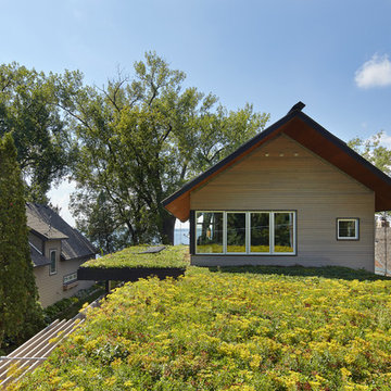
The homeowners sought to create a modest, modern, lakeside cottage, nestled into a narrow lot in Tonka Bay. The site inspired a modified shotgun-style floor plan, with rooms laid out in succession from front to back. Simple and authentic materials provide a soft and inviting palette for this modern home. Wood finishes in both warm and soft grey tones complement a combination of clean white walls, blue glass tiles, steel frames, and concrete surfaces. Sustainable strategies were incorporated to provide healthy living and a net-positive-energy-use home. Onsite geothermal, solar panels, battery storage, insulation systems, and triple-pane windows combine to provide independence from frequent power outages and supply excess power to the electrical grid.
Photos by Corey Gaffer
 N C R
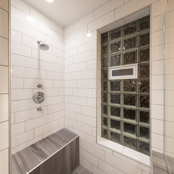
N C RA large master bathroom remodeled to fit our clients' needs. For this renovation, we replaced the large jacuzzi tub with a second vanity, exchanged the floor-to-ceiling shower doors with lower Starfire glass (which also prevents excess steam), a new shower bench and niche, as well as a new entryway to the walk-in closet.
This new and improved master bath was then adorned with large dark grey floor tiles, dark grey painted walls and vanities, rich blonde maple doors, and artisanal pendant lights with sleek Edison bulbs.
Designed by Chi Renovation & Design who serve Chicago and it's surrounding suburbs, with an emphasis on the North Side and North Shore. You'll find their work from the Loop through Lincoln Park, Skokie, Wilmette, and all of the way up to Lake Forest.
Find the right local pro for your project
 MARGARITA BRAVO
Our clients wanted a modern mountain getaway that would combine their gorgeous mountain surroundings with contemporary finishes. To highlight the stunning cathedral ceilings, we decided to take the natural stone on the fireplace from floor to ceiling. The dark wood mantle adds a break for the eye, and ties in the views of surrounding trees. Our clients wanted a complete facelift for their kitchen, and this started with removing the excess of dark wood on the ceiling, walls, and cabinets. Opening a larger picture window helps in bringing the outdoors in, and contrasting white and black cabinets create a fresh and modern feel.
---
Project designed by Miami interior designer Margarita Bravo. She serves Miami as well as surrounding areas such as Coconut Grove, Key Biscayne, Miami Beach, North Miami Beach, and Hallandale Beach.
For more about MARGARITA BRAVO, click here: https://www.margaritabravo.com/
To learn more about this project, click here: https://www.margaritabravo.com/portfolio/colorado-nature-inspired-getaway/
 TVL Creative Ltd.
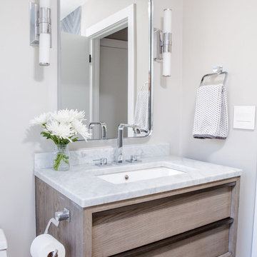
These wonderful clients returned to us for their newest home remodel adventure. Their newly purchased custom built 1970s modern ranch sits in one of the loveliest neighborhoods south of the city but the current conditions of the home were out-dated and not so lovely. Upon entering the front door through the court you were greeted abruptly by a very boring staircase and an excessive number of doors. Just to the left of the double door entry was a large slider and on your right once inside the home was a soldier line up of doors. This made for an uneasy and uninviting entry that guests would quickly forget and our clients would often avoid. We also had our hands full in the kitchen. The existing space included many elements that felt out of place in a modern ranch including a rustic mountain scene backsplash, cherry cabinets with raised panel and detailed profile, and an island so massive you couldn’t pass a drink across the stone. Our design sought to address the functional pain points of the home and transform the overall aesthetic into something that felt like home for our clients.
For the entry, we re-worked the front door configuration by switching from the double door to a large single door with side lights. The sliding door next to the main entry door was replaced with a large window to eliminate entry door confusion. In our re-work of the entry staircase, guesta are now greeted into the foyer which features the Coral Pendant by David Trubridge. Guests are drawn into the home by stunning views of the front range via the large floor-to-ceiling glass wall in the living room. To the left, the staircases leading down to the basement and up to the master bedroom received a massive aesthetic upgrade. The rebuilt 2nd-floor staircase has a center spine with wood rise and run appearing to float upwards towards the master suite. A slatted wall of wood separates the two staircases which brings more light into the basement stairwell. Black metal railings add a stunning contrast to the light wood.
Other fabulous upgrades to this home included new wide plank flooring throughout the home, which offers both modernity and warmth. The once too-large kitchen island was downsized to create a functional focal point that is still accessible and intimate. The old dark and heavy kitchen cabinetry was replaced with sleek white cabinets, brightening up the space and elevating the aesthetic of the entire room. The kitchen countertops are marble look quartz with dramatic veining that offers an artistic feature behind the range and across all horizontal surfaces in the kitchen. As a final touch, cascading island pendants were installed which emphasize the gorgeous ceiling vault and provide warm feature lighting over the central point of the kitchen.
This transformation reintroduces light and simplicity to this gorgeous home, and we are so happy that our clients can reap the benefits of this elegant and functional design for years to come.
 Tile Doctor Ltd
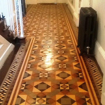
This hallway floor was actually at a house in the town of Stamford which is just over the northern border of Northamptonshire and slightly out of my area; however I was recommended to the owner by another client which is always welcome and a testimonial in itself. I work right across the county so it wasn’t long before I was in the general area and arranged a visit to carry out an inspection of the Victorian Quarry tiled floor and provide a quote for a full restoration.
The owner of the house had just moved in recently and although the floor was in good overall physical, it was in need of a thorough clean and new seal to bring back some life to the tiles. Additionally she was having lots of other building work done to the house and she wanted to retain this as an original feature of the property. My quote was accepted and I was able to book the work in for the following week.
These first photos show how dull the floor looked due to a build-up of builder’s dust and general wear and tear. They also show some of the equipment needed to undertake the following cleaning process.
I used a brush and vacuum to remove as much loose debris and dust from the surface of the floor as possible. I then applied a strong dilution of Tile Doctor Pro Clean to the floor which is a strong alkaline cleaner which can also be used to remove sealers; the solution was left it to dwell for roughly ten minutes before agitating it with scrubbing pads and brushes to remove the muck that was lifted to the surface. This was then wet-vacuumed twice to remove all the slurry and neutralise any chemicals.
As it was such an old property I then used a steamer to heat up the tiles and draw up any contaminants and assist with the drying process. I also chose to install two fans and a dehumidifier to dry the floor even further.
With the cleaning process complete – and achieving a marked difference to the appearance of the floor – I left the tiles to finish drying for 24 hours.
Upon my return to the house, I checked for any excess moisture by running damp tests as this has the potential to affect the performance of the sealer. Once satisfied with the results, I sealed the floor with two coats of Tile Doctor Colour Grow, a colour enhancing sealant which offers both a robust surface seal and an aesthetically pleasing finish.
I also carried out water repellency tests to ensure the sealer was working as expected and the floor had sufficient protection and will be hard-wearing for a hallway which is a high traffic area.
On my client’s return to the house she was very happy with the final results – in fact, she was also in contact about some further work in the New Year!
Phil Vissian
Northamptonshire Tile Doctor
 Revival House
This kitchen remodel of a 70’s home reflects the character of the existing home and some design features of that era while giving it a fresh, modern look. The client wanted the remodeled space to blend in with the rest of the home, retaining some of the 1970’s character while including all the best features of today’s kitchens.
Removing the wall separating the informal eating area from the family room provided a nice open space allowing for a larger kitchen footprint and plenty of light throughout.
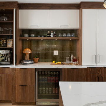
A combination of Decor's Dove Wing painted and Natural stained Walnut cabinetry was chosen. The dark walnut, slab lower cabinets unite the kitchen with the darker wood theme found throughout the home, while the white, slim-shaker upper cabinets give the space a light and airy feeling. The beautiful vertical grain of the walnut is the foundation of a theme that is echoed throughout the space: tall & thin vertical lines without bulk or needless ornamentation. The unique design detail gives the kitchen a great balance of depth and character while still brightening the space. Walnut crown molding throughout defines the space and ties everything together.
The vertical-set green Japanese tile from Virginia Tile, also characteristic of the 1970’s, serves as the backsplash and fills the range wall. The tall & slim theme is underscored by several design elements from the vertical tile and tall cabinet pulls in matte black from Top Knobs, to the thin quartz countertops, skinny shaker cabinet door style, and tall, slim refrigerator doors, all meant to eliminate excess bulk and lighten up the space.
An impressive focal point in this kitchen is the custom walnut reeded hood, designed to reflect a popular 1970’s feature. Narrow walnut shelves below the white upper cabinets near the refrigerator provide a nice surprise to the eye. An extra long island, decked in polished 2cm Corian Quartz countertop in Novello, provides ample seating, storage, and task space, making it an ideal surface for serving, eating, meal prep, gathering, and entertaining. The client desired a long island with comfortable counter seating at one end for a family of five, including space for a baby’s high chair.
High-end Bosch appliances and functional storage were also priorities. The dry bar on the opposite wall features additional storage and an Elica beverage refrigerator, framed by tall walnut larder cabinets on each end. The white larder cabinet doors pocket into the sides, revealing beautiful finished walnut interiors.
Wall cabinets feature Decor’s integrated under-cabinet lighting, while puck lights illuminate the beverage center counter. This kitchen is bursting with integrated storage. Many deep drawers feature interior double drawers making smaller items more accessible. Decor’s spice drawer to the right of the range keeps spices organized, while divided tray storage on the left of the range keeps these taller items handy.
While the design is inspired by the 1970’s, it exemplifies the best of the 2020’s, and the new space is open, bright, and functional for this family with young children.
 Mom's Design Build
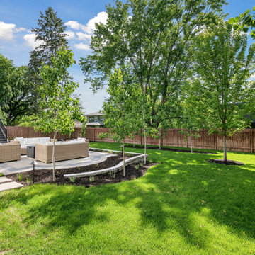
This project transformed a basic builder-grade deck and unlandscaped yard into a beautifully designed outdoor living space. The renovation included elevating the architectural finish of the deck with low-maintenance fascia, trim, and wrapped columns as well as the addition of a pergola for shade and style. A new fireplace was added to create a cozy seating arrangement, adding both privacy and visual interest.
The landscaping was enhanced with a patio and a gas fire pit seating area, perfect for relaxation and gatherings. Additionally, a dining area was incorporated to facilitate hosting and entertaining. To address the yard’s excessive slope, a retaining wall was constructed, leveling the terrain and providing a more functional and aesthetically pleasing outdoor space.
 Mastercraft Design Inc.
Refined Everyday Living
Cabinetry design doesn’t stop at the kitchen.
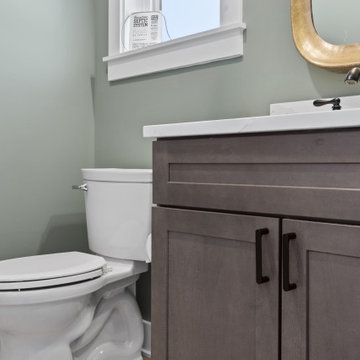
In this Nokesville home, we collaborated with the homeowners to create four thoughtfully designed bathroom vanities — each tailored to its specific space while maintaining a cohesive feel throughout the home.
For the guest bath and two master baths, we selected Mantra Cabinetry in solid wood with the Omni door style, finished in Beachwood stain. The warmth of the stain brings softness and approachability to everyday routines, while the clean-lined door profile keeps the look timeless and uncluttered.
In the Jack and Jill bath, we introduced contrast with the Omni door style in the Admiral paint option — adding depth and character while still maintaining design continuity.
By repeating the same door style across all four spaces, we ensured visual harmony. By varying finish selections, we allowed each bathroom to feel intentional and appropriately scaled to its function.
Refinement isn’t about excess.
It’s about thoughtful decisions that elevate everyday living.
 MARGARITA BRAVO
Our clients wanted a modern mountain getaway that would combine their gorgeous mountain surroundings with contemporary finishes. To highlight the stunning cathedral ceilings, we decided to take the natural stone on the fireplace from floor to ceiling. The dark wood mantle adds a break for the eye, and ties in the views of surrounding trees. Our clients wanted a complete facelift for their kitchen, and this started with removing the excess of dark wood on the ceiling, walls, and cabinets. Opening a larger picture window helps in bringing the outdoors in, and contrasting white and black cabinets create a fresh and modern feel.
---
Project designed by Miami interior designer Margarita Bravo. She serves Miami as well as surrounding areas such as Coconut Grove, Key Biscayne, Miami Beach, North Miami Beach, and Hallandale Beach.
For more about MARGARITA BRAVO, click here: https://www.margaritabravo.com/
To learn more about this project, click here: https://www.margaritabravo.com/portfolio/colorado-nature-inspired-getaway/
 Century Stair Company
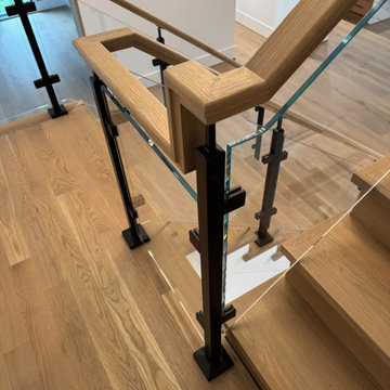
Warm wood and cold glass don't always work well together, but here they do. This white oak staircase pairs naturally grained treads with a sleek glass balustrade anchored by bold black metal posts, a combination that feels considered rather than contrived. The wrap-around starting steps ease the entry, softening what could have been a hard geometric statement into something more welcoming. Overhead, a statement lighting installation pulls the eye upward, casting a warm glow that works with the oak rather than against it. Clean lines throughout, nothing excessive.
1976-2026 © Century Stair Company
 Green River Stone Company
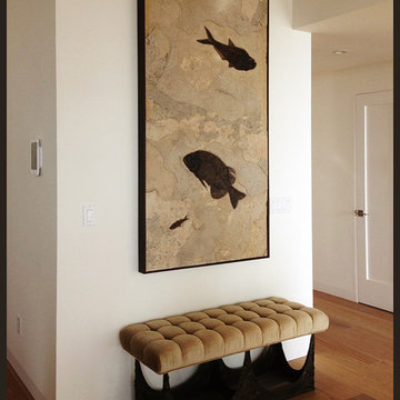
Green River Stone Company's private quarry lies at the bottom of an ancient lake. 50 million years ago, fortuitous conditions combined to preserve fish perfectly.
Our technicians remove excess stone using fine hand tools to reveal the pristine fossils in stunning detail. The finished fossil mural is a snapshot in time, a timeless piece of natural art.
 Home Builders Association of Greater Des Moines
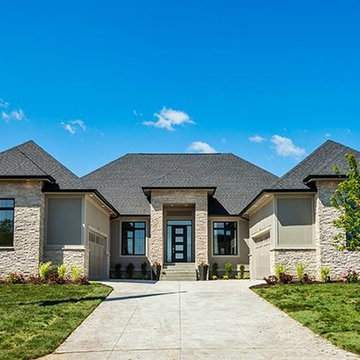
Sundance Homes invites you to tour this 2,600-square-foot walkout ranch. As you enter the home take note of the frosted glass track doors, which offer privacy and seclusion to a home office. The kitchen, dining and great room offer an open concept, while still maintaining their own distinct and defining characteristics. From the hardwood floors carried throughout the house, to the GE Monogram stainless steel appliances and quartz countertop island, this home provides the most usable space for family as well as entertaining. A spacious covered deck extends along the entire back of the house with access to the owner’s retreat. This is the place to relax at the end of the day with a stone fireplace, soaker tub, walk-in shower with digital control rain heads, an abundance of closet space and a bonus of its own washer and dryer. The second and third bedrooms include a Jack & Jill bath with individual vanities. Just steps away are the laundry room and mud room, featuring built-in lockers to give little ones a unique space to store their stuff. This home is equipped with energy-efficient, environmentally friendly geothermal HVAC system and radiant floor heating in the 4-car garages. Additionally, the garage floor drains and outside gutters are tied into an underground gutter system, effectively pulling excess water away from the foundation. This home also has a Control 4 Home Operating System with video and audio, providing the homeowner with a true sense of security – while at home and away.
 Archadeck of Northeast Dallas
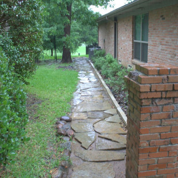
To solve this Irving homeowner's drainage issues, Archadeck removed the gravel and flagstone and first installed a gravity French system consisting of 6-inch PVC pipes and ten catch basins. This portion of the project extended out 200-feet. We also installed nine downspout connectors to the six-inch PVC pipes. This system allows gravity to divert the excess water from the area.
 Structured Cabinetry
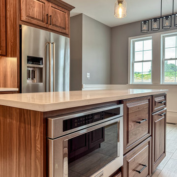
This traditional kitchen centers on the timeless beauty of Shiloh’s walnut cabinetry, crafted in a raised center panel door style that showcases the full warmth and character of the wood. The natural grain, depth of tone, and smooth finish highlight walnut’s inherent elegance, giving the space a grounded, heirloom-quality feel. The raised panel detailing reinforces a classic aesthetic, adding dimension and sophistication without excess ornamentation. Together, these elements create a kitchen defined by craftsmanship, durability, and the enduring appeal of richly stained wood.
 Sarah Lawson Design
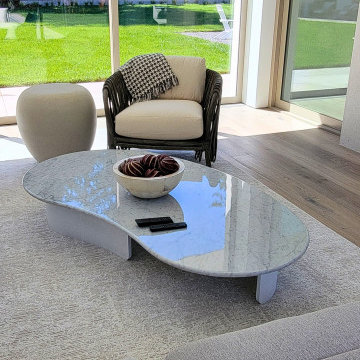
The great room is organized around symmetry, scale, and a strong relationship to the landscape. Operable floor-to-ceiling glazing on both sides of the space allows the room to fully open to the outdoors, while a pocketing window at the kitchen sink further dissolves the boundary between interior and exterior. Restrained furnishings and integrated lighting maintain a composed, architectural presence, allowing the space to function as a central gathering area without visual excess.

 Steel Life
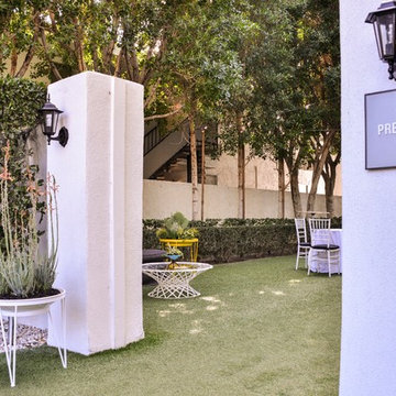
An ideal sanctuary for all your succulents and water-wise plants. This modern planter's unique design eliminates the need for excessive soil and water that would be needed to fill a deeper container. Sustainable, efficient and unparalleled style~this planter is a game changer in the modern garden world.
Includes rubber footings to protect your surface from scratches. Includes optional drain hole.
Powder coated steel. Wipe clean with a soft damp cloth.
18" x 18"x 18"
20" and 24" available for special orders. Contact us for pricing.
Photo credit: www.CarolineGreyshock.com
 Apple Tree Homes Inc
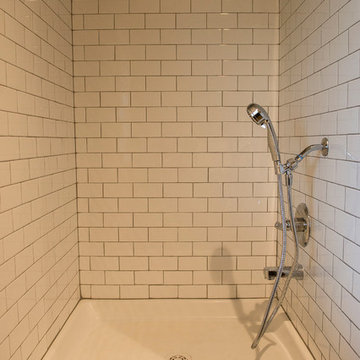
Elevated dog shower in mudroom with white subway tile and pull-off sprayer.
Bathroom - 1960s bathroom idea in Kansas City
Bathroom - 1960s bathroom idea in Kansas City
 Fix It 2 Sell It
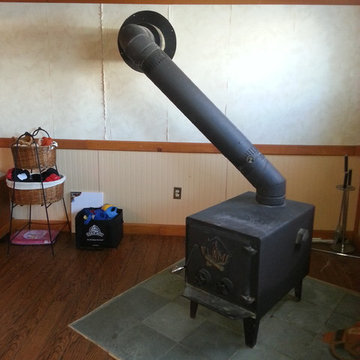
The old wood stove was sitting on an ugly pad, in a non-symmetrical position, and was an eye-sore.
The Otter street basement renovation was a fix-to-sell project. The homeowners were being relocated by the military, and they needed to do a facelift on their home before selling.
The main point of contention was the basement: it had been finished in a country-barn style, and was dark and uninviting. The walls were in bad shape, and the electrical needed to be brought up to code.
Also in this project, were other touch-ups including replacing the kitchen backsplashes.
The main issue was a wood-burning stove that was placed on a pad of tiles, which really took up space in the room, and was an eye-sore. The solution to this was to replace it with a gas-burning efficient direct vent corner fireplace, and cut away the flooring to make a symmetrical tiled pad.
The opposite corner had to have a pipe concealed, so we decided to make it look like the fireplace mantel. The fireplace mantel, the corner mantel, and the window sill were all done in red oak, and were tied together.
The tops of the mantels were done with the same tiles as on the floor.
The kids' playroom had new walls, ceiling, and flooring to brighten it up.
This house was placed on the market after a month of renovations, and was sold within 24 hours with an offer in excess of 98% of the asking price.
Now that's a Fix It 2 Sell It success!
66