
Search results for "Existing lines" in Home Design Ideas
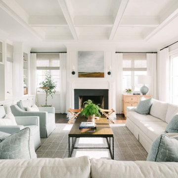
 White Sands Coastal Development
We remodeled this 5,400-square foot, 3-story home on ’s Second Street to give it a more current feel, with cleaner lines and textures. The result is more and less Old World Europe, which is exactly what we were going for. We worked with much of the client’s existing furniture, which has a southern flavor, compliments of its former South Carolina home. This was an additional challenge, because we had to integrate a variety of influences in an intentional and cohesive way.
We painted nearly every surface white in the 5-bed, 6-bath home, and added light-colored window treatments, which brightened and opened the space. Additionally, we replaced all the light fixtures for a more integrated aesthetic. Well-selected accessories help pull the space together, infusing a consistent sense of peace and comfort.
 Jacobson Construction
This is the story about a kitchen that was showing it’s age with white countertops and dark oak cabinets on a dark oak floor. It all worked once, but now the kitchen felt dark, cramped and dysfunctional. The owners were looking for a total kitchen transformation.
After a disastrous beginning with a contractor taking their money and vanishing into thin air, the owners were left with a completely gutted kitchen that consisted of only the walls. They hired Rick Jacobson to rescue them and restart the project.
The new kitchen design began with the idea of using Cobalt Blue as a primary color. The blue seen on many glassware pieces is Cobalt Blue, and it was decided to use it in the tile for the kitchen, as well as the pendant lights. Another goal was to make the kitchen brighter with an easier traffic flow, as well as completely updated cabinetry. And there were traffic patterns to improve, a refrigerator to move, and exhaust vents to reroute.
Rick Jacobson listened to the owners and worked to create the kitchen that the owners imagined. He began by thinking through the traffic flow patterns. He noted that the doorway from the dining room needed to be widened. He added rounded doorway headers to match the home’s existing décor.
He carefully thought through where the kitchen island should be, including how opening the oven doors would be in relation to people sitting at the kitchen island at a family gathering. Kitchen cabinet touches include off edge flat panel doors, soft close wooden drawers, and a spice cabinet with two slide-out racks. The new longer center island features a drawer microwave that opens and closes automatically with the push of a button. The center island also features two recycling bins and seating for four. Rick even thought of adding decorative elements to the existing half wall to make it look in line with the kitchen island. The kitchen’s black granite countertops offer an unusually appealing view: There are lots of interesting reflections throughout the kitchen.
Another of Rick’s touches is that all of the lights, including recessed ceiling lights, three cobalt blue pendant lights and below cabinet lights are on dimmers which work to balance daytime and nighttime lighting.
The under mounted stainless steel single sink is complemented with a gooseneck faucet. The stainless steel gas range is thin enough to allow for a wide drawer below for utensils, and the stainless steel vent hood is vented through the ceiling to outdoors, allowing additional storage space in the top cabinets. Double ovens with white doors are the perfect match to the cabinets, with a location that makes baking and roasting easier with the two large vertical storage for baking sheets and supplies nearby.
The result: A functional, open, bright and Cobalt blue kitchen.
 Zieba Builders, Inc.
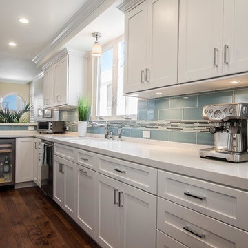
Our clients loved the location of their duplex home with its peak-a-boo ocean view, but their existing kitchen was not suited for their growing family. They wanted a kitchen with a coastal vibe, plenty of storage space, and an eat-in area.
We started by bringing the far wall into the kitchen space to accommodate a large panty and communication center for the family. Doing this allowed us to move the refrigerator out of the main traffic area and doubled the amount of storage space. Several new windows were added to bring in natural light. A half wall was moved to allow more countertop area and open up sight lines. The previously awkwardly shaped island was slimmed down to create better flow.
There were a few venting challenges to overcome; gas lines and plumbing had to be re-routed without disturbing the unit below. To open up sight lines, soffits were eliminated which allowed the extension of cabinets to the ceiling. To stay within the homeowner’s budget, we match existing scraped flooring by lacing in and repairing patches.
The old dining area was too small for table, so we designed and built a custom banquette to maximize the space and take advantage of the outdoor views. The overall space works for family meals as well as entertaining.
A light summer palette was used to reflect the shades of the sand, sea and sky. Even though the new kitchen is actually smaller than the original space, its now far more functional and open.
Find the right local pro for your project
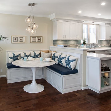 Zieba Builders, Inc.
Our clients loved the location of their duplex home with its peak-a-boo ocean view, but their existing kitchen was not suited for their growing family. They wanted a kitchen with a coastal vibe, plenty of storage space, and an eat-in area.
We started by bringing the far wall into the kitchen space to accommodate a large panty and communication center for the family. Doing this allowed us to move the refrigerator out of the main traffic area and doubled the amount of storage space. Several new windows were added to bring in natural light. A half wall was moved to allow more countertop area and open up sight lines. The previously awkwardly shaped island was slimmed down to create better flow.
There were a few venting challenges to overcome; gas lines and plumbing had to be re-routed without disturbing the unit below. To open up sight lines, soffits were eliminated which allowed the extension of cabinets to the ceiling. To stay within the homeowner’s budget, we match existing scraped flooring by lacing in and repairing patches.
The old dining area was too small for table, so we designed and built a custom banquette to maximize the space and take advantage of the outdoor views. The overall space works for family meals as well as entertaining.
A light summer palette was used to reflect the shades of the sand, sea and sky. Even though the new kitchen is actually smaller than the original space, its now far more functional and open.
 Studio 1200
After having lived in 22 different places all around the world, this family decided to settle in a Dutch colonial home in Harding Township. The house sits on a wonderful piece of property that is only challenged by the wetlands that surround it. For this reason, we had to work within the existing footprint and not consider any additions. The homeowners wanted to be able to host the holidays in their new home which meant we had an aggressive design and construction schedule. We started the design work in the Spring of 2012 and construction took place over the Summer and into the Fall. By Thanksgiving, the project was complete, with no meaningful cost overruns.
Renovations included a new kitchen, mudroom, and office/library on the first floor and a new master suite, hall bath, home office, and laundry room upstairs. The challenge was creating comfortable space with clean lines that would accommodate the homeowner’s casual and worldly lifestyle, but would not feel out of place with the character of the existing house.
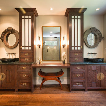
The kitchen is a glorious hard-working space with lots of counter space, space for a giant farmer’s table, and symmetrical views through oversized double hung-windows out to the expansive yard. The master bath is outfitted with wood, stone, and metal, and also includes artifacts from some of their world travels. In a second phase of work, we designed some outbuilding to further enhance the character of the property. Currently we are working with the family to design a memorial to honor their child who died of Leukemia.
 Regan Baker Design Inc.
Intentional. Elevated. Artisanal.
With three children under the age of 5, our clients were starting to feel the confines of their Pacific Heights home when the expansive 1902 Italianate across the street went on the market. After learning the home had been recently remodeled, they jumped at the chance to purchase a move-in ready property. We worked with them to infuse the already refined, elegant living areas with subtle edginess and handcrafted details, and also helped them reimagine unused space to delight their little ones.
Elevated furnishings on the main floor complement the home’s existing high ceilings, modern brass bannisters and extensive walnut cabinetry. In the living room, sumptuous emerald upholstery on a velvet side chair balances the deep wood tones of the existing baby grand. Minimally and intentionally accessorized, the room feels formal but still retains a sharp edge—on the walls moody portraiture gets irreverent with a bold paint stroke, and on the the etagere, jagged crystals and metallic sculpture feel rugged and unapologetic. Throughout the main floor handcrafted, textured notes are everywhere—a nubby jute rug underlies inviting sofas in the family room and a half-moon mirror in the living room mixes geometric lines with flax-colored fringe.
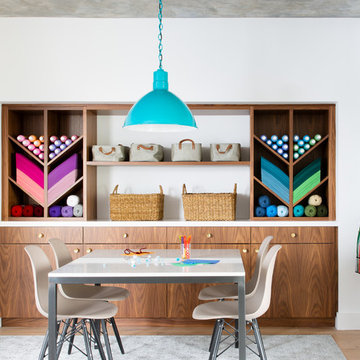
On the home’s lower level, we repurposed an unused wine cellar into a well-stocked craft room, with a custom chalkboard, art-display area and thoughtful storage. In the adjoining space, we installed a custom climbing wall and filled the balance of the room with low sofas, plush area rugs, poufs and storage baskets, creating the perfect space for active play or a quiet reading session. The bold colors and playful attitudes apparent in these spaces are echoed upstairs in each of the children’s imaginative bedrooms.
Architect + Developer: McMahon Architects + Studio, Photographer: Suzanna Scott Photography
 Amy A. Alper, Architect
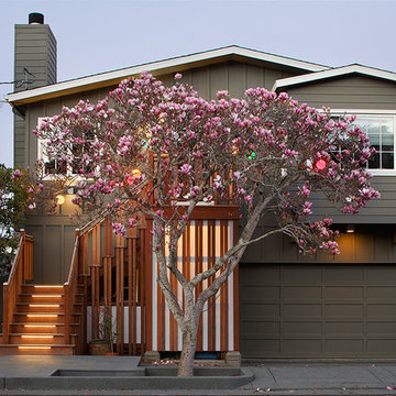
Entry Stair Lighting
Photo: Eric Rorer
Example of a mid-sized transitional green two-story exterior home design in San Francisco
Example of a mid-sized transitional green two-story exterior home design in San Francisco

Sponsored
Columbus, OH

Hope Restoration & General Contracting
Columbus Design-Build, Kitchen & Bath Remodeling, Historic Renovations
 Urban Oasis Landscape Design
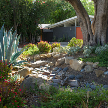
Sculptural agaves, succulents and California native plants punctuate the front landscape complementing the “arroyo seco” rain garden studded with boulders and branches. The rain garden catches 50% of the stormwater runoff from the roof and infiltrates it into the soil. The remaining 50% of the runoff goes to a second rain garden in the back yard.
 Klopf Architecture
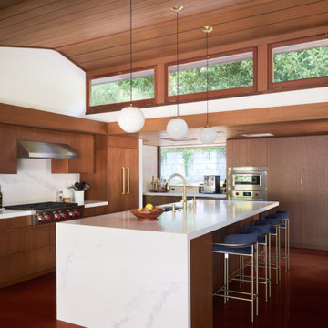
Nestled in the hills of Orinda, California, this 1951 residence is one of only seven extant homes, now known as “The Magnificent Seven”, designed by architect Olof Dahlstrand, a protégé of Frank Lloyd Wright. With its low-slung rooflines, natural materials, and deep integration with the sloping landscape, the home is a pristine example of mid-century modern design inspired by Wright’s organic principles. Over the years, prior homeowners have emphasized preservation, ensuring that the house remained relatively untouched. Each owner has respected the original architecture and stayed true to Dahlstrand’s intent. When a family of five—two college-aged sons and a middle school-aged daughter—acquired the property, they were captivated by its history, legacy of care, and architectural significance. While they appreciated Dahlstrand’s original vision, they also recognized the need to adapt the home for contemporary living while preserving its design integrity.
The remodel was conceived as a thoughtful response to the past—an effort to bring the house into the 21st century without compromising its soul. The primary mandate was to maintain architectural continuity while improving the functionality, comfort, and livability for a modern family. The design team—architects and contractor alike—worked with a shared reverence for the original architecture, allowing that mindset to guide even the most technical or pragmatic decisions.
A key objective was to increase natural light in the kitchen—a departure from Wrightian principles of enclosed, intimate cooking spaces—while maintaining the home’s architectural language. The kitchen was reconfigured to foster a stronger connection to adjacent living spaces while retaining the underlying concept of spatial separation. One of the most transformative architectural changes was the removal of a ridge beam that was originally planned to remain visible through the kitchen. During construction, the team collaborated on a better solution: a wide-flanged steel beam concealed within the roof envelope. This subtle move preserved the clean lines and ceiling continuity, a modern update carried out with utmost respect for the existing framework.
The home’s original powder room, previously accessible only through the kitchen, was relocated for better flow and privacy. A new powder room was carved out of former kitchen cabinetry—a narrow, interior space that could have felt dark and enclosed. To avoid this, the design extended the line of original transom windows into the new powder room and added a skylight above the vanity. The result is a bright and airy space that feels consistent with the rest of the home. Other updates included the installation of new solid-core interior doors with veneers carefully matched to the original mahogany, enhancing the continuity of the interiors. Even smaller decisions, such as placing the door knobs at 42 inches high, mirrored the original proportions. Every choice reflected a shared belief between the architect, contractor, and client: that new work should serve the integrity of the old.
The home’s extensive interior redwood millwork and paneling was meticulously restored. Where new materials were introduced—such as the replacement redwood soffit paneling—the contractor took pains to find finish nails that matched the original, rather than using modern equivalents. This level of craftsmanship and collaboration defined the project. It extended even to the detailing of a blind door to the new powder room, which had to disappear into the existing redwood board-and-batten wall. It was a team effort: the owner found a suitable handle, the architects devised the custom in-swing mechanism, and the contractor executed it so the door aligned precisely with the battens. Throughout, the homeowners were deeply engaged in the design process. One, a meticulous design enthusiast, focused on aesthetic integrity and historic detail. The other brought a practical and function-driven perspective, ensuring that new fixtures and materials would be durable and require minimal maintenance.
While the home’s location posed no major site challenges, sustainability was a key concern. The team upgraded the roof insulation, installed solar panels with battery storage, and added ductless mini-split cooling systems. Lighting was another area where modern technology was woven into a historic framework: new square LED fixtures echo the original custom perimeter soffit lights, maintaining the design language while offering advanced performance.
A planned expansion of a bedroom into suite with a bathroom had to be shelved due to budget constraints and the high cost of below-grade foundation work. Still, the team focused their efforts on making the most of the existing footprint, resolving constraints through design ingenuity rather than adding square footage. This renovation represents a collaborative achievement in preserving and evolving a historically significant home. Every decision was shaped by a shared ethos among clients, architects, and contractor: to maintain the home’s architectural soul while updating it for contemporary life. The result is a timeless modernist residence that continues Olof Dahlstrand’s legacy, remaining grounded in nature, craftsmanship, and human-scale design.
Klopf Architecture Team: John Klopf, AIA, Klara Kevane, Fernanda Bernardes
Interior Architectural Design: Klopf Architecture
Structural Engineer: Daniel Bastiao
Contractor: Don Larwood, Larwood Construction
Photography: Mariko Reed
Year Completed: 2022
 Klopf Architecture
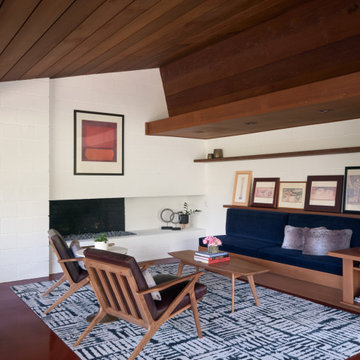
Nestled in the hills of Orinda, California, this 1951 residence is one of only seven extant homes, now known as “The Magnificent Seven”, designed by architect Olof Dahlstrand, a protégé of Frank Lloyd Wright. With its low-slung rooflines, natural materials, and deep integration with the sloping landscape, the home is a pristine example of mid-century modern design inspired by Wright’s organic principles. Over the years, prior homeowners have emphasized preservation, ensuring that the house remained relatively untouched. Each owner has respected the original architecture and stayed true to Dahlstrand’s intent. When a family of five—two college-aged sons and a middle school-aged daughter—acquired the property, they were captivated by its history, legacy of care, and architectural significance. While they appreciated Dahlstrand’s original vision, they also recognized the need to adapt the home for contemporary living while preserving its design integrity.
The remodel was conceived as a thoughtful response to the past—an effort to bring the house into the 21st century without compromising its soul. The primary mandate was to maintain architectural continuity while improving the functionality, comfort, and livability for a modern family. The design team—architects and contractor alike—worked with a shared reverence for the original architecture, allowing that mindset to guide even the most technical or pragmatic decisions.
A key objective was to increase natural light in the kitchen—a departure from Wrightian principles of enclosed, intimate cooking spaces—while maintaining the home’s architectural language. The kitchen was reconfigured to foster a stronger connection to adjacent living spaces while retaining the underlying concept of spatial separation. One of the most transformative architectural changes was the removal of a ridge beam that was originally planned to remain visible through the kitchen. During construction, the team collaborated on a better solution: a wide-flanged steel beam concealed within the roof envelope. This subtle move preserved the clean lines and ceiling continuity, a modern update carried out with utmost respect for the existing framework.
The home’s original powder room, previously accessible only through the kitchen, was relocated for better flow and privacy. A new powder room was carved out of former kitchen cabinetry—a narrow, interior space that could have felt dark and enclosed. To avoid this, the design extended the line of original transom windows into the new powder room and added a skylight above the vanity. The result is a bright and airy space that feels consistent with the rest of the home. Other updates included the installation of new solid-core interior doors with veneers carefully matched to the original mahogany, enhancing the continuity of the interiors. Even smaller decisions, such as placing the door knobs at 42 inches high, mirrored the original proportions. Every choice reflected a shared belief between the architect, contractor, and client: that new work should serve the integrity of the old.
The home’s extensive interior redwood millwork and paneling was meticulously restored. Where new materials were introduced—such as the replacement redwood soffit paneling—the contractor took pains to find finish nails that matched the original, rather than using modern equivalents. This level of craftsmanship and collaboration defined the project. It extended even to the detailing of a blind door to the new powder room, which had to disappear into the existing redwood board-and-batten wall. It was a team effort: the owner found a suitable handle, the architects devised the custom in-swing mechanism, and the contractor executed it so the door aligned precisely with the battens. Throughout, the homeowners were deeply engaged in the design process. One, a meticulous design enthusiast, focused on aesthetic integrity and historic detail. The other brought a practical and function-driven perspective, ensuring that new fixtures and materials would be durable and require minimal maintenance.
While the home’s location posed no major site challenges, sustainability was a key concern. The team upgraded the roof insulation, installed solar panels with battery storage, and added ductless mini-split cooling systems. Lighting was another area where modern technology was woven into a historic framework: new square LED fixtures echo the original custom perimeter soffit lights, maintaining the design language while offering advanced performance.
A planned expansion of a bedroom into suite with a bathroom had to be shelved due to budget constraints and the high cost of below-grade foundation work. Still, the team focused their efforts on making the most of the existing footprint, resolving constraints through design ingenuity rather than adding square footage. This renovation represents a collaborative achievement in preserving and evolving a historically significant home. Every decision was shaped by a shared ethos among clients, architects, and contractor: to maintain the home’s architectural soul while updating it for contemporary life. The result is a timeless modernist residence that continues Olof Dahlstrand’s legacy, remaining grounded in nature, craftsmanship, and human-scale design.
Klopf Architecture Team: John Klopf, AIA, Klara Kevane, Fernanda Bernardes
Interior Architectural Design: Klopf Architecture
Structural Engineer: Daniel Bastiao
Contractor: Don Larwood, Larwood Construction
Photography: Mariko Reed
Year Completed: 2022
 Klopf Architecture
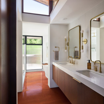
Nestled in the hills of Orinda, California, this 1951 residence is one of only seven extant homes, now known as “The Magnificent Seven”, designed by architect Olof Dahlstrand, a protégé of Frank Lloyd Wright. With its low-slung rooflines, natural materials, and deep integration with the sloping landscape, the home is a pristine example of mid-century modern design inspired by Wright’s organic principles. Over the years, prior homeowners have emphasized preservation, ensuring that the house remained relatively untouched. Each owner has respected the original architecture and stayed true to Dahlstrand’s intent. When a family of five—two college-aged sons and a middle school-aged daughter—acquired the property, they were captivated by its history, legacy of care, and architectural significance. While they appreciated Dahlstrand’s original vision, they also recognized the need to adapt the home for contemporary living while preserving its design integrity.
The remodel was conceived as a thoughtful response to the past—an effort to bring the house into the 21st century without compromising its soul. The primary mandate was to maintain architectural continuity while improving the functionality, comfort, and livability for a modern family. The design team—architects and contractor alike—worked with a shared reverence for the original architecture, allowing that mindset to guide even the most technical or pragmatic decisions.
A key objective was to increase natural light in the kitchen—a departure from Wrightian principles of enclosed, intimate cooking spaces—while maintaining the home’s architectural language. The kitchen was reconfigured to foster a stronger connection to adjacent living spaces while retaining the underlying concept of spatial separation. One of the most transformative architectural changes was the removal of a ridge beam that was originally planned to remain visible through the kitchen. During construction, the team collaborated on a better solution: a wide-flanged steel beam concealed within the roof envelope. This subtle move preserved the clean lines and ceiling continuity, a modern update carried out with utmost respect for the existing framework.
The home’s original powder room, previously accessible only through the kitchen, was relocated for better flow and privacy. A new powder room was carved out of former kitchen cabinetry—a narrow, interior space that could have felt dark and enclosed. To avoid this, the design extended the line of original transom windows into the new powder room and added a skylight above the vanity. The result is a bright and airy space that feels consistent with the rest of the home. Other updates included the installation of new solid-core interior doors with veneers carefully matched to the original mahogany, enhancing the continuity of the interiors. Even smaller decisions, such as placing the door knobs at 42 inches high, mirrored the original proportions. Every choice reflected a shared belief between the architect, contractor, and client: that new work should serve the integrity of the old.
The home’s extensive interior redwood millwork and paneling was meticulously restored. Where new materials were introduced—such as the replacement redwood soffit paneling—the contractor took pains to find finish nails that matched the original, rather than using modern equivalents. This level of craftsmanship and collaboration defined the project. It extended even to the detailing of a blind door to the new powder room, which had to disappear into the existing redwood board-and-batten wall. It was a team effort: the owner found a suitable handle, the architects devised the custom in-swing mechanism, and the contractor executed it so the door aligned precisely with the battens. Throughout, the homeowners were deeply engaged in the design process. One, a meticulous design enthusiast, focused on aesthetic integrity and historic detail. The other brought a practical and function-driven perspective, ensuring that new fixtures and materials would be durable and require minimal maintenance.
While the home’s location posed no major site challenges, sustainability was a key concern. The team upgraded the roof insulation, installed solar panels with battery storage, and added ductless mini-split cooling systems. Lighting was another area where modern technology was woven into a historic framework: new square LED fixtures echo the original custom perimeter soffit lights, maintaining the design language while offering advanced performance.
A planned expansion of a bedroom into suite with a bathroom had to be shelved due to budget constraints and the high cost of below-grade foundation work. Still, the team focused their efforts on making the most of the existing footprint, resolving constraints through design ingenuity rather than adding square footage. This renovation represents a collaborative achievement in preserving and evolving a historically significant home. Every decision was shaped by a shared ethos among clients, architects, and contractor: to maintain the home’s architectural soul while updating it for contemporary life. The result is a timeless modernist residence that continues Olof Dahlstrand’s legacy, remaining grounded in nature, craftsmanship, and human-scale design.
Klopf Architecture Team: John Klopf, AIA, Klara Kevane, Fernanda Bernardes
Interior Architectural Design: Klopf Architecture
Structural Engineer: Daniel Bastiao
Contractor: Don Larwood, Larwood Construction
Photography: Mariko Reed
Year Completed: 2022
 Billinkoff Architecture PLLC
Mark LaRosa
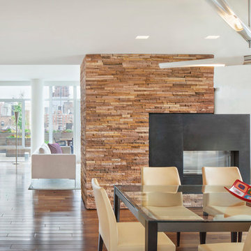
Large trendy dark wood floor dining room photo in New York with white walls and a two-sided fireplace
Large trendy dark wood floor dining room photo in New York with white walls and a two-sided fireplace
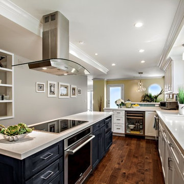 Zieba Builders, Inc.
Our clients loved the location of their duplex home with its peak-a-boo ocean view, but their existing kitchen was not suited for their growing family. They wanted a kitchen with a coastal vibe, plenty of storage space, and an eat-in area.
We started by bringing the far wall into the kitchen space to accommodate a large panty and communication center for the family. Doing this allowed us to move the refrigerator out of the main traffic area and doubled the amount of storage space. Several new windows were added to bring in natural light. A half wall was moved to allow more countertop area and open up sight lines. The previously awkwardly shaped island was slimmed down to create better flow.
There were a few venting challenges to overcome; gas lines and plumbing had to be re-routed without disturbing the unit below. To open up sight lines, soffits were eliminated which allowed the extension of cabinets to the ceiling. To stay within the homeowner’s budget, we match existing scraped flooring by lacing in and repairing patches.
The old dining area was too small for table, so we designed and built a custom banquette to maximize the space and take advantage of the outdoor views. The overall space works for family meals as well as entertaining.
A light summer palette was used to reflect the shades of the sand, sea and sky. Even though the new kitchen is actually smaller than the original space, its now far more functional and open.
Sponsored
Columbus, OH
Hope Restoration & General Contracting
Columbus Design-Build, Kitchen & Bath Remodeling, Historic Renovations
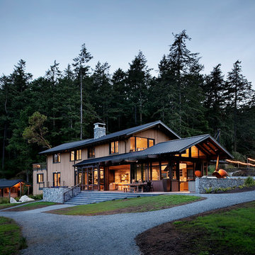
 NB Design Group, Inc
Rustic Modern Exterior of Private Residence Compound
Inspiration for a large rustic three-story exterior home remodel in Seattle
Inspiration for a large rustic three-story exterior home remodel in Seattle
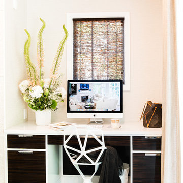
 House of L
A traditional Georgian home receives an incredible transformation with an addition to expand the originally compact kitchen and create a pathway into the family room and dining area, opening the flow of the spaces that allow for fluid movement from each living space for the young family of four. Taking the lead from the client's desire to have a contemporary and edgier feel to their home's very classic facade, House of L worked with the architect's addition to the existing kitchen to design a kitchen that was incredibly functional and gorgeously dramatic, beckoning people to grab a barstool and hang out. Glossy macassar ebony wood is complimented with lacquered white cabinets for an amazing study in contrast. An oversized brushed nickel hood with polished nickel banding makes a presence on the feature wall of the kitchen. Brushed and polished nickel details are peppered in the landscape of this room, including the cabinets in the second island, a storage cabinet and automated hopper doors by Hafele on the refrigeration wall and all of the cabinet hardware, supplied and custom sized by Rajack. White quartz countertops by Hanstone in the Bianco Canvas colorway float on all the perimeter cabinets and the secondary island and creates a floating frame for the Palomino Quartzite that is a highlight in the kitchen and lends an organic feel to the clean lines of the millwork. The backsplash area behind the rangetop is a brick patterned mosaic blend of stone and glass, while surrounding walls have a layered sandstone tile that lend an incredible texture to the room. The light fixture hanging above the second island is by Wells Long and features faceted metal polygons with an amber gold interior. Woven linen drapes at window winks at the warmer tones in the room with a lustrous sheen that catches the natural light filtering in. The rift and sawn cut white oak floors are 8" planks that were fitted and finished on site to match the existing floor in the family and dining rooms. The clients were very clear on the appliances they needed the kitchen to accommodate. In addition to the vast expanses of wall space that were gained with the kitchen addition the larger footprint allowed for two sizeable islands and a host of cooking amenities, including a 48" rangetop, two double ovens, a warming drawer, and a built-in coffee maker by Miele and a 36" Refrigerator and Freezer and a beverage drawer by Subzero. A fabulous stainless steel Kallista sink by Mick De Giulio's series for the company is fitted in the first island which serves as a prep area, flanked by an Asko dishwasher to the right. A Dorenbracht faucet is a strong compliment to the scale of the sink. A smaller Kallista stainless sink is centered in the second island which has a secondary burner by Miele for overflow cooking.
Jason Miller, Pixelate
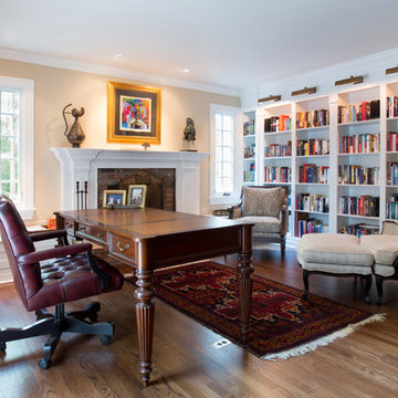 Studio 1200
After having lived in 22 different places all around the world, this family decided to settle in a Dutch colonial home in Harding Township. The house sits on a wonderful piece of property that is only challenged by the wetlands that surround it. For this reason, we had to work within the existing footprint and not consider any additions. The homeowners wanted to be able to host the holidays in their new home which meant we had an aggressive design and construction schedule. We started the design work in the Spring of 2012 and construction took place over the Summer and into the Fall. By Thanksgiving, the project was complete, with no meaningful cost overruns.
Renovations included a new kitchen, mudroom, and office/library on the first floor and a new master suite, hall bath, home office, and laundry room upstairs. The challenge was creating comfortable space with clean lines that would accommodate the homeowner’s casual and worldly lifestyle, but would not feel out of place with the character of the existing house.
The kitchen is a glorious hard-working space with lots of counter space, space for a giant farmer’s table, and symmetrical views through oversized double hung-windows out to the expansive yard. The master bath is outfitted with wood, stone, and metal, and also includes artifacts from some of their world travels. In a second phase of work, we designed some outbuilding to further enhance the character of the property. Currently we are working with the family to design a memorial to honor their child who died of Leukemia.
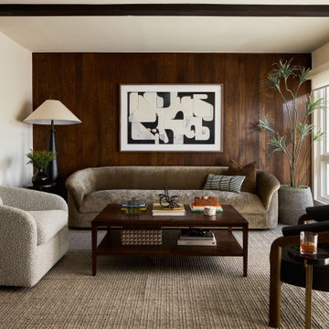
 Velène Design House
At Velène Design House, we revived the home’s vintage charm, balancing original mid‑century elements, like stone fireplaces and wood paneling, with clean, contemporary lines, subtle traditional touches, and thoughtful textures.
This mid‑century ranch remodel transformed a largely untouched 1960s home into a refined, family‑ready retreat.
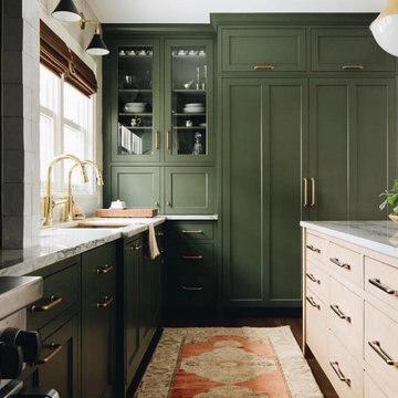

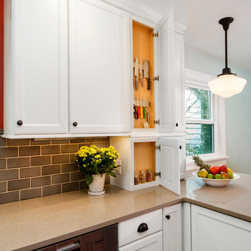
 Kayron Brewer, CMKBD / Studio K B
Dan Farmer, Seattle Home Tours
Example of a classic kitchen design in Seattle
Example of a classic kitchen design in Seattle
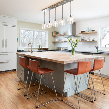
 Arcadea Architecture
A small existing kitchen is opened in both directions with an eclectic assortment of white, gray, and natural wood to create a new look and a fresh sense of connection to the outdoors. The feel is still casual and a bit country to feel at home with the existing windows and character.
 Décor Aid
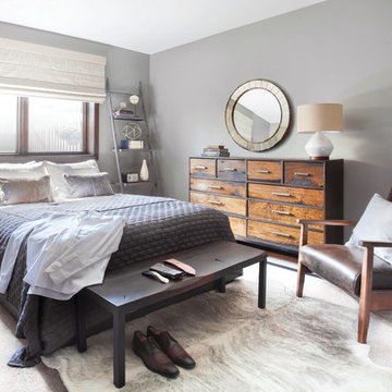
Another designer had already been hired to redo the interior, but once Ryan and Michael saw the finished backyard, they decided to hire Decor Aid to redesign the entire apartment, which included gut renovations of the kitchen and bathroom, a custom-made bar in the foyer, and a restyling of the bedroom and living room.
The apartment already featured some wood and leather furniture pieces, and so the redesign had to incorporate these existing pieces, while balancing the couple’s neutral palette and welcoming personalities.
Darker elements in the kitchen and bathroom were brought in to fit the couple’s modern, yet masculine style, and were contrasted with lighter, airy pieces, to keep smaller spaces from feeling claustrophobic. White marble and grey-washed wood tile was used to balance the matte black accents in the bathroom, while white cabinets and stainless steel appliances were used to balance the black tile backsplash and black countertops in the kitchen.
To fit the hip industrial vibe of Hoboken, rustic wood details were incorporated to offset the sleek modern finish that is consistent throughout the apartment. A lighter wood flooring was used in the bathroom, to complement the other wood elements in the apartment.
The living room and bedroom had already been repainted and refurnished, and so the restyling of each space had to feel cohesive with the existing elements. An organic cowhide rug offset the crisp lines in the bedroom, and dark linens were used to compliment the wood dresser and leather chair. The custom-built wood bar fit Ryan and Michael’s desire to transform their apartment into a space ready for entertaining, while tying together the apartment’s modern industrial look.
15